
U.S. Department of Health and Human Services
Private Long-Term Care Insurance: Following an Admission Cohort over 28 Months to Track Claim Experience, Service Use and Transitions
Jessica S. Miller, M.S., Xiaomei Shi, M.A., and Marc A. Cohen, Ph.D.
LifePlans, Inc.
April 2008
PDF Version: http://aspe.hhs.gov/daltcp/reports/2008/coht28mo.pdf (55 PDF pages)
This report was prepared under contract #HHS-100-02-0014 between the U.S. Department of Health and Human Services (HHS), Office of Disability, Aging and Long-Term Care Policy (DALTCP) and LifePlans, Inc. For additional information, you can visit the DALTCP home page at http://aspe.hhs.gov/_/office_specific/daltcp.cfm or contact the ASPE Project Officers, Pamela Doty and Hunter McKay, at HHS/ASPE/DALTCP, Room 424E, H.H. Humphrey Building, 200 Independence Avenue, S.W., Washington, D.C. 20201. Their e-mail addresses are: Pamela.Doty@hhs.gov and Hunter.McKay@hhs.gov
The opinions and views expressed in this report are those of the authors. They do not necessarily reflect the views of the Department of Health and Human Services, the contractor or any other funding organization.
TABLE OF CONTENTS
- I. BACKGROUND
- II. PURPOSE
- III. METHOD AND SAMPLE
- IV. FINDINGS
- A. Socio-Demographic Characteristics
- B. Functional Characteristics
- C. Satisfaction with Service Providers
- D. Use of Care Management
- E. Experience with Filing a Claim
- F. Effect of Having Long-Term Care Insurance
- G. Movement and Transitions
- H. Multivariate Analyses
- V. SUMMARY
- LIST OF FIGURES
- FIGURE 1: Service Setting by Wave
- FIGURE 2: Average Age by Setting by Wave
- FIGURE 3: Proportion over Age 87 by Setting and Wave
- FIGURE 4: Proportion Married by Setting and Wave
- FIGURE 5: Average Number of ADL Limitations by Wave and Service Setting
- FIGURE 6: Percentage of Individuals by HIPAA Triggers by Wave
- FIGURE 7: Percentage of Home Care and Assisted Living Residents Meeting HIPAA Triggers by Wave
- FIGURE 8: Average Number of IADL Limitations by Wave and Service Setting
- FIGURE 9: Average Number of IADL Limitations by Wave for Nursing Home Residents
- FIGURE 10: Satisfaction with Specific Home Care Providers by Wave
- FIGURE 11: Satisfaction with Specific Assisted Living and Nursing Home Facility by Wave
- FIGURE 12: Current Care Needs Are being Met by Wave by Service Setting
- FIGURE 13: Use of Care Manager by Wave by Service Setting
- FIGURE 14: Proportion of Home Care Recipients who State Care Manager Recommended Changes to Plan of Care and Service Setting
- FIGURE 15: Proportion Receiving Paid Care at Wave 1 Who Filed a Claim and the Result
- FIGURE 16: Proportion of Approved Claimants Reporting Disagreements with Their LTC Insurance Company at Wave 1
- FIGURE 17: Proportion of Both Approved and Denied Claimants Reporting Disagreements with Their LTC Insurance Company at Wave 1
- FIGURE 18: Base and Adjusted Denial Rates for the Cohort of Those Reporting Denied and Pending Claims at Wave 1 Over Time
- FIGURE 19: Costs Covered by LTC Insurance by Wave
- FIGURE 20: Having LTC Insurance Made Obtaining Services Easier by Wave
- FIGURE 21: Having LTC Insurance Provided Claimant Greater Flexibility with Choice of Service Setting by Wave
- FIGURE 22: Having LTC Insurance Has Limited Provider Choice by Wave
- FIGURE 23: Without LTC Insurance Claimant Would Receive Less Paid Care by Wave
- FIGURE 24: Percent Remaining in Baseline Service Setting at Each Wave
- FIGURE 25: Transitions Between Waves
- FIGURE 26: Rate of Transitions for Those Observed at Baseline and All Seven Waves
- LIST OF TABLES
- TABLE 1: Sample Distribution by Wave
- TABLE 2: Average ADL Limitations by Wave and Baseline ADL Category and Cumulative Mortality Rate
- TABLE 3a: Movement and Transitions for the Baseline Home Care Recipients
- TABLE 3b: Movement and Transitions for the Baseline Nursing Home Residents
- TABLE 3c: Movement and Treatment for the Baseline Assisted Living Facility Residents
- TABLE 3d: Movement and Treatment for Those Report No Paid Care at Baseline
- TABLE 4: Characteristics Associated with Transitioning
- TABLE 5: Logistic Regression Results for Predicting Mortality
- TABLE 6: Unobserved Effects Logit Model on Care Setting Transitions among Paid Care Recipients
- TABLE 7: Key Descriptive Statistics
- TABLE 8: Fixed-Effect Model Results for Monthly Costs of Care
AUTHORS
Jessica S. Miller, M.S. Director of Analytic Services, LifePlans, Inc. President, Center for Health and Long-Term Care Research, Inc. 51 Sawyer Road, Suite 340 Waltham, MA 02453
Xiaomei Shi, M.A. Research Analyst, LifePlans, Inc. 51 Sawyer Road, Suite 340 Waltham, MA 02453
Marc A. Cohen, Ph.D. President, LifePlans, Inc. Senior Scientist, Center for Health and Long-Term Care Research 51 Sawyer Road, Suite 340 Waltham, MA 02453
EXECUTIVE SUMMARY
This is the third in a series of reports based on longitudinal information collected from a sample of 1,474 individuals with long-term care (LTC) insurance, who notified their insurance company that they were receiving or intended to receive paid services for which they filed, or would be filing, a claim under their LTC policy. These individuals comprise an admissions cohort of new LTC service users. This admissions cohort has been tracked over a period of 28 months. Every four months after the initial in-person baseline interview, these individuals were contacted and completed a telephonic assessment that focused on changes in disability status, service settings, preferences, experience with the claims filing process, use of care management services and service setting transitions. The purpose of this report is to present findings from the analysis of longitudinal data collected over this 2½ year period. We also report on individuals satisfaction with providers and their experiences with their LTC insurance. For a more detailed explanation of the larger study, as well as a discussion of findings from the baseline interviews, please see the report entitled Service Use and Transitions: Decisions, Choices and Care Management among an Admissions Cohort of Privately Insured Disabled Elders located at: http://aspe.hhs.gov/daltcp/reports/2006/admcohort.htm.
Highlights and key findings are presented below.
Sample Distribution
- Most of those using paid care throughout the study period were residing at home or in assisted living facilities.
- The proportion of sample receiving care in any of the service settings does fluctuate over time suggesting that there are transitions over the period, although not of a very large magnitude.
- The mortality rate at the first Wave of telephone interviews, four months after baseline is high (13%), which suggests that at least one in ten new admissions to the LTC system is very sick, and not likely to be long users of care.
- By the end of the study period, 39% of the original sample was deceased.
Socio-Demographic Characteristics
- As expected, the age and gender profile of paid care recipients during the follow-up period mirrors that at baseline.
- Those in assisted living facilities remain the oldest and most likely to be widowed while those receiving paid care at home remain the youngest.
- The largest increase in the proportion of those age 85 and over is in assisted living.
Functional Characteristics
- Disability levels remain fairly constant across the Waves and service settings, with those residing in nursing homes being the most disabled and those in assisted living the least disabled.
- Those who started out at baseline needing help with less than two activities of daily living (ADLs) remain the least disabled over time, increasing to an average of 2.47 ADL limitations by the end of Wave 7.
- For the most part, people are deteriorating over time as is evidenced by the fact that the average number of ADL and instrumental activities of daily living (IADL) limitations increases over time.
- The exception to this general pattern is found for those who are most disabled (had between five and six ADL limitations at baseline). While this group remains the most disabled, the average number of ADL limitations drops by Wave 7 by almost a full ADL (from an average of 5.31 to 4.33), which is most likely due to the fact that the sickest or most disabled in this group are dying and the healthiest (in a relative sense) of this group are remaining in the sample.
Satisfaction with Service Providers
- When looking at satisfaction as a dichotomous variable, satisfaction rates in all service settings across all Waves are very high.
- When focusing on those who reported very high satisfaction levels, however, nursing home residents are least likely to report that they are very satisfied and this group has the largest decline in satisfaction over time -- with less than half reporting that they are very satisfied by the end of the follow-up period.
Use of Care Management
- While the use of care management was low at baseline (19%, 11% and 7% for home care, nursing home and assisted living facility respectively), there is a significant increase in the use of care management at Wave 1, which is when individuals are putting specific services in place.
- At Wave 1, 35% of home care recipients, 20% of nursing home residents and 12% of assisted living facility residents reported using a care manager within the last four months.
- Almost all of those who used a care manager found them helpful, responsive to their needs and felt that the care manager spent enough time with them.
Experience with Filing a Claim
- Ninety-six percent of paid care receivers reported filing a claim by the time of the first follow-up interview.
- The majority of claims for which a decision was rendered were approved -- 95.7% at Wave 1, with 4.3% reporting they were denied benefits.
- At the end of Wave 4 and through Wave 7, the adjusted denial rate (total denials over the period) drops to 2.4%. The remainder of those who reported initial denials at Wave 1, who were not approved by Wave 4 and remained in the sample, were not receiving any paid care.
- Those who were denied state that they were told they were not disabled enough to qualify for benefits yet. In fact, they only have an average of 0.74 limitations in ADLs at baseline and 1.8 at Wave 1.
- Of all those who submitted claims at Wave 1 (both approved and denied), 94% report having no disagreements with their insurance company or that their disagreements were resolved satisfactorily.
Effect of Having a LTC Insurance
- At Wave 1, roughly three-quarters of claimants agree that having their insurance made it easier to obtain needed services and that number increases to a high of 89% by the fifth follow-up interview and levels out at 80% by Wave 7.
- The majority of claimants also agreed that having their LTC insurance policy allowed them greater flexibility with the choice of care setting.
- A majority at all Waves stated that they would have to decrease the amount of paid care they receive if they did not have their policies.
Movement and Transitions
- Movement is defined as changes in service settings (e.g., to and from receiving care at home, in assisted living or in a nursing home. Transitions include not only movement across care settings but also change from using no paid care to receiving paid care and vice versa.
- Those who moved to an assisted living facility at baseline were the most likely to remain there over time.
- Those who began using paid care at home at baseline were the most likely to stop using paid care over time and had the lowest cumulative mortality rate over the 28 months.
- Nursing home residents had the highest overall mortality rate -- close to two in five were deceased after 28 months, with 21% of these dying four months after entering the nursing home.
- The highest rate of transitions occurred at Wave 1 with 37% of the sample either changing care settings or going from paid care to no paid care or vice versa.
- Of those receiving paid care, the majority had only one transition during their involvement in the study (84%), while 13% experienced two transitions and only 4% changed care settings three times.
- For those who were followed for the entire 28 month period, 30% reported no change in care setting or service use, and 51% reported experiencing at least one transition.
- The average number of transitions for those observed at all points in time was one.
- For those who do transition, they are most likely to be younger, less disabled (both functionally and cognitively) recipients of paid home care and report being less than satisfied with their initial choice of service provider.
Multivariate Analysis
Mortality
- Those who have more ADL limitations and are 85+ are more likely to die, holding other variables constant.
- Compared with people who were clinically assessed as expected to improve, those individuals whose condition was assessed as worsening, were about three times more likely to die during the study period.
Transitions among paid care users
- Level of functional disability and age are negatively related to the probability of having a transition -- that is the older and/or more functionally disabled one is, the less likely it is that one will move between care settings.
- All other variables held constant, the odds of transition for nursing home and assisted living facility residents are 24% and 22% of the odds of transition for home care recipients.
- Those who are cognitively impaired are 50% less likely to transition when compared to their non-impaired counterparts.
- Individuals who are receiving unpaid care are 1.31 times more likely to transition to an alternative care setting than are those without such care.
- People who are very satisfied with their care or who believe that their care needs are being met are less likely to transition to a different care setting than are those who are dissatisfied or report unmet need.
LTC Expenditures
- We estimated the average monthly expenditure for each person who was surveyed at least twice in the sample by assigning costs to current service use. The figures were computed for 3,604 person-waves of data and then an average was calculated for each service setting. We then used a fixed-effect model to analyze the data.
- Nursing home residents incurred the highest monthly cost ($5,561) whereas assisted living residents had the lowest average costs -- $2,653.
- Home care recipients spent $3,601 and those individuals who were not receiving paid care at the baseline interview but subsequently began using care, spent an average of $1,746.
- Disability status is also related to expenditures. The more disabled one is, the higher the service costs incurred.
- The independent effect of an additional year of age is to increase average monthly expenditures by about 10%.
Opinion surveys (http://www.aarp.org/research/longtermcare/trends/) indicate that most older Americans hope to continue to reside at home after developing LTC needs, if possible. Alternatively, if they cannot live at home, they hope to be able to make one move to a specialized elder care setting (preferably assisted living) and then age in place. Most elders would prefer to avoid having to move to a nursing home unless the level of care they need requires that they be in this setting. For most private LTC insurance claimants, their comprehensive insurance coverage facilitates their ability to make choices about when and where to receive care in accord with such preferences. The findings presented here support these notions. The vast majority (88%) of the private LTC insurance sample who started out at home were able to remain at home for the entire period of their participation in the study,1 and for those who remained in the sample over the 28 month period, this proportion was almost equally as high -- 81%. Of those who did move to a specialized residential elder care setting (assisted living or nursing facility), the great majority (85%) experienced only one such move throughout their participation in the study and it was most often to an assisted living facility. A much smaller proportion of the sample choose to use nursing home care, with less than one-quarter (21%) of the sample reporting a move to a nursing home at some point during the study period.
Overall, this study of private LTC claimants suggests that most individuals with insurance coverage for LTC are able to negotiate the service system with little or no help from a professional care manager. Most were able to obtain services that they thought met their needs and that they were satisfied (often very satisfied). This suggests perhaps that affordability not fragmentation of the service system or lack of availability of good service providers is the main barrier that the average elder in need of LTC faces and that insurance (assuming it is affordable) can be a solution to that problem. The one striking exception to this apparent conclusion is that LTC claimants in nursing homes experienced declining satisfaction with quality of care, which suggests perhaps that, even elders who can afford better quality care have difficulty finding nursing home care that they find satisfactory.
I. BACKGROUND
By definition, individuals who require long-term care (LTC) need such assistance over an extended period of time (at least for a few months but perhaps for several years). However, most research on individuals use of informal and paid LTC is cross-sectional. This study is one of comparatively few that have sought to follow a group of individuals in need of LTC over time (specifically, 28 months) to understand whether and how their patterns of service use and satisfaction with services change or remain constant.
It is widely believed that most elders and families find making decisions about LTC services very complicated and difficult. The difficulty is assumed to be only partly a matter of affordability. That is, many professionals and experts in the field assume that, even when affordability is not the overriding consideration or obstacle, individuals and families who want or need paid care may have trouble identifying and accessing appropriate services and, because of lack of information about alternatives, they are likely to over-utilize nursing homes. Only a minority of elders with LTC needs can qualify for public programs because of restrictive coverage rules (Medicare) and restrictive financial eligibility requirements (Medicaid). Moreover, the major public program (Medicaid) is also frequently criticized for its alleged nursing home bias. Individuals who plan ahead (by anticipating possible future needs for LTC while they are still healthy) may be able to increase their ability to afford paid services by purchasing private LTC insurance. However, many experts have questioned whether private LTC insurance will actually be of much help when it is needed. Some skeptics think that insurance companies will find a way to avoid paying claims or that insurance benefits will cover too small a share of the actual service costs to be of much assistance.
The present study was designed to test the factual bases of such widespread beliefs and concerns. By focusing on private LTC insurance claimants, this study minimizes the role of affordability as an overriding consideration likely to restrict choice of and among paid LTC settings and providers. All participants in the study sample had private LTC insurance that provided them with a means of financing LTC at home, in assisted living, or in a nursing home. Thus, this research is able to focus on understanding the factors other than cost that influence LTC decision-making.
This study also addresses some of the major concerns of those who are skeptical about the value of private LTC insurance. By studying the claims experience of a representative sample of claimants of participating insurance carriers and including a baseline in-home assessment of need, it is possible to measure the rate of claims denials2 and to assess the likelihood that claims denied were, in fact, legitimate and should have been approved. Measures of mortality also make it possible to estimate how long claimants will remain alive and still in need of care, having exhausted their insurance coverage.
II. PURPOSE
This is the third in a series of reports based on longitudinal information collected from a sample of 1,474 individuals with LTC insurance who notified their insurance company that they were receiving or intended to receive paid services for which they had, or would, file a claim under their LTC policy. This admissions cohort has been tracked over a period of roughly 2½ years (28-32 months). The purpose of this report is to analyze data collected from all of the follow-up telephone interviews conducted at four month intervals. We examine key issues related to disability level, use of care management services, claims experience and transitions through the continuum of care. We also report on their satisfaction with providers and experiences with their LTC insurance.3 Finally, we employ multivariate analytic techniques to uncover the factors related to service transitions, costs and mortality. This report focuses on answering a number of key research questions. These include:
-
How do functional and cognitive disability status change over time and does this vary by service modality?
-
Are individuals satisfied with their service providers and does this level of satisfaction persist over time?
-
Do individuals using formal paid care also use care management services and do they find it beneficial over time?
-
What are the aggregate and adjusted claim approval and denial rates over time?
-
How does having LTC insurance affect care patterns?
-
How do individuals transition across service settings over time?
-
What are the characteristics associated with mortality rates over the period and with making a transition between service settings?
-
What are the characteristics associated with greater LTC expenses?
III. METHOD AND SAMPLE
A detailed in-person baseline interview was conducted with each of the 1,474 participating individuals. This interview collected basic demographic information (i.e., age, gender, marital status, education, income level, presence of children near household, etc.); service use data (i.e., type, intensity, duration, and start date of formal and family care); use of care management (i.e., was it offered, was it used, is there a care plan, developed, etc.); and health and disability data such as basic activity of daily living (ADL) and instrumental activity of daily living (IADL) limitations and scores on the Short Portable Mental Status Questionnaire, behavioral assessment, information on number of medications, etc. as well as information regarding the decision-making process, service use, family support, and insurance coverage. The sample was collected from ten of the largest LTC insurance companies accounting for diverse market segments and policy designs that employ differing underwriting and claims management strategies. In order to be included in the baseline interview, the insured had to meet the following criteria:
- An individual had to have begun using paid services in their current service setting within the last 120 days or had to anticipate beginning paid service use within 60 days; and,
- They had to have an LTC policy that covered care in all three service modalities, that is, nursing home, home care, and assisted living; and,
- They intended to file a claim or had already filed a claim with their LTC insurance company.
After the initial in-person assessment was completed, we began a period of follow-up that consisted of a telephonic interview conducted every four months. The follow-up period lasted roughly 2½ years, with a total of seven phone interviews completed after the baseline interview. The purpose of these interviews was to track the functional, service setting and attitudinal characteristics of the participant, as well as their experiences with their insurance and insurer. In this way, we gained a real-time understanding of the factors behind various transitions, in cases where they occur. This report focuses on the findings from the all seven Waves which began in October 2003 (Wave 1) and ended in October 2007 (Wave 7).
Because there are so many different ways to define paid services, it is important to note that the following definitions were used when discussions pertain to service settings.
-
Nursing Home: defined as a federally certified or state licensed nursing home.
-
Assisted Living Facility: defined as a state licensed residential care facility other than a nursing home. Each state varies in terms of their definition and nomenclature regarding assisted living. Therefore, for the purposes of this report, we use it as a generic term for residential care that is not a nursing home.
-
Paid Care at Home: defined as care from a certified, licensed or non-licensed individual that is paid to come in to the home and provide care related to daily activities. This category does not include someone who only had home modifications or assistive devices that may have been paid for under their home care benefit of their LTC policy. People in this category were all receiving human assistance in a private home.
Lastly, the findings below are based on weighted data. Once all of the responses were collected, we developed a standard weight based on the in-force market share of each of the participating companies. These market share numbers were obtained from the 2003 and 2004 National Association of Insurance Commissioners experience exhibits, as well as the 2003 and 2004 Top Writers Survey conducted by LifePlans.4 In this manner, we assure that we are not giving too much weight to companies with smaller market shares that contributed larger samples to the survey and alternatively, too little weight to companies with larger market shares, but smaller samples. All of the tables and charts that follow are based on analyses done with the weighted sample unless otherwise noted.
IV. FINDINGS
Table 1 below shows the distribution of the sample in terms of completed interviews, rate of refusal, mortality rate and drop-off rate for all seven Waves of the follow-up interviews. Keeping in mind that the first Wave of telephone interviews took place four months after the baseline, the mortality rate for the first Wave is very high. This suggests that at least one in ten new admissions to the LTC system is very sick, and not likely to be long users of care. After the first four months, mortality rates among survivors stabilize at about 6% per four month period. In fact, on a cumulative basis, roughly 20% of the original admissions cohort had died within one year of the baseline interview and by the end of the study period, 39% had died.5
As shown, the refusal rate remains fairly low throughout all study Waves, perhaps due to the affinity that these participants have with their insurance carriers. Where possible, the insurance companies were contacted to convert wrong numbers or assist in finding policyholders that we were unable to contact at their previously given information. Thus, we were able to keep our drop-off rate (those we were not able to locate for subsequent Waves) fairly low.
| TABLE 1: Sample Distribution by Wave | |||||||
| Wave 1 | Wave 2 | Wave 3 | Wave 4 | Wave 5 | Wave 6 | Wave 7 | |
| Completed Interviews | 1,118 | 884 | 735 | 602 | 458 | 351 | 269 |
| Refused | 7% | 6% | 7% | 8% | 14% | 12% | 15% |
| Deceased | 13% | 8% | 9% | 8% | 7% | 8% | 5% |
| Unable to locate | 3% | 3% | 2% | 3% | 5% | 6% | 4% |
| NOTE: Wave 1 occurred 4 months after the baseline interview; Wave 2 occurred 8 months after the baseline interview; Wave 3 occurred 12 months after the baseline interview; Wave 4 occurred 16 months after the baseline interview; Wave 5 occurred 20 months after the baseline interview; Wave 6 occurred 24 months after the baseline interview; Wave 7 occurred 28 months after the baseline interview. | |||||||
Figure 1 shows the overall distribution of all Waves by service status. It is important to note that this figure does not take into account individual transitions. In other words, the 34% of participants who were receiving home care in Wave 1 are not necessarily the same participants that comprise the 31% who were receiving home care in Wave 2 and so forth. At any given survey Wave over the 28 month study period, between 23% and 34% of sample members were receiving paid care at home and between 22% and 31% of sample members were receiving care in assisted living facilities, whereas the lowest proportion (between 13% and 19%) were receiving care in nursing homes. This distribution of service use across settings makes clear that LTC insurance is not nursing home insurance, as it has often been perceived. With the vast majority of buyers of LTC insurance choosing comprehensive coverage (coverage for nursing home, assisted living facility and home care), it would appear that only a minority choose to use their benefits in nursing home.
| FIGURE 1: Service Setting by Wave |
 |
The proportion of the study sample receiving paid care in any of the service settings does fluctuate over the period suggesting that there are transitions over the period, although not of a very large magnitude. Over the period, at any given Wave, between one-quarter and one-third of the sample does not receive paid care. Not receiving paid care is the classification for participants who were not receiving any paid care at the time they were interviewed, but may have received paid care during a prior study interview, that is, within the time period between the baseline interview and the time they were observed at a particular Wave. Not receiving paid care was determined simply by asking the question, Are you currently receiving paid care? In order to remain a study participant, one must have used paid care by Wave 2. If an individual indicated that they were not receiving paid care in Wave 2 and they had not received paid care at the time of the baseline and Wave 1 interview, they were dropped from the study.
When we examined the disability level of those who reported no longer receiving paid care (but who had received paid care at the previous interview), we found that they had significantly less ADL limitations than their paid care counterparts. We also asked why they were no longer receiving paid care and the most common answer was an improvement in health, but also included things such as their family was providing all the care they needed, their claim was denied or pending, or they were not happy with the care provider they had chosen or that was available. This pattern suggests that at various points throughout the time period a meaningful proportion of individuals stop using paid services and the reasons given show that this is not simply a disruption of services (such as a move to a hospital), but a permanent change due mostly to improved health.
Until Wave 4, claimants are almost twice as likely to use assisted living facility services as nursing home care. After Wave 1, among the percentage of claimants who use paid care, assisted living facility is as frequently used as paid care at home. Around one-quarter of participants were living in an assisted living facility at any given time, which may indicate that LTC insurance policyholders using services view residential care in an assisted living facility as a comfortable alternative to staying at home, even when they have a policy that would pay for that care at home.
A. Socio-Demographic Characteristics
One would not expect the socio-demographic profile of the participants to change drastically over the follow-up period. Figure 2 highlights the change in the average age of individuals by service setting. Across all Waves, the average age of assisted living residents is higher than the age of other service users. Home care recipients tend to be the youngest service users. Given that we are analyzing data over a two and a half year period, one would expect the average age in each of the service settings to increase. On the other hand, setting-specific mortality rates could lead to declines in the average age over time. Figure 2 shows relative stability across the home care and nursing home settings and increases in average age in the assisted living setting.
| FIGURE 2: Average Age by Setting by Wave |
 |
We also focused on the changing proportion of individuals age 85 and over in each of the service settings. Figure 3 shows that the largest increase in the over age 85 group occurs in assisted living facilities.
| FIGURE 3: Proportion over Age 87 by Setting and Wave |
 |
Figure 4 summarizes data related to marital status. What this figure shows is that the highest proportion of married service users receive care at home and that over time, this proportion grows. Two phenomena explain this. First, over time, as individuals become widowed, they are more likely to change service settings and move to assisted living facilities or nursing homes. Second, individuals who transition from non-service users to service users typically begin care in home care settings, and these individuals tend to be married. The highest percentage of non-married is in assisted living facilities -- between 76% and 80% across the Waves.
| FIGURE 4: Proportion Married by Setting and Wave |
 |
B. Functional Characteristics
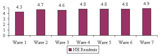
As part of the baseline interview, the trained nurses assessed the functional status of the claimants by asking questions regarding Katzs ADL scale and Lawtons IADL scale. ADLs include bathing, dressing, toileting, transferring, eating and continence. IADLs include doing housework, doing laundry, meal preparation, shopping for groceries, managing money, using the telephone, transportation and medication management. For the follow-up interviews, participants were asked whether someone is currently helping them with a particular activity. Help was defined as someone needing to be near when the activity is being performed (stand-by assistance) or someone physically helping with the activity (hands-on assistance). Figure 5 below shows the average number of ADL limitations by Wave for individuals in each service setting.6
| FIGURE 5: Average Number of ADL Limitations by Wave and Service Setting |
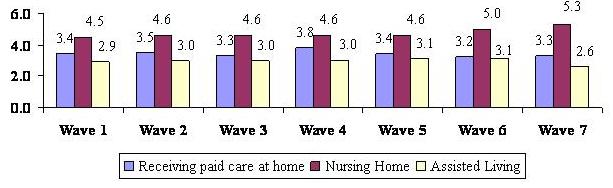 |
Disability level remains fairly constant across the Waves and service settings, with those residing in nursing homes being the most disabled (4.5 to 5.3 limitations out of six) and those in assisted living reporting help with the least amount of ADLs on average -- between 2.6 and 3.1 over the follow-up period. These findings mirror those reported in the baseline interviews. This data does not track individual transitions, but aggregate point-in-time statistics regarding disability status of individuals by service setting.
We were also interested in following the disability level of respondents on a longitudinal basis. Are people who are classified in a certain ADL category at baseline getting better, worse, staying the same or dying? We expected that the highest mortality would be those that were the most disabled at baseline. We also anticipated that those who had fewer ADL limitations at baseline, would become more disabled over time, but less so than those with higher levels of disability. We calculated the average number of ADL limitations and cumulative mortality rate for those who fell into different ADL categories at baseline. At the time of the baseline interview, about one-quarter of the sample had less than two ADL limitations (26%), about one in six had exactly two ADL limitations (16%), 29% of the sample had 3-4 limitations and another 29% had 5-6 ADL limitations. Overall, 41% of the baseline sample was cognitively impaired. Table 2 shows the average ADL transition results by Wave.
| TABLE 2: Average ADL Limitations by Wave and Baseline ADL Category and Cumulative Mortality Rate | |||||||||
| Baseline ADL Category | Baseline | Wave 1 | Wave 2 | Wave 3 | Wave 4 | Wave 5 | Wave 6 | Wave 7 | Deceased |
| 2 ADL Limitations | 0.51 | 1.43 | 1.86 | 2.17 | 2.34 | 2.26 | 2.47 | 2.47 | 17% |
| 2 ADL Limitations | 2.00 | 2.18 | 3.09 | 2.89 | 2.82 | 2.81 | 3.64 | 3.56 | 19% |
| 3-4 ADL Limitations | 3.64 | 2.83 | 3.47 | 3.51 | 3.85 | 3.81 | 3.73 | 3.43 | 26% |
| 5-6 ADL Limitations | 5.31 | 4.64 | 4.63 | 4.49 | 4.81 | 4.53 | 4.36 | 4.33 | 40% |
| Cognitively Impaired | 3.43 | 3.47 | 3.55 | 3.67 | 3.76 | 3.70 | 4.11 | 3.98 | 35% |
| NOTE: The percentages that appear in the deceased column above are cumulative, that is they represent the total proportion of people in each category that were deceased by Wave 7. While the ADL categories are mutually exclusive among themselves, those who were determined to be cognitively impaired at baseline could fall in to any of the baseline ADL categories | |||||||||
In terms of mortality patterns, the results show that the least disabled individuals at baseline are also the least likely to die by Wave 7 -- only 17% of those who had less than two ADL limitations at baseline had died by Wave 7. Alternatively, about two in five of those who reported between five and six ADL limitations at baseline were deceased by Wave 7. In terms of average ADL limitations, the overall pattern is also not surprising. For those who started out with less than two ADL limitations -- an average of 0.51 at baseline -- by the end of the 28 month period they had an average of 2.6 ADL limitations.
For the most part, people are deteriorating over time and this is evidenced by the fact that the average number of limitations increases over the time period. The exception to this general pattern is found for those who had between five and six ADL limitations at baseline. While this group remains the most disabled, the average number of ADL limitations shows a gradual decline over the course of the follow-up period. This is most likely due to the fact that the sickest or most disabled in this group are dying and the healthiest (in a relative sense) of this group are remaining in the sample through Wave 7. What is not shown is that the mortality rate for all groups is highest at Wave 1, meaning that most deaths occur four months after the baseline interview and is highest for those in the 5-6 limitation category (20% deceased at Wave 1) and the 3-4 limitation category (9% deceased at Wave 1). It seems that there are factors aside from intrinsic disability levels that are related to relatively high mortality rates at the outset of new service use, primarily in nursing home settings. This could account for the decline in the average limitations at Wave 1 for these two groups.
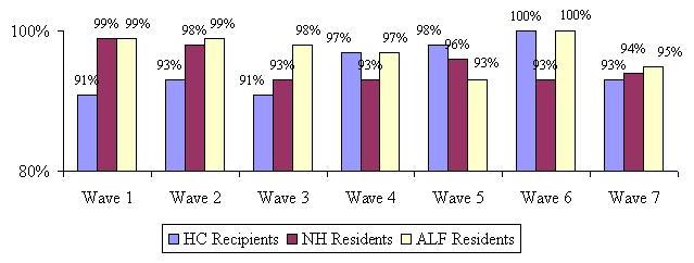
An important issue is the extent to which individuals remain eligible for benefit payments throughout their care transitions. The eligibility criteria used in the analysis that follows is the definition provided under the Health Insurance Portability and Accountability Act (HIPAA) of 1996. Namely, to be eligible for tax qualified benefits, an individual must be disabled in at least two ADLs or be cognitively impaired requiring substantial supervision. It is worth noting that some of the policies included in the sample may not use the HIPAA triggers (they may have medical necessity or doctor certification as their benefit eligibility requirement). Figure 6 below shows that for the sample as a whole, somewhere between 87% and 92% of individuals meet the HIPAA eligibility requirements; the implication is that at any one time over the 28 month period, between 8% and 13% of the sample would not qualify for benefits under the HIPAA definition.7
| FIGURE 6: Percentage of Individuals by HIPAA Triggers by Wave |
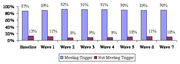 |
At baseline the proportion of individuals who do not meet triggers is greatest, at 13%. This suggests that people may be filing claims in anticipation of further declines in physical or cognitive function, and therefore, are beginning the claims process somewhat early. It may also suggest that it is difficult for consumers to know the exact point at which they would be considered benefit eligible under their policy. The vast majority -- 87% -- do seem to get it right.
| FIGURE 7: Percentage of Home Care and Assisted Living Residents Meeting HIPAA Triggers by Wave |
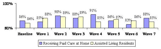 |
Figure 7 shows the distribution of assisted living residents and home care users who meet HIPAA triggers. For the most part, the vast majority of nursing home residents -- 97% to 100% -- meet HIPAA eligibility triggers throughout all of the Waves. There is much greater volatility in the HIPAA eligibility status of home care users as well as those in assisted living facilities. For some Waves, 17% of home care recipients and 16% of assisted living residents do not meet HIPAA eligibility standards. Clearly, the functional status of individuals in these settings does change over the study period, thus indicating that claimants functional status can improve as well as deteriorate.
Figure 8 summarizes the IADL profile of home care and assisted living facility residents throughout the follow-up period showing the average number of IADLs for which they receive help. Nursing home residents were asked a simplified set of questions relating to IADLs and their profile is represented in Figure 9. All home care and assisted living residents were asked whether someone helped with each of the eight IADLs (listed previously) separately, while those in the nursing home were asked if someone helped them with the following five activities: (1) caring for personal possessions such as clothing, toiletries, etc.; (2) securing personal items such as newspapers; (3) using the telephone; (4) managing money; and (5) managing and taking medications.8 We assumed that IADLs related to housework, laundry, meal preparation and shopping for groceries were all services that were provided to nursing home residents (whether they are able to do them or not). Therefore asking about them would not give a true sense of whether those in nursing homes get help with the types of activities that need to be done on a daily basis and are comparable to IADLs.
| FIGURE 8: Average Number of IADL Limitations by Wave and Service Setting |
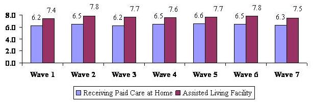 |
As shown, across all Waves, home care recipients have fewer IADL limitations than do assisted living residents. Over time and across all service settings, individuals receive help with a growing number of IADLs. Although assisted living residents have fewer ADL limitations on average than home care recipients, they receive assistance with more IADLs. This may also be related to the fact that some of these services are provided to them by virtue of their residing in an assisted living facility. Although not shown in the diagram, nursing home residents require help with more than four of the five IADLs, and they appear to require more help over time. This is borne out by the fact that 57% of NH residents required assistance with all five IADLs at Wave 1 (not shown) and by Wave 7, this figure had risen to over 90%.
| FIGURE 9: Average Number of IADL Limitations by Wave for Nursing Home Residents |
 |
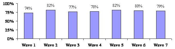
C. Satisfaction with Service Providers
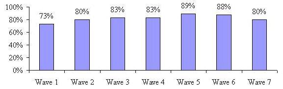
An important focus of our study was to assess the level of overall satisfaction with the current service provider -- agency or individually-hired caregiver for home care recipients, the specific assisted living facility or specific nursing home. We asked whether participants were very satisfied, somewhat satisfied, not very satisfied or not at all satisfied with their current service provider. Figure 10 and Figure 11 show the proportion reporting that they were very satisfied with their provider. When looking at satisfaction as a dichotomous variable, (satisfied versus not satisfied) satisfaction rates in all service settings across all Waves are relatively high (between 96%-99% for home care, 88%-97% for nursing home and 96%-98% for assisted living facility). When focusing on the proportion reporting they are very satisfied, one observes some fairly significant differences over time and across settings.
| FIGURE 10: Satisfaction with Specific Home Care Providers by Wave(percent very satisfied) |
 |
| FIGURE 11: Satisfaction with Specific Assisted Living and Nursing Home Facility by Wave(percent very satisfied) |
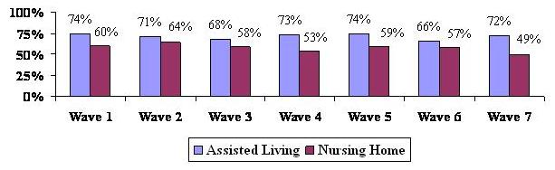 |
As shown, people are most satisfied with their home care provider and this does not vary much over the seven Waves. In contrast, fewer people in assisted living and nursing home settings are inclined to indicate that they are very satisfied with their care provider. Moreover, especially with respect to nursing home residents, the level of satisfaction declines precipitously over time. By Wave 7, fewer than half of residents indicate that they are very satisfied with the care provided by the nursing home. We know from the baseline interviews that many of those residing in nursing homes choose that care setting because of an acute incident or moved there from a hospital. Perhaps they expected their health to improve over time and viewed the nursing home as a temporary residence. Not shown is the fact that nursing home residents are also consistently more likely to say that they do not have enough privacy and that the staff do not spend enough time with them. This same pattern does not emerge in the assisted living sample. Here, there is greater stability of response, although across all Waves, these people are less likely to be very satisfied with their provider than are home care recipients.
We also asked participants whether the care they are receiving is meeting their needs. We assumed that the level of unmet need would be related to overall satisfaction -- the more unmet need, the lower the overall satisfaction. However, as shown in Figure 12, this is not necessarily the case. Almost all participants -- including those in nursing homes -- report that their care needs are being met. This finding suggests that there are other factors associated with lower reported satisfaction levels in these service settings. These can include such things as physical plant, control over time and schedule, privacy, and the like. In the first three survey Waves, individuals in home care settings are somewhat more likely to point out that the care that they are receiving is not meeting their current need. Still, for the overwhelming majority (>90%), the paid care that they receive does meet their needs.
| FIGURE 12: Current Care Needs Are being Met by Wave by Service Setting |
 |
D. Use of Care Management
We learned prior to beginning the fieldwork for this study that while all of the participating companies claim that they provide care management, each defines this service differently. Therefore, we provided participants with the most broad and inclusive definition of a care manager that was read to them at baseline and all subsequent telephone interviews. The definition is as follows:
Sometimes when people need to find paid care and make arrangements for care, they work with a person called a care manager or care coordinator. This person is generally a nurse or health professional and is either someone you can hire privately or someone your LTC insurance company provides to you. He or she may visit with you in your home or talk to you over the telephone. This person is different from a doctor or a hospital discharge planner.
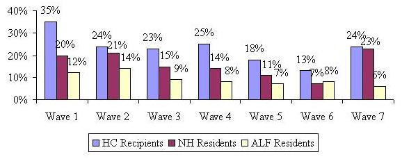
We found that only a small percentage of participants at baseline had used care management services -- 19%, 11% and 7% for home care, nursing home and assisted living facility respectively. This was perhaps due to the fact that the baseline interview occurred very close to the time that they were making their decision to use paid care. It is possible that at baseline, participants were focused on dealing with needing care and may not yet have thought about or contacted someone who could help them with their decisions. At each Wave, we asked participants if they had been in contact with a care manager in the past four months (since the last interview). Figure 13 below shows the proportion of participants who used care managers over the 28 months after the baseline interview.
Clearly, Figure 13 shows that across all service settings, there is a significant increase in the use of care management, particularly at Wave 1, which is when individuals are putting specific services in place. The proportion using care managers almost doubled for all service settings from the baseline interview to Wave 1, although the percentage is still relatively small for those who moved into an assisted living facility. One would expect the use of a care manager to be highest in the home, where people are more likely to need help finding (licensed) care providers, investigating all of the costs involved and coordinating different care providers -- perhaps from different agencies. For Wave 2, the use of a care manager dropped somewhat, but then seemed to level off or only decline slightly in subsequent Waves. It is not surprising that roughly 28 months after the decision was made to use paid care, the use of a care manager would decline, given that most often care managers were used to develop care plans, assure appropriate services were provided and to help find local providers if needed.
| FIGURE 13: Use of Care Manager by Wave by Service Setting |
 |
We also asked those who used a care manager if they found the care manager helpful. The vast majority of individuals (in excess of 95%) found the care manager to be helpful. For the group of participants at each Wave who reported they had been in contact with a care manager for the first time (they had not used a care manager in the past), we asked a series of questions about the duties performed by the care manager. Although not shown in graph form, the highest proportion of new users reported that the care manager made sure they were receiving the appropriate services -- roughly five out of every six participants using a care manager for the first time stated that the care manager was making sure they were receiving appropriate services; this finding was consistent across service settings and across Waves. The next highest proportion of new users reported that the care manager helped in the development of a plan of care -- roughly three out of every four participants using a care manager stated this.
Although the proportion of paid care recipients using a care manager increased after baseline, the overall number of people remains relatively small. We did ask a number of questions about the care manager and the types of services that they provided; however, due to the small sample sizes in the nursing home and assisted living facility settings, we will report results related to the care management questions only for the largest group -- home care recipients.9
We first wanted to know if the care manager was responsive to the insureds needs. Again, well over 95% found the care manager to be responsive to their needs. We also asked if participants felt that the care manager spent enough time with them and/or their family (if they were involved). Between 80% and 100% of home care recipients across all Waves felt that their care manager had spent enough time with them when they contacted them.
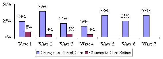
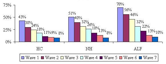
Finally, we asked specifically if the care manager recommended any changes to the home care recipients existing plan of care or if perhaps they recommended a change in the service setting. Not surprisingly, few individuals receiving care at home said that the care manager recommended they move to a facility. A higher proportion -- between 16% and 39% -- stated that the care manager recommended changes to a plan of care over the study period (see Figure 14).
| FIGURE 14: Proportion of Home Care Recipients who State Care Manager Recommended Changes to Plan of Care and Service Setting |
 |
E. Experience with Filing a Claim
A primary focus of the baseline interviews was to ask questions related to the decision-making process of policyholders as close to the time that they began using paid care as possible. The questions asked at baseline focused mainly on the demographic, functional, cognitive and service use profile, the decision-making process regarding specific providers, as well as satisfaction with their providers. At that time, we intentionally left out questions related to the insurance company claims process as we believed these questions would be more appropriate during the follow-up period and particularly relevant at the time of the first interview (Wave 1) directly following the baseline. At the time of the Wave 1 interview (four months after the baseline), we asked all participants who were receiving paid care whether they had filed a claim and if so, whether it was approved, denied or still pending. Results reported in this section will not be segmented by service setting, but simply reported for the entire sample.
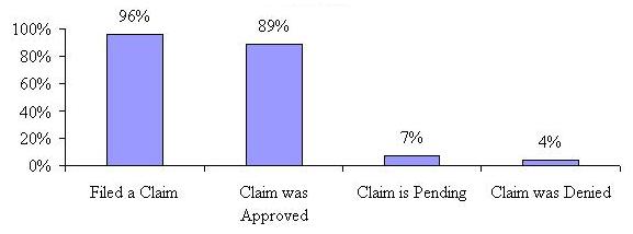
Figure 15 shows that 96% of paid care receivers reported filing a claim by the time of the first follow-up interview.10 The majority of those filing claims reported that they were approved and had become claimants -- 89%, while 7% reported that they were still waiting for a decision. Only 4% reported that their claims were denied. Thus, at Wave 1, for those for whom a decision had been made (not including those who said their claim was pending), 4.3% were denied benefits under their LTC insurance policy and 95.7% had been approved for claims payment.
| FIGURE 15: Proportion Receiving Paid Care at Wave 1 Who Filed a Claim and the Result |
 |
For those claimants receiving paid care at Wave 1, we also asked how easy or difficult it was to file their claim. About three-quarters said that it was either easy or neither easy nor difficult, and one-quarter found filing the claim difficult. When looked at by service setting, a higher percentage of nursing home residents found filing a claim difficult (31%), than those receiving care at home (22%) or in an assisted living facility (21%). The most common reasons given for why it was difficult to file a claim was that it took longer than expected to obtain benefits and that there were problems understanding and filling out the claim forms.
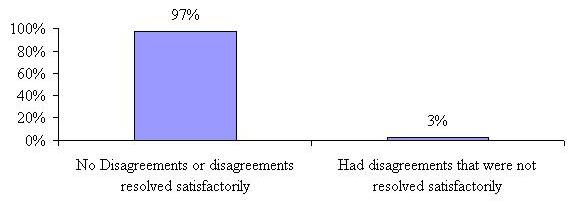
We also asked these approved claimants if they had any disagreements with their insurance company over coverage or eligibility for benefits and if so, were they resolved to their satisfaction. Figure 16 shows that an overwhelming majority -- 97% either reported no disagreements or that their disagreements were resolved satisfactorily.
| FIGURE 16: Proportion of Approved Claimants Reporting Disagreements with Their LTC Insurance Company at Wave 1 |
 |
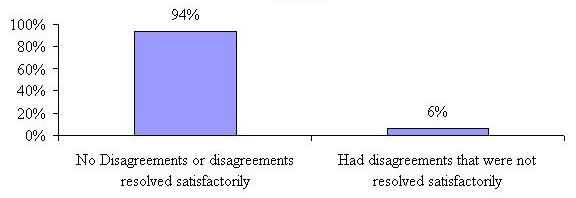
Of the 4% who said their claim was denied (27 people) at Wave 1, the majority stated the reason for the denial was that they were not disabled enough to meet policy definitions. In fact these denials had an average of only 0.74 limitations in ADLs at baseline and 1.8 ADL limitations by Wave 1 and close to three-quarters (71%) were residing in assisted living facilities at Wave 1. A small number (less than 15%) of those reporting denied claims said they were using services or providers not covered under their policy or that they had not yet met their policy elimination period. We also asked this small sample of individuals who had their claims denied if they had any disagreements with their insurance company that were not resolved to their satisfaction. Not surprisingly, 60% reported having disagreements with their insurer over coverage or eligibility that were not resolved to their satisfaction. Of all those who submitted claims at Wave 1 (including those reporting their claim was approved and those reporting that their claims had been denied), 94% reported having no disagreements with their insurance company or that their disagreements were resolved satisfactorily.
| FIGURE 17: Proportion of Both Approved and Denied Claimants Reporting Disagreements with Their LTC Insurance Company at Wave 1 |
 |
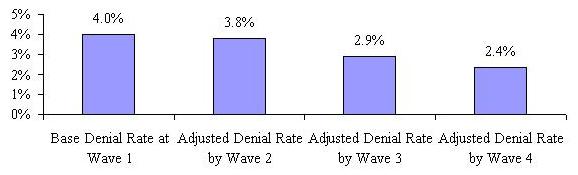
Because we are following a cohort (the same group of people over time), we are able to uncover what happens to different sub-sets of participants over the 28 month period. We were interested to know if the original group of 27 people (4%) who stated that their claims had been denied at Wave 1 reported that they had been approved at a subsequent Wave. This allows us to calculate an adjusted denial rate over the course of paid care use. This adjusted denial rate is based only on those who reported that their claims were denied at Wave 1 and for whom we have information at each of the subsequent Waves -- we do not include or impute denials for those who were dropped from the sample (refused, deceased, unable to locate, etc.)11
We found that of the people who stated their claims were denied at Wave 1, four stated that the insurance company was paying for their care or that they had filed a claim that was approved four months later at Wave 2. At Wave 3, eight months after their initial response of a denied claim, an additional three participants stated that their insurance company was paying for care or that they had filed a claim that was approved. At Wave 4 (i.e., 12 months after their initial response at Wave 1), an additional four participants reported that their insurance company is paying for benefits or that they had filed a claim that was approved. Not surprisingly, there were no additional claims filed or adjudicated (either approved or denied) after Wave 4 for those who reported an initial denial decision at Wave 1. Those few participants who initially reported their claim was denied at Wave 1 and who were not approved by Wave 4 (and remained in the sample) were no longer receiving paid care -- supporting the most common reason given at Wave 1 for denial that the participant was not disabled enough to meet their policy triggers.
We also looked at responses for those who stated they were still waiting for a response to their claim submission at Wave 1. Responses to subsequent claim related questions over the following Waves for this group show that the vast majority of these convert to approved claims (76% of those remaining in the sample at Waves 2 and 3) and that only three respondents whose claim submission was pending at Wave 1 are subsequently denied (these were denied at Wave 2).
Based on the responses of those who reported their claims were denied or pending at Wave 1, we calculated an adjusted denial rate for each of the subsequent Waves at which changes in claim status occurred. Figure 18 tracks the adjusted denial rate over the Waves -- showing that the rate goes down to 2.4% after a one year period. Because there were no claims filed or decisions made after Wave 4, the adjusted denial rate cannot be calculated beyond Wave 4.
| FIGURE 18: Base and Adjusted Denial Rates for the Cohort of Those Reporting Denied and Pending Claims at Wave 1 Over Time |
 |
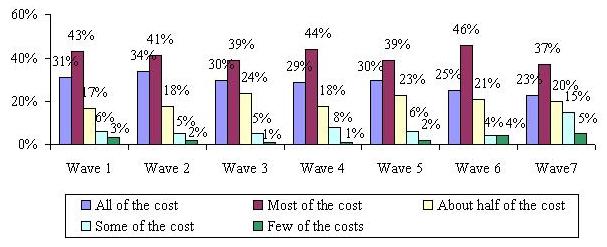
For those who were receiving paid care that was reimbursed by their LTC insurance company (in other words -- claimants), we were interested in knowing how much of that care was covered by their insurance and did it change over time? The question was asked simply, do your long-term care insurance benefits pay for all, most, half, some or few of the costs of your paid care? Figure 19 shows the results. The vast majority report that their policies are paying for about half or more of the paid care they are receiving. In fact, between 60% and 75% reported that their policies were paying for most of their care at any given time.
| FIGURE 19: Costs Covered by LTC Insurance by Wave |
 |
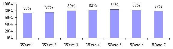
F. Effect of Having LTC Insurance
We were interested in knowing what perceived effect having a LTC policy had on claimants service use and claim experience. Also examined were peoples thoughts about what they would do in the absence of their insurance policy. As shown in Figure 20, in Wave 1, roughly three-quarters of claimants agreed that having their insurance made it easier to obtain needed services. That number increased to 89% by the fifth follow-up interview and then drops back down to 80% by the 28th month.
| FIGURE 20: Having LTC Insurance Made Obtaining Services Easier by Wave |
 |
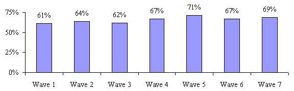
We also asked if having the policy allowed claimants greater flexibility to choose where they could receive care (e.g., at home instead of in a nursing home). It is important to note that all participants have policies that pay benefits for all service settings (home care, nursing home and assisted living facility), thereby mitigating the effect of insurance policy design on their choice of service setting. Again, the majority of claimants agreed that their policy did allow them greater flexibility and this perception tended to increase over the 28 month follow-up period (See Figure 21).
| FIGURE 21: Having LTC Insurance Provided Claimant Greater Flexibility with Choice of Service Setting by Wave |
 |
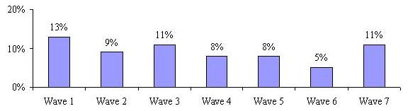
Some LTC insurance policies have contract language that compels service providers chosen by the insured to meet certain requirements -- for example some policies require that paid caregivers in the home be licensed. We asked claimants if their policies limited their choice of care providers in any way. Figure 22 shows that the majority does not believe that their policy definitions restricted their choice of provider, with typically only 8%-11% reporting that it did. The highest percentage (13%) reported this for Wave 1, suggesting that for some people, specific knowledge of the coverage only occurs after they begin accessing services. Most of the individuals who indicated that they felt that the policy restricted their use of specific providers were in the home care setting (62% at Wave 1 and roughly 48% at all other Waves).
| FIGURE 22: Having LTC Insurance Has Limited Provider Choice by Wave |
 |
Lastly, we were interested in knowing how claimants perceived the impact of not having their LTC insurance policy on the use of paid care. We asked if claimants believed that they would receive less paid care if they did not have their insurance policy. In fact, the majority of claimants agreed that they would have to decrease the amount of paid care they receive if they did not have their insurance. This is not surprising given that most of the claimants report that the policy pays for most, if not all, of the paid care they receive.
| FIGURE 23: Without LTC Insurance Claimant Would Receive Less Paid Care by Wave |
 |
G. Movement and Transitions
One of the key questions that this research was designed to answer is the extent to which individuals transition through the service system as their disability status changes over time. The tables below show transitions through care settings for the baseline samples. A transition is defined as a change in service setting (moving from a nursing home to an assisted living facility for instance) or a change from a status of no paid service use to paid service use or vice versa. We were interested in knowing whether and how people moved between care settings over the 28 month period. We also track those who filed a claim at baseline, but were not yet using paid services.
Findings are discussed separately for each baseline group. It is important to note that for all of the following tables, the percentages reported for those who died, refused to participate, or were not locatable, are cumulative; that is, they are the rates for the 28 month period, not the proportion that applies to the current Wave.
At the baseline interview, 37% of the sample reported using home care (not shown). Table 3a shows that at Wave 1 (four months after the initial interview) the majority was either still receiving home care or had stopped using paid care (43% and 26% respectively). Only a small proportion entered nursing homes or assisted living facilities. This pattern continues to hold true over the 28 month period. Noteworthy is the fact that by Wave 7, fewer than 10% of those receiving home care at baseline, were still receiving care. The highest percentage of individuals transition from home care to no paid care over the study period.
| TABLE 3a: Movement and Transitions for the Baseline Home Care Recipients | |||||||
| Care Setting | Wave 1 | Wave 2 | Wave 3 | Wave 4 | Wave 5 | Wave 6 | Wave 7 |
| Home Care | 43% | 30% | 24% | 18% | 11% | 9% | 8% |
| Nursing Home | 3% | 3% | 3% | 2% | 2% | 1% | 1% |
| Assisted Living Facility | 2% | 3% | 3% | 4% | 3% | 3% | 2% |
| No Paid Care | 26% | 23% | 20% | 19% | 18% | 15% | 11% |
| - - - - - - - - - - | - - - - - - - - - - | - - - - - - - - - - | - - - - - - - - - - | - - - - - - - - - - | - - - - - - - - - - | - - - - - - - - - - | - - - - - - - - - - |
| Deceased | 11% | 15% | 18% | 20% | 22% | 23% | 24% |
| Refusal | 10% | 18% | 22% | 24% | 29% | 31% | 34% |
| Unable to locate | 5% | 8% | 10% | 13% | 15% | 18% | 20% |
| 100% | 100% | 100% | 100% | 100% | 100% | 100% | |
| NOTE: Percentages above the dotted line apply only to that Wave. Those below the dotted line are cumulative. | |||||||
Also shown is that 24% of the original home care sample is deceased 28 months after their initial baseline interview. We also know from the baseline report that those using paid care at home at baseline were among the least disabled in terms of their ADL and IADL profile. Therefore, it is not surprising that a high percentage of them move from paid care to no paid care.
At the baseline interview, 14% of the sample reported moving into a nursing home. Of that original sample, only 51% remained in the nursing home at Wave 1; about one-in-five died within the first four months of nursing home use. Very few nursing home residents transitioned to the home care setting or assisted living, although slightly more seemed to have gone to assisted living than home care. By Wave 7, 39% of the original sample was deceased, much higher than the 24% of the original home care sample. Few nursing home residents transition back to a status of receiving no paid care. In fact, of those who moved in to a nursing home at baseline, only 14% of them ever move back home permanently.
| TABLE 3b: Movement and Transitions for the Baseline Nursing Home Residents | |||||||
| Care Setting | Wave 1 | Wave 2 | Wave 3 | Wave 4 | Wave 5 | Wave 6 | Wave 7 |
| Home Care | 5% | 3% | 3% | 3% | 2% | 2% | 2% |
| Nursing Home | 51% | 40% | 32% | 26% | 18% | 13% | 8% |
| Assisted Living Facility | 5% | 7% | 8% | 6% | 6% | 5% | 4% |
| No Paid Care | 9% | 11% | 8% | 7% | 6% | 5% | 6% |
| - - - - - - - - - - | - - - - - - - - - - | - - - - - - - - - - | - - - - - - - - - - | - - - - - - - - - - | - - - - - - - - - - | - - - - - - - - - - | - - - - - - - - - - |
| Deceased | 21% | 24% | 29% | 32% | 35% | 37% | 39% |
| Refusal | 7% | 11% | 13% | 17% | 20% | 24% | 27% |
| Unable to locate | 2% | 4% | 7% | 9% | 13% | 14% | 14% |
| 100% | 100% | 100% | 100% | 100% | 100% | 100% | |
| NOTE: Percentages above the dotted line apply only to that Wave. Those below the dotted line are cumulative. | |||||||
Table 3a and Table 3b show that a greater proportion of baseline nursing home recipients transition to a lower level of care (going from nursing home to assisted living facility, home care or no paid care -- 19%) than proportion of baseline homecare recipients transition to a higher level of care (going from home care to nursing home -- 3%). Given the differences in sample size, it is not clear whether these differences are statistically significant. It is also not clear whether an assisted living facility represents a lower or higher level of care than home care.
At baseline, 23% of the sample reported living in an assisted living facility. Although this sample had the highest average age, they have a much lower rate of death than those living at home or in nursing homes, reflecting their superior functional status. At Wave 1, only 7% of the sample was deceased and this proportion grew to 27% by Wave 7. This group also seems to have the lowest transition rates during the first year of interviews among the three groups discussed so far; almost one-half still residing in assisted living facilities 12 months after the initial interview. By the 28 month, however, only 10% of the original cohort remains in an assisted living facility. They also report the lowest rate of transition to no paid care, which is not surprising since a move to an assisted living facility is typically a permanent lifestyle change and in fact only 11% of the baseline assisted living facility sample report moving back home permanently.
| TABLE 3c: Movement and Transitions for the Baseline Assisted Living Facility Residents | |||||||
| Care Setting | Wave 1 | Wave 2 | Wave 3 | Wave 4 | Wave 5 | Wave 6 | Wave 7 |
| Home Care | 1% | 1% | 2% | 1% | 0% | 1% | 1% |
| Nursing Home | 5% | 7% | 9% | 8% | 8% | 5% | 3% |
| Assisted Living Facility | 70% | 56% | 46% | 32% | 22% | 13% | 10% |
| No Paid Care | 8% | 6% | 5% | 5% | 5% | 4% | 2% |
| - - - - - - - - - - | - - - - - - - - - - | - - - - - - - - - - | - - - - - - - - - - | - - - - - - - - - - | - - - - - - - - - - | - - - - - - - - - - | - - - - - - - - - - |
| Deceased | 7% | 12% | 13% | 18% | 20% | 25% | 27% |
| Refusal | 5% | 10% | 16% | 21% | 26% | 30% | 34% |
| Unable to locate | 4% | 8% | 9% | 15% | 19% | 22% | 23% |
| 100% | 100% | 100% | 100% | 100% | 100% | 100% | |
| NOTE: Percentages above the dotted line apply only to that Wave. Those below the dotted line are cumulative. | |||||||
Slightly more than one-quarter (26%) of the original sample report that they had not begun using paid care at baseline. Since we were only interested in following those people who used paid care at some point in the study period, we asked a question at each Wave pertaining to their current or intended paid care use. In order to be included in the study sample, a participant had to either be using paid care or intend to begin paid care in the next four months. Those who were not receiving paid care at the baseline interview were asked again at Wave 1 if they were receiving paid care. If they said no, they were then asked if they intended to begin using paid care in the next four months. If they answered no again, they were considered ineligible and removed from the sample. If they answered in the affirmative, they were kept in the sample for an interview at Wave 2. The same set of questions was repeated at Wave 2 for this group; however, if they were not yet receiving paid care at Wave 2, regardless of whether they intended to begin in the next four months, they were dropped from the study.
Table 3d shows that 30% of insureds who notified their company of an intention to file a claim and begin using paid care never actually began using paid services. This can be discerned from the fact that the cumulative total for the Ineligible columns is 30%. The percentages for the ineligible category are cumulative -- the same as the proportions in the deceased, refused and unable to locate categories. In other words, at Wave 1, 15% were ineligible and at Wave 2 another 15% became ineligible -- for a total of 30% of the original baseline sample of those not receiving paid care dropped after Wave 2. These 30% were removed from the sample and no longer interviewed after Wave 2.
| TABLE 3d: Movement and Transitions for Those Report No Paid Care at Baseline | |||||||
| Care Setting | Wave 1 | Wave 2 | Wave 3 | Wave 4 | Wave 5 | Wave 6 | Wave 7 |
| Home Care | 28% | 21% | 18% | 13% | 10% | 8% | 5% |
| Nursing Home | 1% | 2% | 1% | 1% | 2% | 2% | 2% |
| Assisted Living Facility | 6% | 7% | 7% | 5% | 4% | 2% | 1% |
| No Paid Care | 22% | 3% | 2% | 2% | 1% | 0% | 0% |
| - - - - - - - - - - | - - - - - - - - - - | - - - - - - - - - - | - - - - - - - - - - | - - - - - - - - - - | - - - - - - - - - - | - - - - - - - - - - | - - - - - - - - - - |
| Deceased | 10% | 14% | 17% | 19% | 20% | 22% | 24% |
| Refusal | 14% | 16% | 17% | 20% | 21% | 23% | 24% |
| Unable to locate | 4% | 7% | 8% | 10% | 12% | 13% | 14% |
| Ineligible | 15% | 30% | 30% | 30% | 30% | 30% | 30% |
| 100% | 100% | 100% | 100% | 100% | 100% | 100% | |
| NOTE: Percentages above the dotted line apply only to that Wave. Those below the dotted line are cumulative. | |||||||
Not surprisingly, the highest proportion of those who did go on to use paid care ended up using paid care at home. This is followed by transitions to assisted living facilities and the smallest percentage transition to nursing home care. By Wave 7, 24% of the original sample is deceased, which is comparable to the rates for the assisted living and home care recipients. This was somewhat surprising given that this group seemed to be the youngest and healthiest. This could imply that mortality rates seem to even out somewhat over the 28 month period, although those starting out in nursing homes die at a much higher rate than all of the other groups.
Figure 24 represents in graph form the percent of participants remaining in their baseline service setting at each Wave. This graph clearly highlights the fact that the vast majority of individuals who start out in one service modality at baseline, are not in that setting 28 months later. The assisted living residents are the most likely to remain in their facility, at least through the first year of residence.
| FIGURE 24: Percent Remaining in Baseline Service Setting at Each Wave |
 |
We were also interested in overall transition rates for the entire sample, both from Wave to Wave and for those that remained in the study from baseline to Wave 7. Figure 25 below shows the transition rate between Waves. We looked at all of those whose location changed from the previous Wave. This could have been a transition from one care setting to another, from paid care to no paid care or from no paid care to paid care.
| FIGURE 25: Transitions Between Waves |
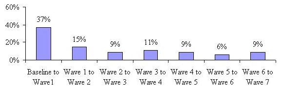 |
The proportion of the sample that changed location or status between baseline and Wave 1 is greater than one in three. This means that 37% of participants either changed their care setting or went from paid to unpaid or unpaid to paid care four months after the baseline interview. This rate declines dramatically over time and levels off somewhat. This implies that after four months, there is much more settling-in to a care setting or service use status.
| FIGURE 26: Rate of Transitions for Those Observed at Baseline and All Seven Waves |
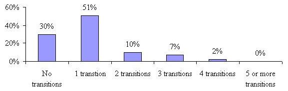 |
Figure 26 characterizes the number of transitions over a 28 month period for participants who were observed at all eight points in time (at baseline and then for all seven telephone Waves). The minimum number of transitions is zero, meaning that a participant did not move at all over the period, and the maximum number is seven. As shown, 30% of those who we observed at all points in time over the 28 month period reported no transitions and another 51% reported changing care settings or going from paid care to no paid care or vice versa only once. A small proportion (10%) transitioned twice, while 9% transitioned three or more times. No one changed settings the maximum number of times over the 28 month period. Not shown is that the average number of transitions for people observed throughout the 28 month period was exactly 1.0 -- a relatively low rate indicating stability of service setting use among those who remain in the sample over the study period.
There are many characteristics that one could hypothesize are associated with a higher likelihood of transitions to use/non-use of paid care and/or across service settings. We looked at age, marital status, gender, baseline disability level, cognitive impairment; baseline service setting, baseline satisfaction level with specific service provider, whether or not unmet need was reported at baseline, whether baseline service setting was the first choice and what factor had the most influence on baseline care setting choice. Table 4 shows the results of only those characteristics that had statistically significant differences at the 0.05 level.
| TABLE 4: Characteristics Associated with Transitioning | ||
| Characteristic | Had at Least One Transition | Had No Transition |
| Average Age | 78 years | 80 years |
| Average ADL limitations | 2.8 | 3.2 |
| Average IADL limitations | 6.2 | 6.7 |
| Cognitively Impaired | ||
| Yes | 36% | 52% |
| No | 64% | 48% |
| Receiving Paid Care at Home | 59% | 41% |
| Receiving Care in NH | 36% | 64% |
| Receiving Paid Care in an ALF | 36% | 64% |
| Satisfaction with Specific Service Provider (at Baseline) | ||
| Very Satisfied | 49% | 59% |
| Other than Very Satisfied | 51% | 31% |
We found that being younger and having somewhat lower levels of functional disability are characteristics associated with a transition -- that is those who had at least one transition were significantly younger (78 years old with 2.8 ADL limitations and 6.2 IADL limitations) than those who did not transition over the 28 month period (80 years old with 3.2 ADL limitations and 6.7 IADL limitations). On the other hand, being cognitively impaired is negatively associated with a transition, that is, such individuals are more likely to stay in one place (have no transitions) for the entire study period. Those receiving paid care at home at baseline were more likely to experience a transition, which seems surprising. However, this is likely due to the high proportion of home care recipients who stopped using paid care (also counted as a transition), especially since previous tables show a low rate of transition to nursing home and assisted living facility among this sample. Beginning paid care use in a nursing home or assisted living facility also means that you are more likely to remain there (only 36% of those in nursing homes at baseline experienced at least one transition) than transition to another care setting or stop using paid care. Nursing home and assisted living facility residents were also significantly less likely than baseline home care residents to have experienced a transition over time. Lastly, we found that those who stated they were less than very satisfied with their choice of provider were more likely than not to experience a transition (51% versus 31% respectively). Marital status, gender, unmet need and whether or not the baseline care setting was the fist choice had no influence on the likelihood of experiencing a transition.
H. Multivariate Analyses
In order to answer a number of our key research questions, we employed multivariate analytic techniques to the panel data. The focus of our analyses is on understanding the independent effect of certain socio-demographic, medical, functional and cognitive characteristics on mortality rates, transition rates, and total expenditures on care over the study period. We begin our discussion with a focus on mortality rates.
H.1. Mortality Rates
We found that 39% of the sample had died by the end of the 28 month study period. Because we are interested in understanding the factors associated with mortality, we employ a logistic regression model which has a dichotomous dependent variable that can have a value 1 with a probability of death ( ), or the value 0 with probability of continued survival (1-). The independent or predictor variables in logistic regression can take any form. The relationship between the independent (predictor) variables and the dependent variable is not a linear function but a logistic function of () which is given as:
Where  = the constant of the equation and, ß = the coefficient of the predictor variables.
Our baseline data provides rich information for us to investigate the factors related to the individuals death over the study period. We focus on varying levels of disability, medical conditions, and specific socio-demographic characteristics. Table 5 summarizes the results. Presented in the table is the Odds Ratio for each variable tested. The Odds Ratio is a measure of the relative impact of a variable on the probability of the event (in this case, death) occurring. Thus, for example, holding all other variables constant, an individual with three or more ADL limitations is 1.83 times more likely to die over the study period than is an individual with fewer than three ADL limitations. Aside from the relatively high number of significant independent variables, the models itself fits the data well as evidenced by a relatively high Hosmer-Lemeshow test statistic of 0.137.12
Most of the variables tested in the equation were shown to have an effect on mortality. Not surprisingly, individuals with more ADL limitations (3+) have a higher probability of dying during the study period. Also, compared to individuals accessing the service system who are younger than age 75, older individuals were much more likely to die. An 85 year old is 2.1 times more likely to die during the study period than is someone younger than age 75. At the baseline interviews, clinical assessors were asked to render a judgment about the likelihood of recovery for individuals. Individuals would be classified as likely to improve, likely to stay the same, or likely to worsen. The independent effect of these clinical predictions proved to be very important in understanding mortality patterns. Compared with people expected to improve, those individuals whose condition was assessed as worsening, were about three times more likely to die during the study period. The same was true of those individuals who were assessed to have relatively stable conditions (compared to those who were expected to improve).
| TABLE 5: Logistic Regression Results for Predicting Mortality | ||||
| Odds Ratio | S.E. | Wald | Sig. | |
| Having 3+ ADL Limitations | 1.830 | 0.143 | 17.923 | 0.000 |
| Being Age 75 to 84 | 1.485 | 0.175 | 5.128 | 0.024 |
| Being Age 85+ | 2.128 | 0.203 | 13.788 | 0.000 |
| No Improvements Anticipated | 2.831 | 0.231 | 20.252 | 0.000 |
| Anticipated Worsening Condition | 2.855 | 0.215 | 23.842 | 0.000 |
| Have Arthritis | 0.609 | 0.174 | 8.154 | 0.004 |
| Have Hypertension | 0.741 | 0.137 | 4.781 | 0.029 |
| Have a Cardiac Condition | 1.414 | 0.139 | 6.231 | 0.013 |
| Have a Respiratory Condition | 2.225 | 0.207 | 14.893 | 0.000 |
| Have Cancer | 3.640 | 0.181 | 51.193 | 0.000 |
| Is Cognitively Impaired | 1.067 | 0.155 | 0.176 | 0.675 |
| Female | 1.464 | 0.148 | 6.606 | 0.010 |
| Married (yes) | 1.353 | 0.149 | 4.096 | 0.043 |
| Uses Home Care at Baseline | 1.497 | 0.195 | 4.268 | 0.039 |
| Is a Nursing Home Resident at Baseline | 1.822 | 0.242 | 6.120 | 0.013 |
| Is an Assisted Living Resident at Baseline | 1.329 | 0.197 | 2.099 | 0.147 |
| Constant | 0.045 | 0.286 | 118.175 | 0.000 |
The particular medical condition had by individuals also affected whether or not they died during the study period. For example, people with arthritis or hypertension are only 0.6 and 0.74 times as likely to die as individuals without these conditions. On the other hand, those with cardiac or respiratory problems had a higher chance of death during the period. Individuals with cancer are almost four times more likely to die than are those without this condition. Having a cognitive impairment is not in and of itself associated with higher mortality. This is because many of these individuals have co-morbidities that have a more significant and direct correlation with mortality. Finally, being female and being married are associated with somewhat higher mortality, holding all other variables constant.
The care setting is also an important predictor for mortality. In this equation, we are controlling for medical condition, physical and cognitive disability status, age, gender, marital status, and prognosis. Thus, the care setting variable to some extent captures the impact of living condition and service on mortality rates. In the table, the variable left out of the equation is Not Yet Receiving Paid Care. Therefore, we are focusing on the impact of being a home care recipient, an assisted living resident or a nursing home resident on the probably of death, when compared to someone who is not yet receiving paid care. The findings are striking in that they follow a pattern similar to the disability profile of individuals. That is, mortality is highest for individuals in nursing facilities and lowest for assisted living residents. Home care users are about 1.5 times more likely to die during the study period than are people who have not yet begun using services (but intend to within a four month time frame).
H.2. Care Setting Transition Rates
Another research question of interest is the relationship between individuals characteristics and the probability of making a transition between care settings during the study period. In the panel dataset, we observed the same set of individuals at various points in time. In fact, 1,118 individuals were observed at baseline and again at the Wave 1 interview and then sub-sets were observed at the additional six follow-up telephone interviews. In this analysis we focus on whether any transition was made over the 28 month period. Again, the dependent variable is binary, capturing whether or not individuals made a transition between any two successive time periods. It is important to note that for the purposes of the following analysis, a transition is defined as movement from one paid care setting to another. Those who transitioned from paid care to no paid care were excluded from this analysis. We employ an Unobserved Effects Logit Model to complete the analysis on this panel data. The model specification assures that independent variables are not influenced by the change in the dependent variable in earlier periods. Moreover, a key assumption of the model is that any observed transition for a particular Wave is a function of the status of the independent variables during that Wave alone, and is not influenced by prior or subsequent changes in the independent variable.
| TABLE 6: Unobserved Effects Logit Model on Care Setting Transitions among Paid Care Recipients | ||||||
| Transition Status | Odds Ratio | Std. Err | z | P>z | [95% Conf. Interval] | |
| Nursing Home Resident | 0.24 | 0.059 | -5.830 | 0.000 | 0.147 | 0.385 |
| Assisted Living Resident | 0.22 | 0.040 | -8.240 | 0.000 | 0.150 | 0.310 |
| Having 2-3 ADL Limitations | 0.62 | 0.108 | -2.740 | 0.006 | 0.440 | 0.872 |
| Having 4 or More ADL Limitations | 0.53 | 0.094 | -3.580 | 0.000 | 0.378 | 0.752 |
| Age 80-84 | 0.70 | 0.126 | -2.000 | 0.046 | 0.490 | 0.993 |
| Age 85 and Over | 0.51 | 0.097 | -3.510 | 0.000 | 0.354 | 0.745 |
| Being Cognitively Impaired | 0.50 | 0.082 | -4.230 | 0.000 | 0.359 | 0.687 |
| Being Female | 1.00 | 0.175 | -0.020 | 0.985 | 0.706 | 1.407 |
| Being Married | 0.88 | 0.156 | -0.730 | 0.464 | 0.620 | 1.243 |
| Accessing Care Management | 0.84 | 0.143 | -1.050 | 0.293 | 0.597 | 1.168 |
| Receiving Unpaid Care | 1.31 | 0.183 | 1.900 | 0.057 | 0.992 | 1.719 |
| Having Your Needs Met | 0.62 | 0.151 | -1.950 | 0.051 | 0.386 | 1.002 |
| Being Very Satisfied with Your Care Provider | 0.75 | 0.110 | -1.940 | 0.052 | 0.563 | 1.002 |
| Rho | 0.36 | 0.049 | 0.265 | 0.457 | ||
| Likelihood-ratio test of rho=0: chibar2(01) = 59.92 Prob >= chibar2 = 0.000 | ||||||
The findings suggest that being female, married or accessing care management services have no impact on whether or not a transition is made during the 28 month study period. On the other hand, ones level of functional disability is negatively related to the probability of having a transition. Individuals with 2-3 ADL limitations and those with four or more limitations are only 0.53 and 0.62 times as likely to have a transition when compared to those with lower disability levels. Moreover, all other variables held constant, the odds of transition for nursing home and assisted living facility residents are 24% and 22% of the odds of transition for home care recipients. This is expected, given that once an individual becomes a resident of a facility, the chance of their moving to a different service setting are relatively small compared to people living in the community. Age is also negatively associated with making a transition: the older one is, the less likely it is that one will move between care settings. For example, claimants between 80 and 85 or those age 85 and above are only 0.7 and 0.51 times as likely to transition as are those under age 80. Finally, people who are cognitively impaired are 50% less likely to transition when compared to their non-impaired counterparts.
The variable that has a large positive impact on transition status is the presence of unpaid care. Individuals who are receiving unpaid care are 1.31 times more likely to transition to an alternative care setting than are those without such care. This may reflect the role of the informal (family) caregiver in the decision-making process, the likelihood that such care can only be provided for a specified duration and then a greater dependence on paid care is required, or the ability of the caregiver to assist in transitions. People who are very satisfied with their care or who believe that their care needs are being met are less likely to transition to a different care setting than are those who are dissatisfied or report unmet need.
H.3. Expenditures on LTC
LTC is one of the most costly liabilities faced by elders. The costs of nursing home care can approach $70,000 per year for a semi-private room.13 In this study we were able to determine expenditures on LTC over the 28 month study period. In the analysis that follows, we estimate the impact of various variables on expenditure levels. More specifically, we take into account care setting, disability status, transition patterns and socio-demographic characteristics to explain expenditure patterns. Again, 1,118 individuals were observed at baseline and again at the Wave 1 interview and then sub-sets were observed at the additional six follow-up telephone interviews covering a 28 month period. Panel data has certain advantages relative to ordinary cross-section data, where individuals would be sampled randomly from a large population at different points in time. In particular, one can separate short-run effects from permanent or long run effects. For example, at a point-in-time, one may find a certain proportion of individuals who are disabled. However, from cross-sectional data, one would not know whether these individuals are just temporarily disabled or whether they are disabled across many time periods. In addition, use of panel data allows one to control for unobserved time-constant effects (effects that do not change over time). These effects capture features of individuals such as motivation, values, or family upbringing. If the unobserved effects are uncontrolled for and correlated with any of the independent variables in a multivariate model, the estimated coefficients would be inconsistent. That is, they would not approximate the values of the true coefficient as the sample size increases.
The Estimation Technique: Fixed-Effects Model
The approaches that have frequently been employed when dealing with panel data that consist of a very large number of cross-sectional units and a much smaller number of time units (N>T) -- as is the case with this study -- are: (1) pooled Ordinary Least Squares (OLS); (2) random-effects estimation; or (3) fixed-effects estimation. In each of the three models -- OLS, Random Effects, and Fixed-Effects -- the error terms  are assumed to be independent and distributed normally for all individuals in all time periods. In general form these models are written as follows:
Where  is a vector of the regressors. We also need to assume that the error terms are not correlated with the regressors, that is, they are exogenous:
These assumptions are sufficient for a pooled OLS estimation. Random effects estimation produces not only a consistent estimate of ß, as does a pooled OLS estimation, but also an efficient estimate. Random effects estimation uses the Generalized Least Squares (GLS) method with the following assumptions:

The first two assumptions indicate strict erogeneity, which means that,  and
and  are uncorrelated not only with
  but also with
  . The GLS estimation requires strict exogeneity. The next two assumptions are that the conditional variance is constant and the conditional covariance of the idiosyncratic error term is zero. The last assumption is the homoskedasticity assumption of the unobserved effect . The last three assumptions taken together guarantee that the random effects estimator is efficient.
If the standard random effects assumptions (3)-(5) hold but the model does not actually contain an unobserved effect, then pooled OLS is efficient. The absence of an unobserved effect is statistically equivalent to  . We can test for the presence of an unobserved effect with the Breusch-Pagan test. If we reject the null hypothesis to obtain efficient estimates, we need to use the random or the fixed-effects estimator.
The main difference between the random and the fixed-effects estimators is assumption (2). The fixed-effects estimation allows the unobserved effect to be arbitrarily correlated with . The key consideration in choosing between the fixed and the random effects estimation is whether and are correlated. The Hausman test checks that under the null hypothesis that and are not correlated.
To summarize, we can test whether there are unobserved effects in our data using the Breusch-Pagan test. It there are no unobserved effects, we can use pooled OLS to obtain efficient estimates of ß. If there is an unobserved effect in the data, we can test whether the unobserved effect is correlated with the regressors using the Hausman test.
To obtain consistent estimates of ß, we would use the random effects estimation if the unobserved effect is not correlated with the regressors. We would use the fixed-effect estimation model if the unobserved effect is correlated with the regressors. The Breusch-Pagan test was used to reject the null hypothesis that there is no unobserved effect in the data, and the results of the Hausman test rejected the null hypothesis that the unobserved effect is uncorrelated with the regressors. Thus, in the analysis below our test indicated that there is a correlation between unobserved effects and regressors; therefore, we chose to use the Fixed-Effects Model.
In explaining monthly expenditure levels, we focus on the care setting, transition status, an individuals level of disability, age, unpaid care, and use of a care manager and other socio-demographic characteristics. The regression equation is as follows:

where is an unobserved time-constant effect and is an idiosyncratic error term. In this model, an unobserved time-constant effect could be peoples motivation, values, or family upbringing, which can have an impact on the level of services received, and which is correlated with transitions that might have been made.
Assigning Costs to Services
Study participants were not asked specific questions about the costs of care, but rather, patterns of services use. For example, we have very accurate information relating to the number of visits per day for home health users. In order to estimate expenditures, we rely on the MetLife Market Survey of Nursing Home and Assisted Living Costs and the MetLife Market Survey of Adult Day Services and Home Care Costs. This annual survey collects detailed cost information by zip code for a variety of service modalities including home health care, assisted living and nursing home care. By using this data, we are able to estimate a monthly expenditure level for every individual in the sample. In total, we calculated average monthly costs on the 1,118 persons who were surveyed at least twice. The monthly cost variable -- which is the dependent variable -- was then transformed by taking its natural logarithm. This was done so that we could evaluate the percentage change in expenditures for every unit change in the independent variables.
The figures in the below table were computed for 3,604 person-waves of data, which was used in the panel data analysis. As shown, nursing home residents incurred the highest monthly cost ($5,561) whereas assisted living residents had the lowest average costs -- $2,653. Home care recipients spent $3,601 and those individuals who were not receiving paid care at the baseline interview but subsequently began using care, spent an average of $1,746. For the sample as a whole, the average monthly cost of care was $3,385.
| TABLE 7: Key Descriptive Statistics | |||||
| HC | NH | ALF | Individuals Transitioning from Unpaid to Paid Care | Total Sample | |
| Number of Person-Waves | 1,082 | 617 | 1,699 | 206 | 3,604 |
| Average Monthly Cost of Care | $3,601 | $5,561 | $2,653 | $1,746 | $3,385 |
| Average # of ADL Limitations | 3.18 | 4.44 | 2.84 | 2.37 | 3.19 |
| Average Age | 80 | 82 | 84 | 80 | 82 |
Output from the Fixed-Effects Model presented in Table 8 shows that in terms of goodness-of-fit, the R2 of 33% is relatively high. Moreover, the F-test run with the model shows that the coefficients on the regressors are all jointly zero, thus indicating that our model is significant in explaining the variance in expenditures.
Clearly, where one receives paid care explains a great deal of the variance in monthly expenditures. Compared to people who are not receiving paid care, home care receivers had monthly expenditures that were 56% higher (other variables held constant). As well, nursing home and assisted living residents had monthly expenditures that were 113% and 62% higher respectively, than individuals who had no paid care. Transitions between different care settings tend to be associated with higher monthly costs -- 28% -- than for those who remain in the same care setting. Not surprisingly, when individuals transition to a no paid care status, their average monthly expenditures decline significantly -- by 91%.
Disability status is also related to expenditures. The more disabled one is, the higher the service costs incurred. For example, compared to individuals with less than two ADLs, those with two or more limitations have average monthly expenditures that are roughly 15% higher. Since cognitive status tends to remain constant across all time periods, it is not included in the model. The independent effect of an additional year of age is to increase average monthly expenditures by about 10%.
Two other variables that were tested include whether or not someone received unpaid care during the study period and whether they accessed care management services. One would expect some level of substitution between paid and unpaid care and also some impact of care management on expenditures. In fact, in the presence of these other variables, neither has a significant impact on expenditure levels. This implies that over time, there may be little substitution of formal (paid) for informal (unpaid) care and that care management (as defined in this study) does not have an independent effect on expenditures, even if it may have an effect on the appropriateness of care and other non-financial factors. This does not mean that care management does not make a difference, only that when taking into account the other variables such as disability status, care setting, etc., there is no independent impact. These other variables may be flags for care managers regarding where to target their energies, and thus, there is likely a correlation between some of these other variables and the efforts of care managers.
| TABLE 8: Fixed-Effect Model Results for Monthly Costs of Care | ||||||
| LN of Monthly Cost of Care | Coefficient | Std. Err. | t | P>|t| | 95% Confidence Interval | |
| Home Care User | 0.557 | 0.039 | 14.330 | 0.000 | 0.481 | 0.633 |
| Nursing Home Resident | 1.133 | 0.053 | 21.290 | 0.000 | 1.029 | 1.238 |
| Assisted Living Resident | 0.618 | 0.047 | 13.090 | 0.000 | 0.525 | 0.710 |
| Had a Transfer Between Different Care Settings | 0.275 | 0.033 | 8.210 | 0.000 | 0.209 | 0.341 |
| Transferred from Paid Care to No Paid Care | -0.907 | 0.041 | -22.210 | 0.000 | -0.987 | -0.826 |
| Had 2-3 ADL Limitations | 0.153 | 0.027 | 5.630 | 0.000 | 0.100 | 0.207 |
| Had 4 or More ADL Limitations | 0.136 | 0.031 | 4.320 | 0.000 | 0.074 | 0.197 |
| Age | 0.102 | 0.011 | 9.290 | 0.000 | 0.080 | 0.123 |
| Received Unpaid Care | -0.010 | 0.020 | -0.490 | 0.626 | -0.049 | 0.030 |
| Accessed Care Management Services | 0.002 | 0.024 | 0.100 | 0.919 | -0.044 | 0.049 |
| Constant | -1.202 | 0.890 | -1.350 | 0.177 | -2.948 | 0.5436 |
| R2 = 33% F(1046, 2525) = 10.97 Probability > F = 0.0000 | ||||||
V. SUMMARY
This is perhaps the first time a random sample of a cohort of new service users in multiple care settings has been interviewed so close to the time of their decision and then followed for a significant length of time, close to 2.5 years. Findings presented here suggest that there is a high mortality rate, particularly in the first four months after initiating paid service use (11%), with 18% dying after one year. Over the course of the study period, roughly one-quarter of the sample is not receiving any paid care at a given time, which suggests that a meaningful proportion of individuals exit the LTC service system within a year or so of initial use.
It is often the case that even today, LTC insurance is viewed as nursing home insurance, a label left over from years ago when the insurance only covered nursing home care. However, these results show that only a small minority of the most severely disabled or cognitively impaired policyholders use their comprehensive insurance coverage to pay for care in a nursing home and that the majority chooses to either use care at home or move in to an assisted living facility.
In fact, in the first year of follow-up, the proportion choosing and using care at home was roughly the same as the proportion choosing or using care in an assisted living facility. This suggests that while it is often true that elders would prefer to remain in their own homes to receive care, assisted living care seems to be a viable, often chosen alternative even when there is a third party payer source to take affordability largely out of the equation.
Findings also show that claims denial rates are low -- with only 2.4% of the sample reporting that their claims were ultimately denied by the end of the study period. The rate of disagreement with the insurance company over coverage or benefit eligibility is also low -- only 6% of those who file a claim (both approved and denied) report that they had disagreements that were not resolved satisfactorily. Furthermore, those who are denied benefits are the least disabled, with an average of less than one ADL limitation at the time they were interviewed at baseline (0.74 ADL limitations) and that average is still less than two ADL limitations four months later (1.8 ADL limitations).
Data on transitions show that 30% of individuals observed over the study period have no transitions at all. The average rate of transitions for the entire sample is exactly 1.0. For those who do transition, they are most likely to be younger, less disabled (both functionally and cognitively) recipients of paid home care and report being less than satisfied with their initial choice of service provider. The highest rate of transition occurs within four months after the baseline interview, and then declines dramatically over time and levels off. Assisted living facility residents are least likely to transition, whereas users of home health care transition more frequently.
This data seems to suggest that having private LTC insurance facilitates aging in place and that participants care arrangements were fairly stable over the study period. Most elders in public opinion polls say that they would prefer to live at home as long as possible, strongly want to avoid nursing homes yet find residential care in assisted living settings attractive and desirable under certain circumstances (such as an alternative to living alone in ones home). Findings here support the notion that having LTC insurance does make it possible for most policyholders to access care in accord with these preferences.
Findings presented here underscore the importance of focusing on phenomena over time, rather than at a point-in-time. In this way it is possible to better understand the dynamic nature of the system as well as those who are using it. Thus, one of the key findings of this study is that entering the LTC system is not a static or last event; there is a great deal of change that occurs both with respect to the disability status of individuals and with respect to how services are used over time.
REFERENCES
Cohen, M., Weinrobe, M., Miller, J. and Ingoldsby, A. (2005) Becoming Disabled After Age 65: The Expected Lifetime Costs of Independent Living. AARP Public Policy Institute Report #2005-08. June.
Lewin Group (2002). Projections from the 1996 Survey of Income and Program Participation, Wave 5. Prepared for the Commission on Affordable Housing and Health Facility Needs for Seniors in the 21st Century.
LifePlans, Inc. (2005). Survey of Top Writers.
MetLife Mature Market Institute (2007). The MetLife Market Survey of Nursing Home & Assisted Living Costs. September.
MetLife Mature Market Institute (2007). The MetLife Market Survey of Adult Day Services and Home Care Costs. October.
Office of the Assistant Secretary for Planning and Evaluation (ASPE) and Administration on Aging (AoA), U.S. Department of Health and Human Services (1998). Informal Caregiving: Compassion in Action. Washington, DC. [http://aspe.hhs.gov/daltcp/reports/carebro2.htm]
NOTES
-
Participation in this regard is defined as the period over which a person continued to provide answers to the questions. For some this will be one Wave and for others all seven.
-
For the purposes of this report, a denial is based upon clinical determination. Therefore a claim denial is one based upon the decision that the insured does not meet the clinical criteria of their policy, not that they were denied payment of a claim (which could be for any number of reasons other than clinical).
-
For a more detailed explanation of the larger study, as well as a discussion of findings from the baseline interviews, please see the report entitled Service Use and Transitions: Decisions, Choices and Care Management Among an Admissions Cohort of Privately Insured Disabled Elders located at: http://aspe.hhs.gov/daltcp/reports/2006/admcohort.htm.
-
These years correspond to the years in which the baseline interviews took place.
-
Social Security Numbers were run through the Social Security Administrations death records file to determine if a participant was deceased. Therefore, some wave specific dispositions were changed from unable to locate to deceased, as we were able to determine mortality rates for all individuals in the study, including those who refused to answer survey questions.
-
ADL status was not captured for those who reported that they were not using paid care at a particular Wave. They were asked why they stopped using paid care, but specific ADL questions were not asked.
-
People who reported that they were not receiving paid care were excluded from the analysis. Of those who do not meet the HIPAA eligibility requirements, the majority (greater than 75%) at any given wave do report that their LTC insurer is paying for their care. Again, it is worth noting that some of the policies included in the sample may not conform to HIPAA eligibility requirements.
-
It is often the case that facility policy requires medication be given to all residents, regardless of their level of dependence with medication management.
-
Sample sizes for home care recipients who reported using a care manager are 121 in Wave 1, 58 in Wave 2, 47 in Wave 3 and 39 thereafter.
-
Of the 4% who had not filed claims, the most common reasons given were that they were still in their elimination period; they did not believe they yet met the benefit eligibility requirements, they had not filled out the paperwork or they were covered under Medicare.
-
It is important to note that these estimates are conservative because the adjusted denial rates shown here are calculated using the original sample of 27 as the denominator throughout the Waves. We do know that at Wave 2, only 20 of the original 27 responded to questions (five refused to participate at Wave 2, one was deceased and one was not locatable). Similarly, at Wave 3, 13 respondents remained (two refused to participate at Wave 3, one was deceased, we were unable to locate two respondents and two respondents were no longer receiving paid care), and at Wave 4, nine of the original 27 remained (an additional two refused to participate at Wave 4, one more was deceased and one was no longer receiving paid care). There were no additional claims approved after Wave 4 and in Waves 5-7, there were an additional five who refused to participate, two who we were unable to locate, one who was no longer receiving paid care and one who was deceased.
-
The Hosmer-Lemshow statistic evaluates the goodness-of-fit by creating ten ordered groups of subjects and then compares the number actually in each group (observed) to the number predicted by the logistic regression model (predicted). Thus, the test statistic is a chi-square statistic with a desirable outcome of non-significance, indicating that the model prediction does not significantly differ from the observed. The ten ordered groups are created based on their estimated probability; those with estimated probability below 0.1 form one group, and so on, up to those with probability 0.9-1.0. Each of these categories is further divided into two groups based on the actual observed outcome variable (death and survival). The expected frequencies for each of the cells are obtained from the model. If the model is robust, then most of the subjects who die are classified in the higher deciles of risk and those who survive are classified in the lower deciles of risk.
-
According to the MetLife Market Survey of Nursing Home and Assisted Living Costs in 2007, the average annual cost for a semi-private room in a nursing home was $68,985 and a private room cost $77,745 annually.
To obtain a printed copy of this report, send the full report title and your mailing information to:
U.S. Department of Health and Human ServicesOffice of Disability, Aging and Long-Term Care PolicyRoom 424E, H.H. Humphrey Building200 Independence Avenue, S.W.Washington, D.C. 20201FAX: 202-401-7733Email: webmaster.DALTCP@hhs.gov
RETURN TO:
Office of Disability, Aging and Long-Term Care Policy (DALTCP) Home [http://aspe.hhs.gov/_/office_specific/daltcp.cfm]Assistant Secretary for Planning and Evaluation (ASPE) Home [http://aspe.hhs.gov]U.S. Department of Health and Human Services Home [http://www.hhs.gov]