
January 19, 2017
Printer Friendly Version in PDF Format (39 PDF pages)
ABSTRACT
This study examines hospice ownership in detail by going beyond the general distinction of for-profit or not-for-profit and considers the extent to which regional or national chains have entered the hospice provider market and how the populations they care for and the services they provide might be distinct from other types of hospice agencies.
DISCLAIMER: The opinions and views expressed in this report are those of the authors. They do not necessarily reflect the views of the Department of Health and Human Services, the contractor or any other funding organization.
TABLE OF CONTENTS
- Data Source
- Chain Coding
- Analyses
- Limitations
- Section I: Hospice Characteristics
- Section II: Service Use Characteristics
- Section III: Visit Information
LIST OF EXHIBITS
- EXHIBIT 1.1: Number of Medicare-Certified Hospice Agencies by Ownership Type, 2000-2013
- EXHIBIT 1.2: Percent of Medicare-Certified Hospice Agencies by Ownership Type, 2000-2013
- EXHIBIT 1.3: Number of Medicare Hospice Enrollees by Ownership Type, 2000-2013
- EXHIBIT 1.4: Percent of Medicare Hospice Enrollees by Ownership Type, 2000-2013
- EXHIBIT 1.5: Largest Hospice Chains by Number of Medicare Hospice Enrollees, 2013
- EXHIBIT 1.6: Characteristics of Largest Hospice Chains by Number of Medicare Enrollees, 2013
- EXHIBIT 1.7: NFP and FP Chain and Non-Chain Hospice Providers, 2000 and 2013
- EXHIBIT 1.8: Percent of Medicare-Certified Hospice Agencies that are Part of a Chain, 2000 and 2013
- EXHIBIT 1.9: Percent of Medicare-Certified Hospice Agencies that are FP, 2000 and 2013
- EXHIBIT 1.10: Percent of Medicare-Certified Hospice Agencies that are Part of a FP Chain, 2000 and 2013
- EXHIBIT 1.11: Percent of Medicare-Certified Hospice Agencies that are Part of a NFP Chain, 2000 and 2013
- EXHIBIT 2.1: Percent Characteristics by Hospice Ownership Type, 2005-2013
- EXHIBIT 2.2: Unadjusted Hospice Use by Patients of FP and NFP Agencies, by Agency Size, 2005-2013
- EXHIBIT 2.3: Unadjusted Patient Characteristics and Hospice Use by Patients of the Five Largest FP and NFP Hospice Chains, 2013
- EXHIBIT 2.4: Adjusted Hospice Use Outcomes by Ownership Type, 2005-2013
- EXHIBIT 2.5: Adjusted Hospice Use Outcomes by Ownership Type and Agency Size, 2005-2013
- EXHIBIT 3.1: Unadjusted Hospice Visit Outcomes by Ownership Type, 2011-2013
- EXHIBIT 3.2: Unadjusted Percentage of Visit Hours across Staffing Categories by Ownership Type, 2011-2013
- EXHIBIT 3.3: Adjusted Visit Outcomes by Ownership Type, 2011-2013
ACRONYMS
The following acronyms are mentioned in this report.
| CHC | Continuous Home Care |
|---|---|
| CHF | Congestive Heart Failure |
| CMS | Centers for Medicare & Medicaid Services |
| COPD | Chronic Obstructive Pulmonary Disease |
| FP | For-Profit |
| GIP | General Inpatient Care |
| HMO | Health Maintenance Organization |
| LPN | Licensed Practical Nurse |
| MD | Medical Doctor |
| MDS | Minimum Data Set |
| NFP | Not-For-Profit |
| NH | Nursing Home |
| NP | Nurse Practitioner |
| PECOS | Provider Enrollment, Chain and Ownership System |
| POS | Provider of Service |
| RHC | Routine Home Care |
| RN | Registered Nurse |
| SW | Social Worker |
EXECUTIVE SUMMARY
This study examines hospice ownership in detail by going beyond the general distinction of for-profit (FP) or not-for-profit (NFP) to consider the extent to which regional or national chains have entered the hospice provider market and how the populations they care for and the services they provide might be distinct from other types of hospice agencies. We believe the study's findings will be of interest to policymakers, government entities, researchers, and others in developing regulatory strategies and quality improvement efforts.
This study utilizes multiple data sources (Medicare Cost Reports, Medicare claims data, Minimum Data Set, and Provider of Services files from 2000-2013) to describe the evolution of the United States hospice care sector, including changes in ownership type and chain status among Medicare-certified hospice agencies, the role of the largest hospice chains, and service use difference across ownership and chain status. In addition to characterizing industry trends, we produced descriptive statistics by agencies' chain status, ownership type, and size, including patient demographic traits and terminal diagnosis, hospice length of stay, percent of very short stays, and the percent of stays with live discharges, and the percent of decedents who do not receive general inpatient care or continuous home care (CHC) hospice in the last seven days of life. We also analyzed several hospice visit outcome measures, including the percent of days with any visits, average visit hours per day, the percent of patients receiving skilled visits at the end of life. Finally, we used regression models to explore the relationship between ownership type and the service use and visit outcomes, controlling for patient and market level factors.
Between 2000 and 2013, the number of Medicare beneficiaries served by chain hospices more than quadrupled, and FP chain agencies are now the largest category of hospice agencies nationally. Around half of all Medicare enrollees received hospice services from a chain in 2013, and three-fourths of those enrollees received services from a FP chain. Although a small number of large chains play a prominent role in the FP hospice sector, most chains are regionally focused and modest in size. FP chains play an especially prominent role in the South.
We observed substantial heterogeneity within hospice profit status, highlighting the need to consider factors such as agency size and chain affiliation to understand factors that might shape Medicare beneficiaries' hospice care. For instance, the role of small agencies is relatively prominent among non-chain FPs, with these agencies having distinct service use patterns such as higher rates of live discharge and lower availability of intensive services at the very end of life.
Our results highlight the value of more detailed analyses of hospice ownership to offer a more nuanced assessment concerning the role of structural and organizational dimensions in care delivery. Such a focus will help guarantee that clinicians, patients, researchers, and policymakers have the tools necessary to assess care provided by particular companies and to ensure greater transparency in the hospice marketplace.
INTRODUCTION
The hospice provider market has changed markedly over the past 30 years, transitioning from a relatively small base of locally run, not-for-profit (NFP) agencies to a larger market where a majority of agencies, some with a national presence, are run on a proprietary basis. There have been few detailed studies looking at the role of ownership in the hospice sector, and most of these have focused on the general distinctions of FP and NFP in the aggregate.1 Studies also have examined traits such as agency size and tenure in the marketplace, finding that smaller and newer FP agencies have higher rates of live discharge and longer lengths of stay than other agencies.2, 3, 4, 5, 6, 7, 8, 9, 10, 11, 12, 13 Yet we argue that the distinction of FP/NFP hospice ownership is overly broad and that it is important to explore issues such as the extent to which regional or national chains have entered the hospice provider market and how the populations they care for and the services they provide might be distinct from other types of hospice agencies.
Existing research in other settings has noted the importance of distinguishing whether a particular FP provider is part of a large national chain as opposed to being a stand-alone facility. These factors are useful not only in thinking about systematic issues that might affect quality of care but also in developing regulatory strategies for policymakers or quality improvement efforts more broadly. Thus, in addition to being of interest to researchers, governmental entities such as the Medicare Payment Advisory Commission, the Office of the Inspector General, and others have expressed considerable interest in exploring these questions in the context of hospice.14, 15 More generally, consumers, policymakers, and providers could utilize such information to consider organizational and company-level factors that might affect quality of care and shape oversight and quality improvement efforts.
This project sought to extend prior research on ownership and the provision of hospice care in the United States. As detailed below, we used additional data sets to refine previous work, and we also pursued additional analyses of interest. Using the latest year of data available from all sources, we seek to describe: (1) the evolution of the United States hospice care sector; (2) changes in ownership type and chain status among Medicare-certified hospice agencies; (3) the role of the largest hospice chains; and (4) service use differences across ownership and chain status.
METHODS
Below is a description of data sources, analytic approach and selected outcome measures, and study limitations.
Data Sources
To describe ownership and chain status trends in the hospice sector and the effect of these changes on Medicare beneficiary outcomes, we used data from multiple sources over the 2000-2013 time period. These data included Medicare Cost Reports, Medicare claims data and the Minimum Data Set (MDS), and Provider of Service (POS) files.
Medicare Cost Reports
Medicare Cost Reports form the basis for our coding of hospice ownership across the analyses. All Medicare-certified hospice agencies must submit cost reports on a yearly basis to the Centers for Medicare & Medicaid Services (CMS), and these data are all publicly available. Medicare Cost Reports provide hospice agency name, parent organization, geographic location, and number of Medicare hospice enrollees, in addition to more detailed financial information. Although cost reports data include variables that specify the parent organization and whether an agency is a part of a chain, we found them to be unreliable. For this reason, coding of hospice chains was an iterative process that included linking organizations using parent organization/chain information from other cost report variables, including the name and address of the hospice agency. In addition to freestanding agencies, we captured ownership information for hospice agencies listed as sub-providers in cost reports for hospitals, home health agencies, and skilled nursing facilities. We coded each hospice agency as FP, NFP, or government-owned and as non-chain or chain (i.e., part of a company owning more than one agency). For chain-owned agencies, we coded the individual chains to which they belong to track their role over time.
Medicare Claims
From the Medicare claims data, we utilized the Master Beneficiary Summary File, Medicare Hospice claims, and the MDS. The Master Beneficiary Summary file was used to obtain hospice enrollee characteristics, including age, sex, race, and date of death. Medicare Hospice claims were used to obtain dates of service use, geographic region, patient's terminal diagnosis, and payment category for each day in hospice. Medicare Hospice claims were also used to determine the hospice length of use, percent of very short stays (<3 days), percent of very long stays (>180 days), percent of stays with live discharges, and the percent of decedents who do not receive general inpatient care (GIP) or continuous home care (CHC) hospice in the last seven days of life. We also used hospice claims data to analyze several visit outcomes, including the percent of enrolled days with any visit and with any skilled visit; the average visit hours per day and the average skilled visit hours per day; and visits by staffing discipline overall and at the very end of life for decedents. Visit analyses were based on routine home care (RHC) days only. Finally, in combination with claims data, we used the MDS to identify overlap between hospice use and nursing home residence. Medicare beneficiaries under 65 years of age were excluded from our analyses, regardless of hospice use.
Provider of Service
Similar to Medicare Cost Reports, the POS system requires Medicare-certified providers to report data to CMS. POS files are reported to CMS' regional offices and updated on a quarterly basis. POS files contain administrative data for hospice agencies, and variables include: ownership status, year certified by Medicare, and staffing levels. For staffing, the POS files contain the number of full-time equivalents, both paid and voluntary, for physicians, nurses (both registered nurses (RNs) and licensed practical nurses (LPNs), and social work staff (medical social workers [SWs], counselors, homemakers, and home health workers). After close examination and investigation of the staffing data in the POS system, we determined that these data were unreliable and missing key data (e.g., aide staffing) for 2011 and 2012. We used the POS system to calculate age of each agency based on Medicare certification date and relied instead on visit information from hospice claims to determine the involvement of staffing types in the delivery of hospice care.
Chain Coding
Using agency name, geographic location, parent organization, and ownership/chain status variables from the Medicare Cost Reports and supplemented as necessary with other sources (e.g., Internet searches and information from Provider Enrollment, Chain and Ownership System [PECOS] files), we employed an iterative process to link hospice organizations together and identify changes in ownership trends and examine growth of chains in the hospice sector. The Medicare Cost Reports were used as the primary data set for coding ownership; however, the PECOS file and other information (e.g., provider websites) were used to supplement and cross-reference data found in the cost reports. Our coding strategy was based on that used by Stevenson, et al. in their 2015 Health Affairs analysis.16
Analyses
We produced descriptive statistics on the growth and prevalence of hospice chains overall, as well as within ownership status (FP vs. NFP vs. government) using the latest year of data available. We stratified by geography to determine if there are sub-national patterns in the growth of chains within the hospice sector. Additionally, we identified the largest hospice chains by number of agencies and number of Medicare hospice enrollees served for all hospice agencies and by ownership status for the latest year available.
We also produced descriptive statistics on service use by chain status, ownership type, and hospice size. These descriptive statistics included patient characteristics, patient diagnosis, hospice length of stay, percent of very short stays, percent of stays with live discharges, and number of visits in the last seven days of life.
Finally, we used regression models to explore the relationship between ownership type and the service use outcomes listed above. These models used the first hospice stay per patient; whereas, the descriptive statistics included all hospice discharges. Additional covariates might include age, sex, race/ethnicity, terminal diagnosis group, enrollment in a Health Maintenance Organization (HMO), region/state of residence, urban/rural status of area of service use, a dummy variable indicating year of discharge, and the ownership status of the hospice agency.
The key service use outcomes of interest were: (1) mean and median length of use, to convey differences in patient populations and the extent to which hospice agencies may target longer-stay patients, who are generally more profitable in the context of per-diem hospice payments;17 (2) percent of stays <3 days, to convey the prevalence of very short stays where patients may be unable to benefit clinically from the transition to hospice;18 (3) percent of stays that end with live discharge, to convey the extent to which individuals disenroll from hospice before death, high rates of which could indicate problems in assessing eligibility and delivering high-quality patient care;11 and (4) the percent of patients receiving no GIP/CHC level care in the last seven days of life, to convey the extent to which agencies did or did not provide intensive services at the end of patients' lives, possibly reflecting deficiencies in care.19 Recognizing the skewed distribution of hospice length of use,17 we also examined the percent of stays >180 days.
We also analyzed several hospice visit outcome measures. Day-level visit measures included the percent of days with any visits, percent of days with skilled visits, average visit hours per day, and average skilled hours per day. Patient-level visit measures included the percent of patients with at least one RN/LPN or medical doctor (MD)/nurse practitioner (NP) visit in the last three days of life and the percent of patients with at least two SW or aide visits in the last seven days of life.
Outcomes of interest were modeled as dichotomous (yes/no) variables and included having a stay of <3 days, having a hospice stay resulting in live discharge, having a stay of >180 days, having at least one RN/LPN visit in the last three days of life, and having at least two SW or aide visits in the last seven days of life. We employed logistic regression models for these outcomes of interest. Using ordinary least squares regression, we modeled mean length of use, the number of visits in the last seven days of life, percent of days with any visit, percent of days with any skilled visit, average visit hours per day, and average skilled visit hours per day. We present these adjusted values for each ownership category.
Limitations
There are two main potential limitations with our analyses: (1) the identification of agencies within hospice chains; and (2) using only administrative data to describe service use patterns. Because our coding strategy relied primarily on text fields and shared provider names, it is possible that some stand-alone hospice agencies may be incorrectly identified as a part of a chain or that chain agencies are not coded as such. We have refined our coding schema over time and feel that it adequately represents major trends in the hospice sector, but our resultant coding could still have inaccuracies. Additionally, although we chose our service use variables with quality of care in mind, we were not able to include formal metrics on the quality of care received using administrative data alone. Hospice agencies began reporting a limited set of quality metrics in 2014, and we may be able to include these in future analyses. Similarly, our analyses used available data through 2013 and do not reflect payment reforms implemented after this time period. Finally, our service use analyses were limited to hospice use only and did not incorporate information about other service utilization, including hospitalizations.
RESULTS
Section I: Hospice Characteristics
Exhibits 1.1-1.2: Hospice Agencies by Ownership Type
Exhibit 1.1 and Exhibit 1.2 display the number of Medicare-certified hospice agencies for each ownership category and the percent of all hospice agencies these numbers represent.
Highlights:
-
The number of FP hospice agencies increased considerably since 2000, with FP chains currently being the most prominent ownership category.
-
The number of NFP non-chain hospices decreased slightly between 2000 and 2013, but their market share dropped considerably because of FP growth in the sector.
-
By 2013, FP hospices comprised almost two-thirds of all agencies in the industry.
| EXHIBIT 1.1. Number of Medicare-Certified Hospice Agencies by Ownership Type, 2000-2013 |
|---|
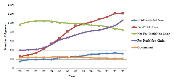 |
| SOURCE: Authors' coding and analyses of Medicare Cost Reports, 2000 and 2013. |
| EXHIBIT 1.2. Percent of Medicare-Certified Hospice Agencies by Ownership Type, 2000-2013 |
|---|
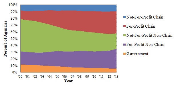 |
| SOURCE: Authors' coding and analyses of Medicare Cost Reports, 2000 and 2013. |
From 2000 to 2013, the number of Medicare-certified hospice agencies grew from 2,034 to 3,680. The number of FP agencies increased considerably over this time period, accounting for most of the overall growth in the hospice sector. Combined, FP chain and non-chain hospice agencies grew 343% over the study period, and almost two-thirds of all hospice agencies (62%) were FP by 2013. The number of NFP non-chain agencies declined in absolute terms between 2000 and 2013 (973 in 2000, 854 in 2013), and the relative share of these agencies declined sharply (48% in 2000 to 23% in 2013) given the surge in FP agencies. Although not a large portion of the hospice market, the growth in NFP chain Medicare-certified hospice agencies (160 in 2000 [8% of all agencies] to 328 in 2013 [9% of all agencies]) mirrored the growth of the hospice industry overall. The number of government-owned hospice agencies declined both in relative and in absolute terms (from 236 in 2000 [12% of all agencies] to 216 in 2013 [6% of all hospice agencies]) and now represents a small portion of the hospice marketplace.
Exhibits 1.3-1.4: Hospice Enrollees by Ownership Type
Exhibit 1.3 and Exhibit 1.4 display the number of Medicare beneficiaries served across the hospice ownership categories and the percent of all hospice enrollees these numbers represent.
Highlights:
-
FP agencies experienced substantial growth in the number of hospice enrollees during the study period, fueled especially by the increased role of FP hospice chains, which now serve more beneficiaries than any other ownership category.
-
NFP non-chain hospice agencies served around half of all hospice enrollees in 2000. These agencies served twice as many enrollees by 2013, but their share of the market fell to around one-third of enrollees in 2013, reflecting the faster expansion of FP agencies.
| EXHIBIT 1.3. Number of Medicare Hospice Enrollees by Ownership Type, 2000-2013 |
|---|
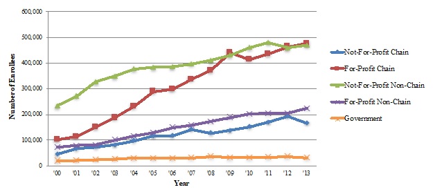 |
| SOURCE: Authors' coding and analyses of Medicare Cost Reports, 2000 and 2013. |
| EXHIBIT 1.4. Percent of Medicare Hospice Enrollees by Ownership Type, 2000-2013 |
|---|
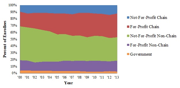 |
| SOURCE: Authors' coding and analyses of Medicare Cost Reports, 2000 and 2013. |
The number of Medicare beneficiaries receiving hospice services across the different ownership categories between 2000 and 2013 tells a similar story to the agency trends. From 2000 to 2013, the number of Medicare hospice enrollees nearly tripled, growing from around 470,000 to almost 1.4 million. FP chain agencies had the largest growth in Medicare hospice enrollees: these agencies served just over 100,000 enrollees (22% of all enrollees) in 2000, a number that almost quintupled by 2013 (476,000 Medicare beneficiaries, or 35% of all enrollees). The number of enrollees served by FP non-chain agencies more than tripled between 2000 and 2013, from 72,000 to 224,000 enrollees (around 15% of all enrollees in both years). The number of enrollees served by NFP, non-chain agencies doubled between 2000 and 2013 (from 234,000 to 470,000); however, reflecting the more rapid growth in other ownership categories, the relative share of enrollees served by these declined (from 50% in 2000 to 34% in 2013). Building from a small base, the number of beneficiaries served by NFP chain agencies increased considerably between 2000 and 2013, from 46,000 to 166,000 enrollees (10% and 12% of all enrollees, respectively).
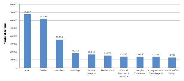
Exhibit 1.5-1.6: Characteristics of the Largest Hospice Chains, by Number of Enrollees Served
Exhibit 1.5 displays the number of Medicare enrollees served by the ten largest hospice chains. Exhibit 1.6 shows characteristics of the 35 largest hospice chains in 2013 by number of Medicare enrollees served, including the chain's profit status, number of agencies in the chain, number of enrollees served per agency, number of states in which the chain operates, and mean agency age.
| EXHIBIT 1.5. Largest Hospice Chains by Number of Medicare Hospice Enrollees, 2013 |
|---|
 |
| SOURCE: Authors' coding and analyses of Medicare Cost Reports, 2013. NOTE: Asterisk (*) indicates that the hospice chain is NFP. |
Highlights:
-
Most of the largest hospice chains operating in the United States in 2013 were FP. Only one NFP chain was in the top ten.
-
Combined, the ten largest chains served almost one-fifth of all hospice enrollees in 2013, with the three largest chains--Vitas, Gentiva, and Heartland--comprising the majority.
-
Outside of the very biggest companies, most of the larger hospice chains play a modest role in the hospice marketplace, serving between 3,000-10,000 beneficiaries in 2013. Only 15 of the largest hospice chains operated in ten or more states, and many of the remaining largest companies were more regionally focused businesses.
| EXHIBIT 1.6. Characteristics of Largest Hospice Chains by Number of Medicare Enrollees, 2013 | |||||||
|---|---|---|---|---|---|---|---|
| # | Chain | Profit Status | Number of Agencies |
Number of Beneficiaries |
Mean Beneficiaries per Agency |
Number of States Chain Operates In |
Mean Agency Age (Years) |
| 1 | Vitas | FP | 40 | 67,197 | 1,680 | 19 | 13.1 |
| 2 | Gentiva | FP | 131 | 61,640 | 471 | 30 | 12.5 |
| 3 | Heartland | FP | 77 | 37,473 | 487 | 27 | 13.6 |
| 4 | Amedisys | FP | 53 | 21,273 | 401 | 21 | 11.7 |
| 5 | Seasons Hospice | FP | 22 | 16,643 | 757 | 16 | 7.6 |
| 6 | Southerncare | FP | 68 | 15,073 | 222 | 14 | 9.9 |
| 7 | Medical Services of America | FP | 18 | 13,860 | 770 | 10 | 11.5 |
| 8 | Hospice Compassus | FP | 33 | 13,613 | 413 | 14 | 11.9 |
| 9 | Compassionate Care Hospice | FP | 37 | 13,451 | 364 | 21 | 6.5 |
| 10 | Hospice of the Valley | NFP | 4 | 12,740 | 3,185 | 1 | 23.9 |
| 11 | Curo | FP | 19 | 10,820 | 569 | 6 | 14.9 |
| 12 | Providence | NFP | 7 | 9,643 | 1,378 | 4 | 24.4 |
| 13 | Chapters | NFP | 2 | 9,313 | 4,657 | 1 | 17.3 |
| 14 | Hospice Advantage | FP | 45 | 9,279 | 206 | 11 | 6.7 |
| 15 | Aseracare | FP | 43 | 9,148 | 213 | 18 | 12.2 |
| 16 | Life Choice | FP | 18 | 8,539 | 474 | 11 | 8.9 |
| 17 | Harden | FP | 9 | 8,534 | 948 | 7 | 11.5 |
| 18 | Pruitt | FP | 18 | 5,599 | 311 | 3 | 10.9 |
| 19 | Evercare Hospice | FP | 14 | 5,505 | 393 | 11 | 7.7 |
| 20 | Covenant Hospice | NFP | 2 | 5,406 | 2,703 | 2 | 20.7 |
| 21 | Heart to Heart | FP | 10 | 5,281 | 528 | 2 | 6.2 |
| 22 | Capital | NFP | 3 | 5,071 | 1,690 | 3 | 22.7 |
| 23 | LHCG | FP | 29 | 5,068 | 175 | 13 | 13.5 |
| 24 | Hosparus | NFP | 2 | 5,040 | 2,520 | 3 | 27.0 |
| 25 | Sutter | NFP | 6 | 4,863 | 811 | 1 | 18.5 |
| 26 | Holy Redeemer | NFP | 3 | 4,622 | 1,541 | 2 | 25.2 |
| 27 | Crossroads Hospice | FP | 6 | 4,441 | 740 | 5 | 6.6 |
| 28 | Hospice of the Bluegrass | NFP | 3 | 4,413 | 1,471 | 1 | 22.2 |
| 29 | Caris | FP | 10 | 4,248 | 425 | 2 | 7.8 |
| 30 | Crossroads | FP | 4 | 4,187 | 1,047 | 3 | 9.3 |
| 31 | Healthessentials | FP | 8 | 4,065 | 508 | 3 | 3.9 |
| 32 | Hospice of Michigan | NFP | 5 | 3,958 | 792 | 1 | 25.0 |
| 33 | Skilled Healthcare | FP | 6 | 3,920 | 653 | 5 | 8.3 |
| 34 | Community Health Systems | FP | 30 | 3,855 | 129 | 16 | 16.4 |
| 35 | Health Management Associates | FP | 3 | 3,586 | 1,195 | 3 | 21.9 |
| SOURCE: Authors' coding and analyses of Medicare Cost Reports and POS files, 2013. | |||||||
The ten largest chains served around 270,000 Medicare beneficiaries in total, accounting for almost 20% of all Medicare hospice enrollees in 2013. Nine of these chains are FP, with Hospice of the Valley being the only NFP chain included. The three largest chains--Vitas, Gentiva, and Heartland--together served around 26% of all enrollees served by hospice chains (FP and NFP) nationally, and around 12% of all hospice enrollees in 2013. The remaining seven chains among the top ten largest served fewer than 20,000 Medicare hospice enrollees each.
The majority of the largest hospice chains (25 out of 35) in 2013 operated on a FP basis. The two largest chains, Vitas and Gentiva, served considerably more patients compared to all other hospice chains and nearly twice as many enrollees as the third largest hospice chain, Heartland. Although these two chains served similar numbers of Medicare enrollees, Gentiva operated considerably more agencies relative to Vitas (131 vs. 40) across a wider range of states (30 vs. 19). Similar variation existed across other chain organizations that had similar numbers of patients served overall, suggesting different operational approaches. There was no consistent relationship between the number of agencies in a hospice chain and the number of enrollees it served: for instance, one chain served fewer than 4,000 Medicare enrollees but had 30 agencies, while another chain served over 12,000 enrollees with just four agencies.
Although FP chains served a higher mean number of enrollees compared to NFP chains overall, agencies at the larger NFP chains served considerably more enrollees on a per agency basis relative to agencies at the largest FP chains--2,075 enrollees versus 563 enrollees, respectively. Some of this difference could relate to the much longer tenure of NFP agencies in the marketplace (e.g., reflecting robust referral networks that have been developed over time). Only nine of the 35 largest hospice chains had a mean agency age of greater than 20 years, and eight of these chains were NFP. Most hospice chains operated in a relatively small number of states, and only four of the largest chains operated in 20 or more states in 2013.
Exhibit 1.7: Chain and Non-Chain Hospice Providers by Profit Status
Exhibit 1.7 shows size, age, geographic reach, and market concentration differences between NFP and FP hospice chains in 2000 and 2013. The Exhibit also shows some of these characteristics for non-chain hospice agencies as a frame of reference.
Highlights:
-
In 2000 and 2013, FP chains on average served more enrollees, had a greater number of agencies per chain, and operated in more states compared to NFP chains. Some of these aggregate differences reflect the sizeable role of the largest FP chains.
-
Agencies in NFP chains on average were older and served a higher number of enrollees compared to FP chain agencies. Nearly all FP chain agencies were freestanding, compared to roughly half of NFP chain agencies.
-
Among non-chain agencies, NFP agencies were much larger than their FP counterparts, a trait that could reflect their longer average tenure in the marketplace. Most non-chain FP hospice agencies were freestanding while this was true for only about half of non-chain NFP agencies.
| EXHIBIT 1.7. NFP and FP Chain and Non-Chain Hospice Providers, 2000 and 2013 | ||||
|---|---|---|---|---|
| 2000 | 2013 | |||
| NFP | FP | NFP | FP | |
| CHAIN AGENCIES | ||||
| Size and Geographic Reach | ||||
| Number of Chains | 45 | 52 | 115 | 177 |
| Avg. Chain Size (agencies) | 3.0 | 5.0 | 2.9 | 7.0 |
| Avg. Chain Size (enrollees) | 880 | 1,925 | 1,452 | 2,740 |
| Median Chain Size (enrollees) | 436 | 754 | 872 | 787 |
| Avg. Agency Size (enrollees/agency) | 289 | 386 | 496 | 388 |
| Avg. Number of States in Which Chain Operates | 1.3 | 2.6 | 1.7 | 3.2 |
| Chains Operating in 3 or More States (%) | 2.2% | 21.2% | 11.3% | 27.1% |
| Average Agency Age (Years) | ||||
| Mean Age | 8.7 | 5.3 | 19.3 | 10.2 |
| Agency Type | ||||
| Freestanding Agencies (%) | 43.1% | 91.2% | 50.1% | 90.8% |
| Hospital-Based Agencies (%) | 40.9% | 0.0% | 32.4% | 0.9% |
| Home Health Agency-Based Agencies (%) | 16.1% | 8.8% | 17.4% | 8.3% |
| Skilled Nursing Facility-Based Agencies (%) | 0.0% | 0.0% | 0.0% | 0.0% |
| Market Concentration | ||||
| Agencies in Top 5 Chains | 29 | 92 | 17 | 321 |
| Number of Enrollees in Top 5 Chains | 15,850 | 61,742 | 39,367 | 203,749 |
| Agencies in Top 10 Chains | 54 | 143 | 36 | 488 |
| Number of Enrollees in Top 10 Chains | 24,123 | 74,205 | 62,263 | 267,597 |
| NON-CHAIN AGENCIES | ||||
| Agency Size | ||||
| Avg. Agency Size (Medicare hospice enrollees/agency) | 243 | 183 | 550 | 212 |
| Average Agency Age (Years) | ||||
| Mean Age | 9.3 | 6.1 | 19.9 | 7.8 |
| Agency Type | ||||
| Freestanding Agencies (%) | 37.0% | 68.6% | 48.8% | 84.5% |
| Hospital-Based Agencies (%) | 49.0% | 8.6% | 32.1% | 1.0% |
| Home Health Agency-Based Agencies (%) | 13.2% | 21.2% | 16.9% | 13.9% |
| Skilled Nursing Facility-Based Agencies (%) | 0.9% | 1.5% | 2.2 % | 0.6% |
| SOURCE: Authors' coding and analyses of Medicare Cost Reports and POS files, 2000 and 2013. NOTE: "Enrollees" refers to Medicare hospice enrollees only. |
||||
In comparing the role of NFP and FP chains in the United States hospice market, several key differences emerge, driven in part by the role of a handful of large national FP chains. Between 2000 and 2013, the number of hospice chains grew considerably, regardless of profit status: from 45 to 115 for NFP chains and from 52 to 177 for FP chains. FP chains served a greater number of Medicare enrollees on average in both 2000 (1,925) and 2013 (2,740) when compared to NFP chains (880 and 1,452, respectively). Reflecting the role of the large FP chains, the median chain size offers a useful contract--NFP chains served 872 enrollees on average, compared to 787 enrollees at the FP chains. FP hospices had a greater number of agencies per chain, on average (7.0 vs. 2.9 agencies, respectively, in 2013). Reflecting their larger average size, FP chains operated in nearly twice as many states as NFP chains (3.2 vs. 1.7 states, respectively, in 2013), and a larger proportion of FP chains operated in three or more states relative to NFP chains (27% vs. 11% in 2013).
At the agency level, NFP chain agencies were larger in the average number of enrollees served relative to FP chain agencies in 2013 (496 vs. 388). Some of this difference reflects the younger age profile of FP chain agencies relative to NFP chain agencies, given that older hospice agencies tend to be larger in size. In 2013, FP chain agencies were an average of 9.1 years younger than NFP agencies, compared to being 3.4 years younger, on average, in 2000.
Agency type also differed considerably across NFP and FP hospice chains. Almost all FP chain hospice agencies were freestanding in 2013, compared to 50% of NFP chain agencies. In 2013, a sizeable proportion of NFP hospice agencies were either hospital (32%) or home health (17%) based.
The role of large national chains is distinct to the FP hospice sector, as almost all NFP chains are relatively small in their number of agencies and enrollees served. Relative to the five largest NFP chains, the five largest FP chains served around five times the number of Medicare enrollees (203,749 vs. 39,367 enrollees) and operated 18 times the number of agencies (321 vs. 17) in 2013.
When comparing non-chain hospice agencies, a few striking differences emerge. Non chain NFP agencies served considerably more enrollees in 2013 relative to non-chain FP agencies (550 vs. 212). As above, this difference reflects, in part, the considerably younger age profile of non-chain FP agencies, which were 12.1 years younger than non-chain NFP agencies, on average.
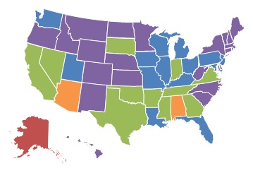
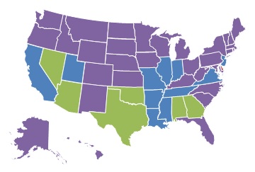
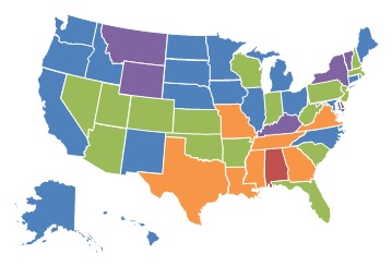
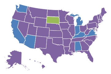
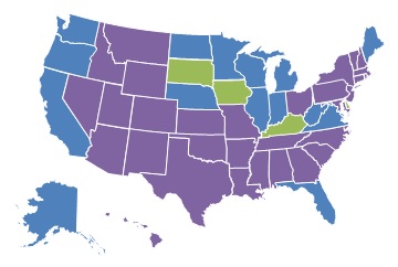
Exhibits 1.8-1.11: Geographic Illustration of Agency Profit and Chain Status
Exhibits 1.8-1.11 are maps that display the geographic variation in hospice chain status and ownership type for 2000 and 2013. Exhibit 1.8 shows state-level differences in the percent of Medicare-certified hospices that are part of a chain between 2000 and 2013. Exhibit 1.9 displays geographic reach of FP hospices as a percent of all hospices in 2000 and 2013. Exhibit 1.10 and Exhibit 1.11 present FP and non-FP chains as a proportion of all Medicare-certified hospices agencies, respectively.
Highlights:
-
As displayed in the series of maps, the proportion of chain hospice agencies grew considerably between 2000 and 2013.
-
The greatest concentration of chain agencies in both 2000 and 2013 was in the South and Midwest, shaped almost completely by the expansion of FP chain agencies.
-
The proportion of hospice agencies operating on a FP basis increased considerably between 2000 and 2013 across states. This growth was fueled by the expansion of FP chain and non-chain agencies.
| EXHIBIT 1.8. Percent of Medicare-Certified Hospice Agencies that are Part of a Chain, 2000 and 2013 | |
|---|---|
| 2000 | 2013 |
 |
 |
 |
|
| SOURCE: Authors' coding and analyses of Medicare Cost Reports, 2013. | |
| EXHIBIT 1.9. Percent of Medicare-Certified Hospice Agencies that are FP, 2000 and 2013 | |
|---|---|
| 2000 | 2013 |
 |
 |
 |
|
| SOURCE: Authors' coding and analyses of Medicare Cost Reports, 2013. | |
The proportion of Medicare-certified hospice agencies that were chain-owned grew between 2000 and 2013, with the greatest concentration of chain agencies across both years being in the South and Midwest. Exhibit 1.9 shows the proportion of FP hospice agencies by state for 2000 and 2013. As with chain hospices, the proportion of FP hospice agencies increased considerably across the study period. By 2013, FP hospice agencies accounted more than 60% of all hospice agencies in 19 states, compared to only five states in 2000. Similarly, in 2013, FP hospices accounted for less than 25% of all agencies in nine states, compared to 24 states in 2000.
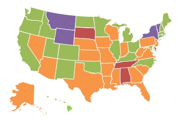
| EXHIBIT 1.10. Percent of Medicare-Certified Hospice Agencies that are Part of a FP Chain, 2000 and 2013 | |
|---|---|
| 2000 | 2013 |
 |
 |
 |
|
| SOURCE: Authors' coding and analyses of Medicare Cost Reports, 2013. | |
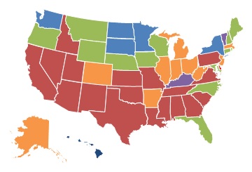
| EXHIBIT 1.11. Percent of Medicare-Certified Hospice Agencies that are Part of a NFP Chain, 2000 and 2013 | |
|---|---|
| 2000 | 2013 |
 |
 |
 |
|
| SOURCE: Authors' coding and analyses of Medicare Cost Reports, 2013. | |
Reflecting the growth of FP and chain hospice agencies between 2000 and 2013, it is not surprising that the proportion of FP chain hospices increased over the study period, as shown in Exhibit 1.10. In 2000, FP, chain-owned hospices accounted for more than 40% of all hospices in only one state (Delaware), compared to nine states in 2013. These states were concentrated in the Southeastern part of the United States. At the other end of the spectrum, only five states had less than 10% of agencies operating as part of a FP chain in 2013, compared to 31 states in 2000.
Relative to FP chain hospice agencies, there was modest growth in the percent of NFP chain hospice agencies across states between 2000 and 2013. In 2000, only one state (South Dakota) had more than 25% of Medicare-certified hospice agencies owned by NFP chains, a number that increased only to three states in 2013 (Kentucky, Iowa, and South Dakota). Interestingly, states with a high proportion of FP chain ownership in 2013 generally had lower proportions of NFP chain ownership and vice versa.
Section II: Service Use Characteristics
Exhibit 2.1: Patient Characteristics by Hospice Ownership Type
Exhibit 2.1 displays a range of patient demographic and other characteristics and unadjusted service use of hospice enrollees discharged from hospice between 2005-2013, by hospice ownership category.
| EXHIBIT 2.1. Patient Characteristics by Hospice Ownership Type, 2005-2013 | ||||||
|---|---|---|---|---|---|---|
| FP Non-Chain | FP Chain | NFP Non-Chain | NFP Chain | Govt | ||
| Patients | Number | 1,084,414 | 2,214,041 | 2,950,651 | 968,039 | 234,554 |
| Percent | 15% | 30% | 40% | 13% | 3% | |
| Sex | Female | 60% | 60% | 57% | 58% | 57% |
| Male | 40% | 40% | 43% | 42% | 43% | |
| Age | Mean | 83.2 | 83.4 | 82.8 | 82.7 | 82.6 |
| 65-74 | 19% | 18% | 20% | 21% | 21% | |
| 75-84 | 36% | 36% | 37% | 37% | 37% | |
| 85+ | 45% | 46% | 43% | 42% | 42% | |
| Race | White | 87% | 86% | 91% | 90% | 91% |
| Black | 9% | 10% | 6% | 6% | 6% | |
| Other | 4% | 4% | 3% | 3% | 3% | |
| Region | Northeast | 14% | 13% | 23% | 11% | 4% |
| Midwest | 20% | 21% | 28% | 25% | 28% | |
| South | 40% | 48% | 35% | 33% | 45% | |
| West | 26% | 19% | 14% | 31% | 23% | |
| Hospice Diagnosis | Cancer | 28% | 26% | 36% | 35% | 35% |
| Dementia | 16% | 19% | 11% | 10% | 9% | |
| Debility | 12% | 11% | 9% | 10% | 9% | |
| CHF | 9% | 9% | 8% | 8% | 9% | |
| COPD | 7% | 7% | 6% | 6% | 7% | |
| Failure to Thrive | 6% | 7% | 5% | 5% | 6% | |
| Other | 21% | 20% | 25% | 25% | 26% | |
| Service Use | Mean Length of Stay | 87.5 | 94.7 | 63.9 | 67.3 | 63.6 |
| Median Length of Stay | 24 | 23 | 15 | 16 | 17 | |
| Stays <3 Days | 14% | 15% | 19% | 18% | 17% | |
| Stays >180 Days | 16% | 18% | 10% | 11% | 10% | |
| Stays with Live Discharge | 24% | 23% | 15% | 16% | 16% | |
| No GIP/CHC Care in Last 7 Days | 77% | 68% | 63% | 70% | 74% | |
| NH Residents | Percent | 34% | 38% | 26% | 24% | 27% |
| NOTE: Includes all hospice stays for Medicare beneficiaries aged 65+ ending in death or discharge during the 2005-2013 study period. If an individual with multiple hospice stays receives care from more than 1 hospice ownership type, she is counted for each ownership type. Nursing home residents are defined as having a hospice claim at any point during a nursing home stay. Certain categories may not add to 100% due to rounding. All traits were significantly different across hospice ownership types (p<0.0001). | ||||||
Highlights:
-
FP and NFP hospice agencies differed considerably in the populations they served and in their service use. In the aggregate, chain status was much less important in explaining these differences than profit status.
-
Compared to NFP agencies, FP hospices had higher proportions of enrollees that were: (1) female; (2) over the age of 85; (3) non-White; and (4) living in the South. Cancer was the most common terminal diagnosis across all ownership types; however, FP agencies had higher proportions of non-cancer diagnoses.
-
Based on unadjusted analyses, FP agencies had: (1) longer mean lengths of stay; (2) higher live discharge rates; and (3) higher proportions of patients residing in nursing homes, compared to NFP and government agencies.
Patients served by FP chain and non-chain hospices were slightly more likely to be female and in the 85+ age category than patients served by those in NFP and government hospices. Compared to other ownership types, FP hospices served higher proportions of non-White patients; FP chain hospices also had an especially high proportion of patients living in the United States South. Cancer diagnoses made up a plurality of the primary terminal diagnoses for all hospice ownership types; however, FP chain and non-chain hospices had higher proportions of patients with non-cancer diagnoses, dementia in particular. FP agencies had longer unadjusted mean lengths of stay--87.5 days for non-chains and 94.7 days for chains--compared to NFP and government agencies, which ranged from 63.6 days to 67.3 days. FP agencies had substantially higher rates of live discharge (about 24%) compared to other agency types (about 16%). Similarly, FP agencies had higher proportions of patients living in nursing homes (around one-third for non-chains and chains), compared to around one-fourth for other agency types.
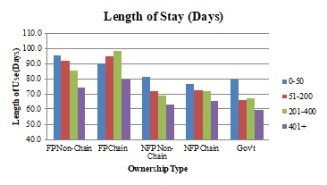
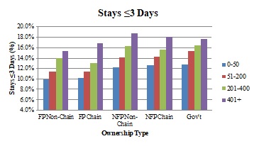
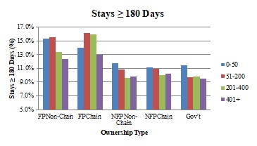
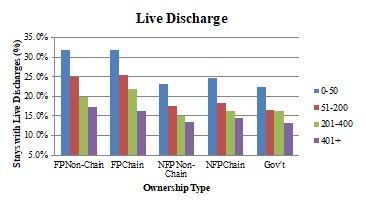
Exhibit 2.2: Service Use by Ownership Type and Size
Exhibit 2.2 presents number of agencies, number of enrollees, and unadjusted service use information stratified by ownership type and size. Size was determined by the average number of discharged enrollees in an agency in a year.
Highlights:
-
Although they serve a relatively modest number of patients overall, small hospice agencies play a more prominent role in the FP hospice sector.
-
Across hospice ownership types, smaller agencies generally had: (1) longer lengths of stay; (2) lower rates of stays less than three days; (3) higher rates of stay greater than 180 days; (4) higher rates of stays with live discharge; and (5) higher rates of decedents who did not receive GIP or CHC level care in the last seven days of life.
| EXHIBIT 2.2. Unadjusted Hospice Use by Patients of FP and NFP Agencies, by Agency Size, 2005-2013 | |||||||
|---|---|---|---|---|---|---|---|
| Patients (Agencies) |
Mean Length of Stay (Days) |
Median Length of Stay (Days) |
Stays <3 Days (%) |
Stays >180 Days (%) |
Stays with Live Discharge (%) |
No GIP/CHC Care in Last 7 Days (%) |
|
| FP | |||||||
| FP Non-Chain | |||||||
| 0-50 | 64,692 (1,014) |
101.5 | 37 | 9% | 20% | 39% | 89% |
| 51-200 | 302,260 (921) |
98.7 | 31 | 11% | 19% | 29% | 87% |
| 201-400 | 232,736 (296) |
87.2 | 23 | 14% | 16% | 22% | 79% |
| 401+ | 502,981 (157) |
78.8 | 20 | 15% | 14% | 19% | 69% |
| FP Chain | |||||||
| 0-50 | 37,343 (639) |
96.5 | 35 | 10% | 18% | 39% | 91% |
| 51-200 | 439,344 (1,053) |
103.9 | 33 | 11% | 20% | 30% | 86% |
| 201-400 | 523,461 (572) |
101.8 | 28 | 13% | 19% | 19% | 80% |
| 401+ | 1,272,255 (322) |
88.4 | 18 | 17% | 16% | 19% | 57% |
| NFP | |||||||
| NFP Non-Chain | |||||||
| 0-50 | 35,729 (330) |
68.1 | 21 | 13% | 11% | 20% | 92% |
| 51-200 | 365,507 (661) |
66.2 | 19 | 15% | 11% | 17% | 88% |
| 201-400 | 505,106 (417) |
61.8 | 16 | 17% | 10% | 15% | 78% |
| 401+ | 2,064,417 (357) |
63.9 | 14 | 20% | 11% | 14% | 55% |
| NFP Chain | |||||||
| 0-50 | 7,885 (101) |
69.8 | 22 | 13% | 12% | 24% | 88% |
| 51-200 | 99,935 (239) |
69.0 | 19 | 15% | 11% | 18% | 88% |
| 201-400 | 160,048 (148) |
64.5 | 18 | 16% | 10% | 17% | 79% |
| 401+ | 705,209 (159) |
67.7 | 15 | 18% | 11% | 16% | 65% |
| NOTE: Includes all hospice stays for Medicare beneficiaries aged 65+ ending in death or discharge during 2005-2013 study period. Hospice agencies categorized into one size category for each study year (2005-2013), based on number of discharged patients in that year. Agencies may fall into different size categories in different years, as their patient populations change. All service use outcomes were significantly different: (1) across agency size categories within ownership type; and (2) across ownership types within agency size categories (p<0.0001). | |||||||
Agency size is an important factor to consider alongside chain status when comparing differences across FP and NFP hospice agencies. Smaller agencies serving 200 or fewer patients per year play an especially prominent role in the FP hospice sector comprising around three-fourths of all agencies. Importantly, these agencies--by virtue of their size--serve a relatively small portion of the total hospice market. For instance, agencies serving 0-50 patients in a year make up 33% of all FP chain and non-chain hospice agencies but only 3% of total hospice patients. Across ownership types, smaller chain and non-chain agencies generally had longer mean and median lengths of stay, lower rates of stays less than three days, higher rates of stays with live discharge and higher rates of decedents who did not receive any GIP or CHC level care during the last seven days of life.
Among FPs, differences in live discharge rates were especially striking across smaller and larger agencies, with smaller agencies having live discharge rates of 39% compared to rates of 19% at the largest agencies. Similar directional trends existed across smaller and larger NFP agencies, although the magnitude of the differences was much smaller. Similarly, large differences existed across smaller and larger agencies in the percent of patients who did not receive any GIP or CHC in the last seven days of life, with larger agencies in particular providing more of this category of service at the end of patients' lives.
Exhibit 2.3: Patient Characteristics and Service Use for the Five Largest FP and NFP Agencies
Exhibit 2.3 presents agency, patient, and service use information for the five largest FP and NFP hospice chains in 2013, by enrollment.
| EXHIBIT 2.3. Unadjusted Patient Characteristics and Hospice Use by Patients of the Five Largest FP and NFP Hospice Chains, 2013 | ||||||||||
|---|---|---|---|---|---|---|---|---|---|---|
| Patients (Agencies) |
Cancer (%) |
Dementia (%) |
NH Residents (%) |
Mean Length of Stay (Days) |
Median Length of Stay (Days) |
Stays <3 Days (%) |
Stays >180 Days (%) |
Stays with Live Discharge (%) |
No GIP/CHC Care in Last 7 Days (%) |
|
| FP | ||||||||||
| Largest 5 Chains | ||||||||||
| Vitas | 49,085 (40) |
26% | 21% | 26% | 91.5 | 16 | 17% | 15% | 17% | 27% |
| Gentiva | 43,284 (131) |
23% | 21% | 37% | 108.5 | 22 | 16% | 18% | 19% | 73% |
| Heartland | 21,679 (78) |
22% | 22% | 47% | 103.7 | 31 | 12% | 19% | 21% | 88% |
| Amedisys | 15,357 (52) |
23% | 21% | 34% | 104.8 | 29 | 12% | 19% | 22% | 86% |
| Seasons Hospice | 12,479 (22) |
26% | 20% | 32% | 70.0 | 14 | 20% | 11% | 15% | 53% |
| NFP | ||||||||||
| Largest 5 Chains | ||||||||||
| Hospice of the Valley | 9,346 (4) |
29% | 15% | 15% | 95.1 | 23 | 16% | 18% | 22% | 48% |
| Chapters Health System | 6,768 (2) |
30% | 14% | 22% | 84.7 | 17 | 19% | 15% | 22% | 30% |
| Kaiser Permanente | 6,065 (15) |
46% | 6% | 7% | 50.9 | 24 | 10% | 6% | 16% | 98% |
| Providence Health | 5,711 (6) |
32% | 18% | 17% | 65.7 | 19 | 17% | 12% | 16% | 84% |
| Covenant Hospice | 4,124 (2) |
27% | 14% | 26% | 92.4 | 17 | 18% | 15% | 18% | 51% |
| NOTE: Five largest chains based on number of discharged patients, 2013. Unadjusted results include all hospice stays for Medicare beneficiaries aged 65+ ending in death or discharge during the 2005-2013 study period. | ||||||||||
Highlights:
-
Large hospice chains play an especially important role in the FP hospice sector. The two largest FP chains each served more enrollees than all five of the largest NFP chains combined.
-
Relative to the largest NFP chains, the largest FP chains generally had lower proportions of cancer patients and higher proportions of patients with dementia and residing in nursing homes.
-
Although large FP chains generally had longer lengths of hospice stay, service use differences between FP and NFP were inconsistent in direction. In particular, of the largest FP and NFP chains, there was considerable variation in service use measures within each ownership type.
Considerable variation existed in patient populations and unadjusted service use among the largest national hospice chains in 2013. Enrollment for the largest FP chains was substantially greater than enrollment in NFP chains overall. VITAS and Gentiva, the two largest FP chains, each had more patients than all five of the largest NFP chains combined. The largest FP chains generally had a lower proportion of cancer patients, a higher proportion of dementia patients, and substantially more patients living in nursing homes. The range of both cancer and dementia diagnoses in FP chains was relatively narrow among the largest FP hospice chains, ranging from 22-26% and 20-22% for cancer and dementia, respectively. The proportion of hospice patients with primary diagnoses of cancer and dementia had a much wider range across the largest NFP hospice chains. Although the largest FP chains generally had longer mean and median lengths of stay compared to the largest NFP chains, considerable variation existed within profit status. For instance, the mean length of stay ranged from 70 days to 109 days among the largest FP chains. Substantial variation also existed within ownership type for other service use measures, although FP versus NFP differences were not as pronounced or consistent.
Exhibit 2.4: Adjusted Hospice Use Outcomes by Ownership Type
Exhibit 2.4 presents adjusted service use outcomes, by hospice ownership type. The adjusted results account for patient and market characteristics, including age, sex, race/ethnicity, HMO enrollment status, terminal diagnosis, region of service use, urban/rural status, and year.
Highlights:
-
Even after adjusting for patient and market characteristics, FP agencies, regardless of chain affiliation, had: (1) longer mean lengths of stay; (2) higher proportions of stays greater than 180 days; (3) higher proportions of stays with live discharges; and (4) lower proportions of stays less than three days, compared to other ownership types.
-
Especially striking among our results was that FP agencies had considerably longer adjusted mean lengths of stay and higher rates of live discharge.
| EXHIBIT 2.4. Adjusted Hospice Use Outcomes by Ownership Type, 2005-2013 | |||||
|---|---|---|---|---|---|
| Hospice Ownership Type | Mean Length of Stay (Days) |
Stays <3 Days (%) |
Stays >180 Days (%) |
Stays with Live Discharge (%) |
No GIP/CHC Care in Last 7 Days (%) |
| FP Non-Chain | 85.4 | 13.8% | 13.6% | 20.7% | 75.2% |
| FP Chain | 90.7 | 14.7% | 14.3% | 19.8% | 69.0% |
| NFP Non-Chain | 69.4 | 17.7% | 9.9% | 14.4% | 63.0% |
| NFP Chain | 71.5 | 17.1% | 10.3% | 15.4% | 68.8% |
| Government | 65.7 | 17.0% | 9.5% | 14.9% | 70.7% |
| p-value | <0.0001 | <0.0001 | <0.0001 | <0.0001 | <0.0001 |
| NOTE: Includes first hospice stay only for Medicare beneficiaries aged 65+ ending in death or discharge during the 2005-2013 study period. Adjusted models focus on the associations between ownership type and each service use outcome and include as covariates: age, sex, race/ethnicity, terminal diagnosis category, HMO enrollment status, region of service use, urban/rural status, and year. Length of use modeled using ordinary least squares regression; other outcomes modeled using logistic regression. P-value associated with tests that outcomes were significantly different across all hospice ownership types. | |||||
FP non-chain and chain agencies had longer mean lengths of stay (85.4 days and 90.7 days, respectively) than the other hospice ownership types (65.7-71.5 days) and similarly had a higher proportion of stays greater than or equal to 180 days. FP agencies exhibited comparatively lower adjusted proportions of stays less than three days, and higher adjusted proportions of stays with live discharges. For instance, FP agencies, regardless of chain affiliation, had adjusted live discharge rates of about 20%, compared to about 15% for other hospice ownership types. The adjusted proportion of patients who received no GIP or CHC level care in the last seven days of life varied significantly across ownership type and did not correlate strongly with profit or chain status.
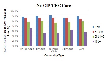
Exhibit 2.5: Adjusted Hospice Use Outcomes by Ownership Type and Size
The panels in Exhibit 2.5 show adjusted service use (average length of stay, percent of stays with live discharge, percent of stays less than three days, percent of stays greater than or equal to 180 days, and percent of patients with no GIP/CHC care at the end of life,) across ownership types, stratified by agency size categories.
Highlights:
-
Across ownership types, smaller agencies--which play a more prominent role in the FP hospice sector--had longer adjusted mean lengths of stay, higher rates of live discharge, a lower proportion of very short hospice stays, higher rates of stays greater than or equal to 180 days, and a higher proportion of hospice patients not receiving intensive hospice services at the end of life.
-
The smallest hospice agencies had live discharge rates that were around twice as high as the largest agencies within each ownership category.
| EXHIBIT 2.5. Adjusted Hospice Use Outcomes by Ownership Type and Agency Size, 2005-2013 | |
|---|---|
 |
 |
 |
 |
 |
|
| NOTE: Includes first hospice stay only for Medicare beneficiaries aged 65+ ending in death or discharge during 2005-2013 study period. Figures based on regression models that include: age, sex, race/ethnicity, terminal diagnosis, HMO enrollment status, region of service use, urban/rural status, year, and ownership status of hospice agency. Hospice agencies categorized into size categories for each study year, based on number of discharged patients in that year. Comparisons made within size categories, across ownership types. Length of use modeled using ordinary least squares regression; other outcomes modeled using logistic regression. All outcomes were significantly different across ownership types (p<0.0001). | |
| ALT TEXT for EXHIBIT 2.5. Exhibit 2.5 is made up of 5 bar charts with the five ownership categories on the x axis, and 4 bars within each category representing 4 agency sizes: 0-50 patients, 51-200 patients, 201-400 patients, and greater than 400 patients. The vertical axis of each chart measures the following outcomes: average length of stay (in days), percent of stays that were less than 3 days, percent of stays that were greater than 180 days, percent of stays that were live discharges, and the percent of decedents with no GIP/CHC care in the last 7 days of life. The average length of stay ranged between approximately 60 and 100 days, with FP chain and non-chain agencies generally having longer lengths of stay than the other ownership types. As agency size increased, average length of stay decreased every ownership category except FP chain agencies. In this ownership category, the length of stay increased as agency size grew, until the size reached more than 400 patients, when length of stay dropped. As agency size increased, the percent of stays that were less than 3 days increased as well. Depending on ownership type, between approximately 10-13% of stays were less than 3 days in the smallest agencies, and approximately 15%-19% in the largest agencies. The proportion of stays that were greater than 180 days decreased slightly as agency size increased with the exception of FP chains. All FP chain and non-chain agencies had percentages of long stays that were greater than those of all other ownership types, regardless of agency size. As agency size grew, adjusted rates of live discharge declined, as did the differential between the percent of live discharges in FP and NFP agencies. In other words, the smallest FP agencies had a substantially higher percentage of live discharges than the smallest NFP agencies, but the percent of live discharges for the largest FP agencies was only slightly larger than their NFP counterparts. The percent of hospice decedents not receiving GIP/CHC care in the last 7 days of life decreased as agency size increased, particularly when agencies served more than 400 patients. There was no clear pattern across agency types. | |
Adjusted mean length of stay and the percent of stays greater than or equal to 180 days decreased as agency size increased for every ownership category except FP chains, where it increased with agency size until agencies served more than 400 patients, when it dropped. FP chain and non-chain agencies generally had higher lengths of stay across agency size categories. The proportion of stays less than three days increased as agency size increased, with FP non-chain and chain agencies exhibiting a slightly lower percentage in each size category. As agency size grew, adjusted rates of live discharge generally declined, as did the differential between the percent of live discharges in FP and NFP agencies. The smallest FP agencies had a substantially higher percentage of live discharges than the smallest NFP agencies, but the percent of live discharges for the largest FP agencies was only slightly larger than their NFP counterparts. The proportion of hospice decedents not receiving GIP or CHC level care at the end of life tended to decrease as agency size grew, particularly when agencies served more than 400 patients; however, we found no clear pattern across ownership types in this measure.
Section III: Visit Information
Exhibit 3.1: Hospice Visit Outcomes by Ownership Type
Exhibit 3.1 presents unadjusted visit information by hospice ownership type for 2011-2013.
Highlights:
-
Across ownership types, unadjusted hospice visit data showed that hospice enrollees received visits on around half of the days in which they are enrolled in hospice. Enrollees received skilled visits on approximately 40% of hospice days.
-
The average total and skilled visit hours per day were 0.96 hours and 0.57 hours per day, respectively, with relatively small differences across ownership types.
-
The percent of hospice decedents receiving skilled visits in the last three days of life was similar across ownership types; however, the percent receiving at least two SW or aide visits in the last seven days of life was higher among FP hospices compared to other agency types.
| EXHIBIT 3.1. Unadjusted Hospice Visit Outcomes by Ownership Type, 2011-2013 | ||||||
|---|---|---|---|---|---|---|
| All | FP Non-Chain | FP Chain | NFP Non-Chain | NFP Chain | Govt | |
| DAY-LEVEL MEASURES | ||||||
| Percent of Days with Any Visits | 53.8% | 53.7% | 54.5% | 53.5% | 53.4% | 54.4% |
| Percent of Days with Skilled Visits | 39.0% | 38.1% | 37.4% | 40.3% | 40.2% | 41.7% |
| Average Visit Hours per Day | 0.96 | 0.92 | 0.97 | 0.99 | 0.93 | 0.93 |
| Average Skilled Visit Hours per Day | 0.57 | 0.54 | 0.57 | 0.60 | 0.59 | 0.58 |
| PATIENT-LEVEL MEASURES | ||||||
| Percent of Patients with at Least 1 RN/LPN or MD/NP Visit in Last 3 Days of Life | 83.0% | 82.0% | 82.4% | 82.9% | 85.2% | 84.9% |
| Percent of Patients with at Least 2 SW or Aide Visits in Last 7 Days of Life | 59.6% | 62.0% | 64.1% | 56.1% | 55.9% | 57.4% |
| NOTE: Visit analyses based on RHC days only. Visit discipline, visit units, and visit place of service obtained from revenue codes within hospice claims. Skilled visits/hours are those made by RNs, LPNs, MDs, or NPs. | ||||||
The percent of enrolled hospice days with any visit is relatively consistent across ownership types, with hospice enrollees having visits on a little more than half of all days they are enrolled in hospice (ranging from 53.4% of days for NFP chains to 54.5% of days for FP chains). The unadjusted percent of enrollee days with any skilled (MD/NP or RN/LPN) visit was similarly close across agency types (37-38% for FP agencies compared to around 40% for NFP agencies). NFP non-chain agencies had the highest unadjusted total visit hours and skilled visit hours per day (0.99 and 0.60 hours per day, respectively), and FP non-chain agencies had the lowest (0.92 and 0.54 hours per day, respectively). The percent of patients who received at least one RN/LPN or MD/NP visit in the last three days of life differed slightly across ownership types (from 82.0% for FP non-chains to 85.2% for NFP chains), whereas the percent of patients who received at least two SW or nurse aide visits in the last seven days of life varied more. FP chain and non-chain agencies had higher percentages of decedents receiving these services at the end of life (64.1% and 62.0%, respectively) compared to NFP chain and non-chain agencies (55.9% and 56.1%, respectively).
Exhibit 3.2: Visit Hours by Staffing Category and Ownership Type
Exhibit 3.2 displays the unadjusted percentage of total hospice visit hours across staffing categories by ownership type for the 2011-2013 period.
Highlights:
-
Across hospice agencies, RN/LPN, nurse aide, and SW hours accounted for almost all visit hours; however, their allocations differed by ownership type.
-
FP agencies had higher unadjusted percentages of aide hours, and lower percentages of RN/LPN hours and SW hours, compared to NFP agencies.
| EXHIBIT 3.2. Unadjusted Percentage of Visit Hours across Staffing Categories by Ownership Type, 2011-2013 |
|---|
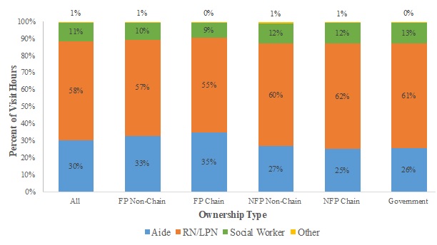 |
| NOTE: Visit analyses based on RHC days only. Visit discipline, visit units, and visit place of service obtained from revenue codes within hospice claims. RN; LPN; "Other" includes MD, NP, and therapist hours. |
Across ownership types, the three categories of staffing that comprise almost all visit hours are RN/LPN hours (55-62% of total), nurse aide hours (25-35%), and SW hours (9-13%); other staffing hours include MD/NP and therapist hours and are no greater than 1% of total hours in any ownership type. The unadjusted allocation of hours across staffing categories varied across ownership types. FP non-chain and chain hospice agencies had higher percentages of aide hours (33% and 35% of total hours, respectively) compared to NFP non-chain and chain agencies (27% and 25%, respectively); lower percentages of RN/LPN hours (57% and 55%, respectively, vs. 60% and 62%, respectively); and lower percentages of SW hours (10% and 9%, respectively, vs. 12% in both NFP categories).
Exhibit 3.3: Adjusted Visit Outcomes by Ownership Type
Exhibit 3.3 presents adjusted visit outcomes across hospice ownership categories. These models adjust for patient and market characteristics, including age, sex, race/ethnicity, terminal diagnosis, HMO enrollment status, region of service use, urban/rural status, and year.
Highlights:
-
FP hospices had slightly higher adjusted percentages of days with any visits, but lower percentages of days with any skilled visits, compared to NFP hospices.
-
The average adjusted total visit hours and skilled visit hours varied little across ownership types, although the variation was statistically significant.
-
The adjusted percentages of patients with at least one skilled visit in the last three days of life were similar across ownership types, but FP agencies had higher percentages of patients with at least two SW or aide visits in the last seven days of life than NFP agencies.
There is little difference in the percent of enrolled days with any visits and with any skilled visits across the different hospice ownership types. Although statistically significant in their differences, the average total visit hours and skilled visit hours per day differed at most by 0.05 hours (~3 minutes) per day and 0.04 hours (~2.5 minutes), respectively, across ownership types.
Finally, looking at the visits received by hospice decedents at the end of life, the percent of patients with at least one RN/LPN or MD/NP visit in the last three days of life were similar across ownership types (81.7-84.8%). The percent of patients with at least two SW or hospice aide visits in the last week of life differed more substantially across ownership types. FP non-chain and chain agencies had the highest percentages of patients with at least two SW or aide visits near the end of life (61.7% and 63.6%, respectively), and NFP non-chain and chain agencies had the lowest (55.8% and 56.2%, respectively).
| EXHIBIT 3.3. Adjusted Visit Outcomes by Ownership Type, 2011-2013 | ||||||
|---|---|---|---|---|---|---|
| Hospice Ownership Type | Percent of Days with Any Visits |
Percent of Days with Skilled Visits |
Average Visit Hours per Day |
Average Skilled Visit Hours per Day |
Percent of Patients with at Least 1 RN/LPN or MD/NP Visits in the Last 3 Days of Life |
Percent of Patients with at Least 2 SW or Aide Visits in the Last 2 Days of Life |
| FP Non-Chain | 54.9% | 38.7% | 0.93 | 0.52 | 81.7% | 61.7% |
| FP Chain | 55.7% | 38.4% | 0.98 | 0.56 | 82.8% | 63.6% |
| NFP Non-Chain | 53.6% | 39.8% | 0.95 | 0.56 | 82.8% | 55.8% |
| NFP Chain | 54.7% | 39.9% | 0.93 | 0.55 | 84.8% | 56.2% |
| Government | 55.6% | 41.1% | 0.96 | 0.55 | 83.8% | 58.3% |
| p-value | <0.0001 | <0.0001 | <0.0001 | <0.0001 | <0.0001 | <0.0001 |
| NOTE: Visit analyses based on RHC days only. Visit discipline, visit units, and visit place of service obtained from revenue codes within hospice claims. Skilled visits/hours are those made by RNs, LPNs, MDs, or NPs. Regression analyses include first hospice stay only for Medicare beneficiaries aged 65+ ending in death or discharge during the 2011-2013 study period. Adjusted models focus on the associations between ownership type and each hospice visit outcome and include as covariates: age, sex, race/ethnicity, terminal diagnosis category, HMO enrollment status, region of service use, urban/rural status, and year. The percent of days with any visits and with skilled visits and the average total and skilled hours per day measures were modeled using ordinary least squares regression; other outcomes modeled using logistic regression. P-value associated with tests that outcomes were significantly different across all hospice ownership types. | ||||||
CONCLUSIONS
Between 2000 and 2013, the number of Medicare beneficiaries served by chain hospices more than quadrupled, and FP chain agencies are now the largest category of hospice agencies nationally, both in the number of agencies and the number of beneficiaries served. Around half of all Medicare enrollees received hospice services from a chain in 2013, and three-fourths of those enrollees received services from a FP chain. Although a small number of large chains play a prominent role in the FP hospice sector, most FP and NFP chains are regionally focused and more modest in size. Chains--particularly FP chains--play an especially prominent role in the United States South.
We observed substantial heterogeneity within hospice profit status, highlighting the need to consider factors such as agency size and chain affiliation to understand factors that might shape Medicare beneficiaries' hospice care.
Ultimately, having information beyond the profit status of a hospice agency is important to understand the role of the diverse companies operating in the hospice sector. Within and across profit and chain status, hospices appear to have differing capacities and approaches to meeting the needs of Medicare beneficiaries at the end of life. Our results point to the value of more detailed analyses of hospice ownership to offer a more nuanced assessment concerning the role of structural and organizational dimensions in care delivery. Such a focus will help ensure that clinicians, patients, researchers, and policymakers have the tools necessary to assess care provided by particular companies and to ensure greater transparency in the hospice marketplace.
REFERENCES
-
Stevenson DG. Growing Pains for the Medicare Hospice Benefit. N Engl J Med. 2012;367(18):1683-1685. doi:10.1056/NEJMp1208465.
-
Wachterman MW, Marcantonio ER, Davis RB, McCarthy EP. Association of Hospice Agency Profit Status With Patient Diagnosis, Location of Care, and Length of Stay. JAMA. 2011;305(5):472. doi:10.1001/jama.2011.70.
-
Report to the Congress: Medicare Payment Policy. Washington, DC: MedPAC; 2012:281-308.
-
Gandhi SO. Differences Between Non-Profit and FP Hospices: Patient Selection and Quality. Int J Health Care Finance Econ. 2012;12(2):107-127. doi:10.1007/s10754-012-9109-y.
-
Lorenz KA, Ettner SL, Rosenfeld KE, Carlisle DM, Leake B, Asch SM. Cash and Compassion: Profit Status and the Delivery of Hospice Services. J Palliat Med. 2002;5(4):507-514. doi:10.1089/109662102760269742.
-
Report to the Congress: Medicare Payment Policy. Washington, DC: MedPAC; 2015:285-312.
-
Cherlin EJ, Carlson MDA, Herrin J, et al. Interdisciplinary Staffing Patterns: Do FP and Nonprofit Hospices Differ? J Palliat Med. 2010;13(4):389-394. doi:10.1089/jpm.2009.0306.
-
Canavan ME, Aldridge Carlson MD, Sipsma HL, Bradley EH. Hospice for Nursing Home Residents: Does Ownership Type Matter? J Palliat Med. 2013;16(10):1221-1226. doi:10.1089/jpm.2012.0544.
-
Carlson MDA, Barry CL, Cherlin EJ, McCorkle R, Bradley EH. Hospices' Enrollment Policies May Contribute to Underuse of Hospice Care in the United States. Health Aff (Millwood). 2012;31(12):2690-2698. doi:10.1377/hlthaff.2012.0286.
-
Aldridge MD, Schlesinger M, Barry CL, et al. National Hospice Survey Results: FP Status, Community Engagement, and Service. JAMA Intern Med. 2014;174(4):500. doi:10.1001/jamainternmed.2014.3.
-
Teno JM, Plotzke M, Gozalo P, Mor V. A National Study of Live Discharges from Hospice. J Palliat Med. 2014. doi:10.1089/jpm.2013.0595.
-
Carlson MDA, Herrin J, Du Q, et al. Hospice Characteristics and the Disenrollment of Patients with Cancer. Health Serv Res. 2009;44(6):2004-2021. doi:10.1111/j.1475-6773.2009.01002.x.
-
McCue MJ, Thompson JM. Operational and Financial Performance of Publicly Traded Hospice Companies. J Palliat Med. 2005;8(6):1196-1206. doi:10.1089/jpm.2005.8.1196.
-
Medicare Hospices That Focus on Nursing Facility Residents. Washington, DC: U.S. Office of the Inspector General; 2011.
-
Hospice in Medicare: Recent Trends and a Review of the Issues. Washington, DC: MedPAC; 2006:59-78.
-
Stevenson DG, Dalton JB, Grabowski DC, Huskamp HA. Nearly Half of All Medicare Hospice Enrollees Received Care from Agencies Owned by Regional or National Chains. Health Aff Proj Hope. 2015;34(1):30-38. Doi:10.1377/hlthaff.2014.0599.
-
Whoriskey P, Keating D. Terminal Neglect? How Some Hospices Treat Dying Patients. Washington Post. https://www.washingtonpost.com/business/economy/terminal-neglect-how-some-hospices-fail-the-dying/2014/05/03/7d3ac8ce-b8ef-11e3-96ae-f2c36d2b1245_story.html. Accessed October 10, 2016.
-
Teno JM, Gozalo PL, Bynum JPW, et al. Change in End-of-Life Care for Medicare Beneficiaries: Site of Death, Place of Care, and Health Care Transitions in 2000, 2005, and 2009. JAMA. 2013;309(5):470. doi:10.1001/jama.2012.207624.
-
Report to the Congress: Medicare Payment Policy. Washington, DC: MedPAC; 2013:259-284.
This report was prepared under contract #HHSP233201500026C between the U.S. Department of Health and Human Services (HHS), Office of Disability, Aging and Long-Term Care Policy (DALTCP) and Vanderbilt University. For additional information about this subject, you can visit the DALTCP home page at http://aspe.hhs.gov/office-disability-aging-and-long-term-care-policy-daltcp or contact the ASPE Project Officer, Iara Oliveira, at HHS/ASPE/DALTCP, Room 424E, H.H. Humphrey Building, 200 Independence Avenue, S.W., Washington, D.C. 20201. Her e-mail addresses is: Iara.Oliveira@hhs.gov.
Reports Available
Tracking the Impact of Ownership Changes in Hospice Care Provided to Medicare Beneficiaries: Final Report
- HTML: https://aspe.hhs.gov/basic-report/tracking-impact-ownership-changes-hospice-care-provided-medicare-beneficiaries-final-report
- PDF: https://aspe.hhs.gov/pdf-report/tracking-impact-ownership-changes-hospice-care-provided-medicare-beneficiaries-final-report
Trends in Nursing Home-Hospice Contracting and Common Ownership between Hospice Agencies and Nursing Homes: Final Report
- HTML: https://aspe.hhs.gov/basic-report/trends-nursing-home-hospice-contracting-and-common-ownership-between-hospice-agencies-and-nursing-homes-final-report
- PDF: https://aspe.hhs.gov/pdf-report/trends-nursing-home-hospice-contracting-and-common-ownership-between-hospice-agencies-and-nursing-homes-final-report