
Preface
The Medicare and Medicaid programs distribute extra payments to hospitals that treat a disproportionate share of indigent patients. The disproportionate share hospital (DSH) payment policies differ substantially between the two programs and, under Medicaid, across states as well. Nevertheless, the general objectives of each program are the same: to support the hospitals that are crucial to the health care safety net, and to preserve access to these hospitals for the respective program's enrollees.
Medicare and Medicaid DSH payments represent an important source of hospital revenues. In federal fiscal year 1998, Medicare DSH payments totaled an estimated $4.8 billion and Medicaid DSH payments totaled $15.0 billion, of which $8.3 billion were federal funds. This represented almost seven percent of total hospital revenues from all sources in that year. Yet relatively little is known about the distribution of these payments and how well they are targeted toward financially vulnerable safety net hospitals.
The Office of the Assistant Secretary for Planning and Evaluation in the Department of Health and Human Services contracted with the Urban Institute with RAND Health as its subcontractor to: 1) examine the distribution of both Medicare and Medicaid DSH funds across hospitals, 2) assess alternative criteria that could be used to identify safety net hospitals, 3) develop measures of hospital financial vulnerability to identify those safety hospitals that are under most financial pressure, and 4) explore the extent to which alternative allocation policies to the current Medicare and Medicaid DSH payment mechanisms would improve the distribution of funds to those safety net hospitals that are most vulnerable. This report provides the results of our analyses.
Acknowledgements
We would like to thank the members of our Technical Expert Panel, who provided many thoughtful insights and constructive comments. The members were: Linda Bilheimer, Ph.D., The Robert Wood Johnson Foundation; Molly Collins and Donald Mays, American Hospital Association; Lynne Fagnani, National Association of Public Hospitals and Health Systems; Stuart Guterman, Ph.D., Centers for Medicare and Medicaid Services; Leighton Ku, Ph.D., Center on Budget and Policy Priorities; Judith Lave, Ph.D., University of Pittsburgh; and, Matt Salo, National Governors' Association. Dr. Guterman was previously at the Urban Institute and made major contributions to the project's design and conceptual framework.
In addition, we are grateful for the help we received in our in-depth analysis of California, New York, and Wisconsin DSH payments. Individuals who provided assistance included Santiago Munoz at the California Public Hospital Association; Karen Heller, Elisabeth Wynn and Patricia Wang, Esq. at the Greater New York Hospital Association, and Jan Spooner at the Wisconsin Department of Health and Family Services.
Finally, we would like to thank our Project Officer, George Greenberg in the Office of the Assistant Secretary for Planning and Evaluation, DHHS and his colleagues Caroline Taplin and Jennifer Tolbert (now at the National Association of Public Hospitals and Health Systems) for the guidance and support that they provided throughout this project.
Executive Summary
Introduction
The Medicare and Medicaid programs distribute extra payments to hospitals that treat a disproportionate share of indigent patients. The disproportionate share hospital (DSH) payment policies differ substantially between the two programs and, under Medicaid, across states as well. Nevertheless, the general objectives of each program are the same: to support the hospitals that are crucial to the health care safety net, and to preserve access to these hospitals for the respective program's enrollees.
Medicare and Medicaid DSH payments represent an important source of hospital revenues. In federal fiscal year 1998, Medicare DSH payments totaled an estimated $4.8 billion and Medicaid DSH payments totaled $15.0 billion, of which $8.3 billion were federal funds. This represented almost seven percent of total hospital revenues from all sources in that year. Yet relatively little is known about the distribution of these payments and how well they are targeted toward financially vulnerable safety net hospitals.
State-reported information on Medicaid DSH payments to individual hospitals permits for the first time a national examination of the joint distribution of Medicare and Medicaid funds and how well the funds are targeted toward vulnerable safety net hospitals. This report provides the results of our analyses to: 1) examine the distribution of both Medicare and Medicaid DSH funds across hospitals, 2) assess alternative criteria that could be used to identify safety net hospitals, 3) develop measures of hospital financial vulnerability to identify those safety hospitals that are under most financial pressure, and 4) explore the extent to which alternative allocation policies to the current Medicare and Medicaid DSH payment mechanisms would improve the distribution of funds to those safety net hospitals that are most vulnerable.
Overview of DSH Funding Policies
Medicare DSH Policies
The Medicare DSH payment is an adjustment to the DRG payment for inpatient hospital services furnished by acute care hospitals. The adjustment is based on the hospital’s disproportionate share patient percentage. This is the sum of:
- the percentage of the hospital's total Medicare patient days attributable to Medicare patients who also are federal Supplemental Security Income (SSI) beneficiaries (excluding state supplement only beneficiaries), and
- the percentage of the hospital's total patient days attributable to Medicaid beneficiaries (excluding Medicare beneficiaries).
The eligibility criteria and formulae for determining Medicare DSH payments have changed over time to include more hospitals and (except for the temporary reductions in the Balanced Budget Act of 1997 (BBA)) to provide more generous payment levels. As a result, the amount of these payments has grown considerably over the last decade. In fiscal year 1989, Medicare DSH payments were an estimated $1.1 billion. By 1992, payments had doubled to $2.2 billion, and they had more than doubled again by 1997.
The Centers for Medicare and Medicaid Services (CMS, formerly the Health Care Financing Administration) has generally maintained that the DSH adjustment is intended to cover only the higher costs associated with the care of Medicare beneficiaries in hospitals serving a disproportionate share of low-income patients. For example, when the prospective payment system for capital costs was implemented in FY1992, the DSH adjustment was established administratively based on the estimated effect of the disproportionate share of low- income patient percentage on total inpatient costs per case and has no minimum threshold (but is limited to urban hospitals with at least 100 beds). On the other hand, the Medicare Payment Advisory Commission (MedPAC) views the DSH adjustment as a policy adjustment independent of hospital cost that is intended to assure access to care for low-income Medicare beneficiaries and other poor people.
MedPAC has made several recommendations regarding the formula used to determine Medicare DSH payments (MedPAC 1998; MedPAC 1999, MedPAC 2001), including:
- The low-income share measure should reflect the costs of services provided to low-income patients in both inpatient and outpatient settings.
- In addition to Medicare SSI and Medicaid patients, the low-income share measure should include patients sponsored by other state and local indigent care programs and uninsured and underinsured patients represented by uncompensated care. This would eliminate disparities caused by differences in Medicaid eligibility rules across states.
- Medicare DSH payments should be concentrated among hospitals with the highest shares of low-income patients. A minimum threshold should be established below which a hospital receives no DSH payment but there should be no “notch” that would provide substantially different payments to hospitals just above and below the minimum threshold.
- To eliminate the disparity between the payments received by urban and rural hospitals with the same proportion of low-income patients, the same general approach for distributing Medicare DSH payments should apply to all PPS hospitals.
- The Secretary should collect the data necessary to implement a revised Medicare DSH payment mechanism.
Medicaid DSH Payments
In keeping with the federal/state partnership under Medicaid, states have considerable latitude in determining which hospitals are eligible for DSH payments and how those funds are distributed. The Medicaid law requires states to designate as disproportionate share hospitals all hospitals meeting one of the following criteria:
- a Medicaid inpatient utilization rate one standard deviation or more above the mean for all hospitals in the state, or
- a low-income utilization rate exceeding 25 percent.
In determining the amount of the DSH payment to eligible hospitals, states may use the Medicare formula or make an adjustment that increases proportionally with the hospital's low- income utilization rate. States may designate other hospitals as disproportionate share hospitals and separate formulae are allowed for different types of hospitals.
In the early 1990s, Medicaid DSH payments grew rapidly from less than $1 billion in FY 1989 to more than $17 billion in FY1992; however, the use of DSH by the states is highly uneven. A study by Ku and Coughlin (1995) found that Medicaid DSH and related programs help support uncompensated care, but that only a small share of these funds were available to cover the costs of uncompensated care because of intergovernmental transfers and the amounts retained by the states. In a later re-examination of this issue after legislation aimed at addressing this issue had taken effect, Coughlin, Ku, and Kim (2000) found that an increasing share of the DSH gains was paid to local public and private hospitals and less was retained by the states.
What Is a Safety Net Hospital?
Federal policymakers, states and researchers have used a broad range of definitions to characterize safety net hospitals. While the definitions vary, a common theme is that safety net hospitals provide a disproportionate amount of care to vulnerable populations. Which hospitals are ultimately identified as safety net providers has important implications for evaluating whether DSH payments are well targeted: Is the purpose to help relieve hospitals financial burden of caring for low-income populations? Help hospitals in financial distress? Protect low- income Medicare and Medicaid beneficiaries’ access to care? Compensate hospitals for providing care to the uninsured? Help states and local governments in areas with high levels of need? Encourage selected hospital behavior such as providing special services—teaching, emergency room care, trauma care and the like? Or, perhaps, the purpose is some combination of these. A summary of the key dimensions to describing a safety net hospital and how policymakers and researchers have defined safety net hospitals is provided in Table ES.1.
An important distinction of safety net hospitals is that they provide care to vulnerable populations. Unfortunately, there is no general agreement on which groups should be considered vulnerable. The Institute of Medicine’s recent report, America’s Health Care Safety Net, adopted a broad definition of vulnerable populations—including the “uninsured, Medicaid and other vulnerable patients” (IOM 2000). The other vulnerable groups included homeless persons, persons with HIV, substance abusers, and the mentally ill.
A major issue is whether low-income patients with insurance should be included in the definition of vulnerable (IOM, 2000). The principal argument for excluding low-income Medicare patients (i.e., those that are entitled to SSI) and Medicaid patients is that they have insurance and thus have access to the health care system. The uninsured, by definition, have no insurance, and generally have very limited ability to pay for their care. The arguments for counting Medicaid patients as a vulnerable population is that, despite having insurance, Medicaid patients have complex health care needs and often have trouble gaining access to health care services because of the historically low program payment rates. Further, their low- income and complex health care needs make them a vulnerable population. An alternative to an “all-or-nothing” policy would be to include shortfalls (the difference between the costs and the amounts received) from Medicaid and local indigent care programs.
Another distinguishing feature of safety net hospitals is that they provide a disproportionate amount of care to vulnerable populations. A key issue in quantifying the amount of care is whether it should be based on the volume of care provided to vulnerable populations or the uncompensated cost of that care. While the Medicare and Medicaid DSH programs identify a safety net hospital primarily on the volume of low-income patients it serves, another common strategy, especially in the research literature, is to designate safety net hospitals by their level of uncompensated care costs—that is, the costs of charity care and bad debt.
Another important issue is how to decide whether the care to vulnerable populations is disproportionate to that provided by other hospitals. Medicare uses a national benchmark while Medicaid compares hospitals to others in the same state. MedPAC recommends that a threshold be set so that between 50-60 percent of hospitals would qualify for Medicare DSH payments.
| Dimension | Research and Policy Definitions |
|---|---|
| Legal Mandate or Mission | Clinton Health Care Proposal: Legal mandate and in area of high need Gaskin and Hadley: Mandate or mission driven or high share of low- income discharges |
| Vulnerable Populations | Medicare DSH formula: Medicaid and Medicare/SSI recipients Basic Medicaid DSH formula: Three available options, which can be used separately or jointly Medicare DSH formula Medicaid recipients only or Low-income populations including Medicaid and indigent persons Medicaid DSH option: states free to establish own criteria for vulnerable populations IOM: uninsured, Medicaid, and other populations such as people with HIV or mental illness. |
| Disproportionate Amount of Care | Volume of care: Medicare DSH Formula: threshold volume of Medicaid and Medicare SSI patients depending upon selected hospital characteristics such as size and location Federal Medicaid DSH minimum standards: Hospital’s Medicaid inpatient rate at least 1 S.D. above state mean Medicaid inpatient rates Hospital’s “low-income use rate” (Medicaid and charity care patients(1)) >25% Many states pay DSH to other hospitals as well Costs of uncompensated care: Top 10% of hospitals providing most bad debt and charity care (Baxter and Mechanic 1997) Top 10% of hospitals with highest ratio of bad debt and charity care to operating expense (Fishman 1997) Ratio of hospital’s uncompensated care to hospital’s total costs >10% (Cunningham and Tu 1997) Type of care: Provision of certain types of services (e.g. ER, trauma, burn) as indication of safety net hospital |
| Level of Aggregation | National — Hospital-type State — Market level |
1. Low income use rate is the sum of two ratios. The first is the share of the hospital’s total revenue for patient services that are paid by Medicaid or state/local subsidies. The second is the percent of total hospital charges for inpatient services accounted for by the net (of state and local subsidies for inpatient care) amount of charity care provided to inpatients.
How Should Financial Vulnerability Be Defined?
Developing and evaluating alternative methods for distributing Medicare and Medicaid DSH payments requires measures of the financial pressure faced by each safety net hospital. The measures serve two potential purposes. First, one or more of them could be used as an explicit factor in allocating funds to safety net hospitals. The measures most appropriate for this purpose would be those that are directly related to serving low-income populations such as shortfalls from Medicaid and local indigent care programs and/or uncompensated care. Second, more general measures such as a hospital’s margin net of DSH payments can be used to evaluate how well the DSH allocation policy targets financially vulnerable safety net hospitals without being explicitly incorporated into the allocation formula. Comparing total margin net of DSH payments to total margin including DSH subsidies under alternative DSH allocation methodologies provides an indication of how a hospital’s financial viability would be affected assuming no behavioral changes occur in the services it provides or in the revenues it receives from Medicaid and other payers.
Framework for Analyzing DSH Allocation Policies
The literature concerning safety net hospitals and the current policies for Medicare and Medicaid DSH payments suggest a set of policy issues related to the distribution of DSH funds.
- To what extent should DSH funds be targeted on core safety net providers that are financially vulnerable? Should hospitals that are able to cover losses attributable to uncompensated care and Medicaid shortfalls receive subsidies? Some hospitals that provide a substantial volume of services to low- income patient populations are not financially vulnerable because they are able to generate sufficient revenue (in the absence of government subsidies) to cross-subsidize the cost of caring for low- income patients.
- How can the allocation policy be structured to maintain or enhance level of effort regarding Medicaid eligibility and reimbursement rates as well as programs to subsidize care provided to the uninsured?
- Should a threshold be used to target DSH payments on those hospitals that serve as core safety net hospitals? What are the implications for communities where caring for the uninsured is shared across hospitals relative to those where it is concentrated in a few hospitals?
Analytical Policy Questions
Underlying these major policy issues are empirical questions regarding the sensitivity of the allocations to different measures that could be used to define financially vulnerable safety net hospitals. These questions are important in understanding the impact the policy choices could have on the distribution of DSH funds to particular hospitals and identifying those choices where administrative preferences for readily available measures would have little effect on the distributions. In this report, we evaluated how different measures of financially vulnerable safety net hospitals would affect 1) the set of hospitals eligible to receive federal subsidies and 2) the distribution of funds among those hospitals. The analytical questions related to the distribution of DSH funds include:
- How sensitive is the allocation of DSH funds to different measures of vulnerable populations? Do measures that use only a subset of low-income patients (e.g. Medicaid patients) target the same hospitals as more inclusive measures?
- Is it feasible for the allocation formula to take into account both inpatient and outpatient services? How does this affect the relative distribution of DSH funds?
- Do measures based on the proportion of care furnished to low-income patients target a different set of hospitals than those based on the financial risk associated with serving low- income patients?
- Does a strategy such as a minimum threshold or sliding scale improve the relationship between a hospital’s financial risk and the subsidy it would receive from a DSH fund?
Our exploratory analyses of alternative allocation policies are within the context of using a single federal DSH funding mechanism. By assuming there would be a new funding stream to support financially vulnerable safety net hospitals, there is no need to link the funds to services provided to Medicare and Medicaid beneficiaries and there is greater flexibility to address the identified shortcomings of the current system. Our baseline is current law Medicare payments and the federal share of Medicaid DSH payments.
The simulations included:
- a MedPAC-like approach that would distribute funds based on the hospital’s proportion of low-income revenues and adjusted discharges2;
- policies focused on the financial risk associated with serving Medicaid and self-pay patients (i.e., Medicaid shortfalls and uncompensated care costs).
To minimize issues related to whether higher costs are attributable to hospital inefficiency or justifiable differences in costs, the financial measures used in the allocation policies do not measure costs directly; rather, they express financial risk associated with serving poor people as a percentage of revenues or costs. In some allocation policies, we made adjustments for cost differences attributable to case mix and hospital wage levels.
2. The terms adjusted days and adjusted discharges refer to adjusting inpatient volume statistics to take into account outpatient services. To do so, the inpatient statistic is increased by the ratio of total patient revenues to inpatient revenues.
Hospital Data Set and Low-income Patient Variables
Ideally, all required data needed to evaluate the distribution of DSH funds would be available for all hospitals across the country for the same time period. Substantial information on individual hospital characteristics is available from national sources, including cost reports filed by Medicare participating providers. However, some utilization and financial data that are needed to measure hospital services to low-income populations (or at least the resources devoted to Medicaid patients and self-pay patients) are not directly available. Detailed inpatient utilization data on self-pay patients are available only for the 20 percent sample of hospitals from the 24 states included in the Agency for Healthcare Research and Quality’s Hospital Cost and Utilization Project (HCUP) database. Much of the needed information on revenues by payer and on uncompensated care is collected in the American Hospital Association (AHA)’s Annual Survey, but confidentiality considerations preclude using that information for detailed exploratory analyses requiring hospital-level information. Thus, we supplemented the available national data with the HCUP national sample and detailed claims and financial data from three states: California, New York, and Wisconsin. The state financial data have detailed information by payer source on inpatient and outpatient gross revenues and on uncompensated care. In addition, we had access to 100% of their 1997 inpatient claims through HCUP.
Medicare DSH Payments: We drew on several public use files maintained by CMS to simulate Medicare FY1998 DSH payments and the payments that would have been made under FY2003 DSH payment assuming all other FY1998 payment parameters remained unchanged.
Medicaid DSH Payments: We relied primarily on the state reports submitted to CMS on FY 1998 DSH payments to individual hospitals. An issue is the extent to which the reported DSH funds represent “new” money to the hospitals. It is commonly recognized that the states often use the Medicaid DSH program not only to finance hospitals serving a disproportionately large share of low-income patients (the program’s direct purpose), but also to secure additional federal funds for the state budget. To evaluate the effect of the program on the financial positions of hospitals, we needed to understand the underlying composition of total Medicaid DSH funds. We were limited in our analysis to information on “new” DSH for the three states for which we had comprehensive financial data.
Low-Income Patient Measures:
Claim-based Measures. These measures are based on the amount of care a hospital furnishes to low-income patients as measured through claims data, i.e. the proportion of days or discharges attributable to low-income patients. Inpatient claims data can also be used to measure the hospital’s percentage of gross inpatient revenues attributable to low-income patients. Inpatient claim-based measures involve several assumptions:
- All utilization on the claim is attributed to the primary payer. For example, the measure is not sensitive to situations where Medicaid is secondary payer for part of an inpatient stay.
- Low-income patients utilize outpatient services in the same proportion as inpatient services. Low-income patients tend to have a relatively higher outpatient utilization rates than inpatient (because they have less access to community physicians).
Including self-pay and no-charge patients in the statistic implicitly assumes that no-charge patients are charity care and that self-pay patients represent low-income patients that are unable to pay for their care. We know that no-charge patients include those receiving courtesy and employee allowances and that the percentage of no-charge patients is likely to overestimate the percentage of charity care patients. Similarly, some self-pay patients are able to pay for some or all of their care (and some, such as wealthy foreign patients are able to pay full charges).
Utilization Measures Derived From Financial Data. Financial data can be used to measure the percentage of gross revenue attributable to low-income patients. These measures have several advantages over those derived from inpatient claims data.
- Secondary payers are accounted for (assuming the reporting is accurate).
- Both inpatient and outpatient volume are directly measured.
- Implicit recognition is given to differences in severity across the hospital’s patient population.
Financial Risk Measures. Instead of measuring low-income patients utilization, financial data can also be used to measure the financial risk associated with serving low-income patients. In this report, we define financial risk in terms of shortfalls from Medicaid and local indigent care programs, bad debt, and uncompensated care. Under this definition, Medicare SSI patients and Medicaid patients to the extent the Medicaid payment covers the cost of their care do not contribute to financial risk.
Joint Distribution of DSH Payments under Current Policies
Medicare DSH Payments
We estimate Medicare FY 1998 actual DSH payments at $4.83 billion. If the FY2003 DSH payment rules had been in effect and all other FY1998 payment parameters remained unchanged, payments would have been $358 million higher, or $5.18 billion. Consistent with the changes in the formula, most payment increases occurred among rural hospitals and small urban hospitals. Although rural hospitals provided 19% of total Medicare inpatient days, they received only 3.1% of the Medicare DSH payments. Under BIPA, the rural share of DSH payments will more than double to 7.2%.
Medicaid DSH Payments
Nationally, we found that the states reported $15 billion in DSH payments to hospitals, with about 23% of this amount paid to institutes for mental disease. The states with the largest DSH programs are California, New York, New Jersey, and Texas. Utilizing the estimates made by Coughlin et al. for FY 1997, we estimate that 11 states retained DSH funds: California, Connecticut, Georgia, Indiana, Kentucky, Massachusetts, Mississippi, Missouri, North Carolina, Rhode Island, and Texas. The amounts retained by the 11 states represented 15% of federal DSH payments. If we assume that only the federal share of DSH payments represents new money to facilities, “new” DSH payments would total $8.3 billion.
Distribution of Total DSH Payments
Five states together receive almost half of the total amount of DSH payments: California (16.7%), New York (12.7%), Texas (9.3%), New Jersey (5.7%), and Louisiana (4.3%). At the same time, these states have only 28% of the total adjusted patient days (7.9, 9.7, 5.8, 2.7, and 1.9 %, respectively) (Table ES.2).
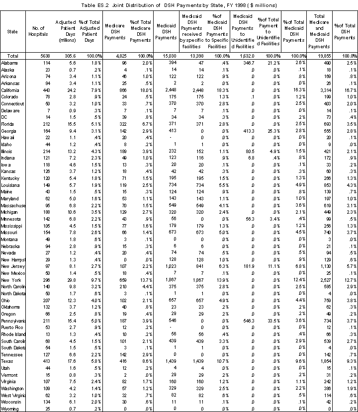
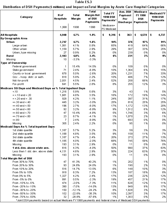
In Table ES.3, we summarize the distribution of DSH payments to the acute care hospitals in our analysis file by hospital characteristics. For the Medicaid component of the DSH payment, we have used only the federal share of DSH payments.
- Across all hospitals, the joint DSH payments raise total margins from 1.9% to 4.7%.
- State and county-owned hospitals receive 13% of Medicare DSH payments and 48% of Medicaid payments.
- Using Medicare SSI and Medicaid days as the measure of low-income patients, 50% of Medicare payments and 64% of Medicaid payments are to hospitals with at least 30% low- income patients. Except for the highest categories, the average DSH payment per discharge increases as the percentage of low-income patients increases.
- 37% of Medicare DSH payments and 63% of Medicaid payments are to hospitals with a Medicaid utilization rate that is above one standard deviation from the state average. The average DSH payment per discharge increases by hospital quartile (the first quartile is the lowest quartile of acute care hospitals in the state based on Medicaid utilization).
- Generally, the average DSH payment per discharge increases as hospital margins decline. The exceptions are the hospital classes with the highest and lowest margins.
- About 53% of Medicare DSH payments and 24% of Medicaid payments went to hospitals that had positive margins prior to taking DSH payments into account.
Exploratory Analyses Using National HCUP Data
As noted earlier, data were not available that allowed us to examine alternative allocation policies with a national set of hospitals. Using the hospitals that are represented in the HCUP national sample that we were able to link with hospital-specific Medicaid DSH payments (100% inpatient claims from a 20% sample of hospitals in 15 states), we examined the relationship between key low-income patient measures that could be used in an allocation formula (e.g. proportion of days, discharges, and revenues and case-mix index including/excluding Medicare SSI patients). The degree of correlation between the measures can be used to predict whether the choice of the measure (utilization or revenue) used to describe hospital’s low-income patients is likely to have a significant effect on the distribution of funds. We were able to evaluate only inpatient utilization and gross revenue low-income patient measures with the HCUP data. The HCUP does not have outpatient data or the uncompensated care data needed to measure financial risk.
There are several findings from our HCUP analysis that have import in designing a DSH allocation policy. First, in defining safety net hospitals, it appears that the choice of patient population to be included in the allocation statistic (e.g. with or without Medicare SSI beneficiaries) is more important than how care provided to those patients is quantified. It may not be administratively feasible to take into consideration all low- income patients. A hospital’s proportion of low-income days is more highly correlated with its proportion of Medicaid days than either its proportion of Medicare SSI and Medicaid patients or its Medicare DSH patient percentage.
The different measures quantifying the amount of care provided to a low-income population (days, discharges, or charges) are highly correlated with each other. However, the choice could have implications for certain hospitals. Those with a high volume of Medicaid maternity cases or shorter than average length of stay (e.g. California hospitals) would benefit if discharges were used instead of days as the measure of the proportion of care provided to low-income patients.
Neither the current DSH allocation policies nor the alternatives that we examined target DSH payments to safety net hospitals in a way that is strongly correlated with net income.3 However, the current DSH policies are more highly correlated than the alternatives that we examined. For example, the correlation between the joint DSH payments to safety net hospitals and their net income was -.48 compared to only -.17 for an allocation policy based on non-Medicare low-income patient days with a wage-index adjustment.
3. For this purpose, safety net hospitals were defined as acute care hospitals with at least 20 percent inpatient days attributable to low-income patients.
Three State Analysis of Alternative DSH Policies
By linking inpatient claims and financial data for the hospitals in California, New York, and Wisconsin, we were able to:
- Trace the actual distribution of “new” Medicaid DSH payments.
- Assess how well the claims-generated measures of low-income patients correspond to measures generated from financial data (e.g. proportion of self-pay and no-charge patients relative to bad debt and uncompensated care costs); and,
- Compare how well the current and alternative DSH allocation policies target financially vulnerable safety net hospitals. In this regard, we were able to examine how funds might be redistributed across classes of hospitals, but because only three states were involved, we could not estimate the redistributions that might occur across states under the different alternatives.
The findings from the three state analysis indicate that an across-the-board assumption regarding “new” DSH funds such as that used in Table ES.3 is not borne out at the hospital level. In California, intergovernmental transfers from county-owned hospitals and the University of California clinics financed over 56 percent of total DSH payments; $936.3 million of $2,153.8 million reported in DSH payments were “new” DSH funds. In New York, the hospital inpatient assessment contributed 13% of the funds to support the indigent care pool, with the remaining coming from payer contributions; $1,169.5 of the $1,350.5 million in DSH payments received by New York hospitals was “new” money. All DSH funds received by Wisconsin hospitals were “new” ($11.2 million).
When we examined the relationship between financial risk as a percentage of operating expenses and the percentage of care provided to low-income patients (Table ES.4), we found only a modest correlation. Consistent with the HCUP findings, there was a stronger correlation between the low-income patient utilization and revenue measures.
| Ratio of FR to Operating Expenses | % Low-income days | % Low-income revenue | % Non-Medicare low-income days | % Non-Medicare low-income revenue | |
|---|---|---|---|---|---|
| MEAN | 0.077 | 0.256 | 0.246 | 0.210 | 0.212 |
| STD | 0.071 | 0.184 | 0.178 | 0.169 | 0.166 |
| N hospitals | 614 | 614 | 614 | 614 | 614 |
| Pearson’s Correlation Coefficient** | |||||
| Ratio of FR to Operating Expenses | 1.000 | 0.567 | 0.591 | 0.560 | 0.579 |
| % Low-income days | 1.000 | 0.826 | 0.979 | 0.786 | |
| % Low-income revenue | 1.000 | 0.811 | 0.984 | ||
| % Non-Medicare low-income days | 1.000 | 0.803 | |||
| % Non-Medicare low-income revenue | 1.000 | ||||
**all values p<.0001
Finally, we examined the relationship between the DSH allocations, financial risk and the hospital’s income net of DSH. We expected to find a negative correlation between the hospital’s ratio of revenues (net of DSH) to expenses and its ratio of financial risk to operating cost; that is, hospitals with high financial risk have more difficulty generating revenues to cover their expenses. While the correlation was in the expected direction, it was modest (-.407). The correlation was -.302 between the DSH funds a hospital receives under current Medicare and Medicaid policies and its ratio of revenues to expenses. When the analysis is limited to the 307 safety net hospitals in the three states (Table ES.5), the correlation between net income and current DSH funding policies is stronger for current DSH policies than alternative policies.
| Income net DSH ($ mill) | Financial risk ($ mill) |
Joint DSH funds ($ mill) |
Medicaid New DSH ($ mill) |
Medicare DSH ($ mill) |
Sim A ($ mill) |
Sim B ($ mill) |
Sim C ($ mill) |
|
|---|---|---|---|---|---|---|---|---|
| MEAN | -8.351 | 12.025 | 8.568 | 4.752 | 3.816 | 8.917 | 8.349 | 8.265 |
| STD | 26.222 | 19.924 | 16.025 | 13.784 | 4.902 | 17.778 | 18.361 | 15.532 |
| N | 307 | 307 | 307 | 307 | 307 | 307 | 307 | 307 |
| Pearson’s Correlation Coefficient** | ||||||||
| Income net DSH | 1.00 | -0.57 | -0.52 | -0.41 | -0.52 | -0.24 | -0.29 | -0.44 |
| Financial risk | 1.00 | 0.74 | 0.64 | 0.63 | 0.73 | 0.73 | 0.83 | |
| Joint DSH funds | 1.00 | 0.96 | 0.58 | 0.80 | 0.81 | 0.78 | ||
| New Medicaid funds | 1.00 | 0.31 | 0.79 | 0.81 | 0.77 | |||
| Current law Medicare funds | 1.00 | 0.40 | 0.35 | 0.40 | ||||
| Sim A: % Non-Medicare low-income days w/WI | 1.00 | 0.96 | 0.81 | |||||
| Sim B: % Non-Medicare low-income revenues | 1.00 | 0.85 | ||||||
| Sim C: Financial risk | 1.00 | |||||||
** All values p<.0001
The mean DSH payments reported in Table ES.5 pertain to safety net hospitals only, which are defined for purposes of this analysis as hospitals with at least 20 percent of their inpatient days attributable to low-income patients. The baseline used in the simulations totaled $2,748 billion across all three states. If all DSH funds had been distributed to safety net hospitals, a hospital would have received on average $8.951 million.4 The difference between this amount and the mean payment in each simulation is accounted for by DSH funds distributed to hospitals with less than 20 percent of their inpatient days attributable to low-income patients. The differences between Simulation A and Simulation B highlight the differences between allocations based solely on inpatient care and allocations that take into account both inpatient and outpatient care. Including all care only slightly improves the targeting of DSH funds to financially vulnerable safety net hospitals. Simulation C allocates funds based on financial risk.
4. The baseline for the simulations was current law Medicare and the federal share of DSH payments.
Summary of Findings and Conclusions
Overall, we found that despite the known issues with the current Medicare and Medicaid DSH policies, the current distribution targets financially vulnerable safety net hospitals at least as well as the alternatives that we examined. The multiple Medicare formula and the flexibility of the Medicaid program may allow for better targeting than a single formula-driven allocation policy. Nevertheless, it is clear that there is room for improvement in the current policies and that further study is warranted. In particular, a multi-variate analysis of the factors affecting financial risk and financial viability is needed. Ideally, the analysis would involve a national database with information on each hospital’s uncompensated care and shortfalls from Medicaid and local indigent care programs. Given the diversity of the Medicaid DSH program, a national database is needed to fully understand the potential impact of alternative allocation policies at both the national and market levels.
Criteria to Measure Care Provided to Low-Income Patients. We explored several types of criteria that could be used to identify safety net hospitals, including inpatient claims-based measures and measures derived from hospital financial data. Our analyses suggest that how the patient population (e.g., with or without Medicare SSI beneficiaries) is defined in the DSH allocation statistic is more important than how the care provided to those patients is quantified (e.g. days, discharges, revenues). Measures that included Medicare SSI beneficiaries along with all other low-income patients generally performed better than those that did not in targeting financially vulnerable hospitals.
The different measures quantifying the amount of inpatient care provided to a low-income population (days, discharges, or charges) are highly correlated. However, the choice could have implications for certain hospitals. Those which have a high volume of Medicaid maternity cases or shorter than average length of stay (e.g. California hospitals) would benefit if discharges were used instead of days as the measure of the proportion of care provided to low-income patients. The Medicare case mix index is not a good proxy for the hospital’s low-income patient case mix. In the absence of data on the case mix of low-income patients, days or charges should be used instead of discharges as the allocation statistic.
From the financial data for the three states we were able to compare how a revenue statistic that includes both inpatient and outpatient care compares to one that includes inpatient care only. The correlation between low-income days and low-income total (inpatient and outpatient) revenues was .811, which indicates the choice of measure could have significant implications for some hospitals. The measure of the proportion of a hospital’s gross revenues that is attributable to low-income patients was slightly more correlated with the hospital’s ratio of financial risk to operating expenses (.591) than the other utilization measures. However, it is not clear from the correlation results that including all care significantly improves the targeting of DSH funds to financially vulnerable safety net hospitals. Also, the inclusion of outpatient care raises issues regarding subsidies to other ambulatory care providers. A policy that concentrates federal support for uncompensated care solely on hospitals may serve to discourage community providers from furnishing substantial amounts of care to indigent populations. It may also have implications for the relative generosity of Medicaid payments for services provided in hospital outpatient departments and clinics and in physician offices.
Evaluation of Alternative Allocation Policies. Neither the current DSH allocation policies nor the alternatives that we examined in the analysis target DSH payments in a way that is strongly correlated with net income. This is an issue that warrants further investigation and understanding. The different Medicare formulae and the Medicaid DSH program’s flexibility may provide mechanisms to target financially vulnerable hospitals in a way that a single formula-driven allocation may not. Targeting financially vulnerable safety net hospitals may require taking into consideration more factors than the amount of care a hospital provides to low-income patients. A multi-variate analysis of the factors affecting a hospital’s financial risk and its overall financial status using a broader set of hospitals could help identify additional factors that should be considered in an allocation policy.
Allocations based on the proportion of care provided to low-income patients (e.g. revenues) result in very different distributions than an allocation based on financial risk (Medicaid shortfalls, uncompensated care and bad debt). Financial risk, however, is not the same as financial viability (i.e., total margins net of DSH payments). Some hospitals with substantial financial risk also have positive margins. The simulations highlighted the need to clarify the policy goals for DSH funding. The key issue is the extent to which subsidies should be given to hospitals that serve low-income patients but do not incur financial risk or are able to cover their risk with other revenues. A closer examination of the hospitals with substantial gains or losses in moving from an allocation policy based on serving low-income patients to one based on incurring financial risk might help clarify the issues. This examination should consider the role of other federal subsidies such as the Medicare indirect teaching adjustment in explaining why some hospitals with substantial financial risk appear to be in a strong financial position.
Data Issues and Limitations. Examining the relationship between the financial status of hospitals and the distribution of DSH payments was a complex task. Particular areas where data issues became potentially problematic included:
- Matching hospitals across multiple data sources: Medicare cost reports, state DSH reports, AHA survey data, HCUP, and (in the case of California, New York and Wisconsin) state financial reports. The inclusion of Medicare provider numbers on the state DSH reports would facilitate matching hospitals with their DSH payments. Universal adoption of the uniform provider number would also help.
- For Medicaid DSH, the net gains to the hospital are more important than the reported DSH payments. CMS should give consideration to obtaining this information. It could be included in the state reports on DSH payments (in which case the information would be available for all hospitals) or it could be required as part of the Medicare cost report. Even knowing the net DSH payments to individual hospitals is not enough; it is also important to know how DSH payments (and any provider contributions) are handled in reporting Medicaid contractual allowances and patient revenues.
- The differences in state accounting and reporting practices made it difficult to determine Medicaid shortfalls and to take “new” DSH payments into account. The financial data for several public hospitals was problematic. It is important to understand how financing occurs for county-owned hospitals in terms of other intergovernmental transfers and deficit funding. An allocation based on financial measures would require uniform reporting by payer.
The “snapshot” approach of looking at one year’s data may not be sufficient for an adequate understanding of the financial implications of serving low-income patients. In California, the FY1998 payments included payments from the state’s fiscal year 1997 and thus overstated average DSH payments. The New York indigent care pool was in transition during FY1998 and additional changes were enacted in 2000. Wisconsin’s uncompensated care costs have increased 60 percent since 1997. Only the first-year impacts of the Balanced Budget Amendment are reflected in the FY1998 data. These considerations suggest that a multi-year study- perhaps with periodic updating- would be appropriate.
Even more troubling than using one year’s data is the lack of a national database that provides uniform information on the quantity of care provided to low-income patients and the financial risk associated with that care. The BBRA provision requiring the Secretary to collect through the Medicare cost report data on uncompensated costs should help. This provision is effective for cost reporting periods beginning on or after October 1, 2001.
Areas for Additional Research
Absent a national database with uncompensated care data and other information needed to develop measures of financial risk, three areas of investigation could be pursued that would provide valuable information related to federal support for hospitals that provide a disproportionate share of care to poor patients.
Update the analysis of the current distribution of DSH payments and expand the in-depth state analyses to include additional states that require hospitals to report uncompensated care information.
- Examine market-level issues related to DSH funding such as how the low-income patient burden shared by the hospitals within a market area and whether it varies by type of payer and type of service.
- Investigate the characteristics of hospitals with large indigent care loads that incur substantial financial risk yet are financially viable. This would include looking at the impact of state and local indigent care programs and other subsidies such as Medicare’s indirect teaching adjustment.
A national database is needed to fully understand the potential impact of alternative allocation policies at both the national and market levels. Having the national database would facilitate:
- A multi-variate analysis of the factors affecting a hospital’s financial risk and its overall financial status using a broader set of hospitals could help identify additional factors that should be considered in an allocation policy.
- An evaluationof inter-state redistributions that would occur under alternative DSH financing policies, including the types of policies examined in this paper as well as additional ones that would take into account a state’s ability to finance indigent care and/or market-level factors.
1. Overview of DSH Funding Policies
Medicare DSH Payments
Evolution of Medicare DSH Policies
Until enactment of the Social Security Amendments of 1983, Medicare payments for hospital inpatient services were based on the costs incurred by the hospital. The amendments created the hospital inpatient prospective payment system (PPS), under which acute care hospitals were paid a fixed rate for the operating costs incurred in treating patients in each diagnosis-related group (DRG). 1 Payment rates were adjusted to reflect several factors thought to affect a hospital's cost structure, including local wages and the intensity of residency training.
The PPS legislation included a provision that allowed for "such exceptions and adjustments to the payment amounts...as the Secretary (of Health and Human Services) deems appropriate to take into account the special needs of public or other hospitals that serve a significantly disproportionate number of patients who have low income." The accompanying legislative history notes that "(c)oncern has been expressed that public hospitals and other hospitals that serve such patients may...[treat patients that are] more severely ill than average and that the DRG payment system may not adequately take into account such factors" (U.S. Congress, 1983). Nevertheless, the PPS that was implemented beginning in October 1983 did not include an adjustment for serving a disproportionate share of low-income patients.
The Consolidated Omnibus Budget Reconciliation Act of 1985 (COBRA) established an adjustment that was based on the hospital's disproportionate patient percentage (DPP), with different formulas for urban hospitals with at least 100 beds, other urban hospitals, and rural hospitals. The DPP was defined as the sum of:
- the percentage of the hospital's total Medicare patient days attributable to Medicare patients who also are federal Supplemental Security Income (SSI) beneficiaries (excluding state supplement only beneficiaries), and
- the percentage of the hospital's total patient days attributable to Medicaid beneficiaries (excluding Medicare beneficiaries).
The construction of this variable was an attempt to balance the distribution of payments between those hospitals located in states with generous Medicaid programs and those with more restrictive eligibility criteria and benefits. There also was a separate provision for certain urban hospitals with at least 100 beds that could demonstrate that more than 30 percent of net inpatient care revenue was provided by state or local government for the inpatient care of low income patients not reimbursed by Medicare or Medicaid.2 The Medicare DSH provision went into effect on a temporary basis in May 1986, and it was extended several times until it was made permanent in the Omnibus Budget Reconciliation Act (OBRA) of 1990.
1. In fiscal years 1984 through 1991, the hospital inpatient PPS applied only to operating costs; capital costs continued to be paid on a reasonable cost basis (with reductions beginning in fiscal year 1987) until FY 1992.
2. Hospitals meeting this criterion are called "Pickle hospitals", after Congressman Pickle of Texas, who sponsored the provision.
Recent Changes in Medicare DSH Policies
The eligibility criteria and formulae for determining Medicare DSH payments for operating costs have changed over time to include more hospitals and (except for the temporary reductions in the Balanced Budget Act of 1997 (BBA)) to provide more generous payment levels. As a result, DSH payments have grown considerably over the last decade. In fiscal year 1989, Medicare DSH payments were an estimated $1.1 billion. By 1992, these payments had doubled to $2.2 billion, and they had more than doubled again to $4.5 billion by 1997.3 Along with most other components of Medicare payments, the Balanced Budget Act of 1997 (BBA) reduced DSH payments: beginning in 1998, there was to be a progressively increasing across-the-board reduction, reaching 5 percent by 2002. These cuts were estimated to total $0.6 billion over the five years. Subsequently, the Balanced Budget Refinement Act of 1999 (BBRA) and the Benefits and Improvement Act of 2000 (BIPA) restored a portion of the BBA cuts. Under current law, there were temporary across-the-board reductions of 2 percent in FY2001 and 3 percent in FY2002.
Under the PPS for operating costs, the payment formulae vary across types of hospitals. Until BIPA, the minimum DPP or threshold for DSH payments also varied. The BIPA enhanced DSH payments to rural and small urban hospitals by establishing a uniform threshold for eligibility to receive DSH payments and making changes in the payment formulae. The policies for determining DSH payments in FY1998 and under current law are shown in Table 1.1.
| Operating DSH Payments: FY1998 Rules | |||
|---|---|---|---|
| Minimum DPP | Type of Hospital | Basic Formula | |
| 15% | 1)urban with 100 or more beds; or 2) rural with 500 or more beds | If DPP => 20.2%: 5.88 % plus .82.5 (DPP- 20.2%) If DPP < 20.2 %: 2.5% plus .65 (DPP-15%) |
|
| 30% | RRC | 4% plus .60 (DPP- 30%) | |
| SCH | 10% | ||
| rural with 100-499 beds | 4% | ||
| 40% | urban with fewer than 100 beds | 5% | |
| 45% | rural with 100 or fewer beds | 4% | |
| "Pickle" hospital: urban with 100 or more beds and 30% revenues from state and local indigent care payments | 35% | ||
| Operating DSH Payments: Rules Effective 4/1/2001 | |||
| 15% | 1) urban with 100 or more beds; or 2) rural with 500 or more beds |
If DPP =>20.2%: 5.88 % plus .825(DPP-20.2%) If DPP < 20.2 %: 2.5% plus .65(DPP -15%) |
|
| SCH | If DPP=>30%: 5.25% plus .60(DPP-30%) If DPP < 30% and =>19.3%: 5.25% If DPP <19.3%: 2.5% plus .65(DPP-15%) |
||
| RRC | If DPP =>30%: 10 % If DPP < 30% and =>19.3%: 5.25% If DPP <19.3%: 2.5% plus .65(DPP-15%) |
||
| 1) Other rural with less than 500 beds; or 2) urban with less than 100 beds |
If DPP =>19.3%: 5.25 % If DPP <19.3%: 2.5% plus .65(DPP-15%) |
||
| All Hospitals | Temporary reductions in DSH amounts otherwise payable: FY 1998: 1 percent FY 1999: 2 percent FY 2000: 3 percent FY 2001: 2 percent FY 2002: 3 percent |
||
| Capital DSH Payments | |||
| None | Urban with 100 or more beds | [e raised to the power of (.2025 x DPP) - 1] Pickle hospitals are deemed to have DPP implicit in operating adjustment |
|
3. These estimates do not include DSH payments for capital costs but include the amounts implicit for DSH in managed care payments.
Purpose of Medicare DSH Payments
The Centers for Medicare and Medicaid Services (CMS, formerly the Health Care Financing Administration) has generally maintained that the DSH adjustment is intended to cover only the higher costs associated with the care of Medicare beneficiaries in hospitals serving a disproportionate share of low-income patients. For example, when the prospective payment system for capital costs was implemented in FY1992, the DSH adjustment was established administratively based on the estimated effect of the DPP on total inpatient costs per case and has no minimum threshold. On the other hand, the Medicare Payment Advisory Commission (MedPAC) (and its predecessor the Prospective Payment Assessment Commission (ProPAC)), views the DSH adjustment as a policy adjustment independent of hospital cost that is intended to assure access to care for low-income Medicare beneficiaries and other poor people.
Medicaid DSH Payments
Evolution of Medicaid DSH Policies
Until enactment of OBRA 1981, state Medicaid programs generally were required to pay for hospital inpatient services on a reasonable cost basis, as was done under Medicare. That legislation allowed states to adopt their own payment methodologies for hospital inpatient services so long as their payment rates reflected the costs "which must be incurred by efficiently and economically operated facilities." The legislation also required that state Medicaid programs set reimbursement rates for hospital inpatient services that "take into account the situation of hospitals which serve a disproportionate share of low-income patients with special needs."
The accompanying House Committee Report language refers to "the special costs of hospitals whose patient populations are disproportionately composed of individuals who are either provided medical assistance under the State plan or who have no source of third party payment for such services" (ProPAC, 1994). The report stipulates that:
In determining whether a hospital's Medicaid and 'free care' population is disproportionate, the Committee expects States to consider the proportion of such individuals in the hospital's patient population, compared to all hospitals in the area, as well as...a hospital's share of the total estimated number of such individuals in an area (ProPAC 1994).
In keeping with the federal/state partnership under Medicaid, the states were given considerable latitude in determining which hospitals were eligible for DSH payments and how those funds would be distributed.
During the early 1980s, very few states established specific DSH payment methodologies. By the fall of 1985, only 17 states had defined disproportionate share hospitals and specified methodologies for adjusting their Medicaid payments. In response to this situation, OBRA 1987 required states to make specific payment adjustments and established minimum criteria for designating and adjusting payment for inpatient services provided by disproportionate share hospitals. States were required to designate as disproportionate share hospitals all hospitals meeting one of the following criteria:
- a Medicaid inpatient utilization rate one standard deviation or more above the mean for all hospitals in the state, or
- a low-income utilization rate exceeding 25 percent.
States could designate other hospitals as disproportionate share hospitals as well.
In determining the amount of the DSH payment to eligible hospitals, states could use the Medicare formula or make an adjustment that increased proportionally with the hospital's Medicaid utilization rate. OBRA 1990 expanded the options for determining the DSH payment amounts. The proportional adjustment now applies to the hospital's low-income utilization rate rather than just its Medicaid utilization rate, and separate methodologies are allowed for different types of hospitals.
In the early 1990s, Medicaid DSH payments grew rapidly. This was the result of two developments.
- In 1983, the Health Care Financing Administration (HCFA) limited a state's aggregate Medicaid payments for inpatient hospital services to no more than the amount that would have been paid under Medicare payment policies. In OBRA 1986, however, this limit was made inapplicable to Medicaid DSH payments.
- In June 1989, a HCFA decision that states could not require or solicit contributions from providers for the purpose of obtaining federal matching funds was overturned in the courts. This provided a mechanism for states to generate additional federal matching funds without any net increases in their own budgets. Moreover, OBRA 1990 imposed a moratorium on any additional attempts to restrict states' use of provider-specific taxes or donations through December 1991.
With the removal of the Medicare limit for Medicaid DSH payments, the ability of the states to take advantage of this mechanism was virtually unbounded. DSH spending grew from less than $1 billion in fiscal year 1989 to more than $17 billion in 1992. The Medicaid Voluntary Contribution and Provider-Specific Tax Amendments of 1991 established conditions for allowable provider-specific taxes and donations and state-specific limits on DSH spending. OBRA 1993 further limited DSH payments for individual hospitals to the total of the hospital's Medicaid payment shortfall and its losses on uninsured patients (not counting government appropriations intended to cover those costs). It also required that hospitals designated for Medicaid DSH payments have a Medicaid utilization rate of at least one percent.
Recent Changes in Medicaid DSH Policies
The BBA contained several provisions that affected the amount and distribution of Medicaid DSH payments. To restrict the use of federal funds to finance care in state-owned institutions for mental disease (IMDs) (which traditionally were viewed as a state and local responsibility), the BBA limited the proportion of a state's DSH payments that could go to IMDs to 33 percent by fiscal year 2002.4
The BBA also reduced the state-specific federal DSH allotments by $10.4 billion between 1998 and 2002. After 2002, federal DSH expenditures are to increase at the nationwide general rate of inflation (all urban CPI), subject to a state-specific ceiling of 12 percent of the state's total Medicaid expenditures in each year (Coughlin, Ku, and Kim 2000). The BBRA later raised the Medicaid DSH ceilings for several states. The BIPA provided further relief by setting 2001 state-specific allotments at 2000 levels adjusted for inflation and setting 2002 allotments at 2001 levels adjusted for inflation. The allotments for states with extremely low DSH payments (defined as FY1999 expenditures greater than zero but less than one percent of total state expenditures) were increased to one percent in FY2001 and increased for inflation thereafter. Also, states were permitted to provide DSH payments up to 175 percent of net uncompensated care costs to public hospitals for two years.
4. The Medicaid statute defines an "institution for mental diseases" as a hospital, nursing facility, or other institution of more than 16 beds, that is primarily engaged in providing diagnosis, treatment, or care of persons with mental diseases, including medical attention, nursing care, and related services.
Issues Related to Distribution of DSH Funds
Concerns with Medicare Formula
In 1997, ProPAC identified several problems with the current method for distributing Medicare DSH payments (ProPAC 1997a):
- The DPP is a poor indicator of hospitals' care for the poor, particularly because it reflects only Medicaid and not uncompensated care. The changing role of the Medicaid program and the variations in this role across states makes Medicaid an increasingly inappropriate proxy for uncompensated care. Moreover, the omission of uncompensated care means that the leading source of financial pressure on safety net hospitals is not considered in the distribution of Medicare DSH payments.
- Because there are multiple DSH formulae, hospitals with the same share of low-income patients can have substantially different DSH payment adjustments. In particular, there was great disparity in the formulas for urban versus rural hospitals: for example, an urban hospital with 100 beds and a DPP of 25 percent received an adjustment of 9.72 percent, while a rural hospital of the same size with the same DPP received no adjustment (The BIPA partially addressed this concern.)
- Each DSH operating formula includes a minimum DPP threshold, below which the hospital receives no DSH payment and at which the hospital receives some minimum percentage. This sometimes creates a substantial "notch". For example, an urban hospital with 100 beds receives a 2.5 percent adjustment if its DPP is 15.0 percent, but nothing if its DPP is 14.9 percent.
ProPAC concluded that these problems prevented Medicare DSH payments from achieving their intended objectives and made several recommendations.
- Medicare DSH payments should be aimed at protecting access to care for its beneficiaries. Payments therefore should be distributed based on each hospital's share of low-income patient care and its volume of Medicare cases.
- The low-income share measure should reflect the costs of services provided to low-income patients in both inpatient and outpatient settings.
- In addition to Medicare SSI and Medicaid patients, the low-income share measure should include patients sponsored by other state and local indigent care programs as well as uninsured and underinsured patients represented by uncompensated care. This would eliminate disparities caused by differences in Medicaid eligibility rules across states.
- Medicare DSH payments should be concentrated among hospitals with the highest shares of low-income patients. Therefore, a minimum threshold should be established, but there should be no notch in the DSH formula.
- To eliminate the disparity between the payments received by urban and rural hospitals with the same proportion of low-income patients, the same general approach for distributing Medicare DSH payments should apply to all PPS hospitals.
- The Secretary should collect the data necessary to implement a revised Medicare DSH payment mechanism.
In succeeding years, the Medicare Payment Advisory Commission5 essentially reiterated ProPAC's recommendations (MedPAC 1998; MedPAC 1999, MedPAC 2001).
Drawing on work by ProPAC, the BBA required the Secretary of HHS to make recommendations to the Congress regarding a revised formula for DSH payments. The formula is to:
- establish a single threshold for hospitals serving low income patients;
- consider the costs incurred by hospitals in serving Medicare patients who are entitled to SSI; and,
- consider the costs incurred by hospitals in serving Medicaid patients who are not entitled to Medicare.
The Secretary's report to Congress has not been released. As indicated above, the BIPA included provisions to establish a single threshold for serving low income patients; however, the different payment formulae remain.
5. The commission was formed by merging ProPAC with the Physician Payment Review Commission in October 1997.
Concerns with Medicaid Distribution
There have been concerns about the distribution of Medicaid DSH funds as well. An early analysis by ProPAC found that "Medicaid DSH payments, in combination with state and local subsidies, played a crucial role in improving the financial status of hospitals with the highest shares of Medicaid patients and other low-income patients" (ProPAC 1994). However, the study also found that although "the increase in Medicaid payments was much more concentrated in hospitals with the largest shares of low-income patients...hospitals with typical (or low) shares of low-income patients … receive a substantial portion of both Medicare DSH payments and the increase in Medicaid payments." This led ProPAC to recommend several changes in the mechanism for distributing Medicaid DSH payments.
A subsequent study by Ku and Coughlin (1995) found that Medicaid DSH and related programs help support uncompensated care, but that only a small share of these funds were available to cover the costs of uncompensated care because of intergovernmental transfers and the amounts retained by the states . In a later re-examination of this issue after the BBA legislation aimed at addressing this issue had taken effect, Coughlin, Ku, and Kim (2000) found that an increasing share of the DSH gains was paid to local public and private hospitals and less was retained by the states. However, the use of DSH by the states remained highly uneven.
Impact of Managed Care
In addition to the policy issues raised regarding the policies used to distribute DSH funds, the growth of Medicare and Medicaid managed care has put pressure on safety net hospitals. Many states are relying on managed care to serve their Medicaid populations (and control costs). Between 1991 and 2000, the proportion of Medicaid beneficiaries enrolled in managed care plans mushroomed from less than 10 percent to 57 percent (Iglehart, 1999; Kaiser, 2002). Under Medicaid managed care, care is moving to the outpatient setting and to hospitals that are not traditional safety net providers. As a result, safety net hospitals may lose not only the patient care payments for former patrons who obtain their care in other settings or at other hospitals, but also a portion of the Medicare and Medicaid DSH payments that they would have received if they had retained those patients.
Medicare managed care growth also affects the flow of Medicare DSH funds to safety net hospitals.6 The number of Medicare inpatient discharges eligible for direct DSH payments decreases as the number of Medicare managed care enrollees increases. If the amounts implicit for DSH in the managed care capitated rates are not passed on by Medicare+Choice organizations, there is a decline in hospital revenues.7
6. Nationally, Medicare managed care enrollment grew rapidly from 3.3 percent in 1990 to 15.4 percent in 1998 (U.S. Congress, 1999) and then has declined slightly (KFF, 2002).
7. The BBA established effective January 1, 1998 a direct pass-though payment to teaching hospitals for indirect medical education costs attributable to Medicare managed care enrollees. There is no comparable provision for DSH payments.
Joint Distribution of Federal DSH Funds
State-reported information on DSH payments to individual hospitals permits for the first time a national examination of the joint distribution of Medicare and Medicaid funds and how well the funds are targeted toward vulnerable safety net hospitals. Our exploratory analyses of alternative allocation policies are within the context of using a single federal DSH funding mechanism. By assuming there would be a new funding stream to support financially vulnerable safety net hospitals, there is no need to link the funds to services provided to Medicare and Medicaid beneficiaries and there is greater flexibility to address the identified shortcomings of the current system. In the next chapter, we discuss potential criteria that could be used to identify hospitals that would be eligible to receive DSH funds and potential bases for determining how to distribute the funds to those hospitals through a separate funding mechanism.
2. A Policy Framework for Targeting Financially Vulnerable Safety Net Hospitals
Researchers, states and federal policymakers have used a broad range of definitions to characterize safety net hospitals. While the definitions vary, a common theme is that safety net hospitals provide a disproportionate amount of care to vulnerable populations. However, how vulnerable, disproportionate, or care is defined varies greatly. To complicate matters, what constitutes a safety net hospital can vary from community to community (Baxter and Mechanic 1997). For example, in some communities, such as Dallas, a single public hospital is the heart of the local safety net. By contrast, in Milwaukee, which recently closed its public hospital, a few community hospitals form the safety net.
Which hospitals are ulti amately identified as safety net providers has important implications for evaluating whether DSH payments are well targeted: Is the purpose to help relieve hospitals financial burden of caring for low-income populations? Help hospitals in financial distress? Protect low-income Medicare and Medicaid recipients' access to care? Compensate hospitals for providing care to the uninsured? Help states and local governments in areas with high levels of need? Encourage selected hospital behavior suchs providing special services — teaching, emergency room care, trauma care and the like? Or, perhaps, the purpose is some combination of these. The definition of safety net hospital that is adopted has direct implications for which facilities would receive money under a federal DSH fund.
What Is a Safety Net Hospital?
Below we highlight some of the key dimensions to describing a safety net hospital and how researchers and policymakers have defined safety net hospitals. A summary of these is provided in Table 2.1.
|
Dimension |
Research and Policy Definitions |
|---|---|
| Legal Mandate or Mission |
|
| Vulnerable Populations |
|
| Disproportionate Amount of Care | Volume of care:
Type of care: |
| Level of Aggregation |
|
1. Low income use rate is the sum of two ratios. The first is the share of the hospital's total revenue for patient services that are paid by Medicaid or state/local subsidies. The second is the percent of total hospital charges for inpatient services accounted for by the net (of state and local subsidies for inpatient care) amount of charity care provided to inpatients.
Legal Mandate or Mission
Perhaps the most basic definition of a safety net hospital is one that has an "open door" policy to all individuals regardless of their ability to pay. This policy can derive from either a legal mandate to care for charity patients or a mission-driven commitment to such patients. In general, researchers and policymakers have not used this definition alone to identify safety net hospitals. Instead, the legal mandate or mission definition is typically used in combination with other characteristics. For example, in the Clinton health care proposal, safety net hospitals were defined as those hospitals that were legally mandated (mission-driven hospitals were not included) to provide care and were located in areas with high levels of need such as health professional shortage areas (HPSAs). Gaskin and Hadley (1999) classified safety net hospitals as those that have an explicit safety net mission or a high proportion of low-income patients — Medicaid, charity care, or self-pay patients.
Vulnerable Populations
An important distinction of safety net hospitals is that they provide care to vulnerable populations. Unfortunately, there is no general agreement on which groups should be considered vulnerable. The Institute of Medicine's recent report, America's Health Care Safety Net, adopted a broad definition of vulnerable populations--including the "uninsured, Medicaid and other vulnerable patients" (IOM 2000). The other vulnerable groups included homeless persons, persons with HIV, substance abusers, and the mentally ill.
A big issue is whether low-income patients with insurance should be included in the definition of vulnerable. Some argue that vulnerable should be limited to indigent, uninsured patients whereas others argue that Medicaid patients should be considered a vulnerable population (IOM, 2000). The principal argument for excluding low-income Medicare patients (i.e., those that are entitled to SSI) and Medicaid patients is that they have insurance and thus have access to the health care system. The uninsured, by contrast, have no insurance, and generally have very limited ability to pay for their care. The arguments for counting Medicaid patients as a vulnerable population is that, despite having insurance, Medicaid patients often have trouble gaining access to health care services because of the historically low program payment rates. Further, their low-income and complex health care needs make them a vulnerable population. Moreover, including Medicaid patients improves the geographic balance between states that have expansive Medicaid programs and those that do not.
Reflecting its status as a federal health insurance program, the Medicare DSH formula takes into account low-income patients covered by Medicaid as well as Medicare. Hospitals get no credit for serving patients covered by other indigent care programs or the uninsured. Owing to the flexibility provided by Medicaid statute, Medicaid state DSH programs vary greatly, both in terms of how hospitals are determined eligible for payments and how payments are allocated among qualifying hospitals. Colorado, for example, largely relies on the federal minimum definition for identifying DSH hospitals. For payment, they use a range of methods including a proportional payment that varies by how the hospital qualifies for DSH. They also have a special program that makes DSH payments based on the facilities proportional level of services provided to the beneficiaries of the Colorado Indigent Care Program, a state-funded program that provides health care services to low-income persons who do not qualify for Medicaid. Florida operates six DSH programs each using different eligibility criteria. One program pays DSH payments to hospitals that provide inpatient services to high cost Medicaid beneficiaries. Another program provides DSH funds based on the number of inpatient admissions referred from county health departments for treatment of communicable disease. Similarly, Massachusetts has several DSH programs that use a range of criteria to issue payments including the volume of hospital services provided to low-income unemployed persons, low- income children, and low-income disabled individuals.
Disproportionate Amount of Care
Another distinguishing feature of safety net hospitals is that they provide a disproportionate amount of care to vulnerable populations. Several definitions have been used to quantify the amount of care. A key issue is whether it should be based on the volume of care provided to vulnerable populations or the uncompensated cost of that care. While the Medicare and Medicaid DSH programs identify a safety net hospital primarily on the volume of low-income patients it serves, another common strategy, especially in the research literature, is to designate safety net hospitals by their level of uncompensated care costs--that is, the costs of charity care and bad debt.
Measures that rely on revenue data or uncompensated care costs have potential for inaccurate reporting and "gaming". For example, MedPAC found that some hospitals include care not covered by Medicaid as bad debt expense (MedPAC 1998) even though contractual allowances are not bad debt. It is possible data based on gross revenues (such as percentage of gross charges attributable to low-income patients) or utilization (such as the percentage of inpatient days and outpatient visits that are attributable to low-income patients or to the uninsured) may provide better defined measures of serving vulnerable populations. We discuss potential measures of financial vulnerability in greater detail in the next section.
A second issue is how to decide whether the care to vulnerable populations is disproportionate to that provided by other hospitals. Medicare's policies establish a minimum DSH patient percentage threshold that hospitals must meet in order to become eligible for DSH payments under the PPS for operating costs. MedPAC recommends that a threshold be set so that between 50-60 percent of hospitals would qualify for DSH payments. The Medicaid law requires that at a minimum States designate as disproportionate share hospitals all hospitals meeting one of the following criteria: a Medicaid inpatient utilization rate one standard deviation or more above the mean for all hospitals in the state, or a low-income utilization rate exceeding 25 percent.
Researchers have tended to focus on a more limited set of hospitals with relatively high uncompensated care costs. For example, Baxter and Mechanic (1997) identified hospitals in the top decile of hospitals providing the most bad debt and charity care in a given community as safety net providers. In another study, safety net hospitals were defined as those with the highest (the top 10 percent of hospitals) level of uncompensated care costs relative to operating costs (Fishman 1997). Others have defined safety net hospitals as those that provide high levels of uncompensated care--10 percent or more--relative to a hospital's total costs (Cunningham and Tu 1997).
Specialized Care
Researchers have also identified safety net hospitals as those that provide selected types of services such as emergency room care or trauma care. Here, the argument is that safety net hospitals often provide services that are either too expensive for other hospitals to provide, unprofitable, or attract patients that may be considered undesirable and thus should be compensated (Gage 1998; Gaskin 1998). In addition, targeting DSH payments based on the provision of selected services may be a way to encourage hospitals to provide such services that they may have not provided otherwise or to continue to operate in an area that they might not otherwise (ProPAC 1994). Baxter and Mechanic, for example, used emergency room used as indicator of hospitals' safety net role (Baxter and Mechanic 1997). Specifically, they examined hospitals that provided the top 10 percent of emergency room visits in a given market. A common element in several states' DSH programs is targeting payments to selected facilities such as children's hospitals or hospitals located in medically underserved areas. Similarly, the Medicare DSH program gives special consideration to the market a hospital operates in--for example, rural referral centers and sole community hospitals.
Level of Aggregation
Another dimension to defining which hospitals are safety net providers is the market context. That is, do you compare hospitals nationally, as the Medicare DSH formula does? Or, do you look at the relative contribution of providers at the state level? Or at the market level? And, if it is at the market level, how do you define the market?
How Should Financial Vulnerability Be Defined?
Developing and evaluating alternative methods for distributing Medicare and Medicaid DSH payments requires measures of the financial pressure faced by each safety net hospital. The measures serve two potential purposes. First, one or more of them could be used as an explicit factor in allocating funds to safety net hospitals. The measures most appropriate for this purpose would be those that are directly related to serving low-income populations such as uncompensated care. Second, more general measures such as a hospital's margin could be used to evaluate how well the DSH allocation policy targets financially vulnerable safety net hospitals without being explicitly incorporated into the allocation formula.
Measures related to serving low-income populations
In the preceding section, we discussed potential measures to identify hospitals that serve vulnerable populations. These measures do not necessarily equate to measures of financial vulnerability. Providing services to Medicare beneficiaries who are entitled to SSI threatens a hospital's financial viability only if there is a higher cost to serving these patients than other patients that is not recognized in the payment rates (which the Medicare DSH adjustment was originally intended to address). Financial viability is also threatened if the overall payment rates under the program are inadequate to cover the costs of providing services. However, if there are no revenue shortfalls, serving Medicare/SSI beneficiaries does not add to a hospital's financial vulnerability. Thus, factors that are used to determine whether a hospital serves vulnerable populations are not necessarily measures of financial vulnerability.
Uncompensated Care
A hospital's uncompensated care load contributes to its financial vulnerability since the hospital must cover the costs of the care through other revenue. Measures of uncompensated care frequently include both charity care and bad debt. Since bad debt may result from irresponsible behavior on the part of non-poor patients, its inclusion in a financial vulnerability measure may discourage hospitals from pursuing collection from such patients. However, many hospitals do not distinguish between charity care, for which the patient is not expected to pay from the time of admission, and bad debt, for which the patient's liability for at least some portion of the bill is waived upon determination of the inability to pay. The fact that such decisions frequently wait until the patient's Medicaid eligibility is determined through the initial application process further complicates this distinction (ProPAC 1997). Moreover, a distinction may be unnecessary. One recent study of Massachusetts hospitals reported that most patients who incurred bad debt had incomes below the poverty line (Weismann et al 1999).
Medicaid Shortfalls
A hospital's Medicaid shortfall can also contribute to its financial vulnerability. A policy issue is whether using Medicaid contractual allowances in an allocation formula would distort both the distribution of payments and the incentives faced by the states. It would reward hospitals in states that have less expansive Medicaid programs and could provide an incentive for the states to reduce their Medicaid level of effort. A measurement issue is the extent to which the shortfall is attributable to the hospital's inefficiency as opposed to Medicaid payment levels. A measure of Medicaid utilization or share of gross revenues (MedPAC's recommended approach) rather than Medicaid shortfalls would address both issues. While this may be an appropriate allocation policy, it is the hospital's shortfalls from serving Medicaid patients that threatens its financial viability. Moreover, federal support is already being provided for the Medicaid population through the federal match. Thus, a measure of the Medicaid shortfall - either directly or indirectly through a measure of the generosity of the state's Medicaid program - should also be considered.
Shortfalls from state or local indigent care program
Shortfalls attributable to serving patients supported through state or local indigent care programs can also contribute to financial vulnerability. Information on these patients is generally not collected separately in national databases. The AHA survey includes patients supported by indigent care programs in the "other government" payer category, along with CHAMPUS, Title V and worker's compensation, and, in some states, state and local government health programs. In the absence of better data, MedPAC assumes that any losses a hospital reports for this category are attributable to indigent care patients (MedPAC 1998).
Other measures of financial vulnerability
Another issue is whether the hospital's overall financial condition should be taken into account in allocating DSH funds, e.g., whether operating losses- whether or not they are directly associated with serving low-income patients- should be considered in an allocation policy. Such measures may be more suitable for evaluating whether the payments are targeted toward the more financially vulnerable hospitals than as an allocation statistic.
A hospital's total revenue margin is the most commonly used measure of financial viability. This measure equals the difference between total net revenues and total expenses as a percentage of total net revenues. It is the most direct indicator of whether the hospital is able to cover its overall expenses with its overall revenues. Hospitals with very low total margins (including many safety net hospitals) find themselves without sufficient funds to pay off debt, increase capital assets, expand services, or finance social missions. A hospital's total margin includes its current subsidies for serving low- income populations. Since a critical question for targeting DSH payments is whether the hospital would be financially viable in the absence of those payments, the hospital's total margin net of DSH payments is a better measure of financial viability for purposes of identifying financially vulnerable safety net hospitals. Comparing total margin net of DSH to total margin including DSH subsidies under alternative DSH allocation methodologies provides an indication of how the hospital's financial viability would be affected assuming no behavioral changes occur in the services it provides or in the revenues it receives from Medicaid and other payers.
The literature suggests that margins alone should not be used to assess hospital financial viability. A hospital with positive margins may have inadequate liquid assets to meet its obligations. Negative margins may reflect changes in accounting rules or a decision to write-off a large expense over a period of years rather than financial distress (Bazzoli 1995). In addition to profitability, an assessment of financial viability should consider liquidity (the ability to pay bills), capital structure (the ability to pay long-term debt), and asset efficiency (how well assets are used in generation of revenues) (Bazzoli 1995; AHA 1998; Zeller 1997). Other factors that have been identified as important indicators of financial condition are working capital efficiency, fixed-asset age, and Medicare case mix index (Prince 1998; Zeller 1997). It is not necessary to use all financial measures in assessing a hospital's financial viability since many of the financial measures are highly correlated (Zeller 1997). Factor analysis has been used to identify the measures or measure sets that are most important in describing a hospital's financial condition (Bazzoli 1995; Zeller 1997).
We note that an advisory panel convened by the American Hospital Association (AHA) felt that both financial and non-financial factors are important considerations in assessing the on-going viability of hospitals (AHA 1998). The panel suggested that bond ratings have value as a leading indicator of financial viability because they take both types of factors into consideration. However, not all hospitals have a bond rating and the ratings include subjective "risk aversion" considerations.2
(Reflecting a tightening of standards, current "BBB" ratings have financial ratios comparable to "A" ratings of several years ago (CHIPS, 2000)). Moreover, there are administrative advantages to using indicators that can be readily generated on an on-going basis from Medicare cost report data.
2. Alternative approaches to using bond ratings as a direct measurement of financial viability would be to draw on research using statistical models to predict bond ratings or to use the financial data on hospitals with poor bond ratings to define financially distressed hospitals. For example, Bazzoli (1995) used the financial ratios for hospitals with BBB- bond ratings from Standard and Poor's to identify a set of financially distressed hospitals (those hospitals that had at least 6 of 8 financial indicators below the median values for the BBB-hospitals).
Policy Issues
The literature concerning safety net hospitals and the current policies for Medicare and Medicaid DSH payments suggest a set of policy issues related to the distribution of DSH funds.
- To what extent should DSH funds be targeted on core safety net providers that are financially vulnerable? Should hospitals that are able to cover losses attributable to uncompensated care and Medicaid shortfalls receive subsidies? Some hospitals that provide a substantial volume of services to low- income patient populations are not financially vulnerable because they are able to generate sufficient revenue (in the absence of government subsidies) to cross-subsidize the cost of caring for low- income patients.
- How can the allocation policy be structured to maintain or enhance level of effort regarding Medicaid eligibility and reimbursement rates as well as programs to subsidize care provided to the uninsured?
- Should a threshold be used to target DSH payments on those hospitals that serve as core safety net hospitals? What are the implications for communities where caring for the uninsured is shared across hospitals relative to those where it is concentrated in a few hospitals?
Underlying these major policy issues are empirical questions regarding the sensitivity of the allocations to different measures that could be used to define financially vulnerable safety net hospitals. These questions are important in understanding the impact the policy choices could have on the distribution of DSH funds to particular hospitals and identifying those choices where administrative preferences for readily available measures would have little practical effect on the distributions. In the remainder of this report, we examine the current distribution of DSH across classes of hospitals and analyze how different measures of financially vulnerable safety net hospitals would affect 1) the set of hospitals eligible to receive federal subsidies and 2) the distribution of funds among those hospitals.
3. Hospital Data Set
In this chapter, we provide a general overview of data sources and variables used in our analyses. We used the data set to support the following analytic tasks:
- determine the current distribution of Medicare and Medicaid DSH expenditures at the individual hospital level and by key hospital characteristics;
- assess alternative definitions of safety net providers;
- evaluate alternative measures of financial vulnerability; and,
- determine how well the current policies and alternative allocation policies target financially vulnerable safety net hospitals. The alternative allocation policies are based on:
- utilization data;
- revenue data; and,
- uncompensated care and other cost data.
Ideally, all required data would be available for all hospitals across the country for the same time period. Substantial information on individual hospital characteristics is available from the national sources discussed below. However, some utilization and financial data that are needed to measure hospital services to low-income populations (or at least the resources devoted to Medicaid patients and self-pay patients) are not directly available. Detailed inpatient utilization data on self-pay patients are available only for the 20 percent sample of hospitals from the 24 states included in the Hospital Cost and Utilization Project (HCUP) database. Much of the needed information on revenues by payer and on uncompensated care is collected in the American Hospital Association (AHA)'s Annual Survey, but confidentiality considerations preclude using that information for detailed exploratory analyses requiring hospital-level information. Thus, we supplemented the available national data with the HCUP national sample and detailed claims and financial data from three states: California, New York, and Wisconsin.
National Databases
Medicare Cost Reports
A Medicare cost report is submitted by each Medicare participating hospital based on the hospital's own fiscal year.1 The Centers for Medicare and Medicaid Services (CMS) makes selected data from the Hospital Cost Report Information System (HCRIS) available as a public use file. This file contains data on utilization (Medicare, Medicaid, and total), Medicare costs and payments, total costs and charges for routine, ancillary and outpatient services, and data from the hospital's financial statement. These data have been used to describe the relationship of Medicare payments and costs for categories of hospital services covered by different payment systems, hospital cost patterns and trends, and overall hospital financial status.
The data from the financial statements are generally less reliable than data elements used for payment purposes. The instructions indicate that the worksheets should be prepared from the hospital's accounting books and records and do not provide specific line item definitions. The fields are normally not audited; however, adoption of a later filing date for certified cost reports may have improved the quality of the financial data in recent years. The cost report data are updated quarterly by CMS.
The cost report has inpatient utilization statistics for Medicare and Medicaid patients (discharges, days) but not for self-pay or charity care patients. Utilization statistics are not collected for outpatient visits. There is no information on revenues by payer class (other than Medicare charges). The only cost information is for Medicare patients and all patients. No information is collected on charity care.2
The financial data cannot be used in its current form to determine uncompensated care costs but can be used to establish overall measures of financial viability.3
In addition, the cost report data can be used to develop cost-to-charge ratios for inpatient services that can be applied to hospital charges to estimate the cost of providing services.
1. Medicare allows low-Medicare utilization hospitals such as children's hospitals to file low-volume reports that do not contain all the cost information required for the full cost report.
2. Under Medicare rules, bad debts, charity, and courtesy allowances are deductions from revenue and are not an allowable costs; however, bad debts attributable to the deductibles and coinsurance amounts for Medicare beneficiaries are reimbursable at 70% (effective in 2001 as a result of the BIPA restoration of BBA reductions).
3. In the future, data on uncompensated care costs should be available through the Medicare cost report. The BBRA requires the Secretary to collect through the cost report data on costs incurred by acute care hospitals in providing inpatient and outpatient hospital services for which the hospital is not compensated, including non-Medicare bad debt, charity care, and charges for Medicaid and indigent care. The provision is effective for cost reporting periods beginning on or after October 1, 2001. HCFA has not issued final instructions implementing this provision.
AHA Survey Data
The most recent AHA survey available for our report was for 1999. In completing the survey, hospitals are requested to report data for a full year based on their fiscal year (so that the reporting period should be consistent with Medicare cost report data). Overall, the average response rate is about 82 percent. However, the response rate on many of the financial items relevant for our purposes is about 65 percent and is not necessarily representative of the universe of hospitals (e.g. proprietary hospitals have a lower response rate for financial data). This makes it difficult to analyze data within states or market areas. Estimates are made of data for non-reporting hospitals and for reporting hospitals that submit incomplete AHA Annual Survey questionnaires. Payer mix and revenue information is confidential and is not available on the public use file. On the non-confidential file, inpatient utilization information by payer is available for Medicare and Medicaid patients but not for other payers.
Provider of Service File
CMS maintains a public use file with information from the certification system on Medicare/Medicaid participating hospitals. The file contains information on a number of hospital characteristics, including location, type, ownership, beds, and staffing. The information is updated only when actions affecting survey, compliance and certification are taken with the hospital so that variables such as staffing may be quite dated. Licensed beds (as opposed to beds that are staffed and maintained) are reported.
PPS Impact Files
CMS produces the PPS impact files each year as part of the annual update in the hospital prospective payment system. The files contain information that can be used to estimate each hospital's payments for the upcoming federal fiscal year. The variables include current payment parameters (e.g. the applicable wage index for the upcoming fiscal year), hospital characteristics from the most recently filed cost report, and patient characteristics from Medicare claims data from two years prior (e.g. the FY2001 impact file is based on MEDPAR data for FY 1999). Relative to the cost report data, the information is timelier and allows a direct estimation of prospective payments (including DSH) by federal fiscal year.
Provider-specific File
The CMS intermediaries that process Medicare hospital claims maintain the provider-specific file to price claims for inpatient hospital services. A public use file is made available annually each year as part of the PPS update that contains all the payment parameters used to pay hospitals for inpatient services in the current year. The file includes certain information (e.g., how a hospital is paid under the capital prospective payment system) that is not available on the PPS impact files.
Medicaid DSH Expenditure Reports
CMS maintains two public use files related to expenditures under Medicaid DSH programs.
- The BBA required that each state submit an annual report describing Medicaid DSH payments made to each disproportionate share hospital. Consequently, CMS requests that states submit hospital-specific data (the name of the hospital, the type of hospital--for example, children's, psychiatric, etc., and public or private--and the annual DSH payment amount) by the end of the first quarter after the state's fiscal year. Public use files with FY1998 distributions to individual hospitals were available for our analyses.
- The HCFA-64 is a quarterly report generated from the Medicaid financial budget and grant system. The report is an accounting statement of actual expenditures made by the states for which they are entitled to receive Federal reimbursement under the Medicaid law for that quarter. The amount claimed on the HCFA-64 is a summary of expenditures derived from source documents such as invoices, cost reports and eligibility records. DSH payments are broken out from other inpatient hospital or mental health facility payments.
Area Resource File
The Area Resources File (ARF) maintained by the Health Resources and Services Administration is a prominent source of information on the area in which each hospital is located. The ARF is a computerized health resources information system that contains more than 7,000 variables at the county level that could be aggregated to other geographic groupings such as MSAs/PMSAs. The ARF integrates data from a variety of sources, including the AHA, Bureau of Census, Interstudy, CMS and the VA. The variables include information on health care facilities and professions, population characteristics and economic data, and utilization. The 2000 release was available for our analyses, which draws most data elements from 1998.
Kaiser Family Foundation State Reports
The Kaiser Family Foundation's State Health Facts Online (www.kff.org) contains state-level data on demographics, health, and health policy, including health coverage, access, financing, compiled from a variety of sources, including CMS and Current Population Surveys. It is a readily available source for information on Medicaid enrollment and expenditures and estimates of the uninsured in each state.
State Databases
Healthcare Cost and Utilization Project (HCUP) Inpatient Databases
The Agency for Healthcare Research and Quality's Healthcare Cost and Utilization Project (HCUP) consists of a national inpatient database containing 100 percent of the inpatient claims from a sample of hospitals in 24 states. Although the sampling frame is limited to participating states, it is selected to reflect characteristics of community hospitals nationwide. Weights are provided that can be used to produce national and regional estimates or state estimates for the participating states. We used the 1998 HCUP data in our analyses.
The HCUP files contain more than 100 clinical and non-clinical variables included in a hospital inpatient discharge abstract, including diagnostic information, patient demographics, length of stay, and--most important for this project--total charges and expected primary and secondary payment source (such as Medicare/Medicaid/private insurance/self-pay). The HCUP data can be used to develop measures of inpatient hospital utilization and case mix by payer class. The charge data can be used with cost-to-charge ratios from the Medicare cost reports to compute costs by payer category for each hospital. Payment amounts are not provided. The sampling means that the data cannot be used to develop measures of market share for specific hospitals
In addition to the national inpatient database, each participating state maintains a State Inpatient Database (SID). The SID contains data on all discharges from all community hospitals in the participating states. We used the 1997 SID for three states in our exploratory analyses: California, New York, and Wisconsin.
There is no comparable database for outpatient services that provides utilization data by payer.4
4. Nine states provide information on ambulatory surgery that includes payer information.
Financial Statements
A number of state databases have detailed hospital-level financial data that could be used as an alternative to the AHA survey data. Some are a by-product of a state uniform reporting system with detailed definitions for each data element. The States that we are using in our analyses- California, New York, and Wisconsin- all have detailed instructions concerning how data should be reported.
Hospital Variables
In this section, we provide an overview of the hospital variables that we constructed to support our analyses. The focus of our attention was on acute care community safety net hospitals that are financially vulnerable. Therefore, we built a detailed data set for all community hospitals (other than Maryland where an all-payer system applies), including children's and cancer hospitals. While we included other specialty hospitals and institutions for mental disease in our database to the extent they receive Medicaid DSH funds, the data for these hospitals was more limited.
We used HCFA's Provider of Service file created January 1, 1998 to establish our universe of hospitals. We identified Medicare-participating hospitals by their Medicare provider number. Hospitals that are not Medicare participating facilities (e.g., institutions for mental disease) were assigned a dummy provider number. Below, we provide a general description of the data elements we included and the sources for the data. Where the variables were created for specific analyses, more detailed information on the data and methods are provided in the chapter reporting on those analyses.
Hospital Characteristics
Hospital capacity and services: We used the Medicare Provider of Service file and the AHA survey public data to determine basic hospital characteristics such as type (e.g., general acute care, children's, long-term), ownership, and bed size. We used the Medicare cost report to determine the number of FTE residents and teaching intensity.
Hospital utilization: We used the Medicare cost report and/or AHA survey public data to determine inpatient days and discharges for Medicare and Medicaid patients and all patients. (Other utilization data by payer, e.g. self- pay inpatient days and outpatient visits, is not available from the AHA survey data.) We used the AHA's adjusted days as an overall measure of hospital capacity.5
Low-income patient measures: Development of low-income measures is hampered by lack of available data. We developed different measures based on available data that enabled us to assess the distributional impact of using different definitions of financially vulnerable safety net hospitals.
All acute care hospitals. We used the Medicare cost report data to generate Medicare and Medicaid utilization statistics for all acute care hospitals. We applied the SSI percentage to the Medicare days to estimate low-income Medicare days. We used these data in evaluating the current distribution of DSH payments (Chapter 4).
1998 HCUP national database. We constructed inpatient measures determining:
- number and proportion of inpatient days/discharges for self pay patients, Medicaid patients and other government patients likely to be indigent;
- case mix for all patients and by payer category; and,
- total inpatient charges by payer category.
We used these data in analyses exploring the implications of using different utilization measures to allocate DSH funds (Chapter 7).
Three-state analysis. We used the databases for California, New York and Wisconsin hospitals for an in-depth analysis of the sensitivity of the allocations to using different measures (Chapter 8). The state financial data have detailed information by payer source on inpatient and outpatient gross revenues and on uncompensated care. In addition, we had access to 100% of their 1997 inpatient claims through HCUP. Our measures from the financial statements included:
- bad debt and uncompensated care
- Medicaid shortfalls
- Medicaid "new" DSH funds (payments net of provider contributions) paid to each hospital
5. The adjusted days reflect the number of days of inpatient care, plus an estimate of the volume of outpatient services, expressed in units equivalent to an inpatient day in terms of level of cost. Outpatient services are converted to the equivalent number of inpatient days by multiplying the number of outpatient visits by the ratio of outpatient revenue per outpatient visit to inpatient revenue per inpatient day.
Other financial measures:
We used Medicare cost reports (HCRIS 13, 14 and 15) to generate a standard set of financial measures for all hospitals in the database covering the four financial domains: profitability, liquidity, capital structure, and asset efficiency (Chapter 5).
4. Current Distribution of DSH Payments
In this chapter, we discuss our analysis of hospital-level distributions of Medicare and Medicaid disproportionate share payments for FY1998 and summarize the results at the state-level and at the national level using key hospital characteristics. We begin with a discussion of our simulation of actual FY1998 Medicare DSH payments and what the payments would have been assuming current law policies for FY2003 had been in effect. Next, we discuss the results of matching the Medicaid DSH payments reported by the states with individual hospitals. Finally, we provide information on combined Medicare and Medicaid DSH payments by hospital characteristic and by state.
Medicare Payments
Medicare DSH payments are made only to acute care hospitals paid under the prospective payment system for inpatient hospital services. The payments are an add-on to the standard DRG federal payment rate. Sole community and Medicare-dependent hospitals that are paid a hospital-specific rate do not receive DSH payments. The DSH payment formula for operating costs differs across classes of hospital while only urban hospitals with 100 or more beds are eligible for DSH payments on the federal payment for capital-related costs (Table 1.1). As explained in Chapter 1, operating DSH payments were affected by the Balanced Budget Act of 1997, the Balanced Budget Refinement Act (BBRA), and the Beneficiary Improvement and Protection Act (BIPA).
Data
We drew on several data sources to estimate Medicare DSH payments: the Provider of Service (POS) file, the PPS Impact files for FY 1998 and FY2000, the Provider-specific File (PSF), and HCRIS files. Our starting point for a hospital listing was the CMS Provider of Service (POS) file. According to this file, there were 8,868 providers classified as "hospital" in the United States in FY1998. Of this total, we identified as our initial sample approximately 6,200 acute care hospitals that could be theoretically eligible to receive Medicare DSH payments. We used the information in the PPS Impact files and the PSF files to simulate DSH payments (see Appendix A for a more detailed explanation of the data sources). The PPS Impact files and the PSF file provided sufficient information to simulate Medicare DSH payments for 5,148 hospitals, or approximately 82% of hospitals in the initial sample. It appears that at least two-thirds of the hospitals with missing data could be hospitals that no longer exist or have merged with other hospitals. Although they are present in the 1998 POS file, they are not listed on other sources for 1998 or later, including the AHA survey.
Methodology
Medicare DSH payments are a percentage add-on to the federal PPS payment rates for operating and capital costs. For an individual discharge, the standard payment is adjusted for the relative weight for the DRG to which the case is classified. The case mix index (CMI) represents the average case weight for all discharges at the hospital over the fiscal year.
The general formula that we used to estimate a hospital's total DSH payments was:
DSHpayi = ((wage-adjusted operating standardized amounti * DSH operating factori) + (geographic-adjusted federal capital rate * DSH capital factor)) * CMIi * Dischargesi
We also took into account special payment provisions that affect the DSH payments for certain types of hospitals.
- For operating payments, sole community hospitals (SCH) receive the higher of 1) the federal payment amount (after adjustment for DSH and indirect medical education (IME) payments and outliers) and 2) a hospital-specific rate.1 We estimated the amount of DSH payable to SCH hospitals paid the federal rate. For informational purposes, we also estimated the amount of DSH payments that would have been paid to SCH hospitals that are paid the hospital-specific rate. We distinguished between the two classes of hospitals when aggregating DSH data.
- Hospitals may request annual reclassification by the Geographic Reclassification Review Board (MGCRB) for purposes of the standardized amount and/or wage index. We took the effect of the reclassifications into account. The reclassifications can affect the standardized amount or geographic adjustment factor applicable to the hospital.
1. Medicare dependent hospitals receive 1) the federal payment amount plus 2) 50 percent of the difference between payments based on the hospital-specific rate and payments based on the federal rate, if the hospital-specific rate is higher. Thus, the MDH provision does not affect the level of DSH payments.
Results
Table 4.1 summarizes the distribution of Medicare payments across classes of hospitals using both the FY1998 payment rules and the rules that will be in effect in FY2003. The latter rules reflect the BIPA changes in the payment formula and the expiration of the BBA across-the-board payment reductions. We estimate FY 1998 actual DSH payments at $4.83 billion. If the FY2003 DSH payment rules had been in effect and all other FY1998 payment parameters remained unchanged, payments would have been $358 million higher, or $5.18 billion. Consistent with the changes in the formula, most payment increases occur among rural hospitals and small urban hospitals. Columns B and C show the distribution of hospitals and Medicare inpatient days within each hospital class regardless of whether they received DSH payments.
Following is a summary of key findings.
Urban/Rural Status. Hospitals located in large urban areas (defined as having a population of 1 million or more) received the largest share of FY1998 Medicare DSH payments. Although they provided only 49% of total Medicare inpatient days, they received 65% of total Medicare DSH payments. The BIPA rules reduce this share only slightly to 62%. Although rural hospitals provided 19% of total Medicare inpatient days, they received only 3.1% of the Medicare DSH payments. Under BIPA, the rural share of DSH payments will more than double to 7.2%.
| A | B | C | D | E | F | G | H |
|---|---|---|---|---|---|---|---|
| No. of Hospitals | Medicare Inpatient Days (millions) | % of Medicare Days | Actual FY1998 Payments | % | Simulated Payments (FY 2003 Rules, FY98 data) | % | |
| All Hospitals | 5148 | 78.5 | 100.0% | 4,825.5 | 5,183.3 | ||
| By Geographic Area | |||||||
| Urban | 2918 | 63.9 | 81.5% | 4,674.2 | 96.9% | 4,812.5 | 92.8% |
| Large urban | 1689 | 38.3 | 48.8% | 3,113.0 | 64.5% | 3,202.4 | 61.8% |
| Other urban | 1229 | 25.6 | 32.7% | 1,561.2 | 32.4% | 1,610.1 | 31.1% |
| Rural | 2230 | 14.5 | 18.5% | 151.2 | 3.1% | 370.9 | 7.2% |
| Urban By Region | 2918 | 63.9 | 100.0% | 4,674.2 | 100.0% | 4,812.5 | 100.0% |
| East North Central | 482 | 10.9 | 17.0% | 498.0 | 10.7% | 506.1 | 10.5% |
| East South Central | 171 | 4.0 | 6.2% | 325.1 | 7.0% | 332.2 | 6.9% |
| Middle Atlantic | 436 | 13.0 | 20.4% | 949.3 | 20.3% | 962.1 | 20.0% |
| Mountain | 138 | 2.3 | 3.6% | 127.0 | 2.7% | 130.9 | 2.7% |
| New England | 152 | 3.2 | 5.0% | 130.0 | 2.8% | 142.1 | 3.0% |
| Pacific | 472 | 7.1 | 11.0% | 963.2 | 20.6% | 983.4 | 20.4% |
| South Atlantic | 462 | 11.9 | 18.6% | 927.8 | 19.8% | 956.7 | 19.9% |
| West North Central | 195 | 4.2 | 6.6% | 157.7 | 3.4% | 161.0 | 3.3% |
| West South Central | 362 | 6.7 | 10.4% | 584.5 | 12.5% | 625.8 | 13.0% |
| Puerto Rico | 48 | 0.8 | 1.2% | 11.7 | 0.3% | 12.1 | 0.3% |
| Urban By Bedsize | 2918 | 63.9 | 100.0% | 4,674.2 | 100.0% | 4,812.5 | 100.0% |
| 0-49 beds | 280 | 0.9 | 1.4% | 22.2 | 0.5% | 29.0 | 0.6% |
| 50-99 beds | 364 | 2.1 | 3.3% | 33.4 | 0.7% | 58.7 | 1.2% |
| 100-199 beds | 723 | 8.2 | 12.8% | 535.0 | 11.4% | 551.6 | 11.5% |
| 200-299 beds | 532 | 11.6 | 18.2% | 627.8 | 13.4% | 640.3 | 13.3% |
| 300-499 beds | 646 | 20.8 | 32.6% | 1,452.1 | 31.1% | 1,473.8 | 30.6% |
| 500 or more beds | 373 | 20.3 | 31.7% | 2,003.8 | 42.9% | 2,059.0 | 42.8% |
| Rural By Bedsize | 2230 | 14.5 | 100.0% | 151.2 | 100.0% | 370.9 | 100.0% |
| 0-49 beds | 1087 | 2.8 | 19.0% | 8.2 | 5.4% | 39.2 | 10.6% |
| 50-99 beds | 628 | 3.4 | 23.3% | 17.0 | 11.2% | 81.0 | 21.8% |
| 100-149 beds | 244 | 2.6 | 17.6% | 23.9 | 15.8% | 58.4 | 15.7% |
| 150-199 beds | 125 | 1.9 | 13.2% | 31.8 | 21.1% | 63.0 | 17.0% |
| 200 or more beds | 146 | 3.9 | 26.8% | 70.3 | 46.5% | 129.3 | 34.9% |
| Type of Hospital | 5148 | 78.5 | 100.0% | 4,825.5 | 100.0% | 5,183.3 | 100.0% |
| General | 5124 | 78.0 | 99.4% | 4,773.4 | 98.9% | 5,129.7 | 99.0% |
| Children's | 3 | 0.2 | 0.2% | 16.2 | 0.3% | 16.4 | 0.3% |
| Psychiatric | 21 | 0.3 | 0.4% | 35.9 | 0.7% | 37.3 | 0.7% |
| Rehabilitation | 0 | 0.0 | 0.0% | 0.0 | 0.0% | 0.0 | 0.0% |
| Type of Ownership | 5148 | 78.5 | 100.0% | 4,825.5 | 100.0% | 5,183.3 | 100.0% |
| Federal | 45 | 0.0 | 0.0% | 2.2 | 0.0% | 3.1 | 0.1% |
| State | 93 | 1.6 | 2.0% | 270.5 | 5.6% | 280.9 | 5.4% |
| County or local | 672 | 5.6 | 7.2% | 440.6 | 9.1% | 490.4 | 9.5% |
| Gov. - hosp. dist | 630 | 5.1 | 6.5% | 325.2 | 6.7% | 405.1 | 7.8% |
| Not-for-profit | 2997 | 57.6 | 73.4% | 3,199.5 | 66.3% | 3,371.2 | 65.0% |
| For-profit | 711 | 8.5 | 10.9% | 587.5 | 12.2% | 632.8 | 12.2% |
| Medicare Case Mix Inde | 5148 | 78.5 | 100.0% | 4,825 | 100.0% | 5,183 | 100.0% |
| 1st quartile | 1288 | 4.1 | 5.2% | 39 | 0.8% | 87 | 1.7% |
| 2nd quartile | 1289 | 10.1 | 12.8% | 356 | 7.4% | 453 | 8.7% |
| 3rd quartile | 1288 | 21.9 | 27.9% | 1,065 | 22.1% | 1,172 | 22.6% |
| 4th quartile | 1283 | 42.5 | 54.1% | 3,366 | 69.7% | 3,471 | 67.0% |
| Category | No. of Hospitals | Medicare Inpatient Days (millions) | % of Medicare Days | Actual FY1998 Payments | % | # of H. | Medicare Inp. Days (mln) | % | Simulated Payments (FY 2003 Rules, FY1998 data) | % |
|---|---|---|---|---|---|---|---|---|---|---|
| Medicare SSI Days and Medicaid Days as Percent of Total Inpatient Days | 5148 | 78.5 | 100.0% | 4,825 | 100.0% | 5148 | 78.5 | 100.0% | 5,183 | 100.0% |
| <.10 | 1509 | 20.7 | 26.3% | 33 | 0.7% | 1509 | 20.7 | 26.3% | 36 | 0.7% |
| = >.10 and <.20 | 1715 | 28.7 | 36.6% | 867 | 18.0% | 1715 | 28.7 | 36.6% | 998 | 19.2% |
| = >.20 and < .30 | 947 | 16.1 | 20.6% | 1,462 | 30.3% | 947 | 16.1 | 20.6% | 1,579 | 30.5% |
| =>.30 and <.40 | 474 | 7.4 | 9.4% | 1,173 | 24.3% | 474 | 7.4 | 9.4% | 1,216 | 23.5% |
| =>.40 and <.50 | 211 | 2.9 | 3.7% | 634 | 13.1% | 211 | 2.9 | 3.7% | 674 | 13.0% |
| =>.50 and <.60 | 96 | 1.2 | 1.6% | 304 | 6.3% | 96 | 1.2 | 1.6% | 311 | 6.0% |
| =>.60 and <.70 | 55 | 0.8 | 1.0% | 226 | 4.7% | 55 | 0.8 | 1.0% | 233 | 4.5% |
| =>.70 and <.80 | 21 | 0.3 | 0.4% | 83 | 1.7% | 21 | 0.3 | 0.4% | 88 | 1.7% |
| =>.80 | 9 | 0.1 | 0.1% | 8 | 0.2% | 9 | 0.1 | 0.1% | 8 | 0.2% |
| Missing | 111 | 0.2 | 0.2% | 36 | 0.7% | 111 | 0.2 | 0.2% | 41 | 0.8% |
| Medicare Inpatient Days As Percent of Total Inpatient Days | 5148 | 78.5 | 100.0% | 4,825 | 100.0% | 5148 | 78.5 | 100.0% | 5,183 | 100.0% |
| 0-24 | 274 | 3.2 | 4.0% | 472 | 9.8% | 274 | 3.2 | 4.0% | 521 | 10.0% |
| 25-49 | 1312 | 25.7 | 32.7% | 2,661 | 55.2% | 1312 | 25.7 | 32.7% | 2,734 | 52.8% |
| 50-64 | 2027 | 35.6 | 45.3% | 1,407 | 29.2% | 2027 | 35.6 | 45.3% | 1,568 | 30.3% |
| 65-79 | 1243 | 12.6 | 16.0% | 151 | 3.1% | 1243 | 12.6 | 16.0% | 220 | 4.3% |
| 80 and over | 165 | 0.8 | 1.0% | 5 | 0.1% | 165 | 0.8 | 1.0% | 8 | 0.1% |
| Missing | 127 | 0.7 | 0.9% | 129 | 2.7% | 127 | 0.7 | 0.9% | 132 | 2.5% |
| Medicare SSI Days As Percent of Total Medicare Days | 5148 | 78.5 | 100.0% | 4,825 | 100.0% | 5148 | 78.5 | 100.0% | 5,183 | 100.0% |
| <.10 | 3152 | 51.3 | 65.3% | 1,333 | 27.6% | 3152 | 51.3 | 65.3% | 1,453 | 28.0% |
| = >.10 and <.20 | 1216 | 20.3 | 25.8% | 2,236 | 46.3% | 1216 | 20.3 | 25.8% | 2,380 | 45.9% |
| = >.20 and < .30 | 436 | 4.7 | 6.0% | 758 | 15.7% | 436 | 4.7 | 6.0% | 825 | 15.9% |
| =>.30 and <.40 | 162 | 1.4 | 1.7% | 292 | 6.1% | 162 | 1.4 | 1.7% | 308 | 5.9% |
| =>.40 and <.50 | 45 | 0.4 | 0.5% | 88 | 1.8% | 45 | 0.4 | 0.5% | 90 | 1.7% |
| =>.50 and <.60 | 17 | 0.1 | 0.2% | 39 | 0.8% | 17 | 0.1 | 0.2% | 40 | 0.8% |
| =>.60 and <.70 | 9 | 0.1 | 0.2% | 44 | 0.9% | 9 | 0.1 | 0.2% | 48 | 0.9% |
| =>.70 | 0 | 0.0 | 0.0% | 0 | 0.0% | 0 | 0.0 | 0.0% | 0 | 0.0% |
| Missing | 111 | 0.2 | 0.2% | 36 | 0.7% | 111 | 0.2 | 0.2% | 41 | 0.8% |
| Medicaid Inpatient Days As a Percent of Total Non-Medicare Days | 5148 | 78.5 | 100.0% | 4,825 | 100.0% | 5148 | 78.5 | 100.0% | 5,183 | 100.0% |
| <.10 | 857 | 10.9 | 13.8% | 27 | 0.6% | 857 | 10.9 | 13.8% | 31 | 0.6% |
| = >.10 and <.20 | 972 | 15.1 | 19.2% | 173 | 3.6% | 972 | 15.1 | 19.2% | 194 | 3.7% |
| = >.20 and < .30 | 1073 | 19.9 | 25.3% | 861 | 17.9% | 1073 | 19.9 | 25.3% | 942 | 18.2% |
| =>.30 and <.40 | 867 | 14.9 | 19.0% | 1,187 | 24.6% | 867 | 14.9 | 19.0% | 1,297 | 25.0% |
| =>.40 and <.50 | 518 | 7.6 | 9.6% | 892 | 18.5% | 518 | 7.6 | 9.6% | 953 | 18.4% |
| =>.50 and <.60 | 317 | 5.2 | 6.6% | 746 | 15.5% | 317 | 5.2 | 6.6% | 786 | 15.2% |
| =>.60 and <.70 | 150 | 1.7 | 2.2% | 315 | 6.5% | 150 | 1.7 | 2.2% | 328 | 6.3% |
| =>.70 and <.80 | 86 | 1.5 | 2.0% | 303 | 6.3% | 86 | 1.5 | 2.0% | 314 | 6.1% |
| =>.80 | 86 | 0.8 | 1.1% | 160 | 3.3% | 86 | 0.8 | 1.1% | 169 | 3.3% |
| Missing | 222 | 0.9 | 1.1% | 162 | 3.4% | 222 | 0.9 | 1.1% | 169 | 3.3% |
| Medicaid Inpatient Days As Percent of Total Inpatient Days | 5148 | 78.5 | 100.0% | 4,825 | 100.0% | 5148 | 78.5 | 100.0% | 5,183 | 100.0% |
| 1st state quartile | 1223 | 16.1 | 20.5% | 85 | 1.8% | 1223 | 16.1 | 20.5% | 103 | 2.0% |
| 2nd state quartile | 1274 | 19.1 | 24.3% | 485 | 10.1% | 1274 | 19.1 | 24.3% | 566 | 10.9% |
| 3rd state quartile | 1257 | 20.9 | 26.6% | 1,206 | 25.0% | 1257 | 20.9 | 26.6% | 1,316 | 25.4% |
| 4th state quartile | 1283 | 22.2 | 28.3% | 3,014 | 62.5% | 1283 | 22.2 | 28.3% | 3,157 | 60.9% |
| 1 s.d. Above State Average | 1120 | 16.3 | 20.8% | 1,892 | 39.2% | 1120 | 16.3 | 20.8% | 1,987 | 38.3% |
| Missing | 111 | 0.2 | 0.2% | 36 | 0.7% | 111 | 0.2 | 0.2% | 41 | 0.8% |
| Teaching Status | 5148 | 78.5 | 100.0% | 4,825 | 100.0% | 5148 | 78.5 | 100.0% | 5,183 | 100.0% |
| Non- teaching | 3993 | 41.5 | 52.9% | 1,592 | 33.0% | 3993 | 41.5 | 52.9% | 1,859 | 35.9% |
| Fewer than 10 residents | 369 | 8.1 | 10.4% | 454 | 9.4% | 369 | 8.1 | 10.4% | 468 | 9.0% |
| Residents >10 and <100 | 509 | 16.9 | 21.6% | 1,121 | 23.2% | 509 | 16.9 | 21.6% | 1,138 | 22.0% |
| Residents => 100 and < 250 | 149 | 6.8 | 8.7% | 900 | 18.7% | 149 | 6.8 | 8.7% | 919 | 17.7% |
| Residents => 250 | 88 | 5.0 | 6.4% | 742 | 15.4% | 88 | 5.0 | 6.4% | 782 | 15.1% |
| Missing | 40 | 0.0 | 0.0% | 17 | 0.4% | 40 | 0.0 | 0.0% | 18 | 0.3% |
Bed Size. Larger urban hospitals receive a disproportionately greater share of Medicare DSH payments. Hospitals with 500 beds or more provided 32% of Medicare inpatient days and received 43% of Medicare DSH funds in FY1998. Actual FY1998 payments to rural hospitals had the same bias towards larger hospitals as urban hospital payments. Rural hospitals with 200 beds or more provided 27% of Medicare inpatient days but received 47% of Medicare DSH payments to rural hospitals. At the same time, hospitals with less than 100 beds provided 42% of Medicare inpatient days but received only 17% of Medicare DSH payments. Among rural hospitals, the BIPA rules will reduce the share of DSH payments to those with more than 200 beds to 35%, and raise the share of DSH payments to those with fewer than 100 beds to 32%. The BIPA rules will not affect the relative distribution of Medicare DSH funds among urban hospitals.Region. The Pacific and East North Central regions have the largest disparities between the share of Medicare DSH payments they received and their share of Medicare inpatient days (20% vs. 11%, and 10.5% vs. 17%, respectively). The differences are largely attributable to the factors other than DSH patient percentage that affect payment distribution. Payments are made on a per discharge basis and are a function not only of the hospital's DSH patient percentage but also its case mix and wage index. The hospitals in the Pacific region are characterized by a shorter length of stay, high case mix, and high hospital wages. Hospitals in the East North Central have a longer length of stay, lower wages, and a lower case mix index. The distribution across regions was not affected by the BIPA changes.
Hospital Type. To be consistent with tables on Medicaid DSH payments that follow, we used the type of hospital assigned by the state in reporting Medicaid payments as the first determinant of provider type. We found several situations in the Medicaid data where a Medicare acute care hospital was classified as a psychiatric facility by the state even though the hospital had a Medicare acute care provider number. It appears that in these cases the Medicaid DSH payments are based on the psychiatric care provided by the institution rather than its acute care services. Ideally, the Medicaid DSH payments would be assigned to the distinct part psychiatric units in these situations and would not be considered acute care hospital payments. However, a provider-by-provider basis determination would be needed that this is the correct interpretation and that the discrepancy does not result from errors in state reporting of provider type or our assignment of provider numbers. In the interim, this accounts for the seemingly anomalous situation where psychiatric facilities receive Medicare DSH funds.2
Ownership. DSH payments are more evenly distributed across hospitals by type of ownership than might be expected based on the traditional role of governmental providers in providing care to low-income patients. Not-for-profit hospitals received the bulk of Medicare DSH payments - 66% of the total - but somewhat less than their share of total Medicare inpatient days (73%). Consistent with their role in providing a significant amount of care to low-income patients, a somewhat larger share of DSH payments went to state and local hospitals. Governmental hospitals provided 16% of Medicare inpatient days and received 21% of Medicare DSH funds. The BIPA changes do not influence this pattern significantly. Interestingly, proprietary hospitals are not generally viewed as safety net hospitals; however, their share of DSH payments (12%) approximates their share of inpatient days (11%).
Case Mix. The relative share of Medicare DSH payments increases as the Medicare case mix index increases. The hospitals in the highest quartile of Medicare case mix index provided 54% of the Medicare inpatient days and received 67% of the payments. This result is consistent with larger tertiary care facilities providing a higher proportion of care to low-income patients.
As expected, Medicare DSH payments are skewed towards hospitals that serve a high percentage of Medicare beneficiaries on SSI and Medicaid patients.3 Hospitals for which Medicare beneficiaries on SSI and Medicaid patients constitute at least 20 percent of the patient census provide about 37% of Medicare inpatient days but receive more than 80 % of the DSH payments.
- Even though the DSH payment is an add-on to Medicare DRG payments, payments decrease as the percentage of Medicare utilization increases. For example, hospitals with 25-49 percent Medicare utilization account for 33% of the days but receive 53% of the DSH payments under FY2003 rules. Hospitals with 50-64 percent Medicare utilization account for 45.3 % of the days but receive only 30% of DSH payments. This is probably a result of the Medicaid utilization in the DSH formula being expressed as a percentage of total inpatient days. By definition, hospitals that have high Medicare utilization will have a low Medicaid percentage in their DSH patient percentage.
- Less than 10% of Medicare patients in most hospitals are entitled to SSI. Once this threshold is passed, hospitals begin to receive a higher percentage of DSH payments relative to their inpatient utilization. For example, hospitals with 10-20 percent of their Medicare population eligible for SSI account for 26 % of Medicare inpatient days but receive 46 % of Medicare DSH payments.
- Medicaid utilization can be expressed either as a percentage of non-Medicare days (the better measure of the proportion of the patient population that is low-income) or as a percentage of total inpatient days (which is used in the Medicare DSH formula). When looked at as a percentage of non-Medicare patients, hospitals on average do not benefit from Medicare DSH until their Medicaid utilization rate exceeds 30 percent. When looked at as a percentage on total inpatient days, hospitals in the upper quartile of Medicaid utilization rates for their state benefit the most. They account for 28% of Medicare inpatient days and 62.5% of the Medicare DSH payments. Hospitals with a Medicaid utilization rate that is at least one standard deviation above the state mean furnish 21% of Medicare inpatient days and receive 38% of DSH payments.
Teaching Status. The distribution of payments across classes of teaching hospitals reflects the commitment of most major teaching hospitals to serving low-income patients. The 237 teaching hospitals in the analysis file with 100 or more residents account for 36 % of Medicare inpatient days and receive 55% of Medicare DSH payments.
2. By design, the Medicare DSH program applies only to acute care hospitals that are paid under the prospective payment system. Hospitals that are excluded from the prospective payment system are reimbursed on a reasonable cost basis subject to rate of increase (TEFRA) limits and do not receive DSH payments. Excluded units of acute care hospitals are assigned separate provider numbers (and, under the Medicare convention for assigning Medicare provider numbers, an acute care unit of a psychiatric facility would receive the main provider number). We found a several situations in the Medicaid data where a Medicare acute care hospital was classified as a psychiatric facility by the state.
3. We use as our measure the percentage of total inpatients that are either Medicare beneficiaries on SSI or non-Medicare patients who are entitled to Medicaid. This differs from the DSH patient percentage, which is the percentage of Medicare patients who are entitled SSI plus the percentage of total patients who are non-Medicare patients entitled to Medicaid.
Medicaid DSH Payments
The Medicaid DSH program was intended to function as a joint effort of the states and the federal government in assisting DSH hospitals. As discussed in Chapter 1, states are required to designate certain hospitals as DSH but have considerable flexibility to tailor the program to state needs and priorities. Each state generates its own funds, which are then matched by the federal share of the total state DSH money according to a fixed percentage (FMAP). Each state has its own allotments (or caps) on the total amount of DSH money it can pay to hospitals, on the maximum federal share in this total amount (federal matching funds), and on some aspects of the distribution of state Medicaid DSH funds.4 A state's actual DSH payments cannot exceed the allotments established by statute. It is commonly recognized that the states often use the Medicaid DSH program not only to finance hospitals serving a disproportionately large share of low-income patients (the program's direct purpose), but also to secure additional federal funds for the state budget. To evaluate the effect of the program on the financial positions of hospitals, we need to understand the underlying composition of total Medicaid DSH funds. States often finance their share of Medicaid DSH funds by obtaining money from the hospitals themselves. In a simplified example, a hospital may provide $100,000 to a state to finance its DSH program. If the state's federal matching percentage is 50%, the state will then receive an additional $100,000 from the federal government in matching funds. Although the total state DSH payment back to the hospital will be $200,000, only half of this amount - the federal share - would represent new money for the hospital.
There is also a possibility that the state will pay the hospital only some share of the federal funds (for example, $60,000, or a total of $160,000). The rest of the federal funds the state may use as DSH payments to other hospitals or it may retain them for other purposes. We call any retained funds (which are gains to the state) residual funds, following the terminology used in Coughlin and Ku (2000).5 In addition, for the state facilities receiving some new DSH, the state may reduce other financial assistance (not related to the DSH program). As a result, there is a possibility that only the federal share of the DSH funds to non-state facilities may in fact represent new funds to facilities from the DSH program.
4. One such distributional issue is the cap on DSH money that states can pay to their Institutions for Mental Disease (see discussion on Table 4.3).
5. The retained funds are not eligible for FMAP.
Data
The hospital-specific Medicaid disproportionate share hospital (DSH) payments for this analysis primarily came from state reports submitted to CMS. As of May 2001, CMS had received at least one report for either FY 1998 or FY 1999 from 46 states and the District of Columbia. Two of the four states that were not included, Hawaii and Tennessee, do not have Medicaid DSH programs and therefore do not submit reports. The other two states, Georgia and Ohio, provided hospital-specific data directly to us upon request.
Methodology
General Approach. To assess the validity of the hospital specific data, we compared total spending included in the CMS reports to DSH expenditure data reported by the states in the annual Financial Management Reports (HCFA-64). We also checked total expenditures from the hospital specific reports against the states' DSH payment limits established in the Balanced Budget Act (BBA) of 1997. To merge the Medicaid DSH payment data with our estimated Medicare DSH payments, we identified hospitals in the Medicaid reports using their Medicare provider numbers. Only two states, Michigan and North Carolina, put Medicare provider numbers on their hospital specific Medicaid DSH reports. We used the CMS On-line Survey and Certification Reporting System (OSCAR) and Provider of Service (POS) files, as well as AHA on-line Hospital Directory (www.ahd.com) to match hospital names in the Medicaid reports with Medicare provider numbers.
Several states included a few individual hospitals in their Medicaid DSH reports that we could not identify with sufficient confidence to match them with their Medicare provider numbers. We created dummy Medicare provider numbers for these hospitals to keep them in the data set, but they could not be linked up with Medicare DSH payment information. In addition, eight states lacked hospital specific payment information for a much larger share of their Medicaid DSH payments.6 For these states, we created one dummy variable to account for the missing DSH payments to acute care facilities and a separate dummy variable to account for missing IMD DSH payments. Appendix A provides an explanation of state-specific reporting issues and how we handled them.
Estimating New DSH Funds. Unfortunately, no data are available on the precise amounts of net gains to hospitals from the Medicaid DSH program (new funds) in FY1998. We used estimates developed by Coughlin, Ku and Kim (2000) for FY1997 to construct possible measures of this parameter on the upper and lower bounds. We looked at four scenarios:
- All funds from the DSH program are new funds to the hospitals. While this is unlikely to be a correct assumption, it gives the upper possible bound on the amount of new funds. We assumed this measure equals our estimate of total DSH payments by the state.
- Only the federal share of DSH payments represents new money to facilities. To calculate this measure, we apply federal matching percentage to the DSH payments made by the state to each hospital.
- Only the portion of the federal share that was actually paid to hospitals represents new money that they receive. This scenario takes into account the possibility that states may retain some residual funds for their own use. We applied estimates of the percentages collected by states in residual funds in FY1997 uniformly to federal shares of all hospitals in the state. We recognize that the actual redistributions at the level of individual hospitals may be more complex and some may have received higher percentages of their federal shares than others. However, we have no basis for making other than an across-the-board estimate. For those states that were not covered by the survey conducted by Coughlin, Ku and Kim (2000), we assumed zero residual funds. The assumption seems to be reasonable, because even within the sample covered by the survey only 12 states out of 40 have state residual funds.
- Only the portion of the federal share that was actually paid to non-state hospitals represents new money to health care facilities in the state. This measure is an estimate of the lower possible limit on the new funds to hospitals. It takes into account the fact that DSH money may not add new funds to state hospitals because of possible offsetting diversion of other state financial assistance.
Actual Medicaid DSH Payments vs. Receivables, by State. In some cases, states make Medicaid DSH payments to facilities located in a different state. We assessed the magnitude of such payments and found that interstate DSH transfers are very small (Appendix B Table B.1). Overall, they constitute only 0.3% of the total FY1998 DSH payments. Because the funds reported as paid to hospitals located in another state are generally small, we assumed in our analyses that the DSH amounts paid by the states and amounts received by the facilities in the same state are equivalent.
6. Alabama, Colorado, Georgia, Illinois, Indiana, Minnesota, New Jersey, and Pennsylvania.
Results
Matching to Medicare Provider Numbers. We were unable to identify the individual hospitals receiving 12.7% of the Medicaid DSH payments. These Medicaid funds with unidentified distribution consist of the two parts:
- payments to specific hospitals for which we know some characteristics, but do not know the provider number (1.8% of the Medicaid total), and
- aggregate payments by states, for which we were not able to identify the distribution among specific hospitals (10.9% of the Medicaid total).
Throughout this report, we refer to specific hospitals with known provider numbers, and to corresponding payments, as "identified" facilities (payments). The rest of the Medicaid DSH payments (12.7%) are referred to as "unidentified". When we combine identified facilities with individual hospitals with unknown provider numbers, we call them together "specific" facilities (payments). Finally, we call state amounts for which we could not identify individual recipients "payments with unknown distribution".
New Funds for Hospitals from the Medicaid DSH Program. Nationally, we found that the States reported $15 billion in DSH payments to hospitals. Utilizing the estimates made by Coughlin et al. for FY 1997, we estimate that the funds retained by the 11 states represented 15% of federal DSH payments. Table 4.2 compares the net gains by facilities from the Medicaid DSH program across the four different assumptions regarding the extent to which the DSH payments represent "new money" to the hospitals.
- Column E shows the amounts hospitals would have received under an assumption that all DSH funds are new funds to the hospitals. The states with the largest DSH programs are California, New York, New Jersey, and Texas.
- Column F shows the amounts hospitals would have received under an assumption that only the federal share of DSH payments represents new money to facilities. It was determined by applying the federal matching rate (Column C) to the DSH payments to individual hospitals as reported by the state.7 Overall, the federal matching rate was 56.6 percent but ranged from a high of 77.1 percent in Mississippi to the 50 percent floor in eight states. A relatively higher percentage of DSH payments are assumed to be new funds in the states with relatively high federal matching rates. We use these results in our analyses examining the joint distribution of Medicare and Medicaid DSH funds
- Column G takes into account that some states may retain residual funds for their own use and assumes that only the portion of the federal share that was actually paid to hospitals represents new money. It reduces the estimate of new DSH funds in 11 states: California, Connecticut, Georgia, Indiana, Kentucky, Massachusetts, Mississippi, Missouri, North Carolina, Rhode Island, and Texas.
- Column H assumes that the federal share of DSH payments to non-state hospitals, less a pro-rata portion of the residual funds retained by the states, is new DSH funds. It affects the estimate of new DSH funds in states that pay a high proportion of their DSH funds to state institutions. Relative to Column G, this assumption reduces the estimate of new DSH funds by more than 50 percent in 13 states, including three with more than $100 million in total DSH payments: Louisiana, Indiana, and Virginia.
| Net Medicaid Payments Received by Facilities: Four Scenarios | |||||||
|---|---|---|---|---|---|---|---|
| State | % of Total Medicaid Days | Federal Matching Percentage | 97 Residual Funds % | All Funds paid by State | Federal Share of DSH Payments only | Federal Share of DSH Payments To All Facilities Less Residual Funds | Federal Share of Payments to Non-State Hospitals Only less Portion of Residual Funds |
| A | B | C | D | E | F | G | H |
| Total | 100.0% | 56.6% | 15.0% | 15,029.890 | 8,320.511 | 7,119.399 | 4,662.346 |
| Alabama | 0.2% | 69.3% | - | 393.726 | 272.931 | 272.931 | 164.145 |
| Alaska | 0.0% | 59.8% | - | 13.776 | 8.238 | 8.238 | 0.000 |
| Arizona | 1.3% | 65.3% | - | 122.347 | 79.929 | 79.929 | 79.427 |
| Arkansas | 0.5% | 72.8% | - | 1.656 | 1.206 | 1.206 | 1.167 |
| California | 7.1% | 51.2% | 24.0% | 2,448.159 | 1,085.000 | 825.000 | 779.678 |
| Colorado | 1.0% | 52.0% | 19.5% | 174.804 | 90.846 | 73.143 | 73.119 |
| Connecticut | 1.6% | 50.0% | - | 370.130 | 185.065 | 185.065 | 132.752 |
| Delaware | 0.0% | 50.0% | - | 7.069 | 3.535 | 3.535 | 0.000 |
| DC | 1.1% | 70.0% | - | 32.857 | 23.000 | 23.000 | 23.000 |
| Florida | 3.9% | 55.6% | - | 370.754 | 206.325 | 206.325 | 136.882 |
| Georgia | 0.0% | 60.8% | 8.6% | 413.330 | 251.470 | 229.902 | 229.902 |
| Hawaii | 0.0% | 0.0% | - | 0.000 | 0.000 | 0.000 | 0.000 |
| Idaho | 0.4% | 69.6% | - | 1.437 | 1.000 | 1.000 | 0.968 |
| Illinois | 2.7% | 50.0% | - | 235.159 | 117.580 | 117.580 | 64.746 |
| Indiana | 0.8% | 61.4% | 7.9% | 123.240 | 75.682 | 69.722 | 27.766 |
| Iowa | 0.5% | 63.7% | - | 19.838 | 8.000 | 8.000 | 0.679 |
| Kansas | 0.6% | 59.7% | - | 43.393 | 25.910 | 25.910 | 1.909 |
| Kentucky | 2.9% | 70.4% | 22.2% | 194.685 | 137.000 | 106.527 | 77.622 |
| Louisiana | 1.4% | 70.0% | - | 734.339 | 514.258 | 514.258 | 61.737 |
| Maine | 0.8% | 66.0% | - | 124.484 | 82.210 | 82.210 | 53.024 |
| Maryland | 1.8% | 50.0% | - | 143.284 | 71.642 | 71.642 | 13.506 |
| Massachusetts | 1.9% | 50.0% | 78.2% | 548.501 | 274.250 | 59.681 | 42.186 |
| Michigan | 4.4% | 53.6% | - | 319.963 | 171.436 | 171.436 | 88.513 |
| Minnesota | 0.0% | 52.1% | - | 56.256 | 29.332 | 29.332 | 20.034 |
| Mississippi | 1.7% | 77.1% | 62.6% | 182.572 | 140.744 | 52.632 | 30.350 |
| Missouri | 2.9% | 60.7% | 41.2% | 666.057 | 404.163 | 237.805 | 159.416 |
| Montana | 0.4% | 70.6% | - | 0.220 | 0.155 | 0.155 | 0.155 |
| Nebraska | 0.3% | 61.2% | - | 5.922 | 3.623 | 3.623 | 2.527 |
| Nevada | 0.4% | 50.0% | - | 73.560 | 36.780 | 36.780 | 36.780 |
| New Hampshire | 0.4% | 50.0% | - | 128.411 | 64.206 | 64.206 | 51.706 |
| New Jersey | 29% | 50.0% | - | 1,058.598 | 529.299 | 529.299 | 320.989 |
| New Mexico | 0.3% | 726% | - | 6.886 | 5.000 | 5.000 | 1.197 |
| New York | 29.0% | 50.0% | - | 1,868.267 | 934.133 | 934.133 | 599.117 |
| North Carolina | 4.8% | 63.1% | 6.6% | 338.800 | 213.749 | 199.578 | 101.635 |
| North Dakota | 0.0% | 70.4% | - | 1.195 | 0.842 | 0.842 | 0.145 |
| Ohio | 4.8% | 58.1% | - | 657.035 | 382.000 | 382.000 | 317.896 |
| Oklahoma | 0.3% | 70.5% | - | 22.692 | 16.000 | 16.000 | 1.131 |
| Oregon | 0.5% | 61.5% | - | 28.235 | 17.353 | 17.353 | 5.076 |
| Pennsylvania | 0.1% | 53.4% | - | 546.329 | 291.685 | 291.685 | 199.221 |
| Rhode Island | 1.0% | 53.2% | 29.2% | 55.986 | 29.768 | 21.066 | 15.711 |
| South Carolina | 1.6% | 70.2% | - | 438.857 | 308.210 | 308.210 | 197.328 |
| South Dakota | 0.6% | 67.7% | - | 1.074 | 0.728 | 0.728 | 0.220 |
| Tennessee | 0.1% | 0.0% | - | 0.000 | 0.000 | 0.000 | 0.000 |
| Texas | 4.9% | 62.3% | 41.7% | 1,438.763 | 896.062 | 522.566 | 385.054 |
| Utah | 0.6% | 72.6% | - | 3.847 | 2.792 | 2.792 | 0.882 |
| Vermont | 0.6% | 62.2% | - | 29.072 | 18.000 | 18.000 | 12.403 |
| Virginia | 1.8% | 51.5% | - | 160.678 | 70.000 | 70.000 | 10.457 |
| Washington | 2.3% | 52.2% | - | 330.274 | 172.238 | 172238 | 96.282 |
| West Virginia | 1.8% | 73.7% | - | 82.223 | 60.573 | 60.573 | 38.707 |
| Wisconsin | 0.8% | 58.8% | - | 11.043 | 6.498 | 6.498 | 5.134 |
| Wyoming | 0.0% | 63.0% | - | 0.106 | 0.067 | 0.067 | 0.067 |
| 1.In some cases these payments may go to hospitals outside that makes payments. 2 Some of these payments may be received from states other than the one where the hospital is located. 3 We assume that these payments go only to the hospitals within the state that makes payments (payments and receivables are the same for this category). |
|||||||
Medicaid DSH Distribution to Acute Care Facilities and IMDs by State. Table 4.3 shows the split of Medicaid DSH payments between acute care facilities and IMDs. The use of Medicaid DSH funds to support mental health care facilities is viewed as troubling by federal policymakers since Medicaid does not cover services in IMDs for the under age 65 population. IMDs received 23% of the total FY 1998 Medicaid DSH funds (Column E) compared to 1997, when it was equal to 21% (Coughlin, Ku and Kim, 2000). The number of states where payments to IMDs exceed 50% of the total Medicaid DSH funds also increased. In 1997, there were six such states (Florida, Illinois, Kansas, Maryland, Oregon, and South Dakota). In 1998, there were ten such states (Alaska, Delaware, Indiana, Kansas, Maryland, Michigan, North Dakota, Oregon, Pennsylvania, and South Dakota)8.
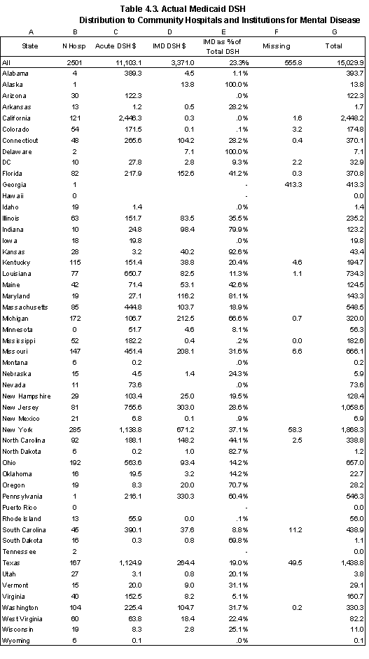
7. In some cases, we found that the sum of these federal shares in all payments made by the state exceeds state federal allotment. We considered scaling down all individual payments proportionately so that the sum is equal to the federal allotment. The assumption behind this would be that the federal matching funds never exceed the maximum limit on such payments established for all states by the federal government. However, we found that the reported amounts were consistent with the HCFA-64. We decided to rely on the HCFA-64 and make no adjustments to the reported amounts.
8. Michigan and Pennsylvania did not take part in the survey conducted by Coughlin, Ku and Kim (2000), so we do not have data on their share of IMD payments in 1997.
Joint Distribution of Medicare and Medicaid DSH Payments
Summary of Distribution of Total DSH Payments
| Category | No. of Hospitals |
Actual Medicare DSH Payments ($mill) |
Medicaid DSH Payments ($ mill) |
Total DSH Payments ($ mill) |
|---|---|---|---|---|
| Total Number of Hospitals1 | 8,868 | |||
| Hospitals Included in the Analysis File2 | 6,837 | |||
| Hospitals with estimated DSH payments | ||||
| Specific Identified Hospitals | 5,534 | 4,825 | 13,120 | 17,946 |
| % of Total | 100.0% | 87.3% | 90.4% | |
| Specific Unidentified Hospitals3 | 104 | 0 | 278 | 278 |
| % of Total | 0.0% | 1.8% | 1.4% | |
| Unidentified DSH Distribution4 | ? | 0 | 1,632 | 1,632 |
| % of Total | 0.0% | 10.9% | 8.2% | |
| Total DSH Payments | 4,825 | 15,029 | 19,855 | |
Table 4.4 summarizes the overall results of combining the Medicare hospital-specific estimates with the hospital-specific distribution of FY1998 Medicaid funds reported by the States. The combined file has 5,638 hospitals with identified DSH payments (Column B). We estimate total DSH payments for FY1998 in the amount of $19.855 billion, with the Medicare share of $4.825 billion and Medicaid share of $15.03 billion.
Of total DSH payments, 9.6 % are attributable to unidentified Medicaid DSH payments. Because we do not know most characteristics of the hospitals receiving unidentified payments, we exclude them from the analysis in summaries of payments by classes of hospitals. However, one characteristic that we do know about these payments is their regional distribution (Table 4.5) Compared to the regional distribution of total Medicaid DSH payments, the unidentified funds are more concentrated in the Middle Atlantic (41.9% vs. 22.6%), South Atlantic (22.7% vs. 12.9%) and East South Central (18.4% vs. 3.5%) regions and rarely occur in the Pacific (0.1% vs. 18.4%) and West South Central regions. This distribution of unidentified Medicaid DSH payments has implications for our analysis of DSH payments by hospital classes. To the extent there are there are systematic differences in the types of hospitals across regions, the distribution of total DSH payments by hospital classes inTables 4.6 and 4.7 will be affected.
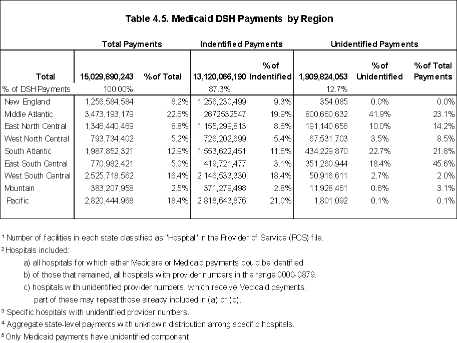
Distribution of Specific DSH Payments by Classes of Hospitals
Table 4.6 describes the distribution of Medicare, Medicaid, and total FY1998 DSH payments. In column C, we report Total Adjusted Patient Days from the AHA survey. It is defined as: Total Inpatient Days + (Total Inpatient Days * (Gross Outpatient Revenue/Gross Inpatient Revenue)). By converting outpatient days into equivalent inpatient days, we obtain a measure of the total capacity of the hospital. The measure is for all patients: Medicare, Medicaid, and other. With the shift of services to outpatient departments, we believe that it is preferable to a measure of inpatient services only.
Major observations from the summary of the distribution of total actual FY1998 DSH funds include the following:
- Urban/Rural Status. Both Medicare and Medicaid DSH payments are concentrated predominantly in urban areas. Although rural areas have 22% of total adjusted patient days, they received only 6% of total DSH funds (3% of the Medicare DSH payments and 7% of the Medicaid DSH payments). Among urban areas, a higher share of total DSH payments go to hospitals located in large urban areas (54% of total DSH funds vs. 45% of total adjusted patient days). The differences are greater for Medicare payments than Medicaid. Large urban areas receive 65% of Medicare DSH payments and 51% of Medicaid DSH payments.
- Bed Size. Among urban hospitals, hospitals with 500 or more beds receive 46% of DSH payments, while they provide only 32% of adjusted patient days. Small rural hospitals (less than 100 beds) receive 33% of total rural DSH. Medicare DSH payments tend to be more highly concentrated in large hospitals than Medicaid DSH payments.
- Hospital Type. Acute care (general) hospitals receive the biggest share of total DSH payments (81%), because DSH program is mainly targeted to these hospitals. However, DSH share of psychiatric hospitals (16%) is disproportionately larger than their share of patient days (4%). Payments to psychiatric hospitals and other institutions for mental disease comprise 22% of Medicaid DSH funds.
- Ownership. Not-for-profit providers receive the largest share of total DSH payments (38%), but this share is considerably less than their share of the total patient days (67%). In contrast, state and local hospitals together receive 48% of the DSH funds, while providing only16% of the total adjusted patient days. The differences are caused by the Medicaid payments. Medicare payments by type of ownership approximate total adjusted patient days.
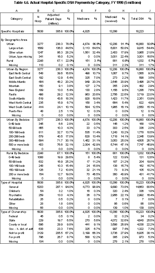
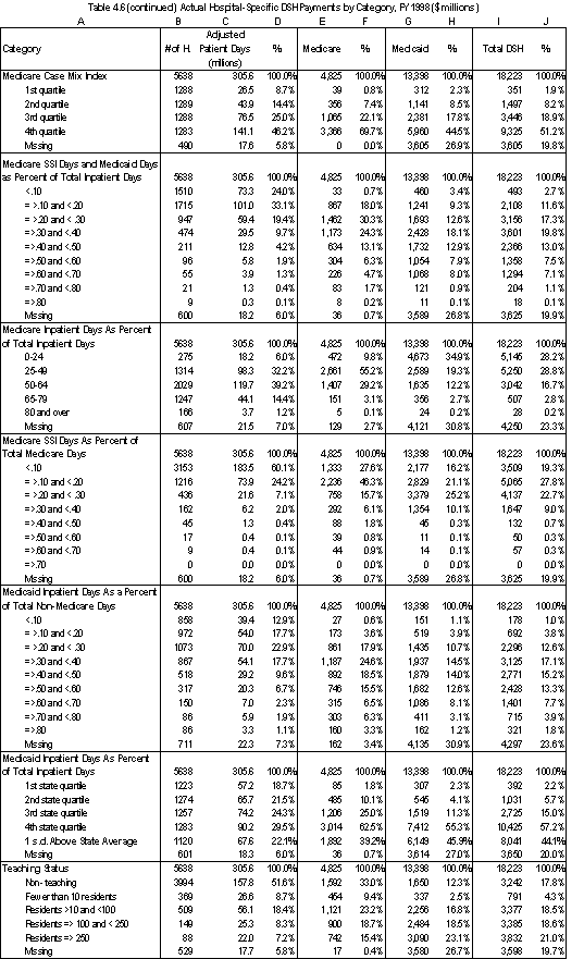
- Case-mix index. We are missing the Medicare case mix index for 490 facilities that received Medicaid DSH funding (unidentified specific hospitals and IMDs). As is the case with Medicare payments, the remaining payments to identified hospitals are skewed towards hospitals with a higher case mix index.
- Low-income Patients. We are missing information needed to categorize about 600 facilities receiving Medicaid DSH payments. When we examine only the distribution of the remaining funds to identifiable hospitals, we find the following:
- A significant portion of the remaining Medicaid DSH funds (3.4%) are paid to hospitals in which less than 10 percent of the inpatient days are attributable to Medicare beneficiaries entitled to SSI or non-Medicare patients entitled to Medicaid. Most of these are psychiatric facilities.
- Compared to Medicare DSH funds, a greater proportion of Medicaid DSH funds are directed towards the hospitals in which 40 percent or more of inpatient days are attributable to Medicare beneficiaries entitled to SSI or non-Medicare patients entitled to Medicaid. There are 392 hospitals in this category that receive about 36 % of identifiable DSH funds from Medicare and Medicaid.
- Facilities with the very highest proportion of non-Medicare patients who are entitled to Medicaid (.70 and above) receive a higher proportion of Medicare funds than Medicaid funds. The facilities with a non-Medicare/Medicaid ratio of .40-.70 receive a higher proportion of Medicaid DSH funds relative to Medicare DSH.
- More than one-third of the total DSH funds to identifiable hospitals flow to facilities with less than 25 percent Medicare utilization. This is because about half of Medicaid funding is concentrated in these facilities.
- Not surprisingly, Medicaid DSH funds are more concentrated than Medicare funds in those hospitals that have the highest Medicaid utilization as a proportion of total patient days. Hospitals that are in the upper quartile of Medicaid utilization for their state receive about 75 % of Medicaid DSH funds compared to 63% of Medicare DSH funds. When the two funding sources are combined, about 72 % of identifiable DSH funds flow to hospitals in the upper quartile of Medicaid utilization for the state in which they are located. About 55 % of total DSH funds flow to hospitals with Medicaid utilization that is at least one standard deviation above the mean Medicaid utilization rate for the state.
- Teaching Status. We are missing information on 530 identifiable facilities that receive Medicaid DSH funding. When we examine the distribution of the remaining funds to identifiable hospitals, we find that Medicaid DSH funding is considerably more concentrated than Medicare DSH payments in major teaching facilities. When considered together, hospitals with 100 or more residents account for about 16 % of adjusted inpatient days but receive nearly half of total DSH funds.
Distribution of Total DSH Payments by State
Table 4.7 shows the joint distribution of Medicare and Medicaid payments. The five states receiving together almost half of the total amount of DSH funds (48.7%) are California (16.7%), New York (12.7%), Texas (9.3%), New Jersey (5.7%), and Louisiana (4.3%). At the same time, these states have only 28% of the total adjusted patient days (7.9, 9.7, 5.8, 2.7, and 1.9 %, respectively).
Baseline for Analyses of Alternative Allocation Policies
In our simulations of alternative DSH policies in Chapter 7, we use a combined estimate of Medicare and Medicaid DSH payments:
- The Medicare estimate is based on the amount of Medicare DSH payments that hospitals would have received in FY1998 if the BBRA and BIPA changes in the eligibility and payment formula had been in effect. The temporary across-the board reductions are not reflected in the baseline.
- The Medicaid estimate is based on the federal share of Medicaid DSH payments.
The results of combining the current law Medicare payments with the federal share of Medicaid payments for all the hospitals in our database are in Appendix B. (The actual baseline for a given simulation is determined by the hospitals that are included in that simulation). Limiting the Medicaid DSH payments to the federal share increases the Medicare share of total DSH funds to identifiable hospitals from 26 % in the preceding tables to 38 % (Table B.2). As a result, Medicare payment distributions have greater influence on the distribution of the combined new DSH funds. In addition, the Medicaid distribution is affected by the FMAP percentages. The proportion of DSH funds received by hospitals in states with a high FMAP increases relative to those with a low FMAP (Table B.3).
5. Evaluating Current Distribution of DSH Using General Measures of Financial Pressure and Vulnerability
In this chapter, we discuss general measures of financial viability that could be used to evaluate how well the DSH allocation policy targets financially vulnerable safety net hospitals. The measures that we evaluated are:
- FY 1998 total margin net of DSH payments;
- Three-year average total margin net of DSH payments (FY1997-1999);
- A three-year composite index of four financial indicators: total margin net of DSH payments, current ratio, cash flow to current debt, and asset turnover.
Measures related to the direct effect of serving low-income populations on a hospital's financial condition are addressed separately in Chapter 8. These measures include uncompensated care and revenue shortfalls from Medicaid and indigent care programs.
General Measures of Financial Vulnerability
A hospital's total revenue margin is the most commonly used measure of financial viability. This measure equals the difference between total net revenues and total expenses as a percentage of total net revenues and is the most direct indicator of whether the hospital is able to cover its overall expenses with its overall revenues. Since a critical question for targeting DSH payments is whether the hospital would be financially viable in the absence of those payments, the hospital's total margins net of DSH payments is a better measure of financial viability for purposes of identifying financially vulnerable safety net hospitals. Comparing total margin net of DSH to total margin including DSH subsidies under alternative DSH allocation methodologies provides an indication of how the hospital's financial viability would be affected assuming no behavioral changes occur in the services it provides or in the revenues it receives from Medicaid and other payers. One of the issues in interpreting the measure is the extent to which Medicaid DSH funds represent "new money" to the hospitals.
The literature suggests that margins alone- and a single year margin in particular- should not be used to assess hospital financial viability. Drawing on the studies discussed in Chapter 2, (AHA 1998; Bazzoli 1995; Prince 1998; Zeller 1997), we constructed a composite index that takes into account four financial indicators:
- Total margin net of Medicare DSH and the federal share of Medicaid DSH payments. This measure is defined as (net income - DSH)/net revenues.
- Current ratio. This measure (total assets/total liability) is a widely-used measure of liquidity.
- Cash flow to total debt. Cash flow is defined as net income plus depreciation. Cash flow as a percentage of total liabilities is used as a measure of capital structure to predict future financial problems (CHIPS 2000).
- Fixed asset turnover. This commonly used measure of operating efficiency is defined as the ratio of net patient revenues to fixed assets.
Data
We calculated indicators of financial pressure for FY1997-FY1999 using the Medicare HCRIS public use files for PPS 13-16 as of June 30, 2001. The HCRIS cost report information is based on the hospital's fiscal year. For example, the PPS-13 files have cost report data for hospital cost reporting periods beginning on or after October 1, 1996 and before October 1, 1997 (i.e., cost reporting periods beginning in FY 1997). Table 1 summarizes the status of the cost reports we use in our analysis.
| N Reports In HCRIS |
% Complete |
% As Submitted |
% Settled |
% Reopened |
|
|---|---|---|---|---|---|
| FY1997 | 6,087 | 95 | 16 | 69 | 16 |
| FY1998 | 5,995 | 93 | 63 | 33 | 4 |
| FY1999 | 5,210 | 81 | 96 | 4 | 0 |
Methods
Since our information for Medicare and Medicaid expenditures is for FY1998, we developed the financial indicators on a federal fiscal year basis using the Medicare cost reports that overlap at least some portion of the three federal fiscal years we are interested in. In those cases where the hospital's fiscal year does not coincide with the federal fiscal year, we calculated
the indicators for the federal fiscal year as a weighted average of values in the two cost reporting periods with portions occurring in the federal fiscal year. We used the proportion of the federal fiscal year occurring in each of the two cost reporting periods as our weights. For example, for a hypothetical hospital with cost reporting period starting on July 1 and ending on June 30, the FY1997 values would be calculated as ¾ of PPS-13 value (which corresponds to the period from October 1, 1996 to June 30, 1997) and ¼ of PPS-14 value (which corresponds to the period from July 1 1997 to September 30 1997). All periods were measured in days.
In about five percent of the cost reports, the reporting period is less than one full year. For some of those hospitals, there is a break in continuous coverage. In such cases, we used the data that are available and prorated it to a full year. Where no cost reporting information was available for a particular provider for either cost reporting period overlapping the federal fiscal year, the hospital was considered as missing for that year.
The analysis file covers all acute care hospitals (and does not include hospitals that are exempt from the Medicare prospective payment system). Table 5.2 shows the number of hospitals for which data were available and the number remaining after eliminating those with incomplete data or outlier values.
| Federal fiscal year | N hospitals with cost reporting period occurring in FY |
N hospitals after controlling for outliers and incomplete data |
Percent remaining |
|---|---|---|---|
| FY1997 | 5,107 | 4,984 | 98 |
| FY1998 | 5,096 | 4,940 | 97 |
| FY1999 | 5,098 | 4,826 | 95 |
Total Margins Net of DSH Payments
Our estimates of FY 1998 Medicare DSH payments relied on the PPS Impact file (which we used to estimate Medicare DSH payments in Chapter 4). For FY 1997 and FY 1999, we used the DSH payment amounts reported on the Medicare cost reports. Our estimate of actual FY 1998 Medicare DSH payments using the PPS impact files closely matches the reported amounts on the cost reports.1
For the Medicaid component of DSH payments, we assumed that the "new" DSH or net gain to the hospital from DSH payments is the Federal share of total DSH payments reported by the State as being paid to the hospital. We have the FY 1998 reported amounts. We approximated payments for FY1997 and FY1999 based on the FY 1998 data. To do so, we applied state-level Medicaid DSH program growth rates in Federal DSH payments (FY1997/FY1998 and FY1998/FY1999) to the FY1998 data.
1. The correlation coefficient between the two series is equal to 0.95, there is less than 0.5% difference in total DSH payments, and the mean and standard deviation values are similar (0.5% and 1% difference, correspondingly).
Total Margin Net of DSH 3-Year Index
We ranked all hospitals according to their three-year average total margin net of DSH payments. We used only one or two years if data for all years were not available in order to retain the maximum number of hospitals in the analysis file.
Composite Index
We constructed a composite index based on four indicators of financial vulnerability: total margin net of DSH payments, current ratio, cash flow to total debt, and fixed asset turnover. This index is an ordinal measure (shows only the order in a sequence) that ranks all hospitals in the sample according to the extent of their financial vulnerability. This rank is not an indicator of the absolute magnitude of hospitals' financial vulnerability.
We constructed the composite index both for 1998 and for three years overall. For 1998, we derived the index by averaging each hospital's rank according to each of the four indicators of financial vulnerability. For example, if a hospital ranks 10 for total margin (lower ranks always implying weaker positions), 200 for current ratio, 100 for cash flow to total debt, and 50 for fixed assets turnover, the composite rank would be (10+200+100+50)/4 = 90. We derived the final index (hospital ordering) by ranking these averages in the ascending order. For the overall 3-year index, one more step is added: a hospital's rank for each year for the same indicator is averaged before the same procedure is applied to the three-year averages.
Two important assumptions underlie the construction of this composite index. First, we assume all four indicators contribute equally to the overall financial health of hospitals (i.e., they have the same importance and thus are weighted equally). Second, we assume that each of the individual indicators conveys separate information that is not duplicative of the other indicators. The validity of these assumptions can be examined based on their substantive meaning for the hospitals, but the definitions of each indicator, as well as the statistical properties of the obtained series, do not appear to contradict these assumptions.
Technically, we calculated the composite index in three steps. First, we calculated the composite index for those hospitals for which all four indicators of financial pressure were available (96.5% of the hospitals that have any indicators calculated). Second, we excluded about one percent of the observations for having outlier values. The outlier cut-offs are:
- Total margin net of DSH payments: absolute value exceeds 70%;
- Current ratio: absolute value exceeds 12;
- Cash flow to total debt: absolute value exceeds 4;
- Fixed asset turnover: absolute value exceeds 18.
Third, we predicted values for the hospitals that had missing values for one or more of the indicators (3.5%) using a regression analysis model that used the available values of indicators for these hospitals as independent variables.
Results
Table 5.3 summarizes the FY 1998 values for the financial indicators. Included is both a simple mean across all facilities and a discharge-weighted mean. For comparison purposes, we include the cut-off value for the 10th percentile of hospitals as well as the median value for hospitals with Standard and Poor bond ratings of BBB+/BBB/BBB-. The 10th percentile cut-offs are substantially below the median for the BBB rated hospitals. The latter are generally comparable to the median values for all hospitals.
| Measure | Definition | Unweighted Mean | Discharge Weighted Mean | 10th Percentile | Median for BBB- rated hospitals* |
|---|---|---|---|---|---|
| Total margin | (Net income [net patient revenue + other revenue - total operating expenses- other expenses]) / total revenues | 2.1% | 4.7% | -9.51% | 3.7% |
| Total margin net of DSH | (Net income - DSH)/ (total revenues-DSH) | 0.2% | 1.9% | -12.98% | N/A |
| Current ratio | total current assets/ total current liabilities | 2.43 | 2.36 | .89 | 1.96 |
| Cash flow to total debt | (net income + depreciation)/( total current liabilities + total long-term liabilities) | .274 | .294 | -0.093 | .171 |
| Fixed asset turnover | Net patient revenues/ total fixed assets. | 2.56 | 2.21 | 1.13 | 2.16 |
* Source: CHIPS, 2001.
Year-to-year stability of the indicators of financial vulnerability
We found that the indicators of financial vulnerability are fairly stable across the three fiscal years. We summarize in Table 5.4 the correlation across fiscal years for each of the indicators. The current ratio and fixed asset turnover rate are somewhat more stable than the margin and cash flow to debt ratio.
| FY1997 to FY 1998 | FY 1998 to FY 1999 | |||
|---|---|---|---|---|
| Simple correlation | Spearman rank correlation | Simple correlation | Spearman rank correlation | |
| Total margin | .62 | .70 | .70 | .74 |
| Total margin net of DSH | .65 | .72 | .70 | .75 |
| Current ratio | .78 | .81 | .81 | .83 |
| Cash flow to total debt | .65 | .70 | .67 | .74 |
| Fixed asset turnover rate | .83 | .84 | .83 | .84 |
To further explore the cross-year dynamics, we also divided each series of indicators into 10 equal parts (deciles), following the ranking for that series from hospitals with the weakest values to hospitals with the strongest values for the indicator. Thus, the first deciles always contain hospitals with the weakest values for the indicator. We then constructed transition matrices for each year-to-year pair within the series. These matrices show in detail by deciles how the hospitals from the first year become redistributed in the second year. The decile redistributions mirror the statistical relationships described above, but provide more precise and detailed pictures of these relationships.
To illustrate, we show in Table 5.5 the matrix comparing hospital deciles for FY 1997 and FY 1998 for total margin net of DSH payments. Each row represents a decile (498 hospitals) of rankings in FY1997 while each column represents a decile (494 hospitals) of rankings in FY1998. Only 240 of the 498 hospitals (48%) that ranked in the first decile in FY1997 also ranked in the first decile in FY 1998. The percent of hospitals moving to the second and third deciles were 19% and 8 %, respectively. The remainder were either dispersed across the remaining deciles (12%) or were not reported in the FY 1998 data (13%). Of the 494 hospitals in the first decile in FY 1998, 16 % had been in the second decile in FY1997 and 12% had been in the third. Nine percent were not reported in the FY 1997 data. Thirty-nine percent of the hospitals that were reported in both years fell below the 50th percentile in both years (1904 out of 4855).
| 1997 | Decile | 1 | 2 | 3 | 4 | 5 | 6 | 7 | 8 | 9 | 10 | Discontinued |
| 1 | 240 | 95 | 38 | 16 | 10 | 8 | 6 | 7 | 4 | 11 | 63 | |
| 2 | 79 | 151 | 116 | 57 | 29 | 19 | 13 | 5 | 8 | 8 | 14 | |
| 3 | 58 | 96 | 107 | 93 | 59 | 27 | 12 | 17 | 9 | 10 | 10 | |
| 4 | 24 | 38 | 88 | 102 | 119 | 62 | 35 | 9 | 8 | 7 | 7 | |
| 5 | 13 | 39 | 51 | 91 | 95 | 91 | 55 | 28 | 21 | 11 | 3 | |
| 6 | 4 | 30 | 25 | 61 | 76 | 113 | 97 | 48 | 27 | 10 | 7 | |
| 7 | 9 | 13 | 18 | 33 | 56 | 85 | 100 | 113 | 51 | 18 | 3 | |
| 8 | 7 | 6 | 19 | 15 | 16 | 49 | 104 | 141 | 98 | 36 | 7 | |
| 9 | 8 | 14 | 16 | 16 | 11 | 28 | 44 | 88 | 181 | 89 | 4 | |
| 10 | 10 | 4 | 10 | 9 | 19 | 6 | 25 | 36 | 84 | 284 | 11 | |
| New | 42 | 8 | 6 | 1 | 4 | 6 | 3 | 2 | 3 | 10 | ||
| 1997-1998 transition matrix (percentages), first decile has the lowest margins 1998 | ||||||||||||
| 1997 | Decile | 1 | 2 | 3 | 4 | 5 | 6 | 7 | 8 | 9 | 10 | Discontinued |
| 1 | 48% | 19% | 8% | 13% | ||||||||
| 2 | 16% | 30% | 23% | 11% | 6% | 4% | ||||||
| 3 | 12% | 19% | 21% | 19% | 12% | 5% | ||||||
| 4 | 5% | 8% | 18% | 20% | 24% | 12% | 7% | |||||
| 5 | 8% | 10% | 18% | 19% | 18% | 11% | 6% | 4% | ||||
| 6 | 6% | 5% | 12% | 15% | 23% | 19% | 10% | 5% | ||||
| 7 | 4% | 7% | 11% | 17% | 20% | 23% | 10% | 4% | ||||
| 8 | 4% | 10% | 21% | 28% | 20% | 7% | ||||||
| 9 | 6% | 9% | 18% | 36% | 18% | |||||||
| 10 | 4% | 5% | 7% | 17% | 57% | |||||||
| New | 49% | 9% | 7% | 5% | 7% | 4% | 4% | 12% | ||||
| Note: Only values greater than 3% are shown; 3% discontinued facilities in old total; 2% new facilities in new total | ||||||||||||
Consistency across the indicators for the same fiscal year
We report the Spearman rank correlations across the indicators for FY 1998 in Table 5.6. Total margin net of DSH is highly correlated with the cash flow to total debt indicator. Both measures are driven largely by net revenues. At the same time, the relationship between these two measures and the remaining two - current ratio and fixed asset turnover - is much weaker or nonexistent. This reflects the fact that balance sheet dynamics, especially the long-term one, may not necessarily coincide with the dynamics of current net revenues. Finally, current ratio and fixed asset turnover also appear to be independent of one another. In sum, the weak correlation between most of the financial indicators supports the theoretical understanding that each indicator provides a measure of a different domain of a hospital's financial viability (profitability, liquidity, capital structure, and asset efficiency) and should be thus considered jointly in evaluating a hospital's overall financial health. We are not concerned by the correlation between total margin net of DSH and total cash flow to debt since both reflect what we believe is the most important measure of financial viability: net income. Including both indicators is a way of giving greater weight to net income.
| Total margin net of DSH | Current ratio | Cash flow to total debt | Fixed asset turnover rate | |
|---|---|---|---|---|
| Total margin net of DSH | 1.00 | .30 | .77 | -0.04 |
| Current ratio | .30 | 1.00 | .42 | -0.05 |
| Cash flow to total debt | .77 | .42 | 1.00 | 0.04 |
| Fixed asset turnover rate | -0.04 | -0.05 | 0.04 | 1.00 |
To further explore the cross-indicator dynamics among the indicators of financial vulnerability, we also divided each series into 10 equal parts (deciles), following the ranking for that series from hospitals with the weakest values of an indicator to hospitals with the strongest values of the indicator. We then constructed comparison matrices for each pair of indicators. To illustrate, we show in Table 5.7 the matrix comparing the FY 1998 deciles for total margin with total margin net of DSH. The results confirm that while the first and tenth deciles are relatively stable, a number of hospitals move into a different decile when the total margin is adjusted for DSH payments. Twenty-two percent of the hospitals in the first decile for total margin move to the second decile of the total margin net of DSH ranking. About 90 percent of the hospitals (2215 of 2470) in the 50th percentile or lower on the total margin ranking are also in the 50th percentile or lower on the total margin net of DSH ranking.
| Hospitals (N); First deciles have the lowest ratios TMnDSH | |||||||||||
| TM | |||||||||||
| Decile | 1 | 2 | 3 | 4 | 5 | 6 | 7 | 8 | 9 | 10 | |
| 1 | 387 | 107 | |||||||||
| 2 | 49 | 262 | 183 | ||||||||
| 3 | 24 | 59 | 187 | 224 | |||||||
| 4 | 12 | 19 | 57 | 153 | 253 | ||||||
| 5 | 8 | 15 | 23 | 59 | 134 | 254 | 1 | ||||
| 6 | 7 | 7 | 23 | 34 | 58 | 139 | 226 | ||||
| 7 | 3 | 11 | 8 | 10 | 28 | 72 | 197 | 165 | |||
| 8 | 1 | 6 | 8 | 9 | 12 | 20 | 49 | 261 | 128 | ||
| 9 | 2 | 7 | 5 | 4 | 7 | 5 | 16 | 63 | 327 | 58 | |
| 10 | 1 | 1 | 1 | 1 | 4 | 5 | 5 | 39 | 436 | ||
| New | 1 | ||||||||||
| Hospitals (Percentage); First deciles have the lowest ratios TMnDSH | |||||||||||
| TM | Decile | 1 | 2 | 3 | 4 | 5 | 6 | 7 | 8 | 9 | 10 |
| 1 | 78% | 22% | |||||||||
| 2 | 10% | 53% | 37% | ||||||||
| 3 | 5% | 12% | 38% | 45% | |||||||
| 4 | 4% | 12% | 31% | 51% | |||||||
| 5 | 5% | 12% | 27% | 51% | |||||||
| 6 | 5% | 7% | 12% | 28% | 46% | ||||||
| 7 | 6% | 15% | 40% | 33% | |||||||
| 8 | 4% | 10% | 53% | 26% | |||||||
| 9 | 13% | 66% | 12% | ||||||||
| 10 | 8% | 88% | |||||||||
| New | 100% | ||||||||||
| Note: Only values greater than 3% are shown | |||||||||||
Summary by Classes of Hospitals
Table 5.8 summarizes the main financial indicators by low-income patient utilization and three categories of hospitals based on the decile rankings for: FY 1998 total margins net of DSH, the three-year average of total margins net of DSH, and the 3-year average composite index. (See Appendix C for summaries of the financial indicators by other hospital classes). Columns 3 and 4 report the discharge- weighted means for FY 1998 total margin and total margin net of DSH payments, respectively. For hospital classes with positive margins, the differences in total margins and total margins net of DSH are slight compared to the differences for hospitals with negative margins. For example, for hospitals with total margins net of DSH between -10% and -20%, the average total margin (net of DSH) increases from -14.0% to -7.0 % when DSH payments are taken into account.
Column 5 reports the 3-year average (discharge-weighted) ranking for each hospital class based on margins net of DSH payments. The average discharge-weighted ranking is in the 54.8 percentile of hospitals. Column 6 shows the discharge-weighted average rankings for FY 1998 total margins net of DSH. The average rankings for each hospital class for FY 1998 are very similar to the rankings for a three-year average. Column 7 reports the weighted average rankings based on the three-year composite index are reported in Column 7.
Across the various utilization measures for low-income populations, the financial indicator rankings of the hospitals serving a higher proportion of low-income patients are lower than those of hospitals serving a relatively low proportion of low-income patients. However, the changes in rankings as the proportion of low-income patients increases are not consistently monotonic. For example, rankings based on total margins net of DSH are lower for hospitals with a low-income patient ratio between .40 and .60 than for hospitals with low- income patient ratios between .60 and .80.2 Our decision to remove only the federal share of Medicaid DSH in computing the margin may contribute to this result.
The relationship between Medicaid utilization and margins is evident in the lower rankings for hospitals with higher Medicaid utilization (and may be indicative of Medicaid shortfalls and uncompensated care). The discharge-weighted average ranking for hospitals one standard deviation above the mean Medicaid utilization for the state is 38.0% compared to 58.1% for those within one standard deviation from the mean. Overall, the difference in rankings across low-income patient categories is greater using total margins net of DSH than the composite index. For example, the mean composite index ranking for hospitals one standard deviation above the mean Medicaid utilization rate is 41.7% compared to 52.6 % for those within one standard deviation from the mean.
Columns 8-11 report the distribution of FY1998 Medicare and Medicaid (federal share only) DSH funds. Key findings include the following:
- Except for the 32 hospitals with lowest margins (-50 to -70 percent), the average FY 1998 DSH payment per discharge increases as the total margin net of DSH decreases.
- Across the total margin net of DSH deciles, the average FY 1998 DSH payment to the hospitals in Decile 1 is nearly twice the average payment to the hospitals in the Decile 2. Using the deciles for the 3-year average net of DSH payments, the average per discharge DSH payment in Decile 1 is $1,378 compared to $701 in Decile 2. The concentration of DSH payments in Decile 1 is attributable to Medicaid payments. The average payment per discharge decreases with each decile through the eighth decile. The average DSH payment per discharge for hospitals in Deciles 9-10 is slightly larger than the payment to hospitals in Deciles 6-7.
- Medicaid DSH payments are more concentrated than Medicare payments in the hospitals in the lower margin deciles. Using the 3-year average margin deciles, 61 percent of Medicare DSH and 82% of Medicaid DSH payments are concentrated in the hospitals in Deciles 1-5. Thirty-five percent of Medicaid DSH payments go to hospitals in Decile 1 compared to 12% of Medicare DSH payments.
- While the average DSH payment per discharge declines as the composite index decile increases, the differences in payments across these deciles are not as great as those for the total margin deciles. The overall concentration of DSH payments in Deciles 1-5 is similar to the finding with respect to the total margin deciles (60% of Medicare DSH and 82% of Medicaid DSH). However, only 13.1% of Medicaid DSH payments go to hospitals in Decile 1 of the composite index.
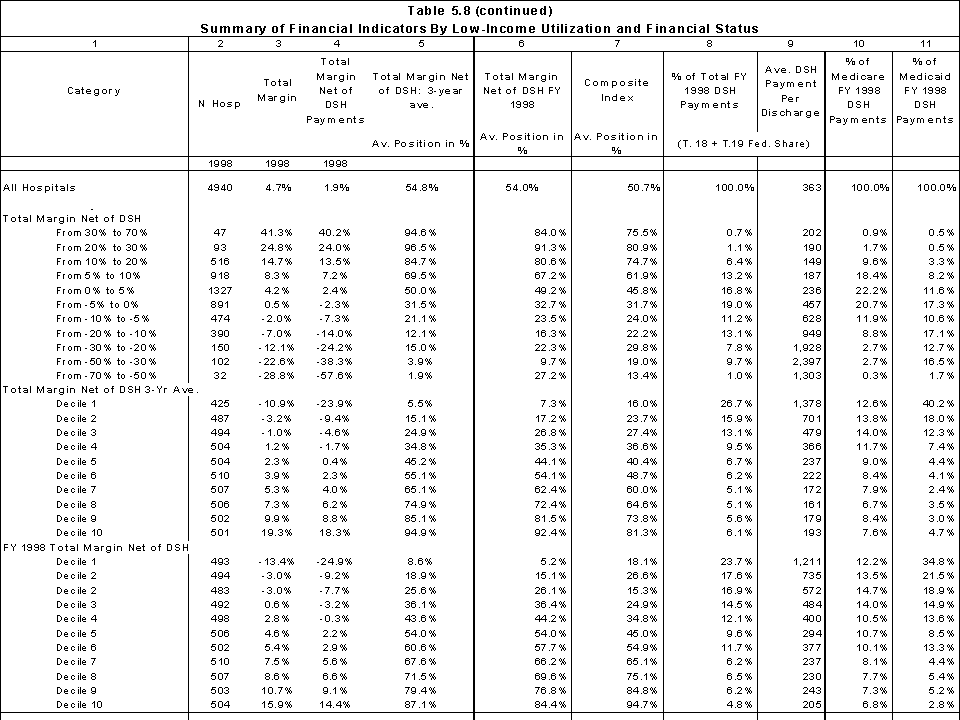
Table 5.9 summarizes the financial indicators by state using the same columns as Table 5.8.
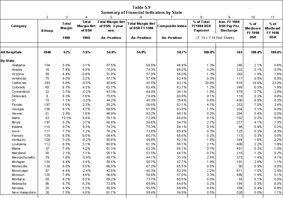
2. The low-income patient ratio for this analysis is defined as the percentage of inpatient days attributable to Medicare SSI and Medicaid (non-Medicare) patients.
Conclusions
The comparison of the measures for total margin and total margin net of DSH payments shows that while there is an overall correlation between the measures, the choice of measure has implications for individual hospitals, particularly those with the lowest margin levels. We believe total margin net of DSH payments is most consistent measure for evaluating how well DSH payments are targeted toward financially vulnerable safety net hospitals.
The composite measure identifies a somewhat different set of hospitals as financially vulnerable. The relationship between serving low-income patients and performance on this measure is not as strong as the relationship between low-income patients and total margins net of DSH. Similarly, the relationship between the composite index and current DSH funding is not as strong. This may be attributable in part to our choice of measures and the equal weighting given each measure. While we include the composite index rankings as a hospital class variable, we believe total margin net of DSH payments should be given more weight as an evaluation tool since, of the financial indicators we examined, it is most directly related to the impact of providing uncompensated care.
The individual measures of financial viability are relative stable from year to year. In particular, the consistency of the 1-year and 3-year total margin figures suggests that only one of the measures is needed in the analysis of alternative allocation methodologies. The three-year measure has the advantage of allowing us to include some hospitals for which we are missing FY 1998 margin data and of smoothing out some year-to-year differences for some hospitals. These advantages are most important if margins are taken into account in the allocation formula (rather than being used solely as an evaluation tool). There are, however, disadvantages to using the 3-year average. The first is the need to impute the FY 1997 and FY 1999 DSH payments in determining total payments net of DSH payments. The second is the partial completeness of the FY1999 cost report files and their "as filed" status. We are missing about 20 percent of the cost reports beginning in FY 1999. Given the funding reductions in the Balanced Budget Act of 1997, the use of a two-year average for some hospitals and a three-year average for others could bias the results. Using the FY1998 margins also simplifies our analysis of alternative allocation policies for FY 1998 DSH funds. Therefore, we use only the FY 1998 margins net of DSH funds in our simulations in Chapters 7 and 8.
6. Alternative DSH Allocation Policies
Analytical Policy Issues
We are interested in evaluating how different measures of financially vulnerable safety net hospitals would affect 1) the set of hospitals eligible to receive federal subsidies and 2) the distribution of funds among those hospitals. The literature concerning safety net hospitals and the current policies for Medicare and Medicaid DSH payments suggest a set of analytical policy issues related to the distribution of DSH funds.
- How sensitive is the allocation of DSH funds to different measures of vulnerable populations? Do measures that use only a subset of low-income patients, e.g. Medicaid patients, target the same hospitals as more inclusive measures?
- Is it feasible for the allocation formula to take into account both inpatient and outpatient services? How does this affect the relative distribution of DSH funds?
- Do measures based on the proportion of care furnished to low-income patients target a different set of hospitals than those based on the financial risk associated with serving low-income patients?
- Does a strategy such as a minimum threshold or sliding scale strategy improve the relationship between a hospital's financial risk and the subsidy it would receive from a DSH fund?
Our analysis is within the context of using a single federal payment mechanism to distribute DSH funds. Our baseline is current law Medicare payments and the federal share of DSH payments. The simulations assume funding would be allocated to hospitals separately from program payments for patient care services. Using a separate funding stream has implications for the formula that is used for allocating the funds (e.g. whether Medicare/SSI beneficiaries need to be taken into consideration in the allocation formula). It also affects the vehicle that is used to distribute the funds (e.g. Medicare DSH payments are paid as an add-on to the DRG standard payment rate so that hospitals with a large uninsured caseload and few Medicare patients receive little support).
The simulations include:
- the joint distribution of Medicare and the federal share of Medicaid DSH payments under current policies to the hospitals in our dataset;
- a MedPAC-like approach that would distribute funds based on the hospital's proportion of low-income revenues and adjusted discharges (with further adjustments for differences in geographic location and case mix);
- policies focused on the financial risk associated with serving Medicaid and self-pay patients (i.e., Medicaid shortfalls and uncompensated care costs).
In exploring the impact of alternative allocation policies, the issue of which hospitals should be eligible to receive DSH payments should be separated from the issue of how the funds should be distributed to eligible hospitals. The advantage of this approach is that it allows the possibility of basing eligibility on the patient population served by the hospital but determining how much the hospital receives in DSH payments on the financial risk it bears as a result. The risk borne by a hospital whose patients are covered by Medicare and Medicaid is less that that borne by a hospital with a substantial uninsured population.
To minimize issues related to whether higher costs are attributable to hospital inefficiency or justifiable differences in costs, the financial measures used in the eligibility and allocation policies do not measure costs directly; rather, they express financial risk associated with serving poor people as a percentage of revenues or costs. In some allocation policies, adjustments are made for cost differences attributable to case mix and hospital wage levels.
Potential Low-income Patient Measures
In this section, we describe potential measures associated with serving low-income patients that could be used either to establish eligibility to receive DSH funding or allocate the funds to eligible hospitals. Some of these measures can be generated from inpatient claims data and others require financial data. We provide definitions of the policies associated with specific measures in Table 6.1.
Claim-based Measures
Measures 1.1 and 1.2 are based on the amount of care a hospital furnishes to low-income patients as measured through claims data, i.e. the proportion of days or discharges attributable to low-income patients. Inpatient claims data can also be used to measure the hospital's percentage of gross inpatient revenues attributable to low-income patients (1.3). These inpatient claim-based measures involve several assumptions:
- All utilization on the claim is attributed to the primary payer. For example, the measure is not sensitive to situations where Medicaid is a secondary payer for part of an inpatient stay.
- The measures assume that low-income patients utilize outpatient services in the same proportion as inpatient services. Low-income patients tend to have a relatively higher outpatient utilization rates than inpatient (because they have less access to community physicians). This is an issue examined in greater detail in our three-state analyses discussed in Chapter 8.
- The measure implicitly assumes that no-charge patients are charity care and that self-pay patients represent low-income patients that are unable to pay for their care. We know that no-charge patients include those receiving courtesy and employee allowances and that the percentage of no-charge patients is likely to overestimate the percentage of charity care patients. Similarly, some self-pay patients are able to pay for some or all of their care. We examine the relationship between the proportion of self-pay and no-charge patients and bad debts and charity care in our three-state analyses.
- The HCUP claims data do not include a separate classification for indigent care programs. We used other government days (which is a residual after excluding CHAMPUS and workmen's compensation) as our proxy for local indigent care programs.
| Measure | Formula |
|---|---|
| 1. Utilization measures from claims data based on proportion on low-income inpatients | |
| 1.1 % Low-Income Days |
Medicare days*SSI ratio + Medicaid days + self-pay days + no-charge days + Title V days + other government days ———————————————————————— Total inpatient days |
| 1.2 % Low-Income Discharges |
Medicare discharges*SSI ratio + Medicaid discharges + self-pay discharges +no-charge discharges + Title V discharges + other government discharges —————————————————————————————— Total inpatient discharges |
| 1.3 % Low-income inpatient revenue |
Medicare charges*SSI ratio + Medicaid charges |
| 2. Gross revenue measures based on percentage of revenue attributable to low-income patients | |
| 2.1 % gross revenue attributable to low-income Medicare and Medicaid patients, local indigent care programs, bad debt and uncompensated care (MedPAC Model) |
Medicare revenue* SSI ratio + Medicaid revenue |
| 2.2 % gross revenues attributable to charity and no-charge patients |
Gross revenues for charity and no-charge patients |
| 3. Financial risk measures based on losses attributable to low-income patients | |
| 3.1 % total cost attributable to shortfalls from Medicaid and indigent care programs, bad debt & uncompensated care |
(Medicaid patient care gross revenue + other government gross revenue + bad debt + uncompensated care) X cost-to-charge ratio - Medicaid payments (exclusive of "new DSH) - payments from other government programs) |
| 3.2 Bad debt and uncompensated care as % of total operating cost |
(Charity care revenue + bad debt expense) X cost-to-charge ratio |
| 4. Market share model for urban hospitals based on proportion of financial risk in the community assumed by the hospital | |
| 4.1. Financial risk measure from 3.2 |
(Charity care revenue + bad debt expense) X cost-to-charge ratio |
 (Charity care revenue + bad debt) X cost-to-charge ratio for the MSA
Measures Derived From Financial Data
Measures 2.1 and 2.2 use financial data to measure the percentage of gross revenue attributable to low-income patients. Measure 2.1 is similar to MedPAC model's definition of a hospital's low-income share.1 Gross revenues derived from financial data have several advantages over those derived from inpatient claims data.
- Secondary payers are accounted for (assuming the reporting is accurate).
- Both inpatient and outpatient volume are directly measured,
- Implicit recognition is given to differences in severity across the hospital's patient population.
There are issues, however, regarding uniform reporting of financial data generally, and uncompensated care and bad debt in particular. We decided to use both bad debt and uncompensated care costs in the models derived from financial data because of reporting inconsistencies (see Chapter 2). Basing a policy on uncompensated care only (with uniform definitions) or uncompensated care and bad debt attributable to self-pay patients might be more appropriate policies to target financially vulnerable safety net hospitals than including bad debt associated with care provided to insured patients. Nevertheless, given current reporting inconsistencies, we have included all bad debt and uncompensated care in our models that use financial data.
Measures 3.1 and 3.2 focus on the financial risk associated with serving low-income patients. Measure 3.1 defines financial risk in terms of shortfalls from Medicaid and local indigent care programs, bad debt, and uncompensated care. Medicare SSI patients and Medicaid patients to the extent the Medicaid payment covers the cost of their care are not taken into consideration. The Medicaid shortfall could be attributable to either low-payment rates or to hospital inefficiency. In computing the Medicaid shortfall, we exclude DSH funds so that the measure is financial risk in the absence of DSH funding (see more detailed discussion of methodology in Chapter 8). There is some danger that including the Medicaid shortfall could provide a perverse incentive to reduce payment rates. The actual incentive will depend on the relationship between the state's FMAP and the generosity of the DSH payments. An alternative to including the Medicaid shortfall would be to count only a portion (e.g. 50%) of gross Medicaid revenues in constructing a revenue measure.
Finally, Measure 4.1 measures each urban hospital's market share of uncompensated care and bad debt. The market is defined by MSA. Conceptually, this measures hospital's uncompensated care load in relation to its market rather than the national market.
1. The AHA data used by MedPAC does not have a separate category for patients under local indigent care programs. As a result, MedPAC assumes that the shortfalls in the "other" patient category are attributable to the local indigent care program. Specific information on local indigent care program revenues is available in our financial data.
Other Potential Allocation Factors
Volume
We avoided establishing a direct DSH subsidy for inefficiencies by expressing the low-income measures as a percentage of revenues or costs rather than absolute dollar amounts. However, this approach also requires that the allocation formula include a measure to take into account differences in patient volume across hospitals (Table 6.2). While inpatient days or discharges could be used for this purpose, a better policy would be to take into account outpatient volume as well. Adjusted inpatient days and discharges convert outpatient volume into equivalent inpatient days or discharges. For example, total adjusted discharges equal total hospital discharges times the ratio of total hospital gross revenues to hospital inpatient gross revenues. The weight assigned to a given hospital would be determined as the product of its low-income patient measure and either adjusted patient days or discharges.
| Measure | Formula |
|---|---|
| Total adjusted days | Low-income measure X total inpatient days X total gross patient revenues / total inpatient gross revenues |
| Total adjusted discharges | Low-income measure X total inpatient discharges X total gross patient revenues / total inpatient gross revenues |
| Cost-adjusted days | Low-income measure X total adjusted days X wage index factor |
| Case-mix and cost-adjusted discharges | Low-income measure X total adjusted discharges X wage index factor X CMI |
| Cost-adjusted days and state's relative resources | Low-income measure X total adjusted days X index of state's resources to other states |
Cost Differentials
The allocation formula could further adjust the hospital's volume-weighted low-income patient measure for systematic differences in cost. A case-mix adjustment should be used when adjusted discharges are used in the allocation formula. A case-mix adjustment is not needed if adjusted inpatient days are used as the volume statistic because case mix is correlated with length of stay. The Medicare hospital wage index can be used to adjust for cost differences across geographic areas.
Resource Differentials
One issue in allocating DSH funds is the extent to which the state's available resources to finance health care for low-income persons should be taken into account in the fund distribution formula. Under current law, Medicare DSH payments are based on national allocation rules without regard to state resources while the federal share of Medicaid DSH payments is determined under a matching formula that varies by state. The Federal Medical Assistance Percentage (FMAP) is intended to provide more generous Medicaid matching percentages to states that have relatively fewer resources to finance health care programs and/or relatively more low-income patients to serve.
The current FMAP formula is based on per capita income and has been criticized for not taking into account total resources available to finance health care and cross-state differences in the cost of health care and the number of people living in poverty. Proposals have been made for an "equitable" FMAP based on the ratio of the state's share of resources (adjusted for differences in health care costs) to the state's share of low-income patients (adjusted for cost-of-living differences and age). Adjusting payments to hospitals using this type of formula would be consistent with a policy that federal support for uncompensated care costs should be higher in those states with limited resources. However, our analyses focus on DSH distributions to individual hospitals rather than aggregate payments to states. If the DSH distribution is based on a utilization or gross revenue measure, using a FMAP-like factor in the allocation formula would be one way to adjust for likely differences in the actual financial risk associated with serving low-income patients (i.e. Medicaid shortfalls and uncompensated care). The assumption would be that hospitals located in states with relatively fewer resources have higher financial risk than hospitals located in states with relatively high resources. We do not believe that it would be appropriate to use an FMAP-like factor if the allocation formula is based on actual financial risk. The purpose of the DSH funds is to protect hospitals from their financial losses associated with serving low-income patients. Two hospitals with comparable financial losses should receive similar levels of protection.
Exploratory Analyses
As discussed in Chapter 3, data were not available that allowed us to examine the alternatives with a national set of hospitals. Our exploratory analyses drew on two different sets of hospitals. The first set consists of the hospitals that are represented in the HCUP national sample. We were able to explore the sensitivity of DSH allocations to low-income patient definitions that rely on utilization or gross inpatient revenue data by payer class. The results of these simulations are discussed in Chapter 7.
By supplementing these analyses with detailed claim and financial information from California, New York and Wisconsin hospitals, we examined a broader set of potential DSH eligibility and allocation policies. We discuss these simulations in Chapter 8.
7. Exploratory Analyses Using National HCUP Data
In this chapter, we report the results of our analyses using the HCUP national inpatient sample. We used the HCUP data to explore the relationship between various inpatient measures of low-income patient care that rely on inpatient utilization or gross revenue data by payer class and the implications this might have for using the different measures to allocate DSH funds.
Data
HCUP National Inpatient Sample
The HCUP national inpatient sample (NIS) is comprised of a 100 percent claims for inpatient discharges occurring during 1998 in a nationally representative sample of about 20 percent of the hospitals in 24 states. In total, there are 984 community hospitals stratified on five characteristics: ownership/control, bed size, teaching status, urban/rural location, and region. Not all states allow individual hospital identifiers to be released. We were able to link the NIS to only 640 hospitals located in states for which we have Medicare cost reports and hospital-specific information on Medicaid DSH payments. These hospitals are located in 15 states: AZ, CA, CO, CN, FL, IL, IO, MA, MD, MO, NJ, NY, UT, WA and WI. We dropped Pennsylvania hospitals because of the lack of hospital-identifiable Medicaid DSH data. We estimated what Medicare DSH payments would be for Maryland hospitals in the absence of the waiver and retained them in our simulation.
The NIS includes uniform categories for the expected primary payer:
- Medicare (both fee-for-service and managed care patients)
- Medicaid (both fee-for-service and managed care patients)
- Private insurance
- Self-pay
- No-charge (includes charity care)
- Other
The "other" payer category includes patients covered by CHAMPUS, Workmen's Compensation, Title V and other government programs. These categories were previously broken out but discontinued in the 1998 data because of problems in coding the data uniformly across states. As explained below, we use the 1997 data to develop an estimate of patients covered by local indigent care programs. Compared to the national estimates (Table 7.1), our HCUP/DSH analysis file has a lower percentage of discharges and days where Medicaid is the expected primary payer (Table 7.1). Additionally, the percentage of Medicare days is considerably higher. The statistics for the uninsured (self-pay) are quite similar to the national average.
| NIS Weighted National Estimate* | Hospitals in HCUP/DSH Database | |||||||
|---|---|---|---|---|---|---|---|---|
| Payer | % Discharges | % Days | Mean Length of Stay | Mean Charge ($) |
% Discharges | % Days | Mean Length of Stay | Mean Charge ($) |
| All | 100.0 | 100.0 | 4.8 | 11,789 | 100.0 | 100.0 | 4.7 | 12,153 |
| Medicare | 34.0 | 39.6 | 6.1 | 15,025 | 36.5 | 47.3 | 6.2 | 15,594 |
| Medicaid | 20.5 | 20.9 | 4.9 | 9,879 | 16.1 | 14.9 | 4.4 | 9,407 |
| Uninsured | 5.0 | 4.0 | 3.9 | 8,962 | 4.9 | 3.8 | 3.8 | 8,763 |
| Other | 40.5 | 28.7 | 3.8 | 10,367 | 42.5 | 33.7 | 3.8 | 10,624 |
*Weighted national estimates from HCUP Nationwide Inpatient Sample (NIS), 1998, Agency for Healthcare Research and Quality (AHRQ), based on data collected by individual states and provided to AHRQ by the states. Total number of weighted discharges in the U.S. based on HCUP NIS = 34,874,001. Note that no significance testing for differences is provided.
Hcris
We used the HCRIS data for FY1998 to develop each hospital's cost-to-charge ratio for inpatient hospital services. We also used the total margin and total margin net of DSH measures used in our evaluation of measures of financial viability (see Chapter 5).
AHA Survey
Consistent with other analyses, we used the adjusted discharges and adjusted days from the 1998 AHA survey. As previous noted, these measures include outpatient volume by adjusting the inpatient statistic by the ratio of gross patient revenues to gross inpatient revenues.
Methods
We used the HCUP data to establish the proportion of total inpatient days, total discharges, total charges, and case-mix index (the average DRG relative weight) attributable to each payer. We estimated the Medicare SSI statistics by applying the hospital's SSI ratio to the Medicare data. Doing so assumes that the Medicare SSI patients have the same length of stay, case mix and charges as other Medicare patients. We determined each hospital's proportion of patients that were classified as "other government" in 1997 and applied the relevant ratio to the FY1998 "other" category to obtain an estimate of proportion of the hospital's patients covered by local indigent care programs. We used the data on patients covered by Medicare SSI, Medicaid, self-pay, no-charge and local indigent care programs to establish the claims-based measures of care provided to low-income patients that we discussed in Chapter 6.
We used correlation analysis to examine the relationship between key low-income patient measures that could be used in an allocation formula (e.g. proportion of days, discharges, and revenues and case-mix index including/excluding Medicare SSI patients). The degree of correlation between the measures can be used to indicate whether the choice of the measure (utilization or revenue) used to describe hospital's low-income patients is likely to have a significant effect on the distribution of funds. The HCUP data is for inpatient services only and allowed us to test only inpatient utilization and gross inpatient revenue measures. HCUP does not have the outpatient data and uncompensated care data that would allow us to evaluate measures using financial risk.
We also simulated potential DSH allocation policies and compared the results to the current distribution of DSH. We used the correlation between the DSH payment and the hospital's net income as a comparative measure of how well the payments target financially vulnerable safety net hospitals.
Results
Low-Income Patient Shares
We examined the relationship between the proportion of low-income patients by payer to address the question of whether one of the more readily available statistics, e.g., the percentage of Medicaid days, is an appropriate proxy for a hospital's percentage of low-income days. We combined Medicare SSI and Medicaid days into a measure of "joint" days and we also computed the patient percentage used in the current Medicare DSH formula (Table 7.2). We found the percentage of Medicaid days is highly correlated with the percentage of low-income days (0.920). The correlation using "joint" days is lower (0.862). Self-pay and no-charge days are poorly correlated with either Medicaid days alone or the "joint" days. The correlation between the DSH patient percentage and the proportion of low-income days is 0.838.
| % Medicare SSI | % Medicaid Days | % No-charge + self-pay days | % Joint days | % Low-income days | DSH Patient % | |
|---|---|---|---|---|---|---|
| MEAN | 0.042 | 0.129 | 0.044 | 0.171 | 0.176 | 0.215 |
| STD | 0.045 | 0.118 | 0.054 | 0.136 | 0.141 | 0.183 |
| N | 638 | 638 | 638 | 638 | 638 | 638 |
| Pearson's Correlation Coefficient** | ||||||
| % Medicare SSI | 1.000 | 0.237 | -0.014 | 0.538 | 0.193 | 0.579 |
| % Medicaid Days | 1.000 | 0.160 | 0.946 | 0.919 | 0.912 | |
| % No-charge/self-pay days | 1.000 | *0.134 | 0.520 | *0.145 | ||
| % Joint days | 1.000 | 0.862 | 0.984 | |||
| % Low-income days | 1.000 | 0.837 | ||||
| DSH Patient % | 1.000 | |||||
* p<.001; ** except as noted, all values p<.0001
We also explored the relationship between the different types of measures of the hospital's care to low-income inpatients. In Table 7.3, we report the correlations between the hospital's percentage of Medicaid and all low-income patient days, discharges, and inpatient charges. The hospital's proportion of Medicaid inpatient charges is highly correlated with its Medicaid discharges (0.955) and Medicaid days (.950). Compared to its average proportion of inpatient days (.129), Medicaid has on average a higher proportion of discharges (.147) and lower proportion of inpatient charges (.110). The large number of Medicaid maternity cases probably accounts for the differences. The same pattern is seen in the overall measures of care provided to low-income patients.
| Medicaid Days |
Low-income days |
Medicaid discharges |
Low-income discharges |
Medicaid charges |
Low-income charges |
|
|---|---|---|---|---|---|---|
| MEAN | 0.129 | 0.176 | 0.146 | 0.237 | 0.109 | 0.193 |
| STD | 0.118 | 0.141 | 0.125 | 0.159 | 0.101 | 0.139 |
| N | 638 | 638 | 638 | 638 | 638 | 638 |
| Pearson's Correlation Coefficient** | ||||||
| Medicaid Days | 1.000 | 0.919 | 0.917 | 0.849 | 0.949 | 0.840 |
| Low-income days | 1.000 | 0.836 | 0.898 | 0.879 | 0.888 | |
| Medicaid discharges | 1.000 | 0.906 | 0.955 | 0.843 | ||
| Low-income discharges | 1.000 | 0.894 | 0.965 | |||
| Medicaid charges | 1.000 | 0.894 | ||||
| Low-income charges | 1.000 | |||||
** all values p<.0001
Case-mix
One objective of the DSH allocation policy is to use an indirect measure of a hospital's costs of providing care to low-income patients. When discharges are used as an allocation statistic, differences in a hospital's case mix need to be taken into account. Since data on a hospital's overall case mix are not readily available, we examined measures that might be used as a proxy such as the Medicare case mix index. We found that there is only a moderate correlation between the Medicare case mix index and the Medicaid case mix index (0.504) and the case mix index for all low-income patients (0.624). An alternative to using a case mix would be to use the proportion of days or charges as the low-income patient measure.
Comparison of Current and Alternative DSH Policies
Table 7.4 summarizes the results of our analysis of the current distribution of DSH payments to the hospitals in the HCUP file. Most of the hospital categories in the first column are self-explanatory. The grouping of hospitals by the percentage of low-income patient days is based on the proportion of low-income patient days attributable to Medicare SSI, Medicaid, local indigent care programs, self-pay and no-charge patients. The safety net hospitals category includes all hospitals with at least 20 percent of their inpatient days attributable to low-income patients. The 20% threshold derives from the 15% threshold used in the Medicare program based solely on Medicare SSI and Medicaid inpatient ratio plus 5% for uninsured patients. These hospitals are grouped by their total margin net of DSH payments.
We eliminated 8 hospitals from our simulations because we did not have margin data for them. In total, 492 of the remaining 632 hospitals received DSH payments from Medicare and/or Medicaid. The total margin net of DSH (Medicare plus the federal share of Medicaid) was 2.0% and the total margin with DSH was 5.7%. The total margin with DSH is about 1% higher than the margin we found for all hospitals in our analysis file in our Chapter 5 analysis (4.7%). In particular, the county-owned hospitals in the full analysis file had a total margin with DSH of 5.0% compared to 12.9% in the HCUP analysis file. This may be indicative of the uniqueness of each state's DSH program and the danger of using selected states to draw national conclusions about DSH payments. Safety net hospitals accounted for 45% of adjusted inpatient days and received 88% of the DSH funds. Safety net hospitals with total margins net of DSH of 5% or higher received 20% of DSH funds. DSH payments were made to 73 hospitals with less than 10% low-income patient days (which resulted from the Medicare DSH formula).
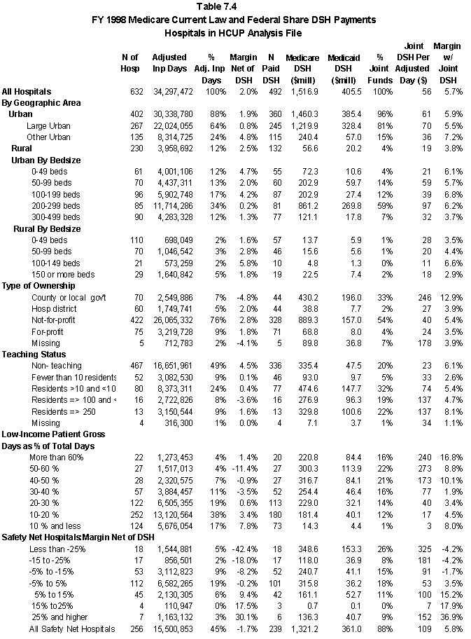
We examined alternative DSH allocation policies using different combinations of the measures discussed in Chapter 6. For illustrative purposes, we present the results from a basic simulation that allocated DSH based on the hospital's percentage of low-income days other than Medicare SSI days (Table 7.5). The allocation factor was based on the formula:
(Medicaid+ local indigent care+ self + no-charge patients) -.15 x WI x adjusted inpatient days
total inpatient days
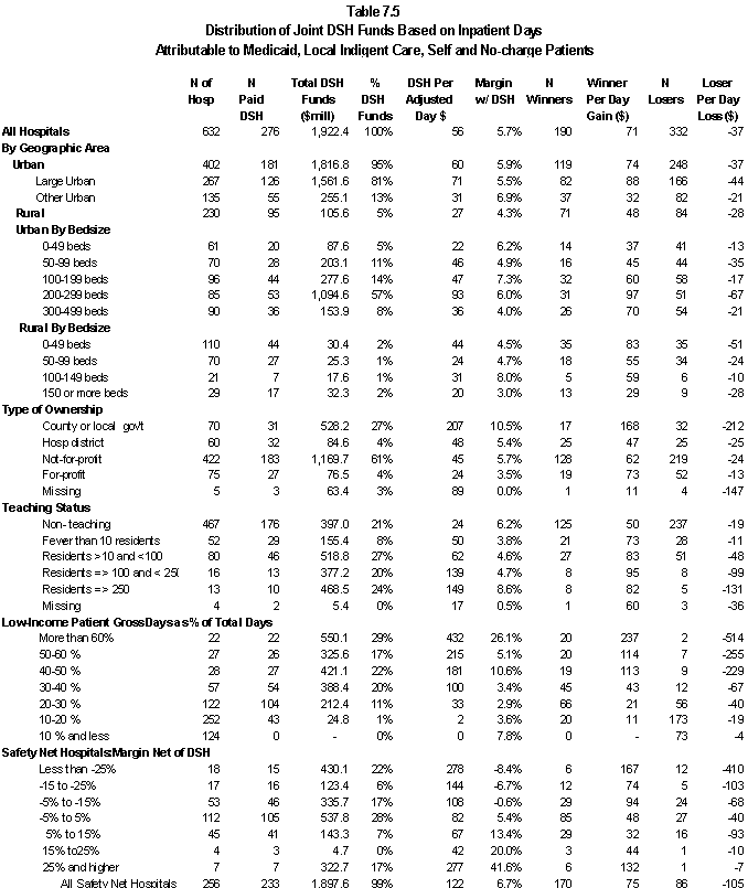
Because Medicare SSI patients were not included in the allocation policy, the patient percentages used to allocate funds are not the same as those used to establish each of the low-income patient categories in the first column. This explains why 23 safety net hospitals did not receive any DSH funds under the simulation. Overall, the number of hospitals that would receive DSH funds decreases from 492 to 276.
- The percentage of DSH funds distributed to county-owned hospitals would decrease from 33% to 27 %. The average payment per adjusted day (for all county-owned hospitals) would decline from $246 to $207 but these hospitals would continue to have higher than average total margins with DSH (10.5%). Non-profit hospitals would be the primary winners ($123.5 million).
- Among teaching hospitals, those with 10-100 residents would lose $103.5 million in DSH funds. The gains are spread across the other teaching categories.
- The hospitals with at least 60 percent low-income patient days (including Medicare SSI patients) would increase their share of DSH funds from 16 to 29%.
- Hospitals defined as safety net hospitals (at least 20 percent low-income patient days) would receive 99% of the DSH funds. Most of the redistribution would benefit those hospitals with total margins net of DSH in the -5.0% to +5.0% range. However, hospitals with margins in excess of 5.0% would increase their share of DSH funds from 19 to 24%.
We examined the relationship between the alternative DSH allocation factors and net income (Table 7.6). The purpose was two-fold: to determine if there are significant differences in the DSH funds that would be allocated to safety net hospitals under the alternative polices and to determine the extent to which the policies direct funds towards safety net hospitals that are financially vulnerable. Our measure of financial vulnerability was net income per day. We used the allocation factors without a threshold for DSH payments so that we could examine the relationship between each allocation factor (e.g. % low-income patients exclusive of Medicare SSI patients x wage index) and net income per day. Ideally, we would have found a strong negative correlation between total income net of DSH and the allocation factor.
| $ per Day | |||||||||
|---|---|---|---|---|---|---|---|---|---|
| Income Net of DSH | Joint DSH | Medicare DSH | Medicaid DSH | Sim A | Sim B | Sim C | Sim D | Sim E | |
| MEAN | -32.82 | 74.68 | 59.50 | 15.18 | |||||
| STD | 203.64 | 123.36 | 85.76 | 40.11 | |||||
| N | 256 | 256 | 256 | 256 | |||||
| Pearson's Correlation Coefficient** | |||||||||
| Income Net of DSH | 1.00 | -0.48 | -0.47 | -0.49 | -0.21 | -0.19 | -0.17 | -0.27 | -0.22 |
| Joint DSH | 1.00 | 0.99 | 0.96 | 0.47 | 0.45 | 0.48 | 0.57 | 0.52 | |
| Medicare DSH | 1.00 | 0.91 | 0.48 | 0.45 | 0.49 | 0.58 | 0.52 | ||
| Medicaid DSH | 1.00 | 0.40 | 0.44 | 0.44 | 0.50 | 0.49 | |||
| Sim A. All low-income days | 1.00 | 0.92 | 0.90 | 0.77 | 0.87 | ||||
| Sim B. Days w/outMedicare SSI beneficiaries | 1.00 | 0.97 | 0.79 | 0.89 | |||||
| Sim C. Days w/out Medicare SSI beneficiaries with wage index adjustment | 1.00 | 0.81 | 0.90 | ||||||
| Sim D. CMI-adjusted discharges w/out Medicare SSI beneficiaries | 1.00 | 0.88 | |||||||
| Sim E. Charges w/out Medicare SSI beneficiaries | 1.00 | ||||||||
** All values with p<.0001
The variables used to establish the allocation factors that we report in Table 7.6 are:
- Simulation A: Proportion of inpatient days attributable to low-income patients.
- Simulation B: Proportion of inpatient days attributable to non-Medicare low-income patients.
- Simulation C: Proportion of inpatient days attributable to non-Medicare low-income days x wage index. This is the simulation reported in Table 7.5.
- Simulation D: Proportion of discharges attributable to non-Medicare low-income patients.
- Simulation E: Proportion of inpatient charges attributable to non-Medicare low-income patients.
There is no strong correlation between any of the allocation statistics and net income; however, the current Medicare and Medicaid DSH policies are more correlated with net income than any of the measures used in the alternative DSH policies (e.g. -0.48 for the joint DSH payment per day compared to -.17 for the Simulation C allocation policy). The allocation alternatives are strongly correlated with each other and moderately correlated with the current DSH policies.
Conclusions
There are several findings from the HCUP analysis that have import in designing a DSH allocation policy. First, it appears that the patient population (e.g., with or without Medicare SSI beneficiaries) included in the allocation statistic is more important than how the care provided to those patients is quantified. Ideally, the allocation statistic would take into consideration all low-income patients. If this is not administratively feasible, using Medicaid patients only is preferable to "joint" days or the Medicare DSH patient percentage, both of which are less correlated with low-income patients.
The different measures of the amount of care provided to a low-income population (days, discharges, or charges) are highly correlated. However, the choice could have implications for certain hospitals. Those which have a high volume of Medicaid maternity cases or shorter than average length of stay (e.g. California hospitals) would benefit if discharges were used instead of days as the measure of the proportion of care provided to low-income patients.
The Medicare case mix index is not a good proxy for the hospital's low-income patient case mix. In the absence of data on the case mix of low-income patients, days or charges should be used instead of discharges as the allocation statistic.
Neither the current DSH allocation policies nor the alternatives that we examined in the analysis target DSH payments in a way that is strongly correlated with net income. This is an issue that warrants further investigation and understanding. The different Medicare formulae and the Medicaid DSH program's flexibility may provide mechanisms to target financially vulnerable hospitals in a way that a single formula-driven allocation may not. Targeting financially vulnerable safety net hospitals may require taking into consideration more factors than the amount of care a hospital provides to low-income patients.
Finally, the diversity of the Medicaid DSH programs makes it difficult to draw conclusions from an analysis of selected states. The lack of information on "new" Medicaid DSH funds further compounds the problem. Since we have data from only selected states- and not even all the hospitals in those states- we have not presented information on the redistributions of DSH payments that might occur across states under the alternative allocation policies. Nevertheless, it is important to not lose sight of the differences in DSH expenditures across states and the likelihood that a national allocation policy would result in substantial state-level redistributions as well as redistributions across classes of hospitals.
8: Three State Analysis of Alternative DSH Policies
In this chapter, we discuss the results of our analyses using the HCUP SID and detailed financial data for hospitals located in California, New York, and Wisconsin. We chose these states because they participate in HCUP, require uniform financial reporting systems, have different types of Medicaid DSH programs and, perhaps most importantly, hospital-specific information is available on intergovernmental transfers and other DSH contributions made by the hospitals. By linking the claims and financial data for the hospitals in these states, we are able to:
- Trace the actual distribution of "new" Medicaid DSH funds.
- Estimate funds retained by the states.
- Assess how well the claims-generated measures of low-income patients correspond to measures generated from financial data (e.g. proportion of self-pay and no-charge patients relative to bad debt and uncompensated care); and,
- Compare how well the current and alternative DSH allocation policies target financially vulnerable safety net hospitals. In this regard, we were able to examine how funds might be redistributed across classes of hospitals, but because only three states were involved, we could not estimate the redistributions that might occur across states under the different alternatives.
Overview of Medicaid DSH Programs
New York
The New York Health Care Reform Act (HCRA) substantially deregulated the state's inpatient hospital rate system effective January 1, 1997 but continued to require non-Medicare payers to make surcharge payments to subsidize indigent care and other health care initiatives1. The surcharges vary by payer and are lower if the payer makes payments directly to the indigent care pool instead of the hospital remitting the surcharge amounts. The indigent care pool is also funded by provider taxes of 1% of inpatient gross receipts from all hospitals and a 0.7% assessment on gross receipts from all patient services from distressed hospitals. The payer and hospital contributions to the fund qualify for federal DSH matching funds.
1998 marked the mid-way transition from the pre-HCRA indigent pool to HCRA. The anticipated funding level for the indigent care pool was $738 million but full funding did not occur. Most hospitals received 25% of their 1996 distribution from the old indigent care pool and 75 percent of a new payment scale. The formula for distributing the indigent care pool under the new scale is based on a hospital's uncompensated care needs. Need for general hospitals is defined as losses from bad debts (reduced to costs) and the costs of charity care expressed as a percentage of reported costs. Hospitals must have at least 0.5% need to qualify for funds. Funds are distributed using a sliding scale:
| Targeted Need Percentage | % Reimbursement Attributable to that Portion of Need |
|---|---|
| 0 to .5% | 60% |
| >.5 to 2% | 65% |
| > 2 to 3% | 70% |
| > 3 to 4% | 75% |
| > 4 to 5% | 80% |
| > 5 to 6% | 85% |
| > 6 to 7% | 90% |
| > 7 to 8% | 95% |
| > 8% | 100% |
Some funds were reserved from the pool for adjustments to non-public hospitals whose need was greater than 4% of reported costs and were distributed based on the hospital's share of aggregate need over 4%. Also, special phase-in provisions applied to non-public financially distressed hospitals and major public hospitals.2 Taxes for distressed hospitals were phased-in with 25% owed in 1998.
1. A surcharge is also used to fund graduate medical education.
2. The Health Care Reform Act of 2000 provided that tobacco settlement funds be used to fully fund the indigent care pool and added supplemental adjustments for rural and high need non-public hospitals ($82 million) and for indigent care at teaching hospitals ($27 million).
California
The California's DSHprogram is funded entirely through federal match of intergovernmental transfers (IGTs) from public entities (county hospitals and the University of California clinics) to the Medi-Cal Inpatient Adjustment Fund. The amount of IGTs paid by a public entity is based on the ratio of the hospital's projected DSHpayments to that of all public hospitals and is increased by their pro-rata obligation for all DSHpayments to private hospitals. The IGTs, less a state administrative fee, is subject to federal matching.
DSH funding is restricted to hospitals that meet the minimum federal requirements for DSH payments, i.e., either have a Medi-Cal inpatient hospital utilization rate at least one standard deviation above the statewide mean or a low-income utilization rate in excess of 25 percent (with at least one percent Medi-Cal utilization). The low-income utilization rate is defined as the proportion of revenue attributable to Medi-Cal and charity care.
The DSH funds are distributed to eligible hospitals using a per diem formula that takes into account the type of hospital (public, private, and those converted from public to private) and the hospital's low- income utilization rate. The per diem amount rewards Medi-Cal days more heavily than charity care and increases with the hospital's low-income utilization rate. The hospital's projected DSH payment is capped by the OBRA 93 limits (see Chapter 1) and any funds that are not expended in the base payments are distributed through supplemental payments to the remaining DSH hospitals.
Wisconsin
Wisconsin supports its Medicaid DSH program through general revenues so that, unlike the California and New York DSH programs, all DSH funds are "new" money to the hospitals. Hospitals qualify for DSH payments if they meet the federal minimum requirements for DSH payments. The DSH payment is incorporated into a hospital-specific diagnosis-related per discharge payment for inpatient services provided to Medicaid beneficiaries.
- For community hospitals with a high Medicaid utilization rate, the DSH formula ranges from a minimum 3% adjustment to a 5.5% adjustment to the hospital with the highest Medicaid utilization rate.3
- The low-utilization rate is the sum of the hospital's total payments from the Medicaid program and local indigent care subsidies as a percentage of net revenues plus the percentage of the hospital's gross revenues attributable to charity care. Courtesy care and bad debt are excluded from the definition of charity care. The DSH adjustment factor is:
| Low income utilization rate | Adjustment percentage |
|---|---|
| 25.0%- 43.99% | 3.0% |
| 44.0%-62.99% | 3.5% |
| 63.0%-81.99% | 4.0% |
| 82.0% and greater | 4.5% |
3. The 3% minimum is increased to 11% for qualifying IMDs with an average length of stay that exceeds 60 days for Wisconsin Medicaid recipients.
Financial Data
California
California hospitals are required to submit Annual Disclosure Reports containing financial and statistical information within four months of the close of the hospital's fiscal year. The Office of Statewide Health Planning and Development produces an electronic data file that contains selected information from the annual reports. We used the data submitted by the hospitals for fiscal years ending in 1998. The file contains 455 hospital reports, of which 383 are for hospitals classified as general acute care by the state. This includes cancer hospitals and children's hospitals that are excluded from the Medicare prospective payment system. The most common fiscal year ends are June 30 (39%) and December 31 (30%).
The report uses five payer categories: Medicare, Medi-Cal, County Indigent Programs, Other Third Parties (includes contractual purchasers and indemnity payers) and Other Payers. Medi-Cal patients enrolled in Medi-Cal HMOs are included in the Other Third Parties category. The County Indigent Programs category includes all patients for whom the county is responsible. The Other Payer category includes all patients not covered by a third party payer and includes self-pay patients and indigent patients who are not a county responsibility (CA OSHPD, 2000). While gross revenues by payer are reported separately for inpatient and outpatient services, information on contractual allowances and bad debt by payer is combined for inpatient and outpatient services. Key data that we used included the following:
- Gross revenues. Revenues by payer are collected separately for inpatient and outpatient services. Since Medi-Cal patients enrolled in HMOs are in the Other Third Parties category, Medicaid revenues are understated. About 51 percent of Medicaid enrollees are in managed care (KFF, 2002).
- Medicaid shortfalls. These can be determined only for fee-for-service enrollees only. The report provides information on Medicaid gross patient revenues, Medi-Cal contractual adjustments, and net revenues (gross revenues less contractual allowances and other deductions from revenue, including charity care and bad debt related to Medi-Cal non-managed care enrollees).
- Bad debt and uncompensated care. Bad debt is reported as a deduction from revenue and is not included in operating expense. A single line item is reported for bad debt.
- Medicaid DSH payments. Medicaid DSH payments are reported as a credit to Medicaid contractual adjustments. DSH funds transferred from the hospitals to a related public entity (i.e. intergovernmental transfers) are reported as a non-operating expense.
The California Association of Public Hospitals provided us with additional information on federal fiscal year 1998 DSH payments and IGTs.
New York
New York hospitals file an annual institutional cost report with the New York State Department of Health. The cost report collects utilization and revenue information for 14 payer categories, including separate categories for Medicaid fee-for-service enrollees, Medicaid managed care enrollees, self-pay, charity care and courtesy care patients. Not all categories (including Medicaid HMO) are used consistently. Gross revenues, net revenues and bad debt by payer are reported by type of service. We used data from the reports filed for calendar year 1998 (the fiscal year for all hospitals is 1/1/98-12/31/98). The cost report also collects information on the hospital's contributions to the indigent care pool, the DSH payments that it received, and its DSH cap. The Greater New York Hospital Association provided us with an electronic file with selected data from the institutional cost report that also had supplemental information from the Department of Health on indigent care pool distributions. Key data that we used included the following:
- Gross revenues by payer. While the cost report provides for separate reporting of Medicaid fee-for-service and managed care revenues, the file we obtained did not include Medicaid managed care revenues in the Medicaid revenue data because of inconsistent reporting. Information on Medicaid managed care enrollees is often combined with data for other HMO enrollees. About 25 percent of Medicaid enrollees in New York are in managed care (KFF, 2002).
- Medicaid shortfalls. We could only determine the shortfalls for Medicaid fee-for-service enrollees.
- DSH payments. DSH distributions are reported as separate line items and are not included in Medicaid patient revenues. DSH provider assessments and contributions on behalf of third-party payer are also reported as separate line items. We did not include the latter in determining "new" DSH since the funds are essentially a "pass-through" from third-party payers that do not contribute directly to the indigent care pool.
- Bad debt and uncompensated care. Bad debt net of recoveries is reported by payer class by type of service. There are separate revenue lines for self-pay, charity care and courtesy care.
Wisconsin
All non-federal hospitals in Wisconsin are required to submit audited financial data to the Bureau of Health Information within 120 days after the end of their fiscal year. The information is available electronically in a public use file. We combined the data submitted for hospital fiscal years ending in calendar year 1997 and 1998 to develop FY1998 financial information for each acute care hospital (based on the number of months covered by the respective reports that occurred during FY1998). Key data that we used included the following:
- Gross revenues by payer. Medicare and Medicaid managed care gross revenues are reported as specific line items. Gross charges billed to county general relief and self-pay patients are separately reported. Gross revenues billed to non-Wisconsin Medicaid programs are combined with billings to other government programs such as CHAMPUS and VA and are not included in our measure of low-income patient revenues.
- Medicaid shortfalls. Total Medicaid payments are separately reported for Medicaid fee-for-service and managed care enrollees. No breakdown is provided between inpatient and outpatient services. Disproportionate share payments are not separately identified from other Medicaid patient revenue.
- Uncompensated care and bad debt. Charity care is measured on the basis of revenue foregone at full-established rates. Courtesy allowances and employee discounts are separately reported. Charges written off as bad debts are reported as an expense.
Variables
Low-Income Patient Utilization
We used the HCUP 100% SID files for calendar year 1997 to construct measures on the percentage of inpatient days and discharges attributable to low-income patients. We were concerned that the claims data might under-report the number of inpatient days and that our measure of Medicaid patients in the CA and New York financial data did not include Medicaid managed care enrollees. To adjust for this in our estimate of low-income utilization, we applied the HCUP percentages to the total inpatient days reported in the financial data.
Medicaid shortfall
To define the Medicaid shortfall, we first estimated Medicaid costs by applying an overall cost-to-charge ratio to Medicaid gross charges. We then estimated the amount received or receivable from the Medicaid program (gross charges less contractual allowances) net of any DSH amounts reported as Medicaid patient revenue (or, in the case of WI, the amount reported by the state for FY1998). By subtracting only the contractual allowances, bad debts attributable to Medicaid patients are included with other bad debts.
Uncompensated care and bad debt
We estimated the costs of uncompensated care and bad debts by applying the hospital's cost-to-charge ratio to the gross charges reported for charity care and the amounts reported as bad debt.
Financial risk
We defined the hospital's financial risk as the sum of its Medicaid (fee-for-service) shortfalls, bad debt, and uncompensated care costs. We measured the hospital's financial risk per adjusted day and as a percentage of operating costs.
Total margin net of "new" DSH
We were interested in estimating what the hospital's margin would have been in the absence of DSH payments. We subtracted actual Medicare DSH payments and, for Wisconsin hospitals, the amounts reported by the state in FY1998 Medicaid DSH payments from net income. For New York and California hospitals, we subtracted the hospital's "new" Medicaid DSH payments, i.e. the difference between the DSH payments it received and its contributions to the DSH fund from net income. We calculated total margins (operating and non-operating) for California and Wisconsin hospitals net of "new" DSH. Our information for New York hospitals was limited to operating margins.
Methods
Simulations
Drawing from the models discussed in Chapter 6, we simulated alternative policies for determining eligibility to receive DSH funds and how the funds would be allocated to eligible acute care facilities. We performed separate simulations for each state so that only intra-state redistributions occur and there are no inter-state redistributions. Total DSH funding in each alternative is the sum of the estimated Medicare payments using current law rules and the federal share of DSH payments to the hospitals in the simulation. Hospitals that are excluded from the Medicare prospective payment system and any Medicaid DSH funds that they received were not included in the simulation. In addition, there were a number of acute care hospitals that we were unable to match with our analysis file, including the New York Health and Hospitals Corporation facilities and several other large safety net hospitals (Table 8.1).
| California | New York | Wisconsin | |
|---|---|---|---|
| Period covered by state financial reports | Hospital fiscal years ending in CY1998 | CY1998 | FY1998 |
| N acute care hospitals in report | 383 | 210 | 128 |
| Medicare participating acute care hospitals in analysis file | 383 | 220 | 125 |
| N hospitals matched to analysis file | 313 | 188 | 113 |
Our baseline comparison is the distribution of current law Medicare funds and "new" Medicaid DSH funds. Since Medicaid "new" DSH and the federal share of DSH are not the same, total DSH funds to the hospitals changed between the current law baseline simulation using "new" DSH and the alternative policy simulations using the federal share of DSH.
Below, we report on the results for four basic simulations designed to show the implications of some of the policy choices regarding the measure used to define eligible hospitals and alternative allocation policies. The simulation parameters are summarized in Table 8.2 and reflect policies that focus increasingly on hospitals with the most financial risk. Simulation A uses the same allocation policy as we used for the HCUP simulation in Chapter 7. It uses the proportion of non-Medicare inpatient days as the low-income patient measure. Simulation B allocates funds based on gross revenues attributable to patients covered by Medicaid and local indigent care programs, self-pay and charity care patients. It uses a lower threshold because Medicare SSI patients are not included in the measure. Simulation C uses financial risk as a percentage of operating costs as the LIP measure and has a 5% threshold. Simulation D also uses financial risk but uses a sliding scale to target additional funds to hospitals with the highest proportion of financial risk.
| Simulation | Type of Measure | Allocation Factor |
|---|---|---|
| A | Inpatient utilization | (% Non-Medicare LIP days-15%) x adjusted days x WI |
| B | Gross revenue | (%Non-Medicare LIP GR-15%) x adjusted days x WI |
| C | Financial risk | (FR as % operating cost - 5%) x adjusted days x WI |
| D | Financial risk | (FR as % operating cost - 5%) x adjusted days x WI x scaling factor(4) |
4. The formula is:
- If FR GE .05 and LT .10, scaling factor = (FR-.05)*.2
- If FR GE .10 and LT .15, scaling factor = (.01 + (FR-.10)*.3
- IF FR GE .15 and LT .20, scaling factor = (.025 + (FR-.15)*.4
- IF FR GE .20, scaling factor = (.045 + (FR-.20)*.5
Bi-variate Analysis
We used simple correlations to compare the relationship between the allocation factors used in the simulations and a hospital's financial risk. We also looked at other issues, such as relationship between financial risk and total margins and the relationship between utilization measures of care for low-income patients and revenue measures.
Results
California
Based on the information provided by the California Public Hospital Association, the FFY 1998 DSH payments reported by the state to CMS included both state fiscal year (SFY) 1997 supplemental DSH payments and SFY1998 base and supplemental payments (Table 8.3). The DSH payments were supported by $1.3 billion in intergovernmental transfers, so that the net gain to hospitals was $1.1 billion. The state retained $162.8 million of the funds (the difference between the federal share and the "new" DSH amounts).
| All Hospitals (millions $) |
Hospitals in Analysis file (millions $) |
|
|---|---|---|
| FFY DSH Payments | ||
| 9/30/97 SFY Supplemental Payments | 293.2 | 254.8 |
| SFY 1998 Base Payments | 1,750.0 | 1,601.7 |
| 9/30/98 Special Supplemental Payments | 405.0 | 353.7 |
| Total FY1998 Payments | 2,448.2 | 2,210.2 |
| Total Intergovernmental Transfers | 1,356.7 | 1,337.6 |
| Net FY1998 "New" DSH Payments | 1,091.4 | 872.6 |
| Federal Share | 1,254.2 | 1,132.3 |
| Funds Retained by State | 162.8 | N/A |
Source: California Public Hospital Association
Among the acute care hospitals in our analysis file, 82 hospitals received $2.2 billion of the Medicaid DSH payments reported for FFY 1998. Eighteen acute care hospitals that are missing from our database received $125 million in DSH payments; specialty hospitals and institutions for mental disease accounted for the remaining DSH payments ($112 million). The multiple payments within the same FFY affected our analysis results. Depending on the hospital's fiscal year end, it may report SFY1997 payments only or both SFY 1997 and 1998 payments. We did not have the resources to examine how significant a problem this might be. In the aggregate, the hospital-level financial data showed slightly lower total Medicaid DSH payments and IGTs than the state's FY1998 data. The "new" DSH estimate is slightly higher. It appears that most hospitals are reporting multiple SFY payments, which has the effect of portraying the Medicaid DSH payments as being higher than they are on average over several years. If we had constructed our baseline using only the SFY 1998 payments, the federal share of Medicaid DSH payments would have been $1,001.8 million, or about 10 percent lower than the amount used in the baseline for our simulations.
| Amounts reported for hospital FY ending in 1998 (millions $)1 |
Amounts reported for FFY 1998 (millions $)2 |
|
|---|---|---|
| Medicare DSH Payments | N/A | |
| N Hospitals Receiving Payments | 274 | |
| Current law DSH Payments | 777.4 | |
| Medicaid DSH Payments | ||
| N Hospitals Receiving Payments | 82 | 82 |
| Reported DSH Payments | 2,153.8 | 2,210.2 |
| Reported IGTs | 1,217.5 | 1,337.6 |
| "New" DSH Payments | 936.3 | 872.6 |
| Federal Share of DSH Payments | 1,103.4 | 1,132.3 |
| Total DSH Payments for Simulations | 1,880.8 | N/A |
1.Source: CA hospital annual financial data for report periods ended in 1998
2.Source: CA Public Hospital Association
In Table 8.5, we report the results of our analysis of the current distribution of DSH payments across classes of California hospitals. Most hospital classes in the table are self-explanatory. The safety net hospitals are those with at least 20 percent of their inpatient days attributable to low-income patients (Medicare SSI, Medicaid, local indigent care programs, self-pay and charity care days based on our HCUP analysis). Hospitals are classified into groupings based on their margins net of Medicare and ''new" Medicaid DSH funds. Financial risk (Medicaid shortfalls, bad debt and uncompensated care) totaled $2.4 billion, or $134 per adjusted day. The dollar-weighted total margin net of DSH payments was -0.4%.
- Financial risk was concentrated in the large urban hospitals (79%). Rural hospitals bore only 3% of the financial risk.
- County hospitals bore 33% of the financial risk and had a -8.8% total margin net of DSH payments.
- Although the major teaching hospitals (those with 250 or more residents) bore 19% of the financial risk, they also had higher margins net of DSH payments (2.5%). Factors such as the Medicare indirect teaching adjustment and non-operating revenues are likely to be contributing to their relatively higher margins. Hospitals with smaller teaching programs had negative margins.
- On average, hospitals with less than 20 percent of their adjusted patient days or revenues attributable to low-income patients had positive margins while those with a higher proportion of low-income patients had negative margins. However, about a quarter of the safety net hospitals (45 of 198) had margins that were 5% or higher. The two safety net hospitals with margins greater than 25% had negative financial risk: their combined net revenues for Medicaid patients and uncompensated care exceeded the estimated costs of that care by an average of $169 per day.
| N of Hospitals |
Adjusted Inp Days |
% Adj. Inp Days |
Financial Risk $ |
% of Fin Risk |
Fin Risk per Adj Day ($) |
Margin Net of DSH |
|
|---|---|---|---|---|---|---|---|
| All Hospitals | 313 | 18,082,036 | 100% | 2,423,193,429 | 100% | 134 | -0.4% |
| By Geographic Area | |||||||
| Urban | 273 | 17,184,252 | 95% | 2,352,826,915 | 97% | 137 | -0.5% |
| Large Urban | 187 | 13,307,536 | 74% | 1,922,247,650 | 79% | 144 | -0.7% |
| Other Urban | 86 | 3,876,715 | 21% | 430,579,265 | 18% | 111 | 0.4% |
| Rural | 40 | 897,785 | 5% | 70,366,514 | 3% | 78 | 3.7% |
| Urban By Bedsize | |||||||
| 0-49 beds | 20 | 367,014 | 2% | 15,890,109 | 1% | 43 | 1.8% |
| 50-99 beds | 41 | 976,628 | 5% | 112,498,784 | 5% | 115 | 3.4% |
| 100-199 beds | 83 | 3,244,026 | 18% | 422,688,378 | 17% | 130 | -3.4% |
| 200-299 beds | 52 | 3,423,606 | 19% | 418,529,766 | 17% | 122 | -3.1% |
| 300-499 beds | 57 | 5,761,176 | 32% | 625,795,639 | 26% | 109 | 2.5% |
| 500 or more beds | 20 | 3,411,802 | 19% | 757,424,238 | 31% | 222 | -2.1% |
| Rural By Bedsize | |||||||
| 0-49 beds | 23 | 395,567 | 2% | 24,864,851 | 1% | 63 | 3.4% |
| 50-99 beds | 12 | 278,896 | 2% | 30,435,631 | 1% | 109 | 2.6% |
| 100-149 beds | 5 | 223,323 | 1% | 15,066,032 | 1% | 67 | 5.4% |
| 150 or more beds | 0 | ||||||
| Type of Ownership | |||||||
| State government | 2 | 243,909 | 1% | 51,816,657 | 2% | 212 | 1.6% |
| County or local government | 28 | 2,227,280 | 12% | 804,820,928 | 33% | 361 | -8.8% |
| Gov. - hosp. dist. | 54 | 2,128,610 | 12% | 167,569,697 | 7% | 79 | 1.0% |
| Not-for-profit | 158 | 10,921,937 | 60% | 1,171,549,582 | 48% | 107 | 0.4% |
| For-profit | 71 | 2,560,300 | 14% | 227,436,565 | 9% | 89 | 3.5% |
| Teaching Status | |||||||
| Non- teaching | 248 | 11,486,410 | 64% | 1,006,508,933 | 42% | 88 | 1.5% |
| Fewer than 10 residents | 23 | 1,533,976 | 8% | 164,970,018 | 7% | 108 | -0.2% |
| Residents >10 and <100 | 28 | 2,590,879 | 14% | 550,885,896 | 23% | 213 | -7.1% |
| Residents => 100 and < 250 | 7 | 1,102,966 | 6% | 250,652,629 | 10% | 227 | -6.3% |
| Residents => 250 | 7 | 1,367,805 | 8% | 450,175,952 | 19% | 329 | 2.5% |
| Low-Income Patient Gross Days as % of Total Days | |||||||
| More than 60% | 39 | 3,068,880 | 17% | 970,100,437 | 40% | 316 | -7.1% |
| 50-60 % | 16 | 607,288 | 3% | 86,229,364 | 4% | 142 | -5.7% |
| 40-50 % | 24 | 1,477,304 | 8% | 177,863,809 | 7% | 120 | -7.1% |
| 30-40 % | 42 | 2,120,914 | 12% | 250,717,411 | 10% | 118 | -1.4% |
| 20-30 % | 77 | 4,763,302 | 26% | 580,986,208 | 24% | 122 | 1.2% |
| 10-20 % | 80 | 4,252,124 | 24% | 288,178,827 | 12% | 68 | 2.2% |
| 10 % and less | 35 | 1,792,225 | 10% | 69,117,372 | 3% | 39 | 10.3% |
| Low-Income Patient Gross Revenues as % of Total Patient Revenues | |||||||
| More than 60% | 24 | 2,014,472.40 | 11% | 763,768,117 | 32% | 379 | -9.1% |
| 50-60 % | 13 | 577,507.01 | 3% | 73,236,676 | 3% | 127 | -3.1% |
| 40-50 % | 27 | 1,190,450.53 | 7% | 174,618,026 | 7% | 147 | -10.1% |
| 30-40 % | 31 | 1,527,190.73 | 8% | 206,587,714 | 9% | 135 | -0.4% |
| 20-30 % | 71 | 3,834,293.23 | 21% | 404,207,568 | 17% | 105 | -2.3% |
| 10-20 % | 89 | 5,426,818.93 | 30% | 596,529,603 | 25% | 110 | 1.4% |
| 10 % and less | 58 | 3,511,303.65 | 19% | 204,245,724 | 8% | 58 | 5.9% |
| Financial Risk | |||||||
| More than 25 % | 20 | 1,202,595.73 | 7% | 545,086,293 | 22% | 453 | -21.6% |
| 20-25 % | 16 | 891,060.10 | 5% | 284,265,601 | 12% | 319 | -4.5% |
| 15-20 % | 20 | 991,451.01 | 5% | 192,929,600 | 8% | 195 | -3.0% |
| 10-15 % | 68 | 3,705,623.66 | 20% | 602,023,352 | 25% | 162 | -2.7% |
| 5-10 % | 97 | 5,760,578.53 | 32% | 606,561,342 | 25% | 105 | 1.1% |
| 0-5 % | 80 | 4,999,405.78 | 28% | 211,062,860 | 9% | 42 | 4.3% |
| None | 12 | 531,321.66 | 3% | -18,735,619 | -1% | -35 | 12.7% |
| Safety Net Hospitals: Margin Net of DSH | |||||||
| Less than -25% | 23 | 1,052,507.08 | 6% | 314,089,338 | 13% | 298 | -43.7% |
| -15 to -25% | 19 | 892,964.84 | 5% | 203,041,031 | 8% | 227 | -19.9% |
| -5% to -15% | 46 | 3,063,287.34 | 17% | 465,821,954 | 19% | 152 | -9.0% |
| -5% to 5% | 65 | 4,444,107.40 | 25% | 665,268,185 | 27% | 150 | 0.5% |
| 5% to 15% | 38 | 2,261,664.95 | 13% | 389,918,082 | 16% | 172 | 8.5% |
| From 15% to25% | 5 | 299,458.74 | 2% | 31,771,749 | 1% | 106 | 17.4% |
| 25% and higher | 2 | 23,697.47 | 0% | -4,013,112 | 0% | -169 | 30.0% |
| All Safety Net Hospitals | 198 | 12,037,687.83 | 67% | 2,065,897,229 | 85% | 172 |
-2.8% |
| N of Hospitals |
N Receiving DSH |
Joint DSH Funds $ | % of DSH New Funds | DSH To Fin Risk | Margin w/ Medicare DSH | Margin w/ Medicaid DSH | Margin w/ Joint DSH | |
|---|---|---|---|---|---|---|---|---|
| All Hospitals | 313 | 269 | 1,693,149,347 | 100% | 0.70 | 2.6% | 3.3% | 6.0% |
| By Geographic Area | 273 | 249 | 1,685,890,559 | 100% | 0.72 | 2.5% | 3.3% | 6.1% |
| Urban | ||||||||
| Large Urban | 187 | 174 | 1,409,825,751 | 83% | 0.73 | 2.4% | 3.3% | 6.2% |
| Other Urban | 86 | 75 | 276,064,808 | 16% | 0.64 | 3.1% | 3.2% | 5.7% |
| Rural | 40 | 20 | 7,258,788 | 0% | 0.10 | 4.2% | 4.0% | 4.5% |
| Urban By Bedsize | ||||||||
| 0-49 beds | 20 | 15 | 3,253,217 | 0% | 0.20 | 2.4% | 2.5% | 3.1% |
| 50-99 beds | 41 | 31 | 29,236,906 | 2% | 0.26 | 4.6% | 4.4% | 5.6% |
| 100-199 beds | 83 | 75 | 225,462,287 | 13% | 0.53 | 0.4% | -1.2% | 2.4% |
| 200-299 beds | 52 | 51 | 367,220,128 | 22% | 0.88 | 0.4% | 2.2% | 5.3% |
| 300-499 beds | 57 | 57 | 497,427,294 | 29% | 0.79 | 5.6% | 5.0% | 7.9% |
| 500 or more beds | 20 | 20 | 563,290,728 | 33% | 0.74 | 0.7% | 4.0% | 6.5% |
| Rural By Bedsize | ||||||||
| 0-49 beds | 23 | 8 | 2,544,852 | 0% | 0.10 | 3.7% | 4.0% | 4.3% |
| 50-99 beds | 12 | 9 | 3,120,316 | 0% | 0.10 | 3.2% | 2.9% | 3.5% |
| 100-149 beds | 5 | 3 | 1,593,620 | 0% | 0.11 | 6.0% | 5.4% | 6.0% |
| 150 or more beds | 0 | |||||||
| Type of Ownership | ||||||||
| State government | 2 | 2 | 37,226,487 | 2% | 0.72 | 4.6% | 5.8% | 8.6% |
| County or local government | 28 | 24 | 661,681,936 | 39% | 0.82 | -6.6% | 7.5% | 9.0% |
| Gov. - hosp. dist. | 54 | 36 | 51,586,310 | 3% | 0.31 | 3.3% | 1.1% | 3.4% |
| Not-for-profit | 158 | 144 | 748,487,855 | 44% | 0.64 | 3.5% | 1.9% | 5.0% |
| For-profit | 71 | 63 | 194,166,759 | 11% | 0.85 | 6.9% | 5.6% | 8.9% |
| Teaching Status | ||||||||
| Non- teaching | 248 | 204 | 561,972,248 | 33% | 0.56 | 4.3% | 2.6% | 5.3% |
| Fewer than 10 residents | 23 | 23 | 164,959,412 | 10% | 1.00 | 4.8% | 2.5% | 7.2% |
| Residents >10 and <100 | 28 | 28 | 368,647,515 | 22% | 0.67 | -3.5% | -0.1% | 3.0% |
| Residents => 100 and < 250 | 7 | 7 | 308,161,514 | 18% | 1.23 | -3.7% | 5.6% | 7.7% |
| Residents => 250 | 7 | 7 | 289,408,658 | 17% | 0.64 | 4.3% | 8.6% | 10.2% |
| Low-Income Patient Gross Days as % of Total Days | ||||||||
| More than 60% | 39 | 39 | 920,532,246 | 54% | 0.95 | -3.1% | 7.1% | 10.1% |
| 50-60 % | 16 | 16 | 152,038,275 | 9% | 1.76 | 0.8% | 6.8% | 11.9% |
| 40-50 % | 24 | 24 | 172,082,921 | 10% | 0.97 | -1.0% | -3.4% | 2.3% |
| 30-40 % | 42 | 39 | 174,363,469 | 10% | 0.70 | 3.9% | -0.2% | 5.0% |
| 20-30 % | 77 | 67 | 204,145,026 | 12% | 0.35 | 4.0% | 1.2% | 4.0% |
| 10-20 % | 80 | 64 | 68,738,158 | 4% | 0.24 | 3.4% | 2.2% | 3.4% |
| 10 % and less | 35 | 20 | 1,249,252 | 0% | 0.02 | 10.3% | 10.3% | 10.3% |
| Low-Income Patient Gross Revenues as % of Total Patient Revenues | ||||||||
| More than 60% | 24 | 23 | 655,615,866 | 39% | 0.86 | -6.9% | 8.3% | 9.8% |
| 50-60 % | 13 | 11 | 75,587,215 | 4% | 1.03 | 2.2% | 4.6% | 9.1% |
| 40-50 % | 27 | 25 | 236,819,840 | 14% | 1.36 | -3.3% | 2.2% | 7.6% |
| 30-40 % | 31 | 25 | 194,771,046 | 12% | 0.94 | 4.2% | 3.7% | 7.9% |
| 20-30 % | 71 | 60 | 265,383,520 | 16% | 0.66 | 2.6% | -1.1% | 3.8% |
| 10-20 % | 89 | 79 | 221,037,541 | 13% | 0.37 | 4.0% | 1.4% | 4.0% |
| 10 % and less | 58 | 46 | 43,934,319 | 3% | 0.22 | 6.6% | 5.9% | 6.6% |
| Financial Risk | ||||||||
| More than 25 % | 20 | 19 | 417,286,265 | 25% | 0.77 | -18.0% | 1.5% | 3.8% |
| 20-25 % | 16 | 15 | 224,877,568 | 13% | 0.79 | -1.6% | 9.5% | 11.7% |
| 15-20 % | 20 | 20 | 137,116,703 | 8% | 0.71 | 1.5% | 3.6% | 7.5% |
| 10-15 % | 68 | 61 | 418,549,503 | 25% | 0.70 | 1.8% | 1.2% | 5.3% |
| 5-10 % | 97 | 84 | 272,990,022 | 16% | 0.45 | 4.1% | 1.4% | 4.3% |
| 0-5 % | 80 | 60 | 174,922,184 | 10% | 0.83 | 5.8% | 5.1% | 6.6% |
| None | 12 | 10 | 47,407,102 | 3% | -2.53 | 16.2% | 15.1% | 18.4% |
| Safety Net Hospitals: Margin Net of DSH | ||||||||
| Less than -25% | 23 | 23 | 405,544,181 | 24% | 1.29 | -34.0% | -7.6% | -2.1% |
| -15 to -25% | 19 | 19 | 176,190,756 | 10% | 0.87 | -12.7% | -7.3% | -1.4% |
| -5% to -15% | 46 | 44 | 323,871,810 | 19% | 0.70 | -3.7% | -4.9% | 0.0% |
| -5% to 5% | 65 | 62 | 449,080,422 | 27% | 0.68 | 3.9% | 3.6% | 6.9% |
| 5% to 15% | 38 | 31 | 231,307,072 | 14% | 0.59 | 10.9% | 10.9% | 13.2% |
| From 15% to25% | 5 | 4 | 36,794,758 | 2% | 1.16 | 20.8% | 20.5% | 23.7% |
| 25% and higher | 2 | 2 | 372,939 | 0% | -0.09 | 30.4% | 30.1% | 30.5% |
| All Safety Net Hospitals | 198 | 185 | 1,623,161,937 | 96% | 0.79 | 1.3% | 2.6% | 6.3% |
In total, 269 of the 313 hospitals in the CA analysis file received DSH funds from either Medicare or Medicaid or both programs. The joint new DSH funds (Medicare DSH payments and Medicaid "new" DSH payments) totaled $1.69 billion and resulted in total margins of 6.0%. Overall, the ratio of DSH payments to financial risk was .70.5
- The ratio of DSH to financial risk was only .10 for rural hospitals compared to .72 for urban hospitals.
- Facilities owned by county or local government (not including hospital districts) received 39% of the funds. Medicare DSH payments to these facilities had far less impact on their average margin (increasing it from -8.8% to -6.6%) compared to Medicaid DSH payments (which increased margins to 9.0%).
- Facilities owned by hospital districts did not make intergovernmental transfers to fund the Medicaid DSH program. They bore 7% of the financial risk but received only 4% of the new DSH funds, primarily from the Medicare program. Both their ratio of DSH to financial risk (.31) and average margin including DSH payments (3.4%) was considerably lower than other hospitals.
- For the most part, DSH payments appear to be targeted toward safety net hospitals. Safety net hospitals (those with low-income patient ratios of 20% or higher receive 96% of DSH funds. In general, hospitals with a relatively high percentage of low-income adjusted patient days or gross revenues have higher ratios of DSH to financial risk. Than hospitals that have proportionately fewer low-income patients.
- There is some evidence, however, that improvements could be made in how the funds are targeted toward those safety net hospitals that are most financially vulnerable. Three percent of DSH funds are going to hospitals that do not incur financial risk and 16% are received by safety net hospitals with total margins net of DSH that are 5% or higher.
Table 8.6 summarizes the results of selected simulations of alternative DSH allocation policies. More detailed results for these simulations are reported in Appendix D. The allocation formulae used in the simulations are:
- Simulation A: (% Non-Medicare LIP days -15%) x adjusted days x WI
- Simulation B: (% Non-Medicare LIP GR-15%) x adjusted days x WI
- Simulation C: (FR as % operating cost - 5%) x adjusted days x WI
- Simulation D: (FR as % operating cost - 5%) x adjusted days x WI x scaling factor
The simulations use Medicare payments and the federal share of DSH as the baseline. Since the state retained some DSH funds, the DSH baseline for the simulations is higher ($1.88 billion) and, as a result, overall margins are higher in the simulations than in Table 8.4 (6.7% vs. 6.0%). Simulation A concentrates DSH payments on hospitals with 15 percent of their inpatient days attributable to low-income patients (The measure is derived from HCUP data and includes inpatient days attributable to Medicaid, local government indigent care programs, and self-pay patients. It excludes Medicare SSI days and therefore is not the same measure as the one used to establish the hospital classes by proportion of low-income inpatient days). Hospitals with more than 40% low-income patient days would on average receive payments in excess of their financial risk. Six hospitals with no financial risk would receive 2 percent of DSH funds and 35 safety net hospitals with margins greater than 5% would receive 24 percent of DSH funds (Table D.1A in Appendix D).
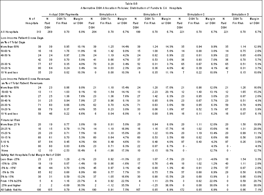
Simulation B uses information from the financial data on gross patient revenues as the measure of low-income patient utilization and allocates funds to hospitals with gross revenues (inpatient and outpatient) of 15% or higher that are attributable to Medicaid, other government programs for low-income patients, bad debt and uncompensated care. Revenues attributable to Medicare SSI patients are not included in this low-utilization measure. Relative to Simulation A
hospitals that provide a relatively high volume of outpatient services to low-income patients are advantaged. While this is a desirable objective, it is not clear that the result is an improvement over Simulation A. For example, hospitals with no financial risk receive higher DSH payments under Simulation B. The loss of funds by safety net hospitals ($121 million) is a re-distribution between hospitals that have a high proportion of low-income inpatient days and hospitals that have a high percentage of gross revenues attributable to low-income patients and highlights the potential importance of deciding how to define safety net hospitals.
Simulations C and D allocate funds to hospitals with ratios of financial risk to operating expenses above .05. Simulation C increases the margins of hospitals with relatively high financial risk and improves the safety net hospital margins. Hospitals with 0-5% financial risk have the lowest margins. This raises an issue regarding whether a threshold should be used in the allocation policy. Simulation D uses a sliding scale in the allocation formula so that hospitals with higher financial risk receive a relatively greater proportion of funds. The formula that was used in the simulation shifts most funds to hospitals with financial risk ratios above .25. Since on average hospitals in this category already have relatively high margins and the overall ratio of DSH to financial risk is high, this particular sliding scale formula provides greater than 1:1 DSH to financial risk coverage for hospitals with the highest financial risk. This type of coverage may be needed to cover operating losses. Across the classes of safety net hospitals, the allocation improves the margins of financially vulnerable safety net hospitals; however, hospitals with total margins net of DSH in excess of 5% receive 15% of the DSH funds. The results suggest that an allocation policy that takes into account both financial risk and financial viability should be explored, e.g. an allocation based on financial risk capped at an amount that would not increase a hospital's margin above 5%-7%. Hospitals that are otherwise able to cover their financial risk through third-party revenues and other revenues would receive little or no funding.
5. We were unable to match 13 hospitals in our analysis file with CA financial data. We eliminated the hospitals so that we would have a matched set of hospitals across the simulations.
New York
Based on data provided by the Greater New York Hospital Association, New York hospitals received $1.3 billion in Medicaid DSH payments during 1998 (Table 8.7). This included the indigent pool distributions as well as special payments for financially distressed hospitals and public hospitals. The hospitals in our analysis file account for only 50 percent of this amount, or $676.6 million. We were unable to match 22 acute care hospitals in the New York financial database (including the New York Health and Hospitals Corporation hospitals) that received $663.0 million in total Medicaid DSH funds and $630.1 million in "new" Medicaid DSH funds to the hospitals in our analysis file.6 As a result, our analysis file under-represents public hospitals and understates both total DSH and "new" DSH payments. In addition, 14 specialty hospitals received $10 million in total DSH funds and $6 million in "new" Medicaid DSH funds. In calculating the "new" DSH funds, we did not include payer contributions that the hospitals collected and passed through to the indigent care pool.
| All Hospitals (millions $) |
Hospitals in Analysis file (millions $) |
|
|---|---|---|
| Medicaid DSH Payments 2 | ||
| N hospitals receiving payments | 163 | 138 |
| Indigent care pool distribution | 668.6 | 510.1 |
| Public Indigent Care adjustment | 405.2 | 33.6 |
| Intergovernmental transfer | 256.7 | 132.9 |
| Total FY1998 Payments | 1,350.5 | 676.6 |
| Medicaid DSH Provider Contributions1,2 | ||
| Inpatient Assessment | (178.9) | (141.5) |
| Medicaid DSH cap reduction loss | (2.1) | (2.0) |
| Net FY1998 Medicaid "New" DSH | 1,169.5 | 533.1 |
| Federal Share of Medicaid DSH Payments | 675.3 | 338.3 |
| Medicare DSH Payments | ||
| N hospitals receiving payments | N/A | 155 |
| Current law payments | 491.9 | |
| Total DSH Payments for Simulation | 830.2 |
1 Hospitals also passed through payer indigent care contributions totaling $73.9 million ($45.8 for hospitals in analysis file).
2 Source: Greater New York Hospital Association
The 188 New York hospitals in the analysis file incurred financial risk (Medicaid shortfalls, bad debt and uncompensated care) of $1.8 billion, or $80 per day (Table 8.8). The hospitals had operating margins net of "new" DSH payments of -12.4% and operating margins with DSH of -6.8%. For comparison, the operating margins of the acute care hospitals that are missing from the analysis file were -24.4% and -6.8 percent without and with DSH, respectively. A higher proportion of the total DSH payments made to the missing hospitals is "new" DSH funds.7 Most hospitals in the analysis file (174 out of 188) received DSH payments from either Medicare or Medicaid or both programs.
- Ninety-five percent of DSH funds went to safety-net hospitals (none of which had operating margins exceeding 5%).
- The NY hospitals with large teaching programs had lower operating margins on average than other hospitals in the state (-8.9% with DSH).
- As was the case with CA hospitals, Medicaid DSH funds are more concentrated on hospitals that serve a high proportion of low-income patients.
- In general, margins decline as the proportion of care furnished to low-income patients increases. However, NY hospitals with fewer than 10 percent low-income patients had slightly below-average margins after DSH payments are taken into account (- 7.2%); in comparison, hospitals with less than 10% of their revenues attributable to low-income patient had operating margins of -3.6 %. Hospitals with more than 50% of their patient population attributable to low-income patients bore 19% of the financial risk and received 29% of DSH payments.
- Given overall negative margins, the question raised by the CA results concerning the appropriateness of making DSH payments to hospitals that are financially viable is less important. Nevertheless, 4% of DSH funds went to hospitals that did not incur financial risk. Across the safety net hospital classes, there is no clear pattern in the ratio of DSH payments to financial risk but there are relatively greater gains by hospitals with the lowest operating margins net of DSH payments.
In New York, total Medicaid distributions to all hospitals and to the hospitals in our analysis file are greater than the federal share of DSH payments. Accordingly, DSH funds for the simulations are about 20 percent lower than the joint Medicare and "new" Medicaid funds under current law ($830 million vs. 1.0 million) and result in lower overall margins (-7.8% vs. -6.8%). The results of the simulations are summarized in Table 8.9. More detailed simulation results are in Appendix D, Tables A8.9A-D.
Simulation A allocates DSH payments to all hospitals with 15% or more Medicaid and self-pay patients and concentrates funding on a smaller set of hospitals (100 versus 174 under current law. The 5 hospitals with 60 percent or more low-income patient days benefit at the expense of the other hospitals. Two of the hospitals have little or no financial risk and account for the high DSH to financial risk ratio and high positive operating margins for the group. Generally, the DSH to financial risk ratio declines as the percentage of low-income utilization or revenue declines. However, hospitals with 50-60% low-income days receive less coverage for their financial risk than hospitals with 40-50% low-income days and, consistent with the California results, 7 hospitals with no financial risk would receive 6 percent of DSH funds.
Simulation B allocates DSH payments using gross revenues attributable to Medicaid, charity care and bad debt. Compared to Simulation A, the DSH to financial risk ratio is somewhat improved across the low-income patient utilization and revenue groups. About $52 million would be re-distributed between hospitals with a relatively high percentage of low-income inpatient days and those with a relatively high percentage of gross revenues attributable to low-income patients (Table A8.9B in Appendix D).
Simulations C and D allocate funds to hospitals with ratios of financial risk to operating expenses above .05. Both simulations improve the operating margins for hospitals with highest financial risk compared to current law policies. There is also a slight improvement for the safety net hospitals with the lowest operating margins net of DSH (less than -25%) compared to current policies after accounting for the overall lower margins in the simulations. Only one hospital in the analysis file benefits from the sliding scale formula used in Simulation D. The results could be quite different if all New York hospitals were included in the analysis. Overall, the ratio of financial risk to operating expenses for the missing acute care hospitals is .15 compared to .08 for the 188 hospitals in the analysis file.
| N of Hospitals |
Adjusted Inp Days |
% Adj. InpDays |
Financial Risk $ |
% of Fin Risk |
Fin Risk per Adj Day ($) |
Margin Net of DSH |
|
|---|---|---|---|---|---|---|---|
| All Hospitals | 188 | 22,533,140 | 100% | 1,808,345,853 | 100% | 80 | -12.4% |
| By Geographic Area | |||||||
| Urban | 152 | 20,143,240 | 89% | 1,752,076,210 | 97% | 87 | -13.2% |
| Large Urban | 107 | 16,005,046 | 71% | 1,620,736,070 | 90% | 101 | -14.8% |
| Other Urban | 45 | 4,138,194 | 18% | 131,340,140 | 7% | 32 | -4.7% |
| Rural | 36 | 2,389,900 | 11% | 56,269,644 | 3% | 24 | -0.8% |
| Urban By Bedsize | |||||||
| 0-49 beds | 6 | 198,321 | 1% | 1,789,233 | 0% | 9 | -8.4% |
| 50-99 beds | 14 | 508,865 | 2% | 9,907,161 | 1% | 19 | -9.1% |
| 100-199 beds | 32 | 2,413,142 | 11% | 90,029,641 | 5% | 37 | -10.7% |
| 200-299 beds | 39 | 3,862,568 | 17% | 156,510,708 | 9% | 41 | -8.1% |
| 300-499 beds | 34 | 4,973,294 | 22% | 359,326,718 | 20% | 72 | -13.3% |
| 500 or more beds | 27 | 8,187,050 | 36% | 1,134,512,748 | 63% | 139 | -15.3% |
| Rural By Bedsize | |||||||
| 0-49 beds | 11 | 362,020 | 2% | 7,790,414 | 0% | 22 | -4.9% |
| 50-99 beds | 10 | 714,418 | 3% | 7,923,024 | 0% | 11 | -4.0% |
| 100-149 beds | 5 | 374,445 | 2% | 32,660,492 | 2% | 87 | 0.8% |
| 150 or more beds | 10 | 939,017 | 4% | 1,789,233 | 0% | 2 | 0.7% |
| Type of Ownership | |||||||
| State government | 3 | 451,385 | 2% | 102,619,126 | 6% | 227 | -43.5% |
| County or local government | 11 | 1,528,029 | 7% | 94,006,793 | 5% | 62 | -21.9% |
| Gov. - hosp. dist. | 0 | - | - | - | - | - | - |
| Not-for-profit | 164 | 19,775,969 | 88% | 1,595,288,322 | 88% | 81 | -11.3% |
| For-profit | 10 | 777,757 | 3% | 16,431,612 | 1% | 21 | -11.4% |
| Teaching Status | |||||||
| Non- teaching | 105 | 7,663,244 | 34% | 207,897,373 | 11% | 27 | -6.0% |
| Fewer than 10 residents | 17 | 1,723,193 | 8% | 51,967,412 | 3% | 30 | -3.5% |
| Residents >10 and <100 | 32 | 3,836,221 | 17% | 197,496,165 | 11% | 51 | -11.5% |
| Residents => 100 and < 250 | 20 | 4,655,349 | 21% | 565,611,769 | 31% | 121 | -17.7% |
| Residents => 250 | 14 | 4,655,133 | 21% | 785,373,134 | 43% | 169 | -15.7% |
| Low-Income Patient Gross Days as % of Total Days | |||||||
| More than 60% | 5 | 560,122 | 2% | 33,805,914 | 2% | 60 | -17.1% |
| 50-60 % | 9 | 1,178,380 | 5% | 305,060,576 | 17% | 259 | -41.1% |
| 40-50 % | 11 | 2,656,218 | 12% | 355,147,421 | 20% | 134 | -23.5% |
| 30-40 % | 22 | 3,539,924 | 16% | 452,694,991 | 25% | 128 | -15.5% |
| 20-30 % | 43 | 5,290,265 | 23% | 344,100,280 | 19% | 65 | -10.2% |
| 10-20 % | 69 | 6,747,140 | 30% | 194,121,520 | 11% | 29 | -2.5% |
| 10 % and less | 29 | 2,561,091 | 11% | 123,415,152 | 7% | 48 | -7.7% |
| Low-Income Patient Gross Revenues as % of Total Patient Revenues | |||||||
| More than 60% | 1 | 184,110.00 | 1% | 32,145,549 | 2% | 175 | -27.8% |
| 50-60 % | 5 | 559,467.00 | 2% | 89,567,523 | 5% | 160 | -23.3% |
| 40-50 % | 15 | 3,201,275.00 | 14% | 503,940,782 | 28% | 157 | -26.4% |
| 30-40 % | 20 | 4,097,775.00 | 18% | 548,956,584 | 30% | 134 | -18.7% |
| 20-30 % | 38 | 4,358,125.00 | 19% | 190,041,988 | 11% | 44 | -8.8% |
| 10-20 % | 73 | 7,228,675.00 | 32% | 348,071,669 | 19% | 48 | -6.8% |
| 10 % and less | 36 | 2,903,713.00 | 13% | 95,621,757 | 5% | 33 | -3.9% |
| Financial Risk | |||||||
| More than 25 % | 1 | 197,289.00 | 1% | 55,413,272 | 3% | 281 | -55.5% |
| 20-25 % | 8 | 1,297,053.00 | 6% | 347,381,295 | 19% | 268 | -35.4% |
| 15-20 % | 5 | 1,486,924.00 | 7% | 236,278,852 | 13% | 159 | -21.1% |
| 10-15 % | 13 | 2,684,243.00 | 12% | 351,032,344 | 19% | 131 | -24.4% |
| 5-10 % | 75 | 8,545,262.00 | 38% | 670,811,230 | 37% | 79 | -9.7% |
| 0-5 % | 72 | 6,885,625.00 | 31% | 174,630,253 | 10% | 25 | -4.6% |
| None | 14 | 1,436,744.00 | 6% | -27,201,393 | -2% | -19 | -6.6% |
| Safety Net Hospitals:Margin Net of DSH | |||||||
| Less than -25% | 21 | 3,927,171.00 | 17% | 709,022,141 | 39% | 181 | -38.1% |
| -15 to -25% | 15 | 2,122,513.00 | 9% | 243,472,749 | 13% | 115 | -20.3% |
| -5% to -15% | 32 | 4,817,718.00 | 21% | 392,877,367 | 22% | 82 | -8.9% |
| -5% to 5% | 22 | 2,357,507.00 | 10% | 145,436,925 | 8% | 62 | -0.9% |
| 5% to 15% | 0 | - | - | - | - | - | - |
| From 15% to25% | 0 | - | - | - | - | - | - |
| 25% and higher | 0 | - | - | - | - | - | - |
| All Safety Net Hospitals | 90 | 13,224,909.00 | 59% | 1,490,809,181 | 82% | 113 | -17.2% |
| N Receiving DSH |
Joint DSH Funds $ |
% of DSH New Funds | DSH To Fin Risk |
Margin w/ Medicare DSH |
Margin w/ Medicaid DSH |
Margin w/ Joint DSH |
|
|---|---|---|---|---|---|---|---|
| All Hospitals | 174 | 1,024,960,992 | 100% | 0.57 | -9.7% | -9.4% | -6.8% |
| By Geographic Area | |||||||
| Urban | 142 | 1,011,467,032 | 99% | 0.58 | -10.2% | -10.0% | -7.2% |
| Large Urban | 102 | 943,187,384 | 92% | 0.58 | -11.5% | -11.2% | -8.1% |
| Other Urban | 40 | 68,279,648 | 7% | 0.52 | -3.4% | -3.5% | -2.3% |
| Rural | 32 | 13,493,960 | 1% | 0.24 | -0.2% | -0.3% | 0.4% |
| Urban By Bedsize | |||||||
| 0-49 beds | 5 | 632,188 | 0% | 0.35 | -8.0% | -8.0% | -7.6% |
| 50-99 beds | 13 | 2,986,130 | 0% | 0.30 | -8.8% | -8.1% | -7.8% |
| 100-199 beds | 31 | 48,677,225 | 5% | 0.54 | -9.0% | -8.8% | -7.1% |
| 200-299 beds | 35 | 83,314,560 | 8% | 0.53 | -6.3% | -6.9% | -5.1% |
| 300-499 beds | 32 | 266,634,840 | 26% | 0.74 | -10.3% | -9.5% | -6.7% |
| 500 or more beds | 26 | 609,222,088 | 59% | 0.54 | -11.7% | -11.4% | -8.1% |
| Rural By Bedsize | |||||||
| 0-49 beds | 10 | 1,393,795 | 0% | 0.18 | -3.3% | -3.1% | -3.8% |
| 50-99 beds | 5 | 3,190,973 | 0% | 0.40 | 1.6% | 1.2% | -2.5% |
| 100-149 beds | 9 | 2,377,184 | 0% | 0.07 | 1.2% | 1.2% | 2.0% |
| 150 or more beds | 5 | 6,532,008 | 1% | 3.65 | -8.0% | -8.0% | 1.8% |
| Type of Ownership | |||||||
| State government | 3 | 125,469,713 | 12% | 1.22 | -38.2% | -19.5% | -15.8% |
| County or local government | 8 | 96,890,885 | 9% | 1.03 | -18.7% | -6.0% | -3.6% |
| Gov. - hosp. dist. | 0 | - | - | - | - | - | - |
| Not-for-profit | 155 | 790,059,425 | 77% | 0.50 | -8.5% | -9.2% | -6.5% |
| For-profit | 8 | 12,540,968 | 1% | 0.76 | -8.8% | -11.0% | -8.4% |
| Teaching Status | |||||||
| Non- teaching | 96 | 71,556,406 | 7% | 0.34 | -4.8% | -5.4% | -4.2% |
| Fewer than 10 residents | 15 | 18,373,381 | 2% | 0.35 | -2.3% | -3.2% | -2.0% |
| Residents >10 and <100 | 30 | 95,730,474 | 9% | 0.48 | -9.7% | -9.9% | -8.2% |
| Residents => 100 and < 250 | 20 | 455,671,001 | 44% | 0.81 | -12.7% | -11.0% | -6.5% |
| Residents => 250 | 13 | 383,629,729 | 37% | 0.49 | -12.4% | -12.1% | -8.9% |
| Low-Income Patient Gross Days as % of Total Days | |||||||
| More than 60% | 5 | 76,547,383 | 7% | 2.26 | -9.5% | -6.7% | -0.4% |
| 50-60 % | 8 | 226,952,274 | 22% | 0.74 | -33.6% | -22.2% | -16.5% |
| 40-50 % | 11 | 248,108,795 | 24% | 0.70 | -17.1% | -15.4% | -9.9% |
| 30-40 % | 22 | 260,877,227 | 25% | 0.58 | -11.2% | -12.9% | -8.8% |
| 20-30 % | 43 | 164,059,030 | 16% | 0.48 | -7.9% | -8.5% | -6.2% |
| 10-20 % | 65 | 37,686,150 | 4% | 0.19 | -1.9% | -2.2% | -1.6% |
| 10 % and less | 20 | 10,730,133 | 1% | 0.09 | -7.5% | -7.4% | -7.2% |
| Low-Income Patient Gross Revenues as % of Total Patient Revenues | |||||||
| More than 60% | 1 | 25,465,915 | 2% | 0.79 | -20.4% | -13.6% | -7.8% |
| 50-60 % | 5 | 90,357,267 | 9% | 1.01 | -15.2% | -10.2% | -3.7% |
| 40-50 % | 15 | 358,155,254 | 35% | 0.71 | -19.7% | -15.7% | -10.1% |
| 30-40 % | 19 | 305,344,174 | 30% | 0.56 | -14.0% | -15.5% | -11.1% |
| 20-30 % | 36 | 118,747,939 | 12% | 0.62 | -6.5% | -7.1% | -4.9% |
| 10-20 % | 71 | 119,229,090 | 12% | 0.34 | -5.7% | -5.7% | -4.6% |
| 10 % and less | 27 | 7,661,353 | 1% | 0.08 | -3.7% | -3.8% | -3.6% |
| Financial Risk | |||||||
| More than 25 % | 1 | 20,900,421 | 2% | 0.38 | -45.4% | -42.3% | -33.8% |
| 20-25 % | 8 | 231,271,389 | 23% | 0.67 | -27.9% | -18.7% | -13.0% |
| 15-20 % | 5 | 128,765,465 | 13% | 0.54 | -14.9% | -14.2% | -8.6% |
| 10-15 % | 13 | 278,374,933 | 27% | 0.79 | -18.5% | -16.5% | -11.3% |
| 5-10 % | 71 | 263,618,684 | 26% | 0.39 | -7.5% | -8.3% | -6.3% |
| 0-5 % | 65 | 63,349,284 | 6% | 0.36 | -3.6% | -4.4% | -3.4% |
| None | 11 | 38,680,816 | 4% | -1.42 | -3.8% | -4.7% | -1.9% |
| Less than -25% | 21 | 462,752,562 | 45% | 0.65 | -31.6% | -26.6% | -21.1% |
| -15 to -25% | 14 | 189,396,369 | 18% | 0.78 | -15.7% | -13.8% | -9.6% |
| -5% to -15% | 32 | 241,159,396 | 24% | 0.61 | -5.4% | -7.1% | -3.7% |
| -5% to 5% | 22 | 83,236,382 | 8% | 0.57 | 1.8% | 0.3% | 2.9% |
| 5% to 15% | - | - | - | - | - | - | |
| From 15% to25% | - | - | - | - | - | - | |
| 25% and higher | - | - | - | - | - | - | |
| All Safety Net Hospitals | 89 | 976,544,709 | 95% | 0.66 | -13.0% | -12.5% | -8.5% |
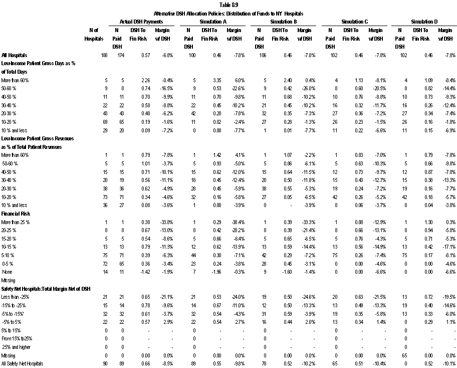
6. The starting point for our analysis file for this project was hospitals that were on HCRIS. The New York HHC facilities file manual cost reports and are not included on HCRIS.
7. We note that direct comparisons should not be made between the CA and NY hospitals both because of the missing hospitals and the use of operating margins in NY and total margins in CA.
Wisconsin
Wisconsin's small Medicaid DSH program benefited 10 Wisconsin general acute care hospitals in FY1998 with one hospital receiving over 80 percent of the funds going to acute care hospitals. The remainder of the funds went to IMDs, children's and other hospitals and two out-of-state hospitals. Medicaid contributed only 17 percent of the total $39.7 million in the FY1998 DSH funds paid to the acute care hospitals (Table 8.10).
| All Hospitals (millions $) |
Hospitals in Analysis file (millions $) |
|
|---|---|---|
| Medicaid DSH Payments1 | ||
| N hospitals receiving payments | 16 | 10 |
| Total FY1998 Payments | 11.2 | 6.7 |
| Net FY1998 Medicaid "New" DSH | 11.2 | 6.7 |
| Federal Share of Medicaid DSH Payments | 6.6 | 3.9 |
| Medicare DSH Payments | ||
| N hospitals receiving payments | N/A | 52 |
| Current law payments | 33.1 | |
| Total DSH Payments for Simulation | N/A | 36.9 |
1. Source: Wisconsin report to CMS on FY1998 DSH expenditures.
The Medicare program paid DSH to 52 hospitals and accounted for 83% of the funds ($33.1 million) (Table 8.11). Taken together, 54 acute care hospitals in our analysis file received DSH payments under current policies. The financial risk associated with serving low-income patients across Wisconsin hospitals is relatively low ($78 per adjusted day) and is shared across all hospitals so that three hospitals bore financial risk that was more than 10 percent of their operating costs. Only 19 Wisconsin hospitals qualify as safety net hospitals using the definition of 20 percent or more of inpatient days attributable to Medicare SSI, Medicaid, local indigent care programs, self-pay and charity care.
| N of Hospitals |
Adjusted Inp Days |
% Adj. Inp Days |
Financial Risk $ |
% of Fin Risk |
Fin Risk per Adj Day ($) |
Margin Net of DSH |
|
|---|---|---|---|---|---|---|---|
| All Hospitals | 113 | 5,165,466 | 100% | 402,965,177 | 100% | 78 | 5.8% |
| By Geographic Area | |||||||
| Urban | 52 | 3,033,000 | 59% | 324,020,668 | 80% | 107 | 5.5% |
| Large Urban | 23 | 1,287,685 | 25% | 158,653,582 | 39% | 123 | 3.4% |
| Other Urban | 29 | 1,745,315 | 34% | 165,367,085 | 41% | 95 | 7.0% |
| Rural | 61 | 2,132,466 | 41% | 78,944,510 | 20% | 37 | 6.8% |
| Urban By Bedsize | |||||||
| 0-49 beds | 6 | 139,083 | 3% | 3,399,099 | 1% | 24 | 6.2% |
| 50-99 beds | 8 | 209,190 | 4% | 11,930,599 | 3% | 57 | 7.1% |
| 100-199 beds | 10 | 305,502 | 6% | 19,083,931 | 5% | 62 | 8.4% |
| 200-299 beds | 8 | 571,377 | 11% | 61,711,929 | 15% | 108 | 4.8% |
| 300-499 beds | 15 | 1,089,365 | 21% | 101,451,220 | 25% | 93 | 6.5% |
| 500 or more beds | 5 | 718,483 | 14% | 126,443,889 | 31% | 176 | 3.1% |
| Rural By Bedsize | |||||||
| 0-49 beds | 32 | 1,014,982 | 20% | 19,641,009 | 5% | 19 | 3.2% |
| 50-99 beds | 20 | 610,746 | 12% | 27,456,984 | 7% | 45 | 6.5% |
| 100-149 beds | 5 | 229,434 | 4% | 9,876,735 | 2% | 43 | 8.5% |
| 150 or more beds | 4 | ||||||
| Type of Ownership | |||||||
| State government | 1 | 184,242 | 4% | 21,564,543 | 5% | 117 | 3.8% |
| County or local government | 5 | 98,222 | 2% | 4,695,152 | 1% | 48 | 9.5% |
| Gov. - hosp. dist. | 0 | - | - | - | - | - | - |
| Not-for-profit | 107 | 4,883,002 | 95% | 376,705,482 | 93% | 77 | 5.8% |
| For-profit | 0 | - | - | - | - | - | - |
| Teaching Status | |||||||
| Non- teaching | 90 | 3,093,999 | 60% | 138,254,019 | 34% | 45 | 6.1% |
| Fewer than 10 residents | 9 | 534,118 | 10% | 49,357,043 | 12% | 92 | 9.7% |
| Residents >10 and <100 | 11 | 1,077,726 | 21% | 107,752,477 | 27% | 100 | 5.7% |
| Residents => 100 and < 250 | 2 | 275,381 | 5% | 86,037,095 | 21% | 312 | -0.2% |
| Residents => 250 | 1 | 184,242 | 4% | 21,564,543 | 5% | 117 | 3.8% |
| Low-Income Patient Gross Days as % of Total Days | |||||||
| More than 60% | 1 | 17,403 | 0% | 2,627,553 | 1% | 151 | -1.3% |
| 50-60 % | 0 | - | - | - | - | - | - |
| 40-50 % | 1 | 35,408 | 1% | 1,503,079 | 0% | 42 | 1.0% |
| 30-40 % | 6 | 485,170 | 9% | 97,355,604 | 24% | 201 | -0.4% |
| 20-30 % | 11 | 431,728 | 8% | 33,402,785 | 8% | 77 | 0.3% |
| 10-20 % | 60 | 2,817,231 | 55% | 191,680,129 | 48% | 68 | 6.3% |
| 10 % and less | 34 | 1,378,526 | 27% | 76,396,028 | 19% | 55 | 8.0% |
| Low-Income Patient Gross Revenues as % of Total Patient Revenues | |||||||
| More than 60% | 0 | - | - | - | - | - | - |
| 50-60 % | 0 | - | - | - | - | - | - |
| 40-50 % | 2 | 112,702.00 | 2% | 55,780,513 | 14% | 495 | -8.4% |
| 30-40 % | 1 | 71,566.00 | 1% | 7,046,785 | 2% | 98 | -6.1% |
| 20-30 % | 3 | 254,394.00 | 5% | 33,718,409 | 8% | 133 | 4.1% |
| 10-20 % | 32 | 1,369,452.00 | 27% | 94,028,253 | 23% | 69 | 2.0% |
| 10 % and less | 75 | 3,357,352.00 | 65% | 212,391,219 | 53% | 63 | 7.8% |
| Financial Risk | |||||||
| More than 25 % | 0 | - | - | - | - | - | - |
| 20-25 % | 0 | - | - | - | - | - | - |
| 15-20 % | 1 | 95,299.00 | 2% | 53,152,960 | 13% | 558 | -9.0% |
| 10-15 % | 3 | 149,507.00 | 3% | 10,505,009 | 3% | 70 | -4.7% |
| 5-10 % | 42 | 1,866,327.00 | 36% | 173,827,268 | 43% | 93 | 5.2% |
| 0-5 % | 67 | 3,054,333.00 | 59% | 165,479,942 | 41% | 54 | 7.1% |
| None | 0 | - | - | - | - | - | - |
| Safety Net Hospitals:Margin Net of DSH | |||||||
| Less than -25% | 0 | - | - | - | - | - | - |
| -15 to -25% | 0 | - | - | - | - | - | - |
| -5% to -15% | 2 | 166,865.00 | 3% | 60,199,744 | 15% | 361 | -8.4% |
| -5% to 5% | 11 | 627,630.00 | 12% | 67,098,264 | 17% | 107 | 1.4% |
| 5% to 15% | 6 | 175,214.00 | 3% | 7,591,013 | 2% | 43 | 8.8% |
| From 15% to25% | 0 | - | - | - | - | - | - |
| 25% and higher | 0 | - | - | - | - | - | - |
| All Safety Net Hospitals | 19 | 969,709.00 | 19% | 134,889,021 | 33% | 139 | -0.1% |
| N Receiving DSH | Joint DSH Funds $ | % of DSH New Funds | DSH To Fin Risk | Margin w/ Medicare DSH | Margin w/ Medicaid DSH | Margin w/ Joint DSH | |
|---|---|---|---|---|---|---|---|
| All Hospitals | 54 | 39,721,492 | 100% | 0.10 | 6.3% | 5.9% | 6.4% |
| By Geographic Area | |||||||
| Urban | 38 | 37,470,610 | 94% | 0.12 | 6.1% | 5.6% | 6.3% |
| Large Urban | 16 | 29,794,272 | 75% | 0.19 | 4.6% | 3.7% | 5.0% |
| Other Urban | 22 | 7,676,339 | 19% | 0.05 | 7.3% | 7.0% | 7.3% |
| Rural | 16 | 2,250,882 | 6% | 0.03 | 7.0% | 6.8% | 7.0% |
| Urban By Bedsize | |||||||
| 0-49 beds | 0 | 0 | 0% | 0.00 | 6.2% | 6.2% | 6.2% |
| 50-99 beds | 3 | 221,718 | 1% | 0.02 | 7.1% | 7.1% | 7.1% |
| 100-199 beds | 7 | 1,428,581 | 4% | 0.07 | 8.7% | 8.4% | 8.7% |
| 200-299 beds | 8 | 2,817,531 | 7% | 0.05 | 5.1% | 4.8% | 5.1% |
| 300-499 beds | 15 | 5,189,832 | 13% | 0.05 | 6.8% | 6.5% | 6.8% |
| 500 or more beds | 5 | 27,812,948 | 70% | 0.22 | 5.0% | 3.6% | 5.5% |
| Rural By Bedsize | |||||||
| 0-49 beds | 7 | 587,856 | 1% | 0.03 | 3.4% | 3.2% | 3.4% |
| 50-99 beds | 6 | 996,141 | 3% | 0.04 | 6.7% | 6.5% | 6.7% |
| 100-149 beds | 2 | 659,384 | 2% | 0.07 | 8.9% | 8.6% | 8.9% |
| 150 or more beds | |||||||
| Type of Ownership | |||||||
| State government | 1 | 2,184,504 | 5% | 0.10 | 4.4% | 3.8% | 4.4% |
| County or local government | 1 | 5,149 | 0% | 0.00 | 9.5% | 9.5% | 9.5% |
| Gov. - hosp. dist. | 0 | 0 | |||||
| Not-for-profit | 52 | 37,531,839 | 94% | 0.10 | 6.4% | 5.9% | 6.5% |
| For-profit | 0 | 0 | - | - | - | - | - |
| Teaching Status | |||||||
| Non- teaching | 32 | 3,792,027 | 10% | 0.03 | 6.3% | 6.1% | 6.3% |
| Fewer than 10 residents | 9 | 2,340,355 | 6% | 0.05 | 9.9% | 9.7% | 10.0% |
| Residents >10 and <100 | 10 | 7,784,573 | 20% | 0.07 | 6.1% | 5.7% | 6.1% |
| Residents => 100 and < 250 | 2 | 23,620,033 | 59% | 0.27 | 3.3% | 1.0% | 4.5% |
| Residents => 250 | 1 | 2,184,504 | 5% | 0.10 | 4.4% | 3.8% | 4.4% |
| Low-Income Patient Gross Days as % of Total Days | |||||||
| More than 60% | 1 | 283,323 | 1% | 0.11 | -0.4% | -0.1% | 0.8% |
| 50-60 % | 0 | 0 | - | - | - | - | - |
| 40-50 % | 0 | 0 | 0% | 0.00 | 1.0% | 1.0% | 1.0% |
| 30-40 % | 6 | 25,422,108 | 64% | 0.26 | 2.9% | 0.7% | 3.9% |
| 20-30 % | 9 | 4,899,009 | 12% | 0.15 | 1.8% | 0.3% | 1.8% |
| 10-20 % | 25 | 8,856,452 | 22% | 0.05 | 6.6% | 6.3% | 6.6% |
| 10 % and less | 13 | 260,600 | 1% | 0.00 | 8.0% | 8.0% | 8.0% |
| Low-Income Patient Gross Revenues as % of Total Patient Revenues | |||||||
| More than 60% | 0 | - | - | - | - | - | - |
| 50-60 % | 0 | - | - | - | - | - | - |
| 40-50 % | 2 | 11,003,071 | 28% | 0.20 | -2.7% | -7.8% | -2.2% |
| 30-40 % | 1 | 588,260 | 1% | 0.08 | -5.0% | -5.6% | -4.6% |
| 20-30 % | 1 | 12,900,285 | 32% | 0.38 | 6.3% | 5.7% | 7.8% |
| 10-20 % | 21 | 9,763,578 | 25% | 0.10 | 2.8% | 2.0% | 2.8% |
| 10 % and less | 29 | 5,466,298 | 14% | 0.03 | 8.0% | 7.8% | 8.0% |
| Financial Risk | |||||||
| More than 25 % | 0 | - | - | - | - | - | - |
| 20-25 % | 0 | - | - | - | - | - | - |
| 15-20 % | 1 | 10,719,748 | 27% | 0.20 | -2.9% | -8.5% | -2.4% |
| 10-15 % | 2 | 871,583 | 2% | 0.08 | -3.8% | -4.1% | -3.2% |
| 5-10 % | 26 | 22,414,802 | 56% | 0.13 | 6.0% | 5.4% | 6.2% |
| 0-5 % | 25 | 5,715,359 | 14% | 0.03 | 7.2% | 7.1% | 7.2% |
| None | 0 | - | - | - | - | - | - |
| Safety Net Hospitals:Margin Net of DSH | |||||||
| Less than -25% | 0 | - | - | - | - | - | - |
| -15 to -25% | 0 | - | - | - | - | - | - |
| -5% to -15% | 2 | 11,308,008 | 28% | 0.19 | -3.3% | -7.9% | -2.8% |
| -5% to 5% | 8 | 18,448,914 | 46% | 0.27 | 3.4% | 2.3% | 4.2% |
| 5% to 15% | 6 | 847,518 | 2% | 0.11 | 9.7% | 8.9% | 9.7% |
| From 15% to25% | 0 | - | - | - | - | - | - |
| 25% and higher | 0 | - | - | - | - | - | - |
| All Safety Net Hospitals | 16 | 30,604,440 | 77% | 0.23 | 2.4% | 0.6% | 3.1% |
A relatively small number of hospitals would receive DSH funds using alternative allocation policies based on low-income utilization or gross revenues. For example, 13 hospitals would receive DSH if a low-income utilization measure that does not include Medicare SSI beneficiaries were used (Simulation A in Table 8.12). The three hospitals with the highest percentage of low-income patients would receive substantially more DSH funds than their financial risk and their total margins would be substantially above the average for Wisconsin hospitals. In comparison, Simulation C (based on financial risk) would result in DSH payments to 46 hospitals, including 16 of the 19 safety net hospitals.
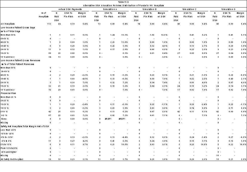
Having few hospitals with relatively high low-income patient loads and/or financial risk makes it difficult to draw any conclusions about the overall effect the alternative allocation policies might have on hospital classes. However, the results in the hospital classes with only one or two hospitals illustrate that the choice of allocation measure can have substantial impact on individual hospitals. For example, the one hospital with 30-40% low-income patient gross revenues would have a DSH to financial risk ratio of .33 under Simulation A, .89 under simulation B, .52 under Simulation C, and .49 under Simulation D. In dollars, the hospital would receive:
- Current law: $588,260
- Simulation A: $2,316,574
- Simulation B: $6,282,418
- Simulation C: $3,657,925
- Simulation D: $3,454,894
(See Appendix D Table D.3A-D.)
The results for this hospital also illustrates that the indirect measures of serving low-income patients instead of direct measures (e.g., percentage of gross revenues attributable to low-income patients x adjusted inpatient days x wage index instead of gross revenues attributable to low-income patients) have implications for how the funds are distributed. The hospital's relatively low costs help explain the relatively high DSH to financial risk ratio in Simulations C and D (.52 and .49, respectively). If the direct measurement were used instead, the hospital would have received about 50% less in DSH funds and would have had a DSH to financial risk ratio of .25 in Simulation C instead of .52.
Correlation Analysis
We examined the relationship between selected measures of serving low-income patients using 614 hospitals in the three-state analysis file (Table 8.13). We found that the correlation between the ratio of financial risk to operating costs and financial risk per day was .675. It suggests that using an allocation policy using the ratio of financial risk to operating costs could result in a considerably different DSH distribution than a policy that uses financial risk per day or another direct measure of the hospital's financial risk in the allocation policy. The correlation between financial risk as a percent of operating expenses and the percentage of low-income revenues (Medicare SSI, Medicaid, local indigent care programs, uncompensated care and bad debt) was .591. The correlation between the financial risk ratio and other measures of low-income patient services were slightly lower. The percentage of revenues was slightly more correlated with the financial risk ratio than the percentage of inpatient days and the measures that included Medicare SSI patients were also slightly more correlated than the measures that excluded these patients. Between the low-income patient utilization and revenue measures, the correlation was moderately high. For example, the correlation between % low-income days and % low-income revenues was .811 for all patients and .803 for non-Medicare patients only.
Next, we examined the relationship between the percentage of self-pay and no-charge patients and the percentage of operating expenses attributable to uncompensated care and bad debt. The issue is whether a hospital's proportion of self-pay and no-charge patients using claims data is a good proxy for its uncompensated care and bad debt costs. We found that the two measures were poorly correlated (.106). Further investigation is needed to understand why a correlation was not found.
| Ratio of FR to Operating Expenses | FR Per Day | % Low-income days | % Low-income revenue | % Non-Medicare low-income days | % Non-Medicare low-income revenue | |
|---|---|---|---|---|---|---|
| MEAN | 0.077 | 96..349 | 0.256 | 0.246 | 0.210 | 0.212 |
| STD | 0.071 | 145.119 | 0.184 | 0.178 | 0.169 | 0.166 |
| N hospitals | 614 | 614 | 614 | 614 | 614 | 614 |
| Pearson's Correlation Coefficient* | ||||||
| Ratio of FR to Operating Expenses | 1.000 | 0.675 | 0.567 | 0.591 | 0.560 | 0.579 |
| Financial Risk Per Day | 1.000 | 0.447 | 0.396 | 0.453 | 0.383 | |
| % Low-income days | 1.000 | 0.826 | 0.979 | 0.786 | ||
| % Low-income revenue | 1.000 | 0.811 | 0.984 | |||
| % Non-Medicare low-income days | 1.000 | 0.803 | ||||
| % Non-Medicare low-income revenue | 1.000 | |||||
* All values p<.0001
Finally, we examined for safety net hospitals the relationship between DSH allocations, financial risk and the hospital's net income (Table 8.14). We expected to find a negative correlation between the hospital's net income and its financial risk; that is, hospitals with high financial risk have more difficulty generating revenues to cover their expenses. The correlation was moderate (-0.57).
- The correlation between joint DSH funds under current policies and financial risk was .74. Interestingly, the correlation between the joint Medicare and Medicaid current policy DSH funds and the two financial risk measures was higher than either the new Medicaid DSH or Medicare DSH policies separately. The correlation between financial risk and Simulations A and B was similar to the joint distribution.
- The correlation between joint DSH funds and net income is -0.52. The correlation was the same for Medicaid "new" DSH and lower for Medicare DSH (-.41). None of the DSH alternatives are as strongly correlated with net income as joint DSH funds. The highest correlations are with Simulations C and D, which use financial risk as an allocation statistic.
- There is a strong correlation between Simulation C and financial risk (.882). This means that the use of the indirect measure of financial risk (ratio of financial risk to operating expenses X wage index X adjusted patient days) works fairly well for safety net hospitals.
- The correlations between the allocation factors used in Simulations A (utilization) and B (revenues) is very high (.96).
| Income net DSH ($ mill) |
Financial risk ($ mill) |
Joint DSH funds ($ mill) |
Medicaid New DSH ($ mill) |
Medicare DSH ($ mill) |
Sim A ($ mill) |
Sim B ($ mill) |
Sim C ($ mill) |
Sim D ($ mill) |
|
|---|---|---|---|---|---|---|---|---|---|
| MEAN | -8.351 | 12.025 | 8.568 | 4.752 | 3.816 | 8.917 | 8.349 | 8.265 | 8.436 |
| STD | 26.222 | 19.924 | 16.025 | 13.784 | 4.902 | 17.778 | 18.361 | 15.532 | 19.732 |
| N | 307 | 307 | 307 | 307 | 307 | 307 | 307 | 307 | 307 |
| Pearson's Correlation Coefficient* | |||||||||
| Income net DSH | 1.00 | -0.57 | -0.52 | -0.41 | -0.52 | -0.24 | -0.29 | -0.44 | -0.40 |
| Financial risk | 1.00 | 0.74 | 0.64 | 0.63 | 0.73 | 0.73 | 0.83 | 0.79 | |
| Joint DSH funds | 1.00 | 0.96 | 0.58 | 0.80 | 0.81 | 0.78 | 0.76 | ||
| New Medicaid funds | 1.00 | 0.31 | 0.79 | 0.81 | 0.77 | 0.77 | |||
| Current law Medicare funds | 1.00 | 0.40 | 0.35 | 0.40 | 0.29 | ||||
| Sim A: % Non-Medicare low-income days w/WI | 1.00 | 0.96 | 0.81 | 0.77 | |||||
| Sim B: % Low-income revenues | 1.00 | 0.85 | 0.83 | ||||||
| Sim C: Financial risk | 1.00 | 0.98 | |||||||
| Sim D : Sliding scale based on financial risk | 1.00 | ||||||||
* All values p<.0001
Conclusions
The California and New York results illustrate the importance of having information on actual IGTs in examining issues related to the current distribution of Medicaid DSH funds. Across-the-board assumptions such as those made Chapter 4 regarding the proportion of DSH funds that are "new" are not substantiated at the hospital-level. CMS should consider expanding the state DSH reports to obtain information on provider contributions to DSH pools as well as the payments from those pools to individual hospitals.
The redistributions that took place between Simulation A and Simulation B highlight the differences between allocations based solely on inpatient care and allocations that take both inpatient and outpatient care into account. While including all care is commonly endorsed as a policy objective, it is not clear from the correlation results that including all care improves the targeting of DSH funds to financially vulnerable safety net hospitals. Also, the inclusion of outpatient care raises issues regarding subsidies to other ambulatory care providers. The role that non-hospital ambulatory care providers play in the safety net for low-income populations is discussed in Appendix E. A policy that concentrates federal support for uncompensated care solely on hospitals may serve to discourage community providers from furnishing substantial amounts of care to indigent populations. It may also have implications for the relative generosity of Medicaid payments for services provided in hospital outpatient departments and clinics and in physician offices.
Allocations based on the proportion of care provided to low-income patients (e.g. revenues) result in very different distributions than an allocation based on financial risk (Medicaid shortfalls, uncompensated care and bad debt). Financial risk, however, is not the same as financial viability (i.e., total margins net of DSH payments). Some of the hospitals with substantial financial risk also have positive margins. The results across all three states highlight the need to clarify the policy goals for DSH funding. The key issue is the extent to which subsidies should be given to hospitals that serve low-income patients but do not incur financial risk or are able to cover their risk with other revenues. A closer examination of the hospitals with substantial gains or losses in moving from an allocation policy based on serving low-income patients to incurring financial risk might help clarify the issues. This examination should consider the role of other federal subsidies such as the Medicare indirect teaching adjustment in explaining why some hospitals with substantial financial risk appear to be in a strong financial position.
Neither the current DSH allocation policies nor the alternative policies examined in the simulations are strongly correlated with a hospital's net income. The factors affecting financial viability may be too complex to be measured with a single statistic. A multi-variate analysis of the factors affecting a hospital's financial risk and it overall financial status using a broader set of hospitals could also help identify additional factors that should be considered in an allocation policy.
Looking in-depth at the relationship between the financial status of hospitals and the distribution of DSH payments was a complex task. The differences in state accounting and reporting practices made it difficult to determine Medicaid shortfalls and to take "new" DSH payments into account. Knowing the DSH payments to individual hospitals is not enough; it is also important to understand how those payments are handled in reporting Medicaid contractual allowances and patient revenues. It is also important to understand how financing occurs for county-owned hospitals in terms of other intergovernmental transfers and deficit funding. An allocation based on financial measures would require uniform reporting by payer. All three states in this analysis require the type of financial information that would be needed.
The "snapshot" approach of looking at one year's data may not be sufficient for an adequate understanding of the financial implications of serving low-income patients. In California, the FY1998 payments included payments from the state's fiscal year 1997 and thus overstated the average DSH payments. The New York indigent care pool was in transition during FY1998 and additional changes were enacted in 2000. Wisconsin's uncompensated care costs have increased 60 percent since 1997. Only the first-year impacts of the Balanced Budget Amendment are reflected in the FY1998 data. These considerations suggest that a multi-year study — perhaps with periodic updating — would be appropriate.
Even more troubling than using one year's data is the lack of a national database that provides uniform information on the quantity of care provided to low-income patients and the financial risk associated with that care. Each state's Medicaid DSH program is idiosyncratic. A close examination of DSH policies in a few states highlights potential issues but a national database is needed to understand the potential re-distributions that might occur both at the market level and across states under a national allocation policy. The BBRA provision requiring the Secretary to collect through the Medicare cost report data on uncompensated costs should help. This provision is effective for cost reporting periods beginning on or after October 1, 2001.
9. Summary of Findings and Conclusions
This project included several inter-related tasks:
- Examine the distribution of both Medicare and Medicaid DSH funds across hospitals;
- Assess alternative criteria that could be used to identify safety net hospitals;
- Develop measures of financial vulnerability to identify those safety net hospitals that are under most financial pressure; and,
- Explore the extent to which alternative allocation policies to the current Medicare and Medicaid DSH payment mechanisms would improve the distribution of funds to vulnerable safety net hospitals.
Overall, we found that despite the known issues with the current Medicare and Medicaid DSH policies, the current distribution targets financially vulnerable safety net hospitals at least as well as the alternatives that we examined. The multiple Medicare formula and the flexibility of the Medicaid program may allow for better targeting than a single formula-driven allocation policy. Nevertheless, it is clear that there is room for improvement in the current policies and that further study is warranted. In particular, a multi-variate analysis of the factors affecting financial risk and financial viability is needed. Ideally, the analysis would involve a national database with information on each's hospitals uncompensated care and shortfalls from Medicaid and local indigent care programs. Given the diversity of Medicaid DSH program, a national database is needed to fully understand the potential impact of alternative allocation policies at both the national and market levels.
Current Distribution of DSH Payments
Medicare DSH Payments. We estimate Medicare FY 1998 actual DSH payments at $4.83 billion. If the FY2003 DSH payment rules had been in effect and all other FY1998 payment parameters remained unchanged, payments would have been $358 million higher, or $5.18 billion. Consistent with the changes in the formula, most payment increases occurred among rural hospitals and small urban hospitals. Although rural hospitals provided 19% of total Medicare inpatient days, they received only 3.1% of the Medicare DSH payments. Under BIPA, the rural share of DSH payments will more than double to 7.2%.
Medicaid DSH Payments. Nationally, we found that the states reported $15 billion in DSH payments to hospitals, with about 23% of this amount paid to institutes for mental disease. The states with the largest DSH programs are California, New York, New Jersey, and Texas. Utilizing the estimates made by Coughlin et al. for FY 1997, we estimate that 11 states retained DSH funds: California, Connecticut, Georgia, Indiana, Kentucky, Massachusetts, Mississippi, Missouri, North Carolina, Rhode Island, and Texas. The amounts retained by the 11 states represented 15% of federal DSH payments. If we assume that only the federal share of DSH payments represents new money to facilities, "new" DSH funds would total $8.3 billion.
Distribution of Total DSH Payments
Five states together receive almost half of the total amount of DSH funds: California (16.7%), New York (12.7%), Texas (9.3%), New Jersey (5.7%), and Louisiana (4.3%). At the same time, these states have only 28% of the total adjusted patient days (7.9, 9.7, 5.8, 2.7, and 1.9 %, respectively).
For the acute care hospitals in our analysis file, DSH payments based on actual Medicare FY 1998 payments and the federal share of DSH payments totaled $9.3 billion.
- Across all hospitals, the joint DSH payments raise total margins from 1.9% to 4.7%.
- Urban hospitals receive 94% of the DSH funds.
- State and county-owned hospitals receive 13% of Medicare DSH payments and 48% of Medicaid payments.
- Using Medicare SSI and Medicaid days as the measure of low-income patients, 50% of Medicare payments and 64% of Medicaid payments are to hospitals with at least 30% low-income patients. Except for the highest categories, the average DSH payment per discharge increases as the percentage of low-income patients increases.
- 37% of Medicare DSH payments and 63% of Medicaid payments are to hospitals with a Medicaid utilization rate that is above one standard deviation from the state average. The average DSH payment per discharge increases by hospital quartile (the first quartile is the lowest quartile of acute care hospitals in the state based on Medicaid utilization).
Alternative Criteria that Could Be Used to Identify Safety Net Hospitals
We explored several types of criteria that could be used to identify safety net hospitals, including inpatient claims-based measures and measures derived from hospital financial data. Our analysis of both the HCUP and three-state data suggest that the definition of the patient population (e.g., with or without Medicare SSI beneficiaries) that is to be considered in the DSH allocation statistic is more important than how the care provided to those patients is quantified. Generally, the measures that included Medicare SSI beneficiaries along with all other low-income patients generally performed better than those that did not in targeting financially vulnerable hospitals. If an "all low-income" patient measure is not administratively feasible, using Medicaid patients only is preferable to Medicare SSI and Medicaid days or the Medicare DSH patient percentage, both of which are less correlated with low-income patients.
The different measures quantifying the amount of inpatient care provided to a low-income population (days, discharges, or charges) are highly correlated. However, the choice could have implications for certain hospitals. Those which have a high volume of Medicaid maternity cases or shorter than average length of stay (e.g. California hospitals) would benefit if discharges were used instead of days as the measure of the proportion of care provided to low-income patients. The Medicare case mix index is not a good proxy for the hospital's low-income patient case mix. In the absence of data on the case mix of low-income patients, days or charges should be used instead of discharges as the allocation statistic.
From the financial data for the three states we were able to compare how a revenue statistic that includes both inpatient and outpatient care compares to one that includes inpatient care only. The correlation between low-income days and low-income revenues indicates the choice of measure could have significant implications for some hospitals. The measure of the proportion of a hospital's gross revenues that is attributable to low-income patients was slightly more highly correlated with the hospital's ratio of financial risk to operating expenses than the other utilization measures. It is not clear from the correlation results that including all care significantly improves the targeting of DSH funds to financially vulnerable safety net hospitals. Also, the inclusion of outpatient care raises issues regarding subsidies to other ambulatory care providers. The role that non-hospital ambulatory care providers play in the safety net for low-income populations is discussed in Appendix E. A policy that concentrates federal support for uncompensated care solely on hospitals may serve to discourage community providers from furnishing substantial amounts of care to indigent populations. It may also have implications for the relative generosity of Medicaid payments for services provided in hospital outpatient departments and clinics and in physician offices. This is an area that warrants further investigation.
Measures of Financial Vulnerability
We developed two types of measures of financial vulnerability. We defined the first measure as the hospital's financial risk associated with serving low-income patients. Developed from hospital financial data for the three states, a hospital's financial risk was computed as the sum of Medicaid and local indigent care shortfalls and uncompensated care (including bad debt). For evaluation purposes, we also developed three measures of financial viability from financial data available on the Medicare cost report:
- Total margin net of Medicare DSH and the federal share of Medicaid DSH payments.
- A three-year average of total margin net of DSH.
- A composite index based on four indicators: total margin net of DSH, current ratio, cash flow to total debt, and fixed asset turnover.
We believe total margin net of DSH payments is most consistent measure for evaluating how well DSH payments are targeted toward financially vulnerable safety net hospitals. We found that the composite measure identifies a somewhat different set of hospitals as financially vulnerable. The relationship between serving low-income patients and performance on this measure is not as strong as the relationship between low-income patients and total margins net of DSH.
The individual measures of financial viability are relative stable from year to year. In particular, the consistency of the 1-year and 3-year total margin figures suggests that only one of the measures is needed in the analysis of alternative allocation methodologies. We used the FY1998 margins to simply our analysis of alternative allocation policies for FY 1998 DSH funds. In some analyses, we used related measures such as the ratio of revenues to expenses and income net of DSH payments.
Comparison of Current and Alternative Allocation Policies
Neither the current DSH allocation policies nor the alternatives that we examined in the analysis target DSH payments in a way that is strongly correlated with net income. This is an issue that warrants further investigation and understanding. The different Medicare formulae and the Medicaid DSH program's flexibility may provide mechanisms to target financially vulnerable hospitals in a way that a single formula-driven allocation may not. Targeting financially vulnerable safety net hospitals may require taking into consideration more factors than the amount of care a hospital provides to low-income patients. A multi-variate analysis of the factors affecting a hospital's financial risk and its overall financial status using a broader set of hospitals could help identify additional factors that should be considered in an allocation policy.
Allocations based on the proportion of care provided to low-income patients (e.g. revenues) result in very different distributions than an allocation based on financial risk (Medicaid shortfalls, uncompensated care and bad debt). Financial risk, however, is not the same as financial viability (i.e., total margins net of DSH payments). Some hospitals with substantial financial risk also have positive margins. The results across all three states highlighted the need to clarify the policy goals for DSH funding. The key issue is the extent to which subsidies should be given to hospitals that serve low-income patients but do not incur financial risk or are able to cover their risk with other revenues. A closer examination of the hospitals with substantial gains or losses in moving from an allocation policy based on serving low-income patients to incurring financial risk might help clarify the issues. This examination should consider the role of other federal subsidies such as the Medicare indirect teaching adjustment in explaining why some hospitals with substantial financial risk appear to be in a strong financial position.
Data Issues and Limitations
Examining the relationship between the financial status of hospitals and the distribution of DSH payments was a complex task. Particular areas where data issues became potentially problematic included:
- Matching hospitals across multiple data sources: Medicare cost reports, state DSH reports, AHA survey data, HCUP, and (in the case of California, New York and Wisconsin) state financial reports. The inclusion of Medicare provider numbers on the state DSH reports would facilitate matching hospitals with their DSH payments. Universal adoption of the uniform provider number would also help.
- For Medicaid DSH, the net gains to the hospital are more important than the reported DSH payments. CMS should give consideration to obtaining this information. It could be included in the state reports on DSH payments (in which case the information would be available for all hospitals) or it could be required as part of the Medicare cost report. In any event, knowing the DSH payments to individual hospitals is not enough; it is also important to know how those payments (and any provider contributions) are handled in reporting Medicaid contractual allowances and patient revenues.
- The differences in state accounting and reporting practices made it difficult to determine Medicaid shortfalls and to take "new" DSH payments into account. The financial data for several public hospitals was problematic. It is important to understand how financing occurs for county-owned hospitals in terms of other intergovernmental transfers and deficit funding. An allocation based on financial measures would require uniform reporting by payer. All three states in this analysis require the type of financial information that would be needed.
- Consistent handling of Medicaid managed care. Although all three states collect fiscal information on Medicaid managed care enrollees, reporting is sufficiently problematic that the California and New York Medicaid managed care data were combined with "other payers" instead of the Medicaid program. As a result, the care provided to Medicaid patients is likely to be understated- even when, as in the case of Wisconsin, Medicaid managed care revenues are separately reported on the public use file.
The "snapshot" approach of looking at one year's data may not be sufficient for an adequate understanding of the financial implications of serving low-income patients. In California, the FY1998 payments included payments from the state's fiscal year 1997 and thus overstated the average DSH payments. The New York indigent care pool was in transition during FY1998 and additional changes were enacted in 2000. Wisconsin's uncompensated care costs have increased 60 percent since 1997. Only the first-year impacts of the Balanced Budget Amendment are reflected in the FY1998 data. These considerations suggest that a multi-year study- perhaps with periodic updating- would be appropriate.
Even more troubling than using one year's data is the lack of a national database that provides uniform information on the quantity of care provided to low-income patients and the financial risk associated with that care. The BBRA provision requiring the Secretary to collect through the Medicare cost report data on uncompensated costs should help. This provision is effective for cost reporting periods beginning on or after October 1, 2001. A national database is needed to understand the potential re-distributions that might occur both at the market level and across states under a national allocation policy.
Areas for Additional Research
Absent a national database with uncompensated care data and other information needed to develop measures of financial risk, three areas of investigation could be pursued that would provide valuable information related to federal support for hospitals that provide a disproportionate share of care to poor patients.
- Update the analysis of the current distribution of DSH payments.
- Update and expand the in-depth state analyses to include additional states that require hospitals to report uncompensated care information.
- Examine market-level issues related to DSH funding. The questions that could be examined include:
- How is the low-income patient burden shared by the hospitals within a market area and does it vary by type of payer and type of service?
- How do communities whose hospitals share the uncompensated care burden fare under current DSH distribution policies relative to those communities where the uncompensated care burden is concentrated.
- How does availability of community safety-net hospitals affect the low-income outpatient care furnished by hospitals? What is the relationship between Medicaid payment rates and the site where ambulatory care is provided to low-income patients?
- What are the issues that would arise if federal support for low-income patient care were to take into account the proportion of a market's low-income or uncompensated care furnished by the hospitals in the market?
- Investigate the characteristics of hospitals with large indigent care loads that incur substantial financial risk yet are financially viable. This would include looking at the impact of state and local indigent care programs and other subsidies such as Medicare's indirect teaching adjustment.
A national database is needed to fully understand the potential impact of alternative allocation policies at both the national and market levels. Having the national database would facilitate:
- A multi-variate analysis of the factors affecting a hospital's financial risk and its overall financial status using a broader set of hospitals could help identify additional factors that should be considered in an allocation policy.
- An evaluation of inter-state redistributions that would occur under alternative DSH financing policies, including the types of policies examined in this paper as well as additional ones that would take into account a state's ability to finance indigent care and/or market-level factors.
References
Agency for Healthcare Research and Quality. MEPS: A New National Health Information Resource. AHRQ Publication No. 00-P050, May 2000. Available at www.ahrq.gov/data/mepsinfo.htm. Last accessed 11/14/2001.
American Hospital Association 1998. Financial Viability Measures for Hospitals and Health Systems. Report of the National Advisory Panel Meeting, June 11, 1998.
Bazzoli, Gloria 1995. "Consequences of Hospital Financial Distress," Hospital and Health Services Administration , Volume 40(4):472-495, Winter 1995.
Blumberg, L., Holahan, J. and M. Moon. 1993. "Options for Reforming the Medicaid Mataching Formula," Urban Institute Working Paper, Washington, DC, February.
Blumberg, L., Holahan, J., Moon, M., and D. Liska. 1995. "Options for Federal Funding for State Costs Under Health Care Reform," Urban Institute Working Paper, Washington, DC, July.
Bureau of Primary Health Care, Health Resources and Services Administration, Experts with the Expertise: 1990-2000, Rockville, MD, 2001a. Available at http://bphc.hrsa.gov/CHC. Last accessed 2/14/02.
Bureau of Primary Health Care, Health Resources and Services Administration, "FQHC Look-Alike Program. " Available athttp://bphc.hrsa.gov/CHC/CHCInitiatives/fqhc_lookalike.asp. Last accessed 11/14/2001b.
Center for Health and Health Care in Schools, "Critical Caring on the Front Line: Dollars and Sense." Available atwww.healthinschools.org/FS/fsdollars.html . Last accessed on November 16, 2001.
Center for Health and Health Care in Schools, "School-Based Health Centers-Background." Available athttp://www.healthinschools.org/sbhcs/sbhc.asp. Last accessed on November 16, 2001.
Center for Healthcare Industry Performance Studies (CHIPS), Almanac of Hospital Financial and Operating Indicators: A Comprehensive Benchmark of the Nation's Hospitals. Ingenix, 2000.
Cherry, D K, CW Burt, and DA Woodwell. National Ambulatory Medical Care Survey: 1999 Summary. Advance Data From Vital and Health Statistics, Department of Health and Human Services, Centers for Disease Control and Prevention, National Center for Health Statistics, No. 322, July 17, 2001. Available at www.cdc.gov/nchs last accessed November 14, 2001.
Coughlin, Teresa A., Leighton Ku, and Johnny Kim. 2000. Reforming the Medicaid Disproportionate Share Hospital Program in the 1990s. Washington, DC: Discussion Paper 99-14.
Cunningham, Peter J and HaT. Tu 1997. "Trends: A Changing Picture of Uncompensated Care," Health Affairs (16:4).
Dievler, A and T Giovannini, "Community Health Centers: Promise and Performance," Medical Research and Review, 55:4, 405-431.
Forrest, CB, and EM Whelan, "Primary Care Safety-Net Delivery Sites in the United States: A Comparison of Community Health Centers, Hospital Outpatient Departments, and Physician Offices," Journal of the American Medical Association, 284:16, 2077-2083.
Fagnani, Lynne and Jennifer Tolbert 1999. The Dependence of Safety Net Hospitals and Health Systems on the Medicare and Medicaid Disproportionate Share Hospital Payment Programs. Washington, D.C.:National Association of Public Hospitals and Health Systems.
Fishman, Linda E and James D Bentley 1997. "The Evolution of Support for Safety-Net Hospitals," Health Affairs (16:4).
Fishman, Linda 1997. "What Types of Hospitals Form the Safety Net," Health Affairs (16:4).
Gaskin, Darrell J 1999. Safety Net Hospitals: Essential Providers of Public Health and Specialty Services.Washington, D.C.: Georgetown University.
Health Care Financing Administration (HCFA). 2000. Medicaid Financial Management Report. Washington, DC.
Kaiser Commission on Medicaid and the Uninsured, Health Insurance Coverage in America- 1999, Washington, D.C., 2000. Available atwww.kff.org last accessed November 14, 2001.
Iglehart, John K. 1999. "The American Health Care System: Medicaid." New England Journal of Medicine (340,5).
Institute of Medicine 2000. America's Heath Care Safety Net: Intact but Endangered. National Academy Press. Washington, D.C. Ku, Leighton, and Teresa A. Coughlin. 1995. "Medicaid Disproportionate Share and Other Special Financing Programs." Health Care Financing Review (16,3).
Kaiser Family Foundation, State Health Facts Online. Available at http://statehealthfacts.kff.org . Last accessed June 23, 2002.
Kirby, JB, SR Machlin, and JM Thorpe. "Patterns of ambulatory care use: changes from 1987 to 1996." Rockville(MD): Agency for Healthcare Research and Quality:2001. MEPS Research Findings No. 16. AHRQ Pub. No.01-0026.
Maclin, SR, JW Cohen, SH Zuvekas et al., "Health care expenses in the community population, 1996. Rockville (MD): Agency for Healthcare Research and Quality; 2001.
MEPS Chartbook No. 5, AHRQ Pub. No. 01-0027. Available at www.ahrq.gov last accessed 12/14/01.
Mann, Joyce M. et al. "A Profile of Uncompensated Care, 1983-1995," Health Affairs (16:4).
Medicare Payment Advisory Commission (MedPAC). 1998. Report to the Congress: Medicare Payment Policy, March 1998. Washington, DC.
MedPAC. 1999. Report to the Congress: Medicare Payment Policy, March 1999. Washington, DC.
Morone, JA, EH Kilbreth, and KM Langwell, "Back to School: A Health Care Strategy for Youth," Health Affairs, 20(1): 122-135.
National Assembly on School-Based Health Care, "Partners in Access: School-Based Health Centers and Medicaid: Policies and Practices," October 2001. Available at www.nasbhc.org/APP/Medicaid.htm. Last accessed on December 5, 2001.
National Association of Public Hospitals and Health Systems, NAPH Ambulatory Care Source Book," Washington, DC, October 2001.
National Research Council. 2001. Choosing the Right Formula. National Academy Press: Washington DC.
Prince, Thomas R. as quoted in "Critical Financial Indicators: Where Do You Stand?" AHA News, March 18, 1998.
Prince, Thomas R. as quoted in "Critical Financial Indicators: Where Do You Stand?" AHA News, March 18, 1998.
Prospective Payment Assessment Commission (ProPAC). 1994. Analysis of Medicaid Disproportionate Share Payment Adjustments. Washington, DC: Congressional Report C-94-01.
ProPAC. 1996. Report and Recommendations to the Congress, March 1, 1996. Washington, DC.
ProPAC. 1997a. Report and Recommendations to the Congress, March 1, 1997. Washington, DC.
ProPAC. 1997b. Medicare and the American Health Care System, June 1997. Washington, DC.
Reed, MC, PJ Cunningham and JJ Stoddard, "Physicians Pulling Back from Charity Care," Issue Brief: Findings from HSC, No. 42, August 2001.
Rollins, G., "The Wishard Advantage: Managed Care-like Program Brings in Patients and Improves Outcomes," The Safety Net, 15:2, 15-17 (2001a).
Rollins, G., "A System Reborn: Public-Private Partnerships Reshape Care Delivery in Los Angeles County," The Safety Net, 15:2, 24-27 (2001b).
Schneider, A. "HCFA's 'Free Care' and 'Third-Party Liability' Policies," Memo dated June 12, 2001 to John Schlitt, National Assembly on School-Based Health Care. Available at www.Nasbhc.org/APP/Free%20Care%Memo.htm. Last accessed on December 5, 2001.
Urban Institute, "The Medicaid DSH Program and Providing Health Care Services to the Uninsured: A Look at Five Programs," Washington, DC, March 2001.
U.S. General Accounting Office. 1990. "Medicaid Formula: Fairness Could Be Improved," testimony before the Subcommittee, on Human Resources and Intergovernmental Relations, Committee on Government Operations, House of Representatives, December 7.
U.S. General Accounting Office. 1995. "Medicaid: Medicaid Formula's Performance and Potential Modifications," GAO/T-HEHS-95-226, July 27.
U.S. General Accounting Office. 1999. "Medicaid Formula: Effects of Proposed Formula on Federal Shares of State Spending," GAO/HEHS-99-29R, February 19.
U.S. Congress, House of Representatives. Ways and Means Committee Report. House Report Number 98-25, March 4, 1983.
Weissman, J., P Dryfoos and K London 1999. "Income Levels of Bad-Debt and Free-Care Patients in Massachusetts Hospitals," Health Affairs, 18(4), 156-166.
Zeller, Thomas L, Brian Stanko, and William O Cleverley 1997. "A New Perspective on Hospital Financial Ratio Analysis," Healthcare Financial Management, November 1997
Appendices
Appendix A. Technical Documentation for Estimating DSH Payments
Data Sources Used to Estimate Medicare Payments
We drew on several data sources to estimate Medicare DSH payments: the Provider of Service (POS) file, the PPS Impact files for FY 1998 and FY2000, and the Provider-specific File (PSF) and HCRIS files. Our starting point for a hospital listing was the CMS Provider of Service (POS) file. According to this file, there were 8,868 providers classified as "hospital" in the United States in FY1998. Of this total, we identified as our initial sample approximately 6,200 acute care hospitals that could be theoretically eligible to receive Medicare DSH payments. We used the information in the PPS Impact files and the PSF files to simulate DSH payments to these hospitals.
PPS Impact Files
The PPS impact files that CMS produces each year as part of the annual update in the hospital prospective payment system contain information that can be used to estimate each hospital's payments for the upcoming federal fiscal year. The variables include current payment parameters (e.g. the applicable wage index for the upcoming fiscal year), hospital characteristics from the most recently filed cost report, and patient characteristics from Medicare claims data from two years prior (e.g. the FY2000 impact file includes data on FY1998 claims received through March 31, 1999). We used a combination of PPS impact files to develop our estimate. That is, the impact file for FY1998 provides the best information on the payment parameters in effect for that fiscal year. The impact file for FY2000 provides the best information on patient characteristics, including SSI percentage, for patients discharged during FY1998. It also provides the best match for the DSH patient percentage that would have been applicable during FY1998.
Provider-specific Files
We used several payment variables from the PSF (and in some case HCRIS) that are not available on the PPS impact file to improve the estimation for capital-related costs. These elements are:
- whether the hospital is paid under the fully prospective methodology or the hold-harmless methodology for capital-related costs. For urban hospitals with 100 or more beds, this information is relevant to determining the federal rate payment eligible for the DSH add-on.
- new capital payment ratio. For hospitals paid under the hold-harmless methodology for old capital costs, the ratio determines the proportion of the federal rate that is payable for new capital.
Summary of Data Sources
We summarize the data sources used to estimate Medicare DSH payments in Table A.1.
| Payment Variable | FY 1998 |
|---|---|
| Standard payment rate | FY1998 FR- Table 1 |
| MSA for standard payment rate | FY1998 impact |
| Wage indices | Wage index history |
| Cost of living adjustment | FY1998 impact |
| Number of discharges(1) | FY2000 impact |
| Case-mix index 1 | FY2000 FR-Table 3C |
| DSH patient percentage(2) | FY2000 impact |
| DSH operating adjustment factor | FY1998 rules |
| DSH capital adjustment factor | FY1998 rules |
| Sole community HSP rate | FY1998 impact |
| Provider type | FY1998 impact |
| Capital federal rate percentage | HCRIS or PSF |
| Eligibility for temporary relief(3) | HCRIS or PSF |
We used these data to determine both Medicare DSH payments and other payments under the prospective payment system (e.g., indirect teaching and outlier) that, while not needed to estimate DSH payments, are need to define classes of hospitals and establish total Medicare payments.
Methodology for Estimating Hospital-specific Medicaid DSH Payments
Data Limitations
There are several problems with the Medicaid DSH reports that make it difficult to use them effectively. Although the BBA requires that states submit these reports, compliance with this requirement appears lax and federal enforcement is limited. As a result, CMS does not have a complete set of reports for any fiscal year. The reports that have been submitted contain varying levels of information because CMS gives states considerable latitude in completing them. In a Federal Register Notice dated October 8, 1998, CMS recommended that states file reports that include the name of hospital, type of hospital, ownership (e.g., public or private) and annual payment. However, when states submit reports, they often do not include this minimal level of information. Among the most significant problems are lack of information to adequately identify hospitals, unreliable or missing identification by hospital type, inconsistent identification of mental health or psychiatric DSH payments, and differing payment amounts compared to reporting on Form HCFA-64.
One problem for researchers that want to use the DSH reports is that the only identifier that most states provide for hospitals are their names. In many cases, they use abbreviations or initials. Some reports contain duplicate names with no other identifiers. Others do not clearly identify out-of-state hospitals. Some states include Medicaid numbers or other numerical identification; others provide no numerical identifiers. Poor identification of hospitals makes it difficult to properly group them into hospital types or to conduct more extensive analyses by linking these data with other hospital specific data.
A second problem is that DSH expenditures reported on Form HCFA-64 and the state reports often do not match. In some cases, these differences are attributable to inconsistent time frames--Form HCFA-64 data represent federal fiscal years and several states submitted reports for state fiscal years or calendar years. In other cases, states reported only the state share of DSH expenditures. There are also several instances in which total DSH expenditures reported on Form HCFA-64 differ from those reported on hospital specific reports for the same time period. For example, Pennsylvania's hospital specific report for FY 1998 showed a total of $41 million in DSH payments whereas the state claimed $546 million in DSH payments on Form HCFA-64. Without standardized reporting by federal fiscal year and method of accounting between the hospital specific reports and Form HCFA-64, it is difficult to determine the accuracy of the information reported on the hospital specific reports.
A third problem is that information concerning ownership and type of hospital is not uniform and is sometimes inconsistent with other sources. Many states do not identify whether hospitals are state-owned, other public, or private. When reported, this information is sometimes at odds with other available sources. For example, New Hampshire's DSH reports identify several hospitals as public that the American Hospital Association (AHA) indicates are private, non-profit. Information on the type of hospital (e.g., acute, children's, psychiatric, rehabilitation) is also often missing or inconsistent. For example, several hospitals in Iowa are identified as both acute and psychiatric in the Medicaid DSH report.
A fourth problem is that identification of DSH payments to psychiatric facilities is not consistent. For example, California, Iowa, Mississippi, and New Mexico all had limits of $0 on DSH payments to institutions for mental diseases (IMD) in FY 1998, yet all four states report payments to hospitals that are identified as psychiatric facilities by the state's DSH report, the AHA, or Medicare files. Several states' reported expenditures to psychiatric hospitals from hospital specific reports are also not consistent with what they report on Form HCFA-64 as IMD DSH payments.
Methodology
CMS staff have compiled states' DSH reports into spreadsheets that include each hospital's name, the total annual DSH payments paid to that hospital by the state, and information about the hospital including ownership (public or private) and type (acute, children's, teaching, or psychiatric). We combined the data for each of the states into a single spreadsheet for the nation. To be consistent with the Medicare DSH estimates, and to take advantage of the largest group of available Medicaid reports, we used FY 1998 as the benchmark year.
In order to merge the Medicaid DSH payment data with our estimated Medicare DSH payments, we had to identify hospitals in the Medicaid reports using their Medicare provider numbers. Only two states, Michigan and North Carolina, put Medicare provider numbers on their hospital specific Medicaid DSH reports. Project staff used the CMS On-line Survey and Certification Reporting System (OSCAR) and Provider of Service (POS) files, as well as AHA data from the on-line American Hospital Directory (www.ahd.com) to match hospital names in the Medicaid reports with Medicare provider numbers. This task had to be done by hand, and was further complicated because of the lack of detailed information about the hospitals. In general, discrepancies in hospital ownership or type were resolved by retaining the classifications from the Medicare or AHA data.
Several states included a few individual hospitals in their Medicaid DSH reports that we could not identify with sufficient confidence to match them with their Medicare provider numbers. We created dummy Medicare provider numbers for these hospitals to keep them in the data set, but they could not be linked up with Medicare DSH payment information. In addition, eight states lacked hospital specific payment information for a much larger share of their Medicaid DSH payments; they were Alabama, Colorado, Georgia, Illinois, Indiana, Minnesota, New Jersey, and Pennsylvania. For these states, we created one dummy variable to account for the missing DSH payments to acute care facilities and a separate dummy variable to account for missing IMD DSH payments. Unidentified hospitals account for 12 percent of total Medicaid DSH expenditures in the completed analysis, although they account for a very small share of reported expenditures in all but a few states.
In a few cases, we could not get hospital specific reports for FY 1998 but received reports for other time periods. We did not get FY 1998 reports for Louisiana, Minnesota, New York, or South Carolina. In Louisiana, total payments in the state fiscal year 1998 report that we received were virtually identical to total payments in federal fiscal year 1998, so we used the state fiscal year report. The adjustments to the other three states are noted in the state specific notes, below.
Once all 49 states with DSH programs were part of the data set, we compared the total amounts of Medicaid DSH payments reported on the state's hospital specific reports with aggregate totals reported on Form HCFA-64 for FY 1998. The HCFA-64 is widely considered the most accurate record of Medicaid expenditures available. In general, most states reported total expenditures on their hospital specific reports that were extremely close if not identical to total DSH expenditures reported on Form HCFA-64. Based on this comparison, we made changes to Alaska, Delaware, and Wyoming as noted below.
Total expenditures for inpatient DSH and IMD DSH from the hospital specific reports were also compared to FY 1998 DSH limits from the BBA. Based on these comparisons, we feel that the hospital specific Medicaid DSH payments used in our analyses are a good reflection of actual payments made in FY 1998.
State-Specific Notes
Alabama
Most hospitals in Alabama take part in a managed care initiative called the Partnership Hospital Program (PHP). No hospital-specific data are reported for the 112 hospitals that participate in the PHP, so we created a single dummy variable to account for the $346 million in acute care DSH payments paid to these hospitals.
Alaska
We increased Alaska's payment to its single DSH hospital from the $12.7 million figure reported on the hospital specific report to $13.8 million to match the HCFA-64.
Delaware
Delaware reported only the state's share of total payments to its single DSH hospital. The state's FMAP is 50%, so we doubled the reported amount.
Georgia
The data we received from Georgia were for state fiscal year 2001 and state officials noted that the amounts paid to specific hospitals may have been significantly different from those paid in FFY 1998 due to recent program changes. We created a single dummy variable to account for the $413 million in DSH payments that Georgia made to acute care facilities.
Indiana
The state reported $123 million in DSH payments on the HCFA-64, but included only $116 million in total payments on its hospital specific report. The total IMD DSH payments claimed on both reports were identical, so we added a dummy acute care DSH payment of $6.8 million to make up the difference.
Illinois
The state reported $235 million in DSH payments on the HCFA-64, but included only $154 million in total payments on its hospital specific report. All of the missing payments appeared to be IMD DSH payments, so we added a dummy IMD DSH payment of $81 million to make up the difference.
Minnesota
The lone hospital specific report submitted by Minnesota was for calendar year 1997. The total payments in this report were comparable to the total payments claimed on Form HCFA-64 for FY 1998, but the distribution among acute care and IMD facilities from the hospital specific report was inconsistent with the reported distribution from Form HCFA-64 and the state's IMD DSH limit from the BBA. We replaced the hospital specific data with separate dummy values for the total acute care DSH payments and total IMD DSH payments reported on the HCFA-64.
New Hampshire
New Hampshire's hospital specific report for FY 1998 did not include New Hampshire Hospital, a psychiatric facility that received an IMD DSH payment of $25 million. We added this hospital to our data set to make the state's total DSH payments match what was reported on the HCFA-64.
New Jersey
The state reported $1.058 billion in DSH payments on Form HCFA-64, but included only $876 million in total payments on its hospital specific report. The total IMD DSH payments claimed on both reports were identical, so we added a dummy acute care DSH payment of $182 million to make up the difference.
New York
New York did not submit a hospital specific report to HCFA for FY 1998. We started with the distribution of payments to specific hospitals from the state's FY 1999 report, then adjusted the payments to all the hospitals so that total DSH payments equaled the FY 1998 amount (statewide). Payments to acute care facilities were multiplied by 0.9043; payments to IMD facilities were multiplied by 1.0237 (The 1999 report included only the federal share).
Pennsylvania
The hospital specific report submitted by Pennsylvania for FY 1998 included only $41 million in total DSH payments, while the state claimed $546 million in total DSH payments on Form HCFA-64. We replaced the hospital specific data with separate dummy values that match the total acute care DSH payments ($216 million) and total IMD DSH payments ($330 million) reported on the HCFA-64.
South Carolina
South Carolina did not submit a hospital specific report to HCFA for FY 1998. We started with payments to specific hospitals from the state's FY 1999 report, then adjusted the payments to all the hospitals so that total DSH payments equaled the FY 1998 amount (statewide). Payments to acute care facilities were multiplied by 1.0285; payments to IMD facilities were multiplied by 1.0162.
Wyoming
Wyoming reported only the federal share of total payments to its DSH hospitals in its hospital specific report. The state's FMAP is 63.02%, so we multiplied the reported payments by 1.5868 (=1.0/0.6302) to get the combined federal and state total payments of $106,315.
Endnotes
1. Unlike the cost report, the CMI and discharges are adjusted for short-stay transfer cases.
2. The DSH patient percentage is based on the percentage of Medicare patients who are entitled to SSI and the percentage of all patients who are eligible for Medicaid (and not Medicare). The SSI percentage is based on FY1998 claims. The Medicaid percentage is from the most recently settled cost report.
3. During FY1998 and FY1999, certain hospitals qualified for a higher update than other hospitals ("temporary relief" hospitals). To qualify, the hospital could not receive DSH or IME payments and needed to be located in a state where such hospitals had a Medicare negative operating margin in FY1995. The provision provided eligible hospitals with negative operating margins with a .5 percent higher update in FY1998 and .3 percent higher update in FY1999.
Appendix B. Additional Tables on the Current Distribution of DSH Payments
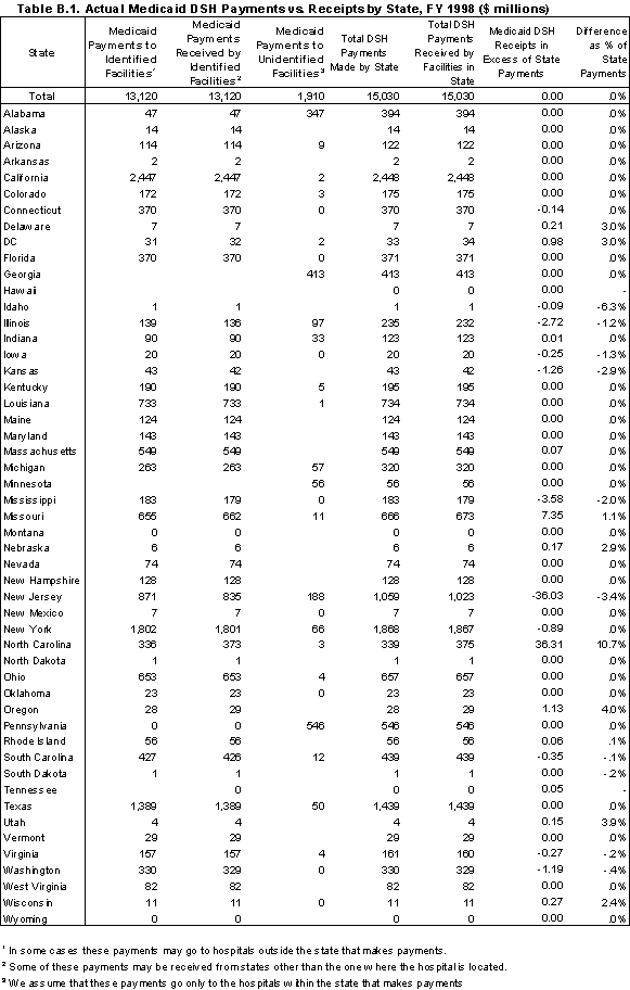
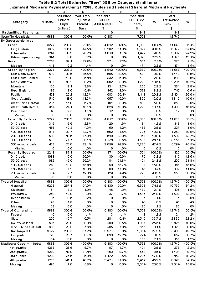
| Medicare SSI Days and Medicaid Days as Percent of Total Inpatient Days | 5638 | 305.6 | 100.0% | 5,183 | 100.0% | 7,559 | 100.0% | 12,742 | 100.0% | 100.0% |
|---|---|---|---|---|---|---|---|---|---|---|
| <.10 | 1510 | 73.3 | 24.0% | 36 | 0.7% | 246 | 3.3% | 282 | 2.2% | 26.3% |
| = >.10 and <.20 | 1715 | 101.0 | 33.1% | 998 | 19.2% | 696 | 9.2% | 1,694 | 13.3% | 36.6% |
| = >.20 and < .30 | 947 | 59.4 | 19.4% | 1,579 | 30.5% | 1,033 | 13.7% | 2,611 | 20.5% | 20.6% |
| =>.30 and <.40 | 474 | 29.5 | 9.7% | 1,216 | 23.5% | 1,413 | 18.7% | 2,630 | 20.6% | 9.4% |
| =>.40 and <.50 | 211 | 12.8 | 4.2% | 674 | 13.0% | 983 | 13.0% | 1,657 | 13.0% | 3.7% |
| =>.50 and <.60 | 96 | 5.8 | 1.9% | 311 | 6.0% | 570 | 7.5% | 880 | 6.9% | 1.6% |
| =>.60 and <.70 | 55 | 3.9 | 1.3% | 233 | 4.5% | 545 | 7.2% | 778 | 6.1% | 1.0% |
| =>.70 and <.80 | 21 | 1.3 | 0.4% | 88 | 1.7% | 61 | 0.8% | 149 | 1.2% | 0.4% |
| =>.80 | 9 | 0.3 | 0.1% | 8 | 0.2% | 5 | 0.1% | 14 | 0.1% | 0.1% |
| Missing | 600 | 18.2 | 6.0% | 41 | 0.8% | 2,007 | 26.5% | 2,047 | 16.1% | 0.2% |
| Medicare Inpatient Days As Percent of Total Inpatient Days | 5638 | 305.6 | 100.0% | 5,183 | 100.0% | 7,559 | 100.0% | 12,742 | 100.0% | 100.0% |
| 0-24 | 275 | 18.2 | 6.0% | 521 | 10.0% | 2,663 | 35.2% | 3,184 | 25.0% | 4.0% |
| 25-49 | 1314 | 98.3 | 32.2% | 2,734 | 52.8% | 1,447 | 19.1% | 4,181 | 32.8% | 32.7% |
| 50-64 | 2029 | 119.7 | 39.2% | 1,568 | 30.3% | 957 | 12.7% | 2,525 | 19.8% | 45.3% |
| 65-79 | 1247 | 44.1 | 14.4% | 220 | 4.3% | 206 | 2.7% | 426 | 3.3% | 16.0% |
| 80 and over | 166 | 3.7 | 1.2% | 8 | 0.1% | 14 | 0.2% | 22 | 0.2% | 1.0% |
| Missing | 607 | 21.5 | 7.0% | 132 | 2.5% | 2,272 | 30.1% | 2,403 | 18.9% | 0.9% |
| Medicare SSI Days As Percent of Total Medicare Days | 5638 | 305.6 | 100.0% | 5,183 | 100.0% | 7,559 | 100.0% | 12,742 | 100.0% | 100.0% |
| <.10 | 3153 | 183.5 | 60.1% | 1,453 | 28.0% | 1,203 | 15.9% | 2,656 | 20.8% | 65.3% |
| = >.10 and <.20 | 1216 | 73.9 | 24.2% | 2,380 | 45.9% | 1,615 | 21.4% | 3,995 | 31.4% | 25.8% |
| = >.20 and < .30 | 436 | 21.6 | 7.1% | 825 | 15.9% | 1,986 | 26.3% | 2,811 | 22.1% | 6.0% |
| =>.30 and <.40 | 162 | 6.2 | 2.0% | 308 | 5.9% | 707 | 9.4% | 1,015 | 8.0% | 1.7% |
| =>.40 and <.50 | 45 | 1.3 | 0.4% | 90 | 1.7% | 26 | 0.3% | 116 | 0.9% | 0.5% |
| =>.50 and <.60 | 17 | 0.4 | 0.1% | 40 | 0.8% | 6 | 0.1% | 45 | 0.4% | 0.2% |
| =>.60 and <.70 | 9 | 0.4 | 0.1% | 48 | 0.9% | 9 | 0.1% | 57 | 0.4% | 0.2% |
| =>.70 | 0 | 0.0 | 0.0% | 0 | 0.0% | 0 | 0.0% | 0 | 0.0% | 0.0% |
| Missing | 600 | 18.2 | 6.0% | 41 | 0.8% | 2,007 | 26.5% | 2,047 | 16.1% | 0.2% |
| Medicaid Inpatient Days As a Percent of Total Non-Medicare Days | 5638 | 305.6 | 100.0% | 5,183 | 100.0% | 7,559 | 100.0% | 12,742 | 100.0% | 100.0% |
| <.10 | 858 | 39.4 | 12.9% | 31 | 0.6% | 80 | 1.1% | 112 | 0.9% | 13.8% |
| = >.10 and <.20 | 972 | 54.0 | 17.7% | 194 | 3.7% | 290 | 3.8% | 484 | 3.8% | 19.2% |
| = >.20 and < .30 | 1073 | 70.0 | 22.9% | 942 | 18.2% | 865 | 11.4% | 1,807 | 14.2% | 25.3% |
| =>.30 and <.40 | 867 | 54.1 | 17.7% | 1,297 | 25.0% | 1,109 | 14.7% | 2,406 | 18.9% | 19.0% |
| =>.40 and <.50 | 518 | 29.2 | 9.6% | 953 | 18.4% | 1,095 | 14.5% | 2,048 | 16.1% | 9.6% |
| =>.50 and <.60 | 317 | 20.3 | 6.7% | 786 | 15.2% | 955 | 12.6% | 1,741 | 13.7% | 6.6% |
| =>.60 and <.70 | 150 | 7.0 | 2.3% | 328 | 6.3% | 584 | 7.7% | 912 | 7.2% | 2.2% |
| =>.70 and <.80 | 86 | 5.9 | 1.9% | 314 | 6.1% | 216 | 2.9% | 530 | 4.2% | 2.0% |
| =>.80 | 86 | 3.3 | 1.1% | 169 | 3.3% | 86 | 1.1% | 255 | 2.0% | 1.1% |
| Missing | 711 | 22.3 | 7.3% | 169 | 3.3% | 2,280 | 30.2% | 2,448 | 19.2% | 1.1% |
| Medicaid Inpatient Days As Percent of Total Inpatient Days | 5638 | 305.6 | 100.0% | 5,183 | 100.0% | 7,559 | 100.0% | 12,742 | 100.0% | 100.0% |
| 1st state quartile | 1223 | 57.2 | 18.7% | 103 | 2.0% | 176 | 2.3% | 279 | 2.2% | 1223 |
| 2nd state quartile | 1274 | 65.7 | 21.5% | 566 | 10.9% | 318 | 4.2% | 884 | 6.9% | 1274 |
| 3rd state quartile | 1257 | 74.2 | 24.3% | 1,316 | 25.4% | 925 | 12.2% | 2,241 | 17.6% | 1257 |
| 4th state quartile | 1283 | 90.2 | 29.5% | 3,157 | 60.9% | 4,121 | 54.5% | 7,278 | 57.1% | 1283 |
| 1 s.d. Above State Average | 1120 | 67.6 | 22.1% | 1,987 | 38.3% | 3,387 | 44.8% | 5,374 | 42.2% | 1120 |
| Missing | 601 | 18.3 | 6.0% | 41 | 0.8% | 2,019 | 26.7% | 2,060 | 16.2% | 111 |
| Teaching Status | 5638 | 305.6 | 100.0% | 5,183 | 100.0% | 7,559 | 100.0% | 12,742 | 100.0% | 5148 |
| Non- teaching | 3994 | 157.8 | 51.6% | 1,859 | 35.9% | 973 | 12.9% | 2,832 | 22.2% | 3993 |
| Fewer than 10 residents | 369 | 26.6 | 8.7% | 468 | 9.0% | 193 | 2.6% | 661 | 5.2% | 369 |
| Residents >10 and <100 | 509 | 56.1 | 18.4% | 1,138 | 22.0% | 1,254 | 16.6% | 2,393 | 18.8% | 509 |
| Residents => 100 and < 250 | 149 | 25.3 | 8.3% | 919 | 17.7% | 1,382 | 18.3% | 2,300 | 18.1% | 149 |
| Residents => 250 | 88 | 22.0 | 7.2% | 782 | 15.1% | 1,755 | 23.2% | 2,537 | 19.9% | 88 |
| Missing | 529 | 17.7 | 5.8% | 18 | 0.3% | 2,002 | 26.5% | 2,020 | 15.8% | 40 |
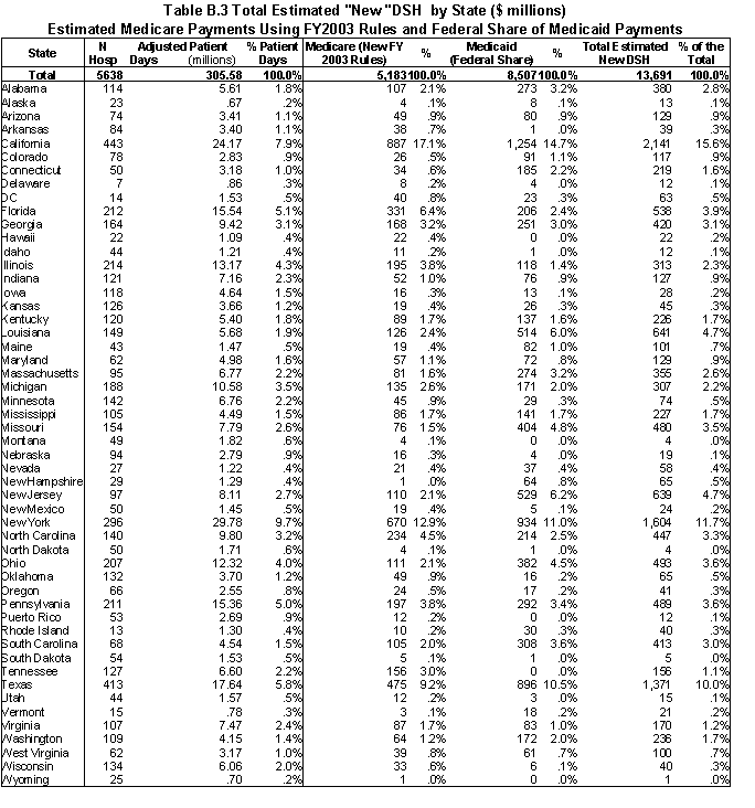
Appendix C. Summary of Financial Indicators by Hospital Class
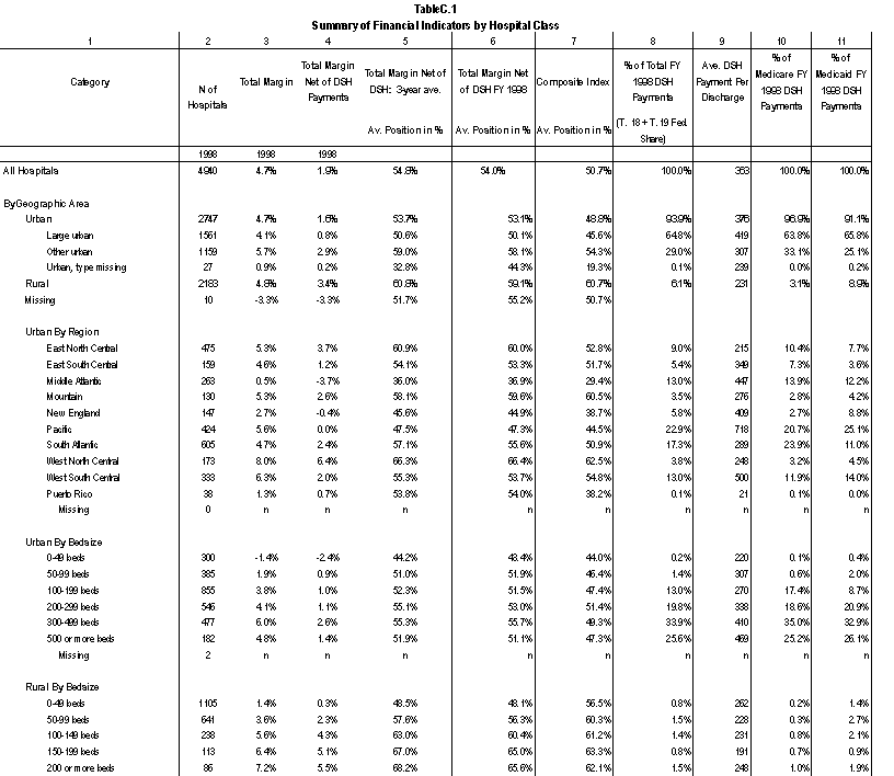
Appendix D. Simulation Results from Three State Analysis
| N Receiving DSH |
DSH Funds $ | % of DSH Funds | DSH to Fin Risk | DSH Per Adjusted Day ($) | Margin w/ DSH | |
|---|---|---|---|---|---|---|
| All Hospitals | 204 | 1,880,769,299 | 100% | 0.78 | 104 | 6.7% |
| By Geographic Area | ||||||
| Urban | 176 | 1,847,252,818 | 98% | 0.79 | 107 | 6.7% |
| Large Urban | 128 | 1,564,749,624 | 83% | 0.81 | 118 | 6.9% |
| Other Urban | 48 | 282,503,194 | 15% | 0.66 | 73 | 5.9% |
| Rural | 28 | 33,516,481 | 2% | 0.48 | 37 | 7.3% |
| Urban By Bedsize | ||||||
| 0-49 beds | 11 | 15,078,245 | 1% | 0.95 | 41 | 7.8% |
| 50-99 beds | 22 | 43,405,547 | 2% | 0.39 | 44 | 6.7% |
| 100-199 beds | 55 | 266,523,501 | 14% | 0.63 | 82 | 3.4% |
| 200-299 beds | 36 | 339,716,788 | 18% | 0.81 | 99 | 4.8% |
| 300-499 beds | 35 | 561,402,713 | 30% | 0.90 | 97 | 8.6% |
| 500 or more beds | 17 | 621,126,025 | 33% | 0.82 | 182 | 7.3% |
| Rural By Bedsize | ||||||
| 0-49 beds | 14 | 10,188,910 | 1% | 0.41 | 26 | 6.8% |
| 50-99 beds | 11 | 15,419,380 | 1% | 0.51 | 55 | 7.1% |
| 100-149 beds | 3 | 7,908,191 | 0% | 0.52 | 35 | 8.2% |
| 150 or more beds | ||||||
| Type of Ownership | ||||||
| State government | 2 | 73,685,230 | 4% | 1.42 | 302 | 14.6% |
| County or local government | 24 | 931,648,833 | 50% | 1.16 | 418 | 14.7% |
| Gov. - hosp. dist. | 35 | 82,333,881 | 4% | 0.49 | 39 | 4.7% |
| Not-for-profit | 100 | 614,447,732 | 33% | 0.52 | 56 | 4.2% |
| For-profit | 43 | 178,653,623 | 9% | 0.79 | 70 | 8.4% |
| Teaching Status | ||||||
| Non- teaching | 149 | 541,979,783 | 29% | 0.54 | 47 | 5.2% |
| Fewer than 10 residents | 19 | 153,104,556 | 8% | 0.93 | 100 | 6.7% |
| Residents >10 and <100 | 24 | 437,571,870 | 23% | 0.79 | 169 | 4.7% |
| Residents => 100 and < 250 | 6 | 311,449,927 | 17% | 1.24 | 282 | 7.9% |
| Residents => 250 | 6 | 436,663,164 | 23% | 0.97 | 319 | 13.6% |
| Low-Income Patient Gross Days as % of Total Days | ||||||
| More than 60% | 39 | 1,211,818,333 | 64% | 1.25 | 395 | 14.4% |
| 50-60 % | 16 | 122,722,215 | 7% | 1.42 | 202 | 9.0% |
| 40-50 % | 24 | 211,266,806 | 11% | 1.19 | 143 | 4.2% |
| 30-40 % | 41 | 166,492,927 | 9% | 0.66 | 79 | 4.7% |
| 20-30 % | 70 | 161,164,585 | 9% | 0.28 | 34 | 3.4% |
| 10-20 % | 14 | 7,304,434 | 0% | 0.03 | 2 | 2.3% |
| 10 % and less | 0 | 0 | 0% | 0.00 | 0 | 10.3% |
| Low-Income Patient Gross Revenues as % of Total Patient Revenues | ||||||
| More than 60% | 21 | 903,669,835 | 48% | 1.18 | 449 | 15.4% |
| 50-60 % | 10 | 112,971,280 | 6% | 1.54 | 196 | 14.1% |
| 40-50 % | 23 | 237,396,523 | 13% | 1.36 | 199 | 7.6% |
| 30-40 % | 27 | 199,262,419 | 11% | 0.96 | 130 | 8.1% |
| 20-30 % | 62 | 284,263,242 | 15% | 0.70 | 74 | 4.2% |
| 10-20 % | 55 | 134,926,526 | 7% | 0.23 | 25 | 3.0% |
| 10 % and less | 6 | 8,279,475 | 0% | 0.04 | 2 | 6.0% |
| Financial Risk | ||||||
| More than 25 % | 19 | 441,924,754 | 23% | 0.81 | 367 | 5.0% |
| 20-25 % | 14 | 313,981,418 | 17% | 1.10 | 352 | 16.9% |
| 15-20 % | 18 | 256,857,318 | 14% | 1.33 | 259 | 15.0% |
| 10-15 % | 60 | 384,735,409 | 20% | 0.64 | 104 | 4.7% |
| 5-10 % | 64 | 296,955,865 | 16% | 0.49 | 52 | 4.6% |
| 0-5 % | 23 | 149,274,304 | 8% | 0.71 | 30 | 6.3% |
| None | 6 | 37,040,231 | 2% | -1.98 | 70 | 17.3% |
| Safety Net Hospitals: Margin Net of DSH | ||||||
| Less than -25% | 23 | 289,976,723 | 15% | 0.92 | 276 | -11.3% |
| -15 to -25% | 19 | 174,513,026 | 9% | 0.86 | 195 | -1.6% |
| -5% to -15% | 45 | 449,934,183 | 24% | 0.97 | 147 | 3.1% |
| -5% to 5% | 60 | 514,819,510 | 27% | 0.77 | 116 | 7.7% |
| 5% to 15% | 37 | 410,566,958 | 22% | 1.05 | 182 | 16.6% |
| From 15% to25% | 4 | 29,142,775 | 2% | 0.92 | 97 | 22.5% |
| 25% and higher | 2 | 4,511,690 | 0% | -1.12 | 190 | 35.5% |
| All Safety Net Hospitals | 190 | 1,873,464,865 | 100% | 0.91 | 156 | 7.5% |
| N Receiving DSH |
DSH Funds $ |
% of DSH Funds |
DSH to Fin Risk |
DSH Per Adjusted Day ($) |
Margin w/ DSH |
|
|---|---|---|---|---|---|---|
| All Hospitals | 199 | 1,880,769,299 | 100% | 0.78 | 104 | 6.7% |
| By Geographic Area | ||||||
| Urban | 163 | 1,804,632,340 | 96% | 0.77 | 105 | 6.5% |
| Large Urban | 113 | 1,480,819,153 | 79% | 0.77 | 111 | 6.5% |
| Other Urban | 50 | 323,813,187 | 17% | 0.75 | 84 | 6.6% |
| Rural | 36 | 76,136,959 | 4% | 1.08 | 85 | 11.6% |
| Urban By Bedsize | ||||||
| 0-49 beds | 17 | 58,268,341 | 3% | 3.67 | 159 | 21.7% |
| 50-99 beds | 20 | 75,631,172 | 4% | 0.67 | 77 | 9.0% |
| 100-199 beds | 54 | 274,858,478 | 15% | 0.65 | 85 | 3.6% |
| 200-299 beds | 27 | 298,129,617 | 16% | 0.71 | 87 | 3.9% |
| 300-499 beds | 30 | 479,095,696 | 25% | 0.77 | 83 | 7.7% |
| 500 or more beds | 15 | 618,649,036 | 33% | 0.82 | 181 | 7.2% |
| Rural By Bedsize | ||||||
| 0-49 beds | 22 | 48,891,109 | 3% | 1.97 | 124 | 17.8% |
| 50-99 beds | 11 | 19,773,636 | 1% | 0.65 | 71 | 8.3% |
| 100-149 beds | 3 | 7,472,214 | 0% | 0.50 | 33 | 8.1% |
| 150 or more beds | ||||||
| Type of Ownership | ||||||
| State government | 2 | 48,283,967 | 3% | 0.93 | 198 | 10.5% |
| County or local government | 27 | 987,312,918 | 52% | 1.23 | 443 | 15.8% |
| Gov. - hosp. dist. | 43 | 133,130,826 | 7% | 0.79 | 63 | 6.9% |
| Not-for-profit | 84 | 519,152,473 | 28% | 0.44 | 48 | 3.6% |
| For-profit | 43 | 192,889,115 | 10% | 0.85 | 75 | 8.8% |
| Teaching Status | ||||||
| Non- teaching | 151 | 568,877,200 | 30% | 0.57 | 50 | 5.4% |
| Fewer than 10 residents | 15 | 146,821,582 | 8% | 0.89 | 96 | 6.4% |
| Residents >10 and <100 | 21 | 440,056,345 | 23% | 0.80 | 170 | 4.8% |
| Residents => 100 and < 250 | 6 | 334,588,026 | 18% | 1.33 | 303 | 8.8% |
| Residents => 250 | 6 | 390,426,147 | 21% | 0.87 | 285 | 12.5% |
| Low-Income Patient Gross Days as % of Total Days | ||||||
| More than 60% | 39 | 1,202,795,032 | 64% | 1.24 | 392 | 14.3% |
| 50-60 % | 15 | 92,842,619 | 5% | 1.08 | 153 | 5.8% |
| 40-50 % | 24 | 145,103,314 | 8% | 0.82 | 98 | 0.9% |
| 30-40 % | 37 | 133,617,566 | 7% | 0.53 | 63 | 3.6% |
| 20-30 % | 52 | 178,875,040 | 10% | 0.31 | 38 | 3.7% |
| 10-20 % | 24 | 103,352,701 | 5% | 0.36 | 24 | 4.0% |
| 10 % and less | 8 | 24,183,028 | 1% | 0.35 | 13 | 11.1% |
| Low-Income Patient Gross Revenues as % of Total Patient Revenues | ||||||
| More than 60% | 24 | 980,221,632 | 52% | 1.28 | 487 | 17.0% |
| 50-60 % | 13 | 163,466,901 | 9% | 2.23 | 283 | 20.1% |
| 40-50 % | 27 | 248,079,032 | 13% | 1.42 | 208 | 8.3% |
| 30-40 % | 31 | 197,005,282 | 10% | 0.95 | 129 | 8.0% |
| 20-30 % | 71 | 255,237,147 | 14% | 0.63 | 67 | 3.6% |
| 10-20 % | 33 | 36,759,306 | 2% | 0.06 | 7 | 1.8% |
| 10 % and less | 0 | 0.00 | 0 | 5.9% | ||
| Financial Risk | ||||||
| More than 25 % | 20 | 509,899,638 | 27% | 0.94 | 424 | 8.0% |
| 20-25 % | 16 | 328,966,091 | 17% | 1.16 | 369 | 17.7% |
| 15-20 % | 20 | 235,533,153 | 13% | 1.22 | 238 | 13.8% |
| 10-15 % | 60 | 318,403,827 | 17% | 0.53 | 86 | 3.5% |
| 5-10 % | 51 | 244,677,509 | 13% | 0.40 | 42 | 4.0% |
| 0-5 % | 22 | 184,313,984 | 10% | 0.87 | 37 | 6.7% |
| None | 10 | 58,975,096 | 3% | -3.15 | 111 | 19.7% |
| Safety Net Hospitals: Margin Net of DSH | ||||||
| Less than -25% | 22 | 334,724,098 | 18% | 1.07 | 318 | -7.5% |
| -15 to -25% | 17 | 154,638,937 | 8% | 0.76 | 173 | -3.4% |
| -5% to -15% | 42 | 373,648,499 | 20% | 0.80 | 122 | 1.3% |
| -5% to 5% | 51 | 499,176,672 | 27% | 0.75 | 112 | 7.5% |
| 5% to 15% | 30 | 350,680,113 | 19% | 0.90 | 155 | 15.5% |
| From 15% to25% | 4 | 35,362,993 | 2% | 1.11 | 118 | 23.5% |
| 25% and higher | 1 | 5,002,258 | 0% | -1.25 | 211 | 36.0% |
| All Safety Net Hospitals | 167 | 1,753,233,570 | 93% | 0.85 | 146 | 6.9% |
| N Receiving DSH |
DSH Funds $ |
% of DSH Funds |
DSH to Fin Risk |
DSH Per Adjusted Day ($) |
Margin w/ DSH |
|
|---|---|---|---|---|---|---|
| All Hospitals | 221 | 1,880,769,299 | 100% | 0.78 | 104 | 6.7% |
| By Geographic Area | ||||||
| Urban | 188 | 1,822,939,093 | 97% | 0.77 | 106 | 6.6% |
| Large Urban | 131 | 1,453,674,718 | 77% | 0.76 | 109 | 6.4% |
| Other Urban | 57 | 369,264,375 | 20% | 0.86 | 95 | 7.4% |
| Rural | 33 | 57,830,207 | 3% | 0.82 | 64 | 9.8% |
| Urban By Bedsize | ||||||
| 0-49 beds | 13 | 31,579,303 | 2% | 1.99 | 86 | 13.7% |
| 50-99 beds | 30 | 98,754,944 | 5% | 0.88 | 101 | 10.5% |
| 100-199 beds | 57 | 419,777,706 | 22% | 0.99 | 129 | 7.0% |
| 200-299 beds | 31 | 352,389,005 | 19% | 0.84 | 103 | 5.0% |
| 300-499 beds | 40 | 390,384,776 | 21% | 0.62 | 68 | 6.8% |
| 500 or more beds | 17 | 530,053,358 | 28% | 0.70 | 155 | 6.0% |
| Rural By Bedsize | ||||||
| 0-49 beds | 19 | 25,942,870 | 1% | 1.04 | 66 | 11.6% |
| 50-99 beds | 11 | 24,269,131 | 1% | 0.80 | 87 | 9.5% |
| 100-149 beds | 3 | 7,618,205 | 0% | 0.51 | 34 | 8.1% |
| 150 or more beds | ||||||
| Type of Ownership | ||||||
| State government | 2 | 27,052,042 | 1% | 0.52 | 111 | 6.8% |
| County or local government | 27 | 774,144,256 | 41% | 0.96 | 348 | 11.5% |
| Gov. - hosp. dist. | 38 | 154,106,674 | 8% | 0.92 | 72 | 7.8% |
| Not-for-profit | 109 | 707,175,043 | 38% | 0.60 | 65 | 4.7% |
| For-profit | 45 | 218,291,284 | 12% | 0.96 | 85 | 9.5% |
| Teaching Status | ||||||
| Non- teaching | 164 | 792,773,178 | 42% | 0.79 | 69 | 6.8% |
| Fewer than 10 residents | 19 | 115,486,497 | 6% | 0.70 | 75 | 5.1% |
| Residents >10 and <100 | 27 | 482,953,399 | 26% | 0.88 | 186 | 5.8% |
| Residents => 100 and < 250 | 5 | 224,820,357 | 12% | 0.90 | 204 | 4.3% |
| Residents => 250 | 6 | 264,735,868 | 14% | 0.59 | 194 | 9.6% |
| Low-Income Patient Gross Days as % of Total Days | ||||||
| More than 60% | 35 | 910,083,780 | 48% | 0.94 | 297 | 9.9% |
| 50-60 % | 14 | 75,570,672 | 4% | 0.88 | 124 | 3.8% |
| 40-50 % | 22 | 144,709,079 | 8% | 0.81 | 98 | 0.9% |
| 30-40 % | 36 | 234,164,879 | 12% | 0.93 | 110 | 7.0% |
| 20-30 % | 65 | 387,763,999 | 21% | 0.67 | 81 | 6.5% |
| 10-20 % | 42 | 113,006,088 | 6% | 0.39 | 27 | 4.1% |
| 10 % and less | 7 | 15,470,802 | 1% | 0.22 | 9 | 10.8% |
| Low-Income Patient Gross Revenues as % of Total Patient Revenues | ||||||
| More than 60% | 21 | 749,628,494 | 40% | 0.98 | 372 | 12.0% |
| 50-60 % | 12 | 104,562,272 | 6% | 1.43 | 181 | 13.1% |
| 40-50 % | 23 | 166,653,435 | 9% | 0.95 | 140 | 3.0% |
| 30-40 % | 23 | 138,057,719 | 7% | 0.67 | 90 | 5.7% |
| 20-30 % | 59 | 385,781,937 | 21% | 0.95 | 101 | 6.3% |
| 10-20 % | 67 | 312,988,957 | 17% | 0.52 | 58 | 5.1% |
| 10 % and less | 16 | 23,096,484 | 1% | 0.11 | 7 | 6.2% |
| Financial Risk | ||||||
| More than 25 % | 20 | 604,832,852 | 32% | 1.11 | 503 | 12.0% |
| 20-25 % | 16 | 290,821,854 | 15% | 1.02 | 326 | 15.6% |
| 15-20 % | 20 | 230,025,256 | 12% | 1.19 | 232 | 13.4% |
| 10-15 % | 68 | 493,671,344 | 26% | 0.82 | 133 | 6.6% |
| 5-10 % | 97 | 261,417,993 | 14% | 0.43 | 45 | 4.2% |
| 0-5 % | 0 | - | - | - | - | 4.3% |
| None | 0 | - | - | - | - | 12.7% |
| Safety Net Hospitals: Margin Net of DSH | ||||||
| Less than -25% | 23 | 379,612,621 | 20% | 1.21 | 361 | -4.0% |
| -15 to -25% | 18 | 207,164,833 | 11% | 1.02 | 232 | 1.2% |
| -5% to -15% | 43 | 422,158,833 | 22% | 0.91 | 138 | 2.5% |
| -5% to 5% | 57 | 453,490,349 | 24% | 0.68 | 102 | 6.9% |
| 5% to 15% | 28 | 263,719,930 | 14% | 0.68 | 117 | 13.9% |
| From 15% to25% | 3 | 26,145,843 | 1% | 0.82 | 87 | 22.0% |
| 25% and higher | 0 | - | 0% | 0.00 | 0 | 30.0% |
| All Safety Net Hospitals | 172 | 1,752,292,409 | 93% | 0.85 | 146 | 6.9% |
| N Receiving DSH |
DSH Funds $ |
% of DSH Funds | DSH to Fin Risk | DSH Per Adjusted Day ($) | Margin w/ DSH | |
|---|---|---|---|---|---|---|
| All Hospitals | 221 | 1,880,769,299 | 100% | 0.78 | 104 | 6.7% |
| By Geographic Area | ||||||
| Urban | 188 | 1,838,660,346 | 98% | 0.78 | 107 | 6.6% |
| Large Urban | 131 | 1,448,347,145 | 77% | 0.75 | 109 | 6.3% |
| Other Urban | 57 | 390,313,201 | 21% | 0.91 | 101 | 7.8% |
| Rural | 33 | 42,108,953 | 2% | 0.60 | 47 | 8.2% |
| Urban By Bedsize | ||||||
| 0-49 beds | 13 | 30,788,348 | 2% | 1.94 | 84 | 13.4% |
| 50-99 beds | 30 | 94,462,579 | 5% | 0.84 | 97 | 10.3% |
| 100-199 beds | 57 | 454,666,710 | 24% | 1.08 | 140 | 7.7% |
| 200-299 beds | 31 | 379,745,485 | 20% | 0.91 | 111 | 5.6% |
| 300-499 beds | 40 | 317,950,971 | 17% | 0.51 | 55 | 6.0% |
| 500 or more beds | 17 | 561,046,251 | 30% | 0.74 | 164 | 6.4% |
| Rural By Bedsize | ||||||
| 0-49 beds | 19 | 17,391,562 | 1% | 0.70 | 44 | 9.1% |
| 50-99 beds | 11 | 19,888,011 | 1% | 0.65 | 71 | 8.3% |
| 100-149 beds | 3 | 4,829,380 | 0% | 0.32 | 22 | 7.1% |
| 150 or more beds | ||||||
| Type of Ownership | ||||||
| State government | 2 | 17,482,651 | 1% | 0.34 | 72 | 5.0% |
| County or local government | 27 | 974,538,115 | 52% | 1.21 | 438 | 15.5% |
| Gov. - hosp. dist. | 38 | 138,470,379 | 7% | 0.83 | 65 | 7.1% |
| Not-for-profit | 109 | 552,514,992 | 29% | 0.47 | 51 | 3.8% |
| For-profit | 45 | 197,763,163 | 11% | 0.87 | 77 | 8.9% |
| Teaching Status | ||||||
| Non- teaching | 164 | 674,128,236 | 36% | 0.67 | 59 | 6.1% |
| Fewer than 10 residents | 19 | 113,080,929 | 6% | 0.69 | 74 | 5.0% |
| Residents >10 and <100 | 27 | 514,374,171 | 27% | 0.93 | 199 | 6.5% |
| Residents => 100 and < 250 | 5 | 283,384,527 | 15% | 1.13 | 257 | 6.7% |
| Residents => 250 | 6 | 295,801,436 | 16% | 0.66 | 216 | 10.3% |
| Low-Income Patient Gross Days as % of Total Days | ||||||
| More than 60% | 35 | 1,108,924,246 | 59% | 1.14 | 361 | 12.9% |
| 50-60 % | 14 | 64,804,974 | 3% | 0.75 | 107 | 2.6% |
| 40-50 % | 22 | 116,167,048 | 6% | 0.65 | 79 | -0.6% |
| 30-40 % | 36 | 194,346,428 | 10% | 0.78 | 92 | 5.7% |
| 20-30 % | 65 | 295,506,794 | 16% | 0.51 | 62 | 5.3% |
| 10-20 % | 42 | 90,513,618 | 5% | 0.31 | 21 | 3.7% |
| 10 % and less | 7 | 10,506,192 | 1% | 0.15 | 6 | 10.6% |
| Low-Income Patient Gross Revenues as % of Total Patient Revenues | ||||||
| More than 60% | 21 | 960,980,171 | 51% | 1.26 | 477 | 16.6% |
| 50-60 % | 12 | 121,176,845 | 6% | 1.65 | 210 | 15.2% |
| 40-50 % | 23 | 152,532,170 | 8% | 0.87 | 128 | 2.0% |
| 30-40 % | 23 | 104,537,633 | 6% | 0.51 | 68 | 4.3% |
| 20-30 % | 59 | 318,224,376 | 17% | 0.79 | 83 | 4.9% |
| 10-20 % | 67 | 209,320,617 | 11% | 0.35 | 39 | 3.9% |
| 10 % and less | 16 | 13,997,489 | 1% | 0.07 | 4 | 6.1% |
| Financial Risk | ||||||
| More than 25 % | 20 | 819,189,624 | 44% | 1.50 | 681 | 19.9% |
| 20-25 % | 16 | 373,537,123 | 20% | 1.31 | 419 | 20.0% |
| 15-20 % | 20 | 191,906,250 | 10% | 0.99 | 194 | 11.1% |
| 10-15 % | 68 | 339,199,428 | 18% | 0.56 | 92 | 3.9% |
| 5-10 % | 97 | 156,936,874 | 8% | 0.26 | 27 | 3.0% |
| 0-5 % | 0 | - | - | - | - | 4.3% |
| None | 0 | - | - | - | - | 12.7% |
| Safety Net Hospitals: Margin Net of DSH | ||||||
| Less than -25% | 23 | 484,023,454 | 26% | 1.54 | 460 | 3.3% |
| -15 to -25% | 18 | 225,626,736 | 12% | 1.11 | 253 | 2.8% |
| -5% to -15% | 43 | 404,079,345 | 21% | 0.87 | 132 | 2.0% |
| -5% to 5% | 57 | 388,358,074 | 21% | 0.58 | 87 | 6.0% |
| 5% to 15% | 28 | 258,961,454 | 14% | 0.66 | 115 | 13.8% |
| From 15% to25% | 3 | 18,700,426 | 1% | 0.59 | 62 | 20.7% |
| 25% and higher | 0 | 0 | 0% | 0.00 | 0 | 30.0% |
| All Safety Net Hospitals | 172 | 1,779,749,489 | 95% | 0.86 | 148 | 7.1% |
| N Receiving DSH | DSH Funds $ | % of DSH Funds | DSH to Fin Risk | DSH Per Adjusted Day ($) | Margin w/ DSH | |
|---|---|---|---|---|---|---|
| All Hospitals | 100 | 830,200,447 | 100% | 0.46 | 37 | -7.8% |
| By Geographic Area | ||||||
| Urban | 79 | 806,647,385 | 97% | 0.46 | 40 | -8.4% |
| Large Urban | 60 | 770,336,074 | 93% | 0.48 | 48 | -9.3% |
| Other Urban | 19 | 36,311,311 | 4% | 0.28 | 9 | -3.4% |
| Rural | 21 | 23,553,062 | 3% | 0.42 | 10 | 1.2% |
| Urban By Bedsize | ||||||
| 0-49 beds | 3 | 490,590 | 0% | 0.27 | 2 | -7.8% |
| 50-99 beds | 2 | 4,272,521 | 0% | 0.27 | 2 | -7.3% |
| 100-199 beds | 16 | 76,422,657 | 1% | 0.43 | 8 | -5.2% |
| 200-299 beds | 18 | 72,260,688 | 9% | 0.85 | 32 | -5.5% |
| 300-499 beds | 18 | 146,532,270 | 9% | 0.46 | 19 | -9.6% |
| 500 or more beds | 22 | 506,668,660 | 18% | 0.41 | 29 | -9.2% |
| Rural By Bedsize | ||||||
| 0-49 beds | 5 | 4,376,182 | 1% | 0.56 | 12 | -1.5% |
| 50-99 beds | 6 | 6,596,429 | 1% | 0.83 | 9 | -0.9% |
| 100-149 beds | 3 | 1,686,480 | 0% | 0.05 | 5 | 1.7% |
| 150 or more beds | 7 | 10,893,971 | 1% | 6.09 | 12 | 2.5% |
| Type of Ownership | ||||||
| State government | 3 | 26,769,580 | 3% | 0.26 | 59 | -36.5% |
| County or local government | 7 | 95,443,292 | 11% | 1.02 | 62 | -3.8% |
| Gov. - hosp. dist. | 0 | - | - | - | - | - |
| Not-for-profit | 87 | 695,744,108 | 84% | 0.44 | 35 | -7.1% |
| For-profit | 3 | 12,243,466 | 1% | 0.75 | 16 | -8.5% |
| Teaching Status | ||||||
| Non- teaching | 45 | 93,689,659 | 11% | 0.45 | 12 | -3.7% |
| Fewer than 10 residents | 9 | 18,642,156 | 2% | 0.36 | 11 | -2.0% |
| Residents >10 and <100 | 16 | 83,116,200 | 10% | 0.42 | 22 | -8.6% |
| Residents => 100 and < 250 | 18 | 338,964,606 | 41% | 0.60 | 73 | -9.2% |
| Residents => 250 | 12 | 295,787,826 | 36% | 0.38 | 64 | -10.4% |
| Low-Income Patient Gross Days as % of Total Days | ||||||
| More than 60% | 5 | 113,298,297 | 14% | 3.35 | 202 | 6.0% |
| 50-60 % | 9 | 162,884,405 | 20% | 0.53 | 138 | -22.6% |
| 40-50 % | 11 | 248,427,182 | 30% | 0.70 | 94 | -9.8% |
| 30-40 % | 22 | 204,527,958 | 25% | 0.45 | 58 | -10.2% |
| 20-30 % | 42 | 98,045,394 | 12% | 0.28 | 19 | -7.8% |
| 10-20 % | 11 | 3,017,210 | 0% | 0.02 | 0 | -2.4% |
| 10 % and less | 0 | 0 | 0% | 0.00 | 0 | -7.7% |
| Low-Income Patient Gross Revenues as % of Total Patient Revenues | ||||||
| More than 60% | 1 | 45,634,579 | 5% | 1.42 | 248 | 4.1% |
| 50-60 % | 5 | 83,462,839 | 10% | 0.93 | 149 | -5.0% |
| 40-50 % | 15 | 311,578,022 | 38% | 0.62 | 97 | -12.0% |
| 30-40 % | 18 | 247,822,381 | 30% | 0.45 | 60 | -12.4% |
| 20-30 % | 28 | 85,040,737 | 10% | 0.45 | 20 | -5.9% |
| 10-20 % | 32 | 56,534,849 | 7% | 0.16 | 8 | -5.8% |
| 10 % and less | 1 | 127,041 | 0% | 0.00 | 0 | -3.9% |
| Financial Risk | ||||||
| More than 25 % | 1 | 15,947,743 | 2% | 0.29 | 81 | -38.4% |
| 20-25 % | 8 | 146,890,863 | 18% | 0.42 | 113 | -20.2% |
| 15-20 % | 5 | 155,706,021 | 19% | 0.66 | 105 | -6.4% |
| 10-15 % | 12 | 216,684,603 | 26% | 0.62 | 81 | -13.9% |
| 5-10 % | 44 | 199,133,297 | 24% | 0.30 | 23 | -7.1% |
| 0-5 % | 23 | 42,469,722 | 5% | 0.24 | 6 | -3.8% |
| None | 7 | 53,368,198 | 6% | -1.96 | 37 | -0.3% |
| Safety Net Hospitals:Margin Net of DSH | ||||||
| Less than -25% | 21 | 374,233,546 | 45% | 0.53 | 95 | -24.0% |
| -15 to -25% | 14 | 163,123,554 | 20% | 0.67 | 77 | -11.0% |
| -5% to -15% | 32 | 211,097,758 | 25% | 0.54 | 44 | -4.3% |
| -5% to 5% | 22 | 78,728,378 | 9% | 0.54 | 33 | 2.7% |
| 5% to 15% | - | - | - | - | - | |
| From 15% to25% | - | - | - | - | - | |
| 25% and higher | - | - | - | - | - | |
| All Safety Net Hospitals | 89 | 827,183,237 | 100% | 0.55 | 63 | -9.8% |
| N Receiving DSH | DSH Funds $ | % of DSH Funds | DSH to Fin Risk | DSH Per Adjusted Day ($) | Margin w/ DSH | |
|---|---|---|---|---|---|---|
| All Hospitals | 106 | 830,200,447 | 100% | 0.46 | 37 | -7.8% |
| By Geographic Area | ||||||
| Urban | 79 | 791,090,467 | 95% | 0.45 | 39 | -8.5% |
| Large Urban | 63 | 765,821,307 | 92% | 0.47 | 48 | -9.3% |
| Other Urban | 16 | 25,269,160 | 3% | 0.19 | 6 | -3.8% |
| Rural | 27 | 39,109,980 | 5% | 0.70 | 16 | 2.5% |
| Urban By Bedsize | ||||||
| 0-49 beds | 3 | 5,997,362 | 1% | 3.35 | 30 | -0.9% |
| 50-99 beds | 4 | 5,886,145 | 1% | 0.59 | 12 | -6.6% |
| 100-199 beds | 16 | 64,529,695 | 8% | 0.72 | 27 | -6.0% |
| 200-299 beds | 19 | 90,043,076 | 11% | 0.58 | 23 | -4.9% |
| 300-499 beds | 16 | 148,184,649 | 18% | 0.41 | 30 | -9.6% |
| 500 or more beds | 21 | 476,449,540 | 57% | 0.42 | 58 | -9.6% |
| Rural By Bedsize | ||||||
| 0-49 beds | 8 | 6,873,409 | 1% | 0.88 | 19 | 0.3% |
| 50-99 beds | 10 | 19,903,949 | 2% | 2.51 | 28 | 4.8% |
| 100-149 beds | 3 | 4,127,901 | 0% | 0.13 | 11 | 2.9% |
| 150 or more beds | 6 | 8,204,721 | 1% | 4.59 | 9 | 2.0% |
| Type of Ownership | ||||||
| State government | 3 | 15,176,932 | 2% | 0.15 | 34 | -39.4% |
| County or local government | 9 | 90,705,455 | 11% | 0.96 | 59 | -4.6% |
| Gov. - hosp. dist. | 0 | - | - | - | - | - |
| Not-for-profit | 90 | 714,286,894 | 86% | 0.45 | 36 | -7.0% |
| For-profit | 4 | 10,031,165 | 1% | 0.61 | 13 | -9.0% |
| Teaching Status | ||||||
| Non- teaching | 53 | 109,052,793 | 13% | 0.52 | 14 | -3.3% |
| Fewer than 10 residents | 8 | 14,470,474 | 2% | 0.28 | 8 | -2.3% |
| Residents >10 and <100 | 15 | 102,172,368 | 12% | 0.52 | 27 | -8.0% |
| Residents => 100 and < 250 | 18 | 326,825,661 | 39% | 0.58 | 70 | -9.5% |
| Residents => 250 | 12 | 277,679,151 | 33% | 0.35 | 60 | -10.7% |
| Low-Income Patient Gross Days as % of Total Days | ||||||
| More than 60% | 5 | 81,200,732 | 10% | 2.40 | 145 | 0.4% |
| 50-60 % | 9 | 129,319,867 | 16% | 0.42 | 110 | -26.0% |
| 40-50 % | 11 | 240,197,914 | 29% | 0.68 | 90 | -10.2% |
| 30-40 % | 21 | 204,296,193 | 25% | 0.45 | 58 | -10.2% |
| 20-30 % | 32 | 119,278,339 | 14% | 0.35 | 23 | -7.3% |
| 10-20 % | 27 | 55,174,433 | 7% | 0.28 | 8 | -1.3% |
| 10 % and less | 1 | 732,969 | 0% | 0.01 | 0 | -7.7% |
| Low-Income Patient Gross Revenues as % of Total Patient Revenues | ||||||
| More than 60% | 1 | 34,369,958 | 4% | 1.07 | 187 | -2.2% |
| 50-60 % | 5 | 77,412,846 | 9% | 0.86 | 138 | -6.1% |
| 40-50 % | 15 | 322,756,368 | 39% | 0.64 | 101 | -11.5% |
| 30-40 % | 20 | 273,163,031 | 33% | 0.50 | 67 | -11.8% |
| 20-30 % | 38 | 104,575,369 | 13% | 0.55 | 24 | -5.3% |
| 10-20 % | 27 | 17,922,875 | 2% | 0.05 | 2 | -6.5% |
| 10 % and less | 0 | - | - | - | - | -3.9% |
| Financial Risk | ||||||
| More than 25 % | 1 | 21,398,241 | 3% | 0.39 | 108 | -33.3% |
| 20-25 % | 8 | 134,352,525 | 16% | 0.39 | 104 | -21.4% |
| 15-20 % | 5 | 153,387,370 | 18% | 0.65 | 103 | -6.5% |
| 10-15 % | 13 | 206,259,824 | 25% | 0.59 | 77 | -14.4% |
| 5-10 % | 42 | 192,186,070 | 23% | 0.29 | 22 | -7.2% |
| 0-5 % | 28 | 79,032,272 | 10% | 0.45 | 11 | -3.1% |
| None | 9 | 43,584,144 | 5% | -1.60 | 30 | -1.4% |
| Safety Net Hospitals:Margin Net of DSH | ||||||
| Less than -25% | 19 | 357,474,269 | 43% | 0.50 | 91 | -24.6% |
| -15 to -25% | 12 | 120,826,112 | 15% | 0.50 | 57 | -13.3% |
| -5% to -15% | 31 | 232,717,221 | 28% | 0.59 | 48 | -3.9% |
| -5% to 5% | 16 | 63,275,443 | 8% | 0.44 | 27 | 2.0% |
| 5% to 15% | - | - | - | - | - | |
| From 15% to25% | - | - | - | - | - | |
| 25% and higher | - | - | - | - | - | |
| All Safety Net Hospitals | 78 | 774,293,044 | 93% | 0.52 | 59 | -10.2% |
| N Receiving DSH | DSH Funds $ | % of DSH Funds | DSH to Fin Risk | DSH Per Adjusted Day ($) | Margin w/ DSH | |
|---|---|---|---|---|---|---|
| All Hospitals | 102 | 830,200,447 | 100% | 0.46 | 37 | -7.8% |
| By Geographic Area | ||||||
| Urban | 84 | 807,707,326 | 97% | 0.46 | 40 | -8.4% |
| Large Urban | 66 | 784,235,150 | 94% | 0.48 | 49 | -9.2% |
| Other Urban | 18 | 23,472,176 | 3% | 0.18 | 6 | -3.8% |
| Rural | 18 | 22,493,120 | 3% | 0.40 | 9 | 1.1% |
| Urban By Bedsize | ||||||
| 0-49 beds | 1 | 19,922 | 0% | 0.01 | 0 | -8.4% |
| 50-99 beds | 7 | 2,631,671 | 0% | 0.27 | 5 | -8.0% |
| 100-199 beds | 19 | 32,094,128 | 4% | 0.36 | 13 | -8.3% |
| 200-299 beds | 14 | 58,839,631 | 7% | 0.38 | 15 | -6.0% |
| 300-499 beds | 21 | 166,814,595 | 20% | 0.46 | 34 | -9.1% |
| 500 or more beds | 22 | 547,307,379 | 66% | 0.48 | 67 | -8.8% |
| Rural By Bedsize | ||||||
| 0-49 beds | ||||||
| 50-99 beds | ||||||
| 100-149 beds | 6 | 5,351,540 | 1% | 0.69 | 15 | -0.8% |
| 150 or more beds | 4 | 5,203,052 | 1% | 2.91 | 6 | -1.5% |
| Type of Ownership | ||||||
| State government | 3 | 39,345,039 | 5% | 0.38 | 87 | -33.5% |
| County or local government | 7 | 112,376,421 | 14% | 1.20 | 74 | -1.2% |
| Gov. - hosp. dist. | 0 | - | - | - | - | - |
| Not-for-profit | 89 | 674,123,720 | 81% | 0.42 | 34 | -7.2% |
| For-profit | 3 | 4,355,267 | 1% | 0.27 | 6 | -10.3% |
| Teaching Status | ||||||
| Non- teaching | 0 | - | - | - | - | - |
| Fewer than 10 residents | 50 | 58,133,939 | 7% | 0.28 | 8 | -4.6% |
| Residents >10 and <100 | 6 | 18,596,540 | 2% | 0.36 | 11 | -2.0% |
| Residents => 100 and < 250 | 17 | 75,558,051 | 9% | 0.38 | 20 | -8.9% |
| Residents => 250 | 16 | 338,111,334 | 41% | 0.60 | 73 | -9.2% |
| Low-Income Patient Gross Days as % of Total Days | ||||||
| More than 60% | 4 | 38,250,746 | 5% | 1.13 | 68 | -8.1% |
| 50-60 % | 8 | 183,617,459 | 22% | 0.60 | 156 | -20.5% |
| 40-50 % | 10 | 269,807,707 | 32% | 0.76 | 102 | -8.8% |
| 30-40 % | 16 | 143,264,817 | 17% | 0.32 | 40 | -11.7% |
| 20-30 % | 27 | 122,811,630 | 15% | 0.36 | 23 | -7.2% |
| 10-20 % | 26 | 45,430,725 | 5% | 0.23 | 7 | -1.5% |
| 10 % and less | 11 | 27,017,363 | 3% | 0.22 | 11 | -6.6% |
| Low-Income Patient Gross Revenues as % of Total Patient Revenues | ||||||
| More than 60% | 1 | 26,567,283 | 3% | 0.83 | 144 | -7.0% |
| 50-60 % | 5 | 56,165,123 | 7% | 0.63 | 100 | -10.3% |
| 40-50 % | 12 | 368,494,554 | 44% | 0.73 | 115 | -9.7% |
| 30-40 % | 15 | 238,126,558 | 29% | 0.43 | 58 | -12.7% |
| 20-30 % | 19 | 46,043,492 | 6% | 0.24 | 11 | -7.2% |
| 10-20 % | 42 | 89,092,876 | 11% | 0.26 | 12 | -5.2% |
| 10 % and less | 8 | 5,710,561 | 1% | 0.06 | 2 | -3.7% |
| Financial Risk | ||||||
| More than 25 % | 1 | 48,487,196 | 6% | 0.88 | 246 | -12.9% |
| 20-25 % | 8 | 229,503,146 | 28% | 0.66 | 177 | -13.1% |
| 15-20 % | 5 | 180,564,053 | 22% | 0.76 | 121 | -4.3% |
| 10-15 % | 13 | 196,200,318 | 24% | 0.56 | 73 | -14.9% |
| 5-10 % | 75 | 175,445,734 | 21% | 0.26 | 21 | -7.4% |
| 0-5 % | 0 | - | 0% | 0.00 | 0 | -4.6% |
| None | 0 | - | 0% | 0.00 | 0 | -6.6% |
| Safety Net Hospitals:Margin Net of DSH | ||||||
| Less than -25% | 20 | 450,185,725 | 54% | 0.63 | 115 | -21.5% |
| -15 to -25% | 13 | 120,205,726 | 14% | 0.49 | 57 | -13.3% |
| -5% to -15% | 19 | 138,341,804 | 17% | 0.35 | 29 | -5.8% |
| -5% to 5% | 13 | 49,019,103 | 6% | 0.34 | 21 | 1.4% |
| 5% to 15% | - | - | - | - | - | |
| From 15% to25% | - | - | - | - | - | |
| 25% and higher | - | - | - | - | - | |
| All Safety Net Hospitals | 65 | 757,752,359 | 91% | 0.51 | 57 | -10.4% |
| N Receiving DSH | DSH Funds $ | % of DSH Funds | DSH to Fin Risk | Adjusted Day ($) | Margin w/ DSH | |
|---|---|---|---|---|---|---|
| All Hospitals | 102 | 830,200,447 | 100% | 0.46 | 37 | -7.8% |
| By Geographic Area | ||||||
| Urban | 84 | 813,785,241 | 98% | 0.46 | 40 | -8.3% |
| Large Urban | 66 | 797,704,343 | 96% | 0.49 | 50 | -9.1% |
| Other Urban | 18 | 16,080,898 | 2% | 0.12 | 4 | -4.1% |
| Rural | 18 | 16,415,206 | 2% | 0.29 | 7 | 0.6% |
| Urban By Bedsize | ||||||
| 0-49 beds | 1 | 13,275 | 0% | 0.01 | 0 | -8.4% |
| 50-99 beds | 7 | 1,753,609 | 0% | 0.18 | 3 | -8.4% |
| 100-199 beds | 19 | 25,181,223 | 3% | 0.28 | 10 | -8.8% |
| 200-299 beds | 14 | 52,203,597 | 6% | 0.15 | 14 | -6.2% |
| 300-499 beds | 21 | 182,717,779 | 22% | 0.16 | 37 | -8.7% |
| 500 or more beds | 22 | 551,915,758 | 66% | 0.49 | 67 | -8.7% |
| Rural By Bedsize | ||||||
| 0-49 beds | 0.6% | |||||
| 50-99 beds | 0 | -7.8% | ||||
| 100-149 beds | 6 | 3,884,666 | 0% | 0.50 | 10 | -1.9% |
| 150 or more beds | 4 | 4,575,324 | 1% | 2.56 | 5 | -1.8% |
| Type of Ownership | ||||||
| State government | 3 | 41,674,833 | 5% | 0.41 | 92 | -32.9% |
| County or local government | 7 | 130,589,383 | 16% | 1.39 | 85 | 1.6% |
| Gov. - hosp. dist. | 0 | - | - | - | - | |
| Not-for-profit | 89 | 654,956,661 | 79% | 0.41 | 33 | -7.3% |
| For-profit | 3 | 2,979,570 | 0% | 0.18 | 4 | -10.7% |
| Teaching Status | ||||||
| Non- teaching | 0 | - | - | - | - | - |
| Fewer than 10 residents | 50 | 40,682,103 | 5% | 0.20 | 24 | -5.0% |
| Residents >10 and <100 | 6 | 15,663,200 | 2% | 0.30 | 4 | -2.2% |
| Residents => 100 and < 250 | 17 | 61,592,795 | 7% | 0.31 | 13 | -9.4% |
| Residents => 250 | 16 | 355,706,165 | 43% | 0.63 | 76 | -8.8% |
| Low-Income Patient Gross Days as % of Total Days | ||||||
| More than 60% | 4 | 36,962,270 | 4% | 1.09 | 66 | -8.4% |
| 50-60 % | 8 | 250,883,191 | 30% | 0.82 | 213 | -14.4% |
| 40-50 % | 10 | 260,183,065 | 31% | 0.73 | 98 | -9.3% |
| 30-40 % | 16 | 117,185,150 | 14% | 0.26 | 33 | -12.4% |
| 20-30 % | 27 | 116,392,446 | 14% | 0.34 | 22 | -7.4% |
| 10-20 % | 26 | 30,591,356 | 4% | 0.16 | 5 | -1.8% |
| 10 % and less | 11 | 18,002,969 | 2% | 0.15 | 7 | -6.9% |
| Low-Income Patient Gross Revenues as % of Total Patient Revenues | ||||||
| More than 60% | 1 | 25,459,103 | 3% | 0.79 | 138 | -7.8% |
| 50-60 % | 5 | 58,755,720 | 7% | 0.66 | 105 | -9.8% |
| 40-50 % | 12 | 438,534,103 | 53% | 0.87 | 137 | -7.0% |
| 30-40 % | 20 | 4,097,775.00 | 18% | 548,956,584 | 15 | 211,149,290 |
| 20-30 % | 38 | 4,358,125.00 | 19% | 190,041,988 | 19 | 30,999,673 |
| 10-20 % | 73 | 7,228,675.00 | 32% | 348,071,669 | 42 | 61,497,337 |
| 10 % and less | 36 | 2,903,713.00 | 13% | 95,621,757 | 8 | 3,805,221 |
| Financial Risk | ||||||
| More than 25 % | 1 | 197,289.00 | 1% | 55,413,272 | 1 | 71,890,843 |
| 20-25 % | 8 | 1,297,053.00 | 6% | 347,381,295 | 8 | 325,150,036 |
| 15-20 % | 5 | 1,486,924.00 | 7% | 236,278,852 | 5 | 167,913,905 |
| 10-15 % | 13 | 2,684,243.00 | 12% | 351,032,344 | 13 | 148,337,726 |
| 5-10 % | 75 | 8,545,262.00 | 38% | 670,811,230 | 75 | 116,907,937 |
| 0-5 % | 72 | 6,885,625.00 | 31% | 174,630,253 | 0 | 0 |
| None | 14 | 1,436,744.00 | 6% | -27,201,393 | 0 | 0 |
| Safety Net Hospitals:Margin Net of DSH | ||||||
| Less than -25% | 21 | 3,927,171.00 | 17% | 709,022,141 | 20 | 513,005,145 |
| -15 to -25% | 15 | 2,122,513.00 | 9% | 243,472,749 | 13 | 96,754,035 |
| -5% to -15% | 32 | 4,817,718.00 | 21% | 392,877,367 | 19 | 129,944,493 |
| -5% to 5% | 22 | 2,357,507.00 | 10% | 145,436,925 | 13 | 41,902,449 |
| 5% to 15% | 0 | - | - | - | - | |
| From 15% to25% | 0 | - | - | - | - | |
| 25% and higher | 0 | - | - | - | - | |
| All Safety Net Hospitals | 90 | 13,224,909.00 | 59% | 1,490,809,181 | 65 | 781,606,121 |
| N Receiving DSH | DSH Funds $ | % of DSH Funds | DSH to Fin Risk | DSH Per Adjusted Day ($) | Margin w/ DSH | |
|---|---|---|---|---|---|---|
| All Hospitals | 13 | 36,983,376 | 100% | 0.09 | 7 | 6.4% |
| By Geographic Area | ||||||
| Urban | 7 | 27,104,556 | 73% | 0.08 | 9 | 6.1% |
| Large Urban | 4 | 23,009,488 | 62% | 0.15 | 18 | 4.6% |
| Other Urban | 3 | 4,095,068 | 11% | 0.02 | 2 | 7.1% |
| Rural | 6 | 9,878,819 | 27% | 0.13 | 5 | 7.6% |
| Urban By Bedsize | ||||||
| 0-49 beds | 0 | - | - | - | - | 6.2% |
| 50-99 beds | 0 | - | - | - | - | 7.1% |
| 100-199 beds | 2 | 4,404,863 | 12% | 0.23 | 14 | 9.4% |
| 200-299 beds | 1 | 3,234,284 | 9% | 0.05 | 6 | 5.2% |
| 300-499 beds | 2 | 2,950,770 | 8% | 0.03 | 3 | 6.6% |
| 500 or more beds | 2 | 16,514,640 | 45% | 0.13 | 23 | 4.5% |
| Rural By Bedsize | ||||||
| 0-49 beds | 4 | 6,038,653 | 16% | 0.31 | 6 | 5.2% |
| 50-99 beds | 1 | 3,420,859 | 9% | 0.12 | 6 | 7.3% |
| 100-149 beds | 1 | 419,307 | 1% | 0.04 | 2 | 8.8% |
| 150 or more beds | ||||||
| Type of Ownership | ||||||
| State government | 0 | - | - | - | - | 3.8% |
| County or local government | 0 | - | - | - | - | 9.5% |
| Gov. - hosp. dist. | 0 | - | - | - | - | - |
| Not-for-profit | 13 | 36,983,376 | 100% | 0.10 | 8 | 6.5% |
| For-profit | 0 | - | - | - | - | - |
| Teaching Status | ||||||
| Non- teaching | 7 | 11,023,118 | 30% | 0.08 | 4 | 6.6% |
| Fewer than 10 residents | 3 | 6,211,334 | 17% | 0.13 | 12 | 10.5% |
| Residents >10 and <100 | 1 | 3,234,284 | 9% | 0.03 | 3 | 5.9% |
| Residents => 100 and < 250 | 2 | 16,514,640 | 45% | 0.19 | 60 | 3.1% |
| Residents => 250 | 0 | - | - | - | - | 3.8% |
| Low-Income Patient Gross Days as % of Total Days | ||||||
| More than 60% | 1 | 3,260,565 | 9% | 1.24 | 187 | 18.3% |
| 50-60 % | 0 | 0 | 0% | - | - | - |
| 40-50 % | 1 | 3,420,859 | 9% | 2.28 | 97 | 13.0% |
| 30-40 % | 6 | 24,782,789 | 67% | 0.25 | 51 | 3.8% |
| 20-30 % | 5 | 5,519,163 | 15% | 0.17 | 13 | 2.0% |
| 10-20 % | 0 | - | - | - | - | 6.3% |
| 10 % and less | 0 | - | - | - | - | 8.0% |
| Low-Income Patient Gross Revenues as % of Total Patient Revenues | ||||||
| More than 60% | 0 | - | - | - | - | - |
| 50-60 % | 0 | - | - | - | - | - |
| 40-50 % | 2 | 9,056,474 | 24% | 0.16 | 80 | -3.2% |
| 30-40 % | 1 | 2,316,574 | 6% | 0.33 | 32 | -0.5% |
| 20-30 % | 1 | 10,718,731 | 29% | 0.32 | 42 | 7.2% |
| 10-20 % | 9 | 14,891,598 | 40% | 0.16 | 11 | 3.2% |
| 10 % and less | 0 | - | - | - | - | 7.8% |
| Financial Risk | ||||||
| More than 25 % | 0 | - | - | - | - | - |
| 20-25 % | 0 | - | - | - | - | - |
| 15-20 % | 1 | 5,795,909 | 16% | 0.11 | 61 | -5.3% |
| 10-15 % | 3 | 5,601,177 | 15% | 0.53 | 37 | 3.9% |
| 5-10 % | 8 | 22,165,431 | 60% | 0.13 | 12 | 6.2% |
| 0-5 % | 1 | 3,420,859 | 9% | 0.02 | 1 | 7.2% |
| None | 0 | - | - | - | - | - |
| Safety Net Hospitals:Margin Net of DSH | ||||||
| Less than -25% | 0 | - | - | - | - | - |
| -15 to -25% | 0 | - | - | - | - | - |
| -5% to -15% | 2 | 8,112,483 | 22% | 0.13 | 49 | -4.4% |
| -5% to 5% | 9 | 27,244,248 | 74% | 0.41 | 43 | 5.5% |
| 5% to 15% | 2 | 1,626,645 | 4% | 0.21 | 9 | 10.6% |
| From 15% to25% | 0 | - | - | - | - | - |
| 25% and higher | 0 | - | - | - | - | - |
| All Safety Net Hospitals | 13 | 36,983,376 | 100% | 0.27 | 38 | 3.7% |
| N Receiving DSH | DSH Funds $ | % of DSH Funds | DSH to Fin Risk | DSH Per Adjusted Day ($) | Margin w/ DSH | |
|---|---|---|---|---|---|---|
| All Hospitals | 14 | 36,983,199 | 100% | 0.09 | 7 | 6.4% |
| By Geographic Area | ||||||
| Urban | 7 | 32,450,940 | 88% | 0.10 | 11 | 6.2% |
| Large Urban | 4 | 25,294,087 | 68% | 0.16 | 20 | 4.7% |
| Other Urban | 3 | 7,156,854 | 19% | 0.04 | 4 | 7.3% |
| Rural | 7 | 4,532,258 | 12% | 0.06 | 2 | 7.2% |
| Urban By Bedsize | ||||||
| 0-49 beds | 0 | 0 | 0% | 0.00 | 0 | 6.2% |
| 50-99 beds | 0 | 0 | 0% | 0.00 | 0 | 7.1% |
| 100-199 beds | 2 | 3,524,409 | 10% | 0.18 | 12 | 9.2% |
| 200-299 beds | 0 | 0 | 0% | 0.00 | 0 | 4.8% |
| 300-499 beds | 3 | 6,619,973 | 18% | 0.07 | 6 | 6.9% |
| 500 or more beds | 2 | 22,306,558 | 60% | 0.18 | 31 | 5.0% |
| Rural By Bedsize | ||||||
| 0-49 beds | 6 | 4,528,472 | 12% | 0.23 | 4 | 4.7% |
| 50-99 beds | 0 | 0 | 0% | 0.00 | 0 | 6.5% |
| 100-149 beds | 1 | 3,786 | 0% | 0.00 | 0 | 8.5% |
| 150 or more beds | ||||||
| Type of Ownership | ||||||
| State government | 0 | - | - | - | - | 3.8% |
| County or local government | 0 | - | - | - | - | 9.5% |
| Gov. - hosp. dist. | 0 | - | - | - | - | - |
| Not-for-profit | 14 | 36,983,199 | 100% | 0.10 | 8 | 6.5% |
| For-profit | 0 | 0 | - | - | - | - |
| Teaching Status | ||||||
| Non- teaching | 8 | 5,286,765 | 14% | 0.04 | 2 | 6.4% |
| Fewer than 10 residents | 3 | 9,172,248 | 25% | 0.19 | 17 | 10.9% |
| Residents >10 and <100 | 1 | 217,626 | 1% | 0.00 | 0 | 5.7% |
| Residents => 100 and < 250 | 2 | 22,306,558 | 60% | 0.26 | 81 | 4.2% |
| Residents => 250 | 0 | - | - | - | - | 3.8% |
| Low-Income Patient Gross Days as % of Total Days | ||||||
| More than 60% | 1 | 2,769,902 | 7% | 1.05 | 159 | 15.8% |
| 50-60 % | 0 | 0 | - | - | - | - |
| 40-50 % | 0 | 0 | 0% | 0.00 | 0 | 1.0% |
| 30-40 % | 6 | 30,773,653 | 83% | 0.32 | 63 | 4.8% |
| 20-30 % | 5 | 1,978,447 | 5% | 0.06 | 5 | 0.9% |
| 10-20 % | 2 | 1,461,197 | 4% | 0.01 | 1 | 6.4% |
| 10 % and less | 0 | - | - | - | - | 8.0% |
| Low-Income Patient Gross Revenues as % of Total Patient Revenues | ||||||
| More than 60% | 0 | - | - | - | - | - |
| 50-60 % | 0 | - | - | - | - | - |
| 40-50 % | 2 | 15,837,168 | 43% | 0.28 | 141 | 0.3% |
| 30-40 % | 1 | 6,282,418 | 17% | 0.89 | 88 | 7.9% |
| 20-30 % | 3 | 11,360,609 | 31% | 0.34 | 45 | 7.4% |
| 10-20 % | 8 | 3,503,003 | 9% | 0.04 | 3 | 2.3% |
| 10 % and less | 0 | - | - | - | - | 7.8% |
| Financial Risk | ||||||
| More than 25 % | 0 | 0 | - | - | - | - |
| 20-25 % | 0 | 0 | - | - | - | - |
| 15-20 % | 1 | 13,067,266 | 35% | 0.25 | 137 | -1.1% |
| 10-15 % | 3 | 9,816,878 | 27% | 0.93 | 66 | 9.5% |
| 5-10 % | 8 | 12,637,857 | 34% | 0.07 | 7 | 5.8% |
| 0-5 % | 2 | 1,461,197 | 4% | 0.01 | 0 | 7.1% |
| None | 0 | - | - | - | - | - |
| Safety Net Hospitals:Margin Net of DSH | ||||||
| Less than -25% | 0 | - | - | - | - | - |
| -15 to -25% | 0 | - | - | - | - | - |
| -5% to -15% | 2 | 19,349,685 | 52% | 0.32 | 116 | 0.8% |
| -5% to 5% | 8 | 15,956,103 | 43% | 0.24 | 25 | 3.9% |
| 5% to 15% | 2 | 216,215 | 1% | 0.03 | 1 | 9.1% |
| From 15% to25% | 0 | - | - | - | - | - |
| 25% and higher | 0 | - | - | - | - | - |
| All Safety Net Hospitals | 12 | 35,522,002 | 96% | 0.26 | 37 | 3.6% |
| N Receiving DSH | DSH Funds $ | % of DSH Funds | DSH to Fin Risk | DSH Per Adjusted Day ($) | Margin w/ DSH | |
|---|---|---|---|---|---|---|
| All Hospitals | 46 | 36,983,199 | 100% | 0.09 | 7 | 6.4% |
| By Geographic Area | ||||||
| Urban | 19 | 27,394,826 | 74% | 0.08 | 9 | 6.1% |
| Large Urban | 8 | 16,667,393 | 45% | 0.11 | 13 | 4.3% |
| Other Urban | 11 | 10,727,434 | 29% | 0.06 | 6 | 7.4% |
| Rural | 27 | 9,588,372 | 26% | 0.12 | 4 | 7.5% |
| Urban By Bedsize | ||||||
| 0-49 beds | 2 | 468,415 | 1% | 0.14 | 3 | 7.0% |
| 50-99 beds | 2 | 25,538 | 0% | 0.00 | 0 | 7.1% |
| 100-199 beds | 2 | 1,823,764 | 5% | 0.10 | 6 | 8.8% |
| 200-299 beds | 4 | 5,163,204 | 14% | 0.08 | 9 | 5.4% |
| 300-499 beds | 5 | 5,867,949 | 16% | 0.06 | 5 | 6.8% |
| 500 or more beds | 4 | 14,045,956 | 38% | 0.11 | 20 | 4.3% |
| Rural By Bedsize | ||||||
| 0-49 beds | 16 | 7,359,904 | 20% | 0.37 | 7 | 5.7% |
| 50-99 beds | 8 | 1,596,116 | 4% | 0.06 | 3 | 6.8% |
| 100-149 beds | 2 | 595,705 | 2% | 0.06 | 3 | 8.9% |
| 150 or more beds | ||||||
| Type of Ownership | ||||||
| State government | 0 | - | - | - | - | 3.8% |
| County or local government | 1 | 19,220 | - | - | - | 9.5% |
| Gov. - hosp. dist. | 0 | - | - | - | - | - |
| Not-for-profit | 45 | 36,963,979 | 100% | 0.10 | 8 | 6.5% |
| For-profit | 0 | - | - | - | - | - |
| Teaching Status | ||||||
| Non- teaching | 34 | 12,119,230 | 33% | 0.09 | 4 | 6.6% |
| Fewer than 10 residents | 5 | 6,789,195 | 18% | 0.14 | 13 | 10.6% |
| Residents >10 and <100 | 5 | 4,910,662 | 13% | 0.05 | 5 | 6.0% |
| Residents => 100 and < 250 | 2 | 13,164,111 | 36% | 0.15 | 48 | 2.4% |
| Residents => 250 | 0 | - | 0% | 0.00 | 0 | 3.8% |
| Low-Income Patient Gross Days as % of Total Days | ||||||
| More than 60% | 1 | 1,083,196 | 3% | 0.41 | 62 | 6.2% |
| 50-60 % | 0 | - | - | - | - | - |
| 40-50 % | 0 | - | 0% | 0.00 | 0 | 1.0% |
| 30-40 % | 6 | 17,937,949 | 49% | 0.18 | 37 | 2.7% |
| 20-30 % | 9 | 8,310,985 | 22% | 0.25 | 19 | 2.8% |
| 10-20 % | 27 | 9,601,824 | 26% | 0.05 | 3 | 6.6% |
| 10 % and less | 3 | 49,246 | - | - | - | 8.0% |
| Low-Income Patient Gross Revenues as % of Total Patient Revenues | ||||||
| More than 60% | 0 | - | - | - | - | - |
| 50-60 % | 0 | - | - | - | - | - |
| 40-50 % | 2 | 11,843,642 | 32% | 0.21 | 105 | -1.8% |
| 30-40 % | 1 | 3,657,925 | 10% | 0.52 | 51 | 2.5% |
| 20-30 % | 2 | 2,778,255 | 8% | 0.08 | 11 | 4.9% |
| 10-20 % | 24 | 14,750,042 | 40% | 0.16 | 11 | 3.2% |
| 10 % and less | 17 | 3,953,335 | 11% | 0.02 | 1 | 7.9% |
| Financial Risk | ||||||
| More than 25 % | 0 | - | - | - | - | - |
| 20-25 % | 0 | - | - | - | - | - |
| 15-20 % | 1 | 10,760,446 | 29% | 0.20 | 113 | -2.4% |
| 10-15 % | 3 | 7,817,236 | 21% | 0.74 | 52 | 6.9% |
| 5-10 % | 42 | 18,405,516 | 50% | 0.11 | 10 | 6.1% |
| 0-5 % | 0 | - | - | - | - | 7.1% |
| None | 0 | - | - | - | - | - |
| Safety Net Hospitals:Margin Net of DSH | ||||||
| Less than -25% | 0 | - | - | - | - | - |
| -15 to -25% | 0 | - | - | - | - | - |
| -5% to -15% | 2 | 14,418,371 | 39% | 0.24 | 86 | -1.4% |
| -5% to 5% | 9 | 11,006,044 | 30% | 0.16 | 18 | 3.1% |
| 5% to 15% | 5 | 1,907,714 | 5% | 0.25 | 11 | 10.9% |
| From 15% to25% | 0 | - | - | - | - | - |
| 25% and higher | 0 | - | - | - | - | - |
| All Safety Net Hospitals | 16 | 27,332,129 | 74% | 0.20 | 28 | 2.8% |
| N Receiving DSH | DSH Funds $ | % of DSH Funds | DSH to Fin Risk | DSH Per Adjusted Day ($) | Margin w/ DSH | |
|---|---|---|---|---|---|---|
| All Hospitals | 46 | 36,983,199 | 100% | 0.09 | 7 | 6.4% |
| By Geographic Area | ||||||
| Urban | 19 | 28,229,325 | 76% | 0.09 | 9 | 6.1% |
| Large Urban | 8 | 18,460,779 | 50% | 0.12 | 14 | 4.4% |
| Other Urban | 11 | 9,768,546 | 26% | 0.06 | 6 | 7.4% |
| Rural | 27 | 8,753,874 | 24% | 0.11 | 4 | 7.5% |
| Urban By Bedsize | ||||||
| 0-49 beds | 2 | 418,333 | 1% | 0.12 | 3 | 6.9% |
| 50-99 beds | 2 | 22,808 | 0% | 0.00 | 0 | 7.1% |
| 100-199 beds | 2 | 1,738,454 | 5% | 0.09 | 6 | 8.8% |
| 200-299 beds | 4 | 4,611,165 | 12% | 0.07 | 8 | 5.3% |
| 300-499 beds | 5 | 5,428,627 | 15% | 0.05 | 5 | 6.8% |
| 500 or more beds | 4 | 16,009,938 | 43% | 0.13 | 22 | 4.5% |
| Rural By Bedsize | ||||||
| 0-49 beds | 16 | 6,763,668 | 18% | 0.34 | 7 | 5.5% |
| 50-99 beds | 8 | 1,425,463 | 4% | 0.05 | 2 | 6.8% |
| 100-149 beds | 2 | 532,014 | 1% | 0.05 | 2 | 8.9% |
| 150 or more beds | ||||||
| Type of Ownership | ||||||
| State government | 0 | 0 | 0% | 0.00 | 0 | 3.8% |
| County or local government | 1 | 17,165 | 0% | 0.00 | 0 | 9.5% |
| Gov. - hosp. dist. | 0 | 0 | - | - | - | - |
| Not-for-profit | 45 | 36,966,034 | 100% | 0.10 | 8 | 6.5% |
| For-profit | 0 | 0 | - | - | - | - |
| Teaching Status | ||||||
| Non- teaching | 34 | 11,014,138 | 30% | 0.08 | 4 | 6.6% |
| Fewer than 10 residents | 5 | 6,361,059 | 17% | 0.13 | 12 | 10.5% |
| Residents >10 and <100 | 5 | 4,385,624 | 12% | 0.04 | 4 | 5.9% |
| Residents => 100 and < 250 | 2 | 15,222,378 | 41% | 0.18 | 55 | 2.8% |
| Residents => 250 | 0 | - | - | - | - | 3.8% |
| Low-Income Patient Gross Days as % of Total Days | ||||||
| More than 60% | 1 | 1,077,066 | 3% | 0.41 | 62 | 6.1% |
| 50-60 % | 0 | 0 | - | - | - | - |
| 40-50 % | 0 | 0 | 0% | 0.00 | 0 | 1.0% |
| 30-40 % | 6 | 19,673,874 | 53% | 0.20 | 41 | 3.0% |
| 20-30 % | 9 | 7,613,062 | 21% | 0.23 | 18 | 2.6% |
| 10-20 % | 27 | 8,575,216 | 23% | 0.04 | 3 | 6.6% |
| 10 % and less | 3 | 43,980 | 0% | 0.00 | 0 | 8.0% |
| Low-Income Patient Gross Revenues as % of Total Patient Revenues | ||||||
| More than 60% | 0 | - | - | - | - | - |
| 50-60 % | 0 | - | - | - | - | - |
| 40-50 % | 2 | 14,152,775 | 38% | 0.25 | 126 | -0.5% |
| 30-40 % | 1 | 3,454,894 | 9% | 0.49 | 48 | 2.1% |
| 20-30 % | 2 | 2,481,210 | 7% | 0.07 | 10 | 4.8% |
| 10-20 % | 24 | 13,363,668 | 36% | 0.14 | 10 | 3.1% |
| 10 % and less | 17 | 3,530,652 | 10% | 0.02 | 1 | 7.9% |
| Financial Risk | ||||||
| More than 25 % | 0 | - | - | - | - | - |
| 20-25 % | 0 | - | - | - | - | - |
| 15-20 % | 1 | 13,075,709 | 35% | 0.25 | 137 | -1.1% |
| 10-15 % | 3 | 7,469,854 | 20% | 0.71 | 50 | 6.5% |
| 5-10 % | 42 | 16,437,636 | 44% | 0.09 | 9 | 6.0% |
| 0-5 % | 0 | - | - | - | - | 7.1% |
| None | 0 | - | - | - | - | - |
| Safety Net Hospitals:Margin Net of DSH | ||||||
| Less than -25% | - | - | - | - | - | |
| -15 to -25% | 0 | - | - | - | - | - |
| -5% to -15% | 2 | 16,530,603 | 45% | 0.27 | 99 | -0.5% |
| -5% to 5% | 9 | 10,129,654 | 27% | 0.15 | 16 | 3.0% |
| 5% to 15% | 5 | 1,703,745 | 5% | 0.22 | 10 | 10.6% |
| From 15% to25% | 0 | - | - | - | - | - |
| 25% and higher | 0 | - | - | - | - | - |
| All Safety Net Hospitals | 16 | 28,364,002 | 77% | 0.21 | 29 | 2.9% |
Appendix E. Federal Support for Uncompensated Care Costs Incurred by Ambulatory Care Providers
Overview
The focus of our project is on federal support to financially vulnerable safety net hospitals. Public hospitals provided about 30 million ambulatory visits in 2000, about half of which were for primary care (NAPH, 2001). Uncompensated care costs associated with these visits as well as those for ambulatory care provided by other hospitals were taken into account in our evaluation of alternative DSH funding policies. However, one of the project's task was also to consider the role of non-hospital ambulatory care providers also play an important role in the safety net for low-income populations. The IOM report, America's Health Care Safety Net: Intact but Endangered, identifies the following classes of ambulatory care providers as core safety net providers(1):
- Community health centers
- Local health departments
- School-based health clinics
- Private practitioners
Support for services furnished by these providers comes from federal, state and local sources. In the first section that follows, we briefly summarize the contribution of these non-hospital ambulatory care providers to the safety net and their sources of funding. Where available, we include an estimate of current federal support for their services and/or uncompensated care costs. We follow with a discussion of our findings related to a review of initiatives to improve the access of the uninsured to ambulatory care. We conclude with a summary of issues related to funding the uncompensated care costs of community safety net providers.
What Role Do Community Safety Net Providers Play in Caring for the Uninsured?
Community Health Centers
Community health centers are private, non-profit organizations that receive public funding to furnish primary and preventive services to medically underserved populations (Dievler, 1998). Federally qualified health centers (FQHCs) must offer a sliding fee scale and provide services regardless of ability to pay (IOM, 2000). In 1998, they served approximately 9 percent of Medicaid beneficiaries, 8 percent of the uninsured, and 19 percent of the population living in medically underserved areas lacking access to primary care physicians (BPHC, 2000). Section 330 of the Public Health Service Act authorizes grant funding to four categories of health centers: community health centers, migrant health programs, organizations providing healthcare for the homeless, and centers providing primary care to residents of public housing. In 2000, 730 centers received Section 330 grants. Of the 9.6 million persons that were served in by these organizations, 33.6 % were covered by Medicaid and 40.2 % were uninsured (Table E.1).
| Principal Insurance Source | N Users | % Users | % of Collected Patient Fees |
|---|---|---|---|
| None | 3,859,036 | 40.2 | 11.0 |
| Medicaid | 3,221,673 | 33.6 | 62.4 |
| Medicare | 695,339 | 7.2 | 10.4 |
| Other public insurance | 338,688 | 3.5 | 4.3 |
| Private Insurance | 1,485,422 | 15.5 | 11.9 |
| TOTAL | 9,600,158 | 100.0 | 100.0 |
| Source: HRSA Uniform Data System, 2001. | |||
| Amount ($millions) | Percent of Total | |
|---|---|---|
| Federal grant revenue | 975.0 | 24.79 |
| Migrant health center | 68.1 | 1.73 |
| Community health center | 720.3 | 18.31 |
| Health care for the homeless | 66.4 | 1.69 |
| Homeless Children | 2.1 | .05 |
| Public housing primary care | 8.9 | .23 |
| Healthy Schools, Healthy Communities | 8.2 | .21 |
| Ryan White | 38.3 | .97 |
| Other federal grants | 62.6 | 1.59 |
| Non-Federal Grants or Contracts | 547.0 | 13.91 |
| State grants and contracts | 262.2 | 6.67 |
| Local government grants and contracts | 166.9 | 4.24 |
| Foundation/private grants and contracts | 117.9 | 3.00 |
| Other Non-Patient Care Related Revenue | 125.3 | 3.19 |
| Patient Care Revenues | 2,152.6 | 54.73 |
| Self-pay | 236.5 | 6.01 |
| Medicaid | 1,343.8 | 34.17 |
| Medicare | 222.8 | 5.66 |
| Other Public | 92.7 | 2.36 |
| Private third party | 256.7 | 6.53 |
| Revenue from Indigent Care Programs | 133.3 | 3.39 |
| Total Revenue | 3,933.1 | 100.0 |
The average user had 4.0 encounters for an average total cost of $406.14. Total costs for the 730 grantees under Section 330 were $3.9 billion. Collections on patient fees
totaled $2.15 billion, of which $1.3 billion was collected from Medicaid (62.4% of total collected fees). Based on the average total cost of $406.14 and 3,859,036 visits, total costs of providing care to the uninsured is estimated at $1.567 billion. Collections from self-pay users totaled $236.5 million, for a net cost of $1.331 billion prior to consideration of revenues from indigent care programs and grants.
Table E.2 summarizes the funding sources to support the 730 grantees. The FQHCs rely on a patch-work of federal grants to provide about 25% of their support (with the bulk coming from CHC funding). The diversity of funding streams has been seen as both administratively burdensome to the FQHCs and protection if funding is cut in one or more programs (IOM, 2000). Medicaid provided 34% of funding in 2000. Effective January 1, 2001, Medicaid reasonable cost reimbursement to FQHCs was repealed and replaced by a new prospective payment system based on historical Medicaid costs adjusted for changes in scope of services.(2) The new payment system will reduce the stability of Medicaid support for FQHC care.
There are also 111 FQHC "look-alikes" that meet the requirements of the Section 330 grant program but do not receive grants. The "look alikes" operate in 182 sites and provide primary care services to over 1,120,000 users (BPHC, 2001a). In addition, there are community-based primary care clinics funded with state and local grants that provide care to the uninsured and low-income populations but do not meet Section 330 requirements. National estimates are not available regarding the uninsured population served by these clinics.
Local Health Departments
| Service | % Providing |
|---|---|
| Immunizations | 96 |
| Well-child clinic | 79 |
| WIC | 78 |
| Medicaid EPDST | 72 |
| STD testing | 71 |
| Family planning | 68 |
| School-based clinics | 25 |
| Source: IOM, 2000. | |
The core public health functions that local health departments are responsible for include linking people to needed personal health services and ensuring the provision of health care when it is otherwise unavailable. Many departments provide direct care to vulnerable populations and specialize in providing free care to populations with special needs (e.g. HIV, drug dependence) (IOM, 2000). Table E.3 summarizes the services and percentage of local health departments providing them in 1998. Funding for local health departments comes from state (40%) and local (37%) government, Medicaid (7%) and categorical federal funding (6%). There is some evidence that direct care services are declining with the growth of Medicaid managed care and less reliance on local health departments as Medicaid providers (IOM, 2000).
School-Based Health Centers
School-based health center (SBHC) programs have grew rapidly during the last decade from about 150 centers in 1990 to an estimated 1300 in 2000 (Morone, 2001). While the centers differ in scope of services, staffing, and funding, they generally consist of a multi-disciplinary team providing a comprehensive range of services that specifically meet the health care needs of young people in the community (CHHCS, 2001).
Initial growth in SBHCs was supported by funding from the Robert Wood Johnson Foundation's "Making the Grade: State and Local Partnerships to Establish School-Based Health Centers " and has been spurred more recently by increased funding from government sources. For the 1997-1998 school year, total funding from state, federal and third party collections totaled $53.5 million (Table E.4). The two main sources of federal funds were state-directed Maternal and Child Health grants and direct grants under the Health Schools/Healthy Communities program. Support from local communities is substantial but has not been estimated at the national level.(3) In addition, foundations continue to provide support (CHHCS, 2001a).
| State Funds | $46.1 |
|---|---|
| State General Fund | $29.6 |
| Other State support | 7.2 |
| Third Party Collections | 9.4 |
| ` Est. Medicaid FFS | 8.2 |
| Est. Medicaid MCO | 0.7 |
| Est. Commercial | 0.5 |
| Federal Funds | 17.3 |
| MCH Block Grant | 9.3 |
| Healthy Schools/ Healthy Communities | 8.0 |
| Total | $53.5 |
| Source: National Survey of School-Based Health Centers | |
A qualified health care provider is responsible for the clinical services furnished by SBHCs. The sponsors of the staff are:
- Hospitals -- 29%
- Health depts. -- 22%
- CHCs -- 18%
- Non-profit health organizations -- 11%
- School systems -- 9%
- Medical and nursing schools -- 6%
- All other -- 4%
(National Assembly, 1999)
National estimates of the care furnished to the uninsured by the school-based clinics have not been made. The estimates are hindered by the policy of many SBHCs to furnish services free of charge to all students seeking care. However, the Centers for Medicare and Medicaid Services policies on "free care" and third-party liability have made it problematic to obtain Medicaid payment without charging other third-party payers (Morone, 2001; National Assembly, 2001; Schneider, 2001). Many states are now encouraging SBHCs to pursue third-party collections (including Medicaid) and to use federal and state grants for the uninsured. There is, however, considerable burden associated with obtaining valid insurance information and establishing billing and collection procedures (National Assembly, 2001).
SBHCs may participate in Medicaid in all but three states: Arizona, Hawaii, and Oklahoma. (CHHCS, 2001). Within the context of the current project, state policies regarding how the school-based health centers are viewed by Medicaid are most pertinent.
- In some states, the school-based health centers are defined as non-institutional Medicaid providers. For example, the Illinois Department of Public Aid has established standards and an application process for school-based health centers seeking enrollment as a medical provider.
- A different model is used in New York. The school-based health center is treated as a sub-provider of the sponsoring institution, which can then bill for the school-based health center's services at the Medicaid all-inclusive rate (National Assembly, 2001).
Either model provides a potential mechanism for obtaining information on the center's volume of uncompensated care and for providing funding for that care. Other models, which require managed care plans to contract with SBHCs do not have the same potential.
Private Practitioners
Eighty percent of ambulatory care delivered by non-Federal physicians is provided in office-based practices (Cherry et al., 2001). The expected source of payment for the office visits in 1999 were:
- Private insurance: 55%
- Medicare: 20%
- Medicaid: 7.5%
- Self-pay: 5.4%
- No-charge: 1.0%
- Other: 10.3%
Although community health centers and hospital outpatient departments are traditionally seen as the major medical providers for vulnerable populations, physician offices provide substantial ambulatory care to low-income populations. Data from the 1996 Medical Expenditure Panel Survey indicates that 86.4 % of ambulatory visits made by the uninsured (71.4 million visits) were to office-based practices compared to 7.6% in outpatient departments and 6.0% in emergency rooms (Kirby, 2001). There is some evidence, however, that physicians in private practice tend to treat patients who are temporarily uninsured and who have income levels above 300 percent of poverty (IOM, 2000). In 1994, 78 percent of the primary care visits by patients with Medicaid or no insurance coverage were to physician offices compared to 10.6 % to community health centers and 11.5% to hospital outpatient departments. The pattern was similar in 1998 (Forrest, 2000).
Data from the 1998-1999 Community Tracking Study (CTS)(Reed, 2001) shows about 72 percent of physicians provide an average of 10.6 hours per month of charity care. Physicians who own their practice are more likely provide charity care than those who do not (81% vs. 61%). Among those least likely to provide charity care are physicians practicing in staff/group HMOs (46%) and hospital-owned settings (61%). While there is concern that the growth of managed care is reducing physician willingness to provide charity care, data from the American Medical Association's 1994 Socio-economic Monitoring Survey indicate that 67.7 percent of all physicians provided charity care, defined as care provided for free or at reduced fees due to financial need on the part of the patient. Of the physicians providing charity care, physicians spent, on average, 7.2 hours or 12.4 percent of their working hours providing charity care.
What Data Sources Are Available to Estimate Uncompensated Ambulatory Care?
National Ambulatory Medical Care Survey
The National Ambulatory Medical Care Survey (NAMCS) is a national probability sample survey related to visits to office-based physicians in the United States. The sample data are weighted to produce national estimates. The most recent survey data available are for 1999. The NAMCS collects information on the characteristics of the physician practice, the patient, and the visit. Of particular interest for purposes of this report is the series of questions related to expected source of payment and the policies of the physician practice related to treating poor patients. Some findings on office-based physician practices were discussed earlier in this. Other findings for 1999 include the following (Cherry et al., 2001):
- There were 756.7 million visits to office-based physician practices. In 95.7 percent, a physician saw the patient. The mean time spent with the physician was 19.3 minutes.
- One-third of physicians do not accept charity cases and 21.6 percent do not accept new Medicaid patients.
- Since 1985, self-pay declined from about 35 to 5% of visits.
There is no single category for uncompensated care on the survey. The self-pay category includes any patient without insurance who is expected to be ultimately responsible for the most of the bill, regardless of whether payment is actually made. Thus, it includes both those who are able to pay for the services and those who are not. The no-charge category includes visits for which no fee is charged, including not only charity care but also research and professional courtesy care.
As indicated earlier, self-pay was estimated as the source of payment for 5.4% of visits. Applying this percentage to the total number of visits to physician practices (756.7 million) yields an estimate of 40.9 million visits by the uninsured in 1999, considerably less that the estimate provided by the MEPS survey (see below). Using both the self-pay and no-charge categories raises the estimated visits to 48.4 million.
Medical Expenditure Panel Survey
The Medical Expenditure Panel Survey (MEPS) is a national survey funded by the Agency for Healthcare Research and Quality (AHRQ) to obtain a variety of measures on health care services, including sources of payment for health care expenditures (AHRQ, 2000). The survey consists of four components, two of which are particularly relevant to estimating the volume of care provided by private practitioners to the uninsured(4)
The household component collects information from a nationally representative sample of approximately 10,000 families and 24,000 individuals.
The medical care component covers approximately 17,000 physicians as well as hospitals and home health care providers. Its purpose is to supplement the information obtained from the household component.
The expenditure data on the file is developed from both the household and medical components. Pre-imputed and imputed versions of expenditure and sources of payment data are provided. Expenditures are defined as the sum of payments for care received, including out-of-pocket payments and payments by insurers and other parties. Charges associated with bad debt and charity care are not counted as health care expenditures because there are no payments associated with them. (Charges are collected in addition to expenditures, but it is not clear how they meaningful they are. Charges with no expenditures cannot be assumed to be charity care because of flat fees and bundled payments). Office-based visits are separately categorized and the payer categories include: self or family, Medicaid, and other state and local sources. The latter category includes community and neighborhood clinics, health departments, and local programs for low-income patients. Thus, MEPS does not contain direct information on charity care but does have indirect information on the expected sources of payment that can be used to make a national estimate the volume of office-based services provided to the uninsured.
As previously reported, the 1996 MEPS estimated the uninsured had 71.4 million visits to office-based practices. The estimate was based on 32.78 uninsured. For all patients, the average expense per ambulatory visit (to all categories) was $127 and the median expense was $50. The average payment by the uninsured for ambulatory care is not available from published data but could be determined from the survey data.
Community Tracking Study (CTS)
The Center for Studying Health System Change uses a set of national biennial surveys and site visits to track changes in health care systems over time and the effects of those changes on patients and providers. The Community Tracking System (CTS) collects data in 60 randomly selected communities stratified by region, community size and type (metropolitan/non-metropolitan) to provide a representative profile of change across the United States. Twelve metropolitan areas with more than 200,000 people are studied in depth, including site visits as well as larger sampling. CTS survey and site visit data for Round I spans 1996-1997, Round II from 1998-1999 and Round III from 2000-2001. The results are available from Round I and II.
The household telephone survey collects information on 60,000 individuals in 33,000 families. The questions involving insurance coverage and health care utilization could be used to estimate the volume of physician services furnished to the uninsured. In particular, the survey asks for information on insurance coverage (and changes within the past year) and use of ambulatory services within the past 12 months, including the number of physician visits. There are also questions related to income and total family out-of-pocket expenses over the past 12 months.
The physician telephone survey collects information from a nationally representative survey of 12,000 non-federal physicians who spend at least 20 hours per week in patient care. The questions are directed to the nature of the practice and its revenues. The only question that is directly related to charity care has limited utility in estimating uncompensated care costs associated with physician services. The question asks the physician to estimate the number of hours spent in the last month providing charity care. The survey defines charity care as meaning that either no fee or a reduced fee was charged because of the patient's financial need. Time spent in providing care that resulted in bad debt (payment expected but not received) or contractual allowances from Medicare and Medicaid are not to be included in the time estimate. There is no distinction between services for which no or token payment was received versus those where the fee was discounted to a level comparable to that received from third party payers such as Medicare.
The uninsured in the CTS Household Survey reported an average of two physician visits per year. Assuming 42.1 million uninsured (Kaiser, 2000) would produce an estimated 84.2 million visits to physician offices in 1999.
Public Programs Providing The Uninsured Access to Community Providers
An earlier Urban Institute study examined programs using DSH funds to provide health care services to the uninsured in five locations: Denver, CO; Indianapolis, IN; Lansing, MI; Detroit, MI; and, San Antonio, TX. These programs are viewed as innovative efforts to increase the access of the uninsured to primary care services. While the design of the programs varied substantially, the primary objective of each program was to provide a health care structure to the uninsured population by offering a service package to uninsured individuals with an established network of providers (Urban, 2001). Eligible individuals enrolled in the program. Some programs assigned participants to a primary care provider while others developed a list of specified providers that participants could use.
- Denver Health provides care through a hospital, FQHCs, school-based clinics, and the local health department. Community physicians in office-based practices are not part of the provider network. (The Colorado Indigent Care Program contracts with licensed community clinics that provide a minimum of three percent charity care).
- Wishard Memorial Hospital has historically been the safety net provider in Indianapolis. Under Wishard Advantage, the Indiana University Medical Group (IUMG), a physician group sponsored by the medical school and the Health and Hospital Corporation, provides primary and specialty care for uninsured patients and managed Wishard Health Services' community health centers. The IUMG primary care physicians provide primary care and act as gatekeepers in exchange got a capitated per member per month (PMPM) payment; payment for specialty care is made separately though the medical school. While most care is furnished at the community centers, some is also provided in the IUMG offices. Recently, Wishard Advantage was opened to other community physicians (Rollins, 2001a).
- The Ingram Health Plan provides low-income uninsured patients with access to ambulatory care. With the exception of one private office, the primary care sites are operated by the health department, University of Michigan, and Ingram Regional Medical Center. Primary care and specialty providers receive PMPM payments.
- The Carelink Program that provides financial assistance to uninsured residents of Bexar County (San Antonio), Texas is sponsored by the University Health System (UHS). The University of Texas physicians staff the hospital and its five clinics. Prior to Carelink, UHS made a pre-determined lump sum payment to the medical school that was unrelated to the patients or volume of care provided by an individual physician. Under Carelink, the physicians are paid on a fee-for-service basis.
- Both programs designed to improve access for low-income uninsured persons in Detroit use managed care approaches and contract with provider networks on a capitated basis.(5)
DSH payments to hospitals are unrelated to the care provided specific uninsured individuals; in contrast, the ambulatory programs discussed above limit payment to services provided to individuals who are enrolled in a program targeted to the uninsured. The model evolving in Los Angeles using 1115 waiver funds is somewhat different in that uninsured patients are not enrolled into a program but complete certificates of indigency attesting to their financial status at the treatment site. The LACDHS allocates the total pool of waiver funds to local service areas based on projected need. Individual providers are paid on a fee-for-services basis (with case management fees available for certain patients with special needs). Under the program, the Los Angeles County Department of Health Services (LACDHS) has extended its provider network from county-owned clinics to include community partners: 17 FQHCs, 25 state-licensed community clinics, and 25 private physician practices (Rollins, 2001b).
Issues Related to Supporting Uncompensated Care Costs of Community Providers
Currently, ambulatory care services provided to the uninsured in community-based settings are supported through charity care and a patchwork of federal, state, and local government programs. The way care is provided at the local level varies substantially across communities. In some, care is concentrated in hospital outpatient departments and to some extent is supported through DSH funding. Other communities have a strong tradition of community health centers that receive federal funding through section 330 grants. Community physicians in office-based practices provide substantial services to the uninsured but for the most part received no public funding for these services. The differences in support have implications for where care is provided and the relative proportion of uncompensated care costs that are borne by the federal government, state and local communities, and the health care provider.
While rationalizing federal subsidies for ambulatory care provided to low-income uninsured populations is an attractive policy objective, the mechanism for doing so in the absence of national health insurance is not clear. Support for uncompensated care provided by hospitals and by community health centers is not tied to care provided specific individuals. However, our limited review of innovative programs funded by 1115 waivers or Community Access Program grants indicate that most programs providing financial assistance for community-based ambulatory care involve enrollment by both the patient and the provider. Enrollment by the patient in a program that qualifies for federal funding would be tantamount to national health insurance. Without patient enrollment, a system of provider enrollment and reporting would be required. A mechanism is already in place for community health centers to subsidize for the difference between operating expenses and revenues. Since these facilities are required by law to treat all patients regardless of ability to pay and to establish a sliding fee schedule, there has not been an issue regarding whether the uncompensated care is attributable to indigent low-income patients. Extending a subsidy to other community-based ambulatory care providers would raise a number of issues:
- Which providers should qualify for subsidies? Should only providers who have a demonstrated commitment to serving low-income populations qualify? How would they be identified? Should there be an enrollment mechanism?
- What services should be subsidized? Is it realistic to limit subsidies to services provided to low-income uninsured populations in the absence of enrolling eligible patients? What reporting and verification system is reasonable? Should the subsidies be limited to services that must be required by law by the Emergency Medical Treatment and Labor Act?
- What level of uncompensated care costs should be subsidized? To what extent should the costs of care to the uninsured be covered by patient fees, absorbed by the provider, supported by state and local government, and subsidized by the federal government? Is there rationale for providing varying levels of support for the different components of the safety net for ambulatory care?
Questions such as these would need to be addressed before an estimate could be made of the projected cost of extending DSH federal subsidies to community ambulatory care providers.
Even with these issues resolved, it will not be easy to estimate the cost of the program based on existing data for the four major types of community-based safety net providers. Our findings in this regard from available published data are detailed below.
- Community health centers. Comprehensive data are available for BPHC grantees. The 730 grantees incurred net costs of $1.331 billion for uninsured users. Comparable financial data are not available for FQHC look-alikes. If we assume they had comparable costs and utilization, their net costs for uninsured users is about $0.62 billion. Data are not available for other community clinics that serve a safety net function.
- Local health departments. We were unable to identify a data source that would allow us to estimate the cost of direct care services provided to the uninsured. There is no uniform reporting of local health department costs or services that could be used for such an estimate.
- School-based health clinics. The no-charge policy of many school-based health clinics hinders an estimate of the uncompensated care costs for uninsured children.
- Private practitioners. National survey data can be used to estimate the volume of physician visits made by the uninsured. Estimates based on earlier data would need to be adjusted for growth in the uninsured and inflation. Assuming 41.2 million uninsured and 2-2.5 ambulatory visits to physician offices per uninsured (based on the CTS and MEPS findings), results in an estimated 82- 103 million visits by the uninsured. The average Medicare physician fee schedule payment for an extended office visit, new patient in 2002 is $130.68. Using this payment as an estimate of the cost of ambulatory visits, results in total estimated costs of $10.7 -13.5 billion before collections are taken into account. While not within the scope of this project, MEPS data could also be used to develop an estimate of the uncompensated care costs associated with these visits since the survey collects information on health care expenses by source of payment.
Additional research is needed to understand how much of the ambulatory care provided to the uninsured population is uncompensated, and how the uncompensated care burden varies across communities and types of providers within the communities. A policy that concentrates funding solely on hospital outpatient departments and clinics may serve to discourage community providers from providing substantial amounts of care to the indigent populations. Survey data could be used to define the characteristics of private physician practices that have a demonstrated commitment to serving the poor that could be used to establish potential criteria for identifying eligible providers for funding support. Case studies of the localities studied in depth by the CTS could also be used to understand differences across communities in the relative share of uncompensated ambulatory care costs borne by physicians relative to hospital-owned systems of care. Findings on this issue have implications for the equity of a policy that concentrates federal subsidies for uncompensated care on hospitals. Case studies of programs that have extended to safety net to include community providers could provide information on whether it is feasible to operationalize a non-enrollment program for the uninsured.
We did not identify a body of literature that examined issues related to financing uncompensated care costs incurred by ambulatory providers. One reason may be the diversity of the arrangements for providing care to the uninsured. An alternative to establishing national policies related to funding charity care provided by non-hospital community providers would be to expand the Community Access Program. This program provides the flexibility to take the structure of the local health care delivery system into account that may be lost in a national allocation policy for uncompensated care costs incurred by community safety-net providers. In the absence of national health insurance, grants to local communities targeted toward expanding and strengthening the role of community safety-net providers that are not current recipients of federal funds would be more appropriate use of DSH-like funds than a program that tries to allocate funding directly to those providers based on national policies and criteria. The challenge will be to devise coordinated policies between DSH funding to hospitals and grant programs for community providers that create appropriate incentives for the expansion of community-based ambulatory care access for the uninsured.
1. The IOM report also notes the important role played by the Veterans Health Administration and Indian Health Service.
2. Section 702 of the Medicare, Medicaid and SCHIP Benefits Improvement and Protection Act effective January 1, 2001.
3. For example, local funds covered 46% of the budgets for school-based health centers in 11 communities.
4. The other two components are a nursing home component and an insurance component that collects information on coverage and premiums from the household component and business establishments.
5. Health Choice targets low-income workers while Plus Care targets the non-elderly adult population.