
Contract No.: 100-03-0017 (HHSP2332008000002T)
MPR Reference No.: 6547-400.
Debra Lipson
Margaret Colby
Tim Lake
Su Liu
Sarah Turchin
Submitted to:
U.S. Dept. of Health and Human Services
Asst. Secretary for Planning and Evaluation
Hubert H. Humphrey Bldg.
200 Independence Ave., SW
Washington, DC 20201
Submitted by:
Mathematica Policy Research, Inc.
600 Maryland Ave., SW, Suite 550
Washington, DC 20024-2512
Telephone: (202) 484-9220
Facsimile: (202) 863-1763
Project Officer:
Rose Chu
Project Director:
Debra J. Lipson
Table of Contents
- Preface
- Executive Summary
- Definition of Efficiency for the Medicaid Program
- Measuring Medicaid Spending and Costs
- Questions and Issues for Measuring Costs
- Measuring Quality, Access, and Other Outcomes
- Questions and Issues for Measuring Quality and Access to Care
- Scoring, Ranking, and Benchmarking
- Questions and Issues for Benchmarking and Scoring
- Next Steps
- Chapter I Introduction
- Chapter II Defining and Measuring Efficiency in Health Care and the Medicaid Program
- Chapter III Measuring Medicaid Spending and Costs
- Analyzing Medicaid Costs by Enrollee Groups
- Analyzing Medicaid Costs by Service Categories and Limitations for Medicaid Managed Care
- Factors Affecting Variation in State Medicaid Health Care Expenditures--To Adjust or Not?
- General factors affecting variation in per capita state health expenditures
- Table III.1. Potential Adjustment Factors
- State Medicaid Program Design Leads to Differences in Per Enrollee Spending
- Conclusions and Recommendations
- Chapter IV Measuring Medicaid Quality, Access, and Other Outcomes
- Current Quality and Access Measures
- Medicaid-Specific Quality and Access Measures
- Conclusions and Recommendations
- Chapter V Scoring, Ranking, and Benchmark-Setting
- Framework for Ranking, Developing Performance Categories, and Establishing Benchmarks
- Previous Rankings of State Medicaid Programs
- How to Combine and Present Cost and Outcome Indicators
- Figure V.1. The Relationship Between Medicare Spending and Quality of Care, by State, 2004
- Setting Benchmarks
- Measure stability and Statistical Significance
- Conclusions and Recommendations
- References
- Appendix ALiterature Review Sources, Methodology, and Summary Table
Preface
This literature review synthesizes studies and reports on efficiency measurement in the health care field, and for the Medicaid program in particular. It was designed to examine alternative methods for analyzing and comparing state Medicaid costs and quality outcomes, and for creating measures of state Medicaid spending efficiency.
The approach that Mathematica Policy Research, Inc. (MPR) will actually use to define, measure, and compare state Medicaid spending efficiency may differ from that presented in the recommendations in this report. Although the literature review provided a foundation for the recommendations, it also raised many questions and issues on which we sought advice from the US Department of Health and Human Services, Assistant Secretary for Planning and Evaluation (ASPE), which commissioned this analysis, and from members of a Technical Advisory Group. Their views, along with other factors such as data availability, will be taken into consideration in selecting the measures and analytic methods to be employed and will be reflected in the final report to be completed in 2010.
Executive Summary
Total Medicaid costs are projected to reach nearly $340 billion in 2008, 57 percent of which are paid by the federal government and 43 percent by state governments. As Medicaid costs rose over the years, they have consumed an ever-greater portion of government budgets, now accounting for nearly 22 percent of state expenditures, on average. And in the next 10 years, expenditures are expected to increase by about 8 percent annually (CMS 2008). When states must pare expenditures during economic recessions, they turn to traditional cost-cutting measures, such as reductions in eligibility, benefits, and provider payments. But these strategies may decrease access to and quality of care, and cause an increase in the use of more costly treatments. Are there ways to reduce costs while maintaining access and quality? Can Medicaid programs be more efficient by getting greater value for the dollars spent?
Improving efficiency or value, terms which this review uses interchangeably, requires that the concept be defined and measured. However, there is little consensus on how to define or measure the efficiency of state Medicaid spending. In order to inform federal and state policymakers seeking to improve the value of state Medicaid spending, the office of the Assistant Secretary for Planning and Evaluation (ASPE) in the U.S. Department of Health and Human Services contracted with Mathematica Policy Research, Inc., (MPR) to define, measure, and compare the efficiency of states’ Medicaid program spending. This project aims to construct measures and benchmarks that state Medicaid agencies can use to gauge their performance in gaining greater value for their Medicaid dollars.
A literature review was conducted to take stock of and learn from previous studies on efficiency measurement and Medicaid cost analyses. This review synthesizes relevant studies, assesses alternative measures and methods for comparing state Medicaid costs and outcomes, and draws lessons to guide MPR’s approach to defining and measuring state Medicaid spending efficiency. It also raises questions for further consideration and discussion by ASPE and a technical advisory group, which will provide expert advice to the project.
Definition of Efficiency for the Medicaid Program
While many definitions of health care efficiency exist, they tend to focus on cost per unit of output. The literature does not provide much guidance for defining efficiency in the Medicaid context. State Medicaid programs are fundamentally health care purchasers that do not produce outputs of care. Instead, they try to obtain the mix of services and contracts with providers that can produce the best access and quality outcomes for a given level of spending. For this reason, we propose to define efficiency from the purchaser perspective, which focuses on total costs per outcome. The working definition we propose is: An efficient Medicaid program is one that has better outcomes for a given level of spending than another. This is a relative concept; it must be assessed by comparing spending and outcomes of state Medicaid programs.
To measure this concept, one must measure costs, select appropriate outcome measures, determine whether and how to combine them, and compare state scores. Based on the methods used in the studies reviewed, a three-phased approach is recommended. First, MPR proposes to construct measures of costs per enrollee, stratified by enrollee categories. We also propose to standardize or adjust costs for factors that influence variation in state Medicaid spending that are clearly beyond state Medicaid agency control. Second, MPR would examine quality and access to care measures for which data is available across all or most states to assess whether variation in outcomes and variation in costs appear to be linked. Because the literature provides less guidance for Medicaid quality and other outcome measurement than for expenditure analyses, we will continue to seek input on appropriate outcome measures to be used. Third, MPR will assess alternate ways to rank and compare state performance on cost and outcome measures.
Measuring Medicaid Spending and Costs
Calculating per enrollee cost measures that support accurate cross-state comparisons requires several technical decisions, including: (1) how to stratify Medicaid enrollees to create reasonably similar comparison groups, (2) whether to examine costs for specific services and if so, how to identify service costs for enrollees in managed care plans, (3) whether to include or exclude costs that cannot be attributed to individual enrollees, such as administrative costs and disproportionate share hospital payments, and (4) how to adjust for factors that are beyond the control of state Medicaid agencies.
Stratifying Medicaid enrollees into similar groups. Previous studies of state Medicaid expenditures tend to measure per enrollee expenditures for four groups, corresponding to Medicaid basis of eligibility (BOE) categories: children, adults, disabled, and aged. Stratification by these eligibility categories will allow for appropriate comparisons across states and limit the complexity of the analysis and the number of comparisons made. But we propose to further divide costs for several additional groups because they have very different expenditure profiles, and costs vary widely across Medicaid programs:
- Users of long-term care: Regardless of BOE category, these individuals have expenditures that are many times those of enrollees who do not use long-term care.
- Pregnant women: In comparison to non-pregnant adults, these beneficiaries are likely to have higher acute-care spending.
- Mentally Retarded/Developmentally Disabled (MR/DD) individuals: Within the disabled population, MR/DD individuals may have different needs and be served in different service settings than those with physical disabilities.
- Dual-eligible individuals: Individuals enrolled in both the Medicare and Medicaid programs receive most acute-care services from the Medicare program, making their acute-care expenditures lower than aged and disabled enrollees who are not dually eligible.
Since the proportion of total enrollees in these groups varies by state, we could: (1) examine per enrollee expenditures separately for each of the subgroups, or (2) present only group-level (for example, aged) per enrollee expenditures, but standardize the measures so the proportion of enrollees within each subgroup (for example, aged/dual eligible, aged/not dual eligible) is held constant in assessing overall group level per enrollee expenditures. Because limited-benefit enrollees (for example, adults qualifying only for family planning services) account for a small proportion of Medicaid spending and receive very few services, we do not recommend including them in analyses of per enrollee expenditures.
Service Costs and Medicaid Managed Care. Measures of efficiency often focus on cost per unit of service. In the Medicaid context, this would mean comparing spending per enrollee for discrete service categories, such as hospital inpatient care, prescription drugs, nursing home care, and physician visits. But lower cost per service does not necessarily produce higher value in terms of better quality or other outcomes. In addition, from the purchaser’s perspective, efficiency could result from a different mix of services provided to enrollees, which argues against analyzing costs at the unit of service level.
For these reasons, we recommend (1) measuring state Medicaid spending for population subgroups for two broad categories of services---acute care and long-term-care---rather than for specific services, and (2) combining fee-for-service (FFS) and managed care populations in each of these two service categories, to the extent that enrollees in managed care organizations (MCOs) can be divided into those receiving primarily acute care versus long-term care services. This higher level of aggregation should produce useful comparisons across states about the efficiency or value obtained through the mix of services provided, and through greater or lesser use of capitated or other forms of managed care compared to fee-for-service payment and delivery models. It is also a practical decision; limitations in the availability of service-specific expenditure data for Medicaid managed care enrollees, whose care is paid on a capitation basis, would restrict detailed comparisons of per-service costs to a small subset of states with little managed care enrollment, or to the long-term care sector where managed care is not as prevalent.
Administrative Costs. Variation in state Medicaid administrative costs per enrollee are likely to reflect efficiency or productivity differences in such areas as eligibility determination and claims processing. But it also reflects different choices in how to provide services such as case management; some states cover case management as an optional benefit, while in other states it is an administrative activity performed by state employees. This practice, combined with the lack of data on administrative costs for enrollee subgroups, suggests the need to equally distribute such costs across all groups.
Disproportionate Share Hospital (DSH) payments. Numerous studies and reports highlight large variation in the amount and proportion of total state Medicaid spending on DSH expenditures. However, since DSH payments, and other payments cannot be attributed to individual Medicaid enrollees, and DSH payments cover the cost of care for non-Medicaid, indigent individuals, we do not recommend including these costs in our analysis.
Adjusting for cost determinants beyond the control of state Medicaid agencies. In order for Medicaid spending efficiency measures to be useful to state Medicaid managers, they must be able to influence the factors that account for costs and outcomes. Yet, previous studies on variation in overall state health care spending suggest that state Medicaid agencies have little or no control over some cost determinants, such as supply-side factors, input prices, and population health status. Accordingly, we recommend making adjustments to state Medicaid spending through standardization approaches or multivariate regression analysis to control for cost determinants that Medicaid agencies cannot directly influence. By contrast, the analysis should not control for variation in local practice patterns since Medicaid agencies have several levers for shaping enrollee’ utilization rates independent of local practices, for example, limits on hospital days or prescriptions covered.
Questions and Issues for Measuring Costs
- What is the right balance between parsimony and specificity in calculating per enrollee expenditures? Beyond the four basic eligibility groups (children, adults, disabled, aged), which subgroups are most important to consider in the cost analysis?
- For which factors should state Medicaid costs be adjusted based on little or no ability of Medicaid programs to control them, e.g. physician supply, local input prices, and population health status? Would doing so "over control" for sources of variation that may be tied to state Medicaid efficiency? What are the best data sources and measures to make these adjustments?
- Regression adjustment (using multivariate regressions to estimate "adjusted" costs per enrollee) and standardization (applying state-specific per enrollee costs to a "standard" population) are two possible ways to make adjustments to the cost measures to improve cross-state comparability. What are the pros and cons to these approaches? Are there other statistical methods that might be appropriate?
Measuring Quality, Access, and Other Outcomes
The literature contains numerous measures of quality of care, access to care, and other outcomes. Yet only a small subset of measures is routinely and consistently collected by Medicaid programs in all or most states. Some state-specific studies and state Medicaid agency reports contain data on such outcomes, but their utility for this project is limited because of the lack of comparability to other states. Consequently, we propose to select a limited number of quality and access measures that align most closely with the enrollee subgroups for which we construct per enrollee costs. We plan to select outcome measures from the data sets described below.
- State-level Medicaid Healthcare Effectiveness Data and Information Set (HEDIS) measures from the National Committee for Quality Assurance (NCQA) Quality Compass, possibly supplemented with state-specific data sources, focused on quality and access to care provision for selected conditions. For the most part, these measures will be limited to a subset of states and to enrollees within those states who receive services through managed care health plans that contract with state Medicaid agencies.
- State-level nursing home quality measures available on the Department of Health and Human Services (DHHS) Nursing Home Compare website. The measures include selected outcome measures (falls and pressure ulcers, for example) and reports of deficiencies in facility inspections.
- Medicaid Consumer Assessment of Healthcare Providers and Systems (CAHPS) measures from NCQA Quality Compass, the Agency for Healthcare Research and Quality (AHRQ) National CAHPS Benchmarking Database, or possibly state-specific data sources, including patient-reported access to care and satisfaction measures. Similar to HEDIS measures, CAHPS measures will be limited to a subgroup of states and selected Medicaid populations within states, generally those served by managed care organizations.
- Selected data sources, such as those maintained by the Centers for Disease Control and Prevention (CDC), that document state-level performance, access to care, or health outcome measures that are influenced to a large degree by state Medicaid programs, such as utilization rates for certain services or rates of infant mortality or other birth outcomes
In developing a detailed analytic plan, we intend to explore ways to combine quality with cost measures. We recommend conducting cost analysis before deciding which directions to pursue for selecting quality measures. For example, we may identify certain states that have especially high or low costs per enrollee for certain populations, and we may also be able to measure certain aspects of quality for these enrollee groups, allowing us to explore whether or not high or low cost states serving these populations appear to have especially high or low quality scores for these groups as well.
Questions and Issues for Measuring Quality and Access to Care
- Should the analysis only include outcomes for which comparable data exists for all states, or would it be useful to examine variation in performance among subsets of states for which certain measures are available, such as those that rely on fully capitated managed care for a significant proportion of enrollees?
- Is it acceptable to compare state performance on measures that are not exclusive to the Medicaid population, but to which Medicaid makes a substantial contribution, such as nursing home quality measures? What are the limitations or caveats that should be considered in using broader population measures?
- What are useful ways to combine or incorporate quality and access measures with cost measures, given the diversity of Medicaid populations and the limited availability of Medicaid-specific measures?
Scoring, Ranking, and Benchmarking
Many alternative methods are available for scoring, ranking, and benchmarking state Medicaid efficiency measures. Most studies that assess state performance on health care indicators rank states in order from highest to lowest. Due to many factors that are not readily apparent affecting state Medicaid costs and outcomes, we do not think it is appropriate to rank-order the per-enrollee state Medicaid cost estimates that we produce. Rank orders also suggest greater differences between states than the absolute measures may indicate. We propose instead to present state performance in broader categories. Once the component cost and quality measures have been calculated, we plan to examine the distribution of measure values before establishing classification categories or cut points to distinguish higher from lower performers. Graphic displays of variation will be particularly helpful for identifying homogenous groups of states and establishing cut points. We do not have a priori plans to establish categories of equal size, since these often group dissimilar performers together.
With regard to benchmarks, we will likely use common reference points, such as the national median. We do not anticipate using external benchmarks because we do not believe that, in the scope of this project, appropriate adjustments can be made to similar measures for the Medicare or private populations to make them comparable to those for the Medicaid population.
Whether and how to construct composite measures of cost or quality in Medicaid remains unclear. Aggregating measures into a composite score in a defensible way may prove challenging, and, unless measures are equally weighted, difficult for audiences to understand. On the other hand, composite measures may be useful for limiting the number of ways in which states may be ranked or classified---allowing for less ambiguous conclusions.
Questions and Issues for Benchmarking and Scoring
- To what extent should we seek to construct composite measures of efficiency? How should the issue of weighting components of composite measures be addressed?
- What are the best ways to illustrate relative state performance? To be most useful to states, should performance categories be broadly sorted into high, medium, low groupings, or narrow as in deciles?
- While we do not expect to use formal external benchmarks, assessments of variation in state health care costs and quality for other populations or payers may provide a benchmark for assessing meaningful differences. What other payers or populations are most appropriate to consult for such benchmarks, e.g., state variation in Medicare costs, state variation for other populations?
Next Steps
While this literature review and subsequent synthesis have provided a solid framework for the next steps of this project, they have also raised several important issues to be considered by the project team in consultation with ASPE and our technical advisory panel. The next steps of the project are to (1) further develop our conceptual framework for measuring costs, quality, and access to care specifically in Medicaid programs; (2) incorporate the advice and views from ASPE and the technical advisory group on this review’s recommendations into a detailed analytic plan; (3) continue to investigate the measures, data availability, and statistical issues related to the analytic plan; and (4) finalize selection of specific measures and data sources, and submit the analytic plan to ASPE for review, before proceeding with the data analysis portion of the project.
Chapter I Introduction
In federal fiscal year (FFY) 2007, the federal government and states collectively spent $333.2 billion on the Medicaid program to cover about 48 million people. Year-to-year growth in Medicaid spending has fluctuated over time, but total spending is estimated to grow by 8 percent annually over the next decade (CMS 2008). Medicaid is now tied with elementary and secondary education as the single largest state budget item, accounting for nearly22 percent of state expenditures on average (NASBO 2008). The current economic crisis has driven Medicaid costs higher as more people qualify and enroll after they lose their job or income falls.
To control or cut Medicaid expenditures, most states rely on a limited set of strategies: reduce eligibility levels; institute limits on the amount, scope, or duration of benefits; require prior authorization for certain services; and reduce provider payment rates. These methods, however, can diminish access to necessary care, lower the quality of care, and may ultimately necessitate more costly treatment (Cunningham and Nichols 2006; Bindman et al. 2008; NASHP 2004).
In the pursuit of cost controls that maintain or even improve access and quality outcomes, federal and state Medicaid officials seek ways to be more efficient purchasers and thereby get more value for the dollars spent. To improve efficiency or value, one should be able to measure it. However, little information exists on the efficiency of state Medicaid spending. We know, for example, that state Medicaid spending per enrollee varies widely--in 2004, it ranged from $10,417 in Alaska to $3,664 in California (Martin 2007). But do states paying less get better or poorer outcomes?
One reason for the scarcity of information on Medicaid spending efficiency is the lack of consensus on how to define the concept in the Medicaid context. A traditional economic definition of health care efficiency would examine cost per unit of service. But the Medicaid program serves four distinct populations---children, adults, the elderly, and disabled---who vary tremendously in the types and intensity of services they need and use. In addition, state Medicaid programs vary enormously in eligibility, benefits, provider payment rates, use of managed care, and administrative practices, resulting in huge variation in cost per enrollee overall, and by enrollee subgroups. 1
To inform federal and state policymakers interested in improving the value of state Medicaid spending, the Assistant Secretary for Planning and Evaluation (ASPE) contracted with Mathematica Policy Research, Inc. (MPR) to develop an approach for measuring the efficiency of Medicaid program spending. This project aims to define efficiency, identify cost and outcome measures, and construct benchmarks that state Medicaid agencies can use to gauge their performance in obtaining greater value for their Medicaid dollars.
We begin by reviewing the literature on the topic. The methods and sources we used to select relevant articles and reports are described in Appendix A. This review synthesizes the most relevant studies in four chapters, which address the following topics and questions:
Chapter II--Defining and measuring Medicaid efficiency
- How do other health care purchasers define and measure efficiency?
- What are appropriate measures or indicators of Medicaid efficiency---for example, cost per unit of service or cost per outcome (quality, access, or other)?
- What efforts have been made to measure the impact of state Medicaid program strategies to improve efficiency or value?
Chapter III--Measures of Medicaid costs
- How should Medicaid populations be divided to make costs comparable? What types of costs should be included and excluded? How should Medicaid managed care be considered?
- What adjustments should be made for the cost determinants over which state Medicaid programs have little or no control?
Chapter IV--Appropriate measures of Medicaid quality, access, and other outcomes
- Which quality, access, or other outcomes are most relevant to each Medicaid population subgroup? Which measures are available at the state level for all or most states?
Chapter V--Alternate ways to establish scores, rank states, and set benchmarks
- ’s Medicaid program(s)?
- How should benchmarks be set--by average scores, best scores, or other? How have state ranking exercises addressed the sensitivity of scores to underlying uncertainty or variability across time?
Chapter II Defining and Measuring Efficiency in Health Care and the Medicaid Program
Many definitions of health care efficiency exist in the literature, but almost none has been applied to Medicaid programs. While the literature does not contain any Medicaid-specific definitions or frameworks relating to efficiency, some empirical studies have measured the efficiency of certain types of care paid by Medicaid programs. Some insights can also be gained from conceptual frameworks of health care efficiency from the purchaser perspective, which emphasizes health care quality outcomes per unit of cost. In this chapter, we review the literature on definitions and measures of health care efficiency, discuss their relevance to Medicaid, and propose a definition and set of measures that can be used to calculate the value produced by Medicaid expenditures.
Definitions of Health Care Efficiency
Health care efficiency is defined in different ways (CBO 2008, MedPAC 2007, NCQA 2007; McGlynn, et al., 2008). Most approaches involve a combination of health care costs, service use, quality of care, or health outcomes. Some define efficiency as costs for a given unit of service, unit of quality, or unit of outcome, while others focus on production of services, quality, or health outcomes per unit of cost. A national conference on health care efficiency identified three basic definitions (AcademyHealth 2006):
- Technical efficiency--increasing outputs for a given level of input
- Productive efficiency--increasing outputs for a given level of cost
- Societal or allocation efficiency -- investing resources in one activity leads to greater output than investing the same amount of resources in another
A recent review of efficiency measures (McGlynn et al., 2008) developed a framework reflecting these different definitions (see Figure II.1). Its components include: (1) from whose perspective efficiency is evaluated (such as a purchaser, a health plan, or a provider); (2) which outputs are used (such as a unit of service, an episode of care, or a unit of quality outcome); and (3) which inputs or resources are used to produce outputs.
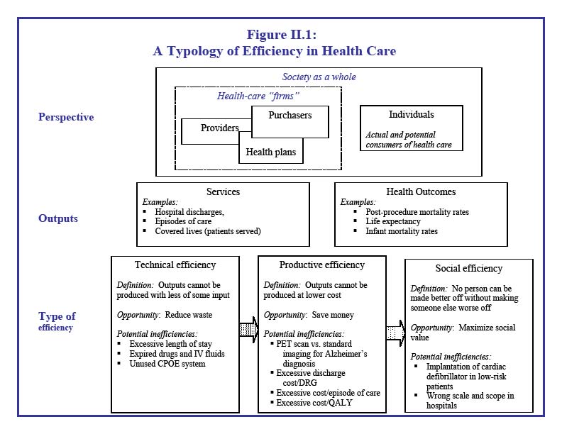 Figure 2.1 is entitled “A Typology of Efficiency in Health Care”. The figure is divided into three sections: Perspective, Outputs, and Type of efficiency. The section on perspective contains nested boxes. The largest box represents society as a whole. Within this box are two smaller boxes, one representing individuals and one representing health-care “firms”. Individuals are defined as the actual and potential consumers of health care. Health-care firms consist of providers, purchasers, and health plans. Providers, purchasers, and health plans are depicted in small overlapping boxes within the health-care firms box to indicate that there are not always clear distinctions between the three groups. The section on outputs is split into two categories: services and health outcomes, and examples of both are provided. Finally, the section on type of efficiency depicts three definitions of efficiency: technical, productive, and social. The figure illustrates arrows from technical efficiency to productive efficiency, and productive efficiency to social efficiency. The formal definition, opportunity (or benefit) from improved efficiency, and potential inefficiencies for each type of efficiency are provided. For example, technical efficiency is defined as “Outputs cannot be produced with less of some input.” The opportunity associated with improved technical efficiency is reduced waste. Examples of inefficiency from a technical perspective include excessive length of stay and expired drugs and IV fluids. Productive efficiency is defined as “Outputs cannot be produced at lower cost.” The opportunity associated with improved productive efficiency is saving money. Examples of inefficiency from the productive perspective include excessive cost per episode of care and using a PET scan versus standard imaging for an Alzheimer’s diagnosis. Social efficiency is defined as “No person can be made better off without making someone else worse off.” The opportunity associated with improved social efficiency is maximizing social value. Examples of inefficiency from the social perspective include implantation of a cardiac defibrillator in low-risk patients and having hospitals of the wrong scale and scope.
Source: AHRQ Publication No. 08-0030 (McGlynn, et al. 2008)
In addition to differences in stakeholder viewpoints and units of measurement for outputs and input, several other factors make it difficult to arrive at one definition of efficiency (AcademyHealth 2006):
- Although there is strong preference for using health outcomes as the unit of output, there is disagreement on which actors should be held responsible for certain outcomes.
- While costs are usually considered the primary inputs, cost elements can vary widely depending on the population, service, or health care setting examined.
- Because the relationship between cost and quality is unknown, there is no guarantee that reducing costs will not harm quality.
- Efficiency is a relative term; there is not necessarily an absolute or highest level of efficiency that can be achieved.
While many believe that health care in the U.S. is inefficient, there is equal concern about the unintended consequences of efforts to reduce inefficiency, given the lack of accepted definitions and measures. As a rule, purchasers want to begin measuring, comparing, and paying providers based on efficiency, while providers raise concerns about harming quality if inaccurate or inappropriate measures are used. Consumers are also concerned about high health care costs, but may regard efficient care as cheap care or low-quality care. To lessen these concerns, many purchasers prefer to use the term "value" rather than "efficiency." (Academy Health 2006)
Related Concepts. Bentley et al. (2008) describe various types of waste in health care spending, including administrative, operational, and clinical. Waste and efficiency are related, in that waste is a component of resource use or allocation that reduces efficiency. Cost-effectiveness and cost-benefit are also related to efficiency, in that more cost-effective or cost-beneficial services may lead to greater efficiency. Other concepts related to, but distinct from efficiency include: return on investment, which assesses whether resources invested now will result in savings or added revenue in the future (Leatherman et al. 2003); and business case for quality, which defines quality of care as the input, and costs as the output (Chen et al. 2007).
Efficiency Measures
Most measures of efficiency come from the provider perspective (physicians or hospitals), so they look at cost per unit of output, such as a service or episode of care, without addressing the quality dimension. Measuring efficiency from the purchaser perspective requires an examination of cost in relation to quality or other outcomes. But few studies have tried to combine these components into one measure.
A comprehensive review of efficiency measures found just nine studies that had robust efficiency measures constructed from the health plan or purchaser perspective (McGlynn et al. 2008). Almost all of them used technical measures of efficiency---outputs produced for a given set of inputs. For example, Rollins et al. (2001) examined the number of inpatient days and ambulatory encounters in relation to costs, which consisted of administrative, inpatient, physician, and other professional expenses. Siddharthan et al. (2000) computed the number of covered lives as a function of inpatient days, outpatient care, and emergency room visits.
Health plan studies. NCQA has begun to examine cost in relation to quality to develop measures of efficiency for health plans. They combine HEDIS quality measures with relative resource use measures for several conditions, including diabetes, asthma, low back pain, hypertension, cardiac conditions, and chronic obstructive pulmonary disease (COPD). Cutler et al. (2000) examined the cost per episode of ischemic heart disease and heart attacks for three types of insurance plans--HMO, PPOs and traditional indemnity--and created two "quality" measures, death and readmission rates after the initial incident. They found that per-episode costs do vary across the plans, but there is little variation in quality outcomes. Overall, the HMO plans, which had lower per-episode costs, had outcomes that were comparable to traditional indemnity insurance, suggesting that quality did not suffer from lower expenditures and the HMO plans may be more efficient.
Studies of Medicaid and Medicare costs relative to quality. Just a handful of studies examine cost in relation to quality measures specifically for Medicaid and Medicare programs. Grabowski et al. (2004) analyzed the relationship between Medicaid payments and risk-adjusted nursing home quality measures. After dividing state Medicaid nursing home per-diem rates into quartiles, they found that nursing facilities in states with per-diem rates in higher quartiles had lower incidences of pressure ulcers and physical restraints. Another study, by the Congressional Budget Office (CBO 2008) takes a similar approach in graphically displaying state-by-state per-Medicare-enrollee expenditures (y-axis) versus a measure of quality (x-axis), which is an index of the percentage of hospitalized Medicare beneficiaries receiving appropriate care. The analysis shows no clear relationship between the two measures, which CBO cites as evidence of inefficiency in the health care system.
Preventable hospitalizations as a possible efficiency measure. Several Medicaid agencies have examined the incidence of avoidable hospitalizations as an indicator of quality and access to primary care. It could constitute an efficiency measure if the reduction in avoidable hospitalizations leads to reductions in inpatient expenditures. To date, use of preventable hospitalizations as a measure of system performance has focused on elderly and disabled enrollees, who have the highest rates of hospitalization among Medicaid enrollees. AHRQ’s development of publicly available software tools for the construction of these measures has greatly increased their use.
For example, Bindman et al. (2007) examined the incidence of preventable hospitalizations in California’s Medicaid program and found that rates of preventable hospitalization were significantly lower for non-elderly disabled enrollees in managed care plans compared to those in fee-for-service care. They concluded that the differences are evidence that managed care has provided care more "effectively," but did not examine costs explicitly. The Center for Health Care Strategies (CHCS 2008) reviewed four states’ current efforts to measure preventable hospitalizations for elderly and disabled populations as performance indicators for their Medicaid programs. Though few studies have examined preventable hospitalizations among children, this may be a useful performance measure given the large number of children served by the Medicaid program. Recent studies in Connecticut (Connecticut Office of Health Care Access 2008) and Oklahoma (Verdier et al. 2009) show that more than one-third of Medicaid preventable hospitalizations occur among children.
Return on investment in Medicaid. Recent work by CHCS has tried to quantify the return on investment (ROI) that Medicaid programs may realize through evidence-based quality improvement programs (Greene et al. 2008). They took the "purposively myopic perspective of the entity making the investment," and computed the cost-benefit ratio associated with 11 quality interventions implemented by Medicaid managed care organizations. The benefits were calculated by measuring change in per-member per-month expenditures, and costs were those associated with the intervention. Only four interventions showed a positive ROI. But the sites did not collect clinical or outcome data to measure whether quality had improved as well. The project assumed that if interventions were "evidence-based," quality should have improved. CHCS designed a Web-based tool to assist states in estimating the ROI of an intervention, but it does not incorporate quality measurement into the cost-benefit analysis.
How to Define and Measure Medicaid Efficiency?
We did not find any existing definitions of efficiency in Medicaid programs or any conceptual frameworks that could serve as a guide to measuring it. In the absence of a model for defining efficiency in the Medicaid program, we recommend adopting a definition that takes the perspective of health care purchasers. As purchasers, Medicaid programs do not produce the outputs or outcomes of care. Instead, they try to purchase the mix of services and contract with providers that can produce the best access and quality outcomes for a given level of spending. We propose a working definition as follows:
An efficient Medicaid program is one that has better outcomes for a given level of spending than another. This is a relative concept; it must be assessed by comparing spending and outcomes of state Medicaid programs.
To measure this concept, one must measure costs, select appropriate outcome measures, determine how to combine them, and compare state scores. This raises a host of issues and questions:
- How should costs or spending be defined in the Medicaid context? What types of costs should be included and excluded? How should Medicaid populations be divided for purposes of comparing costs? Should adjustments be made for cost determinants over which Medicaid has limited influence, and if so, which ones?
- For which quality or other outcomes should Medicaid programs be held accountable? Which quality and access measures are best suited to different Medicaid populations?
- How can state Medicaid programs be scored, and ranked or categorized, on the basis of cost and quality measures?
These questions are the focus of the remaining chapters in this literature review. In Chapter III we discuss issues involved in measuring and comparing state Medicaid costs. In Chapter IV we review alternative measures of quality and other outcomes. In Chapter V we consider how to combine cost and quality measures into one or more efficiency or value scores, issues involved in ranking state scores, and how to set appropriate benchmarks.
Chapter III Measuring Medicaid Spending and Costs
There are many ways to cut the Medicaid spending pie. Most studies stratify Medicaid costs by population groups, although the groupings vary considerably. Some studies examine costs for categorical eligibility groups; others distinguish high-cost enrollees from low-cost enrollees, regardless of eligibility group. Few studies attempt to control for factors that are beyond the control of state Medicaid programs, such as prevailing local input prices. Consequently, it will be challenging to create comparable measures of Medicaid program spending for purposes of measuring efficiency.
Based on previous studies, available Medicaid data, and project objectives, we recommend measuring costs at the enrollee level, as this is aligned with the purchaser’s perspective on efficiency and value. We recommend empirically measuring "cost" as total expenditures per enrollee, including administrative expenditures but excluding spending not related to enrollee services. We also recommend stratifying enrollee costs by the four standard categories of eligibility (adults, children, disabled, and aged), and consider further subdividing some of those categories. We also suggest analyzing cost per enrollee group by two care settings--acute care versus long-term care. We think it is also important to standardize or regression-adjust costs for a variety of cost determinants that are beyond state control, such as a medical price index, physician supply, and the prevalence of poor health status in each state’s low-income population.
This chapter begins by reviewing why studies define the population unit differently for purposes of comparing state Medicaid costs, and discusses options for stratifying Medicaid enrollee costs for this project. It then outlines factors that influence differences across states in health expenditures generally, and in Medicaid spending specifically, to assess whether and how to adjust Medicaid costs for state-specific characteristics. It examines which cost components of Medicaid spending should be included or excluded and how this would help to make comparisons across states more accurate and fair. The chapter concludes with a recommended approach to measuring Medicaid costs for this project.
Analyzing Medicaid Costs by Enrollee Groups
Total Medicaid expenditures depend on the number of enrollees served, so state-by-state comparisons generally examine annual expenditures per person. The population can be defined in various ways: per capita, per enrollee, and per user of specific services. Each denominator has different purposes.
- Per capita comparisons use the population of each state, either as a whole, or by age or other characteristics. Comparisons of per capita Medicaid spending reveal state differences in the proportion of the population enrolled in Medicaid. However, these measures tend to obscure differences in state expenditures among those actually enrolled in Medicaid. For example, Holahan (2002) compares per capita Medicaid spending, using the population with incomes below 200 percent of the federal poverty line (FPL) as the unit of analysis to capture the degree to which state Medicaid programs cover those in greater need of public coverage.
- Per enrollee comparisons are useful for showing differences in state spending for all services used by different types of enrollees (Wenzlow et al. 2007; Martin et al. 2007; Sommers et al. 2006; Dougherty Management Associates 2005; CMS 2008).
- Per service user comparisons are useful for highlighting differences in utilization rates, and the costs paid for specific services, across states. For example, Wenzlow et al. (2007) reported per enrollee costs of $1,752 for institutional long-term care (LTC) among fee-for-service Medicaid enrollees in 2002; however, only about 5.8 percent of enrollees used such services, leading to much higher per user costs of $30,367.
Among these three measures, per enrollee comparisons seem best aligned with the purchaser’s view of efficiency, since it captures all the services reimbursed by the payer for covered lives. In contrast, the per capita measures are more useful for addressing questions of societal efficiency: is Medicaid optimally fulfilling its safety-net role, given the needs of each state population? Per user measures are more useful for addressing questions of technical efficiency---for example, could prescription drugs be provided at lower cost? We therefore recommend computing Medicaid costs per enrollee, consistent with our recommendation to use the purchaser perspective for this analysis.
Selecting Enrollee Subgroups. Given the diversity of the populations covered by Medicaid, nearly every study reviewed divides Medicaid costs by homogenous groups of enrollees. Several studies calculate spending within the four basis of eligibility (BOE) categories: (1) adults and pregnant woman, (2) children, (3) disabled children and adults, and (4) the aged (Wenzlow et al. 2007, Sommers et al. 2006, Sommers et al. 2005, Holahan and Cohen 2006, CMS 2008). In 2005 there was an eight-fold difference in national average per enrollee Medicaid expenditures between the least costly group---non-disabled children ($1,729)--and the most costly group--disabled enrollees ($14,536) (CMS Statistical Supplement 2008).
Medicaid databases such as MSIS and MAX also classify enrollees by maintenance assistance status (MAS) categories, which reflect the primary financial eligibility criteria met by an enrollee. The five MAS categories are: cash assistance; medically needy; poverty-related; section 1115 waiver groups; and "other" eligibles, including foster children. Although the MAX analytic chartbook presents a few statistics by MAS, this categorization does not appear common in the literature (Wenzlow et al. 2007).
The four BOEs and five MASs can be combined to form 20 BOE/MAS groups (Sommers et al. 2005). However, the BOE/MAS categories available in national-level data sets do not map into the legally distinct "mandatory" and "optional" beneficiary groups that state Medicaid programs serve. To achieve an "apples-to-apples" comparison across states, it might seem to make sense to look at only mandatory groups because all states must cover these groups. However, some BOE-MAS groups include both mandatory and optional populations. For example, the BOE-MAS group "aged individuals who received cash assistance" includes aged individuals who receive supplemental security income (SSI) (a mandatory population), and individuals who receive only state supplemental payments to SSI (an optional population). Excluding enrollees covered through optional groups would eliminate an estimated 29 percent of all Medicaid enrollees (Sommers et al. 2005), and half of all aged enrollees. Moreover, while the Sommers study uses a method to divide enrollees into mandatory and optional categories, the approach is technically complex, and the authors note that, "These [mandatory and optional] distinctions may not reflect the practical alternatives states face within today’s policy environment."
Other potential enrollee subgroups. It may be important to further subdivide the BOE groups into subgroups based on service utilization patterns. Some studies analyze per enrollee expenditures among those with the highest costs, since improved care management for these groups has the greatest potential for Medicaid savings. For example:
- Dual eligibles. Per enrollee cost measures have been constructed for dual eligibles (Wenzlow et al. 2007; Liu et al. 2006), since an estimated 46 percent of all Medicaid expenditures were for dual eligibles (Holahan et al. 2009).
- Long-term care users. Sommers et al. (2006), Kaye et al. (2009) and Burwell et al. (2007), divide state LTC spending into two sets: (1) for the aged and younger people with physical disabilities and (2) individuals with mental retardation or developmental disabilities.
- Pregnant women. They incur significantly higher acute-care expenditures than non-pregnant adults. Because pregnancy confers categorical eligibility for Medicaid, the mix of pregnant women and non-pregnant adults among all adults in a state Medicaid program will affect per enrollee adult expenditures (Verdier et al. 2009).
To the extent that appropriate quality measures can be constructed for these subgroups, and their costs can be separately identified, it may be useful to compute per enrollee expenditures for these subgroups, given their higher cost profiles and the potential for greater value and efficiency if their care can be better managed.
Analyzing Medicaid Costs by Service Categories and Limitations for Medicaid Managed Care
High Level Categories. State Medicaid costs can be compared for specific services or care settings, using the two major data sets containing Medicaid spending--the Medicaid Statistical Information System (MSIS)/ Medicaid Analytic Extract (MAX) and CMS form 64 data, which are described in more detail in Appendix B. The highest level service categories are acute care and LTC.
Distinguishing between acute care and long-term care may help to compare the value obtained by state Medicaid spending because these categories reflect important differences in the way states purchase care and seek to improve value through the mix of services covered, or through greater or lesser use of capitated or other forms of managed care. For example, state initiatives to improve efficiency have aimed to reduce preventable hospitalizations (Bindman et al. 2007), boost generic prescribing (NCSL 2008), and encourage routine physician visits to lessen emergency room utilization (Verdier et al. 2009). These initiatives are aimed at reducing acute-care costs per enrollee, but probably would not substantially influence LTC costs. Within the LTC arena, costs vary between institutional and home- and community-based care (HCBS), with spending per institutionalized enrollee nearly three times that of community-based enrollees (Sommers and Cohen 2006; Wenzlow et al. 2007; Holahan and Cohen 2006). States with a larger number of HCBS enrollees would have lower per enrollee LTC expenditures than states with a greater proportion of LTC enrollees in institutional care (Kaye et al. 2009).
Detailed Service Categories and Medicaid Managed Care. Medicaid MAX files have 30 unique service categories for fee-for-service Medicaid enrollees grouped into four categories: inpatient, institutional LTC, prescription drugs, and other services. But for Medicaid managed care enrollees, this level of detail is not available; only total capitation expenditures are reported (Wenzlow et al. 2007).
One could restrict detailed comparisons of per-service costs to states with little managed care enrollment, but that would eliminate a large segment of Medicaid enrollees and a large number of states. Overall, nearly 40 percent of Medicaid enrollees were enrolled in a comprehensive managed care plan at some point in 2002, and in 19 states, more than half of enrollees were in such plans (Wenzlow et al. 2007). Enrollment in managed LTC plans is much lower overall, though a few states, including Arizona, Minnesota, and Massachusetts, have fairly high rates. Such variation in managed care enrollment limits the availability of detailed expenditure data by service type across states. To address this shortcoming, some researchers have apportioned capitated payments across service types according to observed spending patterns among fee-for-service enrollees, but this may not be a valid approach for cross-state comparisons of per enrollee expenditures (Sommers et al. 2005; Martin et al. 2001). Applying national-level expenditure proportion to state-level capitation payments would obscure cross-state variation.
Complex financing arrangements and responsibility by dual payers for some services can also complicate cross-state measures within detailed spending categories. For example, since 2003 some states have participated in multi-state prescription drug purchasing agreements to negotiate additional manufacturer rebates on top of those required by federal law (Cohen 2008). These rebates are reflected in the CMS-64 quarterly financial reporting forms, but are not reflected in person-level MSIS and MAX files (Wenzlow et al. 2007). Accurate per enrollee prescription drug expenditure analyses would have to incorporate state-by-state data on drug rebate receipt. Behavioral health care expenditures are another specific service that may be difficult to accurately compare across states, due to different choices that states have made in sharing mental health care costs and responsibilities across Medicaid and state mental health agencies (Mark et al. 2003; Dougherty Management Associates 2005).
Due to these problems and limitations in the availability of service-specific expenditure data for Medicaid managed care enrollees, detailed comparisons of per-service costs across states are difficult to construct. In addition, variation in state Medicaid spending efficiency could be influenced by decisions regarding how much to rely on managed care and the specific mix of services covered under fee-for-service. For these reasons, we recommend (1) measuring state Medicaid spending for population subgroups for two broad categories of services---acute care and long-term-care---rather than for specific services and (2) combining fee-for-service (FFS) and managed care populations in each of these two service categories, to the extent that enrollees in managed care organizations (MCOs) can be divided into those enrolled in MCOs providing acute care and those providing long-term care services.
Factors Affecting Variation in State Medicaid Health Care Expenditures--To Adjust or Not?
If efficiency measures are intended to reflect the purchasers’ ability to get more value for their spending, then expenditures per enrollee should reflect factors over which state Medicaid agencies have some control. The corollary is that state Medicaid program costs should be adjusted for factors over which they have little or no control, such as the age and disability profile of enrollees and local input prices. In this section, we review factors affecting state-to-state variation in Medicaid expenditures, consider whether they should be adjusted for, and discuss methods to adjust for determinants of variation in state Medicaid spending.
General factors affecting variation in per capita state health expenditures
Variation in per capita health expenditures across states is substantial. In 2004, total personal health care spending per capita (expenditures divided by the state population) ranged from $3,972 in Utah to $6,683 in Massachusetts; spending per Medicaid enrollee ranged from $3,664 in California to $10,417 in Alaska (Martin 2007). Even among Medicare enrollees, where payment rates are nationally administered and eligibility is consistent from state to state, regional variation in service mix and intensity resulted in overall per enrollee costs ranging from $5,640 in South Dakota to $8,569 in Louisiana (Martin 2007).
A CBO report identified key determinants of health spending within a state, including: socio-economic characteristics (age, sex, income, and education); the incidence of health risk behaviors (such as smoking) and illness or disability; and supply-side factors, such as the inpatient hospital admission rate, number of physicians per capita, proportion of physicians engaged in primary care, and HMO market share (CBO 2008; Gold 2004). These same factors are also likely to contribute to differences in Medicaid program spending, and Medicaid agencies have little control over them (Table III.1). Accordingly, we propose to control for supply-side factors, input prices, and population health status. While variation in local practice patterns also contributes to variation in overall state health spending, we do not propose to control for such variation in state Medicaid cost estimates because Medicaid programs have several levers with which they can and do shape enrollee utilization rates---for example through limits on the number of hospital days or prescription medications.
Table III.1. Potential Adjustment Factors
| Adjustment Factor | State Variation and Effects on Costs | Level of State Control for Medicaid Population | Potential Data Sources |
|---|---|---|---|
| Physicians Per Capita | Low to medium | Low | Area Resource File |
| Local Input Prices | Medium to high | Low to medium | CMS Hospital Wage Index for Medicare; CMS Geographic Indices for Physician Fees in Medicare |
| Population Health Status | Medium | Low to medium | Behavioral Risk Factor Surveillance Survey; Center for Disease Control and Prevention Public Health Measures |
| Local Practice Patterns | High | High | Medicare utilization rates |
Several data sources may be used to adjust for health care market differences across states. For example, Grabowski et al. (2004) applies the CMS hospital wage index, which is used to adjust Medicare inpatient reimbursements, as a proxy for local input prices. The geographic adjustment factor, a summary index of the three different factors (physician time, practice expense, and malpractice) applied to Medicare physician payments, may also be used to adjust state Medicaid costs to take into account market prices (GAO 2007). Data from the Area Resource File can be used to make adjustments for the number of physicians and active primary care physicians per capita (Verdier et al. 2009).
State Medicaid Program Design Leads to Differences in Per Enrollee Spending
Federal law grants states substantial flexibility to establish the eligibility criteria, benefits, and provider payment rates for their Medicaid programs. Differences in state Medicaid program design leads to very different profiles of covered populations, volume and type of services used, and total expenditures per enrollee. States may also have different levels of administrative costs, depending on how they operate their programs, and some states spend more than others on non-service costs related to care for low-income groups not covered by Medicaid.
State Variation in Enrollee Characteristics and Services Covered. Sommers et al. (2005) estimate that just under 40 percent of Medicaid spending nationwide is attributable to mandatory services provided to mandatory groups. The remaining costs are spent on optional eligibility groups, such as pregnant women and children at higher income thresholds than those for mandatory groups, childless adults under special waivers, medically needy individuals, 2 aged and disabled individuals enrolled in HCBS waivers, and optional services. All states cover some optional benefits, though to varying degrees. About 18 percent of total Medicaid spending pays for optional services provided to mandatory groups and 42 percent of expenditures are for optional eligibility groups. Hence, state-to-state variation in per enrollee expenditures may be due to differences in covered services and the limitations placed on the amount, scope, or duration of covered services.
One could argue that adjustments should not be made for state differences in covered services, since these inputs may lead to different outcomes. For example, a high-value or more efficient Medicaid program might be serving enrollees via HCBS (optional services) rather than nursing home care (a mandatory service). Or it might realize reduced hospitalizations (a mandatory service) through more generous coverage of prescription drugs (an optional service).
On the other hand, state differences in the coverage of optional groups can lead to considerable variation in the age and disability distribution of Medicaid enrollees. Since older and disabled individuals are likely to incur greater health care costs, regardless of Medicaid purchasing decisions, efficiency measures should control for these differences by examining costs within demographic groups. Otherwise, the measure would penalize states that have more generous coverage of the aged and disabled, relative to states that have more generous coverage of children. For example, in two demographically similar states---North Dakota and South Dakota---there was a four percentage point difference in 2005 (11 percent versus 7 percent) in the proportion of Medicaid enrollees that were aged. North Dakota had overall per enrollee costs of $7,576 while South Dakota had per enrollee costs of $4,762, due in part to the different mix of enrollees. Accordingly, the choices states have made in extending eligibility to optional groups can translate into large differences in per enrollee expenditures if the age and disability profile of enrollees is not taken into account.
Similarly, the proportion of Medicaid enrollees receiving partial coverage varies from state to state and may have to be adjusted to make fair comparisons of states’ per enrollee expenditures. For example, dual eligibles receive their acute-care services primarily through Medicare; a state with a large proportion of dual eligibles among its aged and disabled enrollees will, on average, have lower per enrollee acute-care costs than one with few dual eligibles in these groups. Nationwide, 15 percent of aged and disabled Medicaid enrollees are dually eligible; however, across the states, this ranges from 9 percent in Arizona to 25 percent in Maine (Wenzlow et al. 2007).
Other limited-benefit enrollees vary in size across the states, including: aliens eligible for only emergency hospital services and people receiving only family planning services. On average, these enrollees represented 9 percent of Medicaid enrollees in 2002; however, again there was wide state-to-state variation. In 2002, 10 states reported fewer than 1 percent of their enrollees received limited benefits; however, 20 percent of enrollees in Alabama and 33 percent of enrollees in California fell into the limited-benefit category that year (Wenzlow et al. 2007).
Variation in Provider Reimbursement Rates and Use of Managed Care. Each state establishes its own Medicaid provider payment rates, so the rates vary widely. The ratio of Medicaid-to-Medicare reimbursement rates for primary care in 2003 averaged 0.62 nationwide, but ranged from 0.34 in New Jersey and Rhode Island to 1.38 in Alaska (Zuckerman 2004). As noted above, absolute variation in payment rates can reflect, to some extent, the cost of local market inputs (Grabowski et al. 2004).
However, states’ ability to set low rates may be limited in service markets where Medicaid has a larger share, such as nursing home care or obstetrics (Quinn and Kitchener 2007; Zuckerman et al. 2004). To ensure enrollee access to these services, Medicaid payments must adequately cover average fixed costs. By contrast, in markets such as primary physician care, where Medicaid plays a more marginal role, the program may be able to achieve adequate access for Medicaid enrollees by covering only variable costs. Medicaid’s relative dominance in each healthcare market likely varies from state to state (Quinn and Kitchener 2007).
State Medicaid programs also choose how much to utilize fee-for-service versus capitated managed care for different types of enrollees and services. Capitated managed care can provide more budget predictability than fee-for-service arrangements because the state pays a single fee for a specified set of services per enrollee. Whether Medicaid managed care results in cost-savings relative to FFS, however, depends on the rates negotiated with managed care plans (Verdier et al. 2009), and on which services are included or carved out of the benefit package.
Variation in Administrative Cost. Medicaid agencies also vary in administrative costs per enrollee. Some variation may reflect efficiencies, such as greater use of information technology to minimize staff time involved in processing applications or claims. Other variation in administrative costs may be due to state decisions to perform some functions "in house" that others perform through provider contracts. For example, states may choose to hire state staff to be case managers, which makes this service an administrative expense. Another state may cover targeted case management as an optional service, so it shows up as a service expense. Some administrative costs are "hidden" in capitated managed care payments (Martin et al. 2001). As with the choice of benefits, one could argue that adjustments should not be made for state differences in administrative inputs, since these choices may lead to different outcomes in efficiency.
Variation in Other Payments. There is also a question about whether to include or exclude from state cost comparisons Medicaid expenditures that are not specifically tied to services, such as disproportionate share hospitals (DSH) payments. These payments are intended to supplement revenues for hospitals that care for a high percentage of low-income patients, including Medicaid and the uninsured. Overall, DSH payments accounted for about 5.9 percent of total Medicaid expenditures in 2004 (Holahan and Cohen 2006), and there is enormous variation across states in DSH allotments. Because DSH payments cannot be specifically attributed to Medicaid enrollees, they are generally excluded from Medicaid cost studies, or presented separately in aggregate (Martin et al. 2001; Holahan and Cohen 2006; Quinn and Kitchener 2007). We recommend excluding DSH payments and other costs that cannot be attributed to enrollees from state Medicaid spending calculations in this study as well. Medicaid MSIS and MAX data exclude such non-service-related costs, making it straightforward to exclude such costs.
Conclusions and Recommendations
Cost measures can be calculated at the per capita, per enrollee, or per user levels. We recommend measuring costs at the per enrollee level because this is most closely aligned with the purchaser’s perspective on efficiency and value. We recommend empirically measuring "cost" as expenditures per enrollee, stratified by several categories of eligibility, and standardized or regression-adjusted for a variety of factors that influence expenditures and are beyond the states’ control.
Enrollees and Services. We recommend measuring total per enrollee Medicaid expenditures for at least four basis of eligibility (BOE) categories that are commonly used in the literature: children, adults, disabled, and aged. Stratification by these eligibility categories will allow for appropriate policy-relevant comparisons across states while still limiting the complexity of the analysis and the number of different comparisons made.
Because enrollees who use LTC have expenditures that are many times those of enrollees who do not use LTC, we also believe that total per enrollee expenditures should be examined separately for LTC users. There are several possible methods for examining LTC users separately:
- Per enrollee expenditures for eight categories---both LTC and non-LTC within each of the four BOE categories
- Per enrollee expenditures for five categories---LTC in aggregate, standardized for the BOE distribution within a state, and non-LTC within each of the four BOE categories
- Consider LTC users separately only within the aged and disabled categories, since most users of long-term care fall into these two eligibility groups
Within the adult, disabled, and aged groups there are also distinct groups that tend to have higher expenditure profiles than others, so it might be useful to examine them separately: (1) pregnant women versus all other adults; (2) individuals with MR/DD versus those with physical disabilities; and (3) dual eligibles versus aged and disabled beneficiaries who are not dually eligible. Since the distribution of these enrollee types varies by state, we could either: (1) examine and present per enrollee expenditures separately for each of these subgroups, or (2) present only group-level (for example, aged) per enrollee expenditures, but standardize the measures so the proportion of enrollees within each subgroup (for example, aged/dual eligible, aged/not dual eligible) is held constant in assessing overall group-level per enrollee expenditures.
Limited Benefit Enrollees and Service-Specific Analysis. Because limited-benefit enrollees (for example, adults qualifying only for family planning services) account for a small proportion of Medicaid spending and receive very few services, we suggest they be excluded from analyses of per enrollee expenditures. We do not recommend dividing enrollees and services into mandatory and optional categories according to the legal definitions of the two, nor do we recommend making cross-state assessments of expenditures for particular services, due to the lack of detailed data on service expenditures for enrollees in capitated managed care plans. Expenditure analyses by specific services would be limited to fee-for-service expenditures, but state spending will vary widely across the country, depending on the proportion of individuals enrolled in managed care. In addition, the value that a Medicaid program achieves may depend more on the overall service mix than on expenditures for a particular service, since services are often complementary or interchangeable.
Administrative and Other Costs. Administrative costs reflect both productivity differences (such as in eligibility determination and claims processing) and differences across states in the decision to pay for such services as case management as a covered benefit versus as an administrative activity performed by state employees. Hence, we believe these costs should be incorporated into the per enrollee expenditure analysis. Administrative costs are available, in aggregate, from the CMS-64 forms. Since the administrative costs are not presented separately for different subgroups of enrollees, we propose equally distributing administrative costs across all enrollees. This method is comparable to that used in determining the administrative portion of Medicaid managed care capitated rates; although individual enrollees may incur higher or lower actual administrative costs related to their service utilization, the up-front capitation amount includes average expected administrative rates. Although a similar approach might be taken with disproportionate share expenditures, the rationale and method for doing so is less clear. Such payments are not specifically tied to the costs of caring for Medicaid enrollees.
Adjusting for Determinants of State Health Care Prices and Population Health. To make the cost per enrollee comparisons across states useful to Medicaid program managers, expenditure estimates should be adjusted for factors that are out of the states’ control, such as overall health care price variation, provider supply differences, and population health status. We propose these adjustments be made through standardization approaches or by multivariate regression analysis, but will have to consider how to accurately adjust for these factors and take into account potential data and statistical limitations.
Chapter IV Measuring Medicaid Quality, Access, and Other Outcomes
While a wide variety of measures have been used to assess the quality of care and access to care in the Medicaid program in state-specific studies, only subsets of measures are routinely and consistently collected in multiple states. Measures for which Medicaid data are collected in many states include: (1) physician or hospital clinical quality-of-care measures for selected diseases or conditions, (2) nursing home quality measures, and (3) patient-reported measures of access to care and satisfaction. In most cases, data for these measures are not collected for all state Medicaid programs nationwide, and others are not limited to exclusively Medicaid populations.
Decisions about the outcome measures most appropriate for this study should be based on two major criteria---relevance to the Medicaid population groups selected and data availability for the largest number of states. After choosing the population groups for cost analysis, we propose to select outcome measures that address the relevant clinical conditions or dimensions of care for each population and investigating the availability and quality of data at the state level. For example, if it is decided to examine costs for Medicaid-covered children, and for adults receiving long-term-care services, the relevant measures may be childhood immunization rates and selected nursing home quality measures, respectively. Because of limited availability of state-level data for many measures, however, it may not be possible to evaluate quality, access, or other outcomes for all 51 Medicaid programs.
This chapter, reviews the state of quality and access measure development in the U.S. , and the availability of such measures for Medicaid populations in multiple states.
Current Quality and Access Measures
Spurred by several landmark studies indicating poor quality of care in the United States , extensive efforts have been undertaken in the last decade to expand the use of standardized measures in quality improvement activities (IOM 1999). Several national multi-stakeholder organizations, including the National Quality Forum (NQF), the Hospital Quality Alliance (HQA), and the AQA (formerly the Ambulatory Care Quality Alliance), have been established to facilitate development, test, and ultimately endorse and promote the use of well-accepted measures (http://www.qualityforum.org; http://www.aqaalliance.org; http://www.hospitalqualityalliance.org)
Measure development efforts today are typically tied to six dimensions of quality identified by the Institute of Medicine (IOM 2001): safe, effective, patient-centered, timely efficient, and equitable. 3 Numerous measures have been developed, submitted for review, and endorsed by the NQF and other bodies, having met criteria for importance, scientific acceptability, usability, and feasibility.
Yet many proposed measures remain unendorsed, with little or no testing or evaluation. For example, private health plans often collect data on the quality of providers in their networks and use this data for a variety of purposes, including public reporting to consumers, feedback to providers for quality improvement, network tiering, or pay-for-performance. Many of these efforts use quality measures that have been developed in-house or by outside consultants. Similarly, individual states often develop quality measures for their own purposes (Stevens, Lake and Taylor 2007).
The overall prevalence and use of quality measures throughout the United States is largely unknown. In fact, the extensive diversity of development and implementation efforts underway makes it challenging to summarize the range of existing activity at any given point. Responding in part to the complexity of the measure development field, the IOM (2005) called for further coordination and rationalization of the measure development process, noting that measures in such areas as patient centeredness, equity, and efficiency were lagging behind measures of safety, effectiveness, and timeliness.
At the same time, the set of measures in widespread use is much smaller than the overall set of available or endorsed measures. Key constraints on the broad and consistent use of available, nationally endorsed measures include implementation burden, data limitations, and funding issues surrounding data collection, reporting, and analysis. In particular, most measures in use in most settings today remain limited to those that can be supported with administrative data. In the future, wider use of health information technology may increase the use of a broader set of measures involving more detailed clinical information.
For most physician and hospital services, quality measurement efforts tend to be primarily focused on: (1) primary-care or hospital-based process-of-care measures, often identifying under-use of recommended services, including Healthcare Effectiveness Data and Information Set (HEDIS) measures, AHRQ preventable hospitalization measures, and HQA hospital quality measures; (2) selected patient safety measures or measures of complication rates, including AHRQ patient safety indicators; and (3) patient-reported measures on satisfaction with or access to care, such as Consumer Assessment of Healthcare Providers and System (CAHPS) measures. Measures of care coordination, clinical outcomes, and efficiency of care are in much more limited use. LTC measures, including care in home health or nursing homes, tend to focus on structural measures, patient complaints, and selected clinical outcome measures, such as those collected through OASIS (home health) and the Minimum Data Set (nursing homes). While some of these measures are now collected nationwide, data are not necessarily available by payer source or at the state level.
Medicaid-Specific Quality and Access Measures
Medicaid-specific quality, access, or other outcome measures are collected most consistently across states in the following areas, each of which is described below:
- Measures related to ambulatory or hospital clinical quality care for a variety of specific conditions
- Nursing home quality measures for nursing home residents
- Measures of patient-reported preventive service use, access to care, health outcomes, and satisfaction with care
- Other population-based utilization or health outcome measures that may be relevant to state Medicaid populations, such as hospitalization rates for certain conditions, immunization rates, or infant mortality rates or other birth outcomes.
Medicaid HEDIS: Ambulatory and Hospital Care Quality. Medicaid HEDIS currently covers a wide array of measures of care effectiveness, including rates of immunizations, rates of various recommended preventive screenings for children and adults, appropriate use of care for low back pain, appropriate management of certain conditions or drug therapies, and selected outcome measures (NCQA 2008). Many of these measures require medical record abstraction, but some may be calculated from administrative claims or encounter data alone. Although HEDIS measures have expanded substantially over time, and cover multiple aspects of medical care and multiple disease conditions, they emphasize screenings and delivery of preventive care, with limited coverage of outcomes or processes of care in the full range of conditions or specialties.
As of 2005, Medicaid managed care plans in 23 states had submitted data to the NCQA Quality Compass (Thompson MedStat 2006). State-level Medicaid data from the 2008 Quality Compass is currently available, although the number of states with a sufficient number of plans reporting for generation of state-level estimates varies by HEDIS measure. Preliminary estimates provided by NCQA staff as part of this review indicate that state-level estimates may be available for only 8 to 11 states, depending on the specific measure. 4 Additional states collect and publish Medicaid HEDIS results individually--potentially adding to the total number of states with available data, assuming methods are comparable across states (Felt-Lisk 2007). In addition, as noted above, selected HEDIS measures might be calculated using national multi-state Medicaid claims data sets, such as Medicaid eXtract (MAX) research files.
Nursing Home Quality. The U.S. Department of Health and Human Services collects and reports quality data on nearly all nursing homes in the United States , making it possible to create state-level measures of nursing home quality. The measures cover patient functioning, onset of complications, and results from nursing home inspections. These measures are not specific to Medicaid enrollees, but such quality information would be relevant to Medicaid, since a large portion of residents in most nursing homes are enrolled in Medicaid. Overall, Medicaid pays for 40 percent to 50 percent of total national expenditures on nursing home care (Quinn and Kitchener 2007), and for 70 percent of nursing home residents admitted for 90 days or longer.
Medicaid CAHPS and Centers for Disease Control (CDC) Measures: Access to Care, Satisfaction, and Health Status. Many states also collect and report CAHPS data covering their Medicaid programs. CAHPS measures address access to care and ratings of care for a variety of services, and include questions about health status and demographics. There are two main sources of national Medicaid CAHPS data. First, 19 states (including individual plans within those states) submit Medicaid CAHPS results to the National CAHPS Benchmarking Database (NCBD) (AHRQ 2007). The second is Medicaid CAHPS data submitted to NCQA’s Quality Compass, discussed above. It is uncertain how much overlap there is between participation in the NCBD and the Quality Compass. If there is little overlap, the number of states for which some CAHPS data is available may be larger than 19; it is also unknown whether participation has been increasing over time. Assuming Medicaid CAHPS measures may be included in this project, the degree of overlap would be investigated in the next stage of identifying potential measures.
The CDC also sponsors several surveys that may provide useful quality measures for Medicaid enrollees. The National Childrens’ Health Survey, conducted in 2003 and 2007, contains many CAHPS-like measures and includes insurance information that would allow the identification of Medicaid beneficiaries. The National Immunization Survey added an insurance question in 2006, allowing these measures to be computed specifically for Medicaid. Other CDC options are not specific to the Medicaid population. For example, the Behavioral Risk Factor Surveillance System (BRFSS) has available information on health status and the use of selected preventive services among adults for all 50 states, but is not specific to the Medicaid population. Similar measures that are collected by the CDC, but are not specific to the Medicaid program, include rates of low-birth-weight infants. We will explore using these public health measures if Medicaid-specific measures are not available across a sufficient number of states for populations of interest.
Conclusions and Recommendations
In conclusion, we recommend making final decisions about selecting quality and access measures for this project following an initial analysis of Medicaid state cost variation for various eligible population groups, as discussed in Chapter III. Given the limited availability of quality and access measures and the scope of this project, our selection will likely be made from among existing data sets, such as Medicaid HEDIS, the National CAHPS Benchmarking Database, the Nursing Home Compare website, and some CDC databases. Some specific quality analyses may have to be limited to a subset of states. We will also consider how we might incorporate quality and cost measures in evaluating state Medicaid performance, including an assessment of whether this is feasible or advisable.
Although it would be useful to construct measures of episode-of-care costs in relation to quality measures for Medicaid programs, as Cutler et al (2000) have done, it would be very resource-intensive. In addition, Medicaid data quality is not adequate to construct accurate per-episode measures from nationally available sources. For example, in an attempt to calculate expenditures per Medicaid enrollee with diabetes, Cohen (2006) found that diagnosis codes were routinely missing from MSIS encounter and fee-for-service claims in many states.
Chapter V Scoring, Ranking, and Benchmark-Setting
Many alternative methods are available for scoring, ranking, and benchmarking state Medicaid efficiency measures. Scores can be built from quantitative or qualitative data, and generated for many or few dimensions, but they are often aggregated into a single composite score to simplify comparisons. Once scores have been generated, ranking states in order from highest to lowest is common. But a strict rank order suggests greater differences between states than the absolute measures may indicate. Broader performance categories can address this problem. Finally, benchmarking---or setting some internal or external performance standard---provides another point of comparison. Benchmarks are used to assess how far a state Medicaid program is from the "average," or from "top performers," or relative to other payers.
Due to many factors affecting state Medicaid costs and outcomes that are not readily apparent, we do not think it is appropriate to rank-order the results. For a pioneering effort like this, it would be more sensible to group states with similar performance and create benchmarks, such as the national median, that reflect common reference points. Benchmarking Medicaid’s performance to commercially insured groups is beyond the scope of this project, since it would require complicated adjustments for differences in health status and other differences between the two sets of insured populations. Whether and how to construct composite measures of cost or quality in Medicaid remains unclear.
In this chapter, we review methods for scoring, ranking, defining performance categories, and benchmarking in the health care field. We then review comparative assessments of state Medicaid programs and health care measures across states, focusing on lessons for ranking or setting performance categories. Next, we examine approaches for establishing benchmarks and issues of measure sensitivity and statistical significance. We conclude with recommendations for an approach that will show how state Medicaid programs compare on efficiency measures.
Framework for Ranking, Developing Performance Categories, and Establishing Benchmarks
The Canadian Institute for Health Information (CIHI) has published a general framework for health care ranking exercises, highlighting important principles which can help guide the performance evaluation phase of this project (2008). CIHI recommends that any ranking scheme’s conceptual framework cover the topics most relevant to the purpose of the ranking; that indicators should be meaningful and valid; and that data used are accurate, complete, and comparable. CIHI also lists "best practices" in the analysis and presentation of measure values:
- The distribution of scores or values used in a ranking scheme must be taken into account to establish cut points that distinguish performance tiers. Meaningful differences (high, medium, low) should be distinguishable; uneven tiers may be the clearest way to present data, depending upon the measure distribution.
- Rank scores are relative measures that can be misleading; both absolute and relative comparisons should be available for review.
- Adjustments must be made to account for underlying differences in the demographic profile of the respective populations compared.
- When combining the values of indicators as part of a ranking scheme, the weighting of each factor in the overall score must be made explicit, and the principles that underlie the weights and aggregation system should be stated.
- Uncertainty that underlies all measurement should be reflected in the results of the ranking scheme. Presentations should distinguish statistically significant differences in performance from those that are not.
- Statistical issues must be considered and appropriately adjusted for, including any correlations among the indicators used and how outlier indicator values are handled.
Previous Rankings of State Medicaid Programs
While lessons can be drawn from previous exercises that ranked state Medicaid programs, none emerges as a clear model for this effort. Of four Medicaid-specific reports, only one claimed to conduct a comprehensive assessment of Medicaid program characteristics, while the other three looked at particular aspects of the program. All four of the reports were constructed by consumer or advocacy groups, and they often had significant methodological weaknesses. None attempted to risk-adjust measures for demographic differences in the Medicaid populations covered or market variations in the cost of health care across states. Many used complex aggregate scoring methods that are sensitive to weighting assumptions, and most ranked states without mention of statistical issues.
Public Citizen Health Research Group Assessment. This widely publicized report (Ramirez de Arellano and Wolfe 2007) sought to assess Medicaid performance in a comprehensive way from the enrollee viewpoint. It posed the question: "If I were a poor, sick person, in which state would I have the best chance of becoming eligible for Medicaid and getting comprehensive, quality health care?" The report included 55 indicators in four domains: eligibility (7 indicators), scope of services (36 indicators), quality of care (9 indicators), and reimbursement (3 indicators). State scores on each indicator were aggregated into domain-specific scores, which were added together to produce the total score. Many indicators translated qualitative data (for example, a state covers free-standing ambulatory surgery) into numeric points. For this reason, the results of the analysis are highly sensitive to the point assignment and weighting schemes applied. The quality domain relies heavily on nursing home and child vaccination measures. While the specific measures and weighting methodology are not directly applicable to this project, the report does present the results clearly, including both absolute and relative performance for the total score and each domain.
Assessments of Specific Medicaid Features. Three recent studies have compared Medicaid program performance on particular aspects:
- Athenahealth PayerView ranked Medicaid programs in their administrative function as payers by using a composite seven-indicator quantitative score to assess the timeliness and completeness of claims payment. Performance was presented in rank order and relative to the median performance of all payers (public and private); however, only 12 states are included in the most recent report (2008).
- In 2007, United Cerebral Palsy ranked state Medicaid programs on how well they serve individuals with intellectual and developmental disabilities. All states were ranked according to a composite score that was constructed from 20 measures in five domains. The measures included both quantitative and qualitative data that had been converted into numeric form. The 10 "best" and 10 "worst" performing states were highlighted; authors were careful to note that while the overall spread in performance was 60 points, the scores of the 25 middle states are separated by only 10 points, so changes in state rankings are sensitive to the score aggregation method.
- U.S. News and World Report, in cooperation with NCQA, ranked all Medicaid managed care plans that submit data to NCQA, based on consumer assessments (CAHPS), performance in treatment and prevention (HEDIS), and NCQA accreditation (2008). All plans received one to five stars in three domains (consumer assessment, prevention, and treatment), and the top 5 performing Medicaid managed care plans (of 81 ranked) were given an "honor roll" designation.
How to Combine and Present Cost and Outcome Indicators
In the broader literature of state health care ranking reports, a variety of indicators and methods for creating composite scores are employed. The literature also offers different approaches for ranking states, creating performance categories, and how to display results.
Number and organization of indicators. Most studies that sought to assess state health care systems in a comprehensive fashion purposely use a large number of indicators organized into domains. Often, more than 20 indicators were used, and some studies use more than 40. Performance is scored within each domain, and domain-specific scores are sometimes weighted to produce an overall performance score (Ramirez de Arellano and Wolfe 2007; NBCH 2007; Schoen 2006; UCP 2008; USNWR 2008; UHF 2008; Commonwealth 2007). United Health Foundation’s America ’s Health Rankings report (2008) was unique; all scores were reported relative to the national mean, resulting in both positive and negative overall performance scores. At the other end of the spectrum, one study examined only two measures (RWJF 2008), but explored differences across population subgroups in greater detail.
Generating composite scores. To produce overall scores, some studies average performance across domains, which weights them equally. Others develop complex methodologies with value-driven weights assigned to each domain or measure. One study (Ramirez de Arellano and Wolfe 2007) developed a weighting methodology through consultation with experts in the field; others did not describe the process used to develop domain weights. Complex methodologies allow an overall score to better reflect the relative importance of strong or weak performance in each domain. But as the approach becomes more complex, it is more difficult to understand how changing performance in a given domain would influence the total score.
Ranks and performance tiers. Both rank-ordering and creating performance categories are frequently found in the literature, although studies that established performance tiers also tended to rank states individually. Calling attention to the "top 10" states was common (UCP 2008; Ramirez and Wolfe 2007; Wenzlow 2007; Schoen 2006; Commonwealth 2007; UHF 2008); discussion of low-performing states was less frequent. Studies showing performance categories have different numbers of tiers: three (RWJF 2008), four (Commonwealth 2007; Weissman 2008; Grabowski 2004; Wenzlow 2007), or five (Zerzan 2006). Authors often aim for tiers of roughly, if not exactly equal size. While this approach is familiar, it also often results in states with statistically similar performance being grouped separately. One approach to consider is mentioned, though not displayed in UCP’s report (2008): where the range of scores among the mid-performing states is narrow, a three-tier approach that groups the middle 25 states into a single tier may be preferable to distinguishing a middle-top from middle-bottom tier.
Displaying measure performance. Performance and ranks are generally displayed in tables, with higher performing states listed at the top of table. Shaded displays of results on national maps are also common and easy to review (RWJF 2008; Wenzlow et al. 2007; Zerzan 2006). One report displays performance in a bar chart, which allows the reader to quickly distinguish whether the measure was continuous over its range or had notable discontinuities (NCBH 2008). To avoid data overload, that report presented absolute scores only at the 25th, 50th, 75th and 90th percentiles.
One approach that may be particularly useful for combining cost and quality measures is illustrated in recent Medicare quality work (Cooper 2008; CBO 2008), which displays costs on one axis and an aggregate quality score on the other axis. An example of this type of chart is shown in Figure V.1. These graphs quickly illustrate the correlation (if one exists) between cost and quality or other measure, while still preserving the component measure values. Such displays may be preferable to computing cost per quality metric, which would obscure whether overall performance was driven by cost or by quality performance. The Commonwealth Fund’s report (2007) also uses such an approach to array quality and access measures.
Figure V.1. The Relationship Between Medicare Spending and Quality of Care, by State, 2004
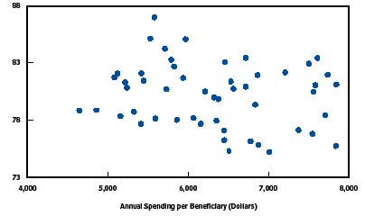
Figure V.1 shows the relationship between Medicare spending and quality of care by the state in 2004. The figure is a scatterplot with 51 datapoints, each representing a state (or the District of Columbia). Performance on a composite quality measure is displayed on the y-axis, with a scale ranging from 73 to 88 points. Annual spending per beneficiary in dollars is displayed on the x-axis, with a scale ranging from 4,000 dollars to 8,000 dollars. Each data point represents the quality and cost measures for a state. Quality of care scores are tightly distributed between 78 and 83 points, while spending ranges considerably from 4,500 dollars to 8,000 dollars. There is no apparent linear pattern to the data points and there are no outliers.
Source: Congressional Budget Office based on data from Department of Health and Human Services, Agency for Healthcare Research and Quality, National Healthcare Quality Report, 2005 (December 2005), Data Tables Appendix, available at http://www.ahrq.gov/qual/nhqr05/index.html, and data from the Centers for Medicare & Medicaid Services’ ContinuousMedicare History Sample.
Note: The composite measure of the quality of care, based on Medicare beneficiaries in the fee-for-service program who were hospitalized in 2004, conveys the percentage who received recommended care for myocardial infarction, heart failure, or pneumonia.
Setting Benchmarks
In addition to ranking states or health plans against one another, many studies also establish performance benchmarks. Usually, the benchmark is the mean or median performance within the group (of states or health plans). Three reports set "reach" benchmarks. RWJF’s assessment of children’s health set its benchmarks for infant mortality and poor general health status as the lowest statistically reliable levels among children in higher income households (2008). The NBCH eValue8 report designated its highest performing plan as the "benchmark" plan in each domain. In evaluating U.S. health system performance, Schoen et al. (2006) set benchmarks that reflect the performance of countries, U.S. states, hospitals, health plans, or other providers in the top 10 percent. Public Citizen’s report (Ramirez de Arellano and Wolfe 2007) had a conceptual "reach" benchmark, as its authors believed that, although no state came close, all states could potentially earn the full 1000 points in their ranking scheme.
Although no reports that ranked state Medicaid programs made comparisons to the private sector, commercial plans’ performance has been used as a benchmark in other studies. For example, Hadley and Holahan (2003) examined whether annual per enrollee medical expenditures differ for individuals with Medicaid coverage and private insurance, controlling for their different demographic, economic, and health status characteristics. But the analysis relies on Medical Expenditure Panel Survey (MEPS) household data to compare the two populations. MEPS is not designed to generate state-level estimates, and so cannot be used for a state-by-state comparison of private and Medicaid expenditures. CAHPS and HEDIS measures are available as points of comparison for Medicaid managed care plans, but without risk adjustment, measures computed for the private sector may be inappropriately high benchmarks for Medicaid.
Measure stability and Statistical Significance
A few studies used regression analyses to assess whether differences in performance were statistically significant (Grabowski et al. 2004; Cooper 2008; Hadley and Holahan 2003). Some studies that did not use regression analysis discussed the sensitivity of their measures to different methods. For example, one analysis of hospital rankings found that subtle changes in the methodology for aggregating indicators could result in individual facilities moving ranks by more than half of the league table (Jacobs et al. 2005).
Of the state ranking exercises that we reviewed that did not use regression analysis, the United Health Group’s analysis (2008) of the "healthiest" states had the most sophisticated approach. It limited the maximum score that any state could receive for a measure to two standard deviations above or below the national norm in order to minimize the influence of any unusual outlier observations that may not be reliable. Some measures (such as infant mortality) combined data across years to improve measure stability. Since the report has been compiled for several years, it also discusses states for which ranking has changed substantially, and factors that may have driven the changes. Public Citizen (Ramirez de Arellano and Wolfe 2007) noted that measure domains with fewer indicators are more "volatile" but do not quantify the extent. One study that tried to rank state performance on children’s mental health ultimately did not issue any rankings; the scores were unstable from year to year and they had concerns about data comparability and quality across states (Dougherty Management Associates 2005).
Conclusions and Recommendations
We recommend developing scoring, ranking, performance categorization, and benchmarking methodologies for this project that follow the CIHI guidelines---that is, to calculate and present measures in a way that makes adjustments for important differences across populations and calls attention to meaningful differences in performance.
Whether and how to construct composite measures of cost or quality in Medicaid remains unclear. Deriving a composite efficiency score will involve complex technical and statistical design decisions that must wait until measures are selected and data are collected and analyzed. While comprehensive analyses array similar measures into domains, creating a composite score from them in a defensible way may prove challenging. Although they do make the results easier to understand, composite scores are very sensitive to component weights. Whatever the final method, we will explicitly discuss statistical issues and sensitivity of results to alternate methods.
Recognizing these concerns, we propose to present results in a way that de-emphasizes rank order and focuses on defining groups of states with similar performance. While ranking states is a common approach, it suggests more precision than warranted, given statistical issues and the range of performance. Once the cost and quality measures have been calculated, we propose to examine the distribution of values before establishing categories or cut points to distinguish higher from lower performers. Graphically displaying cost and quality measures is a promising alternative to calculating efficiency "scores" since underlying performance in both dimensions is preserved. Graphic displays of variation can also identify similar groups of states. We do not have a priori plans to establish categories of equal size, since these often group dissimilar performers together and obscure meaningful differences. Since state categories may not be equally divided, we will consider displaying as benchmarks some common reference points, such as the national median performance.
References
- AcademyHealth. "Efficiency in Health Care: What Does it Mean? How is it Measured? How Can it be Used for Value-Based Purchasing?" Available at http://www.academyhealth.org/publications/EfficiencyReport.pdf. May 2006.
- Agency for HealthCare Research and Quality. "National HealthCare Quality Report: 2007 State Snapshots." Available at http://statesnapshots.ahrq.gov/snaps07/index.jsp?menuId=1&state. 2007.
- Athena PayerView. "2008 National Rankings" Available at http://www.athenapayerview.com/. 2008.
- Beal, A. J. Co, D. Dougherty, T. Jorsling, J. Kam, J.Perrin, and R. H. Palmer. "Quality Measures for Children’s Health Care." Pediatrics, vol. 113, no. 1, January 2004, pp. 199-209.
- Bella, Melanie, Chad Shearer, Karen Llanos, and Stephen Somers. "Purchasing Strategies to improve Care Management for Complex Populations: A National Scan of State Purchasers." Center for Health Care Strategies. Available at http://www.chcs.org/usr_doc/Purchasing_Strategies_to_Improve_Care_Manag…. March 2008.
- Bella, Melanie, Claudia Williams, Lindsay Palmer, and Stephen Somers. "Seeking Higher Value in Medicaid: A National Scan of State Purchasers." Center for Health Care Strategies. Available at http://www.chcs.org/usr_doc/State_Purchaser_Scan.pdf. November 2006.
- Bentley, Tanya, Rachel Effros, Kartika Palar, and Emmet Keeler. "Waste in the U.S. Healthcare System: A Conceptual Framework." The Milbank Quarterly, vol. 86, no. 4, 2008, pp. 629-659.
- Bindman, A., A. Chattopadhyah, and G. Auerback,. "Interruptions in Medicaid Coverage and Risk for Hospitalization for Ambulatory Care-Sensitive Conditions," Annals of Internal Medicine, 149(12), 2008, pp. 854-860.
- Bindman, A. K. Goodwin, A. Chattopadhyay, and G.Auerback. "Preventable Hospitalizations among Medi-Cal Beneficiaries and the Uninsured." San Francisco, CA: California HealthCare Foundation, December 2007.
- Burwell, B., K. Sredl, and S. Eiken, Medicaid Long-Term Care Expenditures in FY 2007, Thomson Reuters. Available at: http://www.hcbs.org/moreInfo.php/doc/2374. 2008.
- Canadian Institute for Health Information. "Making Sense of Health Rankings." Available at http://secure.cihi.ca/cihiweb/dispPage.jsp?cw_page=AR_2409_E. 2008.
- Center for Health Care Strategies. "Medicaid Best-Buys: Performance Measurements for Programs Serving Adults with Disabilities and Chronic Conditions." Available at http://www.chcs.org/publications3960/publications_show.htm?doc_id=697703. July 2008.
- Centers for Medicare & Medicaid Services. "2008 Actuarial Report on the Financial Outlook for Medicaid." Available at http://www.cms.hhs.gov/ActuarialStudies/downloads/MedicaidReport2008.pdf. October 2008.
- Centers for Medicare & Medicaid Services. "Medicare and Medicaid Statistical Supplement." Available at http://www.cms.hhs.gov/MedicareMedicaidStatSupp/LT/List.asp. 2008.
- Chen, Arnold, Melanie Au, and Allison Hamblin. "The ROI Evidence Base: Identifying Quality Improvement Strategies with Cost-Saving Potential." Available at http://www.chcs.org/usr_doc/ROI_Evidence_Base.pdf. November 2007.
- Cohen, Mindy. "An Overview of Medicaid Enrollees with Diabetes in 2003." Available at http://www.kff.org/medicaid/upload/7700.pdf. October 2007.
- Cohen, Robin. "Viability of State Joining Multi-State Compact for Medicaid-Covered Prescription Drugs." Connecticut Office of Legislative Research. Available at http://www.cga.ct.gov/2008/rpt/2008-R-0664.htm. 2008.
- Congressional Budget Office. "Key Issues in Analyzing Major Health Insurance Proposals." Washington, DC: CBO, December 2008.
- Congressional Budget Office. "The Long-Term Outlook for Health Care Spending." Washington, DC: CBO, November 2007.
- Congressional Budget Office. "Geographic Variation in Health Care Spending." Washington, DC: CBO, February 2008.
- Connecticut Office of Health Care Access. "Preventable Hospitalizations in Connecticut: An Updated Assessment of Access to Community Health Services, FYs 2000-2006." Hartford, CT: Connecticut Office of Health Care Access, April 2008.
- Cooper, Richard. "States with More Health Care Spending Have Better-Quality Health Care: Lessons about Medicare." Health Affairs. Available at http://content.healthaffairs.org/cgi/content/full/28/1/w91. December 2008.
- Cunningham, Peter and Len. Nichols. "The Effects of Medicaid Reimbursement on the Access to Care of Medicaid Enrollees: A Community Perspective," Medical Care Research and Review, vol. 62, no. 6, 2005, pp. 676-696.
- Cutler, David, Mark McClellan, and Joseph Newhouse. "How Does Managed Care Do It?" Journal of Economics, vol. 31, no. 3, 2000, pp. 526-548.
- Dafny, Leemore and Jonathan Gruber. "Does Public Insurance Improve the Efficiency of Medical Care? Medicaid Expansions and Child Hospitalizations." NBER Working Paper No. W7555. February 2000.
- Dougherty Management Associates. "Children’s Mental Health Benchmarking Project: Fourth Year Report." Available at http://www.chcs.org/publications3960/publications_show.htm?doc_id=211377. March 2005.
- Duggan, Mark. "Does contracting out increase the efficiency of government programs? Evidence from Medicaid HMOs." Journal of Public Economics, vol. 88, no. 12, December 2004, pp. 249-257.
- Felt-Lisk, Suzanne, Allison Barrett, and Rebecca Nyman. "Public Reporting of Quality Information on Medicaid Plans." Health Care Financing Review, vol. 28, no. 3, spring 2007, pp. 5-16.
- Fisher, Elliot, David Wennberg, Therese Stuckel, Daniel Gottlieb, F.L. Lucas, Etoile Pinder. "The Implications of Variation in Regional Medicare Spending. Part 1: The Content, Quality, and Accessibility of Care." Annals of Internal Medicine, vol. 138, no. 4, February 2003, pp. 273-287.
- Gold, Marsha. "Geographic Variation in Medicare Per Capita Spending: Should Policymakers Be Concerned? Robert Wood Johnson Foundation Research Synthesis Report, No. 6. 2004.
- Government Accountability Office. "Medicaid Financing: Long-standing Concerns about Inappropriate State Arrangements Support Need for Improved Federal Oversight." GAO-08-650T, April 2008.
- Government Accountability Office. "Geographic Areas Used to Adjust Physician Payments for Variation in Practice Costs Should be Revised." GAO-07-466, June 2007.
- Grabowski, David, Joseph Angelelli, and Vincent Mor. "Medicaid Payment And Risk-Adjusted Nursing Home Quality Measures." Health Affairs, vol. 23, no. 5, 2004, pp. 243-252.
- Greene, Sandra, Kristin Kilpatrick, Sheila Leatherman, Stephen Somers, and Allison Hamblin. "Searching for the Business Case for Quality in Medicaid Managed Care." Health Care Management Review, vol. 33, no. 4, October 2008, pp. 350-360.
- Hadley, Jack and John Holahan. "Variations Among States in Health Insurance Coverage and Medical Expenditures: How Much is Too Much?" Washington, DC: The Urban Institute. Available at http://www.urban.org/health_policy/url.cfm?ID=310520. June 2002.
- Hadley, Jack and John Holahan. "Is Health Care Spending Higher Under Medicaid or Private Insurance?" Inquiry, vol. 40, no.4, winter 2003/2004, pp. 323-42.
- Holahan, John, D. Miller, and D. Rousseau. "Dual Eligibles: Medicaid Enrollment and Spending for Medicare Beneficiaries in 2005." Washington DC: Kaiser Commission on Medicaid and the Uninsured, February 2009.
- Holahan, John and Mindy Cohen. "Understanding Recent Changes in Medicaid Spending and Enrollment Growth Between 2000 and 2004." Washington DC: Kaiser Commission on Medicaid and the Uninsured, May 2006.
- Holahan, John, and Sharon K. Long. "Cover Missouri Project Report 2: Costs, Access, and Utilization Under Medicaid: A Review of the Evidence." Washington, DC: The Urban Institute. Available at http://www.urban.org/health_policy/url.cfm?ID=1001002. June 2006.
- Institute of Medicine. "Crossing the Quality Chasm: A New Health System for the 21st Century." Available at http://www.iom.edu/?id=12736. March 2001.
- Institute of Medicine. "Performance Measurement: Accelerating Improvement." Available at http://www.iom.edu/?id=34827. December 2005.
- Jacobs, Rowena, Maria Goddard, and Peter Smith. "How Robust are Hospital Rankings Based on Composite Measures?" Medical Care, vol. 43, no. 12, December 2005, pp. 1177-1184.
- Kaiser Commission on Medicaid and the Uninsured. "A Brief Overview of our Medicaid Data Sources." Available at http://www.kff.org/medicaid/upload/OverviewMedicaidDataSources.pdf. January 2006.
- Kaye, H. Stephen, Mitchell P. LaPlante, and Charlene Harrington. "Do Noninstitutional Long-Term Care Services Reduce Medicaid Spending?" Health Affairs, vol. 28, no. 1, 2009, pp. 262-272.
- Ku, Leighton and Matthew Broaddus. "Public and Private Health Insurance: Stacking up the Costs." Health Affairs, vol. 27, no. 4, June 24, 2008, pp. w318-w327 (published online:10.1377/helthaff.27.4.w318).
- Kuhmerker, Kathryn and Thomas Hartman. "Pay-for-Performance in State Medicaid Programs: A Survey of State Medicaid Directors and Programs." The Commonwealth Fund and IPRO, Available at http://www.commonwealthfund.org/publications/publications_show.htm?doc_…. April 2007.
- Landon, Bruce, Eric Schneider, Sharon-Lise Normand, Sara Hudson Scholle, L. Gregory Pawlson, and Arnold Epstein. "Quality of Care in Medicaid Managed Care and Commercial Health Plans." JAMA, vol. 298, no. 14, pp. 1674-1681.
- Leatherman, Sheila, Donald Berwick, Debra Iles, Lawrence Lewin, Frank Davidoff, Thomas Nolan, and Maureen Bisognano. "The Business Case for Quality: Case Studies and Analysis." Health Affairs, vol. 22, no. 2, March 2003, pp. 17-30.
- Liu, Korbin, Joshua Wiener, and Marlene Niefeld ."End of Life Medicare and Medicaid Expenditures for Dually Eligible Beneficiaries." Health Care Financing Review, vol. 27, no. 4, June 2006, pp. 95-110.
- Lynn, Joanne, Barry Straube, Karen Bell, Stephen Jencks, and Robert Kambic. "Using Population Segmentation to Provide Better Healthcare for All: The Bridges to Health Model." Millbank Quarterly, vol. 85, no. 2, pp. 185-208.
- Mark, Tami, Jeffrey Buck, Joan Dilonardo, Rosanna Coffey, and Mady Chalk. "Medicaid Expenditures on Behavioral Health Care." Psychiatric Services, vol. 54, February 2003, pp. 188-194.
- Martin, Anne, Lekha Whittle, Stephen Heffler, Mary Carol Barron, Andrea Sisko, and Benjamin Washington. "Health Spending by State of Residence: 1991-2004." Health Affairs, vol. 26, no. 6, September 2007, w651.
- Martin, Anne,Lekha Whittle, and Katharine Levit. "Trends in State Health Care Expenditures and Funding: 1980-1998." Health Care Financing Review, vol. 22, no. 4, summer 2001, pp. 111-140.
- Mastal, Margaret and Susan Palsbo. "Measuring the Effectiveness of Managed Care for Adults with Disabilities." Center for Health Care Strategies. Available at http://www.chcs.org/publications3960/publications_show.htm?doc_id=329417. December 2005.
- McGlynn, Elizabeth, et al. "Identifying, Categorizing, and Evaluating Health Care Efficiency Measures." AHRQ Pub No. 08-0030. Rockville, MD: Agency for Healthcare Research and Quality, April 2008.
- Medicare Payment Advisory Commission. "Report to Congress: Promoting Greater Efficiency in Medicare." Available at http://www.medpac.gov/documents/Jun07_EntireReport.pdf. June 2007.
- Mukamel, Dana and William Spector. "Nursing Home Costs and Risk-Adjusted Outcome Measures of Quality." Medical Care, vol. 38, no. 1, January 2000, pp. 78-79.
- Mukamel, Dana, Laurent Glance, Yue Li, David Weimer, William Spector, Jacqueline Zinn, and Laura Mosqueda. "Does Risk Adjustment of the CMS Quality Measure for Nursing Homes Matter?" Medical Care, vol. 46, no. 5, May 2008, pp. 532-541.
- National Academy for State Health Policy. "Making Medicaid Work: State Options to Control Costs." Issue Brief No. 4. Available at http://www.nashp.org/Files/mmw_costcontrol.pdf. November 2004.
- National Association of State Budget Officers. "Fiscal Year 2007 State Expenditure Report." Washington, DC: NASBO. Available at http://www.nasbo.org/Publications/PDFs/FY07%20State%20Expenditure%20Rep…. December 2008.
- National Business Coalition on Health. "Connecting the Dots in Health Care: eValue8 Health Care 2007 Report." Available at http://www.nbch.org/documents/evalue8_2ndreport.pdf. 2007.
- National CAHPS Benchmarking Database. "What Consumers Say About the Quality of Their Health Plans and Medical Care: CAHPS Health Plan Chartbook." Available at https://www.cahps.ahrq.gov/content/ncbd/Chartbook/2007_CAHPS_HealthPlan…. December 2007.
- National Committee for Quality Assurance. "Measurement of Resource Use and Efficiency." Presentation at AcademyHealth Annual Meeting. June 2007.
- National Committee for Quality Assurance. "The State of Health Care Quality 2007." Washington, DC: NCQA. Available at http://www.ncqa.org/Portals/0/Publications/Resource%20Library/SOHC/SOHC….
- National Conference of State Legislatures. "Recent Medicaid Prescription Drug Laws and Strategies, 2001-2009." Washington, DC: NCSL. Available at http://www.ncsl.org/PROGRAMS/HEALTH/medicaidrx.htm. January 2009.
- Orszag, Peter. "Opportunities to Increase Efficiency in Health Care." Congressional Budget Office. Testimony before the Senate Committee on Finance. Washington, D.C., June 2008.
- Palmer, Lindsay, Karen LLanos, Melanie Bella, and Carol Tobias. "Integrated Care Program: Performance Measures Recommendations." Center for Health Care Strategies. Available at http://www.chcs.org/publications3960/publications_show.htm?doc_id=379026. June 2006.
- Partridge, Lee and Carrie Szlyk. "National Medicaid HEDIS Database/Benchmark Project: Pilot Year Experience and Benchmark Results." New York: The Commonwealth Fund, February 2000.
- Pawlson, L. Gregory, Joachim Roski, and Sally Turbeyville, "Measurement of Resource Use and Efficiency." National Committee for Quality Assurance. Presentation at Academy Health. Available at www.academyhealth.org/2007/tuesday/southernhemisphere1/pawlsong.ppt. 2007.
- Quinn, Kevin and Martin Kitchener. "Medicaid’s Role in the Many Markets for Health Care." Health Care Financing Review, vol. 28, no. 4, summer 2007, pp. 69-82.
- Ramirez de Arellano, Annette and Sidney Wolfe. "Unsettling Scores: A Ranking of State Medicaid Programs." Public Citizen. Available at http://www2.citizen.org/hrg/medicaid/assets/reports/2007UnsettlingScore…. April 2007.
- Robert Wood Johnson Foundation. " America Starts with Healthy Children: How Do States Compare?" Available at http://www.rwjf.org/pr/product.jsp?id=35010&c=EMC-ADV. October 2008.
- Rollins, James, Lee Kwangsoo, Yihua Xu, and Yasar Ozcan. "Longitudinal study of health maintenance organization efficiency." Health Services Management Research, vol. 14, no. 4, November 2001, pp. 249-262.
- Schoen, Cathy, Karen Davis, Sabrina How, and Stephen Schoenbaum. " U.S. Health System Performance: A National Scorecard," Health Affairs, Web Exclusive, W457-475, September 2006.
- Schwartz, Sonya, Robert Mollica, and Alan Weil. "Ideas for Managing Costs and Improving Care Delivery for High-Cost Medicaid Beneficiaries." National Academy of State Health Policy. Available at http://www.nashp.org/_docdisp_page.cfm?LID=C2FB8203-29F3-4DD2-8A8E3B7EE…. January 2007.
- Schwartz, Sonya, Shelly Gehshan, Alan Weil and Alice Lam, "Moving Beyond the Tug of War: Improving Medicaid Fiscal Integrity," National Academy for State Health Policy. Available at http://www.nashp.org/Files/Medicaid_Fiscal_Integrity.pdf.
- Siddarthan, Kris, Melissa Ahern, and Robert Rosenman. "Causes of Cost Inefficiency in HMOs." International Journal of Health Care Quality Assurance, vol. 13, no. 4, pp. 162-169.
- Siddarthan, Kris, Melissa Ahem, and Robert Rosenman. "Data Envelopment Analysis to Determine Efficiencies of Health Maintenance Organizations." Journal of Health Care Management Science, vol. 3, January 2000, pp. 23-29.
- Silow-Carroll, Sharon, and Tanya Alteras. "Value-Driven Health Care Purchasing: Four States that are Ahead of the Curve." The Commonwealth Fund. Available at: http://www.commonwealthfund.org/publications/publications_show.htm?doc_…. August 2007.
- Sommers, Anna, Mindy Cohen, and Molly O’Mally. "Medicaid’s Long Term Care Beneficiaries: An Analysis of Spending Patterns." Kaiser Commission on Medicaid and the Uninsured, November 2006.
- Sommers, Anna, Arunabh Ghosh, and David Rousseau. "Medicaid Enrollment and Spending by "Mandatory" and "Optional" Eligibility and Benefit Categories." Kaiser Commission on Medicaid and the Uninsured, June 2005.
- Sommers, Anna and Mindy Cohen. "Medicaid’s High Cost Enrollees: How Much Do They Drive Progam Spending?" Kaiser Commission on Medicaid and the Uninsured, March 2006.
- Stevens, Beth, Tim Lake and Erin Taylor. "Improving Health Care Quality Reporting: Lessons from the California HealthCare Foundation." Oakland, CA: CHCF Issue Brief, January 2007.
- The Commonwealth Fund. Commission on a High Performance Health System. "Why Not the Best? Results from the National Scorecard on U.S. Health System Performance," Available at http://www.commonwealthfund.org/publications/publications_show.htm?doc_…. July 2008.
- The Commonwealth Fund. Commission on a High Performance Health System. "Aiming Higher: Results from a State Scorecard on Health System Performance." Available at http://www.commonwealthfund.org/publications/publications_show.htm?doc_…. June 2007.
- The Lewin Group. "Increasing Use of the Capitated Model for Dual Eligibles: Cost Savings Estimates and Public Policy Opportunities. Available at http://www.communityplans.net/Portals/0/Policy/Medicare/Lewin%20dual%20…. November 2008.
- Thompson Medstat. "Thirteen State Medicaid Core Performance Measure Reporting Summary: Highlighting Model Practices." Available at http://www.cms.hhs.gov/MedicaidSCHIPQualPrac/Downloads/13.pdf. 2006.
- United Cerebral Palsy. "The Case for Inclusion." Washington, DC: UCP. Available at http://www.ucp.org/uploads/Case_For_Inclusion_Report_2007.pdf. May 2007.
- United Health Group. " America ’s Health Rankings: A Call to Action for Individuals and Their Communities." Available at http://www.americashealthrankings.org/2008/pdfs/2008.pdf. 2008.
- U.S. News and World Report. " America ’s Best Health Plans Honor Roll." Available at http://health.usnews.com/articles/health/health-plans/2008/11/07/americ…. November 2008.
- Verdier, James et al. "SoonerCare 1115 Waiver Evaluation: Final Report." Washington, DC: Mathematica Policy Research, Inc., January 2008.
- Weissman, Joel, Alan Zaslavsky, Robert Wolf, and John Ayanian. "State Medicaid Coverage and Access to Care for Low-Income Adults." Journal of Healthcare for the Poor and Underserved, vol, 19, no. 1, February 2008, pp. 307-319.
- Wenzlow, Audra, Dan Finkelstein, Ben Lee Cook, Kathy Shepperson, Christine Yip, and David Baugh. The Medicaid Analytic eXtract Chartbook. Baltimore, MD: Centers for Medicare & Medicaid Services. Available at http://www.cms.hhs.gov/MedicaidDataSourcesGenInfo/Downloads/MAX_Chartbo…. 2007.
- Zerzan, Judy, Nancy Morden, Stephen Soumerai, Dennis Ross-Degnan, Elizabeth Roughead, Fang Zhang, Linda Simoni-Wastila, and Sean Sullivan. "Trends and Geographic Variation of Opiate Medication Use in State Medicaid Fee-For-Service Programs, 1996 to 2002." Medical Care, vol. 44, no. 11, November 2006, pp. 1005-1010.
- Zuckerman, Stephen, Joshua McFeeters, Peter Cunningham, and Len Nichols. "Changes in Medicaid Physician Fees, 1998-2003: Implications for Physician Participation." Health Affairs. Available at http://content.healthaffairs.org/cgi/content/full/hlthaff.w4.374v1. June 2004.
Appendix ALiterature Review Sources, Methodology, and Summary Table
The literature review involved three steps: (1) searches for pertinent articles and reports, using academic and public website search tools; (2) rapid review of the articles found, and selection of those that were most relevant to this project; and (3) thorough review of the most relevant articles, and coding of the topics, measures, and other issues for which they were most informative.
Searches for pertinent articles
We searched through OVID, Medline, and Google Scholar for articles published in 1995 or later that contained two or more of the following search terms: efficiency, cost-effectiveness, costs, expenditures, spending, measures, indicators, Medicaid, state scorecard, ranking, quality-based/value-based purchasing/payment, value-based, access, quality, MAX, MSIS, CMS-64.
We also searched websites of key organizations involved in Medicaid-related expenditure research and technical assistance on value-based purchasing. Government sources included: Assistant Secretary for Planning and Evaluation for the U.S. Department of Health and Human Services (ASPE), Centers for Medicare & Medicaid Services (CMS), Agency for Healthcare Research and Quality (AHRQ), the Congressional Budget Office (CBO), and the Government Accountability Office (GAO). Research organizations included: Mathematica Policy Research, Inc., the Urban Institute, the Institute of Medicine (IOM), and Thomson Reuters/Medstat. Foundations included: the Kaiser Commission on Medicaid and the Uninsured (KCMU), the Robert Wood Johnson Foundation (RWJF), and the Commonwealth Fund. Other organizations and associations included: the Center for Health Care Strategies (CHCS), the National Association of State Medicaid Directors (NASMD), the National Association for State Health Policy (NASHP), the National Governors’ Association (NGA), the National Association of State Budget Officers (NASBO), the National Conference of State Legislatures (NCSL), and AcademyHealth.
Rapid review of articles to select the most relevant
To identify articles most relevant to this project, we selected those that: (1) examined efficiency or costs from the purchaser perspective, (2) considered per enrollee expenditures, and (3) involved quantitative analyses using administrative data. We excluded efficiency studies at the provider or hospital level, those that analyzed Medicaid spending trends without considering per enrollee costs, case studies based on survey data or other non-administrative data sources, and reports that modeled savings or improved efficiency, for example, through adoption of health information technology, or prescription drug utilization review. The majority of excluded studies were case studies and modeling studies. We also excluded some analyses from 1995-2000 that had been updated by more recent work.
We identified some additional articles by reviewing citations in the most relevant articles. We also requested input from the ASPE and from colleagues within MPR who have worked on other quality- and cost-measurement projects. A few articles published after we conducted our initial searches were added to the list for thorough review.
Thorough review and coding of most relevant articles
For all articles identified as most relevant, we coded the topics, measures, and other issues addressed in each one. Full citations for each article are listed at the end of the literature review.
Appendix B Data Sources
Data Sources for Calculating Medicaid Expenditures
There are three major data sources for analyzing state Medicaid expenditures in all 50 states and the District of Columbia. The table below summarizes the major characteristics of each. Both the Medicaid Statistical Information System (MSIS) Summary File and the Medicaid Analytic Extract (MAX) provide user-level and claim-level information for all Medicaid fee-for-service claims and capitation payments. CMS-64 forms, which states use to report aggregate Medicaid expenditures by service and administrative category on a quarterly basis, are also a valuable source of expenditure information, and are sometimes regarded as a more accurate source of actual Medicaid spending. Other data sources which report Medicaid expenditures, such as the National Health Expenditure Accounts, rely on these primary data sources.
| Data Source | Description |
|---|---|
| Sources: KCMU 2006 and Wenzlow et al. 2007. | |
| Medicaid Statistical Information System | User-level and claims-level record of expenditures that can be attributed to individual enrollees Reflects claims and expenditures adjudicated during the fiscal year (not necessarily occurring during the fiscal year) Excludes administrative and lump-sum expenditures made outside the claims-processing system, such as premium payments that Medicaid makes to Medicare for dual eligibles |
| Medicaid Analytic Extract | Derived from MSIS and cleaned for research use Initial/voided claims and adjustments combined to reflect final service event records Data linked to Medicare enrollment database to allow identification of dual eligibles Retroactive changes in eligibility are incorporated Service dates are used to construct files that reflect calendar year utilization |
| CMS-64 Forms | Quarterly statement of expenditures incurred across more than 40 service and administrative categories; no utilization information Forms the basis for determining states’ federal matching funds, so includes all Title XIX expenditures, such as: Administrative costs Disproportionate Share Hospital payments Other supplementary payments |
Data Sources for Adjusting Costs for State Health Care Status
To adjust for differences in the health status of Medicaid enrollees, data from the Behavioral Risk Factor Surveillance System (BRFSS) and National Childrens’ Health Surveys (NCHS) may be useful. BRFSS is an annual telephone survey conducted in all 50 states and can be used to track the number of low-income adults reporting risk behaviors such as smoking and poor exercise habits, as well as the number who have been diagnosed with diabetes or asthma (RWJF 2008; Verdier et al. 2009). While the survey design does not allow these measures to be calculated specifically for Medicaid-eligible or Medicaid-enrolled individuals, the measures would allow for rough risk adjustment of the health status of potential enrollees across states. NCHS is a telephone survey conducted in 2003 and 2007 in all 50 states, and can be used to compute health status measures for low-income children or, specifically, Medicaid-enrolled children. However, measures calculated specifically for the Medicaid population might reflect program outcomes as much as they reflected the baseline status of potential enrollees.
1 In this review, we refer to individuals enrolled in the Medicaid program as "enrollees." Enrollees who use particular services are referred to as "users." Both of these groups are distinct from "eligibles," which refers to the pool of individuals who are eligible for Medicaid, whether or not they are enrolled. We do not use the term "beneficiary," because this term is used loosely in the literature, sometimes referring to enrollees and sometimes to users. The term "per capita" is used exclusively for population groups broader than the Medicaid population; for example, the population of a state or other subgroups.
2 Medically needy individuals are those with sufficiently high medical costs that their net income falls below a state-established level. In 2003, 35 states and the District of Columbia had medically needy programs, and among them, one ( Texas) excluded elderly and disabled.
3 For example, the annual National Health Care Quality Report produced by the Agency for Healthcare Research and Quality tracks the state of health care quality in the nation using a set of measures that encompasses these six dimensions (AHRQ 2007).
4 NCQA produces state-level estimates if five or more health plans operating in a state report results.