
By Thomas DeLeire and Caryn Marks
The Affordable Care Act established the Health Insurance Marketplaces (Marketplaces) to provide consumers with choices of affordable health plans offered in a competitive insurance market. The Marketplaces are designed to enable consumers to easily compare different insurance products. The aim is to support consumers in finding an appropriate plan that meets their specific needs and budget. The HealthCare.gov and state-run Marketplace portals offer detailed information about each health insurance plan sold in an area, including the premiums, deductibles, other out-of-pocket costs, provider network, customer service, and more.
This report examines consumer plan choices during the second year of enrollment through the Marketplaces (the 2015 plan year) for those consumers who had selected a Marketplace plan at any time in 2014 in states using the HealthCare.gov platform during 2014 and 2015.[1] During the 2015 open enrollment period, consumers made decisions to stay in the same plan (if it remained available), change their Marketplace health insurance plans, or leave their Marketplace coverage (e.g. enroll in employer-sponsored insurance, off-Marketplace coverage, Medicaid, or Medicare, etc.).
Consumers’ decisions to change health insurance plans or issuers may be influenced by a number of factors including a preference for a different premium, provider network, cost-sharing requirements, or issuer. By examining plan switching behavior, we can estimate how responsive consumers are to information and premiums in 2015.
In this issue brief, we specifically focus on how consumers responded to premium differences among health plans in their area, net of any advance payments of the premium tax credit (APTC) for which the consumer was determined eligible for in 2015, when selecting a 2015 plan.
| Key Highlights
|
I.CONSUMER PLAN CHOICES IN 2015
Consumers who had Marketplace coverage in 2014 either chose to stay in their same Marketplace plan, switch to a new Marketplace plan, or leave Marketplace coverage (e.g. enroll in employer-sponsored insurance, off-Marketplace coverage, Medicaid, or Medicare, etc.). People who stayed in the same plan in 2015 either actively selected the same plan or were automatically re-enrolled. Figure 1 displays the consumer plan choices for 2014 Marketplace enrollees.
Figure 1: Consumer Plan Choice in the Marketplace

Appendix Table 1A shows the distribution of consumer plan choices of all 2014 Marketplace enrollees. Appendix Table 1B shows the distribution of consumer plan choices for 2014 Marketplace enrollees who selected a plan in 2015 (re-enrollees). For this analysis, all individuals who selected a different plan in 2015 compared to 2014 did so through active re-enrollment. Consumers who selected a “crosswalk plan” are not considered to have selected a new plan.
About one-quarter (23%) of re-enrollees were “switchers” that chose a new Marketplace plan in 2015. The rate of plan switching in the Marketplace is high relative to that reported among employees of firms offering employer sponsored insurance (2.8% in 2010), among participants of the Federal Employee Health Benefits Program (FEHBP; 12% switched plans in 2001) and among elderly consumers enrolled in Medicare Drug Plans (13% across four enrollment periods).[i] This finding is included in Table 1A in the Appendix.
- When examining only those people who re-enrolled in coverage through the Marketplace in 2015, about one-third (31%) switched to a new plan in 2015. Among consumers who re-enrolled in coverage (4.8 million), 1.5 million chose a different plan in 2015. This finding is included in Table 1B in the Appendix.
- More than half (51%) of 2014 enrollees chose the same plan in 2015. Fifty-one percent of 2014 enrollees were “stayers” that re-enrolled into the same plan in 2015 as in 2014, with most of those, about 34% of all 2014 enrollees (or 67% of stayers), automatically re-enrolled into the same plan. These findings are included in Table 1A in the Appendix.
- When examining only those consumers who re-enrolled in coverage, about two-thirds (69%) chose the same plan in 2015. These findings are included in Table 1B in the Appendix.
Roughly one-quarter of consumers (26% or 1.6 million consumers) who enrolled in coverage through the Marketplaces in 2014 did not select a plan and were not automatically re-enrolled in a Marketplace plan in 2015. Consumers may not have re-enrolled in Marketplace coverage for a variety of reasons including an offer or family member’s offer of employer-sponsored insurance, qualifying for other public coverage programs (Medicaid, CHIP or Medicare), a move to a state with a State-based Marketplace (this analysis doesn’t include information from those states), a change in income or household status that affected eligibility for premium tax credits, or another reason.
State-level percentages of 2014 enrollees that chose the same plan, switched plans, or did not enroll in Marketplace coverage in 2015 as well as for 2014 enrollees that re-enrolled in coverage in 2015 are reported in Appendix Tables 2A and 2B.
II.CONSUMER PREMIUM SAVINGS AS A RESULT OF PLAN SWITCHING
Using enrollment and plan data, we compared the difference between the 2015 premium of the plan selected in 2014 and the 2015 premium of the plan enrolled in for 2015 for each consumer who selected a Marketplace plan in both 2014 and 2015. For consumers who switch plans, this difference is the amount the consumer saved on premiums by switching plans. We determined the average premium savings after advance payments of the premium tax credit (APTC) for:
- All 2014 consumers who switched plans in 2015;
- The group of 2014 consumers who switched plans but stayed within the same metal level in 2015 as in 2014; and
- The group of 2014 consumers who switched plans and switched issuers, but stayed within the same metal level in 2015 as in 2014.
Consumers that switched plans but did not switch metal levels in 2015 saved $33 per month, or nearly $400 annually, on premiums relative to what they would have paid had they remained in the same plan as in 2014 (Figure 2). This means consumers who comparison-shopped in 2015 were able to save $33 per month in their net premium expenses without lowering their level of coverage. Consumers that stayed in the same metal level but switched plans and also switched issuers tended to save even more on premiums ($41 per month or over $490 annually).
Overall, all consumers that switched plans saved $40 per month. However, some of these consumers switched metal levels and switching to a lower metal level typically will be accompanied by a reduction in the actuarial value of the plan. Expected out-of-pocket costs may therefore be higher for these consumers.
Figure 2: Monthly Premium Savings for Switchers
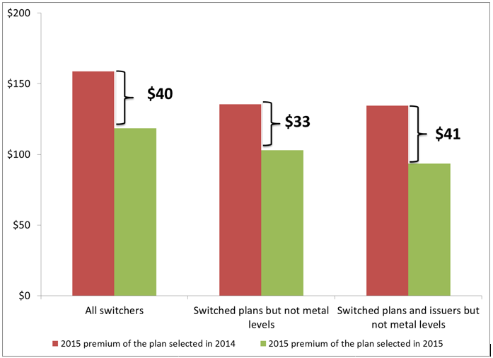
Note: Savings are calculated as the difference between the 2015 premium of the 2015 selected plan and the 2014 selected plan. Calculated for non-tobacco users only. Numbers are rounded to the nearest dollar.
Appendix Table 3 reports state-level savings among 2014 enrollees who chose a new plan and stayed within the same metal level in 2015.
III.CHARACTERISTICS OF PLAN CHOICE BY METAL LEVEL
To represent different levels of cost sharing, the Affordable Care Act created categories or “metal levels” of coverage that vary based on the share of the total costs of the essential health benefits expected to be received by an average person (also known as actuarial value) paid for by the health plan. Marketplace health plan metal levels range from bronze, with the lowest premiums but the highest cost sharing, to platinum with the highest premiums and lowest cost sharing.[2] Appendix Table 4 shows the distribution of 2014 and 2015 Marketplace enrollment according to metal level. The table also shows the distribution of consumers’ plan decisions for 2015 Marketplace enrollment according to metal level (e.g., the portion of 2014 silver plan enrollees staying in the same metal level, moving to a plan in a lower metal level, moving to plan in a higher metal level in 2015).
Consumers that switched plans were more likely to change issuers than to change metal level (Table 1). Specifically, 39% of enrollees who changed plans in 2015 also changed issuers but did not change metal levels while only 20% of consumers who changed plans in 2015 also changed metal levels but did not change issuers. Enrollees who changed both their issuer and their metal level represented 18% of consumers who switched plans
| Table 1: 2015 Issuer and Metal Level Choices of Switchers | ||
|
| Number of Enrollees | Percent of All Switchers |
| Switchers | 1.5 million | 100% |
| Changed Plans but not Metal Level or Issuer | 340,000 | 23% |
| Changed Issuer but not Metal Level | 570,000 | 39% |
| Changed Metal Level but not Issuer | 300,000 | 20% |
| Changed Metal Level and Issuer | 260,000 | 18% |
The majority of consumers in silver plans stayed in the same metal level of coverage in 2015 (Appendix Table 4). Enrollment in silver level plans is much higher than other metal level plans—69% of enrollees chose a silver plan in 2014. The appeal of silver plans for many of the consumers who are eligible for them is that most consumers eligible for cost-sharing reductions can only apply them when enrolled in a silver level plan (approximately 85% of silver enrollees in states using the HealthCare.gov platform received cost-sharing reductions in 2015)[ii] and the amount of advance payment of premium tax credits is calculated based on the second-lowest cost silver plan in a consumer’s rating area.
Switchers that changed their metal level of coverage were twice as likely to choose a lower metal level of coverage in 2015 as a higher metal level of coverage (Appendix Table 4). Among the 9% of 2014 enrollees that changed metal level of coverage, two-thirds chose to change plans to a lower metal level category. Consumers who chose lower metal levels were more likely to have been originally enrolled in gold or platinum plans (21% of gold enrollees and 25% of platinum enrollees who switched plans chose a lower metal level) and typically these consumers chose silver level plans.
Enrollees in catastrophic level coverage were more likely to leave the Marketplace and the least likely to stay in the same level of coverage compared to other enrollees (Appendix Table 4). Enrollment in catastrophic level coverage was much lower than metal level coverage with only 2% of all 2014 enrollees selecting a catastrophic plan. While access to catastrophic plans was limited to consumers under the age of 30 or who qualified for a “hardship or affordability exemption,” only 17% of consumers who initially chose this level of coverage in 2014 enrolled in the same level of coverage in 2015. Among the catastrophic enrollees, 63% terminated their coverage and 19% selected a new plan in a metal level category (and the majority of these consumers selected bronze plans).
IV.The Effect of Premium Competition Among Plans on Consumer Choice in 2015
Each year, premium rates are filed by issuers and approved by states. Between 2014 and 2015, premiums for the second-lowest cost silver plan (also called the benchmark plan) increased modestly, by 2% on average before tax credits. The plans offering the lowest prices sometimes changed from 2014 to 2015, so consumers often faced different market conditions in the second year of open enrollment and thus might well have benefited from shopping for a new plan.[3]
Because premium tax credits are based in part on the premium of the second lowest cost silver plan in a specific rating area, how consumers’ net premiums change from 2014 to 2015 will depend not only on the change in premiums, but also on the change in the premium of the benchmark plan in the rating area and on any change in family size, household income, or other eligibility information, such as access to other minimum essential coverage. An example of how premium increases affect tax credits is included in the Methods section.
MODELING CONSUMER RESPONSIVENESS TO PLAN PREMIUMS
In addition to examining the descriptive statistics of 2015 consumer plan choices of 2014 Marketplace enrollees, we estimated consumer responsiveness to plan premiums using a statistical model of consumer choice of Marketplace health insurance plans. Under this statistical model, 2015 plan choices are hypothesized to depend upon premium differences among health plans in the rating area, net of any advance payments of the premium tax credit (APTC) the consumer might have received holding constant other factors. A more complete discussion of the statistical model used is presented in the Methods section of this report.
Consumers are sensitive to net premiums when selecting a plan. Consumers are less likely to select a plan if its premium, net of any advance payment of the premium tax credit, is high relative to the net premiums of other plans in the rating area. Table 2 shows the degree of this consumer responsiveness, by metal level of the plan. For example, consumers are 16% less likely to enroll in a catastrophic plan with a premium that is 10% higher relative to other plans in the rating area.
Table 2 also shows consumers were more sensitive to the premiums of plans in higher metal levels of coverage compared to lower metal levels. For example, a platinum plan with a 10% higher premium in 2015 relative to other plans in the rating area was 37% less likely to be selected by consumers. Similarly, a silver plan with a premium in 2015 that is 10% higher relative to other premiums was 24% less likely to be selected by consumers.
These reductions represent a substantial degree of consumer responsiveness. Such responsiveness can contribute to a market environment in which there exists a strong competitive incentive for issuers to keep premiums low so as to preserve enrollment and protect against significant losses in revenue (that might follow a premium increase greater than the rating area average).[4]
| Table 2: Degree of Consumer Responsiveness of Plan Choice to the Premium of the Plan | |
| Coverage Level | Percent Reduction in Likelihood of Selecting a Plan in Response to a 10% Increase in the Plan Premium |
| Catastrophic | 16% |
| Bronze | 20% |
| Silver | 24% |
| Gold | 28% |
| Platinum | 37% |
Note: Calculated based on state-level analysis of enrollment data from the 35 states that use the HealthCare.gov platform in both 2014 and 2015.
Consumer responsiveness to net premium increases also depends upon the landscape of premium changes in the rating area. We assess how consumer responsiveness to an increase in a plan’s premium varies with whether the premiums of competing plans also increase. For example, a plan that increases its premiums by 10% in a rating area in which no other plan increases its premium would see its enrollment decline by 30%. However, if this same plan were to increase premiums in a rating area in which all plans also increased their premiums by 10%, enrollment in that plan would decline by only 4%.
This range of responsiveness underscores that simply examining average premium increases in a state or rating area is insufficient to determine the impact of these increases on consumers’ propensity to change plans. In areas in which there is a wider range of premium increases, consumers are more likely to switch into more affordable plans.
Because premium tax credits are based in part on the premium of the second lowest cost silver plan in a specific rating area, how consumers respond to premium increases will depend both on the change in the premium of the chosen plan and on the premium of the benchmark plan in the rating area. An example of how premium increases affect tax credits is included in the Appendix.
V.The Association Between Consumer Demographics and 2015 Plan Choice
Finally, we examine differences in plan choices by key enrollee characteristics to understand if plan choice patterns in 2015 varied by a number of demographic factors. Using information collected from the Marketplace enrollment applications, the characteristics examined included: gender, age, ethnicity, marital status, income, family size, tobacco usage, and enrollment assistance.[5] Characteristics of all 2014 enrollees as well as characteristics by 2015 plan choice are reported in Appendix Table 5.
We found very few demographic differences among consumers based on their plan selections in 2015. Consumers who switched plans and those who actively selected to stay in their plan were similar in terms of race, marital status, family size and receipt of financial assistance. Furthermore, they were similar to all enrollees. For example, 91% of 2014 enrollees who actively selected the same plan in 2015 as in 2014 were eligible for premium tax credits in 2014, as compared to 84% for 2014 enrollees overall.
VI.Conclusions
There are a variety of factors that may influence a consumer’s decision to switch health insurance plans. Consumers may have a preference for a different issuer, provider network, cost-sharing requirements or premium. Understanding plan selection behavior can serve as a proxy for estimating how responsive consumers are to information and their sensitivity to premiums.
The findings from this analysis show that consumers are sensitive to the premium they pay when enrolling in health insurance plans. Similar to 2014 where 65% of enrollees chose the lowest or second lowest premium, 2014 Marketplace consumers tended to gravitate towards silver level plans in their 2015 plan enrollments, most likely because cost-sharing subsidies generally are only available for consumers who select silver plans.[iii] Among 2014 consumers who changed plans and metal levels, most chose a silver plan in 2015. Notably, enrollment in catastrophic coverage was very low in 2014, and those enrollees overwhelmingly either terminated their coverage or chose a different metal level in 2015.
Additionally, consumers are sensitive to net premiums when making their 2015 plan selections. Enrollment data showed that consumers were likely to switch plans when the premium of their 2014 selected plan increased substantially. As a result, consumers who changed plans in 2015 saved a substantial amount of money by doing so. Our statistical modeling of consumer plan selection showed that consumers were sensitive to the entire landscape of premiums in their rating area, both because they can choose among many similar products within their rating area and because of how eligibility for advance premium tax credit is determined.
VII.Appendix Tables
| Appendix Table 1A: 2014 Enrollees by Plan Choice in 2015 | ||
|
| Number of Enrollees | Percent of Enrollees |
| 2014 Total Enrollees | 6.4 million | 100% |
| Stayers (Chose the Same Plan in 2015) | 3.3 million | 51% |
| Active re-enrollee | 1.1 million | 17% |
| Auto re-enrollee | 2.2 million | 34% |
| Switchers (Chose a Different Plan in 2015) | 1.5 million | 23% |
| Leavers (Did not choose a plan in 2015) | 1.6 million | 26% |
Notes: Information on plan choices are for enrollees in the 35 states that used the HealthCare.gov platform for both the 2014 and 2015 plan years. 2014 enrollees include those who selected plans during open enrollment period 1 (OEP1) and those who enrolled in a plan during a Special Enrollment Period (SEP). 2015 enrollees includes those who enrolled a plan by 2/22/2015, but excludes those whose enrollment was terminated prior to 3/1/2015.
| Appendix Table 1B: Re-Enrollees by Plan Choice in 2015 | ||
|
| Number of Enrollees | Percent of Enrollees |
| 2015 Total Re-Enrollees | 4.8 million | 100% |
| Stayers (Chose the Same Plan in 2015) | 3.3 million | 69% |
| Active re-enrollee | 1.1 million | 46% |
| Auto re-enrollee | 2.2 million | 23% |
| Switchers (Chose a Different Plan in 2015) | 1.5 million | 31% |
Notes: Information on plan choices are for enrollees in the 35 states that used the HealthCare.gov platform for both the 2014 and 2015 plan years. 2014 enrollees include those who selected plans during open enrollment period 1 (OEP1) and those who enrolled in a plan during a Special Enrollment Period (SEP). 2015 enrollees includes those who enrolled a plan by 2/22/2015, but excludes those whose enrollment was terminated prior to 3/1/2015.
| Appendix Table 2A | |||||
| 2015 Plan Choice of 2014 Consumers by State | |||||
| Chose same plan in 2015 | Chose a new plan in 2015 | Did not chose a plan in 2015 | |||
| State | All | Auto | Active | ||
| All 35 States | 51% | 34% | 17% | 23% | 26% |
| AK | 43% | 23% | 20% | 33% | 24% |
| AL | 65% | 33% | 32% | 11% | 24% |
| AR | 66% | 49% | 17% | 13% | 22% |
| AZ | 55% | 43% | 12% | 27% | 18% |
| DE | 56% | 38% | 18% | 16% | 28% |
| FL | 43% | 25% | 18% | 32% | 25% |
| GA | 54% | 38% | 16% | 22% | 24% |
| IA | 30% | 21% | 9% | 25% | 44% |
| IL | 59% | 42% | 17% | 16% | 25% |
| IN | 49% | 37% | 12% | 27% | 24% |
| KS | 50% | 36% | 15% | 24% | 25% |
| LA | 52% | 36% | 15% | 24% | 24% |
| ME | 64% | 29% | 35% | 17% | 19% |
| MI | 56% | 42% | 14% | 16% | 28% |
| MO | 50% | 34% | 16% | 26% | 25% |
| MS | 58% | 47% | 11% | 19% | 23% |
| MT | 59% | 40% | 19% | 21% | 19% |
| NC | 53% | 26% | 26% | 23% | 24% |
| ND | 52% | 31% | 21% | 25% | 23% |
| NE | 22% | 14% | 8% | 37% | 40% |
| NH | 47% | 35% | 12% | 26% | 27% |
| NJ | 48% | 33% | 16% | 26% | 26% |
| NM | 59% | 45% | 13% | 15% | 26% |
| OH | 50% | 37% | 13% | 22% | 28% |
| OK | 55% | 39% | 16% | 21% | 25% |
| PA | 60% | 44% | 16% | 16% | 23% |
| SC | 52% | 37% | 15% | 22% | 26% |
| SD | 52% | 40% | 12% | 25% | 24% |
| TN | 44% | 29% | 14% | 17% | 39% |
| TX | 52% | 35% | 17% | 21% | 27% |
| UT | 56% | 40% | 16% | 20% | 24% |
| VA | 54% | 32% | 23% | 21% | 25% |
| WI | 48% | 31% | 16% | 27% | 25% |
| WV | 60% | 38% | 22% | 15% | 25% |
| WY | 56% | 39% | 17% | 26% | 18% |
| Notes: Information is for enrollees in the 35 states that used the HealthCare.gov platform for both 2014 and 2015. 2014 enrollees include those who selected plans during OEP1 and those who selected plans during a Special Enrollment Period. 2015 enrollees include those who selected a plan by 2/22/2015, but exclude those whose plans were terminated prior to 3/1/2015. | |||||
| Appendix Table 2B | ||||
| 2015 Plan Choice of Re-Enrollees by State | ||||
| Chose same plan in 2015 | Chose a new plan in 2015 | |||
| State | All | Auto | Active | |
| All 35 States | 69% | 46% | 23% | 31% |
| AK | 56% | 30% | 27% | 44% |
| AL | 85% | 43% | 42% | 15% |
| AR | 84% | 63% | 21% | 16% |
| AZ | 67% | 52% | 15% | 33% |
| DE | 78% | 53% | 25% | 22% |
| FL | 58% | 33% | 24% | 42% |
| GA | 71% | 50% | 22% | 29% |
| IA | 55% | 38% | 17% | 45% |
| IL | 79% | 56% | 23% | 21% |
| IN | 64% | 48% | 16% | 36% |
| KS | 68% | 48% | 20% | 32% |
| LA | 68% | 48% | 20% | 32% |
| ME | 79% | 35% | 44% | 21% |
| MI | 78% | 58% | 19% | 22% |
| MO | 66% | 45% | 21% | 34% |
| MS | 75% | 61% | 14% | 25% |
| MT | 73% | 50% | 23% | 27% |
| NC | 69% | 35% | 34% | 31% |
| ND | 68% | 40% | 27% | 32% |
| NE | 38% | 24% | 14% | 62% |
| NH | 64% | 48% | 16% | 36% |
| NJ | 65% | 44% | 21% | 35% |
| NM | 80% | 62% | 18% | 20% |
| OH | 70% | 51% | 18% | 30% |
| OK | 73% | 52% | 21% | 27% |
| PA | 79% | 58% | 21% | 21% |
| SC | 70% | 51% | 20% | 30% |
| SD | 68% | 52% | 15% | 32% |
| TN | 72% | 48% | 24% | 28% |
| TX | 71% | 48% | 23% | 29% |
| UT | 73% | 52% | 21% | 27% |
| VA | 72% | 42% | 30% | 28% |
| WI | 64% | 42% | 22% | 36% |
| WV | 80% | 51% | 29% | 20% |
| WY | 68% | 47% | 21% | 32% |
| Notes: Information is for enrollees in the 35 states that used the HealthCare.gov platform for both 2014 and 2015. Re-enrollees include those who selected plans during OEP1 and those who selected plans during a Special Enrollment Period as well as those who returned to the Marketplace and selected a plan in 2015 by 2/22/2015. The analysis excludes those whose plans were terminated prior to 3/1/2015. | ||||
| Appendix Table 3 | ||||
| Premium Savings from Switching Plans within Metal Levels by State | ||||
| State | Number of 2014 Enrollees that Chose a New Plan in 2015 and Stayed within the Same Metal Level | Average Monthly Premium Savings of Switchers | Average Annual Premium Savings of Switchers | Annual State-level Savings from Switching |
| All 35 States | 785,809 | $33 | $390 | $306,474,438 |
| AK | 2,770 | $36 | $432 | $1,195,870 |
| AL | 5,493 | $16 | $193 | $1,057,512 |
| AR | 3,237 | $18 | $220 | $712,561 |
| AZ | 22,361 | $42 | $507 | $11,347,095 |
| DE | 1,014 | $6 | $67 | $67,774 |
| FL | 198,159 | $39 | $465 | $92,050,507 |
| GA | 40,923 | $20 | $238 | $9,741,003 |
| IA | 1,144 | $18 | $222 | $253,931 |
| IL | 21,586 | $11 | $127 | $2,748,726 |
| IN | 26,630 | $32 | $379 | $10,104,653 |
| KS | 8,349 | $28 | $340 | $2,841,625 |
| LA | 16,354 | $58 | $699 | $11,424,210 |
| ME | 4,541 | $16 | $188 | $852,064 |
| MI | 25,237 | $24 | $287 | $7,234,680 |
| MO | 23,887 | $33 | $395 | $9,425,376 |
| MS | 7,863 | $54 | $642 | $5,049,230 |
| MT | 4,786 | $28 | $331 | $1,582,285 |
| NC | 56,106 | $40 | $482 | $27,068,126 |
| ND | 1,986 | $19 | $226 | $449,633 |
| NE | 3,413 | $57 | $682 | $2,327,477 |
| NH | 7,386 | $19 | $233 | $1,719,651 |
| NJ | 33,545 | $55 | $663 | $22,239,059 |
| NM | 3,186 | $24 | $290 | $923,403 |
| OH | 18,411 | $37 | $447 | $8,225,391 |
| OK | 9,126 | $28 | $335 | $3,058,438 |
| PA | 29,168 | $50 | $603 | $17,578,294 |
| SC | 17,503 | $14 | $173 | $3,034,079 |
| SD | 2,300 | $39 | $468 | $1,076,197 |
| TN | 16,613 | $15 | $179 | $2,976,431 |
| TX | 100,555 | $23 | $276 | $27,763,159 |
| UT | 11,852 | $6 | $76 | $900,628 |
| VA | 27,515 | $12 | $141 | $3,872,282 |
| WI | 28,767 | $43 | $515 | $14,801,429 |
| WV | 1,854 | $8 | $92 | $171,490 |
| WY | 2,189 | $23 | $274 | $600,167 |
| Note: Information is from enrollees in the 35 states that used the HealthCare.gov platform for both 2014 and 2015. Savings is calculated as the difference between the 2015 premium of the 2015 selected plan and the 2015 premium of the 2014 selected plan and is calculated only on the 785,809 non-tobacco using enrollees who switched plans but not metal levels between 2014 and 2015. | ||||
| Appendix Table 4: Distribution of and Changes in Metal Level | |||||||||
|
| 2014 Metal Level of 2014 Enrollees | Percent who: | 2015 Metal Level of 2014 Enrollees | ||||||
| Number in Millions | Percent | Stayed in Same Metal Level | Chose a Plan with a HIGHER Metal Level | Chose a Plan with a LOWER Metal Level | Did Not Select a Plan | Number in Millions | Percent | ||
| Catastrophic | 0.1 | 2% | 17% | 19% | -- | 63% | 0.02 | 1% | |
| Bronze | 1.1 | 17% | 56% | 10% | 1% | 34% | 0.8 | 13% | |
| Silver | 4.4 | 69% | 72% | 1% | 5% | 22% | 3.4 | 53% | |
| Gold | 0.6 | 9% | 51% | 1% | 21% | 27% | 0.3 | 5% | |
| Platinum | 0.3 | 4% | 46% | -- | 25% | 29% | 0.1 | 2% | |
| No Plan | -- | -- | -- | -- | -- | -- | 1.6 | 26% | |
| Total | 6.4 | 100% | 66% | 3% | 6% | 26% | 6.4 | 100% | |
| Appendix Table 5: Characteristics of 2014 Enrollees by 2015 Plan Decisions | |||||||||
|
| All 2014 Enrollees | “Stayers” | “Switchers” | “Leavers” | |||||
|
|
| All | Auto | Active |
|
| |||
| Gender | |||||||||
| Male | 45% | 45% | 46% | 43% | 44% | 46% | |||
| Age | |||||||||
| Average age | 40 | 41 | 40 | 43 | 42 | 38 | |||
| Aged 20 or less | 12% | 12% | 12% | 11% | 12% | 13% | |||
| Race and Ethnicity | |||||||||
| White | 73% | 75% | 75% | 76% | 74% | 69% | |||
| Black | 17% | 15% | 16% | 13% | 15% | 24% | |||
| Asian | 8% | 9% | 8% | 10% | 10% | 6% | |||
| Native American | 1% | 1% | 1% | 1% | 1% | 1% | |||
| Native Hawaiian / Pacific Islander | 1% | 1% | 1% | 1% | 1% | 1% | |||
| Hispanic | 7% | 7% | 7% | 6% | 7% | 8% | |||
| Marital Status | |||||||||
| Married | 43% | 43% | 40% | 50% | 47% | 38% | |||
| Income | |||||||||
| FPL 150 | 38% | 41% | 41% | 39% | 37% | 35% | |||
| FPL > 150 & 200 | 23% | 24% | 23% | 25% | 23% | 20% | |||
| FPL > 200 & 250 | 13% | 13% | 13% | 13% | 15% | 12% | |||
| FPL > 250 & 400 | 14% | 14% | 13% | 15% | 16% | 14% | |||
| FPL > 400 | 12% | 9% | 10% | 7% | 9% | 19% | |||
| APTC Eligible in 2014 | 84% | 87% | 85% | 91% | 87% | 73% | |||
| Family Size | |||||||||
| Family size | 2.4 | 2.4 | 2.4 | 2.5 | 2.5 | 2.3 | |||
| No. of family members in same plan | 1.8 | 1.8 | 1.8 | 2.0 | 1.9 | 1.7 | |||
| Enrollment Assistance | |||||||||
| Received any enrollment assistance in 2014 | 38% | 39% | 40% | 39% | 39% | 33% | |||
| Received any enrollment assistance in 2015 | 36% | 33% | 31% | 36% | 42% | N/A | |||
| Note: The data on race and ethnicity should be interpreted with caution since more than one-third of enrollees did not provide this information. | |||||||||
VIII.Appendix: Data and Methods
Data
The analyses in this brief used data obtained from the information systems of the Centers for Medicare & Medicaid (CMS), based on information collected for the 35 states using the HealthCare.gov platform in both 2014 and 2015. Data on 2014 enrollment into Marketplace medical plans were collected for all plans chosen during the 2014 Open Enrollment Period of 10/1/2013 through 3/31/2014, as well as for plans chosen during any Special Enrollment Period (SEP) through the start of the 2015 Open Enrollment Period. Data on 2015 enrollment into Marketplace medical plans were collected for all plans chosen during the 2015 Open Enrollment Period for 11/15/2014 through 2/15/2015 (including SEP activity through 2/22/2015).
Enrollment is “pre-effectuated” enrollment; enrollment is not considered effectuated until the first premium payment is made. Thus, the analysis includes plan selections for which enrollment was not effectuated.
2014 enrollment includes all plans chosen by unique individuals in 2014, including those that were subsequently terminated prior to the start of the 2015 Open Enrollment Period. For individuals selecting more than one plan in a calendar year, only the most recently selected plans was used in this analysis.
As a result, this analysis considers the 2015 plan choices of 6.4 million individuals who selected a plan in 2014. Our numbers here differ from those in the March 2015 Enrollment Report. According to the March 2015 Enrollment report, 5.4 million individuals selected a plan during the 2014 Open Enrollment Period (including SEP activity through 4/19/2014). This number differs from ours (6.4 million) because this analysis also considers the nearly 1.0 million individuals who selected a plan in 2014 for the first time during an SEP. (More than 0.5 million additional individuals selected a new plan in 2014 during an SEP after having selected a plan during the OEP; for these individuals, this analysis considers the plan selected during the SEP as the “final” plan selection.)
2015 enrollment includes all plans chosen by unique individuals in 2015 but excludes plan enrollments that were terminated prior to 3/1/2015. As with 2014, for individuals selecting more than one plan in a calendar year, only the most recently selected plans were used.
The analysis is restricted to the 35 states that used the HealthCare.gov platform in both 2014 and 2015. Idaho switched from using the HealthCare.gov platform in 2014 to using its own Marketplace platform in 2015. Oregon and Nevada switched from using their own Marketplace platforms in 2014 to using the HealthCare.gov platform in 2015. Thus, enrollment from Idaho, Oregon, and Nevada are not included in the analysis as plan selection information for these states in both years was not available for the purposes of this analysis.
A limitation of these data is that they do not indicate whether a 2014 consumer that did not choose to enroll in a Marketplace plan in 2015 instead chose to enroll into Medicaid, Medicare, or private insurance, or another form of coverage, or whether he is she enrolled in Marketplace coverage through a State-based Marketplace.
Plan Selection
This analysis characterizes 2014 enrollees in the 35 states using the HealthCare.gov platform in both 2014 and 2015 as having in 2015, selected the same Marketplace plan, selected a different Marketplace plan, or having not selected a Marketplace plan. Among those who selected the same Marketplace plan, we further characterize these enrollees as having been passively re-enrolled or having actively re-enrolled into that plan. All individuals who selected a different plan did so through active re-enrollment.
We define a 2014 consumer as having chosen a different plan in 2015 if that consumer selected a 2015 plan with a different plan ID as their 2014 plan. Information on plan IDs are obtained from the Landscape files available at HealthCare.gov. Some plans changed their IDs slightly from 2014 to 2015; these plan IDs are considered identical to their 2014 plan IDs for the purposes of this analysis. Some consumers’ 2014 plans were no longer active for 2015 but the issuer offered a plan with similar benefits, known as a “crosswalk plan.” Consumers who selected a “crosswalk plan” are not considered to have selected a new plan.
We define a 2014 consumer as having chosen the same plan in 2015 if that consumer selected a 2015 plan with either the same plan ID than their 2014 plan or a “crosswalk plan.”
In this analysis, a 2014 consumer could be considered as having chosen a different plan or the same plan in 2015 as they did in 2014 even if they did not have an active Marketplace plan as of November 1, 2014 so long as that consumer had chosen a 2014 plan at some point prior to November 1, 2014.
Active re-enrollees include those consumers who returned to the HealthCare.gov portal, updated their information, and selected a plan at any time between the beginning of the 2015 Open Enrollment Period and 2/22/2015. Active re-enrollees include re-enrollees who selected a different plan than in 2014 and some re-enrollees who selected the same plan as in 2014.
Automatic re-enrollees include those who had a Marketplace plan as of November 1, 2014 but did not actively select a plan prior to 12/15/2014. These consumers were automatically re-enrolled into their 2014 plan or into a crosswalk plan. If such a consumer actively updated his or her information or actively selected a different plan after 12/15/2014 but before 2/22/2015, they are considered an active re-enrollee for the purposes of this analysis.
Automatic re-enrollees whose plan was no longer available in 2015 were re-enrolled in a crosswalk plan, if available. For the purposes of this brief, active re-enrollees who selected the crosswalk plan for the 2015 coverage year (identified based on information provided to CMS by the insurance companies) are considered having actively selected to remain in the same plan.
Individuals who did not select a plan in 2015 include all those 2014 enrollees with no plan selection in 2015. These individuals include enrollees who had no active plan as of November 1, 2014 and who did not return to the Marketplace in 2015. This measure also includes individuals who either actively selected or passively selected a plan during the 2015 Open Enrollment Period who subsequently terminated that plan prior to 2/22/2015.
The March 2015 enrollment brief reported that there were 4.2 million consumers that re-enrolled into Marketplace plans in 2015, while this report indicates that there were 4.5 million re-enrolling consumers. The difference between these two figures is due to the fact that the 4.2 million figure is restricted to 2014 consumers with an active plan as of November 1, 2014. That is, 0.3 million consumers selected a plan in 2014 but their plan selection was not active on November 1, 2015. Similarly, the March 2015 brief indicated that 1.0 million consumers actively re-enrolled into the same plan and 1.2 million selected a different plan, while the corresponding numbers reported in the brief as 1.1 million and 1.5 million respectively. Once again, the difference is due to the fact that this report considers consumers that selected a plan in 2014 but whose plan selection was not active on November 1, 2015 and who selected a Marketplace plan in 2015 as re-enrolling consumers.
Premiums
Information on the 2014 and 2015 premiums of plans were obtained from the Landscape files available at HealthCare.gov. Each plan has an “Age 21” premium for non-tobacco users. A person’s premium is calculated by adjusting the Age 21 premium according to the HHS default standard age curve and any relevant tobacco-use adjustment factors. A person’s net premium is determined by subtracting that person’s share of their family’s premium tax credit that the family elects to receive in advance from the premium. The premium tax credit is the difference between the family’s expected premium contribution and the cost of the benchmark plan premium for enrolled family members.
Among individuals who selected a different plan in 2015 than in 2014, we calculate an individual’s savings as the difference between their 2015 net premium and what that person would have paid for a net premium in 2015 net premium had they stayed in the same plan as in 2014 .
The following example shows how premium increases affect tax credits: If a silver plan’s monthly premium increased by $25, and the benchmark premium in the same rating area also increased by $25, then the consumer’s premium tax credit would increase by $25 such that the net premium increase faced by the consumer would be $0 (the cost to taxpayers would increase by $25, however). On the other hand, if the benchmark premium instead did not increase, then both subsidy-eligible and subsidy ineligible consumers would face the full $25 increase and would have a greater incentive to choose a lower-cost plan.
Analytic Modeling
We estimate McFadden’s choice model (McFadden 1974), in a consumer’s choice among a set of Marketplace plans where choice is modeled to depend upon the individual consumer’s net premium for a Marketplace plan and on the change in the premium of consumer’s 2014 selected plan.
In this model, the probability that a consumer i chooses plan j (out of a possible J plans to pick from) is given by:
(1) 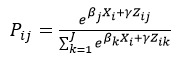 ,
,
where:
Xi is a set of enrollee characteristics and
Zij is a set of plan characteristics (that also might vary by enrollee) such as the net premium.
This model is estimated separately for each FFM state.[6] Since the predicted probabilities of enrollees choosing plan are functions of net premiums, changes in these probabilities in response to changes in the premiums of any or all of the set of plans consumers have to choose from can be determined.
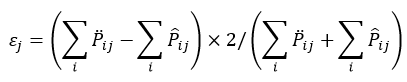
Own-Price Elasticities
The coefficients from the choice model can be used to calculate own-price elasticities, which can be interpreted as a measure of how responsive consumers are to the premium when choosing Marketplace plans. These elasticities are calculated for each plan as:
(2)  ,
,
where γ is the estimated coefficient on the net premium from the choice model.
Simulations
The predicted probabilities from the choice model are used to simulate how plan enrollments would change if the premiums in a rating area were different. In particular, we consider the following two situations on a plan’s enrollment: (1) a plan’s premium increases by 10 percent, but no other plan increases its premium (and the benchmark premium does not change); and (2) a plan’s premium increases by 10 percent and all other plans (including the benchmark plan) also increase premiums by 10 percent.
We calculate the percent change in enrollment under scenario (1) as:
(3) 
where
![]() is the baseline predicted probability that enrollee i selects plan j and
is the baseline predicted probability that enrollee i selects plan j and
![]() is the counterfactual predicted probability that enrollee i selects plan j under scenario 1 (where plan j and no other plan increase premiums by 10%).
is the counterfactual predicted probability that enrollee i selects plan j under scenario 1 (where plan j and no other plan increase premiums by 10%).
We calculate the percent change in enrollment under scenario (2) as:
(3) 
where
![]() is the baseline predicted probability that enrollee i selects plan j and
is the baseline predicted probability that enrollee i selects plan j and
![]() is the counterfactual predicted probability that enrollee i selects plan j under scenario 2 (where plan j as well as all other plans increase premiums by 10%).
is the counterfactual predicted probability that enrollee i selects plan j under scenario 2 (where plan j as well as all other plans increase premiums by 10%).
We calculate these simulated percent changes in enrollments for each plan in each rating area. The overall estimate is the straight average of these changes over rating-area specific plans.
[1] The analysis is restricted to the 35 states that used the HealthCare.gov platform in both 2014 and 2015. Idaho, Oregon and Nevada are not included in the analysis since they did not use HealthCare.gov both years and plan selection information is not available for both years for these states.
[2] Certain consumers can also enroll in catastrophic plans, designed to appeal to younger, healthier individuals, which have lower premiums and higher deductibles than most bronze plans.
[4] In particular, these estimates suggest that the price-elasticity of demand for Marketplace plans is “elastic” (or greater than 1). See, for example, Krugman, Paul and Robin Wells (2008) Microeconomics (2nd ed.), Ch. 6. Worth: New York for an explanation of how increases in the price of elastically-demanded products can generally lead to reductions in revenues by the firms producing those products.
[5] The data on race and ethnicity should be interpreted with caution since more than one-third of enrollees did not provide this information.
[6] We model was estimated separately by state both for computational reasons and to allow for differential responsiveness of consumers by state, which might have occurred because of geographic differences in marketing and outreach efforts.
[i] Cunningham, Peter, “Few Americans Switch Employer Health Plan for Better Quality, Lower Costs,” National Institute for Health Care Reform, 2013.
Hoadley, et al., “To Switch or Not to Switch: Are Medicare Beneficiaries Switching Drug Plans to Save Money,” Kaiser Family Foundation 2013.
Aderly, Adam, Curtis Florence and Kenneth E. Thorpe, “Health Plan Switching Among Members of the Federal Employees Health Benefits Program,” Inquiry, Vol. 42, No. 3 (Fall 2005).
[ii] Effectuated Enrollment Snapshot, June 30, 2015, CMS, 2015, https://www.cms.gov/Newsroom/MediaReleaseDatabase/Fact-sheets/2015-Fact….
[iii] Burke, et al,. “Premium Affordability, Competition, and Choice in the Health Insurance Marketplace, 2014,” ASPE/HHS, 2014, http://aspe.hhs.gov/sites/default/files/private/pdf/76896/2014MktPlacePremBrf.pdf.