
Final Technical Report for DHHS Contract HHSP23320054301ER
Please do not circulate without permission of the authors or the Office of the Assistant Secretary of the Department of Health and Human Services.
Stephen T. Parente, Ph.D.
Roger Feldman, Ph.D.
CARLSON
SCHOOL OF MANAGEMENT
__________________
UNIVERSITY OF MINNESOTA
ABSTRACT
The purpose of this project was to examine a key element to the success of consumer directed health plans (CDHPs)—namely the extent to which consumers use provider cost and quality information to select the highest value provider. A large (unnamed) national insurer has been using a star system to rank providers with different levels of quality and cost. These data, along with person-level claims before and after the star system was implemented, could identify whether consumers respond to these systems. As such, this analysis would help examine this critical component of CDHPs. This analysis has two key findings –1) older, sicker individuals and women are more likely to use the provider rating system, and 2) the provider rating system appears to have a negative impact on expenditures.
Material contained in this publication is in the public domain and may be reproduced, fully or partially, without permission of the Federal Government. The courtesy of attribution is requested. The recommended citation follows:
Office of Health Policy, ASPE(2008) The Regulation of the Individual Health Insurance Market.
Washington, DC: U.S. Department of Health and Human Services, Office of the Assistant Secretary for Planning and Evaluation.
Introduction
Consumer Directed Health Plans (CDHPs) are designed to engage consumers more directly in their health care purchases. The primary conceptual model is that CDHPs will make cost and quality information evident to the consumer, usually through the Internet, thus creating a more efficient health care market. To date, however, all empirical research on CDHPs has focused on their impact on cost and utilization. A critical missing element of the research is evidence that CDHPs affect health plan participants by creating incentives for consumers to ‘shop’ for services that give them the best value. A common concern about CDHPs is the lack of information for consumers to engage in retail shopping for health care purchases. Recently, this lack of information has fueled a call for ‘transparency’ in metrics on provider quality and efficiency.
Other than some web sites that provide hypothetical cost impacts from changing a prescription from brand to generic drugs, or switching from a retail pharmacy to mail-order, information on cost and quality transparency is not available. One exception is medical provider rankings based on quality and cost-efficiency metrics. For example, UnitedHealth Group (UHG) has developed a ‘star ranking’ system for their providers where any patient can see the ranking of a provider and determine if they want to stay with their current provider or upgrade to a higher-ranked provider. In a world of CDHPs where the consumer has ‘skin in the game’ through increased cost sharing for medical care, such a provider ranking system has the potential to be used by consumers and possibly to affect their health care cost and utilization.
Working with UHG, we obtained the provider quality and efficiency rankings posted on UHG’s web site since 2006. Using claims data from enrollees representing almost 4,000 covered lives in two firms where UHG was the sole provider of health insurance, we are able to address two research questions:
1) Did patients switch to higher-quality and more-efficient doctors when the provider rankings became available?
2) What is the effect of switching on total expenditures, out-of-pocket expenditures, and use of preventive services?
Addressing these questions identifies the likelihood that transparent provider quality and cost information will have a meaningful impact on the health care system of the United States.
Literature Review
The Internet has the potential to lower the costs of distributing information to consumers. The Internet also provides a dynamic interactive medium where the consumer can seek specific information on a topic. With regard to health care, while the value of the Internet for seeking health information has been documented by Baker, Bundorf and Wagner (2003), it is unknown whether consumers understand the information they receive, gain knowledge as a consequence, and take action from this knowledge.
Health care costs have increased for decades. The recent promotion of transparency of health care cost and quality information by President Bush is intended to provide information to consumers that would be difficult to obtain systematically and objectively. The provision of this information is the foundation of the recent CDHP initiative as well as the goal of developing a national health information technology infrastructure. To support the transparency initiatives, private and public insurers recently have developed and distributed tools to inform consumers about health care quality and cost. For example, Medicare’s Hospital Compare project disseminates web-based hospital performance measures collected as part of its reimbursement incentive program.
One of the key technologies enabling provider transparency initiatives is provider profiling. Provider profiling is a proven technology that is nearly twenty years old. Motivated by Wennberg’s discovery of small-area variations in providers’ practice styles (Wennberg and Gittlesohn, 1974), early use of the technology has been credited anecdotally with helping to make early physician-led managed care organizations solvent by the mid- to late-1980s. In 1992, a national conference of policy makers, academics and health plans agreed on the widespread use of the technology to contain health care costs (PPRC, 1992). Recent innovations and policy initiatives have reinvented provider profiling. The push for health care price and quality transparency is driving public and private insurers to use redesigned provider profiling tools. New metrics for measuring quality have been created by the National Committee for Quality Assurance (NCQA, 2007) and the Agency for Healthcare Research and Quality (AHRQ, 2007). In addition, pharmacy-based quality measures have been developed for pharmaco-economic studies. The eventual addition of clinical data from a national health information technology infrastructure will increase the quality of the tools even more.
UnitedHealth Group’s Provider Rating System
UHG was an early user of provider profiling and documented the value of the technology for improving quality of care in an early publication on these initiatives (Leatherman, et al., 1991). Today, these applications have evolved into a comprehensive provider rating system focused on primary care as well as specialty physicians. The goal of this system is to empower consumers and their physicians with information. The leaders of the initiative recognize that not all health care is the same and physicians may not know how they are doing compared with their peers. Furthermore, consumers want information but may not know how to get it, or how best to use it.
The provider rating system to be evaluated uses two dimensions of performance – quality and efficiency. Each dimension is represented by a star to consumers. One star denotes a high-quality provider and two stars denote a high-quality and high-efficiency provider. The quality and efficiency scores are created by a five-step process based on claims data available to UHG from all lines of their health insurance business:
- Twenty-four months of data are collected and analyzed on all physicians in the specialties eligible for designation.
- The quality screens are applied based on specialty and, where applicable, focus of care provision.1
- Only those physicians who meet/exceed the quality criteria are designated by a quality star and move on to the efficiency analysis.
- Episodes/procedures are analyzed for cost efficiency by benchmarking to market specialty averages and are case mix/severity adjusted.
- Those who meet or exceed market cost criteria are designated by two stars.
Once the data are synthesized, the ratings are made available to providers and consumers. Providers receive on-line performance reports with patient-level detail available for further exploration. A Medical Director is also available to discuss quality and efficiency improvement opportunities. Figure 1 illustrates the range of provider-specific scores of interventional cardiology practices in Cleveland, OH, based the two dimensions of quality and efficiency.
Figure 1 – UHG Provider Quality and Efficiency Distribution
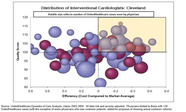
Figure one presents an example graphic of UHG analytic tools. The graphic illustrates is a multicolor bubble graph showing the the range of provider-specific scores of interventional cardiology practices in Cleveland, OH, based the two dimensions of quality and efficiency.
Figure 2 – Example of Individual Physician Report
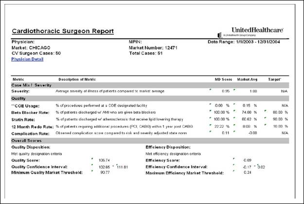
Figure two is an example of a page of output from UHG analytics. The chart shows a variety of statistics relating to pay-for-performance systems.
Recently, UHG introduced a ‘Practice Rewards’ pay-for-performance system to reward demonstrated performance. Figure 2 presents an illustration of provider-level reporting.
Methods
Health care cost is the central measure to gauge the impact of UHG’s provider rating tool. To investigate the impact of provider ratings on cost, we completed a claims-based analysis using data from UHG. The unit of analysis was continuously enrolled health plan participants over two years. Individuals were chosen based upon the deployment of the provider rating tool within a specific UHG geographic market. Currently, UHG has full claims data available for over forty million subscribers in markets that span the United States. In most markets, UHG has approximately 20% (on average) of the eligible enrollees.
To answer our research questions we used a quasi-experimental design where we tracked the health care cost and utilization of a specific subscriber and dependents over a two-year period from 2005 to 2006. The tool was not available to consumers in 2005, so this serves as the pre-tool base year. However, UHG collected information that enabled us to create provider rankings for 2005 and thus to calculate a difference score described below. In 2006 the tool was introduced in selected markets, and it was introduced in more markets in 2007.
Data for our study came from two large employers with over 8,000 covered lives where all of the insurance contracts are managed by UHG. We had access to medical and pharmacy claims and enrollment data for two years: pre- and post-exposure to the provider ranking system.
2006 was also the year in which the two employers had ‘full replacement’ of their PPO/POS plans with CDHPs. Neither firm had prior experience with CDHPs. Of these two employers, Firm #2 adopted a Health Reimbursement Arrangement (HRA) and a Health Savings Account (HSA) in 2006, while Firm #1 adopted only a HSA in 2006. Because exposure to the provider ranking system occurred simultaneously with full replacement, we cannot generalize the findings to employers that adopted the provider rankings, but did not implement full replacement.
We selected employees who were enrolled in the employers’ health benefits programs for two continuous years. This provided us with a cohort sample to identify the effects of the provider rankings. Firm #1 had higher cohort retention with 61.6% of the first-year population also being in the second year. Firm #2 had a lower retention rate of 47.2%. These cohorts include not only the employees but their spouses and dependents. As a result, even if a firm has relatively low employee turnover, changes in coverage among spouses and dependents can substantially reduce the size of a continuous cohort. From both firms, the cohort sample had 3,928 continuously enrolled subscribers, spouses, and dependents.
The demographics of our study sample are described in Table 1. We see that Firm #1 has a slightly older population (34.1 years of age versus 33.9) and a higher share of dependents (37.3% versus 29.5%). Firm #1 is also associated at baseline with a higher illness burden, as computed from claims data based on the Johns Hopkins ACG system (Weiner, 1991), and the presence of serious health events that could be catastrophic.2
| Variable | Firm 1 | Firm 2 |
|---|---|---|
| Age (years) | 34.118 | 33.928 |
| Female=1, else Female=0 | 0.527 | 0.439 |
| Baseline Illness Burden | 3.406 | 2.472 |
| Catastrophic Shock=1, else 0 | 0.268 | 0.234 |
| Enrollee is subscriber=1, else 0 | 0.375 | 0.445 |
| Enrollee is spouse=1, else 0 | 0.252 | 0.258 |
| Enrollee is dependent=1, else 0 | 0.373 | 0.295 |
| Observations (total=3,928) | 2,464 | 1,464 |
One of the critical variables for this analysis is the ‘provider portfolio index’ of quality and efficiency. This index is derived from UHG’s provider rating system. The concept of a portfolio index is similar to that of a person having a portfolio of different stocks and their associated rates of return. The portfolio index works in the following fashion. A patient will see different physicians, each with a different UHG provide rating. To get an aggregate measure of the quality of the patient’s providers, one needs a numeric score for each provider, and then one weights the extent of exposure to a given provider by either reimbursement or service contact with a physician. For example, if a patient sees two physicians where one has a quality rating of 3 and the other a rating of 1 (3 is the best score and 1 is the least score possible), an average un-weighted portfolio score would be 2.0. However, if the patient saw the 1-rated physician for 90% of all expenditures and the 3-rated physician for 10% of all expenditures, the reimbursement-weighted portfolio score would be 1.2. If the percentages were reversed, the score would be 2.8. Thus, simply taking the average without accounting for exposure could lead to different results. An alternative and more traditional approach is to identify a usual source of care and then associate the provider rating score with that physician. Of concern with this method is the array of different providers with whom patients can come into contact and the significant variation in their provider ratings. The portfolio approach considers the effect of all providers with variation in efficiency and quality.
To use the portfolio approach, we needed a numeric score that would create the data for a weighted portfolio score. We transposed UHG’s provider star rating system in the following way:
| Value | Situation |
|---|---|
| 1 | No provider rating3 |
| 2 | Good quality rating only |
| 3 | Good quality and efficiency ratings |
The rationale for placing quality over efficiency is the patient’s perspective. Given that most health care costs from a significant unplanned or discretionary procedure are borne by the insurer/employer and not the patient, we assume patients would care more about quality than efficiency.
With a patient-level provider portfolio score, we can measure any changes in the patient’s portfolio score from the pre-ranking year to the post-ranking year. A reduction in the portfolio score might be due to lack of access or an overriding desire to maintain a relationship with a provider, regardless of quality or efficiency. An increase in the portfolio score would indicate increased interest in physicians who are efficient and practice with high quality.
Our econometric method to answer question #1 is simply a nonlinear regression where we identify the factors associated with an improvement in the provider portfolio score. Specifically, the dependent measure equals 1 if the difference between the 2006 physician portfolio score and the 2005 physician portfolio score is greater than 0. The dependent measure is 0 otherwise. Factors considered affecting the change in portfolio are age, gender, firm, contract holder status (e.g., employee, spouse, or dependent), baseline illness burden, and the catastrophic health shock variable. The provider portfolio rating was weighted based on total allowed expenditures which include those paid by the health plan and the consumer.
To examine the second research question, we test whether those who upgraded their provider portfolios had statistically significant differences in expenditures and the use of preventive services. We used a difference-in-differences regression model to test the impact on cost of those who switched or remained with their physicians using methods similar to those used in our prior empirical analyses (Parente, Feldman, and Chen, 2008; Feldman, Parente, and Christianson, 2007).
We also used descriptive statistics to see the scale of the switching effect as well as the cost differences for patients who switched in a manner consistent with the star rating and with those who did not switch. Analytic files with cost as well as preventive care measures were constructed based on claims data provided by UHG. We used a set of preventive care measures developed in previous collaborative research with clinicians at the University of Pennsylvania, (Pollack et al, 2008).
Results
Our first step to complete the empirical analysis was to generate the provider portfolio ratings. We weighted the portfolio ratings by three different patient and year-specific variables: the unique number of provider visits of a patient, the allowed charge amount for the patient, and the out-of-pocket expenditures of the patient. Table 2 provides the results of these ranking methodologies. The first set of variables in the table corresponds to the second-year portfolio score by each of three methods used. Note that both firms have average scores above 1 (the lowest value), except the out-of-pocket expenditure weighted score for firm #2. The second set of rows in Table 2 is the change between year 1 and year 2 in provider portfolio ratings. Note that the visit weighted portfolio decreased slightly for Firm #1. The last set of rows in the table is associated with the variable we use in our multivariate analysis. Here we measure a 0/1 variable for whether a person’s provider portfolio improved from one year to the next. Although the out-of-pocket expenditure weighing method is associated with the greatest improvement in portfolio rankings, we choose the median method in terms of impact – weighting by allowed charges.
| Variables | Firm 1 | Firm 2 | |
|---|---|---|---|
| Year 2 Portfolio Score | |||
| Visit Weigted | 1.405 | 1.299 | |
| Allowed Charges Weighted | 1.347 | 1.280 | |
| Out-of-pocket Expenditure Weighted | 1.033 | 0.867 | |
| Year 2 - Year 1 Portfolio Rating Delta | |||
| Visit Weigted | -0.004 | 0.010 | |
| Allowed Charges Weighted | 0.001 | 0.031 | |
| Out-of-pocket Expenditure Weighted | 0.942 | 0.397 | |
| Positive Change in Score = 1, else 0 | |||
| Visit Weigted | 0.323 | 0.249 | |
| Allowed Charges Weighted | 0.335 | 0.264 | |
| Out-of-pocket Expenditure Weighted | 0.655 | 0.423 | |
In Table 3, we present the bivariate results associated with a change in provider portfolio ratings on expenditures and preventive care use. The two firms experienced a major change in benefit design where there was a full replacement of a PPO design for a CDHP design. As noted above, we use the change in portfolio from an allowed charges weighting method to identify the impact of the ranking system at each firm.4 In the case of Firm #1, total expenditures increased from $2,359 to $3,483 for patients with a negative or neutral provider portfolio change, but decreased from $4,894 to $4,087 for those with a positive provider portfolio change. Similar patterns were observed in Firm #2, with increases from $1,948 to $2,100 for patients with a negative or neutral provider portfolio change, and decreases from $4,020 to $2,989 for those with a positive provider portfolio change. Patients with positive changes had higher baseline spending in both firms – an indication of the need to control for baseline illness burden and other factors that determine the level of spending across patients.
Out-of-pocket medical expenditures have different patterns compared with overall expenditures. Out-of-pocket spending increased for both types of patients in both firms. This is due, most likely, to the changes in health plans in both firms in 2006. Similar patterns were observed for consumer out-of-pocket pharmacy spending.
With respect to preventive visits, patients in both firms with positive provider portfolio changes had fewer colonoscopies in year 2 than in year 1. Other changes in preventive visits and colonoscopies were not statistically significant.
| Negative or Neutral Provider Portfolio Change | Positive Provider Portfolio Change | |||||||||||
|---|---|---|---|---|---|---|---|---|---|---|---|---|
| Firm 1 | Firm 2 | Firm 1 | Firm 2 | |||||||||
| Year 1 | Year 2 | Year 1 | Year 2 | Year 1 | Year 2 | Year 1 | Year 2 | |||||
| Total Expenditures | $2359.22 | $3483.18 | *** | $1947.77 | $2100.32 | *** | $4893.98 | $4087.08 | *** | $4019.60 | $2989.08 | *** |
| Consumer Medical Expenditures | $ 86 | $ 344 | *** | $ 256 | $ 486 | *** | $ 144 | $ 445 | *** | $ 557 | $ 714 | *** |
| Consumer Pharmacy Expenditures | $ 48 | $ 240 | *** | $ 145 | $ 176 | *** | $ 70 | $ 365 | *** | $ 290 | $ 407 | *** |
| Preventive Visits | 0.291 | 0.273 | 0.106 | 0.105 | 0.425 | 0.446 | 0.248 | 0.255 | ||||
| Colonoscopy Screenings | 0.204 | 0.240 | 0.128 | 0.107 | 0.267 | 0.187 | ** | 0.251 | 0.123 | *** | ||
| *** p<=.001, ** p<=.01, *P<=.05 | ||||||||||||
The attributes associated with positive changes in provider portfolios are described in Table 4. Here we look at the results of three logistic regressions, each using a different weighting strategy for identifying a positive change in the provider portfolio. The middle set of results that is boxed represents the weighted by allowed charges strategy we use for this analysis. The table is useful to identify the attributes of patients associated with positive changes in provider portfolios. Across all methodologies we see a positive relationship with female gender. Age has a positive relationship for visits and allowed charge weighted portfolio scores and a negative relationship with out-of-pocket expenditure weighted portfolio scores. Those who are more ill, either due to a higher illness burden or a catastrophic medical event, have greater likelihood of improving their provider portfolio. In all weighting methodologies, spouses and dependents have less improvement in their provider portfolio than the insurance contract holder.
| Variable | Visit | All Allowed $$$ | Out-of-Pocket $$ | |||
|---|---|---|---|---|---|---|
| Coefficient | Pr>ChiSq | Coefficient | Pr>ChiSq | Coefficient | Pr > ChiSq | |
| Intercept | -1.0281 | <.0001 | -0.9209 | <.0001 | 0.3397 | <.0001 |
| Age (years) | 0.0046 | 0.0032 | 0.0026 | 0.0913 | -0.0096 | <.0001 |
| Female=1, else 0 | 0.0951 | 0.0024 | 0.0863 | 0.0054 | 0.1449 | <.0001 |
| Baseline Illness Burden | 0.1055 | <.0001 | 0.1122 | <.0001 | 0.1736 | <.0001 |
| Catastrophic Shock=1, else 0 | 0.1355 | 0.0002 | 0.0730 | 0.0476 | 0.1157 | 0.0024 |
| Year 2=1, else Year 1 | 0.0039 | 0.9196 | 0.0021 | 0.9549 | 0.0009 | 0.9808 |
| Firm 2=1, else 0 | -0.0894 | 0.0513 | -0.0750 | 0.0981 | -0.4872 | <.0001 |
| Firm 2 & Year 2 interaction | -0.0339 | 0.5949 | -0.0327 | 0.6038 | -0.0284 | 0.6442 |
| Enrollee is spouse=1, else 0 | -0.0139 | 0.7124 | -0.0166 | 0.6593 | -0.0765 | 0.0466 |
| Dependent enrollee=1, else 0 | -0.1687 | 0.009 | -0.1707 | 0.0075 | -0.6324 | <.0001 |
In Tables 5 through 7, we present two models of the effects of a positive change in provider portfolio on expenditure. Model 1 uses a ’dummy’ variable defined as 1 if there was a positive change in the patient’s provider portfolio between year 1 and year 2, and 0 if there was not a positive change. Model 2 includes an interaction term between the illness burden metric and the dummy variable indicating a positive change in provider portfolio. In Table 5, we examine the effect of the change in provider portfolio on the change in total expenditure. In model 1, the effect is largely negative and statistically significant, suggesting an overall cost savings from provider portfolio improvement. In model 2, the portfolio change variable is now positive and insignificant. However, the interaction of illness burden and provider portfolio change is negative and significant. This suggests patients with a greater illness burden have lower expenditures if they receive care from a set of providers where there was improvement in the provider portfolio. As expected, age and the presence of a catastrophic illness shock have statistically significant and positive effects on the change in total expenditures.
| Model 1 | Model 2 | ||||
|---|---|---|---|---|---|
| Coefficient | Pr > |t| | Coefficient | Pr > |t| | ||
| Intercept | 804.954 | 0.227 | 89.754 | 0.894 | |
| Age (years) | 15.353 | 0.226 | 21.021 | 0.097 | |
| Female=1, else 0 | 192.379 | 0.458 | 121.538 | 0.638 | |
| Baseline Illness Burden | -370.544 | <.0001 | -176.619 | 0.005 | |
| Catastrophic Shock=1, else 0 | 3323.816 | <.0001 | 3293.081 | <.0001 | |
| Firm 2=1, else 0 | -927.401 | 0.001 | -874.774 | 0.001 | |
| Enrollee is spouse=1, else 0 | 593.991 | 0.065 | 540.374 | 0.092 | |
| Enrollee is dependent=1, else 0 | -316.554 | 0.545 | -155.532 | 0.766 | |
| Provider Portfolio improvement=1, else 0 | -1593.317 | <.0001 | 709.520 | 0.145 | |
| Portfolio Change & Illness Burden | -642.657 | <.0001 | |||
| Adjusted R-Square | 0.047 | 0.055 | |||
Tables 6 and 7 look at the effect of a positive change in provider portfolio on the change in consumer out-of-pocket expenditures for medical care and pharmaceuticals, respectively. We find different impacts of the provider portfolio change on these two types of spending. For out-of-pocket medical expenditures, there is a negative impact from the portfolio change variable interacted with the illness burden of the patient in model 2. In model 1, the effect of provider portfolio improvement is also negative but not statistically significant at the p<.05 level. The catastrophic shock variable is associated with the largest positive impact on the change in out-of-pocket medical expenditures.
|
Model 1 |
Model 2 |
||||
|---|---|---|---|---|---|
| Coefficient | Pr > |t| | Coefficient | Pr > |t| | ||
| Intercept | 362.619 | <.0001 | 323.352 | <.0001 | |
| Age (years) | -1.612 | 0.112 | -1.300 | 0.200 | |
| Female=1, else 0 | 64.858 | 0.002 | 60.968 | 0.003 | |
| Baseline Illness Burden | -16.422 | 0.000 | -5.774 | 0.253 | |
| Catastrophic Shock=1, else 0 | 353.670 | <.0001 | 351.982 | <.0001 | |
| Firm 2=1, else 0 | -65.964 | 0.002 | -63.075 | 0.003 | |
| Enrollee is spouse=1, else 0 | -20.570 | 0.423 | -23.513 | 0.359 | |
| Enrollee is dependent=1, else 0 | -226.746 | <.0001 | -217.905 | <.0001 | |
| Provider Portfolio improvement=1, else 0 | -30.728 | 0.177 | 95.706 | 0.014 | |
| Portfolio Change & Illness Burden | -35.284 | <.0001 | |||
| Adjusted R-Square | 0.063 | 0.067 | |||
For pharmaceutical services, the effect is quite different. In Table 7 there is a positive and significant effect of provider portfolio change in model 1. In model 2, the interaction of illness burden and change in provider portfolio is small and statistically insignificant. This suggests that for pharmaceutical services, there may be less value in changing to providers who have a higher star rating.
| Model 1 | Model 2 | ||||
|---|---|---|---|---|---|
| Coefficient | Pr > |t| | Coefficient | Pr > |t| | ||
| Intercept | 77.289 | 0.004 | 76.935 | 0.005 | |
| Age (years) | 2.632 | <.0001 | 2.634 | <.0001 | |
| Female=1, else 0 | 22.760 | 0.030 | 22.725 | 0.031 | |
| Baseline Illness Burden | 18.363 | <.0001 | 18.459 | <.0001 | |
| Catastrophic Shock=1, else 0 | -19.260 | 0.128 | -19.276 | 0.128 | |
| Firm 2=1, else 0 | -152.306 | <.0001 | -152.280 | <.0001 | |
| Enrollee is spouse=1, else 0 | -27.280 | 0.036 | -27.307 | 0.036 | |
| Enrollee is dependent=1, else 0 | -55.067 | 0.010 | -54.987 | 0.010 | |
| Provider Portfolio improvement=1, else 0 | 51.635 | <.0001 | 52.776 | 0.008 | |
| Portfolio Change & Illness Burden | -0.319 | 0.944 | |||
|
Adjusted R-Square |
0.134 | 0.134 | |||
In Tables 8 and 9, we examine the effect of a change in provider portfolio on the change in use of preventive services. In Table 8, the portfolio change variable shows a positive and significant relationship with the change in preventive visits, after accounting for age, gender and health status. However, for colonoscopy screening the result is quite different. As seen in Table 9, a positive change in provider portfolio is associated with a substantial decrease in colonoscopy screening and the result is statistically significant at the p<.001 level.
| Coefficient | Pr > |t| | ||
|---|---|---|---|
| Intercept | 0.031 | 0.385 | |
| Age (years) | 0.000 | 0.903 | |
| Female=1, else 0 | 0.006 | 0.667 | |
| Baseline Illness Burden | -0.017 | <.0001 | |
| Catastrophic Shock=1, else 0 | 0.007 | 0.666 | |
| Firm 2=1, else 0 | -0.001 | 0.949 | |
| Enrollee is spouse=1, else 0 | -0.006 | 0.735 | |
| Enrollee is dependent=1, else 0 | 0.010 | 0.727 | |
| Provider Portfolio improvement=1, else 0 | 0.050 | 0.001 | |
| Adjusted R-Square | 0.010 | ||
| Coefficient | Pr > |t| | ||
|---|---|---|---|
| Intercept | 0.384 | 0.002 | |
| Age (years) | -0.005 | 0.024 | |
| Female=1, else 0 | -0.001 | 0.982 | |
| Baseline Illness Burden | -0.019 | 0.001 | |
| Catastrophic Shock=1, else 0 | -0.004 | 0.894 | |
| Firm 2=1, else 0 | -0.074 | 0.014 | |
| Enrollee is spouse=1, else 0 | 0.007 | 0.803 | |
| Provider Portfolio improvement=1, else 0 | -0.112 | <.0001 | |
| Adjusted R-Square | 0.029 | ||
Discussion
This analysis has two key findings. The answer to our first research question – who uses provider rating system – is that older, sicker individuals and women are more likely to use the system. The second finding, addressing our second research question, is that the UHG provider rating system appears to have a negative impact on expenditures. The effect is found for total expenditures and out-of-pocket medical spending, but not for out-of-pocket pharmacy costs. With respect to prevention, the story is more mixed. Overall preventive visits go up when the patient has an improved provider portfolio. We do not see the same effect for colonoscopy procedures.
Back to Top Caveats
This study is based on the provider ranking system implemented by one company, UnitedHealth Group, in one setting, full replacement of two firms’ traditional health plans with CDHPs. Other systems and settings could be associated with different results. For example, consumers might save less money from switching to cost-effective providers in settings where the financial rewards from switching are not as great. Another important caveat is that we do not actually know what beneficiaries accessed the rating system. This could be possible to track in future research beyond our study period.
Conclusion
We looked for the effect of provider quality and efficiency rankings on expenditures and use of preventive services. The value of this analysis is to show that consumers use these rankings to engage in retail shopping for health care services. Other dependent variables can be used as well as more years of information and different benefit designs. Other insurers’ provider transparency systems could be examined and compared as well. With regard to policy implications, the Bush Administration’s push for transparency appears to have merit. Although the results are quite early, they show promise and suggest that additional information on price and quality can indeed by processed by consumers to serve their interests in gaining more value from their health insurance benefits
References
- Agency for Health Research and Quality. National Healthcare Quality Report Parameters, http://www.qualitymeasures.ahrq.gov/resources/summaryarchive.aspx#updat…. Accessed July 28, 2007.
- Baker, L. Wagner, T.H., Singer, S., Bundorf, M.K., “Use of the Internet and E-mail for Health Care Information,” Journal of the American Medical Association 2003; 289:2400-2406.
- Feldman, R., Parente, S.T. and Christianson, J.B, “Consumer Directed Health Plans: New Evidence on Spending and Utilization,” Inquiry, 44:1 (Spring, 2007), pp. 26-40.
- Leatherman, S. Peterson, E., Heinen, L. and Quam, L., “Quality Screening and Management Using Claims Data in a Managed Care Setting,” Quality Review Bulletin, 17(11): 348-359, 1991.
- National Committee on Quality Assurance, HEDIS 2007 Measure Set, URL: http://web.ncqa.org/Portals/0/HEDISQM/HEDIS2007/MeasuresList.pdf, Accessed August 6, 2007.
- Parente, S.T., Feldman, R. and Chen, S., “The Effects of a Consumer Driven Health Plan on Pharmaceutical Spending and Utilization: Do Three-Tier Plans Have a Competitor?,” Health Services Research, 43:5 (October, 2008), pp. 1542-1556.
- Physician Payment Review Commission Conference on Profiling Washington, DC: Physician Payment Review Commission, May 1992; Publication No. 92–2.
- Pollack, C.E., Mallya, G. and Polsky, D., “The Impact of Consumer-Directed Health Plans and Patient Socio-economic Status on Physician Recommendations for Colorectal Cancer Screening,” Journal of General Internal Medicine, 23:10 (2008), pp. 1595-1601.
- United Health Group. 2004, Episode Treatment Group, United Health Group White Paper. URL: http://www.symmetry-health.com/ETGTut_Desc1.htm, Accessed, August 6, 2007.
- Weiner J.P., Starfield, B.H., Steinwachs, D.M., Mumford, L.M., “Development and Application of a Population-oriented Measure of Ambulatory Care Case-mix,” Medical Care. Vol. 29, No. 5 (May 1991), pp. 452-72.
- Wennberg, J., and A. Gittelsohn, “Small area variations in health care delivery,” Science, 182:1102-8, 1973.
Footnotes
1 A focus of care provision can be a disease, specialty or treatment modality where sufficient evidence based medicine metrics exist to assess quality of care.
2 Overall illness burden is based on a count of Ambulatory Diagnostic Groups (ADGs) in the base year of observation and derived from an algorithm described by Weiner et al (1991). Catastrophic shock is a concurrent year variable based on the presence of an ADG where the patient had a major acute care event, cancer diagnosis, injury or trauma.
3 No provider rating is associated with providers where there was insufficient data available for scoring or where a provider did not meet the criteria for any star rating.
4 We chose to weight by allowed charges because our interest is in the effect of the star system on resource use. This is best measured by allowed charges, some of which will be paid by the member and some by the plan.