
By:
Kathryn L.S. Pettit, G. Thomas Kingsley, and Claudia J. Coulton
With Jessica Cigna
Submitted to:
The Office of the Assistant Secretary for Planning and Evaluation
U.S. Department of Health and Human Services
Submitted by:
The Urban Institute
"
Acknowledgments
This project was unusual in the degree to which it attempted to integrate quantitative research at the national level with local data assembly and real community processes in several different cities. As such, it required contributions from a sizeable number of professionals.
Most important were the staffs of the five local data intermediaries (partners in the National Neighborhood Indicators Partnership) who both prepared site-specific analyses (which entailed collecting new datasets, analyzing the data, and working to apply the results in their communities) and contributed data and advice to the Urban Institute in the cross-site analysis.
They included Claudia J. Coulton, Kristen Mikelbank, Lisa Nelson, Katherine Offutt, Engel Polousky, and Siran Koroukian of the Center on Urban Poverty and Social Change, Case Western University (Cleveland); Matthew Hamilton and Terri J. Bailey of the Piton Foundation (Denver); Sharon Kandris, Cynthia Cunningham, and Dale Drake of the Polis Center at Indiana University-Purdue University at Indianapolis and Gilbert Liu of the Children's Health Services Research Program in the Department of Pediatrics at Indiana University (Indianapolis); Junious Williams, Matthew Beyers, Yung Ouyang and Keith Prior of the Urban Strategies Council (Oakland); and Katie Murray of the Providence Plan and Peter Simon of the Rhode Island Department of Health (Providence).
At the Urban Institute, Katheryn L.S. Pettit and G. Thomas Kingsley served as co-directors for all aspects of the work. In preparing this report, Pettit developed the analyses of neighborhood health trends and the relationships between health and contextual variables, Kingsley took the lead on the context analysis and in summarizing the site-specific studies, and the two collaborated on all other sections. Claudia J. Coulton contributed all research and writing related to health disparities indices. Jessica Cigna provided superb research support in data assembly, analysis, Geographic Information System work, and report preparation.
The authors are indebted to two other Urban Institute colleagues, Embry Howell and Tim Waidmann, who both reviewed plans and products and provided much valuable advice along the way; and to Tim Ware, who did an outstanding job of formatting and assembling the final report.
Finally, we give considerable credit and thanks to Peggy Halpern, who served as task order monitor for this project at the Department of Health and Human Services. Her diligent oversight and valuable guidance throughout had a substantial impact on the result.
How to Obtain a Printed Copy
To obtain a printed copy of this report, send the title and your mailing information to:
Human Services Policy, Room 404EAssistant Secretary for Planning and Evaluation
U.S. Department of Health and Human Services
200 Independence Av, SW
Washington, DC 20201
Fax: (202) 690-6562
You may print a copy of the report using the "printer friendly" version in PDF format.
Section 1 - Introduction: the Project and the Report
This document is the final report of the Development and Use of Neighborhood Health Analysis project, which has been conducted by the Urban Institute (UI) under the sponsorship of the U.S. Department of Health and Human Services (HHS), Office of the Assistant Secretary for Planning and Evaluation (ASPE) through a contract that began in 2001.(1) The work period ran from September 2001 through April 2003.
The project was motivated by an issue of growing importance to health policy. It is increasingly recognized that variations in neighborhood conditions are critical to health outcomes and program options--in almost all urban areas, serious health problems are highly concentrated in a fairly small number of distressed neighborhoods--yet only a handful of U.S. cities now have data that allow them to analyze health problems constructively at the neighborhood level.
The research was designed to take advantage of an initiative that offers special advantages in at least beginning to address this issue: the National Neighborhood Indicators Partnership (NNIP). NNIP is a collaborative effort by the Urban Institute and local partners in 20 cities to further the development and use of neighborhood information systems in local policy making and community building.(2)
NNIP's local partners represent the majority of the local organizations in this country that have built advanced information systems with integrated and recurrently updated data on neighborhood conditions in their cities. Thus, NNIP is particularly well prepared to provide both (1) relevant data and analysis (comparable across sites) and (2) practical guidance on developing local data systems for health analysis and using them to improve programs and policies.
This section introduces the project. We begin by describing the project's purposes and overall structure. We then discuss in more depth our approach and methodology in the two major work components: cross-site analysis and site-specific analysis. Finally, we review the contents of the remainder of the report.
Purposes and Approach
The project had two major purposes. The first was to contribute to expanding the range and usefulness of health indicators available at the neighborhood level in America's localities. It is well recognized that such indicators could be extremely valuable in planning, implementing, and evaluating health programs. Yet most cities do not regularly produce any indicators of health conditions at the neighborhood level, and in those that do, the range of available information is quite limited (mostly variables that can be derived from vital statistics files). Under this project, a selected group of NNIP partners were to assemble new health related indicators and incorporate them into their data systems. With assistance from the UI, they were then to analyze variations in these indicators in relation to other variables, report on the implications of the analyses, and take steps to encourage practical use of the data in local health initiatives.
The second purpose was to gain greater understanding of the relationships between characteristics of neighborhoods and health outcomes. Considerable theory supports the concept of neighborhood as an underlying cause or mediating mechanism in relation to a variety of health and social problems. This ecological research in some cities has shown that problems such as child maltreatment, low birth weight, and infant mortality are significantly clustered and correlated with such neighborhood variables as concentrated poverty, family instability, and residential turnover (Ellen, Mijanovich, and Dillman, 2001). However, these analyses have been limited as to the range of variables considered and the number of cities studied. In this research, the UI and the selected NNIP partners were to examine relationships between health indicators and a broader range of variables, including new tract-level data from the 2000 census. Special emphasis was to be given to the development of indicators pertaining to the health of children and youth, and to gaining understanding of disparities in health outcomes, considering race and other factors.
To accomplish these purposes, the first step was selecting five local NNIP partners (the maximum the budget would allow) to participate in the work. In October 2001, a request for proposals, based on the HHS accepted overall work plan for the project, was sent out to all 12 of the organizations that were partners in NNIP at that time. Proposals were received from 9 of the 12. The proposals were reviewed by a small panel of Urban Institute staff using a pre-established point system. Key factors for award included the extent and quality of the data already maintained in their systems (in terms of potential contribution to the cross-site analysis) as well as the creativity and professionalism exhibited in their proposals to conduct the site-specific analysis. All nine proposals were responsive and met our basic standards, but the five selected came out highest in overall points.
The selected partners were: the Center on Urban Poverty and Social Change, Case Western University (Cleveland); the Piton Foundation (Denver); the Polis Center of Purdue University at Indianapolis (Indianapolis); the Urban Strategies Council (Oakland); and the Providence Plan (Providence).(3) Project work was divided into two components:
- Site-specific analysis, which entailed assembling and analyzing new neighborhood level indicators pertaining to local health issues in each site and using the data to further local health improvement initiatives. In this component, the local partners took the lead in the work and the Urban Institute provided guidance to them and pulled together lessons learned from all of the sites for this report.
- Cross-site analysis, which entailed conducting research on the changing urban context in each of the five study sites, examining ecological relationships between metropolitan and neighborhood conditions and health outcomes in a comparable manner across sites, and developing a neighborhood disparity index. This work was done by Urban Institute staff, with data and guidance provided by the local partners along the way.
Urban Institute staff also took the lead in developing concluding sections covering the assessment of issues and the presentation of recommendations. In this work, however, they relied on interviews with local NNIP partners and other local leaders in public health in the five sites.
The Neighborhood Concept. Since the "neighborhood" is a central theme of this report, it is important to say what we mean by the term at the outset. A neighborhood is generally thought of as (1) a small residential area (size not exceeding the bounds of easy walking distance), where there is (2) considerable social interaction between neighbors, and probably (3) some degree of social homogeneity (as defined by class, ethnicity, or other social characteristics). Residents have common interests because they share the same physical space, and are likely to have other common interests as well. City planners most often adopt a neighborhood concept in planning new residential areas, thinking of it as an area with a radius of roughly one-quarter to one-half mile. Probably the most prominent explicit definition was by Clarence Perry in 1929 (Gallion, 1950). Perry saw a neighborhood as the area served by one elementary school (enrollment of 1,000 to 1,200 pupils), implying a total population in the range of 4,000 to 6,000.
Looking at an existing city, the task of defining a consistent set of neighborhood boundaries, satisfying to all people for all purposes, has proved to be impossible (Rossi, 1970). It is widely known that the extent of social cohesion and organization can vary widely across neighborhoods, and a number of studies (e.g., Lynch 1960) have shown that residents of the same area often see the boundaries of their neighborhood differently.
Nonetheless, there is wide agreement that the concept is important - that the neighborhood context can have important impacts on people's lives (Ellen and Turner, 1997). And, while recognizing that there can be no all-satisfying way to define boundaries, several acceptable approaches have been found to make the concept operational. First, community groups often come together to agree on boundary definitions of their own neighborhood for an improvement initiative. Second, many cities have adopted a set of "general purpose" neighborhood definitions that seem to work reasonably well for many purposes, even if individual communities sometimes develop alternatives (see further discussion in Kingsley, 1999).
Third, some cities and most national researchers rely on census tract boundaries as reasonable approximations of neighborhoods. Census tracts have an average population of around 4,000; thus they approximate the size of a neighborhood as traditionally defined. Also, in designing tracts initially, the Census Bureau has tried to be sensitive to what cities have regarded as important physical and socio-economic boundaries. Tracts cannot be expected to represent neighborhoods the way all local residents would define them, and tract analysis does not indicate patterns of intensity within tracts. The Oakland study described in section 5 provides an example of an alternative approach using isopleth maps. Even with these limitations, analysis of spatial patterns and trends using census tracts can be extremely valuable, and that is the approach we use in this report.
Site-specific Analysis
In this component, the selected NNIP partners were asked to assemble and analyze new neighborhood level indicators pertaining to local health issues (data not already in the local information system they maintain), and to do so in a way that would contribute directly to local health improvement initiatives in their cities. They were asked to choose topics that were recognized as important in local policy deliberations.
This component, therefore, was to contribute to both of the project's major purposes. First, it would include analysis of ecological relationships utilizing the new health indicators the sites identified in relation to the other demographic and contextual data already assembled. Second, the experiences of the sites in conducting the work would provide lessons on (1) approaches and barriers to expanding the availability of health indicators at the neighborhood level and (2) the efficacy of various processes of applying such data in local policy-making and program implementation.
Research Questions
For the site-specific analysis, HHS specified the following research questions:
- What ecological correlations emerge between the unique health, demographic, and contextual variables selected for study by each site?
- Are census tract data useful for identifying contiguous or non-contiguous groups on the basis of health and demographic indicators?
- What implications for policy and planning do these findings have?
- As a result of site-specific analysis, are any actions planned such as specific public health initiatives, strategic plans, or metropolitan-wide policy changes?
Study Topics
In their proposals, the five sites specified the topics they would examine. In their selection of a topic, the sites were asked to try to meet two implied requirements simultaneously. First, they needed a health-related topic pertaining to children or youth (if possible) that was already recognized as important in policy discussions in the community. Second, they needed a topic that offered a reasonable prospect for them to acquire and analyze new data in the time available and one in which their analyses would take community understanding of the issue to a new level.
We recognized at the outset that there would be limits to what we could accomplish in this component given our schedule. It might prove impossible, for example, for some sites to overcome bureaucratic barriers to data assembly, or to do an adequate job of data editing, in the time available. Similarly, policy change processes started-off by the partners' new studies could not be expected to have an impact on health outcomes in the limited time remaining in the contract period. Nonetheless, it was judged that valuable insights could be gained from a serious critical examination of these experiences, even if partial. The selected topics were as follows:
- Cleveland developed neighborhood indicators of child access to primary care using eligibility, claims, and encounter data from Ohio's Medicaid data system. Cleveland's analysis sought to clarify relationships between neighborhood conditions and children's access to primary care (as indicated by use of emergency services for non-emergency conditions and regularly-scheduled well-child doctor's visits).
- Denver explored new datasets focused on (1) the relationship between the spatial pattern of environmental hazards and other conditions and the locations of Denver's poorer neighborhoods (where children represent a much higher than average share of the population) and (2) violence as a public health issue for children using data files on violent crime, violence-related school suspensions and expulsions, and child abuse and neglect.
- Indianapolis used spatial analysis to study the relationship between community conditions and obesity in children in Marion County from 1998 to 2000. The contextual variables they used came from three broad areas including socioeconomic conditions, proximity to exercise opportunities, and social barriers to physical activity.
- Oakland focused on the relationship between neighborhood conditions and the incidence of tuberculosis. Staff sought in particular to examine fresh approaches to analyzing the data, applying new techniques developed in the fields of Geographic Information Systems (GIS) and spatial statistics.
- Providence undertook analysis to determine the extent of residential mobility of young children and the impact of mobility on delivery of child health care services. In particular, Providence looked at measures of continuity of care (from immunization data files) timely blood lead screenings, and consistent care with a primary provider.
Cross-site Analysis
This component was designed as our main contributor to the project's first purpose. As noted, the project's central activity was examining ecological relationships between various neighborhood conditions and health outcomes in a comparable manner across the five study sites. Data for the analysis included statistics from the 1990 and 2000 censuses as well as comparably defined health and context variables drawn from the information systems maintained by our selected NNIP partners. The research employed charts, quantitative analysis of relationships (bi-variate and multi-variate), and selective mapping to illustrate some of these relationships.
The work began with a context analysis; a broader examination of conditions and trends in the study sites in the 1990s at the neighborhood, city, and metropolitan levels. It also included the use of data from all five sites to develop a neighborhood health disparity index that can be applied in policy analysis in other cities.
Research Questions
HHS posed four major research questions for the cross-site analysis:
- What are the similarities and differences across the selected NNIP sites with regard to the ecological correlations among the selected health, demographic, and contextual variables in the 1990s?
- How have ecological correlations among selected health, demographic, and contextual variables changed in the 1990s, and what contextual variables might account for these changes?
- Are the 2000 census tract data useful for identifying contiguous or noncontiguous groupings based on their health and demographic characteristics in each NNIP site?(4)
- What implications do the ecological analyses have for community approaches to problem solving in the health area?
Data Assembly
To implement the research, we began by formulating a series of working hypotheses to be tested, building off the rapidly evolving literature in this field (see the References section). Consistent with those hypotheses, we attempted to do the work to best take advantage of U.S. Census data and the data sets maintained by the five selected partner organizations. Specifically, analysis relied on the following types of variables at the neighborhood level:
- Health variables derived from vital records maintained by the five NNIP partners. Examples include teen birth rates, percentage of births with early prenatal care, rate of low-birth weight babies, and age-adjusted death rates.
- Demographic variables derived from the 1990 and 2000 censuses, such as age structure, race/ethnicity, poverty rate, number of households by type, and adults by level of education completed.
- Contextual variables referring to the economic, physical, and social environment of the neighborhood (derived from the census and partners' systems), including crime rates and rates of welfare recipiency.
Context Analysis
Background information on urban trends is needed to facilitate understanding of the context for the ecological analyses that are the centerpiece of this research. Whereas conditions in America's inner-city neighborhoods generally worsened in the 1980s, census and other data suggest a much more diverse range of trends and outcomes in the 1990s. Accordingly, the first step in our cross-site analysis was to examine general patterns of social, economic, and physical change in that decade in the five NNIP cities and compare their experiences with those in the 100 largest metropolitan areas. Measures are presented in categories related to our study hypotheses (see below).
Ecological Analysis
The literature of the field suggests that neighborhood level health outcomes are influenced by a variety of types of conditions. Our review of the literature led to the development of the specific hypotheses to be tested in this research. The hypotheses fall into five categories defined by types of independent variables involved. These include four defined by neighborhood level measures: (1) socioeconomic conditions; (2) physical stressors; (3) social stressors; and (4) social networks. Hypotheses are primarily defined with respect to ecological relationships at a point in time, but some address changes in those relationships over time. The dependent variables (health indicators) fall into two categories (1) maternal and infant health, and (2) mortality.
The data are used to examine the hypothesized relationships in four ways. First, we present uniform tables, maps and graphics of basic health conditions and trends for all sites. Second, we present bi-variate correlation analysis to express the relationships between all indicators in our hypotheses (health, demographic, and context) that we have constructed by neighborhood in each city.
Third, we have conducted multiple regression analysis to examine relationships of various measures to health outcomes. We do not have the unit-record data on characteristics of individuals and families to perform the sorts of multi-level regressions that could explain influences on change in outcomes more completely. However, regressions with tract-level variables across five different cities offer lessons about concentration that should be valuable for policy.
As implied by the research questions noted earlier, these analyses examine the relationships within sites and then consider similarities and differences in the findings across sites (i.e. the extent to which levels and changes in health conditions found in one city hold up in similar types of neighborhoods in other cities). We also examine how these relationships have changed over time during the 1990s in the five cities.
In this work, we deal explicitly with what is often termed the "rare events" issue. Even when one has complete annual data for a neighborhood (say at the census tract level) over several years, the numbers of health-relevant events (specific types of births, deaths, and incidences of health problems) may be so small that they are subject to random variation (i.e., they may not exhibit a reliable trend). This issue is normally dealt with by aggregating years and/or neighborhoods. In this work, we assess how varying approaches to aggregation affect results.
Disparity Index
We believe there is a need for one or more "neighborhood health disparity indexes." In an Annex to the report, we review relevant concepts, present alternative index formulations, show how index values vary across our five cities and over time.
Issues and Recommendations
Our final aim was to draw on the results of our studies (and other sources to a limited extent) to offer guidance for the future of the field. We do this both with respect to technical aspects (potential for the development and use of neighborhood level data in health research) and, less extensively, policy development.
The first task was to explore the potentials for expanding the scope and extent of health-relevant data that is available at the neighborhood level in America's communities. To do this, we both review the experiences of the NNIP partners in this study and scan prior literature on the range of possible data sources available. We examine the problems the partners faced in expanding their data sets in these areas, how they tried to address these problems, and broader steps that might be taken (by governments at different levels and other institutions, as well as NNIP-type intermediaries) to substantially expand the local availability of data of this type.
Finally, we consider contributions to local policy making. The most important source for this is the evidence in Part 1 on what has happened to this point in response to the site-specific studies in each city, and what discussions with NNIP partners and other local leaders suggest may happen in follow-up activities regarding these issues in the future. We draw on these descriptions and other experiences (in NNIP sites and elsewhere) in suggesting lessons for the effective use of neighborhood level data in health policy and program design.
Organization of this Report
The organization of the remainder of this report parallels the discussion of the work above. The report has three parts:
Part 1 - Site-Specific Analysis
Part 1 offers summaries of each of the five site-specific studies: Cleveland (section 2), Denver (section 3), Indianapolis (section 4), Oakland (section 5), and Providence (section 6).
Part 2- Cross-Site Analysis
Because of the complexity involved, this part opens with a more detailed discussion of approach and methodology that also includes a discussion of data sources (section 7). We then present the results of the context analysis (section 8) and a straightforward description of trends in health conditions in the five sites (section 9). Section 10 presents our ecological research (bivariate correlations and multivariate regression analysis) and spatial mapping.
Part 3 - Issues and Recommendations
This part (section 11) incorporates our broader assessments of issues and presentation of recommendations on the expansion and improvement of neighborhood-level data and the application of such data in policy development.
The report has a list of References and several Annexes: (A) a description of the National Neighborhood Indicators Partnership (NNIP); (B) a description of the analysis supporting the development of a neighborhood disparity index; and (C) a compilation of supporting tables.
1. Delivery Order No. 19, under Contract No. HHS-100-99-0003.
2. The 20 NNIP partners are identified in annex A of this report. That annex also describes the purposes of NNIP, its activities and its accomplishments in more detail.
3. The local partners that submitted proposals but were not selected were the Baltimore Neighborhood Indicators Alliance, the Florida Department of Children and Families in Miami, Nonprofit Center in Milwaukee, and DC Agenda in Washington, D.C.
4. U.S. Census tracts are locally-determined geographic units, ranging in size from 2,500 to 8,000 persons. Tracts are meant to approximate "neighborhoods" by capturing a group of residents with similar population characteristics, economic status, and living conditions. Tracts can be used by themselves as units of analysis, or as the building blocks to create larger neighborhood areas.
Part 1 - Site-specific Analysis
Section 2 - Cleveland: Using Medicaid Claims to Measure Children's Access to Primary Care
CLEVELAND:
USING MEDICAID CLAIMS TO MEASURE CHILDREN'S ACCESS TO PRIMARY CARE
PURPOSE AND APPROACH
This section summarizes the site-specific analysis prepared by the Center on Urban Poverty and Social Change at Case Western Reserve University in Cleveland.(5) It focuses on the relationship between neighborhood conditions and residents' access to primary health care.
Access to health care is obviously recognized as an important determinant of health. It is also suspected that access is generally low for residents of poor neighborhoods, because sufficient facilities and services do not exist in or near those neighborhoods and/or because other barriers (e.g., the lack of health insurance, cultural barriers) prevent them from accessing those that do exist. One noted indication is the tendency of the poor to visit hospital emergency departments to deal with problems that more affluent Americans typically take to their regular family doctor. However, the lack of neighborhood-level indicators of health access has prevented significant research on the issue to this point.
Data Source: Medicaid Files
The Center's staff reasoned that Medicaid claim and encounter records would be a good source of data to shed more light on the issue--data from the state of Ohio's Department of Jobs and Family Services. A large share of all low-income families are enrolled in Medicaid, and the records for each family contain information on their address and on much of the health care they receive.
The Center has an established reputation with the state, having done a considerable amount of research for state agencies in the past, and it was able to obtain access to the files in time to conduct this analysis within our project's time constraints. The files for the study contained the records for all children from Cuyahoga County who were between birth and 6 years of age between July 1998 and June 1999.
Indicators and Methods
The staff selected two types of indicators that could be created from the files. The first was comprehensive preventative visits (CPVs) to doctors during a child's first year of life. They developed four specific indicators in this category: (1) percentage of newborns with a CPV before 3 months; (2) percentage of infants with no CPV from birth to age 1; (3) percentage of infants with five or more CPVs from birth to age 1; and (4) average number of CPVs for infants from birth to age 1. The second category contained two indicators dealing with visits to hospital emergency departments (EDVs): (1) monthly average percentage of children under 6 with an EDV and (2) annualized number of EDVs per child under 6.
The analysis consisted of relating each of the above indicators at the neighborhood level to a series of other neighborhood measures from the census and other administrative records as maintained in the Center's information system (indicators of age and racial/ethnic composition and family type along with various rates, such as inadequate prenatal treatment, low-birth weight births, child maltreatment, violent crime, poverty, and employment). The staff employed mapping analysis as well as correlation analysis to examine these relationships.
FINDINGS AND IMPLICATIONS
Hypotheses and main findings
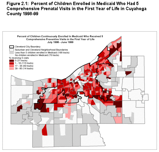
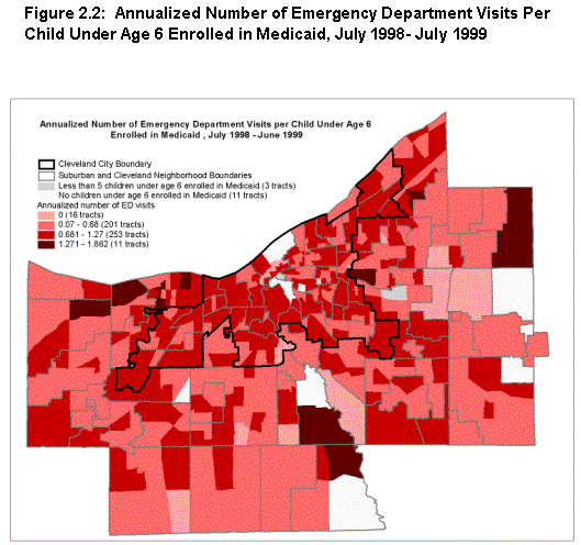
The correlation coefficients resulting from this ecological analysis are presented in table 2.1, and maps showing spatial patterns for two of the indicators are presented in figure 2.1. Findings are noted under the four hypotheses posed by the staff.
| Early initiation of CPV | No CPVs | All CPVs | Average CPVs | Percent with ED visit per month | Annualized ED visits | |
|---|---|---|---|---|---|---|
| ECONOMIC INDICATORS | ||||||
| Poverty rate | -0.07 | 0.11 | -0.16* | -0.18** | 0.13** | 0.13** |
| Poverty rate for children under age 6 | -0.07 | 0.09 | -0.12 | -0.14* | 0.19** | 0.18** |
| Employment rate for males age 16 and over | 0.08 | -0.06 | 0.1 | 0.09 | -0.08 | -0.06 |
| Employment rate for females age 16 and over | 0.04 | -0.05 | 0.09 | 0.11 | -0.06 | -0.06 |
| RACE/FAMILY STRUCTURE INDICATORS | ||||||
| Percent white | 0.04 | -0.05 | 0.15* | 0.09 | -0.12** | -0.11* |
| Percent black | -0.04 | 0.03 | -0.13* | -0.07 | 0.10* | 0.10* |
| Percent hispanic | 0.03 | 0.13* | -0.12 | -0.14* | 0.17** | 0.16** |
| Percent of households with children under age 18 that are female-Headed | -0.04 | 0.09 | -0.20** | -0.18** | 0.23** | 0.22** |
| Note: CPV is an abbreviation for comprehensive preventative visits. ED is an abbreviation for emergency department. ** Correlation is significant at the .001 level. * Correlation is significant at the .05 level. |
||||||
- That health care utilization measures would be related to other measures of health and safety. This hypothesis holds, but not strongly or uniformly. The percentage of infants with no CPVs is correlated with the percentage of births with inadequate prenatal care. The percentage of infants receiving CPVs and the average number of CPVs show weak but significant negative correlations with low-birth weight rates, unmarried birth rates, and child maltreatment rates. Indicators reflecting reliance on EDVs are positively correlated with health problem indicators but uncorrelated with measures of safety across tracts. The fact that EDV use correlates positively with the rate of inadequate prenatal care suggests that these types of indicators may be sensitive to a similar problem of shortage of primary care providers.
- That low-income neighborhoods would have lower scores on the new health care access indicators. None of the economic indicators correlate with the rate of newborn CPVs or with the percentage of infants with no CPVs. This suggests that efforts to provide preventive services to residents of poor neighborhoods have been successful. However, the fact that there is a weak negative correlation of neighborhood poverty and receipt of all visits suggests there may be some remaining difficulties in achieving complete access. In contrast, this hypothesis clearly holds for the relationship between EDVs and poverty (although there is no correlation between any of these indicators and employment rates).
- That there would be relationships between race, ethnicity, and family structure measures and health care access. This hypothesis appears to hold for the most part. None of the indicators correlate with the rate of newborn CPVs. However, census tracts with higher Hispanic populations are more likely to have infants who receive no CPVs during their first year. Tracts with large numbers of African Americans have fewer infants who receive all of their CPVs in the first year. The percentage of African Americans and Hispanics is positively correlated with EDVs for children under 6. The percentage of households with children that are headed by females is negatively correlated with the rate at which infants receive CPVs in their first year and positively correlated with EDV rates.
- That a neighborhood's distance from primary care sites would lead to poorer performance on the health care access indicators. The Center was unable to get the addresses of all primary care providers in the region from the state to test this hypothesis. However, an alternative approach was possible using the state's listing of tracts identified as "Health Professional Shortage Areas" by comparing the rates on the new indicators that had this shortage designation with the rates in all other tracts.(6) Major differences were not evident in all cases, but a significantly lower share of infants in shortage areas get all five of their CPVs (13.8 percent) than in areas with no shortage (17.2 percent; t value = -2.48, p < .05). Also, the average number of annual EDVs was higher in shortage areas (0.75) than in areas without shortage (0.66; t value = 4.04, p <. 001).
Implications
All of the findings were certainly not as expected. The ideal of primary care has been for all children to have a "medical home"--a place where they can get regular preventive or well-child care and can also receive medical treatment for acute or chronic illnesses that are appropriately treated by pediatricians in their clinics and offices. The researchers had initially assumed that CPVs were indicative of access to preventive care, one aspect of primary care. However, they did not have a direct way of measuring access to primary care providers for illnesses.
Instead, the Center chose to measure a negative indicator: the frequency of EDVs. The assumption was that high EDV rates would be a proxy for the lack of access to primary care for illnesses. The Center recognized that some EDVs, especially for trauma or critical conditions, were appropriate, but it has not yet perfected a method for removing the "true emergency" EDVs from the counts.
In an additional analysis, the researchers showed that CPVs and EDVs were not correlated with each other at the census tract level. This suggests that these two types of indicators are measuring different things. It is possible that they are measuring two unrelated aspects of primary care access or that one of them is not an indicator of access but responds to other factors.
The researchers' assumption, though, is that families have more difficulty getting in to see a primary doctor when their children are ill than for well-child visits. Sick visits might be difficult for several reasons. Families that do not own an automobile may find it difficult to take a sick child to the doctor or clinic during normal business hours. They may need to wait until someone gets off work to drive them and, by that time, only the emergency services are open. Or these families may have a sense that illnesses are urgent and may not be comfortable waiting for an appointment with a primary care provider. Another possibility is that clinics and doctors' offices that serve these families for their well-child care are overcrowded and cannot readily schedule same-day sick visits, which are often needed for young children who are ill.
Another unexpected finding was that several of the measures of CPV rates were not correlated with poverty or other economic indicators at the neighborhood level. This may reflect the fact that local agencies and the managed care organizations have made a concerted effort to reach out to poor families to ensure that they receive their needed well-child visits. Thus, these indicators do not show any ecological correlations because the usual barriers have been removed. Deeper study (interviews and analysis of other administrative data) would be required to find out whether this is the correct interpretation. Whatever the result, it would seem advisable to monitor these relationships in the future.
Data limitations and potentials
Center staff encountered a number of difficulties in preparing these data for analysis. Extra work was required to avoid double counting where more than one claim was made for an event. Also, a simplifying assumption was needed to avoid excess complexity arising from the fact that children can move several times during their year of birth (it was decided to use the census tract at birth for all of a child's CPVs). Another difficulty was that data could not be provided for tracts with fewer than five children on Medicaid, to protect confidentiality. In addition, data for other tracts had to be removed from the analysis because of the rare events issue discussed earlier in this report--a problem that could be addressed in the future by averaging over several years, assuming the data will continue to be provided.
The Medicaid data also have some obvious coverage limitations. First, these files contain no data on children who are privately insured or are otherwise not enrolled in Medicaid. Nor do they have data on children who were not enrolled for periods of time for various reasons (to address the latter, staff included only children who were continuously enrolled during the year). Also, some events are missed because of services provided by public health clinics and other providers that do not seek reimbursement from Medicaid.
Nonetheless, these data do have a great deal to say about a large population of interest. Given the difficulties, the fact that Center staff were able to edit and analyze these data successfully is important evidence. It certainly suggests that more extensive use could be made of them in Cleveland and that local data intermediaries in other cities might be able to take advantage of them as well. Relevant offices in other states may be able to provide similar data for similarly controlled studies. For future work in Cleveland, the research would be even more valuable if the additional information sought by the Center but not received could be obtained: data on addresses of all Medicaid service providers and on non-EDV visits related to illnesses.
The data clearly fill a void in local knowledge--at present, local officials and advocates have virtually no recurrently provided information on how types and levels of primary health care vary across neighborhoods for low-income populations. Such data would appear extremely useful for program management, policymaking, and public accountability, especially if monitored recurrently.
Community Process
The Early Childhood Initiative (ECI) in Cuyahoga County has chosen as one of its goals a "medical home" for every child under age 6. Its initial focus has been on newborns and their parents. The ECI is very interested in using the indicators in this report as a way of measuring its own progress. It has already succeeded in expanding Medicaid enrollment to virtually all of the county's uninsured children. The new indicators of access to primary care will allow the ECI to determine whether there are particular neighborhoods that need to be targeted for assistance with access to primary care. Moreover, these indicators can be disaggregated in other ways, such as by age or program status, which will allow ECI to refine its approach. Since the indicators have just been reported at the time of this writing, it will be several months before all of the potential uses become apparent.
Section 3 - Denver: Indicators of Community Environmental Hazards and Community Violence in Relation to Neighborhood Conditions
DENVER:
INDICATORS OF COMMUNITY ENVIRONMENTAL
HAZARDS AND COMMUNITY VIOLENCE IN RELATION TO
NEIGHBORHOOD CONDITIONS
PURPOSE AND APPROACH
This section summarizes the site-specific analysis prepared by the Piton Foundation in Denver.(7) It focuses on the possible effects of two types of conditions that are increasingly discussed as risks to health in urban neighborhoods: environmental hazards and exposure to violence.
Purpose
The Piton Foundation has a tradition of working closely with residents, activists, and community-based organizations located in or serving Denver's poorer communities. One focus of this work has been the search for more and better data to describe neighborhood realities and inform community action.
Denver Benchmarks is a new initiative embodying this theme in which Piton is partnering with residents, city officials, and other stakeholders to develop measures of community health and quality of life for all Denver neighborhoods. The two neighborhoods that are piloting the initiative (Cole in northeast Denver and Overland in south central Denver) have important socioeconomic differences, but both identified environmental hazards and community violence as their highest priority concerns. Accordingly, the Foundation sought to help these communities learn more about the influence of these problems so they could better address them.
Data sources and approach
The Piton team assembled a considerable amount of information that might serve as the basis for indicators in these areas. They planned to use correlation and mapping analysis to relate data on these problems to health outcomes and other neighborhood conditions.
As to environmental hazards, they purchased data on items 1 through 6 below from a commercial vendor (which had obtained and cleaned original data from various national sources). Data on items 7 and 8 were obtained from the Denver Department of Public Health and Environment. Information on all topics was provided for multiple years, and locations were geo-coded so they could easily be analyzed and related to neighborhood boundaries.
- Storage tanks, used primarily for the storage of petroleum products
- Environmental Protection Agency (EPA)-designated Superfund sites and sites rated as less serious hazards recorded in the Comprehensive Environmental Compensation and Liability Information System (CERCLIS)
- Solid waste facilities
- Solid waste disposal sites registered by the Resource Conservation Recovery Act (RCRA), including those labeled as "violators" and "corrective action sites")
- Sites where toxic substances had been released into the environment (from the Toxic Release Inventory)
- Sites of spills of oil or other hazardous substances as reported to the Emergency Response Notification System (ERNS)
- Sites with state permits to discharge regulated substances into open water
- Citizen-reported environmental complaints
As to community violence, Piton already maintained data on Part I violent crimes by neighborhood (as noted in section 2). For this study, they obtained two new types of data. The first was information on suspensions and expulsions of students in the Denver public school system, coded by reason. They selected several of the reason codes as identifying violence-related offenses and geo-coded them for one academic year (2001/2002) by residence address of the student.(8) The second type of data was on confirmed cases of child abuse and neglect (by address), provided by the state Department of Human Services. For confidentiality reasons, Piton has agreed not to report such data for any area with five or fewer cases. To reduce the impact of this restriction for the analysis (and to address the broader rare events issue), Piton grouped the data for overlapping three-year periods (starting with 1995-1997 and running through 1998-2000--this allowed reporting for 57 of Denver's 77 defined neighborhoods).(9)
As to health outcomes,Piton already had the measures based on vital statistics from its own data system (as analyzed in section 4). However, the team obtained data on two new indicators from vital records: (1) Apgar scores, which represent the results of tests of physical functioning taken just after birth, and (2) the premature birth rate (live births with a clinical gestation period of 20 to 36 weeks as a percentage of all live births).(10)
FINDINGS AND IMPLICATIONS
This study had more difficulty in finding strong associations between variables at the neighborhood level than those in the other sites, but it offers useful lessons that could lead to development and use of more effective indicators in the future.
Hypotheses and findings: Environmental hazards
The team had hoped to test the following two hypotheses in this area, but they were unable to construct reliable measures of hazards needed to test either.
- That environmental hazards are disproportionately located in neighborhoods with significant concentrations of children, people of color, and poverty.
- That infants born to families living in neighborhoods with concentrations of environmental hazards have worse birth outcomes than other children.
The team had assembled a considerable amount of environmental data, as noted earlier. The problem was that after working with the community to think through the meaning of the data, they mutually discovered that none of this environmental data, as given, yielded useable indicators of hazardous conditions at the neighborhood level (i.e., conditions that would let them reliably rate the extent of hazards in one neighborhood in comparison to another). There were several reasons:
- The existence of many of these conditions does not actually represent a hazard. Properly maintained and operated storage tanks (#1), solid waste facilities (#3 and #4), and permitted discharges into waterways (#7) should not be an environmental concern. The files contain data on "leaking" tanks and solid waste facilities labeled as "violators" and "corrective action sites," but most of those conditions have been remediated, and there was not enough information on the files to tell whether the remainder are really hazardous or not.
- Some of the other conditions are more likely to be hazardous, but the available data do not offer measures of the extent of the problem. This is true of Superfund and CERCLIS sites (#2), for example. A neighborhood with two such sites might have much higher risks than one with ten, depending on the type and extent of the hazards involved.
- This difficulty also exists in interpreting the ERNS database on spills (#6) and the Toxic Release Inventory data (#5). The latter file indicates only 36 incidents in Denver, occurring in 13 neighborhoods.
- One might expect complaint volumes (#8) to be a more sensitive indicator. However, complaints do not appear to be correlated with either neighborhood poverty or what is known about locations of actual environmental problems. Staff surmise that some neighborhoods simply have more active complainers than others.
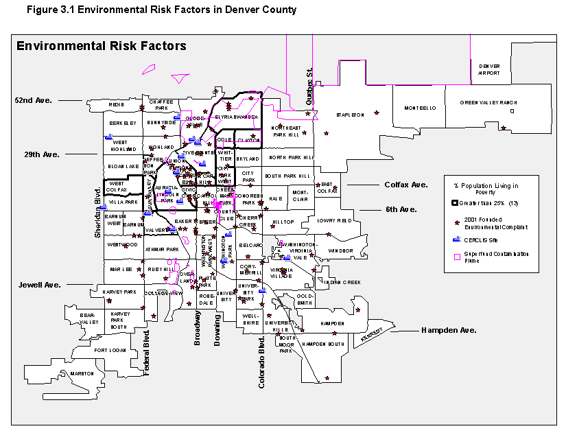
The team did run correlations relating the location of these conditions to the neighborhood distributions of children, poverty, and minorities, but they found no significant associations. Piton already produces "asset and risk factor" maps for Denver, and this analysis has allowed them to add a new map to the risk factor section (showing Superfund contamination plumes, CERCLIS sites, and confirmed environmental complaints--figure 3.1). Beyond that, however, interpreting the nature and extent of environmental hazards in neighborhoods will require deeper information on conditions at each location.
Hypotheses and findings: Community violence
There are many reasons to expect a higher incidence of violence in neighborhoods distressed on other measures. The Piton team sought to test the following hypothesis with the new indicators they had obtained.
- That violent events are disproportionately located in neighborhoods with significant concentrations of children, people of color, and poverty.
This hypothesis was supported by most of the available indicators. As expected, there was a high correlation between the rate of violent crime and the other measures: 0.624 with respect to poverty rates, and poverty is closely correlated with the minority percentage of total population at the neighborhood level (0.658). Correlations with poverty were even higher for two of the new measures: 0.719 for the rate of confirmed child abuse and 0.703 for violence-related school suspensions and expulsions. The latter relationship is also directly observable by comparing the map for the latter variable in Denver (figure 3.2) with that for poverty (figure 8.3).

Piton advises caution in the use of these measures. Even though Piton was conservative in selecting suspension/expulsion reason codes as violence related, one couldn't be sure that there was not bias in assigning the codes initially. Staff errors or misjudgments are possible in child abuse/neglect designations as well. Furthermore, it is suspected that abuse/neglect cases are recorded more often for low-income families because, as beneficiaries of various Department of Human Services subsidy programs, they have more contact with city social service professionals. Furthermore, Piton and the communities see reported violent crime as only a very limited starting point to understanding. To gain enough knowledge to plan a sensible response, more information about the perpetrators, the victims, and the circumstances of these crimes is indicated.
Community process
Using the relationships forged through Denver Benchmarks,Piton is beginning discussions with the Denver Department of Safety, the Colorado Judiciary, and the Colorado Department of Corrections to seek new and deeper data that could result in more powerful indicators of neighborhood safety and risk for violence. Piton will also be pursuing more information about the circumstances of environmental hazards and how to measure them more meaningfully.
Work with the communities continues and does seem to be having an influence. One example is a shift in orientation of the work in the Overland neighborhood. That community had come together initially with the sole objective of securing the rehabilitation of a Superfund site. Once that objective was achieved, the group might well have disbanded. However, with their participation in the Benchmarksprocess (and following the approach being taken in the Cole neighborhood), they have now embarked on their own strategy to create a comprehensive plan for community change.
Finally, Piton has also been working with other agencies on the broader policy front. The City Council has recently approved a resolution in support of Denver Benchmarks. In the resolution, the Council urges city agencies to share data and otherwise cooperate with Denver Benchmarks, and use their data in policymaking and resource allocation, and the Council pledges to use its own data in decisionmaking.
Section 4 - Indianapolis: Environmental Factors and the Risk of Childhood Obesity
INDIANAPOLIS:
ENVIRONMENTAL FACTORS AND THE
RISK OF CHILDHOOD OBESITY
PURPOSE AND APPROACH
This section summarizes the site-specific analysis prepared by the Polis Center at Indiana University-Purdue University at Indianapolis (NNIP's local partner in Indianapolis) in conjunction with the Children's Health Services Research Program in the Department of Pediatrics at Indiana University.(11) It focuses on the relationship between neighborhood conditions and risk of childhood obesity.
Purpose
In the past two decades, the prevalence of obesity has risen dramatically (Anderson 2000). Concern about this rise centers on the link between obesity and increased health risks that translate into increased medical care and disability costs. In the United States, total costs attributable to obesity exceeded $100 billion in 2000, or approximately 8 percent of the national health care budget (Wolf and Colditz 1998). Although the immediate health implications of obesity in childhood have not been examined extensively, obese children are likely to become obese adults, particularly if obesity is present during adolescence (Braddon et al. 1986; Serdula et al. 1993). However, adverse social and psychological effects of childhood obesity have been demonstrated (Stunkard and Burt 1967; Stunkard and Mendelson 1967). Furthermore, being overweight during adolescence has been shown to have deleterious effects on high school performance, educational attainment, psychosocial functioning, and socioeconomic attainment (Gortmaker et al. 1993).
The purposes of this research were to learn about and measure relationships between the prevalence of obesity and socioeconomic status, the presence of exercise opportunities, and exposure to social barriers at the neighborhood level during the late 1990s in Indianapolis (Marion County).
Data sources and approach
The researchers had access to a database for this work that is nationally known for its comprehensiveness: the Regenstrief Medical Records System (RMRS), which contains data on patient circumstances and care reported by a large number of care providers and other health entities in Indiana (now with data on 1.5 million patients since 1974).
The researchers recognized that the pediatric data in the RMRS reflected a population in which African Americans, Hispanics, and patients receiving Medicaid are overrepresented. While the selection bias affects the generalizability of the findings, it also works to the study's advantage given that several U.S. minority populations are disproportionately affected by obesity, particularly African Americans, Hispanics, and Native American women (Strauss 1999).
From the RMRS, the researchers obtained data on a random sample of children, ages 4 through 18, who had been seen by primary care clinics in the Indiana University Medical Group in Marion County from 1996 through 2000 and for whom simultaneous height and weight measurements were available. They classified all children in the sample according to body mass index (BMI) categories. Obese children were those with BMI above the 95th percentile according to a scale developed by the Centers for Disease Control and Prevention. They also had data on the children's addresses and other characteristics such as race. After excluding 17 percent of the initial group (because of unreasonable data or geo-coding difficulties), they were left with a sample of 17,871 children. The sample reflected the general age and gender distribution of the patient population.
Data were analyzed at the block group level. Block group characteristics included income and other socioeconomic variables from the 2000 census and information on physical activity opportunities (e.g., YMCAs, parks, after-school physical education programs) and crime rates from the Social Assets and Vulnerabilities Indicators database (SAVI), the neighborhood data system maintained by the Polis Center).
Patient characteristics and block group environmental data were first subjected to bivariate analysis. The researchers then conducted multivariate logistic regression analysis using only variables that evidenced significant associations in the bivariate analysis. They also prepared and examined maps of the key variables involved.
FINDINGS AND IMPLICATIONS
Hypotheses and main findings
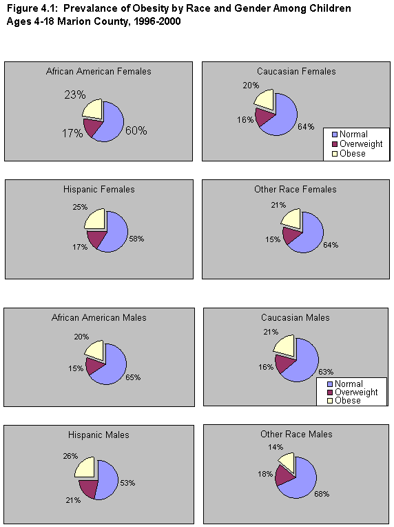
Figure 4.1 shows that there are important differences by race and gender. The prevalence of obesity is generally higher for females than males. Among females, 25 percent of Hispanics and 23 percent of African Americans were obese, compared with 20 to 21 percent for those of other races. Among males, 26 percent of Hispanics, 21 percent of whites, 20 percent of blacks, and only 14 percent of those of other races were obese. (It should be remembered that whites and African Americans are by far the dominant population groups in Indianapolis.) The researchers formulated the following hypotheses:
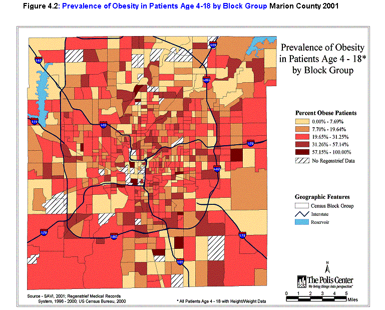
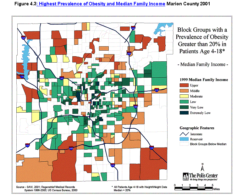
- That children living in areas of lower socioeconomic status (as measured by income and educational attainment) are more likely to be obese. Results of the multivariate analysis related to age, gender, race, and socioeconomic status are shown in table 4.1. While education (share of adults 25 and over without a high school diploma) appeared important in bivariate analysis, its effects were eliminated in the multivariate logistic regression. That analysis, however, showed a significant negative relationship with income (as well as important relationships with gender, race, and age). Children from areas with very low median income are the most likely to be obese; the odds of obesity relative to children from areas with upper income are 1.55 (95 percent confidence interval: 1.27-1.90). The spatial pattern is shown in figure 4.2.
- That children living near opportunities for exercise (specifically parks, greenways, after-school programs, and YMCAs) are less likely to be obese than other children. For this analysis, the researchers calculated the straight-line distance from the residence of each child in the sample to the nearest public play space. The mean was 567 meters for obese children and 571 meters for other children. In other words, there was no significant difference in the distances for obese and nonobese children. (Note that this analysis was performed only for a smaller sample of 2,496 children who had been seen at the clinics only in calendar year 2000.)
| Parameter | Estimate | Standard error | P-value |
|---|---|---|---|
| Intercept (Obese) | -1.4933 | 0.1034 | < 0.0001 |
| Female | -0.0713 | 0.0636 | 0.2627 |
| African American | -0.0464 | 0.0583 | 0.4261 |
| Hispanic | 0.3622 | 0.1297 | 0.0052 |
| Other races | -0.4255 | 0.2105 | 0.0433 |
| Female & African American | 0.1752 | 0.0793 | 0.0271 |
| Female & Hispanic | 0.0269 | 0.1879 | 0.8863 |
| Female & Other race | 0.5892 | 0.2833 | 0.0375 |
| Age | 0.0746 | 0.0049 | < 0.0001 |
| Age & gender | -0.0109 | 0.0012 | < 0.0001 |
| Extremely low income | 0.3654 | 0.1359 | 0.0072 |
| Very low income | 0.4380 | 0.1035 | < 0.0001 |
| Low income | 0.3857 | 0.0988 | < 0.0001 |
| Moderate income | 0.2960 | 0.1127 | 0.0086 |
| Middle & upper income | 0.2890 | 0.1123 | 0.0100 |
3. That children living in areas with high exposure to social barriers (as measured by high crime rates, single-parent families, and those who are linguistically isolated) are more likely to be obese. Working with the larger sample, with all measurements at the block group level, bivariate analysis showed that none of these factors was significantly predictive of obesity. The block group averages for crime densities (Part I crimes per square mile, 1996-2001) were 603 for normal children, 605 for overweight children, and 603 for obese children. Block group averages for single-parent families as a percentage of all households were the same (29 percent) for all three weight groups. Block group averages for linguistic isolation (percentage of families with English language difficulties according to the 2000 census) were also the same (2.2 percent) for all three groups.
Implications
That obesity is strongly associated with SES (as measured by income) is noteworthy. To our knowledge, this is the first large population-based study to examine environmental (rather than individual) SES as a predictor of obesity in children. Characteristics of neighborhoods almost certainly have significant effects on the behavior of residents. Neighborhoods are where people make connections to others and become part of a social network. Therefore, neighborhoods can be seen as generating social and cultural capital that represents concrete targets for interventions aimed at improving self-management. If we can design strategies to combat the deleterious effects of low environmental SES, then we stand to empower vulnerable populations to make healthy choices.
The evidence did not support the other hypotheses, but that does not prove them incorrect. Other recent studies have found evidence to suggest that features of the physical environment (e.g., presence of sidewalks, enjoyable scenery) can be positive determinants of physical activity, and that other environmental factors (e.g., high rates of crime, the lack of a safe place to exercise) can be negative determinants (Brownson et al. 2001; King et al. 2000). It is likely that the measure used (linear distance) was too crude a measure/proxy for access to play space. Research using other, more sophisticated measures related to the other hypotheses seems warranted.
 Data potentials
This study demonstrates that a large ongoing repository of data on patients and their care, supplied by a very large share of all local care providers (e.g., the Regenstrief System) can be used productively for policy analysis and, by logical extension, for helping to design and monitor program initiatives that may result from it. Few urban areas have mobilized and maintained the broad-scale agreement of providers to report in this way. The development of similar systems in other metropolitan areas is worth exploring.
Community process
This research has been timely for Indianapolis. The Alliance for Health Promotion there is forming a collaborative Strategic Thinking Coalition to address the issue of obesity. Stakeholders involved include the mayor's office, the United Way, health organizations, neighborhood organizations, educators, fitness and nutrition experts, members of the media, and local foundations. While the mission and goals of this new group are in the process of being defined, it is clear that it will become a strong forum for motivating action on the issue over the long term. The Coalition has decided to focus on both children and adults, recognizing the importance of affecting change through the family unit.
The Coalition is now reviewing the local report for this study. It expects to use it as a base for targeting resources to neighborhoods as well as understanding the issue and its determinants more broadly. The Coalition will also be involved in decisions on follow-up research to support the design of effective interventions.
The Polis Center has also met with the United Way of Central Indiana (its partner in SAVI) to discuss the implications of this analysis for local health initiatives. United Way plans to use the results to guide policy development in two of its impact councils: on Community Health and Well-Being and on Children and Youth. Plans are also being made to disseminate the report and its findings broadly within the local medical community.
Section 5 - Oakland: Tuberculosis Infection in Oakland - At-Risk Populations and Predicting "Hot Spots"
OAKLAND: TUBERCULOSIS INFECTION IN OAKLAND--
AT-RISK POPULATIONS AND PREDICTING "HOT SPOTS"
PURPOSE AND APPROACH
This section summarizes the site-specific analysis prepared by the Urban Strategies Council in Oakland.(12) It focuses on the relationship between neighborhood conditions and tuberculosis infection.
Purpose
The Council conduced the work in close coordination with the Alameda County Public Health Department (PHD), which is designing community-based interventions to reduce the risk of certain diseases, including tuberculosis. New drugs discovered in the 1940s brought a tentative cure for this disease, and through 1984 its incidence declined nationally. There was striking reversal of the trend thereafter, however, associated with the AIDS epidemic, increasing immigration from abroad, and other factors (Cowie and Sharpe1998; Lillebaek et al. 2001; Talbot et al. 2001;). Tuberculosis today disproportionately affects minorities (Centers for Disease Control and Prevention1990), and there has been research and speculation about the spatial concentration of TB in distressed urban neighborhoods and poverty as a potential risk factor (Barr et al. 2001).
Council staff wanted to find out about the spatial pattern of tuberculosis in Oakland to help guide PHD in resource targeting and to better understand its association with variations in neighborhood conditions in the city (specifically, with minority and foreign-born populations, poverty, and overcrowded housing). The Council had initially hoped to conduct similar analyses with respect to sexually transmitted diseases (STDs) and AIDS in Oakland as well, but PHD data administrators so far have been unwilling to release the relevant data owing to confidentiality concerns (an issue discussed further later in this section).
Data sources and approach
The Tuberculosis Control Unit of PHD provided the Council with data on reported cases of tuberculosis in Alameda County from 1997 through 2001. Only the 456 cases with residences in the city of Oakland were used in the analysis. Data on the independent variables were from the 2000 census.
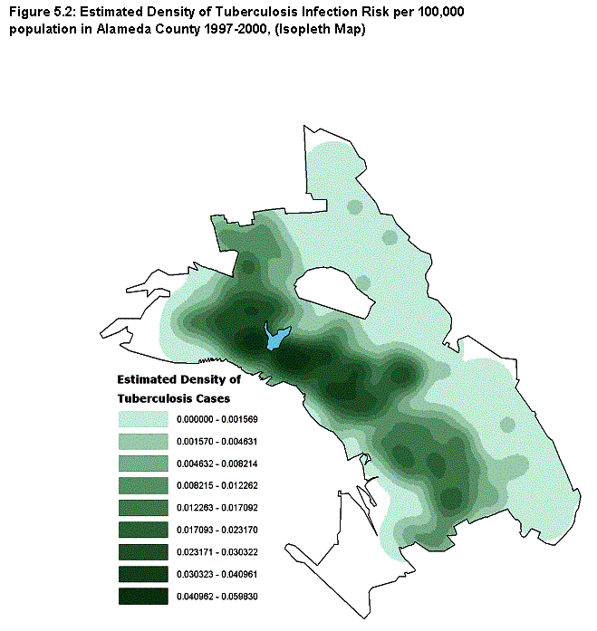
As with most of our other site-specific analyses, Council staff ran correlation analysis (bivariate and multivariate) to test their hypotheses, and mapped spatial patterns as well. However, they used an innovative approach to do so. Normally in this type of work, analyses are run on data sets with values for all variables provided for comparatively small administrative or data collection areas (e.g., census tracts or block groups). In this case, the staff applied data originally provided (using addresses to pinpoint locations for the 456 tuberculosis cases and the centroids of Oakland's 337 block groups for the census variables) to then estimate values of all variables for all of the cells in a much more finely grained grid (69,181 square cells with 150-foot sides).
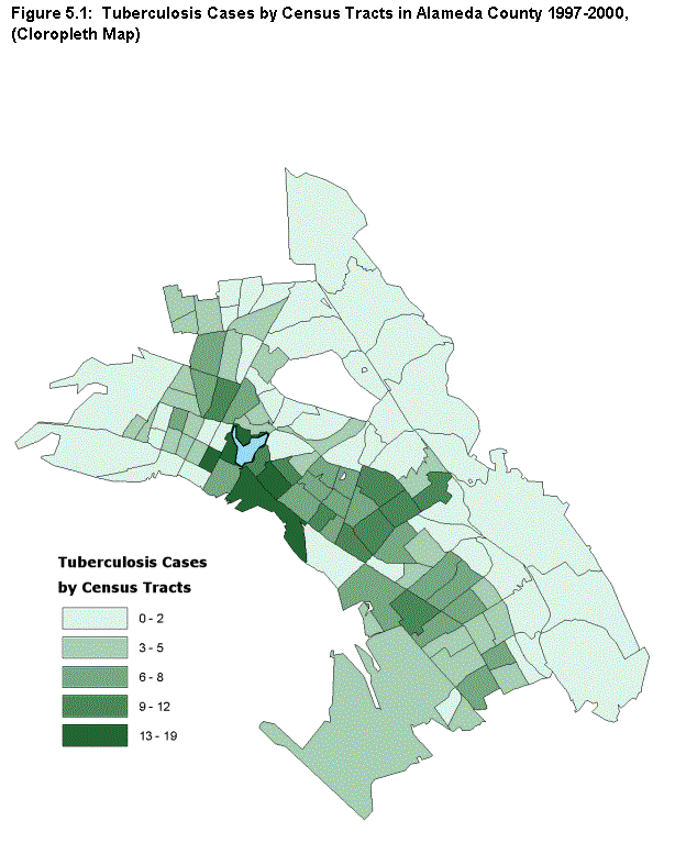
The methodology for any variable involves interpolating between the point locations for the values given in the original data to estimate values for cells in between. The work was done using the "single kernel density routine" in the CrimeStat II software package (originally developed for identifying "hot spots" of criminal activity).(13) The approach leads to a more accurate understanding of spatial patterns. The traditional approach yields chloropleth maps like that shown in figure 5.1, with colors or tones of indicating uniform intensities in each census tract. The new approach yields isopleth maps with contour intervals, as in figure 5.2, that can show more accurately how patterns of intensity change within tracts without the constraints of arbitrary political or planning boundaries.
FINDINGS AND IMPLICATIONS
Hypotheses and main findings
The work focused on the Urban Strategies Council's analysis of three main hypotheses concerning relationship between neighborhood conditions and tuberculosis:
- That incidence rates of tuberculosis are positively correlated with the percentage nonwhite population and the percentage foreign-born population.
- That incidence rates of tuberculosis are positively correlated with the percentage of people in poverty.
- That, controlling for the demographic and economic relationships above, incidence rates of tuberculosis are positively correlated with the number of occupants per room in housing units.
Accordingly, the analyses measured the relationship between the rate of incidence of tuberculosis (cases per 100,000 population including both males and females, or TB100K), the dependent variable, and six independent variables:
- Males as percentage of population (PER_MALE)
- Percentage of population in poverty (PER_POV)
- Nonwhites as percentage of population (PER_NONW)
- Immigrants as percentage of population (PER_IMM)
- Occupants per room (C_CROWD)
- Percentage of population over 65 years of age (PER_65)
The bivariate analysis showed that the relationships between all of the predictors and tuberculosis were positive except for age. The strongest of these was the immigrant percentage, +0.64. Coefficients from the multivariate analysis are given in table 5.1. Summary statistics are as follows:
R Square and Adjusted R Square = 0.481
Std. Error of the Estimate 719.081
Durbin-Watson = 1.625
Change Statistics:
- R Square Change = 0.481
- F Change = 9165.634
- Significance of F Change = .000
| Unstandarized coefficients | Standardized coefficients | 95% confidence interval -B | |||
|---|---|---|---|---|---|
| B | Standard error | Beta | Lower bound | Upper bound | |
| (Constant) | 3127.74* | 60.17 | 3,009.80 | 3,245.68 | |
| Per_male | 2966.19* | 137.67 | (0.083) | (3,236.03) | (2,696.35) |
| Logit of Per_pov | 189.35* | 4.57 | 0.223 | 180.39 | 198.31 |
| Logit of Per_nonw | 37.80* | 3.27 | 0.062 | 31.38 | 44.21 |
| Logit of Per_imm | 635.07* | 5.91 | 0.505 | 623.48 | 646.65 |
| Square of c_crowd | 277.15* | 23.86 | 0.081 | 230.38 | 323.92 |
| Square of per_65 | 7725.61* | 323.76 | 0.193 | 17,091.04 | 18,360.18 |
| * Significant at the .0001 level | |||||
In sum, 48.1 percent of the variance in tuberculosis in Oakland can be explained by the six variables, indicating that this is a strong model. Immigration is the single most important variable that predicts tuberculosis, followed by poverty.
Mapping analysis
As noted in section 8, Oakland is not like the prototypical big city with high-poverty neighborhoods all clustered around the city center--its spatial pattern is much more complicated. The staff began the analysis by preparing a series of chloropleth maps of the incidence of tuberculosis (like the map at the tract level in figure 5.1) for various types of administrative areas: City Council Districts, PHD Health Team Areas, and ZIP Codes, in addition to census tracts. Because of the way the areas are configured, each map suggested that different areas of the city were experiencing the highest incidences of tuberculosis. Also, it was apparent that the areas were generally too large to provide useful information to guide intervention and prevention efforts.
The map in figure 5.2 is an isopleth map of the estimated density of the risk of tuberculosis infection. It shows spatial patterns in a more precise way, indicating variations within the larger geographies noted above. Therefore, it should support operational planning and management more effectively. While earlier maps highlighted fewer and larger geographies, the risk map shows that downtown, Chinatown, and neighboring areas reaching into West Oakland, as well as the Lower San Antonio and Fruitvale areas southeast of Lake Merritt, are where prevention efforts should be targeted. This analysis shows that combining regression analysis with kernel density estimation can be a powerful way to analyze disease infection geographically.
Implications and community process
As of this writing, the uses of the Urban Strategies Council's report are not fully planned, but some steps have been taken and others agreed to. The central staff of PHD have been briefed on the results of the analysis and its significance. A considerable amount of PHD work in the community occurs through Neighborhood Health Teams, and there is agreement that meetings will be held to discuss the findings with the Teams. These discussions will highlight the opportunities for action with the Teams that work in the neighborhoods identified in the analysis as having a high risk for tuberculosis. Also, a community-driven Health Working Group has recently been established in the Lower San Antonio area. The Urban Strategies Council has been working closely with residents and leaders in that area for years, as a part of the Annie E. Casey Foundation's Making Connections initiative and in other ways. Accordingly, special efforts will be made to brief the new Health Working Group on the report and its implications.
Section 6 - Providence: Residential Mobility in Context
PROVIDENCE:
RESIDENTIAL MOBILITY IN CONTEXT
PURPOSE AND APPROACH
This section summarizes the site-specific analysis prepared by the Providence Plan, working closely with the state of Rhode Island Department of Health (HEALTH).(14) It focuses on the relationship between residential mobility and childhood health and the way neighborhood conditions influence that relationship.
Background and purpose
A sizeable number of studies have established that highly mobile children (those who move from one house to another much more frequently than average) face serious educational disadvantages. These include poor verbal abilities, poor attendance, lower test scores, and repeated grades (see, for example, Buerkle 1999; Koehn 1998; U.S. General Accounting Office (GAO) 1994). It is believed that residential mobility disrupts learning because of the emotional and behavioral difficulties that accompany it. Children who move often are placed under more stress because of the loss of friendships and other social support systems.
While there has been less research on the topic (exceptions are GAO 1994; Morrow 1995), it seems reasonable to hypothesize that high mobility also has deleterious effects on children's health. The authors of this study wanted to find out the extent to which this was true in Providence, and how mobility and health effects varied with characteristics of local neighborhoods.
Data sources and methods
To conduct this study, the Providence Plan had access to unusually complete data on mobility and other aspects of the lives of children in Providence. First, for some time the staff have been conducting demographic and other analyses for the Providence School Department using its database, which now contains historic data on all students enrolled from 1987 through 2001. Information about each student includes all address changes as well as data on test scores, absenteeism, repeating of grades, and other indicators of educational performance.
Second, they were more recently given access to the state Department of Health's KidsNet Databases, which at the time of this project contained information on all children born in Rhode Island from 1997 through 2001--a group overlapping, but generally younger than, those in the School Department dataset. Each of the children has been tracked since birth, so this file also contains information on address changes as well as on birth-related measures (e.g., birth weight, prenatal care) and selected services by various local health care providers (e.g., well-child and illness-related visits to physicians, immunizations, and lead screenings).
In addition to these sources, the staff used various tract-level indicators from the U.S. census and local administrative records (e.g., on reported crime). Relationships were examined using tables, charts, and census tract maps.
FINDINGS AND IMPLICATIONS
Hypotheses and main findings
Introductory analysis showed that mobility was indeed high among children in Providence and Rhode Island. Information from the School Department database showed that on average, one-quarter of all students in Providence changed addresses at least once in any given year. Information from the HEALTH database showed that nearly one third-of the 65,800 children for whom there were records state-wide had moved at least once by their first birthday; 43 percent of all children born in 1997 had moved at least once by the end of 2001. Children born in the core cities of the state had the highest mobility rates. For example, 22 percent of Providence children had moved two times or more from 1997 to 2001, compared with 7 percent for those outside of the core cities.
Providence Plan staff explored a large number of hypotheses related to these measures, including some to reconfirm the problematic effects of high mobility on educational outcomes. Here we regroup the findings and report on three main hypotheses that emphasize health effects.
1. That young children who move often will have more disruptions to health care access than other children. Staff defined and examined three ways in which access might be disrupted: (1) when children have to shift from one care provider to another; (2) when children have fewer office visits for immunization; and (3) when children do not receive recommended blood level screenings in a timely manner. Results were mixed:
- The data supported the hypothesis with respect to the first measure, but only modestly. Young children (ages 0 to 5) who moved often were only slightly less likely to see more than one provider than their more stable counterparts. The share of children who saw only one provider dropped from 84 percent for those who never moved, to 80 percent for those who moved once, to 77 percent for those who moved twice, to 74 percent for those who moved four times or more.
- Data on office visits for immunizations also supported the hypothesis, although again modestly; the contrasts were not dramatic (figure 6.1). Among all children born in 1999, for example, half of the children who never moved had the desired number (seven or more) of immunization visits. The shares with seven or more visits then declined consistently the more times the child had moved, reaching a low of 36 to 37 percent for children who had moved three times or more.
- Residential mobility does not appear to affect whether a child receives timely blood level screenings.
Figure 6.1:
Frequency of Visits to Service Provider and Number of Residential Moves
between 1997 ad 2001 for all Children born in 1997, Providence, RI
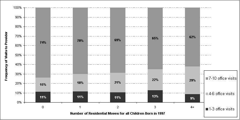
2. That children born to disadvantaged women, women of color, and single women are likely to move more often than other children. In this analysis, the staff defined "mobile" children as any born between 1997 and 2000 who had moved two or more times by December 2001 and any born in 2001 who had moved at all in that year. All results supported the hypothesis:
- Mobile children accounted for 28 percent of those born to African-American mothers and 31 percent of those born to Hispanic mothers, but only 11 percent of those born to white mothers.
- Just over one-quarter (27 percent) of the mothers of mobile children had delayed prenatal care (starting after the first trimester), compared with only 15 percent of mothers of other children; 15 percent of mothers of mobile children had insufficient prenatal care (fewer than six obstetric visits by the 36th week of pregnancy), compared with only 6 percent of other mothers.
- Two-thirds of all mobile children were born to single women, compared with less than one-third (30 percent) of other children; 21 percent of mobile children were born to teen mothers, compared with 8 percent of other children.
- Two-thirds of mobile children were classified as "risk positive at birth" by the state of Rhode Island, compared with 36 percent of other children(15).
3. That neighborhoods with high levels of distress will also have higher rates of child mobility. For this analysis, Providence Plan staff identified 13 measures of distress and counted the number of times each census tract's score exceeded the mean for each measure by one standard deviation or more(16). The tracts that met this standard for at least two of the measures were classified as "distressed." These tracts, shown on the map in figure 6.2, are clustered to the west and south of downtown Providence and heavily overlap the high-poverty tracts mapped in section 3.
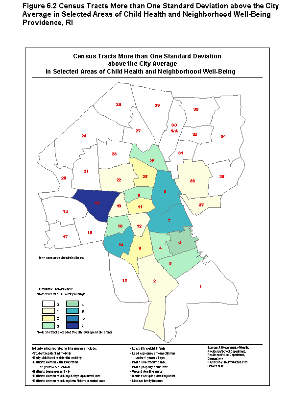
Mobility data support the hypothesis: (1) 92 percent of the distressed tracts have student residential mobility rates above the city average between 1996 and 2001; (2) the same share (92 percent) had residential mobility rates for young children above the city average (children age 5 and under as identified in the health database).
Looking at this relationship from the other direction, the staff also showed that neighborhoods with high rates of child mobility (see figure 6.3 related to younger children) have higher levels of neighborhood distress with respect to health. The seven tracts with the highest rates of child mobility (tracts 4, 5, 8, 9, 10, 11, and 19) are above the city's average on a number of measures of distress, including births to women with delayed or insufficient prenatal care; births to single women; risk-positive births; elevated blood lead levels; and violent crime.
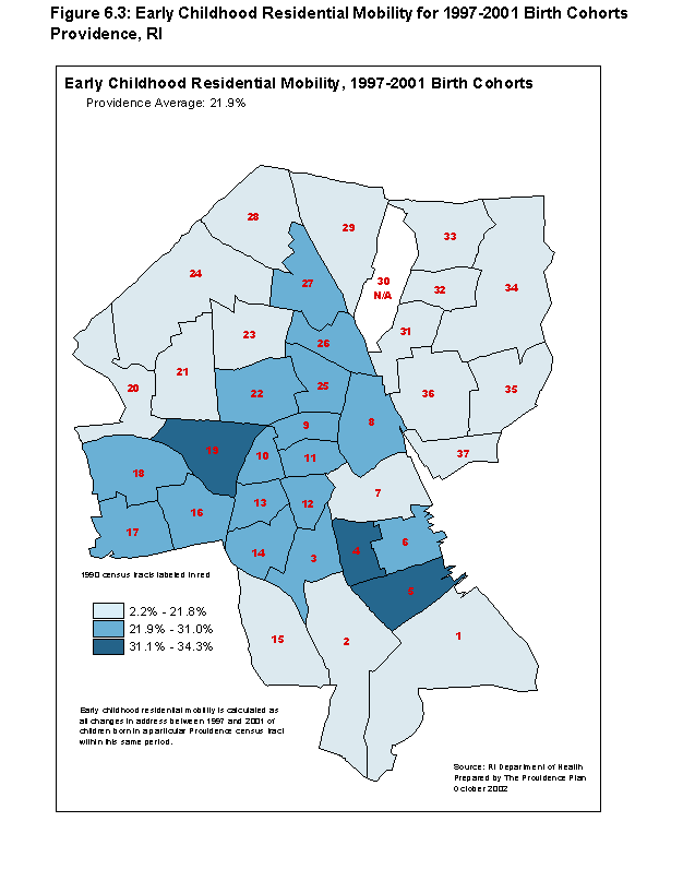
Implications and community process
High rates of mobility are indeed prevalent among children from distressed and minority families and in Providence's most troubled neighborhoods. While the effects are not dramatic, they also appear to have a negative impact on health care. Coupled with the Providence Plan's previous research showing negative effects of high mobility on education outcomes, there is now substantial evidence to draw attention to the issue.
Staff members recognize that mobility cannot be lessened in isolation from the myriad of other problems facing distressed families. There is need to better understand how the circumstances of poverty and neighborhood-level stressors interact to cause high mobility and other problematic impacts on families and children, and then to approach the mix of problems holistically. Next steps have now been planned in conjunction with HEALTH.
First, now that high-mobility children have been specifically identified, it will be possible for trained "parent consultants" (e.g., peers) employed by HEALTH to have targeted discussions with the families both to find out more about why they move and raise awareness of deleterious effects. Providence has a system of grass-roots community health centers (operated by nonprofits), and this work will be coordinated through them. Consideration is also being given to involving an ethnographic researcher from Brown University to help understand the dynamics of the issue.
After better information is available, HEALTH will reassess how well all of its services meet the needs of mobile families. For example, families of risk-positive children are offered home visiting and early intervention services. The report showed that two-thirds of highly mobile children were identified as risk-positive at birth. Assessment of how well the home-visit approach is working and how it might be modified to better address mobility issues would be a priority. Starting from data in this report, further work on locational patterns would also appear warranted to allow HEALTH to develop a better system of indicators so it can more efficiently target resources to those most in need.
In addition, plans are being made to present the findings of this report to the staffs of housing agency and advocacy groups. It is recognized that growing housing affordability problems play a central role in expanded mobility for low-income families. Housing professionals need to be working more closely with community health centers and other grass-roots groups if the issue is to be addressed.
Data potentials
The detailed schools and health data systems available to the Providence Plan for this work are not readily available for policy analysis in most American cities, if they exist at all. However, they offer models that should be attractive to develop elsewhere. In particular, the KidsNet Databases (birth records coupled with records on subsequent health system interactions for each child) would certainly seem worth emulating. The potential of such databases to support effective program planning, resource targeting, and internal performance monitoring, as well as providing a basis for external accountability, should be substantial.
This analysis built on an existing, working relationship between the Providence Plan and HEALTH has enabled the organizations to jointly explore issues of concern to the health community for several years. Appropriate data sharing and confidentiality agreements have promoted the relationship. The Providence Plan had no problems in accessing the data and found the records to be orderly and reliable in general.
5. The study is fully documented in an as yet unpublished report of the Center on Urban Poverty and Social Change Mandel School of Applied Social Sciences, Case Western University: Neighborhood Health Indicators in Greater Cleveland: The Use of Medicaid Claims to Measure Children's Access to Primary Care, by Claudia Coulton, Kristen Mikelbank, Katherine Offutt, Engel Polousky and Siran Koroukian. 2002.
6. For a full discussion of the criteria and locations of Health Professional Shortage Areas, see the Health Resources and Services Administration web site at http://bhpr.hrsa.gov/shortage/.
7. The study is fully documented in an as yet unpublished report of the Piton Foundation: Indicators of Community Environmental Hazards and Community Violence in Relation to Neighborhood Conditions, 2002.
8. Three years of data had been provided by the school district, but analysis by Piton evidenced problems in the data for the first two years that made them unusable.
9. This rolling three-year average approach is the same method we used with vital records data in section 4. Piton staff also explored the idea of using the Confirmed Child Sexual Abuse Rate and the Rate of Deaths Due to Violent Causes, but the numbers of cases were too small to support neighborhood analysis.
10. Piton also asked the state's Department of Health and Environment for a file linking births data to Medicaid records for mothers and children eligible for that program. This would have supported a range of other types of analysis, including examination of service frequencies such as that done in Cleveland (section 6). The Department is attempting to create such a file, but it could not be completed in time for research in this project.
11. The study is fully documented in an as yet unpublished report of the Polis Center at Indiana University-Purdue University at Indianapolis: Indianapolis Site-Specific Neighborhood Health Analysis: Environmental Factors and Risk of Childhood Obesity, 2002, by Sharon Kandris and Gilbert Liu, 2003.
12. The study is fully documented in an as yet unpublished report of the Urban Strategies Council, Tuberculosis Infection in Oakland, CA 1997-2001: At-Risk Populations and Predicting "Hot Spots" An Analysis Method Combining Kernel Density Estimation Mapping with Regression, 2002.
13. The method of interpolation was the normal distribution. The choice of bandwidth was that of the fixed interval and their fixed interval was 0.253 square miles, the mean nearest neighbor distance between block group centroids in Oakland.
14. The study is fully documented in an as yet unpublished report of the Providence Plan: Development and Use of Neighborhood Health Analysis: Residential Mobility in Context, 2002. The work received support from the Rhode Island Department of Health as well as from this project.
15. The Rhode Island Department of Health establishes risk for developmental delay for all newborns based on a variety of maternal health and socioeconomic criteria and vital statistics gathered at birth.
16. The thirteen measures of distress were: student residential mobility, early childhood residential mobility, births to women without a high school degree, births to teens age 15 to 19, births to women receiving delayed prenatal care, births to women receiving insufficient prenatal care, low birth weight infants, lead exposure among children under 6 years of age, Part I violent and property crime rate, vacant dwelling units, renter-occupied housing units, and median family income.
Part 2 - Cross-site Analysis
Section 7 - Approach and Methodology
APPROACH AND METHODOLOGY
This section begins with a description of the framework, drawn from relevant literature, that drives the work of our cross-site analysis. It notes what research of this kind can and cannot accomplish. It then describes the way we have structured the types of neighborhood conditions that we suspect influence health outcomes and, accordingly, the research hypotheses we will test. The section next describes the specific data--of different types and at different geographic levels--which we utilize in the research. Finally it presents the hypotheses themselves and reviews our methods of analysis in more detail. Specifics on analytic methods (bivariate and multivariate analysis) will be discussed in section 10.
FRAMEWORK
Specific Purposes
The notion than conditions of the social and physical environment in urban neighborhoods affect the lives of the residents has been the subject of speculation and scholarly research since the 1920s (Burgess 1925; Park 1929, 1936). This tradition of ecological research has demonstrated that neighborhood conditions matter, but clearly they are not the only things that matter.
Socioeconomic characteristics and behaviors of individuals and families, for example, also have an extremely important effect on their well-being, whatever their neighborhood of residence. In fact, the field offers stern warnings to researchers to avoid the "ecological fallacy" (i.e., concluding because there is a close statistical relationship between some neighborhood conditions and changing outcomes that the one is the cause of the other, without recognizing the role of other variables (e.g., family characteristics) that are not included directly in the analysis). Nonetheless, it is generally conceded that neighborhood conditions do have some effects independent of the influence of individual or family characteristics (Ellen and Turner 1997).
The limitations involved in obtaining individual and family level data are an important overall constraint on what this research could accomplish. Administrative data files with health indicators, such as those maintained by the NNIP partners, seldom contain (or at least permit agencies to release) detailed descriptive information on individuals and their families. Without such data, we cannot perform the type of multilevel analysis needed to explain more fully relationships between changes in neighborhood-level variables and health outcomes.
Still, there are other purposes of studying these relationships, and they can be of substantial practical value.(17) Ecological analyses can be used effectively in identifying potential problems and developing hypotheses about what is causing them, if not for drawing definitive conclusions on causation. Most basically, health agencies need to know about trends in the extent to which (and where) health problems are spatially concentrated if they are to develop efficient strategies for prevention and care. Knowing trends in the relationships between specific neighborhood conditions and health outcomes can provide valuable hints as to likely changes to spatial patterns in the future and, thereby, to specific programmatic opportunities those shifts may imply.
Categories: Overview
In this analysis, we have grouped the conditions likely to influence health outcomes (our independent variables) into three basic categories, as suggested by our review of the literature. First, we divide neighborhood-level conditions into two groups: socioeconomic conditions (e.g., income and poverty levels) that indirectly influence health, and direct pathways that can have more direct effects (e.g., environmental hazards or crime).
Neighborhood Conditions: Socio-economic Factors
As noted, our first set of indicators tries to capture the demographic and socioeconomic status characteristics of the neighborhood, and there is little doubt of important associations with health. In the most comprehensive review of the literature we identified, Ellen, Mijanovich, and Dillman (2001) recognize a broad consensus that "residents of socially and economically deprived communities experience worse health outcomes on average than those living in more prosperous areas . . . suffer from higher rates of heart disease, respiratory ailments and overall mortality." Yet more seriously, their review suggests to them that:
"neighborhoods may primarily influence health in two ways: first, through relatively short-term influences on behaviors, attitudes, and health care utilization, thereby affecting health conditions that are most immediately responsive to such influences; and second, through a longer term process of "weathering," whereby the accumulated stress, lower environmental quality, and limited resources of poorer communities, experienced over many years, erodes the health of residents in ways that make them more vulnerable to mortality to any given disease (Geronimus 1992)."
There have been numerous studies on linkages between neighborhood socioeconomic conditions and varying types of health outcomes. Researchers have found correlations between socioeconomic status (SES) and indicators of health-related behavior, such as smoking (Kleinschmidt, Hills, and Elliot 1995) and physical activity and body-mass index (Robert 1999). Relationships between low-SES neighborhoods and mental health problems have been examined by Aneshensel and Sucoff (1996)--a study of adolescents in Los Angeles County --and Katz, Kling, and Liebman (2000)--psychological benefits of moving to better neighborhoods in the Moving to Opportunity Program.
Perhaps the most work of this type has been done on associations between neighborhood socioeconomic characteristics and birth-related outcomes, including low-birth weight births (Collins and David 1990; Duncan and Laren 1990; O'Campo et al. 1997) and infant mortality (Collins and David 1992; Coulton and Pandy 1992; Guest, Almgren, and Hussey 1998). Research has also evidenced the association between distressed neighborhood conditions and lower early prenatal care rates among African-American mothers (Perloff and Jaffee 1999). Finally, Robert (1998) and Marmot et al. (1998) have found relationships between lower neighborhood SES measures and more chronic health problems (self-rated) of adults.
For this research, we have subdivided indicators in this broader category into three subgroups. The first is demographic, covering data on race and age composition. The second, and probably most significant, is economic. To represent the economic circumstances in a neighborhood, we use several variables, including average household income, the unemployment rate, and the overall poverty rate. The third subgroup includes measures related to social risks, such as the share of adults with no high school degree, the share of households receiving public assistance, and the share of families with children that are headed by females.
Neighborhood Conditions: Direct Pathways
Ellen, Mijanovich, and Dillman (2001) identify four pathways through which neighborhood can affect health more directly: (1) neighborhood institutions and resources; (2) stresses in the physical environment; (3) stresses in the social environment; and (4) neighborhood-based networks and norms.
The first of these refers to the availability of neighborhood institutions and assets, including health care facilities, grocery stores, and reliable transit, which can affect individuals' ability to access health care, healthy food, or other health supports in their neighborhood or elsewhere. The second pathway refers to physical conditions or contaminants that directly affect people's health, such as environmental hazards or lead paint. The third touches on the mental or psychological stress from neighborhood conditions such as crime. The last refers to the social networks, support systems, and community expectations of a neighborhood that can help promote healthy behaviors.
The contextual data available to us cannot measure all of these mechanisms directly, but they can act as imperfect proxies for the underlying processes for three of them. For the first of the pathways identified, neighborhood institutions and resources, we do not have data from any source that we believe can serve as adequate proxies.
However, we can access a set of indicators on housing quality that should act as a proxy for physical stressors in the neighborhood, dealing with the age of housing (older housing is more likely to have problems with lead paint, poor heating and plumbing systems, and run-down structures), the extent of overcrowding (overcrowded housing has been associated with less sanitary conditions and the spread of disease), and measures related to home values. Use of the latter is responsive to hedonic price modeling theory, which says that a home price represents a bundle of characteristics that have a particular value in the housing market. We include average home values and values of home purchase mortgage loans as measures of overall quality of the housing in the neighborhood.
Next, we use data on crime rates to represent social stressors in residents' lives. Data from local systems are available on total, violent, and property crime rates in the five cities. Based on the work of Zapata et al. (1992) and others, we would expect the violent crime rate to be a greater stressor than property crime and thus to have a stronger correlation with health outcomes.
The final pathway, neighborhood-based networks and norms, is difficult to quantify. To investigate proxies for this concept, we selected several indicators of turnover and mobility within tracts. They are based on the assumption that in areas where people move around a lot, there is less opportunity to develop meaningful connections with neighbors or be integrated into neighborhood social networks. In this analysis, we used higher rates of renter-occupied housing, vacancies, and home purchase mortgages as proxies for weaker social ties. They will also have a greater proportion of people who lived in a different house in 1995, and a rapidly changing (growing or declining) population. Finally, we suggest that a greater number of home improvement mortgages is a positive sign of stability, indicating households who are committed to staying in their home and area.
Putting all of this together, we will be reporting on relationships between health indicators and independent variables in five major categories: (1) socioeconomic conditions; (2) physical stressors; (3) social stressors; and (4) social networks
DATA SOURCES AND DEFINITIONS
We now discuss the data assembled for this analysis. Basically, there were two types of sources: (1) the data systems operated by the participating local partners in NNIP and (2) national datasets with information at the census tract level. In our discussion of the former, we distinguish between data on health outcomes and those on contextual variables. We also note two types of national datasets: decennial census data, as presented in the Neighborhood Change Database (NCDB), and the Home Mortgage Disclosure Act data files.
Geographic Definitions
Most of the analysis in this report pertains to the "central city/county" in each study site; the central area within each metropolis for which we were able to obtain health-related data (see discussion below). For one of our sites, this was the central county, Cuyahoga County in metropolitan Cleveland. For the others, we use central city boundaries as our reference area, although it should be noted that the central cities are also counties in two of the sites: Denver County in metropolitan Denver and Marion County in metropolitan Indianapolis.
In some sections, we also present data for the metropolitan areas in full: the central city/county plus a number of additional surrounding counties. In these cases we use the 2000 boundaries of the Primary Metropolitan Statistical Area or the Metropolitan Statistical Area as defined by the federal government (Office of Management and Budget).
Data Systems Operated by Local NNIP Partners
Before we discuss individual variables, it should be helpful to say a few things about the data systems operated by NNIP's local partners in general. All 20 of them have built or are building advanced GIS information systems with integrated, recurrently updated information on neighborhood conditions in their cities. This is a capacity that did not exist in any U.S. city in the 1980s. The breakthrough became possible because (1) most administrative records of government agencies (for example, on crimes or births) are now computerized; and (2) inexpensive GIS software now exists that can match the thousands of addresses in these records to point locations, and then add up area totals for small geographic areas (such as blocks or census tracts).
The indicators in their systems cover topics such as births, deaths, crime, health status, educational performance, public assistance, and property conditions. Operating under long-term data-sharing agreements with the public agencies that create the base records, they recurrently obtain new data, integrate them in their systems, and make them available to a variety of users for a variety of purposes. Their accomplishment demonstrates that, while never easy, it is quite possible today to overcome the past resistance of major public agencies to sharing their data in this way.(18)
Important for this research is what is known about the quality of their data. Urban Institute staff were generally familiar with their data holdings and the procedures they follow to ensure quality before this project began, and we found out more during the project about the specific data files sent to us for this work. All sites do follow regular procedures to check and clean the files they receive from public agencies, and the individual indicators they calculate and disseminate are documented (see web sites listed in annex A for the selected partners).
An advantage for us was that the specific data files we needed from them for this effort were among the highest quality in their systems: files on (1) vital statistics; (2) reported crimes; and (3) Aid to Families with Dependent Children/Temporary Assistance for Needy Families (AFDC/TANF) recipiency. For all of these, particularly the first two, the original data providers work under fairly tight guidelines as to data quality and use definitions that are reasonably standard for national reporting.
Local Data - Health Indicators
Virtually all NNIP partners obtain detailed vital statistics data (births and deaths) at the census tract level on an annual basis. A few maintain other health-related indicators (e.g., from records on immunizations and hospital admissions), but these indicators were not useable for our cross-site analysis because they were not uniformly available, let alone uniformly defined, in all five sites. Therefore, we relied solely on vital statistics data to develop health indicators for this component of the research. The selected measures are as follows:
Maternal and infant health indicators
- Percentage of low birth weight births of all births (low birth weight defined as less than 2,500 grams)
- Percentage of births where mother received early prenatal care (in first trimester)
- Teen birth rate (number of births to teens aged 15 to 19 per 1,000 women of that age group)
Mortality indicators
- Infant mortality rate (deaths of infants 0 to 12 months old per 1,000 live births in the same year)
- Age-adjusted mortality rate (total deaths per 100,000 population that would have occurred assuming local death rates by age category and the national percentage distribution of population in the same categories)(19)
We obtained all data needed to construct these indicators by census tract for all of the individual years from 1990 through 2000 for which the partners maintained the information (see table 7.1). Our work was generally guided by advice on constructing indicators based on vital records provided by Coulton (1998).
|
Health variables |
Birth files | Death Files |
|---|---|---|
|
Cleveland (Cuyahoga Co.) |
1990-2000 | 1990-2000 |
|
Denver |
1990-2000 | 1990-2000 |
|
Indianapolis |
1990-2000 | 1990-2000 |
|
Providence |
1995-2000 | none |
|
Oakland |
1990-2000 | 1990-1999 |
| Context Variables | Crime | AFDC/TANF |
| Cleveland (Cuyahoga Co.) | 1990-2000 | 1992-2000 |
| Denver | 1990-2000 | 1999 |
|
Indianapolis |
1992-2000 | 1998-2000 |
|
Providence |
2000 | 1996, 1998, 2000 |
|
Oakland |
1996-2000 | none |
All data were provided to us by age and race/ethnicity categories within tracts. As to the latter, local designations in Denver, Oakland, and Providence were combined to form five categories in our analysis: Hispanic plus four groups of non-Hispanics, white, black, Asian, and other. Data from Cleveland and Indianapolis did not allow us to separate Hispanics from non-Hispanics within races, so the data for those sites are not comparable. While this must be kept in mind, we do not believe it much affects our inter-site comparisons, since there are comparatively few Hispanics in those two sites.
For the teen birth rate and the age-adjusted mortality rate, we constructed denominators from census data. To do so, we interpolated between 1990 and 2000 numbers in the relevant age categories in each tract (straight-line method) to create annual estimates to correspond to the years of the vital statistics data. Although we know change was not likely to be exactly uniform over the 1990s, this procedure seems generally reasonable and has the benefit of being consistent across sites.
We acquired the data in early 2002, after multiple conversations with staff in our partner organizations to clarify variable definitions, file specifications, and steps taken to clean the data. Where possible, we checked county-level totals and rates in the data provided to us by the partners with comparable measures for the same counties independently reported by the original local data providers to the National Center for Health Statistics. We found no unreasonable differences.
The "Rare Events" Issue
The last and most challenging step in data development was to consider how to reliably depict indicators derived from rare events (e.g., the number of low-birth weight births or infant deaths in one census tract in any given year). As Buescher (1997) explains:
Most health care professionals are aware that estimates based on a random sample of a population are subject to error due to sampling variability. Fewer people are aware that rates and percentages based on a full population are also estimates subject to error. Random error may be substantial when the measure such as a rate or percentage, has a small number of events in the numerator. . . . A rate observed in a single year can be considered as a sample or estimate of the true underlying rate.
Buescher recommends computing a confidence interval (the interval within which we would expect the "true" rate to fall a certain percentage of the time) around the proportion or rate to help decide the size of the numerator needed for the analysis at hand. There is no hard and fast rule, but a numerator of 20 cases is often considered as an absolute minimum, since for any smaller number a 95 percent confidence interval will be wider than the rate itself. With this in mind, the numbers for infant mortality at the census tract level were found to be too small for use in this research.
To address this issue in neighborhood analysis, the data often have to be grouped to obtain larger numerators. There are two ways to do that. First, add the data for several years together for one census tract (e.g., present information for a multiyear period such as 1991-1993). Second, add the data for several tracts together for one year (e.g., present information for a new neighborhood aggregation of several tracts). Neither approach is better than the other is in general, and very small numbers may require that both approaches be used. The choice should be made based on the purposes of the analysis at hand (i.e., depending on whether you care more about a high level of geographic detail or a more finely grained examination of change over time).
Table 7.2 shows characteristics of the distribution of numerator sizes for different variables in our five sites. The data are shown first for census tracts and then for neighborhood clusters (clusters of adjacent tracts that each of the cities uses for planning purposes). These cluster definitions may be very useful for local planning and action, when policymakers and community members have a common understanding of the different areas. Unfortunately, they vary a great deal in size and how they were defined, making cross-site comparisons difficult. For example, the city of Cleveland has 224 tracts and 36 neighborhood clusters, for an average of 6.2 tracts per cluster, whereas Denver has only 1.8 tracts per cluster.
For total births and births to mothers with early prenatal care, a comparatively small share of the tracts had fewer than 20 events during the three-year period 1998-2000, whereas for low-birth weight births and births to teens, the share below 20 is very high. Switching to neighborhood clusters reduces all shares below 20 significantly, although the shares are still fairly high for low-birth weight births and births to teens in all cities except Cleveland.
It is one thing to use tract-level data in a regression (as we do in section 5), but it is quite another to present exact rates in a table form for individual tracts or even neighborhoods at these levels. Tract-level tables with three-year data might make sense for total births and births to mothers with early prenatal care, if a special symbol instead of a number were given for tracts with very small numerators. However, switching to the neighborhood level would certainly be advisable for rates of low-birth weight births and births to teens, and strong cautions would need to be stated.
| Cleveland (Cuyahoga Co.) |
(Denver City/Co.) |
Indianapolis (Marion Co.) |
Oakland (City) |
Providence (City) |
|
|---|---|---|---|---|---|
| Census Tracts (Total number) | 224 | 143 | 203 | 37 | 105 |
| Total births, 1998-2000 Median events/tract |
105 | 163 | 153 | 150 | 154 |
| % of tracts, < 20 events | 13 | 7 | 2 | 3 | 3 |
| Births to mothers with early prenatal care Median events/tract |
75 | 128 | 115 | 112 | 134 |
| % of tracts, < 20 events | 18 | 7 | 2 | 3 | 4 |
| Low birth weight births Median events/tract |
10 | 14 | 14 | 13 | 12 |
| % of tracts, < 20 events | 83 | 62 | 73 | 68 | 78 |
| Births to teens (age 15-19) Median events/tract |
18 | 14 | 23 | 29 | 13 |
| % of tracts, < 20 events | 54 | 58 | 44 | 38 | 61 |
| Neighborhood Clusters (NC) (Total no.) | 36 | 79 | 48 | 15 | 44 |
| Total births, 1998-2000 Median events/NC |
666 | 295 | 398 | 485 | 382 |
| % of NCs, < 20 events | 0 | 4 | 0 | 0 | 0 |
| Births to mothers with early prenatal care Median events/NC |
501 | 222 | 314 | 317 | 346 |
| % of NCs, < 20 events | 3 | 4 | 0 | 0 | 0 |
| Low birth weight births Median events/NC |
71 | 25 | 35 | 38 | 29 |
| % of NCs, < 10 events | 3 | 22 | 6 | 13 | 5 |
| % of NCs, < 20 events | 11 | 34 | 25 | 13 | 20 |
| Births to teens (age 15-19) Median events/NC |
112 | 30 | 53 | 85 | 49 |
| % of NCs, < 10 events | 3 | 28 | 4 | 20 | 9 |
| % of NCs, < 20 events | 3 | 35 | 19 | 27 | 27 |
In this research we employed both approaches at different stages. We avoid these problems in our analysis of time trends in section 4 by presenting data only for higher aggregations of time and geography. We group the data for three-year periods and present results for only two geographic aggregations of tracts in each city: (1) all high-poverty tracts and (2) all other tracts. In the bivariate and multivariate analyses (as will be explained more fully in section 5), we use tract-level data grouped for three-year periods. Each three-year tract average is an observation in the regression, and we believe the large number of observations (more than 8,000) and the multivariate methodology offset any random year-to-year variation.
Local Contextual Variables
The bulk of the demographic and contextual data needed for the cross-site analysis could be obtained from the census (see discussion below), but we felt that it would helpful to have two types of year-by-year information from local partners' data systems in addition.
The first is reported crime. We obtained tract-level data for Part I crimes (as uniformly defined by the FBI) from all sites. The reporting of Part I crimes is guided by the standards set by the Uniform Crime Reporting (UCR) program. The UCR provides a nationwide view of crime based on the submission of statistics by law enforcement agencies throughout the country. Part I crime consists of eight offenses--murder, forcible rape, robbery, aggravated assault, arson, burglary, larceny-theft, and motor vehicle theft. Murder, rape, robbery, and aggravated assault are crimes against persons. Arson, burglary, larceny-theft, and auto theft are crimes against property.
Data are provided for the following summary indicators for years as noted in table 7.1:(20)
- Violent crimes per 1,000 population
- Property crimes per 1,000 population
- Total Part I crimes per 1,000 population
The second topic is federal welfare (AFDC/TANF) recipiency. In this case, Oakland is the only one of our sites that has been unable to obtain data on the topic. For the others, three provided individual record data and one provided household data. We have calculated the following indicators:(21)
- Individuals receiving AFDC/TANF as a percentage of total population (Cleveland, Denver, and Indianapolis)
- AFDC/TANF cases as a percentage of total households (Providence)
NNIP partners maintain other contextual indicators that could have potentially been useful for this analysis. For instance, Denver, Oakland, and Providence have more extensive education data, while Cleveland and Providence have more information about property conditions. Because we did not have data on these topics uniformly across at least three or four sites, however, we decided not to try to incorporate a wider range of variables in this work.
National Data Files: The Census and the Neighborhood Change Database
Before NNIP-type data systems were set up, tract-level data from the U.S. censuses were virtually the only nationally comparable indicators of neighborhood conditions in America. For our type of analysis, however, the data made available directly by the U.S. Bureau of the Census have a problem: all is not held constant from one census to the next. Some variable definitions and, more important, about 35 percent of tract boundaries change between censuses, so the data are not directly comparable over time.
To remedy this, the Rockefeller Foundation funded the Urban Institute and GeoLytics, Inc., to go back over the definitions and the data (using block data where possible to make adjustments) and achieve comparability. The result was the Neighborhood Change Data Base (NCDB), the only database that contains nationwide census data at the tract level with tract boundaries and variables that are consistently defined across the four U.S. censuses from 1970 through 2000.(22)
In this research, we rely on the NCDB as a primary source of data for measuring 1990-2000 conditions and trends in most of the topical categories introduced earlier in this section. At the neighborhood level, they include data on demographic, economic, social, and housing characteristics and neighborhood stability. The NCDB is also our source for measures of economic health and segregation at the metropolitan level.
Since the sites' year-by-year data on health and contextual indicators are based on tract boundaries as defined for the 1990 census, we conduct all of these analyses using 1990 tract boundaries (i.e., weights developed in the NCDB were used to enable us to present 2000 census data for 1990-defined tracts).
National Data Files: Home Mortgage Disclosure Act
The Federal Reserve annually releases files on home mortgage applications by census tract nationwide, as required by the Home Mortgage Disclosure Act (HMDA).(23)The files contain records on individual applications, including the census tract identifier, loan amount, race and income of applicant, purpose of loan (purchase/home improvement, owner/renter occupied), and whether the application was approved or denied. To prepare for this analysis, we compiled the individual loan data for originated mortgages (those both approved by the banks and accepted by the borrower) from 1995 through 1999 by tract. We then constructed indicators for the number and average value of loans, broken down by those used for home purchase and those used for home improvement. These indicators act as proxies for neighborhood investment and home values.
RESEARCH HYPOTHESES
Static Hypotheses
Considering our potential range of independent variables within the categories noted earlier, we have formed the following hypotheses about these associations at any point in time.
Socioeconomic hypotheses
- Census tracts with a majority nonwhite population and higher levels of immigrants will have higher levels of mortality and poor maternal and infant health outcomes than majority white census tracts.
- Low-income census tracts, as measured by poverty rate and average income, will be associated with poorer scores on the mortality and the maternal and infant health measures than higher-income tracts.
- Census tracts with higher overall social risks (e.g., lower education and employment levels, higher rates of welfare or public assistance recipiency) will have poorer scores on the mortality and the maternal and infant health measures than those with lower risks.
Physical stressors
- Census tracts with poor housing quality, as measured by age of the housing, overcrowded units, and low home values, will have higher levels of mortality and poorer maternal and infant health outcomes than stronger and more stable tracts.
Social stressors
- Census tracts with high total, violent, or property crime rates will have poorer scores on the mortality and the maternal and infant health measures than safer tracts.
Social networks
- Census tracts with less stable populations, as measured by renter occupancy, vacancy rate, and mobility rate, will have higher levels of mortality and poorer maternal and infant health outcomes than stronger and more stable tracts. Tracts with less change in total or minority population or a higher rate of home improvement or refinancing loans will have better mortality and birth outcomes.
Dynamic Relationships
The discussion so far has focused on relationships between indicators at a point in time. Since we had indicators over a period of several years, we were able to examine how these relationships changed over time. We tested all of the hypotheses above to see if the associations remained constant throughout our analysis period. The time periods examined depended on the data source. We looked at 1990 and 2000 census data, 1995-2000 HMDA data, and varied dates for local contextual variables. Generally, we hypothesized that the relationships held over the 1990s; that is, as the level of one indicator that was negatively related to health (such as the crime rate) rose, the health outcomes worsened.
However, there are three cases in which we think that the relationships will continue to be in the same direction but will be weaker at the end of the decade than at the beginning. First, we know that racial disparities, while still considerable, are decreasing for some maternal and health outcomes, so we suspect that the relationship between high-minority tracts and poor health outcomes may be somewhat reduced (Keppel 2002). Second, Medicaid, Special Supplemental Nutrition Program for Women, Infants, and Children (WIC), and other public programs have been expanded over the past decade, enabling more pregnant women to access prenatal care. Low-income tracts should therefore be less correlated (although still positively) with the percentage of births to mothers receiving late or no prenatal care.
Finally, we believe two factors have altered the relationship between low-birth weight births and the income level of the tract. The better care that low-income women are receiving will reduce the number of low-birth weight births and allow more of the remaining low-birth weight babies to survive. On the higher end of the income scales, more affluent women are delaying having children, thereby increasing their chances of having a low-birth weight baby. As with the first two, we believe the relationship will remain significant and positive, but at a lesser magnitude than earlier in the decade.
In sum, our hypotheses about changing relationships between health and demographic variables are as follows:
- The correlation between high-minority tracts and poor birth and mortality outcomes will remain positive, but has decreased over the 1990s.
- The correlation between low-income tracts and births with late or no prenatal care will remain positive, but has decreased over the 1990s.
- The correlation between low-income tracts and high rates of low-birth weight births will remain positive, but has decreased over the 1990s.
METHODOLOGY
Tables, Graphs, and Mapping Analysis
We have been working with a large amount of information, and our challenge has been to develop statistical and graphic methods to test these hypotheses and to cogently display the key findings. We begin our analysis in sections 8 and 9 with a series of tables and graphs. Section 8 tells the story of the changing context of urban change in the 1990s in our five sites. Tables there cover comparative metropolitan characteristics, and then go on to contrast demographic and nonhealth conditions and trends in high-poverty neighborhoods with those in other urban neighborhoods over the decade.
Section 9 begins by similarly contrasting health conditions and trends in high-poverty tracts with other tracts in the five cities. Differences between high-minority tracts and low-minority tracts within each city are also discussed. Using these divisions, we examine the extent to which these noncontiguous groupings of tracts are helpful in revealing health disparities among different types of neighborhoods. From the tabular information, we identify interesting stories to depict in graphic format. We include line charts illustrating the change over time and differences between types of neighborhoods across cities.
Also in section 9, we present illustrative maps of the most informative indicator values and the change in levels over the time. High-poverty areas (tracts with greater than 30 percent poverty) are indicated by a dot pattern laid over colors that indicate patterns for the health indicators.
Correlation and Regression Analyses
In section 10, we calculate the correlation coefficients among the health and contextual variables across time. These matrices allow us to examine the magnitude and direction of the connections among variables. With our longitudinal data files, we examine how some of these relationships have changed over the 1990s--whether they are growing stronger or weaker. These results will be used to confirm or reject our hypotheses and to suggest the most meaningful variables to map together. Full correlation matrices are included in annex C.
We use multivariate analysis to analyze health outcomes (e.g., low birth weight rates) as dependent variables. Independent variables will include some area characteristics as control variables (e.g., sociodemographic characteristics), as well as the community characteristics that are being investigated as possible causes for the health problem (such as crime rates, housing quality, or other factors).
Again, as discussed above, relationships that are statistically significant will not definitively identify causal relationships but rather will be used in discussions with communities as ways to develop hypotheses regarding what could be contributing to an identified community problem.
Section 8 - Context Analysis
CONTEXT ANALYSIS
INTRODUCTION
As emphasized earlier, the centerpiece of this project is the analysis of neighborhood-level health trends and correlations that will be presented in sections 9 and 10. This section presents data on conditions and trends in our various categories of independent variables that we believe add to our ability to interpret ecological relationships and their implications. We develop descriptive characterizations of the context of urban change under way in the 1990s as the health trends we study were emerging. We examine conditions at the metropolitan as well as neighborhood levels, for the five study sites and for the 100 largest U.S. metropolitan areas on average.
Current notions of trends in urban neighborhoods are largely formed by literature based on data from the 1980s. Most prominent have been the accounts of the deterioration of neighborhoods in the inner city and the increasing concentration of urban poverty in that decade (Jargowsky 1997; Wilson 1987). That story featured the decline of well-paying manufacturing jobs in the cities and the departure of the black middle class from urban ghettos, leaving little in the way of economic opportunity, role models, or supportive institutions for those left behind. Increasingly recognized as critical in this mix was the decrease in the share of all adults in these areas who had jobs (Wilson 1996). Much of the research on the relationships between neighborhood conditions and health (e.g., as reviewed by Ellen, Mijanovich, and Dillman 2001) was developed in that context, and it generally found deteriorating health going hand-in-hand with declines in other neighborhood conditions.
This section reviews data on what happened to these background conditions in the 1990s. It is structured in accord with the indicator categories presented earlier, although we felt it would be wise to characterize differences among the five study sites at the metropolitan level first before going into variations in neighborhood conditions. Thus, we begin with a review of changes and differences in metropolitan demography, economic strength, and spatial structure. We then examine trends in the categories established for neighborhood conditions: (1) socioeconomic conditions (demographic, economic, and social); (2) physical stressors; (3) social stressors; (4) social networks.
METROPOLITAN CONDITIONS AND TRENDS
Demographic and Economic Change
Table 8.1 shows that the total size of the metropolitan populations of the five study sites in 2000 did not vary dramatically. They ranged from 1.2 million (Providence) to 2.4 million (Oakland). All are among the 100 largest metropolitan areas in the country, and their average size, 1.9 million, is modestly above the 1.7 million average for that group.(24)
Along other dimensions, however, the five are very different from one another.(25)Among the most important are differences in the pace of population and employment growth. Population in three of the sites grew more rapidly than the 14 percent per decade rate experienced by the large metropolitan areas on average: Denver at 30 percent, and Indianapolis and Oakland at 16 and 15 percent, respectively. The other two sites experienced much slower population growth: Cleveland at 2 percent and Providence at 5 percent.(26)
Employment changes followed the same general pattern. Cleveland and Providence have grown slowly, Oakland and Indianapolis are more in the middle range, and Denver's growth has been most rapid by far. Rapid growth creates tensions (e.g., difficulty in keeping up with infrastructure demands), but for examining the effects on health outcomes, the disadvantages of slow growth (e.g., difficulty of providing employment opportunities to low-income residents) are probably more important.
| Largest 100 Metros | Cleveland | Denver | Indianapolis | Oakland | Providence | ||
|---|---|---|---|---|---|---|---|
| Population (thous.) | 2000 | 169,500 | 2,251 | 2,109 | 1,607 | 2,393 | 1,189 |
| Population growth % | 1980-90 | 11 | -3 | 14 | 6 | 18 | 5 |
| 1990-00 | 14 | 2 | 30 | 16 | 15 | 5 | |
| % metropolitan population by race | |||||||
| Black | 1990 | 14 | 17 | 6 | 13 | 14 | 3 |
| 2000 | 15 | 19 | 6 | 14 | 13 | 5 | |
| Hispanic | 1990 | 11 | 2 | 13 | 1 | 13 | 5 |
| 2000 | 16 | 3 | 19 | 3 | 18 | 9 | |
| Other minority | 1990 | 5 | 1 | 3 | 1 | 13 | 3 |
| 2000 | 6 | 2 | 4 | 2 | 19 | 4 | |
| Total minority | 1990 | 30 | 20 | 22 | 15 | 40 | 11 |
| 2000 | 37 | 24 | 29 | 19 | 50 | 18 | |
| Unemployment rate | 1990 | 6 | 7 | 5 | 5 | 6 | 7 |
| 2000 | 6 | 5 | 4 | 4 | 5 | 6 | |
| % age 25 and over with college degree |
1990 | 23 | 19 | 29 | 20 | 30 | 20 |
| 2000 | 28 | 23 | 34 | 26 | 35 | 24 | |
| Ave. family income (1999 $ thous.) | 1990 | 65 | 59 | 64 | 60 | 76 | 61 |
| 2000 | 70 | 65 | 77 | 68 | 88 | 64 | |
| % change | 1990-00 | 9 | 10 | 20 | 14 | 15 | 4 |
| Poverty rate, % | 1990 | 12 | 12 | 10 | 10 | 9 | 10 |
| 2000 | 12 | 11 | 8 | 9 | 10 | 12 | |
| Source: Urban Institute analysis of U.S. census data 1980-2000. | |||||||
Differences in racial/ethnic composition are also pronounced. The 2000 census data indicate that the two Midwestern metropolises have comparatively large African-American populations (14 percent in Indianapolis, about the same as the average for the top 100, with a notably larger 19 percent in Cleveland) and much smaller nonblack minority shares (Hispanic, Asian, and other at 5 percent in each, compared with a 22 percent average for the top 100). Denver and Providence exhibit the reverse pattern, with higher nonblack minority shares (23 and 13 percent, respectively) and low black shares (6 and 5 percent). Oakland stands alone with large shares in both categories: a remarkable total minority share of 50 percent (13 percent black plus 37 percent nonblack).
Differences in other economic indicators on table 8.1 are generally as expected given what economic growth rates suggest about comparative economic health. Denver and Indianapolis had the lowest unemployment rates in 2000 (4 percent compared with 5 to 6 percent for the others). Two other measures show important improvements for all five sites over the 1990s. In all of them, the share of all adults with college degrees increased (from 20 to 24 percent on average), and average family income (constant 1999 dollars) increased significantly (by 13 percent on average). Still, there were notable differences. Denver and Oakland had shares with college degrees (34 to 35 percent) much above the rates for the other sites (23 to 26 percent). Income growth was most rapid in Denver (20 percent), in the middle range in Indianapolis and Oakland (14 and 15 percent, respectively) and slower in Cleveland and Providence (10 and 4 percent, respectively).
Interestingly, the poverty rate (the percentage of the population in poverty) did not vary by much across these sites in 2000 and had not changed by much over the preceding decade. As might be expected based on the economic indicators discussed above, the overall poverty rate in 2000 was lowest in Denver and Indianapolis (8 to 9 percent), but the others were not far behind (10 to 12 percent).
Metropolitan Spatial Structure
There is a substantial literature on the deleterious effects of racial segregation on society, recently including impacts on health (Ellen 2000). Similar concerns have been raised about segregation of the poor within the nation's urban regions--the spatial concentration of poverty. Jargowsky (1997) notes that in neighborhoods where very high proportions of the population are poor--
families have to cope not only with their own poverty, but also with the social isolation and economic deprivation of the hundreds, if not thousands of other families who live near them. The spatial concentration of poor people acts to magnify poverty and exacerbate its effects (p. 1).
A decade ago, researchers found that while it remained high, racial segregation (blacks vs. whites) generally abated somewhat in the 1980s, but that decade had seen an acceleration of what appeared to be an inexorable increase in the concentration of poverty. The news from the 2000 census in this regard is more positive. Black/white segregation continued to abate modestly, and there was a clear reduction in the concentrated poverty in most of the country.
Table 8.2 presents the data. The first lines show the changes in the concentration of poverty (measured as the share of the poor population in each area that live in high-poverty neighborhood - those with poverty rates of 30 percent or more). The remainder of the table presents values for commonly used indexes of segregation or dissimilarity. The dissimilarity index measures the evenness of a distribution, with values ranging from 0 (complete integration) to 100 (complete segregation). It can be interpreted as the percentage of a minority group's population that would have to move to achieve full integration (Massey and Denton 1988).
Several points are noteworthy about the data for 2000. First, the overall reduction in concentrated poverty was indeed significant. While, as noted above, the poverty rate itself did not change much in 100 largest metropolitan areas the 1990s, the share of the poor living in high poverty areas dropped from 31 percent to 26 percent. Second, however, there were important differences across cities. Cleveland has the most severe levels of segregation and poverty concentration by every measure on the chart. With respect to poverty concentration, Providence was second highest, but interestingly enough, with respect to black/white segregation it is now by far the lowest. Dissimilarity index values with respect to poverty for Denver, Indianapolis, and Oakland are similar, but Denver's current population share of poor in high-poverty tracts (8 percent) is much below the 13 to 15 percent level of the other two.
With respect to site-by-site changes over the decade, although the differences are generally modest, the data show improvements by every measure for every site, except for the concentration of poverty in Providence, which deepened considerably. The most sizeable improvements were registered by Cleveland (all measures), Denver (particularly with respect to poverty concentration), and Providence (with respect to black/white segregation).
| Largest 100 Metros |
Cleveland | Denver | Indianapolis | Oakland | Providence | ||
|---|---|---|---|---|---|---|---|
| % of poor in high- poverty tracts |
1990 | 31 | 46 | 25 | 19 | 16 | 18 |
| 2000 | 26 | 33 | 8 | 13 | 15 | 29 | |
| Dissimilarity Indexes | |||||||
| Segregation of | 1990 | 37 | 49 | 40 | 40 | 40 | 37 |
| poor from nonpoor | 2000 | 36 | 45 | 39 | 37 | 38 | 40 |
| Segregation of | 1990 | NA | 82 | 64 | 75 | 68 | 66 |
| blacks from whites | 2000 | NA | 77 | 61 | 70 | 62 | 32 |
| Source: % of poor in high-poverty tracts from Kingsley and Pettit, forthcoming; index on segregation of the poor from Tatian and Wilson, forthcoming; index of black/white segregation from U.S. Bureau of the Census, 2002. | |||||||
SPATIAL PATTERNS
The maps in figures 8.1 through 8.10(27)provide orientations to the spatial patterns in the central areas of the five study sites. All show 1990-defined census tract boundaries, and are at a uniform scale: 1 inch = 3 miles. The first map for each city shows 1990 poverty rates for all census tracts. In almost all cities, high-poverty areas tend to be located in
a ring surrounding or adjacent to the central business district. An exception is metropolitan Oakland, where in addition to a high-poverty cluster next to the central district there are a number of other poverty concentrations (e.g., on the coast and around the university in Berkeley and stretching along major highways to the southeast of central Oakland).
Figure 8.1
Cuyahoga County, OH. Poverty Rate 1990
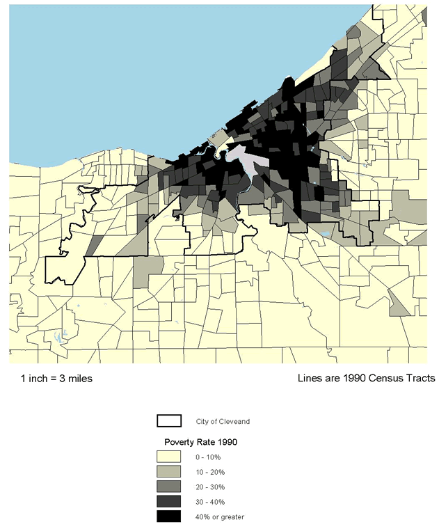
Figure 8.2
Cuyahoga County, OH. Predominant Race 1990
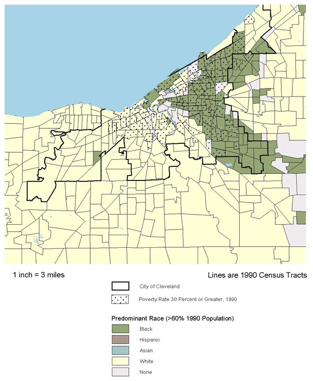
Figure 8.3
Denver County, CO. Poverty Rate 1990
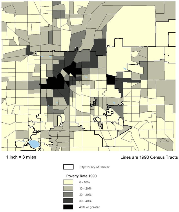
Figure 8.4
Denver County, CO. Predominant Race 1990
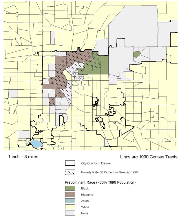
Figure 8.5
Marion County (Indianapolis), IN. Poverty Rate 1990
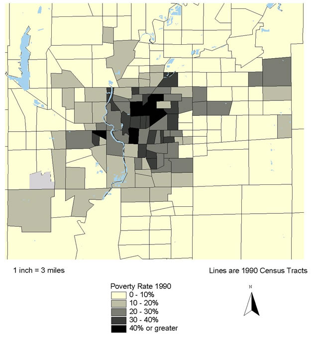
Figure 8.6
Marion County (Indianapolis), IN. Predominant Race 1990
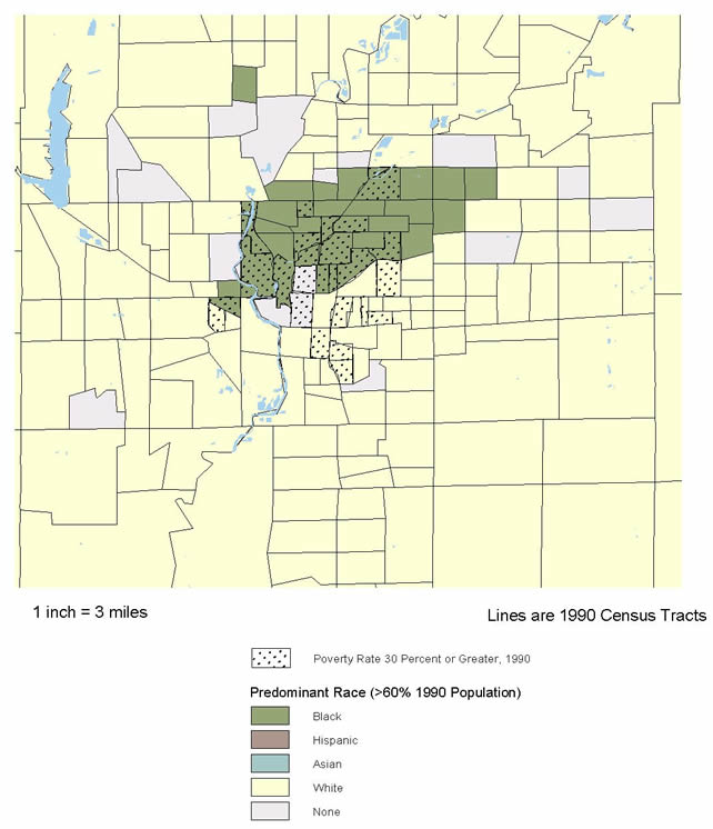
Figure 8.7
Alameda County, CA. Poverty Rate 1990
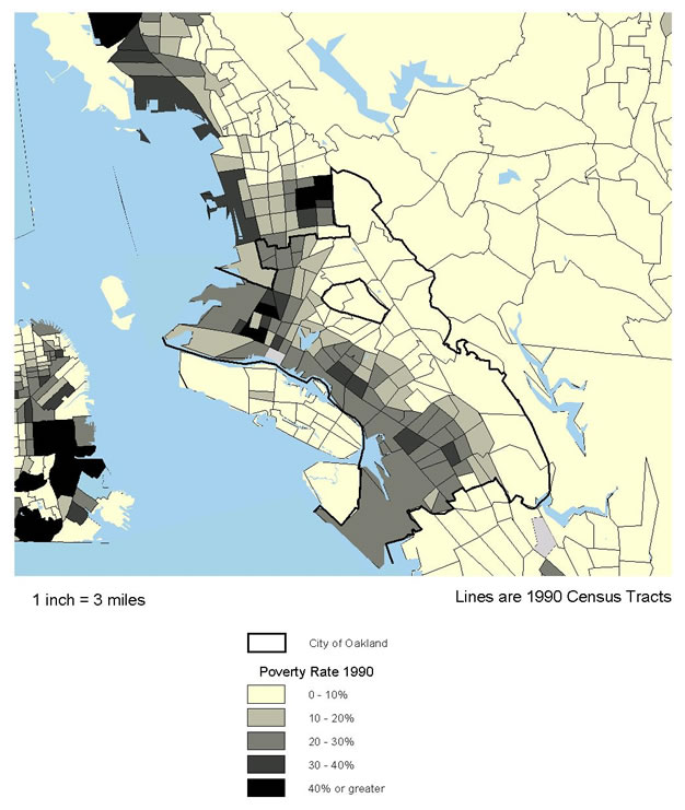
Figure 8.8
Alameda County, CA. Predominant Race 1990
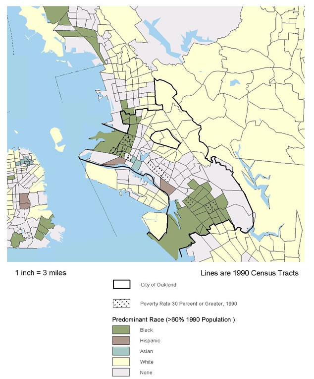
Figure 8.9
Providence County, RI. Poverty Rate 1990
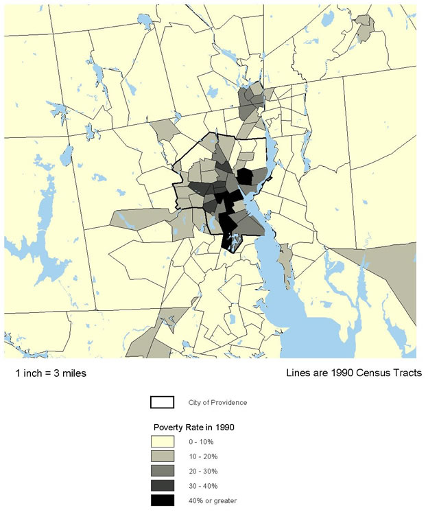
Figure 8.10
Providence County, RI. Predominant Race 1990
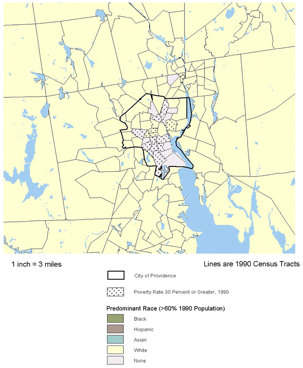
The second map in each set shows the predominant racial/ethnic group in each tract in 1990 overlaid against a dot pattern showing the location of high-poverty tracts (the predominant group accounts for 60 percent or more of the population of the tract).
- In Cleveland, there is a significant, but not complete, overlap of predominantly African-American population and high poverty to the east and southeast of the city center. High-poverty areas farther west are predominantly white.
- Denver has a more complex pattern. Predominantly Hispanic tracts are almost all in the high-poverty category, forming something like a semicircle to the northwest of the city center. There is a cluster of predominantly black neighborhoods just below the northern border to the east of the center, about half of which are high-poverty. There are also a large number of racially mixed tracts (no group with 60 percent or more) generally adjacent to the areas of Hispanic and black concentration.
- The pattern in Indianapolis is simpler: a large concentration of predominantly African-American neighborhoods to the north of the center (about half of which are high-poverty), just a few racially mixed neighborhoods (spatially scattered), and all the rest predominantly white (eight tracts are also high-poverty).
- Oakland's pattern reflects what we have already said about its racial/ethnic diversity: by far the largest number of racially mixed tracts, with two major concentrations that are predominantly black (one in northwest Oakland and one about five miles southeast of the city center). Almost all of the tracts directly east of Oakland and Berkeley are predominantly white, sitting on the other side of the hills inland from those two cities.
- The Providence area has no tracts with a predominant race other than white, but it has several racially mixed tracts, significantly overlapping the high-poverty clusters north and especially south of the city center. (A number of the racially mixed tracts to the south of the city center shown on this map had become predominantly Hispanic by 2000.)
NEIGHBORHOOD CONDITIONS AND TRENDS
The remainder of this section presents data on the changing characteristics of different types of neighborhoods in the central city or county in each metropolitan area. As noted in section 2, these central areas are defined as Cuyahoga County in metropolitan Cleveland, and the cities of Denver (same as Denver County), Indianapolis (same as Marion County), Oakland, and Providence.
For each site, we contrast conditions in high-poverty neighborhoods (those with 1990 poverty rates of 30 percent or more) with those in all other neighborhoods. This approach avoids a serious interpretation issue that often arises when citywide averages are compared. The conditions in City A may look worse than in City B only because the former has a higher proportion of high-poverty neighborhoods, while in fact conditions in the high-poverty neighborhoods themselves are better in A than B. We are most interested in finding out whether, and to what extent, conditions in high-poverty neighborhoods have improved.
It is important to note that we purposefully chose to focus on neighborhoods (tracts) that were in the high-poverty category in 1990 rather than the largely overlapping group that were in that category as of 2000. If we had chosen the latter we would have missed changes for a large number of tracts whose poverty rates dropped below the 30 percent threshold in the 1990s, a story that is critical to understanding the dynamics of change in that decade. We recognize that this choice omits tracts whose fortunes went in the other direction (i.e., whose poverty rates increased to a point above 30 percent). There is a considerably smaller number in that category, however. Their story is also worth telling, but we judge that doing so here would have added complexity and the benefits would not have been worth the cost.
Table 8.3 shows that there are indeed variations in the shares of population that live in high-poverty neighborhoods in these sites; a range in 2000 from only 7 percent in Indianapolis up to 34 percent in Providence, with the other three sites in the 15 to 18 percent range. Note that these shares had not changed much at this city/county level, in contrast to more notable declines in high-poverty shares at the metropolitan level.
Population Growth and Composition
Table 8.3 also makes it clear that minorities are concentrated in high-poverty neighborhoods in these sites. Across the five in 2000, on average, minorities account for 77 percent of the population in high-poverty tracts vs. 42 percent in other tracts. As was the case at the metropolitan level, blacks are the dominant minority in Cleveland and Indianapolis, Hispanics are more important in Denver and Providence, and Oakland stands out as the most mixed racially. Minorities accounted for 94 percent of Oakland's high-poverty area population, compared with a low of 66 percent in Indianapolis.
Perhaps the most dramatic change during the 1990s, however, was the growth of Hispanics and other nonblack minorities. Except for Cleveland and the nonpoor sections of Indianapolis and Providence, black shares of total population actually declined. The share in the Hispanic and other category, in contrast, increased everywhere (poor and nonpoor neighborhoods in all cities), but particularly in Providence, Oakland, and Denver. In high-poverty neighborhoods, this Hispanic and other share went up from 38 to 54 percent in Providence, from 39 to 52 percent in Oakland, and from 50 to 56 percent in Denver.
| Cleveland (Cuyahoga Co.) |
Denver (City/Co.) |
Indianapolis (Marion Co.) |
Oakland (City) |
Providence (City) |
||
|---|---|---|---|---|---|---|
| % city/co. pop. in '90 | 1990 | 17 | 18 | 9 | 14 | 34 |
| High-poverty tracts | 2000 | 16 | 18 | 7 | 15 | 34 |
| % population black | ||||||
| High-poverty tracts | 1990 | 67 | 21 | 61 | 55 | 19 |
| 2000 | 70 | 15 | 60 | 42 | 17 | |
| Other tracts | 1990 | 16 | 11 | 17 | 41 | 9 |
| 2000 | 20 | 11 | 22 | 36 | 13 | |
| % population Hispanic and other minority | ||||||
| High-poverty tracts | 1990 | 7 | 50 | 2 | 39 | 38 |
| 2000 | 10 | 56 | 6 | 52 | 54 | |
| Other tracts | 1990 | 3 | 21 | 2 | 26 | 14 |
| 2000 | 4 | 31 | 6 | 37 | 31 | |
| % population foreign born | ||||||
| High-poverty tracts | 1990 | 3 | 13 | 1 | 27 | 27 |
| 2000 | 3 | 27 | 4 | 35 | 32 | |
| Other tracts | 1990 | 6 | 6 | 2 | 19 | 16 |
| 2000 | 7 | 15 | 5 | 25 | 22 | |
| % population change | ||||||
| High-poverty tracts | 1980-90 | (14) | (15) | (14) | 15 | 3 |
| 1990-00 | (9) | 20 | (10) | 11 | 7 | |
| Other tracts | 1980-90 | (4) | (2) | 6 | 8 | 5 |
| 1990-00 | 0 | 19 | 10 | 7 | 8 | |
| Source: Urban Institute analysis of U.S. census data 1980-2000. | ||||||
Only Denver, Oakland, and Providence have sizeable shares of foreign-born population. The foreign born are concentrated in high-poverty areas in these three cities, although their shares increased markedly in both high- and low-poverty areas in the 1990s.
As to overall population dynamics, high-poverty areas in Cleveland (Cuyahoga) underwent a 9 percent population loss in the 1990s, compared with no change in other parts of the county, and high-poverty neighborhoods in Indianapolis lost 10 percent, compared with a gain of 10 percent in the rest of the city. In contrast, high-poverty neighborhoods in the other three cities gained population (ranging from 7 percent in Providence to 20 percent in Denver) and did so at rates generally comparable to those for the rest of their cities.
Economic and Social Conditions
Table 8.4 identifies six indicators of economic and social well-being. The data for 2000 show that, as expected, conditions remained significantly more problematic in high-poverty areas than other neighborhoods with respect to every indicator in every one of our five sites. However, the data also show that in the 1990s, conditions in high-poverty areas had improved in 28 of 30 possible cases (six indicators times five sites), and the problem gap between high-poverty and other neighborhoods had diminished in 27 of the 30.
Among the sites, the high-poverty neighborhoods in Cleveland evidenced either the worst or next to the worst scores on five of the six measures, and Oakland was worst or next to the worst on four. Denver's high-poverty areas registered the least problematic conditions on five of the six measures.
- Poverty rates in high-poverty tracts declined on average from 39 percent to 34 percent over the decade (year 2000 range from 37 percent in Cleveland and Providence to 29 percent in Denver). The average poverty rate in high-poverty tracts for the five cities dropped from 3.4 to 2.7 times that for other tracts.
- Unemployment rates in high-poverty tracts dropped from 15 percent to 13 percent on average (year 2000 range from 16 percent in Cleveland and Oakland to 10 percent in Denver). The high-poverty average dropped from 2.4 to 2.2 times that for other areas.
- Employment rates (employed as percentage of population age 16 and over) in high-poverty tracts increased on average from 44 percent to 48 percent over the decade (year 2000 range from 43 percent in Indianapolis to 57 percent in Denver). The high-poverty average increased from 0.74 to 0.78 times that for other tracts.
- Adults without high school diplomas in high-poverty tracts dropped from 47 percent to 41 percent on average (year 2000 range from 45 percent in Oakland to 36 percent in Indianapolis). The high-poverty average dropped from 2.10 to 2.06 times that for other areas.
| Cleveland (CuyahogaCo.) |
Denver (City/Co.) |
Indianapolis (Marion Co.) |
Oakland (City) |
Providence (City) |
||
|---|---|---|---|---|---|---|
| Poverty rate | ||||||
| High-poverty tracts | 1990 | 44 | 40 | 38 | 38 | 37 |
| 2000 | 37 | 29 | 31 | 34 | 37 | |
| Other tracts | 1990 | 8 | 12 | 10 | 16 | 17 |
| 2000 | 9 | 11 | 10 | 17 | 25 | |
| Unemployment rate | ||||||
| High-poverty tracts | 1990 | 21 | 13 | 14 | 17 | 11 |
| 2000 | 16 | 10 | 11 | 16 | 11 | |
| Other tracts | 1990 | 6 | 6 | 5 | 9 | 8 |
| 2000 | 5 | 5 | 5 | 7 | 9 | |
| Employed as % of population age 16 and over | ||||||
| High-poverty tracts | 1990 | 39 | 52 | 50 | 42 | 39 |
| 2000 | 44 | 57 | 49 | 43 | 46 | |
| Other tracts | 1990 | 60 | 65 | 67 | 59 | 50 |
| 2000 | 61 | 65 | 67 | 58 | 56 | |
| % population age 25 and over, no high school degree | ||||||
| High-poverty tracts | 1990 | 51 | 42 | 46 | 46 | 49 |
| 2000 | 38 | 40 | 36 | 45 | 44 | |
| Other tracts | 1990 | 22 | 17 | 21 | 23 | 32 |
| 2000 | 15 | 18 | 17 | 23 | 30 | |
| % families with children, female headed | ||||||
| Hi-pov.tracts | 1990 | 63 | 52 | 59 | 56 | 50 |
| 2000 | 62 | 40 | 58 | 43 | 49 | |
| Other tracts | 1990 | 23 | 28 | 27 | 39 | 34 |
| 2000 | 27 | 27 | 30 | 36 | 41 | |
| % households receiving public assistance | ||||||
| Hi-pov.tracts | 1990 | 35 | 19 | 18 | 38 | 26 |
| 2000 | 17 | 6 | 8 | 18 | 15 | |
| Other tracts | 1990 | 6 | 5 | 5 | 15 | 12 |
| 2000 | 3 | 3 | 3 | 7 | 8 | |
| Source: Urban Institute analysis of U.S. census data 1990-2000 | ||||||
- Female-headed shares of all families with children in high-poverty tracts dropped from 56 percent to 50 percent on average (year 2000 range from 62 percent in Cleveland to 40 percent in Denver). The high-poverty average dropped from 1.9 to 1.6 times that for other areas.
- Shares of households receiving public assistance in high-poverty tracts declined on average from 27 to 13 percent over the decade (year 2000 range from 18 percent in Oakland to 6 percent in Denver). The high-poverty average dropped from 3.6 to 3.0 times that for other tracts.
Two indicators related to public assistance have been used in the cross-site analysis. The first one (referred to in the above paragraph and in table 8.4) is a census measure that reflects the percentage of households who said they received public assistance in April 2000. This is a fairly comprehensive measure defined to include income from AFDC/TANF, Supplemental Security Income (SSI), and General Assistance. It is a self-reported measure, however, and researchers have found that it often understates participation rates determined from administrative records. The second measure, AFDC/TANF recipiency, is obtained from administrative records and is an indicator of share of all population or households of an area participating in this specific program at a point-in-time.(28)
NNIP partners generally have some information from administrative records on AFDC/TANF recipiency, but Cleveland is the only one of the five sites that has a consistently defined time series going back to the early 1990s (figure 8.11). The pattern in the Cleveland data tells the same basic story as the census public assistance measure. Recipiency rates decline dramatically over the decade, and they do so more rapidly in high-poverty neighborhoods than elsewhere. For high-poverty areas, for example, Cleveland's administrative data (percent of population receiving AFDC/TANF) show a rate of 31 percent in 1992, going down to 14 percent in 2000, whereas the census measure (percentage of households receiving public assistance) was 35 percent in 1990, going down to 17 percent in 2000. The AFDC/TANF measures show the path of change annually over the decade. Clearly, the decline in Cleveland started long before the passage of the welfare reform law in 1996, and may reflect earlier welfare reform efforts taking place in the state. The census measure for Cleveland showed the 2000 public assistance recipiency rate in high-poverty neighborhoods on average to be 5.7 times that of other neighborhoods, whereas the AFDC/TANF rate in high-poverty neighborhoods was 7.0 times that for other areas in that year.
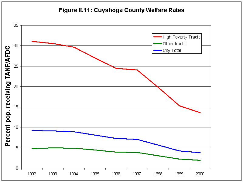
Some consistently defined data for TANF recipiency based on population are available for two other sites near the end of the decade. The 1998-2000 TANF recipiency rates for Indianapolis were 8 percent on average for the high-poverty neighborhoods (exactly the same as the for census rate in 2000) and a 2 percent average for other neighborhoods (compared with 3 percent according to the census). The Denver TANF data do not match the census figures quite as well. They show a 2 percent recipiency rate for high-poverty neighborhoods in 1999 (compared with 6 percent by the census measure in 2000), and 1 percent for other neighborhoods (compared with 3 percent by the 2000 census measure).
For Providence, the welfare indicator available for this analysis was the percentage of households that received AFDC/TANF (not the percentage of population used in other sites), so it is not directly comparable with the other sites. In all three years available (1996, 1998, and 2000), the AFDC/TANF household rates for high-poverty areas are about 1.8 times the rates for nonpoor tracts. The high-poverty areas fell from 19 percent of households receiving AFDC/TANF in 1996 to 16 percent in 2000, with the nonpoor area rates dropping by the same amount (from 11 percent in 1996 to 9 percent in 2000). The census public assistance numbers are very similar (15 percent for high poverty areas and 8 percent for nonpoor areas).
Neighborhood Physical Conditions
Various types of environmental and other physical problems in a neighborhood can contribute directly to health problems. We do not have data on environmental hazards, but we do have some indirect indicators of neighborhood physical conditions that may be of influence (table 8.5).
| Cleveland (Cuyahoga Co.) |
Denver (City/Co.) |
Indianapolis (Marion Co.) |
Oakland (City) |
Providence (City) |
||
|---|---|---|---|---|---|---|
| % households overcrowded | ||||||
| High-poverty tracts | 1990 | 4 | 10 | 5 | 23 | 11 |
| 2000 | 4 | 15 | 5 | 31 | 13 | |
| Other tracts | 1990 | 1 | 3 | 2 | 10 | 4 |
| 2000 | 1 | 6 | 3 | 14 | 7 | |
| % housing units built before 1960 | ||||||
| High-poverty tracts | 1990 | 80 | 73 | 80 | 69 | 70 |
| Other tracts | 1990 | 63 | 53 | 42 | 70 | 76 |
| High-poverty tracts | 1990 | 40 | 77 | 42 | 141 | 196 |
| 2000 | 65 | 145 | 68 | 157 | 179 | |
| Other tracts | 1990 | 120 | 127 | 97 | 282 | 189 |
| 2000 | 146 | 212 | 122 | 311 | 152 | |
| High-poverty tracts | 1995/96 | 53 | 90 | 60 | 101 | 90 |
| 2000/01 | 70 | 149 | 73 | 157 | 106 | |
| Other tracts | 1995/96 | 108 | 121 | 100 | 183 | 102 |
| 2000/01 | 118 | 165 | 106 | 227 | 114 | |
| Source: Urban Institute analysis of U.S. census data 1990-2000. Mortgage data are calculated from the 1995-2001 Home Mortgage Disclosure Act files. | ||||||
The first indicator is the percentage of all occupied housing units that are overcrowded (with more than one person per room). Overcrowding rates are very low in America, a fact that is reflected in the data on table 8.5, but in all cases, overcrowding is substantially more prevalent in high-poverty areas than in other types of neighborhoods. The rates have also been increasing recently, particularly in regions with rapidly growing Hispanic populations. Indeed, the table shows that the three sites where that is occurring (Denver, Oakland, and Providence) have overcrowding rates that are both higher and increasing more rapidly than the other two sites. Overcrowding even in high-poverty tracts in Cleveland and Indianapolis is quite low (4 to 5 percent) and did not increase over the 1990s.
The remaining indicators on table 8.5 refer to the physical quality of housing. The first of these is the age of housing: specifically, the share of an area's housing units in 1990 that had been built 30 years or more before. A higher share of housing in high-poverty areas is in this category than is found in higher-income areas in all sites except Providence.
The other two indicators, average value of owner-occupied homes (as reported on the census) and average value of home mortgages originated, are more current. The first measure represents the self-reported value of all single-family owner-occupied homes, while the second measures the mortgage loan amount borrowed for home purchases. However, the two corroborate each other on some interesting circumstances and trends. First, in both cases, the values almost everywhere are lower in high-poverty areas (on average in 2000/2001, high-poverty area home values were 67 percent of those in other neighborhoods, and mortgage values were 76 percent of those in other neighborhoods).(29)
Second, however, both measures had increased more rapidly in the high-poverty neighborhoods than they had elsewhere in all of these cities (except Providence) in the 1990s. In these four cities on average, home values increased by 56 percent over the decade in the high-poverty areas compared with 31 percent in other areas.
These data all reinforce our notion of the differences between the two older sites in the Midwest (Cleveland and Indianapolis--2000 average home values of $70,000 to $73,000 in high-poverty areas) and the other three that have been experiencing more growth in general and more immigration in particular. The high-poverty neighborhood averages were $157,000 in Oakland, $149,000 in Denver, and $106,000 in Providence.
Providence is an outlier by these measures. In that site only, home values in the 1990s were higher in high-poverty neighborhoods than in the rest of the city, and values declined over the decade in all areas.(30)
Neighborhood Conditions - Social Stressors
As noted in section 7, the main indicators in this area relate to crime in the neighborhood, particularly violent crime. Figure 8.12 shows rates of reported violent crime for all five cities in the 1990s, and figure 8.13 does the same for reported property crime (in each, the top panels show the average rates for high-poverty tracts and the lower panels show them for other tracts). The series cover the entire decade in Cleveland and Denver, but consistently defined data are available only for eight years (1992-2000) in Indianapolis and four years (1996-2000) in Oakland. Only one year of data was available for Providence census tracts, so it is not included in the figures.
The levels are very different from each other. The annual averages across years for violent crime in high-poverty neighborhoods range from 8 per thousand population (Providence) to 34 per thousand (Indianapolis). In lower poverty neighborhoods, the averages range from 2 percent (Cleveland) to 16 percent (Oakland). For property crimes in high-poverty neighborhoods, annual averages across years range from 39 per thousand population (Oakland) to 101 per thousand (Indianapolis). In low-poverty neighborhoods, the averages range from 14 percent (Cleveland) to 66 percent (Oakland).
The graphs evidence one surprising result. In Oakland, for both violent and property crimes, the rates in low-poverty neighborhoods are consistently well above those in high-poverty neighborhoods. We questioned this outcome, but after checking, we found no reason to doubt the data, although we have found no explanation for it so far.
For the other four cities, however, the results are as expected. Crime rates are always higher in high-poverty neighborhoods on average than in the other parts of these cities. For violent crime, the gap is greatest in Cleveland, where the high-poverty average is 8.9 times that for other areas, and smallest in Providence (1.2). For property crimes, the same cities mark the extremes. The high-poverty average in Cleveland is 4.9 times that for other areas, while in Providence it is again 1.2 times higher.
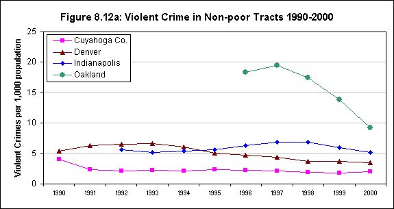
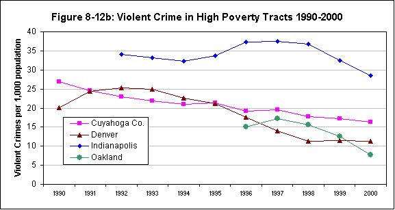
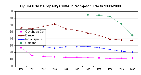
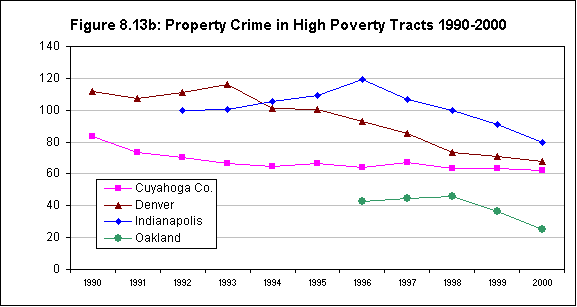
One other finding is consistent across all four cities with trend data, for both types of areas within cities and for both types of crimes: Reported crime rates declined significantly in the 1990s. There were notable variations in the speed of the decline, however. The most rapid declines were in Oakland, with violent crime dropping at 14 to 16 percent per year and property crime at 12 percent per year in both types of areas (over the four-year period for which data are available). The slowest declines were in Indianapolis, with violent crime declining annually by 2 percent and property crime by 3 to 4 percent (eight years of data, again with little difference between high- and low-poverty areas).
Denver is the only city for which annual rates of decline were consistently higher in high-poverty areas than in the rest of the city: 5.8 vs. 2.2 percent for violent crime, and 10.2 vs. 4.1 percent for property crime (data span a 10-year period).
Neighborhood Stability and Social Networks
All of the measures on table 8.6 are crude proxies for the characteristics Ellen et al (2002) were interested in for this category, but they do offer additional insight into differences within and between cities. Overall, they suggest that high-poverty neighborhoods are notably less stable than other areas in these cities and that the degree to which this is so did not change much over the 1990s.
- The share of households that had moved at least once in the five years before the 2000 census was higher in high-poverty neighborhoods than in the rest of the city in all sites; average 56 percent vs. 49 percent (same numbers as in 1990). Rates in the rapidly growing cities were higher than in the others: 63 percent in Denver's high-poverty neighborhoods vs. 46 percent in Cleveland's.
- An area made up of homeowners is generally considered to be more stable than one dominated by renters. On average across sites in 2000, renters accounted for 70 percent of all households in high-poverty neighborhoods vs. 45 percent elsewhere. Variation across sites was not marked, nor was change in these relationships over the decade.
- Low rental vacancy rates indicate tight housing markets and, normally, problems with housing affordability for low-income groups. Here, there are more differences across places and time. In the two older Midwest cities (Cleveland and Indianapolis), vacant rentals are much more prevalent in high-poverty areas, and this relationship remained much the same from 1990 to 2000. In the other cities, rental markets in high-poverty neighborhoods got much tighter in the 1990s, and their vacancy rates at the end of the decade were close to those in other parts of the city.
The final measure on the table is the number of home purchase mortgages in each area per 1,000 units. Again, Cleveland and Indianapolis (and in this case, Providence) evidence a pattern typical of older cities: much lower rates in high-poverty areas than in the rest of the city, where markets are more active. However, in both types of areas in all cities, this measure was going up significantly in the 1990s. On average, comparing the 1995/96 rate with the one for 2000/01, it increased from 14 to 27 in high-poverty areas and from 29 to 39 elsewhere.
| Cleveland (Cuyahoga Co.) |
Denver (City/Co.) |
Indianapolis (Marion Co.) |
Oakland (City) |
Providence (City) |
||
|---|---|---|---|---|---|---|
| % households in different house, 5 years ago | ||||||
| High-poverty tracts | 1990 | 43 | 60 | 54 | 57 | 63 |
| 2000 | 46 | 63 | 58 | 52 | 61 | |
| Other tracts | 1990 | 38 | 53 | 52 | 51 | 51 |
| 2000 | 39 | 56 | 52 | 48 | 52 | |
| % households renters | ||||||
| High-poverty tracts | 1990 | 65 | 71 | 64 | 77 | 77 |
| 2000 | 64 | 68 | 64 | 77 | 78 | |
| Other tracts | 1990 | 33 | 47 | 41 | 56 | 59 |
| 2000 | 32 | 44 | 39 | 56 | 56 | |
| Rental vacancy rate | ||||||
| High-poverty tracts | 1990 | 13 | 16 | 12 | 7 | 12 |
| 2000 | 13 | 4 | 15 | 5 | 7 | |
| Other tracts | 1990 | 8 | 13 | 10 | 6 | 10 |
| 2000 | 8 | 5 | 11 | 3 | 6 | |
| Home purchase mortgages per 1,000 1990 housing units | ||||||
| High-poverty tracts | 1995/96 | 12 | 24 | 11 | 9 | 12 |
| 2000/01 | 17 | 43 | 21 | 32 | 20 | |
| Other tracts | 1995/96 | 32 | 34 | 38 | 20 | 21 |
| 2000/01 | 37 | 43 | 47 | 36 | 34 | |
| Source: Urban Institute analysis of U.S. census data 1990-2000. Mortgage data are calculated from the 1995-2001 Home Mortgage Disclosure Act files. | ||||||
SUMMARY
Whereas trends for America's cities in the 1980s seemed almost uniformly distressing, the 1990s tell a very different story. City populations generally increased more (or declined less) than they did in the 1980s, and the changes were not all confined to the better parts of town. Population declines were stemmed in a number of high-poverty areas, and growth returned to some (Kingsley and Pettit 2002).
It appears that there was a notable overall deconcentration of poverty in most, although not all, urban regions. In the 100 largest metropolitan areas, the share of the poor living in high-poverty areas declined markedly. Also, a number of other studies have shown that key social indicators (e.g., crime rates) improved substantially in many cities during the latter part of the decade, and we find similar trends in other census indicators in this analysis.
Overall, however, it seems likely that the 1990s will be known more for diversity of outcomes than uniform improvement, with many cities and neighborhoods within cities still declining as others have begun to turn around. It is clear that racial and ethnic diversity have increased substantially in urban America, and these changes will also surely have had effects on determinants of health at the neighborhood level.
In addition, it is important to remember that the reference data of the recent decennial census (April 2000) was near the peak of the economic boom that began in the mid-1990s. Circumstances may well have deteriorated since then. Nonetheless, even given that prospect, the review in this section represents a marked contrast to the almost universally bleak assessments that emanated from reviews of trends in American cities a decade ago.
Section 9 - Neighborhood Health Trends
NEIGHBORHOOD HEALTH TRENDS
INTRODUCTION
The previous section reviewed the characteristics of the regions surrounding our five study sites, as well as key demographic, social, and economic conditions and trends of the sites themselves. In this section, we independently examine trends in the health related variables that are available for this analysis: the birth and mortality indicators derived from vital records files maintained by the NNIP partners in the sites. Specifically, we examine trends for five indicators: teen birth rates, rates of early prenatal care, rates of low-birth weight births, infant mortality rates, and age-adjusted mortality rates. As in the previous section, we also contrast conditions and trends in high-poverty tracts (poverty rates of 30 percent or more in 1990) with those in nonpoor tracts in each site.
As noted in section 7, prior studies have shown that health-related problems measured by these rates are generally more severe in high-poverty neighborhoods than in nonpoor areas, but these studies have typically covered only one city and dealt with different time periods. Our data allow us to go farther and examine variations in the extent of these gaps and how they have shifted over the same time period in several different cities. Also, data have already been published to show that conditions as measured by these indicators improved in many American cities in the 1990s. This analysis is the first, however, to quantify and compare the extent of the improvements between poor and nonpoor neighborhoods within cities and between cities.
TRENDS FOR KEY INDICATORS
For this analysis, to address the rare events issue noted earlier, we averaged three years of data from 1990 to 2000 to smooth out the annual variations that could occur due to small numbers of events. For simplicity's sake, the text will refer to rates by the start and end points of the data. For example, the 1990/1992 rate discussed below refers to the rate obtained by averaging 1990, 1991, and 1992 data. For three of the cities, the data were available for the full time period from 1990 to 2000. As stated in section 7, there were two exceptions. First, Providence had no mortality data and birth data only from 1995 to 2000. Second, at the time of this analysis, Oakland only had mortality up until 1999.
Births and birth rates
For each of the cities, the high-poverty areas account for very different shares of all births in 1998/2000--from a low of 9 percent in Indianapolis to 37 percent in Providence. With the exception of Providence, birth rates in the non-poor areas of our cities declined in the 1990s. The birth rates in high poverty neighborhoods also fell, but at 2 to 4 times faster than the non-poor rates.
To provide context for our analysis of trends for the five indicators, particularly those related to maternal and infant outcomes, it should be helpful to review the characteristics of the births in each city overall. As discussed in the previous section, these study areas vary greatly in population size, and this pattern carries over in the number of births (table 9.1). However, the changes in births from 1990 to 2000 did not always track with the trends in population. In the high-poverty tracts in Cleveland and Indianapolis, the number of births dropped three times faster than the general population. The percentage rise in births in high-poverty areas in Denver and Providence generally tracks the increasing total population. Oakland has the most unusual pattern--moderate growth in population with large decreases in the number of births.
| Cleveland (CuyahogaCo.) |
Denver (City/Co.) |
Indianapolis (Marion Co.) |
Oakland (City) |
Providence* (City) |
||
|---|---|---|---|---|---|---|
| Number of births 2000 |
High-poverty tracts | 4,057 | 2,327 | 1,093 | 1,066 | 952 |
| Other tracts | 14,150 | 7,432 | 11,450 | 5,046 | 1,632 | |
| Pct. change in the number of births1990-2000 | High-poverty tracts | -30 | 16 | -28 | -33 | 11 |
| Other tracts | -12 | 17 | -3 | -19 | 6 | |
| Pct births in high poverty areas | ||||||
| 1990/1992 | 25 | 25 | 11 | 20 | 38 | |
| 1998/2000 | 20 | 25 | 9 | 17 | 37 | |
| Pct. births to Hispanic mothers | ||||||
| 1990/1992 | 3 | 35 | 1 | 22 | 37 | |
| 1998/2000 | 4 | 49 | 6 | 33 | 42 | |
| Pct. births to black mothers** | ||||||
| 1990/1992 | 36 | 15 | 27 | 46 | 18 | |
| 1998/2000 | 35 | 11 | 28 | 35 | 18 | |
| * Birth Data for Providence begins in 1995, so rates labeled 1990/92 are for 1995/1997. **In Cleveland and Indianapolis, "black" includes black mothers of Hispanic and non-Hispanic origin. |
||||||
The analysis to follow discusses the aggregate indicators for high-poverty tracts and the nonpoor tracts. In 1998/2000, for each of the cities, the high-poverty areas account for very different shares of all births--from a low of 9 percent in Indianapolis to 37 percent in Providence. As expected from the racial change described in section 8, the racial/ethnic composition of births altered markedly over the decade in most of the cities. The share of Hispanic births increased in all of the cities, though it still remained low in Cleveland and Indianapolis. In Denver and Oakland, there was a corresponding loss of share for births to black mothers.
For the four cities with data for the full decade, birth rates in high-poverty areas in all the cities were higher than in the nonpoor areas throughout the decade (figures 9.1a and 9.1b). Of the high-poverty areas, Denver ended the decade with the highest rate (23 births per 1,000 population), and Providence ended with the lowest (16 births per 1,000 population).
With the exception of Providence, birth rates (births per 1,000 population) in the nonpoor areas of our cities declined in the 1990s (see figure 9.1a). The birth rates in high-poverty neighborhoods also fell, and at rates two to four times faster than in the nonpoor areas. Even Providence, with birth rate increases in the nonpoor areas, experienced a slight drop in its high-poverty areas from 1995/1997 to 1998/2000. While the rates in high-poverty areas were consistently higher than in the nonpoor areas, the patterns of change generally resulted in much smaller differentials between the two types of areas by 1998/2000.
Teen birth rates
Teen birth rates fell in both the poor and nonpoor areas in four cities in the 1990s, with the most substantial decreases in both types of areas in Oakland. Even with the decreases, considerable disparities between poor and nonpoor neighborhoods remain in Cleveland, Denver, and Indianapolis.
As shown in figure 9.2a, only the nonpoor areas of Denver and Oakland had 1990/1992 teen birth rates far above the national average of six births per 100 girls aged 15 to 19. Starting from this high level, the rates in Oakland's nonpoor areas showed a strong decline, falling twice as fast as the national average (see annex table C.15 for details). The nonpoor areas in the other cities also saw declines, but at a much slower rate. By the end of the decade, only the teen birth rate for the nonpoor areas in Denver (7.5) remained well above the national average.
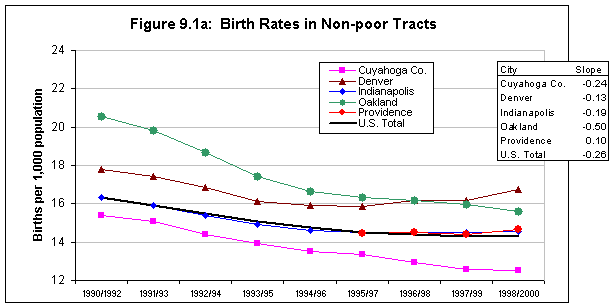
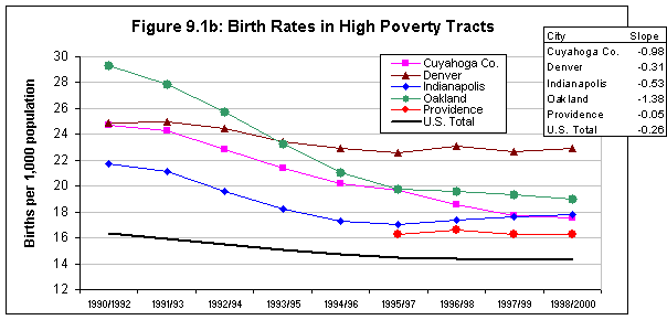
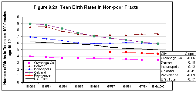
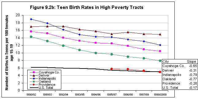
In 1990/1992, the teen birth rates in the high-poverty areas for four of our cities were two to three times the national average (figure 9.2b). In Oakland, the teen birth rate in the poor areas 1990/1992 was 14 percent, lowest of the rates in that year. It fell 6 percentage points over the decade, with the majority of the gains in the first half of the decade. Figure 9.3 shows the low rates at the end of the decade, with rates in poor areas very similar to rates in nonpoor areas.
The high-poverty areas in Indianapolis had the highest rate in 1990/1992 (19 percent), but they also showed the most improvement--dropping 7 points to end at the second highest rate. This progress cut the difference between poor and nonpoor areas in half--from 12 points at the beginning of the decade to 6 points at its end. In Cleveland's high-poverty tracts, the teen birth rate fell midway between the sites and had a sharp decline like that of Oakland and Indianapolis. However, Cleveland still had the widest disparity in rates, with the 1998/2000 rate in high-poverty neighborhoods (10 percent) triple the rate of the low-poverty ones. The reduction in teen birth rates was primarily due to reductions in births to black teens. The African-American teen birth rates dropped from 2 to 9 points in high-poverty areas, while Hispanic teen birth rates stayed the same in Cleveland, increased in Indianapolis, and fell only 1 to 3 points in the remaining three cities (see annex tables C.17 to C.18 for details).
High-poverty areas in Denver (with very high rates) and Providence (with very low rates) did not experience reductions as large as the cities discussed above. Denver had the highest overall teen birth rate for most of the 10 years, surpassing Indianapolis early in the decade. Figure 9.4 clearly shows the overlap of the extreme teen birth rates with high-poverty areas in the western half of the city. This is also the predominantly Hispanic area--in 1998/2000 almost one in five Hispanic teen girls in Denver became mothers. Providence also had a very small drop over the 1995/1997 to 1998/2000 time period. This trend is not as troubling as in Denver, since the rates in Providence are remarkably low for all races and the time period covered is shorter. The Providence teen birth rates in the high-poverty areas were at the U.S. average, and the difference between the poor and nonpoor areas was less than 1 percent.
Figure 9.3
Alameda County, CA. Teen Birth Rates 1998-2000
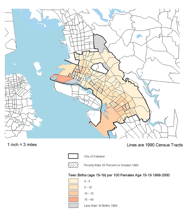
Figure 9.4
Denver County, CO. Teen Birth Rates 1998-2000
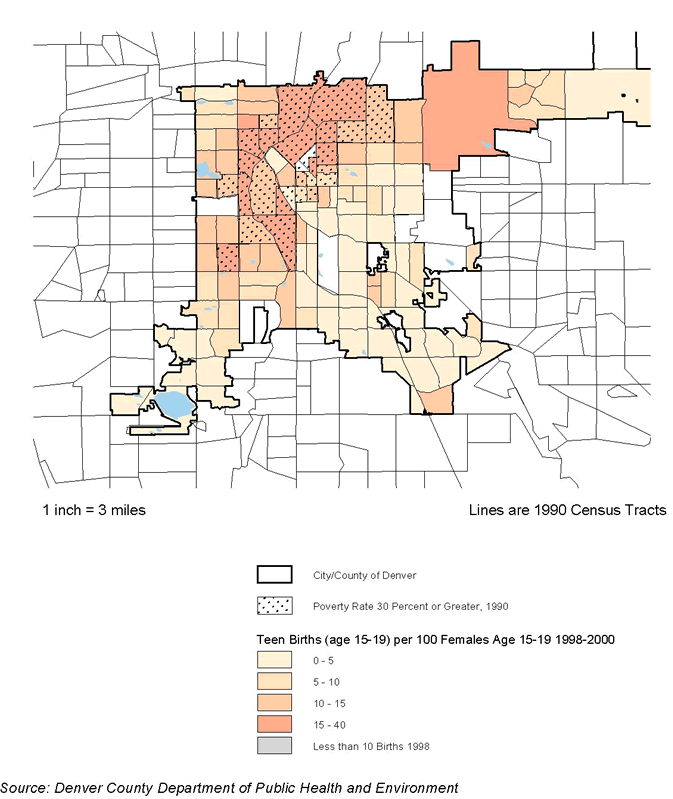
Early prenatal care
Except for Providence, poor and nonpoor areas in all cities showed improvements in prenatal care rates. Indianapolis and Oakland stand out, with impressive expansion of early prenatal care to high-poverty areas.
Nationally, great gains were made in providing prenatal care to mothers. In 2001, 83 percent of pregnant women received prenatal care in the first trimester of pregnancy, up 7 percentage points from 1990/1992. At the beginning of the decade in nonpoor areas, only the Cleveland figure was significantly above the U.S. rate of 76 percent (figure 9.5a). For high-poverty areas, the rates in Cleveland and Oakland approached the national rate in 1990/1992, with the other three cities much farther behind (figure 9.5b). From these starting points, the improvements seen in the U.S. average are not evident in all of our sites.
In three of our cities, the change in levels of prenatal care may well be linked to specific program initiatives occurring during the 1990s. Beginning in 1991, Oakland was a demonstration site for the Healthy Start initiative, a federal program aimed at reducing infant mortality rates and generally improving maternal and infant health in at-risk communities.(31) In the city's high-poverty tracts, the prenatal care rate improved remarkably over the 1990s, moving up more than 13 percentage points in high-poverty areas to end at 85 percent--the highest rate of all the cities. Figure 9.6 shows that the declines spread across the city. The gap in rates between poor and nonpoor neighborhoods was reduced to 3 percentage points by 2000. In addition to being spatially dispersed, the increases occurred for all races. The 9-point increase in the Hispanic early prenatal care rate is particularly impressive since those rates for Hispanics fell in the other four cities (annex table C.18).
Figure 9.5a:
Early Prenatal Care Rates in Non-poor Tracts
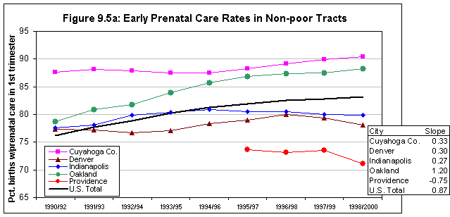
Figure 9.5b:
Early Prenatal Care Rates in High Poverty Tracts
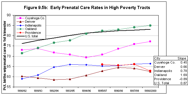
Figure 9.6
Alameda County, CA. Change in Early Prenatal Care Rates 1990-2000 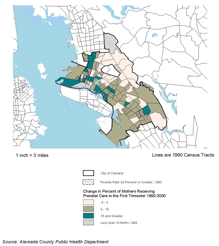
In Indianapolis, the Campaign for Healthy Babies was formed in 1989 as a public-private partnership to develop resources and strategies to reduce infant mortality. It stressed the need to increase the percentage of women receiving adequate prenatal care. The campaign organizers placed particular geographic focus on areas with the worst infant mortality rates. The official campaign ended in 1992, although the Marion Health and Hospital Association continued with a smaller scale effort. During the period of the campaign, early prenatal care rates improved for poor neighborhoods by 6 percentage points. The high-poverty area rates then leveled off for the remainder of the decade to end at 66 percent. This was still 13 points below the rates in nonpoor areas, though progress was made in closing the gap. Figure 9.7 displays the moderate and large declines in most of the high-poverty tracts, with more mixed results outside the core city.
Cleveland/Cuyahoga County began with the highest rate for nonpoor areas and continued to improve over decade, ending at 90 percent. From 1990/1992, the rate for high-poverty tracts went up 4 percentage points to reach 77 percent (the second highest level).(32) African-American rates showed the most progress, up 8 points in both high- and low-poverty areas. Black mothers still fare better in non-poor tracts, with an early prenatal care rate 6 points higher than in high-poverty tracts (annex table C.17). In conversations with local experts, we learned of two program initiatives that could be linked to the improvements. In one, Ohio made a strong effort in the late 1990s to increase access to Medicaid coverage, particularly for pregnant women and children. Second, Cleveland has been a Healthy Start site, and is cited as one of its "success stories." (33) Cleveland's comprehensive program targets neighborhoods with high rates of infant deaths, and has built-in mechanisms for community involvement in the programs.
In the remaining two cities, local sources cited the increasing Hispanic and immigrant populations as the most likely drivers of the change in prenatal care rates. In Denver's nonpoor areas, early prenatal care declines in the beginning of the decade were reversed to reach a high of 80 percent in 1996/1998. However, falling rates in 1997/1999 and 1998/2000 eroded the progress. The high-poverty areas followed a similar trend at a lower level, beginning at 60 percent in 1990/1992 and ending at 63 percent in 1998/2000. In addition to the racial and ethnic changes, our local sources mentioned two other trends as possible contributing factors to the decrease in early initiation of prenatal care. First, cutbacks in Medicaid reimbursement caused
Figure 9.7
Indianapolis, IN. Changes in Early Orenatal Care 1990-2000
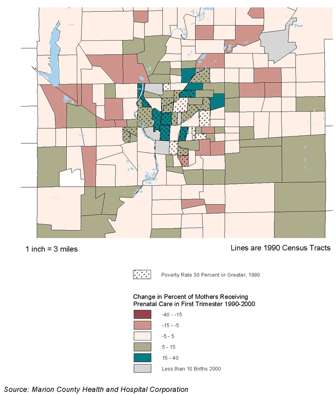
most private providers to either drop out of the Medicaid program or refuse to accept any additional Medicaid patients. The result was fewer health facilities for Medicaid patients and longer waiting lists at public clinics. Second, immigrant women may use more nontraditional health providers either from preference or because they fear that the use of public services or systems may result in exposure or deportation.
While we do not have data on early 1990s trends for Providence, toward the end of the decade it had the lowest rate of early prenatal care in nonpoor areas of all the cities, with only three-quarters of women receiving early care. The reasons for the relatively low level are not completely clear, but local sources speculated on two potential explanations. Like Denver, Providence had a growing immigrant population during the 1990s, who may be less likely to use the formal health care system for reasons described above. Local sources also spoke of the dismantling of the state-level public health system, resulting in an increased reliance on often-overburdened nonprofit providers.
Low-birth weight births
In three of the cities (Cleveland, Denver, and Oakland), rates in high-poverty neighborhoods fell over the decade, while the national trend of low birth weight rates was generally flat. The rates in both poor and nonpoor areas in Indianapolis and Providence, in contrast, are on the upswing.
Figure 9.8a shows that the earlier rates for low-birth weight births in nonpoor areas fell into two clusters: one at or below the national average of 7 percent of all births at a weight of less than 2,500 grams (Cleveland, Indianapolis, Providence) and another above 9 percent (Denver, Oakland). The nonpoor rates in Cleveland and Denver mirrored the national trend with slight increases, but Indianapolis and Providence rates (though only from 1995) rose significantly. Of the nonpoor areas, only Oakland saw decreases over the decade, moving into the cluster around the national average.
The earlier rates of low-birth weight births in high-poverty areas ranged from a low of 10.8 percent in Oakland to a high of 14.7 percent in Cleveland (see figure 9.8b). In three of the cities (Cleveland, Denver, and Oakland), the rates declined, contrary to the national trend. The rates went up in Indianapolis and Providence by 0.7 and 1.4 percentage points, respectively.(34)
Figure 9.8a.
Low Birth Weight Rates in Non-poor Tracts
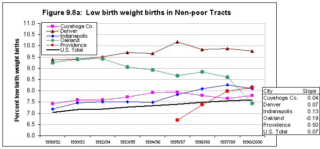
Figure 9.8b.
Low Birth Weight Rates in High Poverty Tracts
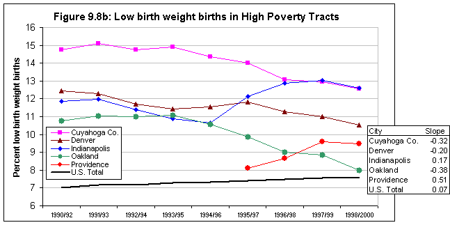
While the low birth weight rates are generally higher in high-poverty areas, the size of the disparity varied significantly by city. Cleveland had the largest disparity in 1990/1992 (7 points), but has cut the difference in half over the past 10 years. Figure 9.9 illustrates the additional understanding of conditions that maps can provide. The highest levels of low birth weight are not prevalent across all poverty areas, but are concentrated in the eastern side of the central city (the predominantly African-American section). Denver began the decade with less inequity than Cleveland, but it too has reduced the gaps by more than 50 percent.
Despite differing rates and trends, Oakland and Providence are similar in that they have very small gaps between high- and low-poverty areas by this measure--about 1 percentage point. Figure 9.10 demonstrates that the greater equity does not necessarily imply greater well-being for mothers in Providence. The low-birth weight rates of several, mostly nonpoor tracts are in the higher ranges in the late 1990's.
Over time and across sites, the African-American low-birth weight rates were generally twice the Hispanic rates. Like the prenatal care rates, the black low-birth weight rates were better in nonpoor than poor areas, but the neighborhood seems to make less of a difference in this indicator. For Hispanics, hardly any difference in rates exists between poor and nonpoor tracts (see annex tables C.17 and C.18).
Infant mortality rates
Infant mortality rates (deaths of infants age 0-12 months per 1,000 live births in that year(35)) dropped in both the poor and nonpoor tracts in four of the cities, generally at a faster pace than the nation (data were not available for Providence). However, the 1998/2000 rates in the high-poverty neighborhoods in Cleveland and Indianapolis were still double the national rate.
Because of the smaller number of events when examining infant deaths, the trends in infant mortality rates are more erratic than the birth and total mortality indicators. Nonetheless, the trends in all the low-poverty areas and in the high-poverty areas of three of the cities appear stable enough to warrant some conclusions.(36)
Figure 9.9.
Cuyahoga County, OH. Low Birthweight Rates 1998-2000
Figure 9.10.
Providence, RI. Low Birthweight Rates 1998-2000 
The infant mortality rate is defined here as the number of deaths of infants 0-12 months as a percentage of total live births in the same year. For the nonpoor areas in 1998/2000, raw rates ranged from a rate of 6.3 infant deaths per 1000 live births (Denver) to a rate of 9.1 (Indianapolis). The rates dropped 2 to 4 points over the decade, in line with the decrease in the national rate. By 1998/2000, only the rate for the Indianapolis nonpoor areas was substantially above the national rate of 7 infant deaths per 1,000 births.
In 1990/1992, the infant mortality rates in high-poverty areas were two to three times the national rate, but all cities made progress in the 1990s. Denver's high-poverty areas experienced the greatest improvements in infant mortality rates, down almost 4 infant deaths per 1000 births from 1990/1992 to 1998/2000. The 1998/2000 rate even approaches the national average. The high-poverty areas in Cleveland showed the highest rates through most of the decade, ending at 16 infant deaths per 1,000 births. The infant mortality rate in high-poverty tracts in Indianapolis was generally lower than in Cleveland, but still well above the national average of 7.5. Like Denver, both Indianapolis and Cleveland made advances in the 1990s, with respective rate declines of 3.8 and 5.4.
Age-adjusted mortality rates
The trends in age-adjusted mortality rates for nonpoor areas were inconsistent for the four sites, with two cities showing small declines and two showing virtually no change. With the exception of Indianapolis, the high-poverty areas saw some decrease in age-adjusted death rates.
By using age-adjusted death rates(37) instead of crude death rates, this analysis can compare rates across time and place while controlling for the age distribution of each area. In this way, a city's rate will not be higher just because more elderly people reside there.
In the nonpoor areas of our four analysis cities, the 1990/1992 age-adjusted death rates ranged from 810 deaths per 100,000 population in Indianapolis to a high of 960 in Oakland, with only Oakland above the national rate of 930 (figure 9.12a). While the national rates declined slightly from 1990/1992 to 1998/2000, the trends in the cities were less consistent. In general, they increased in the first half of the decade, decreased for the next couple of years, and then turned back upward. Oakland's nonpoor areas are the exception, with a steady decline for most of the decade. For all the nonpoor areas, the trends resulted in very little change in rates from start to finish.
Figure 9.11a:
Infant Mortality in Non-poor Tracts
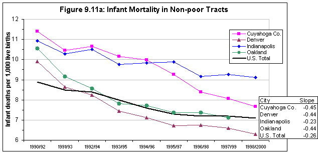
Figure 9.11b:
Infant Mortality in High Poverty Tracts
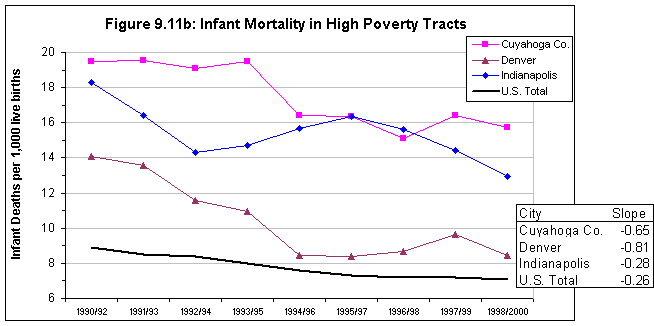
The rates in the high-poverty areas are all higher than the rates for nonpoor areas. The high-poverty rates were clustered together in 1990/1992--from 1,160 deaths per 100,000 in Oakland to 1,280 in Cleveland--but paths diverged over the 10 years. By the end of the decade, the high-poverty rates in Oakland and Denver slipped 137 and 151 deaths per 100,000, respectively. Oakland's rate ended the lowest at 1,000 deaths per 100,000 population. The high-poverty death rate in Indianapolis increased somewhat--up 71 from 1990/1992 to the highest rate of 1,280 per 100,000 population in 1998/2000. The Cleveland pattern is the least consistent--flat until 1993/1995, decreasing to 1996/1998, and then moving up again. The rate ends the decade near the starting point.
Cleveland and Indianapolis end the decade with gaps of 360 and 450, respectively, between the poor and nonpoor rates. These rates represent improvement for Cleveland and a setback for Indianapolis. Figure 9.13 shows the high-mortality-rate areas in Indianapolis clustered in and around the city's poorest areas. In addition to having lower rates for high-poverty areas than nonpoor ones, Oakland and Denver also have smaller differentials at the end of the decade in mortality rates between those two types of areas--100 and 270 deaths per 100,000, respectively.
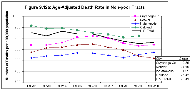
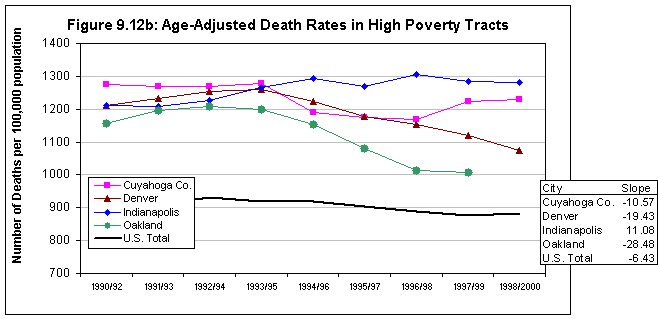
Figure 9.13.
Indianapolis, IN. Age Ajusted Death Rates 1998-2000
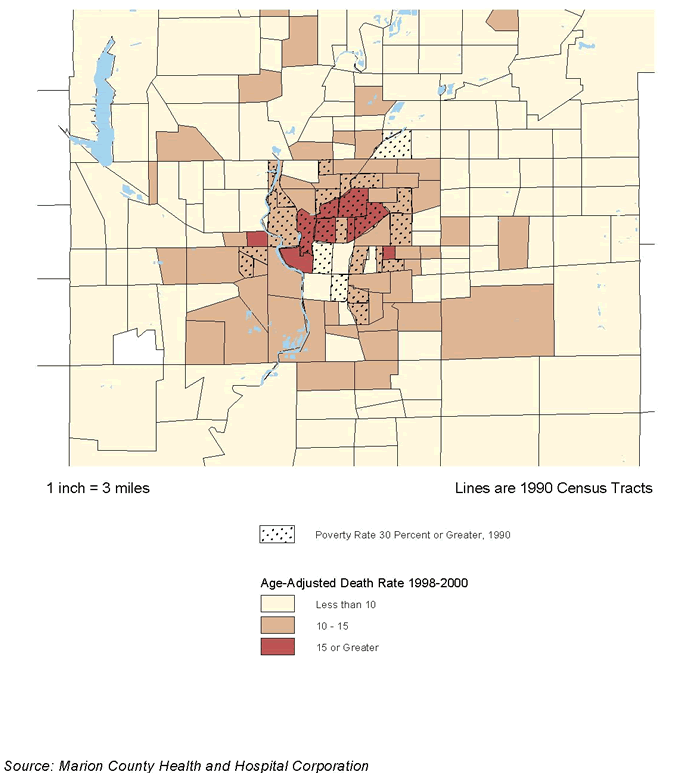
SUMMARY AND IMPLICATIONS
The trends we have reviewed in this section are complex. However, the most important findings can be summarized under three points as follows:
- Gaps between high-poverty neighborhoods and others by the indicators we reviewed were indeed substantial in the early 1990s, with health-related problems in high-poverty neighborhoods more severe for almost all indicators in all cities. However, the extent of the gaps varied. The differences in low-birth weight and mortality rates were much more pronounced in Cleveland and Indianapolis (where African-Americans are the dominant minority) than in the more racially diverse cities. However, for early prenatal care rates and teen birth rates, the disparities in Denver rose to the levels of Cleveland and Indianapolis.
- In almost all cities, the 1990s saw notable improvements in the maternal and infant health indicators we have examined, in both the high-poverty and the nonpoor neighborhoods, parallel to the findings about contextual conditions in section 8. In fact, the rates of improvement in the health-related indicators were generally faster in the high-poverty neighborhoods than in the other parts of these cities. Nonetheless, these differences were not enough to eliminate the gaps between these two types of areas by the end of the decade.
- Still, there were important variations in the rates of improvement. In some cases, it appears on the surface that the change was influenced largely by the city's racial composition. For example, the teen birth rate for African Americans dropped faster than for Hispanics, so high-poverty areas that were predominantly African America, such as those in Cleveland, experienced more rapid declines. In other cases, it is hard to explain the differences without taking programmatic efforts into account. For example, Oakland, which had a highly regarded Healthy Start initiative in the 1990s, experienced a rate of improvement in prenatal care in its high-poverty areas much above those in the other sites.
Our findings so far are suggestive. Section 8 showed that a broad range of neighborhood conditions, grouped in the explanatory categories of Ellen et al (2001), generally improved in the high poverty areas and the other parts of our study sites in the 1990s. This section showed similar trends and relationships for health related indicators. We have also identified some interesting variations from the general trends and have offered a few speculations about possible causes. None of this pins down relationships between the variables in a reliable way, however. To do that, we need to conduct rigorous bivariate and multivariate correlation analysis of these indicators in a more spatially disaggregated form. This is the task of the next section.
Section 10 - Ecological Correlations
ECOLOGICAL CORRELATIONS
INTRODUCTION
As noted, this section formally analyzes the relationships between the contextual indicators (selections from the neighborhood conditions introduced in section 8) and health-related indicators (reviewed in section 9). We first test the hypotheses set out in section 7 by examining the bivariate correlations of contextual characteristics with four of the health indicators from section 9: teen birth rates, early prenatal care rates, low birth weight birth rates, and age-adjusted death rates.(38) This analysis is based on three-year averages for these indicators as in the last section, but the indicators are calculated for individual census tracts as the geographic unit of analysis instead of the high-poverty/nonpoor groupings used previously. We review the results for all the cities together and for each city separately.
We next move to multivariate analysis with a select set of contextual variables to test the independent relationship between a selected set of contextual indicators and the four health indicators listed above. The multivariate analysis reveals three things: (1) the independent association between the dependent health variable and the tract condition; (2) how much of the variation of each health indicator is explained by the five racial and socioeconomic factors versus other conditions in the city and time period; and (3) whether some of the key shifts in health indicators are statistically significant or due to random fluctuation of small numbers of events.
BIVARIATE CORRELATION ANALYSIS
The bivariate correlation analysis is organized around the hypotheses that were introduced in section 7. Under each static hypothesis, we discuss the aggregate and site-specific results from the data. As noted, we use the three-year rolling average approach to calculate values for the health variables, but we calculated them for all individual census tracts in all study sites. Each overlapping three-year average health indicator rate for each census tract is an observation. This method yielded a total of over 8,400 observations across the five sites.(39)
For the contextual indicators derived from the census, we interpolated annual estimates for all tracts based on 1990 to 2000 trends. The census indicator for a given year was related to the value of the health indicators as of the mid-point of the three-year period employed for them. For example, each 1991/1993 health indicator value is paired with the 1992 estimated poverty rate, percentage female-headed households, etc. To test our dynamic hypotheses, we compare the correlation coefficients for two time periods: 1990 to 1995 and 1995 to 2000.
STATIC HYPOTHESES
Socioeconomic conditions
Hypothesis: Census tracts with a majority non-white population and higher levels of immigrants will have higher levels of mortality and poor maternal and infant health outcomes than majority white census tracts.
Our first hypothesis addresses race, ethnicity, and nativity. As shown in table 10.1, the aggregate results are all significant in the expected directions for the overall percentage minority and the African-American and Hispanic percentages of the population. However, when looking at the individual city correlations, the share of the population that is Hispanic significantly correlates for low-birth weight rates only in Cleveland. The remaining results are mostly consistent for all cities and indicators, with a few notable exceptions. (For the complete list of city-specific correlations, see annex table C.23.) In Providence, the relationships between low-birth weight rates and percentages minority and African-American are slightly positive but not significantly correlated. In Oakland, teen births and the percentage African-American were not significantly associated.
Relationships with the percentage foreign born are more complicated. Overall, high percentages of foreign-born population are associated with worse prenatal care and teen birth rate outcomes as expected, but with better low-birth-rates.(40) The correlation with age-adjusted death rates was not significant. On closer examination of the city-specific correlations,
| Pct. low birth weight |
Pct. prenatal care in first trimester |
Teen birth rate |
Age-adjusted death rate |
|
|---|---|---|---|---|
| Census tracts with a majority non-white population and higher levels of immigrants will have higher levels of mortality and poor maternal and infant health outcomes than majority white census tracts. | ||||
| Percent minority | 0.53 * | -0.56 * | 0.26 * | 0.36 * |
| Percent African-American | 0.54 * | -0.45 * | 0.19 * | 0.32 * |
| Pct. Hispanic | 0.05 * | -0.34 * | 0.18 * | 0.13 * |
| Percent foreign-born population | -0.09 * | -0.02 * | 0.08 * | 0.00 |
| Low-income census tracts as measured by poverty rate, median income,and public assistance and AFDC/TANF recipiency will be associated with poorer scores on the mortality and the maternal and infant health measures than higher income tracts. | ||||
| Poverty rate | 0.52 * | -0.66 * | 0.33 * | 0.59 * |
| Average family income | -0.37 * | 0.56 * | -0.27 * | -0.45 * |
| Pct. pop. receiving public assistance | 0.52 * | -0.53 * | 0.28 * | 0.52 * |
| Pct. pop. receiving AFDC/TANF** | 0.52 * | -0.62 * | 0.39 * | 0.43 * |
| Census tracts with higher social risk factors, as measured by lower education, low employment rates, and higher shares of female headed families, will have worse scores on the mortality and the maternal and infant health measures than those with lower values. | ||||
| Pct. pop. age 25 and over with no HS degree | 0.39 * | -0.66 * | 0.37 * | 0.55 * |
| Percent population age 16 and over not employed | 0.42 * | -0.45 * | 0.24 * | 0.48 * |
| Percent fem-headed HH of HH w/kids | 0.58 * | -0.63 * | 0.28 * | 0.48 * |
| Percent mothers w/HS education | -0.31 * | 0.67 * | -0.35 * | -0.48 * |
| * Significant at the .05 level. **AFDC/TANF correlations only include Cleveland, Denver, and Indianapolis because administrative data was not available for Oakland and Providence data reflected households instead of individual level data. |
||||
the relationships with health indicators are split. Cleveland and Indianapolis show better outcomes in tracts with higher immigrant levels, but the immigrant areas in the three more Latino cities have worse birth and death indicators.
Hypothesis: Low-income census tracts, as measured by poverty rate, median income, and public assistance and AFDC/TANF recipiency, will be associated with poorer scores on the mortality and the maternal and infant health measures than higher income tracts.
The next group of characteristics describes the economic conditions of the neighborhood. As many studies have found personal economic status to be linked with birth and mortality outcomes, it is not surprising that the aggregate correlations show the same relationships at the census tract level. These correlations are overwhelmingly strong and consistent across cities and measures. As with the racial variables, low birth weight in Providence and teen birth rates in Oakland are the two exceptions.
Hypothesis: Census tracts with higher social risk factors, as measured by lower education, low employment rates, and higher shares of female-headed families, will have worse scores on the mortality and the maternal and infant health measures than those with lower values.
In aggregate, all of the social risk factors--low levels of education and employment, and higher percentages of female-headed households with children--were significant and in the hypothesized direction. At the city level, the indicators were not always significantly related to low birth weight in Providence or teen birth rates in Oakland.
Physical stressors
Census tracts with poor housing quality, as measured by older housing, overcrowded units, and lower home values, will have higher levels of mortality and worse maternal and infant health outcomes than stronger housing markets.
For the next group of contextual variables, we use age of housing, overcrowded conditions, and home values as proxies for physical housing quality. Table 10.2 shows that indicators of better physical housing conditions are generally associated with better maternal and mortality outcomes as hypothesized, though the relationship is weaker than we saw with the socioeconomic indicators. Looking at city-by-city correlations (annex C.23) the only notable findings inconsistent with the hypothesis were that older housing was significantly related to better maternal and infant outcomes in Oakland and Providence.
| Pct. low birth weight |
Pct. prenatal care in first trimester |
Teen birth rate |
Age-adjusted death rate |
|
|---|---|---|---|---|
| Census tracts with poor housing quality, as measured by age of the housing, overcrowded units, and home values, will have higher levels of mortality and poor maternal and infant health outcomes than stronger and more stable markets. | ||||
| Pct. housing units built before 1960 | 0.16 * | -0.17 * | 0.17 * | 0.40 * |
| Pct. overcrowded units | 0.14 * | -0.31 * | 0.25 * | 0.22 * |
| Avg. owner-occupied home values | -0.26 * | 0.44 * | -0.22 * | -0.33 * |
| Avg. amount of home purchase mortgage ($) | -0.23 * | 0.45 * | -0.28 * | -0.06 * |
| * Significant at the .05 level. | ||||
| Pct. low birth weight |
Pct. prenatal care in first trimester |
Teen birth rate |
Age-adjusted death rate |
|
|---|---|---|---|---|
|
Hypothesis: Census tracts with high total, violent or property crime rates will have poorer scores on the mortality and the maternal and infant health measures than safer communities. |
||||
|
Total Part I Crimes per 1000 population |
0.07 * | 0.02 | 0.30 * | 0.23 * |
|
Property Crimes per 1000 population |
0.07 * | 0.02 | 0.29 * | 0.22 * |
|
Violent Crimes per 1000 population |
0.07 * | -0.00 | 0.35 * | 0.27 * |
|
* Significant at the .05 level. |
||||
Social stressors
Hypothesis: Census tracts with high total, violent, or property crime rates will have poorer scores on the mortality and the maternal and infant health measures than safer communities.
As in section 8, we used data on crime rates provided by our local partners as a proxy for social stressors in neighborhoods. Table 10.3 shows that census tracts with higher levels of crime generally have worse maternal and mortality outcomes as hypothesized, but that relationship did not hold for early prenatal care rates. The correlations are much stronger for teen birth rates and age-adjusted death rates than for low-birth weight rates. In Oakland, there is a remarkable 93 percent correlation between teen birth rates and violent crime rates, although the results for low-birth weight rates are insignificant. Although the aggregate calculation showed no association between crime and prenatal care rates, higher crime rates do have a substantial and negative association with prenatal care rates in Indianapolis.
Social networks
Hypothesis: Census tracts with less stable populations, as measured by renter occupancy, vacancy rate, and mobility rate, will have higher levels of mortality and worse maternal and infant health outcomes than stronger and more stable markets.
In this grouping, we select crude proxies for social networks, with the idea that less stable neighborhoods will have less opportunity for neighborhood cohesion than more stable ones. Overall, the correlations between the health indicators and our mobility variables confirm the hypothesis (see table 10.4). City-by-city results are not always consistent, however (annex C.3). The expected inverse relationship between renter occupancy and positive health outcomes holds generally, but the results for vacancy rate and percentage moved vary across cities and health indicators. Only the vacancy rates and percentage moved in Cleveland and Denver are consistently associated with worse health effects.
Hypothesis: Places with less change in total or minority population or a higher rate of home improvement or refinancing loans will have better mortality and birth outcomes.
The correlations for all three of these contextual indicators representing the social network category are in the opposite direction of the hypothesis, with more population change and fewer home improvement loans associated with better outcomes (see table 10.4). Gentrification is one possible explanation for the better maternal outcomes associated with greater population change, though more research would need to be done to confirm this. The separate city correlations are often inconsistent for the percentage population change and the rate of home improvement, with some positive and some negative values. However, larger percentage change in the minority population relates to better indicators for all cities except Providence.
| Pct. low birth weight | Pct. prenatal care in first trimester | Teen birth rate | Age-adjusted death rate | |
|---|---|---|---|---|
| Census tracts with less stable populations, as measured by renter-occupancy, vacancy rate, and mobility rate, will have higher levels of mortality and worse maternal and infant health outcomes than stronger and more stable markets. | ||||
| Pct. renter-occupancy | 0.35 * | -0.51 * | 0.25 * | 0.42 * |
| Rental vacancy rate | 0.20 * | -0.26 * | 0.15 * | 0.21 * |
| Pct population age 5 and over in different house 5 yrs ago | 0.08 * | -0.29 * | 0.10 * | 0.11 * |
| Places with less change in total or minority population or a higher rate of home improvement or refinancing loans will have better mortality and birth outcomes. | ||||
| Pct. change in total population, 1990-2000 | -0.11 * | 0.06 * | -0.01 | -0.16 * |
| Pct. change in minority population, 1990-2000 | -0.19 * | 0.17 * | -0.08 * | -0.14 * |
| Rate of home improvement loans | 0.04 * | -0.07 * | 0.06 * | 0.23 * |
| * Significant at the .05 level. | ||||
DYNAMIC HYPOTHESES
Hypothesis: The correlation between high-minority tracts and poor birth and mortality outcomes will remain positive, but will have decreased over the 1990s.
Consistent with the hypothesis, table 10.5 shows that the relationships between percent minority and early prenatal care levels and low birth weight rates weakened from the 1990-1995 to the 1995-2000 period but still continued to be significant and substantial. We see that for low-birth- weight rates, the strength of the relationships fell for both percentage African American and percentage Hispanic, while the declines in association with low early prenatal care rates occurred only for the percentage African American. For overall percentage minority and percentage African American, the correlation coefficients for age-adjusted deaths changed very little from the beginning to the end of the decade. There was a decrease, however, in the magnitude of the association with the percentage Hispanic.
Contrary to our hypotheses, however, in the late 1990s teen births appear to be more concentrated in minority (both black and Hispanic) areas than in the early 1990s. The pattern of much higher correlations occurs with the vast majority of our indicators and for all cities. After the tremendous progress seen over the decade in this indicator, we suspect that the places remaining with high teen births tend to be in the more segregated and distressed areas.
Hypothesis: The correlation between low-income tracts and births with late or no prenatal care will remain positive, but will have decreased over the 1990s. The correlation between low-income tracts and high rates of low-birth weight births will remain positive, but will have decreased over the 1990s.
Consistent with the hypothesis, lower early prenatal care rates are slightly less correlated with the income variables in 1990-1995 than in 1995-2000. More striking, the association between low-birth weight rates and tract economic conditions has diminished considerably over the 1990s. This is likely due to several interacting factors, including (1) advanced medical technology enabling an increasing number of low-birth weight infants born in high-poverty and nonpoor areas to survive, (2) the increase of low-birth weight infants due to women having children at later ages, and (3) reductions in low-birth weight infants in poor areas due to better and earlier prenatal care.
| Pct. low birth weight | Pct. prenatal care in first trimester | Teen birth rate | Age-adjusted death rate | |
|---|---|---|---|---|
| Dynamic Hypothesis: The correlation between high-minority tracts and poor birth and mortality outcomes will remain positive, but has decreased over the 1990Percent minority | ||||
| 1990/1992 - 1993/1995 | 0.57 * | -0.62 * | 0.24 * | 0.36 * |
| 1995/1997 - 1998/2000 | 0.47 * | -0.49 * | 0.40 * | 0.36 * |
| Percent African-American | ||||
| 1990/1992 - 1993/1995 | 0.57 * | -0.53 * | 0.19 * | 0.32 * |
| 1995/1997 - 1998/2000 | 0.49 * | -0.35 * | 0.27 * | 0.32 * |
| Pct. Hispanic | ||||
| 1990/1992 - 1993/1995 | 0.06 * | -0.33 * | 0.17 * | 0.15 * |
| 1995/1997 - 1998/2000 | 0.03 * | -0.37 * | 0.33 * | 0.10 * |
| Dynamic Hypothesis: The correlation between low-income tracts and births with late or no prenatal care will remain positive, but has decreased over the 1990Poverty rate | ||||
| 1990/1992 - 1993/1995 | 0.57 * | -0.67 * | 0.32 * | 0.59 * |
| 1995/1997 - 1998/2000 | 0.44 * | -0.64 * | 0.48 * | 0.58 * |
| 1990/1992 - 1993/1995 | -0.41 * | 0.58 * | -0.25 * | -0.43 * |
| 1995/1997 - 1998/2000 | -0.31 * | 0.55 * | -0.42 * | -0.48 * |
| * Significant at the .05 level. | ||||
MULTIVARIATE ANALYSIS
Purposes
Once the bivariate analysis confirmed most of our hypothesized relationships, the next step was to develop a multivariate model. The multivariate regression allows us to go beyond the findings of the bivariate correlations in three ways. First, it enables us to look at the influences of several variables simultaneously. As stated before, many of the census tract contextual conditions are correlated with each other. Lower income tracts also tend to have higher shares of minority population and higher social risk factors, like female-headed families and welfare recipiency. Multivariate analysis allows us to identify the independent association between a health condition and each contextual variable, holding all other variables constant.
Second, in addition to estimating the strength and direction of the independent relationships, the model used in this analysis allows us to separate out how much of the variation among cities can be explained by underlying differences in the contextual variables. As we viewed trends in section 9, we sometimes speculated that rate or trend differences between cities were due to demographic and racial/ethnic differences. For example, we stated that Denver and Providence (the more Hispanic cities) might not be experiencing the same magnitude of teen birth reductions as Cleveland and Indianapolis (the more African-American cities). In this section, we will quantify how much of the rate differences are accounted for by the five contextual indicators we specify. The remaining unexplained difference relates to other factors particular to each city and not specified in our model, including health services, policy initiatives, or census tract characteristics we omitted.
The third benefit of the multivariate models is to test shifts over time in our dependent variables for statistical significance. We know from the discussion of rare events in section 7 that rates based on a small number of events can fluctuate widely from year to year, so any given annual rate may not represent the underlying true rate. Statistical tests allow us to sort out changes due to this "white noise" from true underlying trends. For example, in section 9, we saw that early prenatal care rates in Providence fell from 1997/1999 to 1998/2000. From looking at simple line graphs, it is impossible to tell whether this is a disturbing change due to lower shares of women receiving timely prenatal care or a random shift caused by few events that may well bounce back the next year. In this section, we identify key shifts in indicators and test whether they represent statistically significant changes or not.
Methodology
We implemented four regression models, each with one of our four health indicators as the continuous dependent variable. As with the bivariate analysis, each overlapping three-year average health indicator rate for each census tract is an observation. Each observation was weighted by the total number of births to account for the varying degree of precision in tracts of different sizes
As to the independent variables, we employed only a subset of the contextual indicators used in the bivariate analysis, primarily because most of the latter were correlated with one another and using them all would have biased the models. The final selection was based on a combination of the strength of correlation, how well the variable represented the concept, and the independence of the variable in relation to the others. Unfortunately, we had to exclude all of our indicators for physical conditions because they were all too closely correlated with the other factors.(41) Crime rates were also omitted because they were not available for all of the tracts in the cities for all years. We finally selected five tract-level variables to serve as the independent variables in all four models: percentage African American, percentage Hispanic, average family income, percentage not employed, and percentage of population that moved in the past five years.
| Dependent Variable | ||||
|---|---|---|---|---|
| Teen birth rate |
Early prenatal care rates |
Low birth weight rates |
Age-adjusted death rates |
|
| R-squared | 0.45 | 0.77 | 0.56 | 0.46 |
| Percent African-American population | 0.04 * | -0.13 * | 0.06 * | 1.45 * |
| Percent Hispanic population | 0.09 * | -0.23 * | -0.02 * | -0.44 |
| Average Family Income (000) | -0.06 * | 0.11 * | -0.01 * | -2.58 * |
| Pct of population age 16 and over that is not employed | 0.20 * | -0.22 * | 0.09 * | 10.35 * |
| Pct pop. age 5 and over who moved in past five years | 0.07 * | -0.11 * | 0.03 * | 8.02 * |
| * Indicates significance at the .001 level Note: For full model results, see Annex Tables C.24 - C.27. |
||||
In addition to the five variables describing tract characteristics, we include three additional series of variables: city dummies, year dummies, and city-year interactions. The first set of city dummy variables controls for differences in the health-related rates solely due to conditions in the each city (other than the five we specified), while the second controls differences due to the time period of the rate. Each dummy variable is coded 1 to indicate the presence of specific attributes for a case and 0 to indicate their absence. So, for Denver observations the variable d_denv = 1; for observations in the other four cities, it would equal zero. All the possibilities within a set of dummy variables cannot be included in the model, since information about all but one of the dummies determines the value of the last category. For example, if you know the values of four of the city dummies are zero, you can figure out the observation is in the fifth city. This means the fifth city variable would not be independent of the other four, and bias the model. To account for this, one city and one year need to be left out of the series. For this analysis, we chose Cleveland and 1999 as the omitted choices.
The third set of variables consists of interaction variables between the city and year of the rate, calculated by multiplying the city and year dummy variables. These variables control for differences in the rates due to particular conditions in a city in a given time period.
The paragraphs below present the results for our four independent variables. Under each, we offer findings in three areas paralleling the three purposes of the multivariate analyses described above. First, we discuss the strength of the overall model, noting the R-squared and the level and significance of individual coefficients (table 10.6).
Second, we examine the overall explanatory power of the contextual variables using data in table 10.7. The values in the table present results for four cities in reference to how much they differ from the Cleveland value in 1999 (since as stated above Cleveland was the reference city and 1999 the reference year for the dummy variables in the model). These differences are averaged across all years for which data were available.
For each indicator, the first line ("average difference in city rates") is calculated by averaging the difference in a city's overall rates from Cleveland's rates. The second line under each indicator is the estimated difference in a city rate from the Cleveland rate that is due to differences in the five contextual characteristics. In section 9, for example, we referred to the fact that low birth weight rates are higher for more African-American areas like in Cleveland. The third line is the estimated difference in rates that is due to "unobserved characteristics" (i.e., not explained by the contextual variables), and that amount is important in interpreting results in each city.(42) These unobserved factors could be the characteristics of the individuals in the city or characteristics of the census tracts not included as independent variables in the model. They could also include influences of programs aimed at improving the particular health indicator (like Healthy Start) or barriers to healthy outcomes, such as lack of insurance or appropriate care facilities
Finally, we examine shifts in the indicator trends over the decade, charting year-by-year changes in the "due to unobserved characteristics" variable (using differences from the Cleveland 1999 values to standardize). This is also important to interpretation. For example, if the trend for teen birth rates in a city goes down on this chart it means that a total decline that might have been observed in section 8 was not totally due the contextual variables (e.g., changes in the race/income indicators) but was also partially explained by something else (e.g., local programs, broader changes in attitudes). We also note whether these trends are statistically significant. (Full data on these results is found in annex tables C.27-C.30.)
Teen Birth rates
Overall strength of model. In the first regression model, the teen birth rate for mothers age 15-19 is the dependent variable. The R-squared is moderately strong, with the independent variables accounting for 45 percent of the variation in the model. The percentage of the population not employed has the highest coefficient, with a 1 percentage point change relating to a 0.20 point change in teen birth rates (table 10.6). All of the city dummies are significant, indicating that the levels of teen birth rates vary by city characteristics not captured by the model. Interestingly, only the year dummy variables through 1994 are significant, reflecting unique conditions in those years. From section 9, we know that these were the years of the largest decreases in teen births. The only significant interaction variables are for three early years in Oakland, signaling the effect of unmeasured city conditions in Oakland in those particular years above and beyond the overall city and year influences.
Explanatory power of contextual variables. Over the 1990s, Denver's teen birth rate averaged about 4 points above the rate of Cuyahoga County (table 10.7). Summing of the regression coefficients for the city, year, and interaction dummies gives us the percentage points' difference that is not explained by the contextual characteristics included in the model. In this case, 2 percentage points' difference is explained by the contextual variables (percentage non-Hispanic black, percentage Hispanic, etc.) and another 2 percentage points are due to factors that are unique to Denver during this period that the model does not measure. For Indianapolis, the census tract characteristics would predict that the average teen birth rate over the decade would be about 0.8 points lower than Cleveland's rate, but, in fact, the rate was 1.4 points higher. This indicates that there are conditions in Indianapolis that increase the teen birth rate to 2.2 points above the predicted level.
Both Oakland and Providence show the opposite situation. The model predicts that with the contextual characteristics of their census tracts (both poorer and more Hispanic than Cleveland), their rates would both be above that of Cleveland. However, there must be some unobserved beneficial factors that bring the expected higher rates down for both cities (1.6 points lower in Oakland and 2.4 points lower in Providence).
Shifts in indicator trends. Figure 10.1 is the graphic illustration of the year-to-year change in Thus, the differences in the chart have already taken into account that Providence has generally lower incomes than Cleveland (Cuyahoga County), and that Denver has a greater share of Hispanic population, and so on. Again, the rate differences are all expressed in relation to the 1999 Cleveland rate (the reference city and year for the dummy variables). The figure looks very similar to the graph of teen birth rates from section 9, with all cities showing downward trends. We can see that Oakland's rate is declining at a faster pace. For the four cities for which we have complete data series (all except Providence), the changes from 1991 to 1999 are all highly significant (at the .001 level). The Providence trend is not statistically significant despite the fact that it parallels Oakland's decline.
Early Prenatal Care
Overall strength of model and contextual relationships. The census tract-level early prenatal care rate was the dependent variable in the second model. The overall model has the most predictive power of all four models tested, with 77 percent of the variation in the rates explained by the independent variables. Our five contextual variables are all highly significant (table 10.6 and annex table C.25). The percentage Hispanic population and the percentage of the population not employed were the strongest of the set, with a 1 percent increase corresponding to a .23 and .22 percentage point respective decrease in early prenatal care rates.
| Denver | Indianapolis | Oakland | Providence* | |
|---|---|---|---|---|
| Note: Differences are all relative to Cuyahoga County 1999 rates.** | ||||
| Births to teens (age 15-19) as percent of females age 15-19 | ||||
| Average difference in city rates, 1991 - 1999 | 4.0 | 1.4 | 2.4 | -0.2 |
| Difference due to five contextual variables in model Percentage points | 1.9 | -0.8 | 4.0 | 2.2 |
| Difference due to unobserved characteristics Percentage points | 2.0 | 2.2 | -1.6 | -2.4 |
| Percent of births to mothers receiving prenatal care in first trimester | ||||
| Average difference in city rates, 1991 - 1999 | -11.0 | -6.5 | -1.2 | -16.2 |
| Difference due to five contextual variables in model Percentage points | -5.4 | 1.9 | -7.3 | -8.4 |
| Difference due to unobserved characteristics Percentage points | -5.5 | -8.4 | 6.1 | -7.8 |
| Percent births with low birth weight | ||||
| Average difference in city rates, 1991 - 1999 | 0.9 | -1.1 | -0.2 | -0.9 |
| Difference due to five contextual variables in model Percentage points | -2.0 | -1.1 | 0.8 | 0.3 |
| Difference due to unobserved characteristics Percentage points | 2.9 | -0.1 | -1.0 | -0.3 |
| Age-Adjusted Death Rates per 100,000 population | ||||
| Average difference in city rates, 1991 - 1999 | 91 | -114 | -20 | NA |
| Difference due to five contextual variables in model Rate difference | 90 | -81 | 9 | NA |
| Difference due to unobserved characteristics Rate difference | 1 | -34 | -29 | NA |
| * The averages for Providence are only for 1996 to 1999. ** Differences are all relative to Cuyahoga County 1999 rates because they are the reference site and yearfor the dummy variables. |
||||
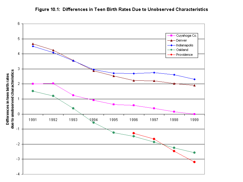
Explanatory power of contextual variables. On average over the 1990s, Denver's early prenatal care rate was about 11 points below that of Cleveland (table 10.7). The explanation for the difference is equally split between the unobservable conditions in Denver during this time and the contextual variables we include in the model. In other words, with the demographic, economic, and social status of Denver's tracts in the 1990s, the model predicts that the early prenatal care rate would be about 5.4 points lower than Cuyahoga County's rate. But, in addition to this, other factors particular to Denver that are not measured in this model are associated with another 5.5 point drop in the average rate. In addition to omitted census tract attributes, some potential policy factors were already listed in section 9--fewer facilities accepting Medicaid and immigrants choosing nontraditional health providers (either because of preference or belief that those using public health services will risk deportation).
The differences in Providence appear similar to Denver, with about half of its lower rate (8.4 points) explained by our chosen contextual indicators and the other half (7.8) by other factors not specified in the model. Like Denver, Providence had a growing immigrant population during the 1990s, which may result in higher teen birth rates.
In Oakland, we see a different situation. The socioeconomic contextual indicators in Oakland should place its rate more than 7 points lower than Cuyahoga County, but other unmeasured circumstances there raise the expected rate by 6 percentage points, narrowing the gap in the overall rates to 1 percentage point. While not conclusive, this finding is consistent with the positive impact of the Oakland Healthy Start initiative described in section 7.
Indianapolis is the only city where the variation in the five contextual variables corresponds to a higher early prenatal care rate than Cleveland (+1.9 percentage points). The unmeasured factors, however, reduce the average rate by 8 points, more than offsetting the influence of the included tract attributes.
Shifts in indicator trends. Figure 10.2 displays the regression-adjusted differences in the early prenatal care rate among the cities. The chart shows the sharp increases in Oakland that we described in section 9, along with the increases in Indianapolis in the early decade. The decreases in Denver in 1997 and Providence in 1998 stand out amid the general improvement in prenatal care in the 1990s. With our model, we can perform a joint test of significance to see if these downturns are significant or just due to random variations. The regression shows that both changes are significant, at the 0.04 level for Providence and the .01 level for Denver. Given that the prenatal care rates in the high-poverty areas in these two cities were already lowest among the five cities, these further declines are troubling.
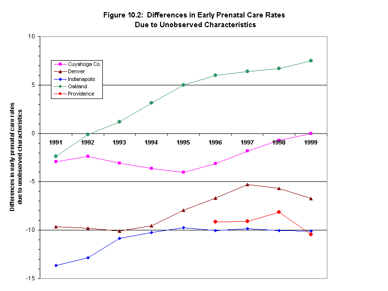
Low-Birth Weight Rates
Overall strength of model and contextual relationships. In the third model, our independent variables explained 56 percent of the variation in the low-birth weight rates. Our five contextual variables are all highly significant, but the coefficients are quite small (table 10.6 and annex table C.26.) The percentage of the population not employed had the highest correlation, with a 1 percent increase corresponding to a .09 percentage point decrease.
Explanatory power of contextual variables. The model predicts that the low-birth weight rate in Denver would be 2 points lower than the Cleveland rate, but the characteristics of Denver during this period raise the rate by 2.9 percentage points, placing the end rate above Cleveland's. Only in Denver does this portion of the difference increase the rate. In both Indianapolis and Providence, our specified contextual variables explain most of the difference between the city rates, with unspecified city influences lowering the rate slightly more. The power of this methodology is apparent when looking at the case of Oakland. Just looking at the difference in overall low birth weight rates between Oakland and Cleveland, it appears that the two are quite similar, only .2 percentage points different. However, decomposing the difference reveals that, as with the previous two models, the levels of the contextual factors in Oakland's should be associated with a rate worse than Cleveland's (0.8 points higher), but the city must have some other protective factors that compensate for the contextual conditions.
Significance of shifts in indicator trends. As stated in section 9, the trends in low-birth weight rates were the least consistent of all the maternal and infant health indicators, and the regression-adjusted means confirm this (figure 10.3). Both Denver (beginning in 1996) and Oakland (beginning in 1997) show statistically significant improvements in low-birth weight rates, at the .04 and .002 significance level, respectively. The increases in Indianapolis from 1995 and Providence in 1996 are also significant.
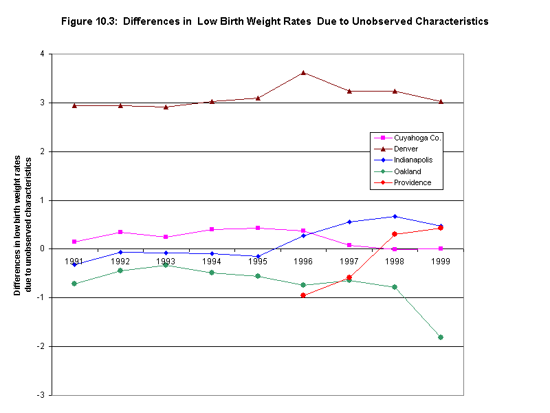
Age-Adjusted Death Rates per 100,000 Population
Overall strength of model and contextual relationships. The final model has the age-adjusted death rates as the dependent variable. The explanatory power of the independent variables is moderately strong, with a .45 R-squared value. This is the one model where not all of the tract descriptive variables are significant--the share of the census tract population who are Hispanic is not correlated with the age-adjusted death rates. Of the remaining three variables, the percentage of population not employed is the most highly associated, with a 1 percentage point increase linked with a 10.4 change in the death rates. The percentage of the population living in a different house five years ago has the second highest coefficient (8.0) (table 10.6 and annex table C.27.)
Explanatory power of contextual variables. The three cities show contrasting situations for the differences in age-adjusted death rates among cities. For Denver, almost all of the difference between its and Cleveland's rates can be explained by the contextual indicators. For Indianapolis, the census tract contextual indicators account for the majority of the lower death rate compared to Cleveland, but the unmeasured conditions do increase the total magnitude of the difference. Finally, Oakland's city-specific influence is much stronger than that of the census descriptors.
Significance of shifts in indicator trends. Three of the cities (Cleveland, Indianapolis, and Oakland) show upward trends in the differences between the regression-adjusted means of the age-adjusted death rates in the late 1990s (see figure 10.4). When tested, however, only the Cleveland trend is statistically significant.
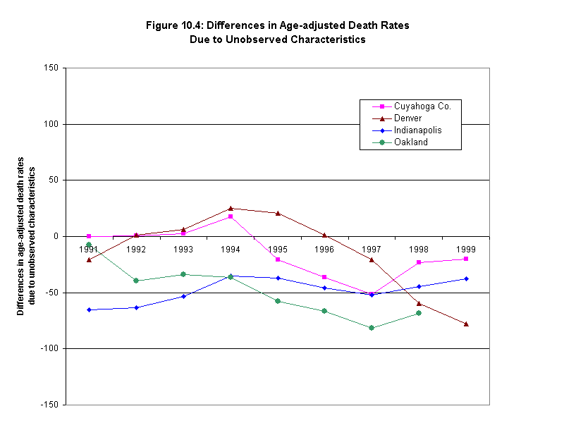
SUMMARY
The following points summarize the key findings of this section:
1. Using the bivariate methodology, we find that most of our hypotheses about the relationships between neighborhood and health conditions proved correct, with a few occasions of site differences. The correlations confirmed that higher rates of minority population, lower socioeconomic status, and lower quality housing are correlated with lower early prenatal care rates and higher rates of low birth weights, teen births, and age-adjusted deaths.
2. Two of our hypotheses were not completely verified with the proxy measures we used. First, higher levels of social stressors (measured by crime rates) were significantly related only to higher rates of low birth weight, teen births, and age-adjusted deaths (not to early prenatal care rates). Second, the hypothesis about stronger social networks correlating with lower levels of mortality and better maternal and infant outcomes was confirmed by one set of proxy variables (rates of renter occupancy, rental vacancy, and mobility) but was related to worse health outcomes with the second set (change in total and minority population and rate of home improvement loans).
3. The multivariate analysis demonstrated that much of the variation among the health indicators is explained by five selected independent variables (percentage African-American, percentage Hispanic, average family income, percentage not employed, and percentage of population that moved in the past five years). The most predictive model was the one with early prenatal care rates as the dependent variable, though the remaining models also have substantial explanatory power (R-squares range from 0.45 to 0.77). Of the five independent variables in the model, the percentage of population that is not employed was the variable most highly correlated with three of the health indicators (with early prenatal care rates as the exception).
4. The models also show that a portion of the variation is not explained by the five selected contextual indicators but, rather, by conditions particular to the city and time period of the measure. For example, Oakland's rates for maternal, infant, and mortality outcomes were consistently better than the model predicts given the contextual conditions in Oakland's census tracts. Finally, we identify which of the trends represent significant changes versus random fluctuations. For example, the results of the model enable us to confirm that the early prenatal care rates in both Denver and Providence have fallen by a statistically significant amount in the recent years--going against positive trends in the United States and the other three cities.
17. For more complete discussion of the appropriate uses of descriptive studies in the health field, see Grimes and Schulz 2002.
18. NNIP has developed a handbook that explains the histories, philosophies, and operating methods and techniques of the original NNIP partners--see Building and Operating Neighborhood Indicators Systems: A Guidebook, (Kingsley 1999).
19. The mortality rates are age-adjusted to the year 2000 standard population. As to the age groupings, we used a standard categorization: less than 1; 1 to 14; 15 to 24; 25 to 44; 45 to 64; and 65 and over.
20. Oakland's crime data are available only for police beat areas, but the staff of our partner institution there created tract-level estimates for the purposes of this study.
21 For all reported crime and AFDC/TANF indicators, population denominators for specific years are again estimated by interpolating between 1990 and 2000 census figures.
22. To find out about the structure and contents of the NCDB, visit http://www.urban.org/nnip/ncua/ncdb and http://www.geolytics.com.
23. For documentation on HMDA data files, visit http://ffiec.gov.
24. This selection includes the largest 100 Primary Metropolitan Statistical Areas (PMSAs) and Metropolitan Statistical Areas (MSAs) based on their 1990 populations. PMSAs are metropolitan subcomponents of our largest urban agglomerations, Consolidated Metropolitan Statistical Areas (CMSAs). MSAs are separate freestanding metropolitan areas. Since we ranked PMSAs and MSAs by size, some smaller PMSAs within CMSAs are not included. We also excluded suburban PMSAs that did not have large central cities within their own boundaries. For a complete listing of these areas and related population data, see Kingsley and Pettit 2002.
25. This diversity in metropolitan characteristics is simply a lucky outcome for this work, since as noted in section 1, we did not structure the selection process to achieve it.
26. Patterns of population change for the central cities of these metropolitan areas were similar. Population change in U.S. central cities was generally more positive (more growth, less decline) in the 1990s than it had been in the 1980s, and this was true for all of the study cities except Oakland (modest drop in growth rate). Denver's shift, from -5 percent to +19 percent, was one of the most striking turnarounds in the country. Even the central cities of the two sites experiencing sluggish metropolitan growth did better in the 1990s than they had in the 1980s. The population of Providence increased by 8 percent in the latter, compared to 2 percent in the former and, while Cleveland still lost population in the 1990s (-5 percent), this drop was a major improvement over its substantial loss rate of the previous decade (-12 percent).
27. The reasons for using 1990 data for poverty rates are explained in the section on Neighborhood Conditions and Trends below. Since we use the 1990 poverty rates, we use the 1990 racial and ethnic composition data as well for consistency.
28. For each year of data available, Cleveland, Denver, and Indianapolis AFDC/TANF data reflect the caseload in the month of June. Providence data reflects the month of December.
29. The exception is Providence due to one high-poverty tract surrounding Brown University. The college student population drives the poverty rate, but the surrounding neighborhood is otherwise affluent.
30. Table 8.6 shows that 78 percent of all households in high-poverty tracts in Providence are renters, and it is no doubt the renters who determine the high average poverty status of these neighborhoods.
31. Moren, Lorenzo, Barbara Devaney, Dexter Chu, Melissa and Seeley. Effect of Healthy Start on Infant Mortality and Birth Outcomes.
32. Trends in the late 1990s for Cuyahoga County are difficult to interpret due to data irregularities in 1997 through 1999. See Kids Count web site http://www.aecf.org/kidscount for details.
33. Thompson, Mildred. Community Involvement in the Federal Healthy Start Program. 2000. Policylink.
34. The unusual shape of the curve is due to small numbers of births in high-poverty areas causing large jumps in the rate.
35. Infant mortality rates are often calculated from files that link birth and death records to identify the number of deaths in a given cohort of births. Since we had only tract aggregates for this analysis, we calculate infant mortality by dividing the total number of infant deaths by the total number of live births in a tract. Census tract codes for Cleveland mortality data from 1990 to 1996 were truncated to four digits. We aggregated the Cleveland death data from 1997 to 2000 to the 4-digit tracts in order to compare rates across the full decade.
36. The exception is the high-poverty areas in Oakland, which had only 45 infant deaths from 1990 to 1992 and 25 from 1997 to 1999.
37. Age-adjusted mortality rates are equal to the total deaths per 100,000 population that would have occurred assuming local death rates by age category and the national percentage distribution of population in the same categories. Generally, mortality data are normalized for age and sex, but data by gender were not available for this particular analysis.
38. Infant mortality rates are not included because of very small numbers at the census tract level.
39. Census tract codes for Cleveland mortality data from 1990 to 1996 were truncated to four digits. We aggregated the Cleveland death data from 1997 to 2000 to the 4-digit tracts in order to compare rates across time.
40. This is consistent with previous research documented in Vega 2001 and Weigners 2001.
41. Average home value and average mortgage origination were 80 percent correlated with average family income, and percentage overcrowded was 60 percent correlated with the percentage of the population that is Hispanic.
42. The difference in rates due to unobserved characteristics calculated for each city and year by first adding the regression coefficients of city dummy, the year dummy, and the city-year interaction term. This value by city and year is then subtracted from the value for Cleveland (the reference site) in that year.
Part 3 - Issues and Recommendations
Section 11 - Issues and Recommendations
ISSUES AND RECOMMENDATIONS
Perhaps more important than anything else, the findings of this study reconfirm the premise that motivated it; namely, that neighborhoods do indeed make a difference for health outcomes and health policy. From our cross-site analysis, we can say that, although neighborhood correlation coefficients did decline in the 1990s in a few cases, patterns of association remain very strong overall. And even though the gaps seem to have diminished over the past decade, the most striking finding is that the health problems of high-poverty neighborhoods remain substantially more serious that those of non-poor neighborhoods in all cities for which we have data.
The implications for health programs are critical. Since conditions differ markedly by neighborhood, 'standardized solutions' applied uniformly in many different types of neighborhoods are unlikely to work everywhere and are likely to be wasteful. Targeting the right services to the places that really need them and adjusting delivery strategies in response to neighborhood differences should both enhance payoffs and may save money. At a time when resources are scarce, it would seem that more emphasis on taking neighborhood variations into account is warranted in public health programming.
We believe that this study has also demonstrated some promising and cost-effective ways for public health agencies and their partner organizations to design and implement more customized approaches. Three things in part account for that: the development of large computer-based information systems, technology that has dramatically reduced the cost of manipulating data, and new institutions and groups of professionals that have learned how to do so in an efficient and practical manner.
We also conclude that the completion of this study is a promising sign for cross-site analysis of changing health conditions at the neighborhood level in the future. A decade ago, obtaining comparable year-by-year data for so many indicators in five cities would not have been feasible (and even at this point we could not obtain data going back to the early 1990s for all five). But more and more cities are developing NNIP-type capacities and building year-by-year data series from vital records and other sources as they go along (see Annex A). Even a few years from now, it seems likely that cross-site analysis like this covering a much larger number of cities will be possible.
And future monitoring in this regard is important. Data already exist on health trends for cities as a whole, but where there are great internal disparities across neighborhoods (as is normally the case) citywide averages can be very misleading. National policy makers need richer information across many cities to realistically understand how health conditions are changing in America and, thereby, how to target interventions more efficiently.
In the remainder of this section, we first look at the prospects for expanding the development of neighborhood-level information systems for use in the health field. We then consider the implications of this work for policy and program development. While many details of what we present may be new, we believe the general approach is very consistent with the National Committee on Vital and Health Statistics' "Strategy for Building the National Health Information Infrastructure" (U.S. Department of Health and Human Services 2001).
NEIGHBORHOOD INFORMATION SYSTEMS AND PUBLIC HEALTH
The local partners in NNIP have all been able to build sizable neighborhood information systems for their cities, but until recently their holdings related to health have been comparatively weak. We believe the experience of this project shows that local partners will be able to expand both their data and analytic work in this field, and that this sort of capacity can be developed elsewhere as similar institutions are established in other cities.
In almost all of the case studies summarized in part 1, the partners faced difficulties in obtaining the data, editing them, and working with them analytically. But that is no different than what the partners faced in building the other components of their systems to date. In each case, progress was made and permanent health-related data expansions either have happened or seem very likely to happen over the coming year. In the process, positive relationships were established with data providers that should facilitate further expansions and joint analytic work in the future. In the paragraphs below, we assess prospects and offer recommendations for further systems development in four areas:
- Contextual variables
- Health conditions
- Health facilities and services
- Integrated health data systems
In this review, we often rely on an important resource that we recommend to all who want to learn more about potentials for local data: Claudia Coulton's 1997 catalog of data sources that are typically available at the local level and contain information that can be presented at the neighborhood level.
Contextual variables
We have already referred to the wide variety of contextual information that has been assembled for small areas by the NNIP partners. The range is summarized in Kingsley (1999), and Coulton's review (1997) covers a yet broader set of opportunities.
In this project, the local partners in the five sites primarily relied on contextual variables from the census or from files that were an established part of their ongoing systems. There were two notable exceptions. The Providence Plan successfully developed small area indicators on children's mobility (section 6). This measure meets a data gap in most NNIP systems: better measures for the comparative stability of neighborhoods. We certainly recommend the development of similar measures elsewhere, but remember that they are only possible if local school and/or health systems maintain records that track address changes for individual children. Although inquiries should be made, we doubt this will be possible in many other cities at this point. In particular, it would be difficult for cities that have several separate school districts.
The second exception is Denver's Piton Foundation, which obtained new data on a series of environmental conditions and added indicators on violence related school suspensions and expulsions, as well as child abuse and neglect. Acquisition costs for the environmental data were not high but Piton was unable to use the data to create a reliable measure of "hazards." Nonetheless, the spatial patterns for some of the conditions were judged to be worth knowing about and were added to Piton's collection of maps of neighborhood "risks." We think it would probably be sensible for intermediaries in other cities to review the Piton experience (section 3) and purchase those data sets that seem appropriate for their needs. As to the other measures, we recommend efforts to acquire child abuse and neglect data (several other NNIP partners have done so) and the school suspension/expulsion measure (although, its viability would depend on the status of the local school districts' information systems).
Health conditions and health care utilization
The availability of neighborhood-level data on health conditions is low to nonexistent in most cities today. The NNIP partners all regularly assemble and report on indicators from vital statistics files. The benefit of these data is they are legally mandated--all births and deaths, along with the residential addresses of the mother or the deceased, are required to be reported--and standard definitions are normally employed virtually everywhere. These events can be geo-coded and sorted to develop indicators by neighborhood--indicators like those we examined for the five selected sites in sections 8 and 9 on rates of teen births, low-birth weight births, infant mortality, and age-adjusted deaths. Yet in most cities, even these measures are not recurrently calculated and published at the neighborhood level, as illustrated in parts of this study.
And for work in health, professionals, advocates, and neighborhood groups would like to know much more; particularly changes in the neighborhood-by-neighborhood incidences of various health problems such as asthma, tuberculosis, and AIDS. At this level, even the NNIP partners typically have little to offer so far. These conditions are not as consistently reported to public agencies as births and deaths. (43) Nonetheless, there are some sources for additional health data and NNIP partners expect to be taking more advantage of them in the future. Privacy concerns involved in utilizing some of these sources are addressed in a discussion of the Health Insurance Portability and Accountability Act (HIPAA) immediately following this section. As identified by Coulton (1997), these sources include the following:
1. Communicable Diseases. Diseases caused by the direct or indirect spread of pathogens from one person to another are called communicable diseases. Tuberculosis, syphilis, and AIDS are examples. By law, physicians are responsible for reporting incidences of many communicable diseases to local and state health officials. Although not always computerized, these data are maintained by departments of health and usually contain addresses that might allow small area analysis. However, confidentiality and generalizability issues require special justifications for release of such data. Furthermore, rare events concerns must often be addressed. Indicators that could be developed include the incidence in a given area, and the classification within the specific group of disease. Some information about emerging and other communicable diseases can be found at the WHO web site, http://www.who.ch/programmes/emc/emc_home.htm. The Center for Disease Control publishes information on communicable diseases in selected metropolitan areas at http://www.cdc.gov/publications.htm.
2. Emergency Medical Services. Emergency Medical Services (EMS) are services delivered with a sense of urgency to those in need of immediate attention. Accident victims and patients having heart attacks, for example, need immediate medical attention. When transport is via the public system, the reports will appear in 911 data, which is being accessed by NNIP partners in some cities. But many medical emergencies treated in emergency rooms do not appear as 911 calls. So emergency room records could be a more complete measure. While there is no common database for emergency room visits in most cities, interest in injury surveillance is considerable (Centers for Disease Control 1988). The availability of E codes in the International Classification of Disease System makes it possible to establish data systems, and a growing number of communities are exploring such systems. When many emergency rooms in a city collaborate on an injury registry system, it is possible to calculate injury rates for small areas. Among the important indicators are rates of intentional and accidental injury by age group (Rivara, Calonge, and Thompson 1989). Among youth in particular, injuries are a good indicator of health risk as well as social control in a community (Prothrow-Stith 1991). Finally, Dr. John Billings, Director of New York University's Center for Health and Public Service Research, has developed an algorithm for analysis of emergent versus non-emergent use of emergency rooms now being used in several communities (Billings 2002).
3. Immunization. The population's status on immunizations is considered an important measure of the adequacy of preventive health care. It is not only the protection afforded by the vaccine that is of interest but also the accompanying chance for a medical professional to examine the young child who is receiving immunizations according to the prescribed schedule. There is no law requiring states to collect data on immunization nor can the information included in the National Immunization Survey be used to access this data. Some states conduct a survey and estimate the number of children immunized and some communities are experimenting with computerized immunization tracking systems. Schools and day care centers are required to ask for proof of immunization before they admit students, so school district data systems may be a source of data on this topic. Some neighborhood indicators can be developed from available data. The immunization rate of children can be calculated to determine what percentage of children are not covered at time of entry into school or did not receive their vaccinations at the appropriate age. More information about immunization can be accessed through the Centers for Disease Control and Prevention's National Immunization Program web site, http://www.cdc.gov/nip/default.htm.
4. Hospital Discharge Files. Hospital discharge files contain information on hospitalizations generated when a patient is discharged. State hospital associations or government agencies may maintain such files. Although there are some common conventions for such data, they vary across locales. Many state hospital associations maintain and publish their own data on patients aggregated at the ZIP code level. Data about age, payer, clinical service, sex, length of stay, Diagnostic Related Group (DRG), hospitals, beds, admissions, and the like may be available for small geographic areas such as a ZIP code. Patient-level data exist but are guided by confidentiality issues for release of information. However, the Agency for Healthcare Research and Quality (AHRQ) is building a standardized health data system that houses longitudinal and administrative state-specific discharge information and a national sample of discharges from community hospitals. AHRQ's Healthcare Cost and Utilization Project (HCUP) is a federal-state-industry partnership that maintains hospital discharge abstracts for 29 states. Five databases, including an interactive web-based site, allow users to analyze clinical and nonclinical information that has been translated for cross-sectional comparisons between states. HCUP also distributes software tools for use on its data and other administrative databases. HCUP resources can be found at http://www.ahrq.gov/data/hcup/. Also, the American Hospital Association publishes Hospital Statistics, which provides some hospital information along with the address of the facility. Some small geographic area indicators that can be developed are average charges by severity, number of inpatients and outpatients, incidence of most prevalent preventable conditions per 1,000 people, average length of stay, number of beds in a small geographic area, and number of hospitals in a small geographic area. Researchers have compiled utilization rates across geographic areas using discharge data (Wennberg, Freeman, and Culp 1987). The National Association of Health Data Organizations (NAHDO) has addressed some of the data-related issues on its web site, http://www.nahdo.org/index1.asp.
5. Medicaid Claims. Medicaid provides medical assistance for certain individuals and families with low incomes and resources. As we learned from the work in Cleveland (section 6), claims filed by medical providers for services delivered under Medicaid may be a valuable source of data on medical conditions and services for populations in small geographic areas. Although Medicaid program administration varies from state to state, Medicaid claims data can likely be obtained from the state agency that administers the program. However, utilization data may be more difficult to obtain if a state's Medicaid program relies on managed care where payments are to plans on a per member per month basis. Data may include provider description, classification of illness, procedure codes, service dates, and service charges. The recipient's address, needed for small area analysis, may need to be merged into the claim from an eligibility file. Most states only enter a limited number of variables into the computerized system. Owing to confidentiality issues special requests justifying need may be necessary for release of data.
Assuming the availability of claims data, small area indicators could be developed from such files including annualized rates of types of medical care utilization (emergency, inpatient, ambulatory, etc.), annualized rates of Medicaid utilization by health status and age, and Medicaid utilization by type of service. Statistical information about Medicaid at the national level can be viewed at the 'Centers for Medicare and Medicaid web site http://cms.hhs.gov/medicaid/. Additional national-level Medicaid-related statistical information such as type of utilization can be found at http://www.census.gov/prod/1/gen/95statab/health.pdf.
6. Special Supplemental Nutrition Program for Women, Infants, and Children (WIC) Files. Local WIC program data files on individual clients contain a great deal of information about health and other circumstances of vulnerable families and children. NNIP's partner in Milwaukee has already performed basic analyses of WIC files locally. They plan further analysis looking at the WIC data in relation to childhood obesity and socioeconomic conditions, nutritional status, and barriers to exercise participation.
7. Youth Risk Behavior Surveillance System (YRBSS). The YRBSS was developed in 1990 to monitor priority health risk behaviors that contribute markedly to the leading causes of death, disability, and social problems among youth and adults in the United States. These behaviors, often established during childhood and early adolescence, include: tobacco use; unhealthy dietary behaviors; inadequate physical activity; alcohol and other drug use; sexual behaviors that contribute to unintended pregnancy and sexually transmitted diseases; and behaviors that contribute to unintentional injuries and violence. The YRBSS includes bi-annual national, state, and local school-based surveys of representative samples of 9th through 12th grade students. CDC provides funding and technical support to states, territories, and major cities to conduct a Youth Risk Behavior Survey (YRBS) every two years. CDC's technical assistance includes: training for state and local coordinators; specialized software to guide states in selecting schools and classes; help with applying survey results to improve school health programs and policies. Sites can add or delete questions in the core questionnaire to better meet the interests and needs of their area. School-based surveys were last conducted in 2001 among students in grades 9-12 in 38 states, 19 large cities, and 7 territories. YRBSS, is fully described at the CDC web site, http://www.cdc.gov/nccdphp/aag/aag_yrbss.htm.
Health facilities and services
Considerable information is also now available in automated form on the locations of health care service providers at various levels. First there are data on physicians by address and specialty (from the American Medical Association) and on dentists by address and specialty (from the American Dental Association). Second, national data on hospital locations (and some characteristics) are available from the American Hospital Association. Finally, there are two national databases on community-based health providers. The Bureau of Primary Health Care keeps aggregate data at the state level for federally funded community health centers and their users in the Uniform Data System (UDS) located at http://www.bphc.hrsa.gov/uds/. The Urban Institute also maintains information on community health centers and other nonprofit providers from a national database on all nonprofit institutions that are required to report financial information to the IRS (non-religious organizations with $25,000 or more in gross receipts). Institutions are classified by the work they do and several health- related categories are included on the list.
Via geo-coding of addresses, most of these files permit the user to count the number of providers of various types in small areas such as census tracts and to calculate rates (e.g., number per 1,000 people). In a few cases, some characteristics of the provider are included as well. For example, in the Urban Institute's nonprofit database, information on the size of the organization in financial terms is available from IRS returns. However, little such information is available in automated form. Users need to recognize that the number of providers in a neighborhood does not by itself provide a reliable measure of the quality of care available to its residents. Still, knowing this much is an important step toward finding out more.
Combined local data systems
Perhaps the most promising developments for work of this type noted in the Site-Specific Analyses were the Indianapolis area's Regenstrief Medical Records System (RMRS, discussed in section 4) and the Rhode Island Department of Health's KidsNet Database (section 6). Both systems are based on agreements among large numbers of local care providers and agency officials to share a wide range of information about individual patients. The agreements, of course, include detailed rules and procedures designed to protect client confidentiality. Records for individuals may include data on birth outcomes, and then information about a string of subsequent interactions with providers (e.g., inoculations, lead screenings, and treatments for various illnesses and diseases).
The Indianapolis and Providence cases, as well as similar efforts being implemented in other communities, illustrate the substantial potential value of these systems. Analysts can cut across case records to examine the spatial patterns of particular health problems (such as obesity) and they can see how those patterns are changing over time. Knowing both the pattern and the trends should not only enable them to target responses more efficiently in the short term, but also to learn more about why the problem develops as it does. They can also analyze various patterns of service performance. Adding links to Medicaid files where possible, like those analyzed in Cleveland, would add to the power of these systems to support more effective health program implementation and planning.
Based on these findings, we suggest that federal and state agencies collaborate with local players in the health field to continue to work toward the development of similar systems in other metropolitan areas.
Addressing confidentiality issues
Advanced information systems have substantial power to improve the performance of health initiatives but they contain sensitive information about individuals that could be very troubling for them if made public. It is not surprising that agency officials responsible for large data files like these are nervous about releasing them to outside organizations. The NNIP partners have established good working relationships with the agencies that provide data to them based on the partners' solid track record in honoring their pledges to protect the confidentiality of any records on individuals they use. Nonetheless, agencies are sometimes wary about releasing such information even to these organizations.
The Health Insurance Portability and Accountability Act of 1996 (HIPAA) represents a major development in the federal regulation of privacy of individually identifiable health information, and will govern the ability of public health authorities that are entities covered by the Act to share individual level data with data-intermediary organizations like the NNIP partners. The Department of Health and Human Services released the final regulations regarding privacy in December 2000. Entities covered under the act (certain health care providers, health plans, and health care clearinghouses that use electronic transactions for which the Secretary has adopted a standard under HIPAA) must be compliant by April 2003.
Under HIPAA, a covered entity must protect the privacy of a person's identifiable health information (PHI) (44). Specifically, a covered entity must:
- Tell the person how their health information will be used or disclosed
- Obtain express permission whenever a use or disclosure is not permitted or required by the rule
- Share only the amount of information necessary for disclosure
- Enable the person to revoke permission at any time.
The regulations permit entities to release limited data sets (those not completely de-identified) with a "Data Use Agreement." The limited set can include dates of admission, discharge or other services; dates of birth or death; age of participant; and some larger geographic information (such as zip code, city, county). The agreement specifies the permitted use of data and prohibits re-identifying or contacting the individuals. In addition to the limited data set, the rule permits release of de-identified information - information can be determined de-identified statistically or by the removal of 18 specified identifiers.
While the regulations govern the disclosure from covered entities of the individual data to an outside entity, they are not intended to interfere with public health surveillance and interventions or the collection of data by public health authorities such as vital statistics or disease registries for the purpose of disease prevention. However, NNIP partners report that some local officials are more guarded about the release of this data in light of HIPAA. As with any new regulatory regime, there are questions and implementation concerns that will need to be addressed. HIPAA will certainly affect the process for sharing public health data, but at this point it is unclear what the long-term implications of HIPAA will be for local data intermediaries. More information about HIPAA is available at http://www.hhs.gov/ocr/hipaa.
HIPAA is one tool for addressing legitimate concerns about confidentiality of medical information. With the increased technological capacity to link data about individuals from many different sources there are good reasons for officials to be cautious. However, we believe many are not sufficiently taking into account the fact that the new technology also provides the basis for stronger confidentiality protection. A simple example is the new approach to mapping used in the Oakland study. With the old system, providing data on a small number of individuals in a small area could well constitute a confidentiality breach, but with the isopleth data, it would be impossible to trace information back to individual cases. Analysts have found other statistical methods that allow researchers to release more detailed information in ways that cloud links to individuals (Lane et al. 2002).
Implications for Program Development
As mentioned at the beginning of this section, our most important finding may be that neighborhoods still make a significant difference. There were indeed important improvements in health outcomes in America's cities in the 1990s, but the health problems of high-poverty neighborhoods remain substantially more serious than those of non-poor neighborhoods in all cities for which we have data.
Addressing health problems in these areas is a well-recognized national priority, particularly since doing so is likely to have positive impacts on other national objectives such as improving educational outcomes and moving a higher share of welfare recipients into employment. This study was not expected to contribute to the debate about national health policy alternatives, but it does have implications for local programs and policies. In the remainder of this section, we discuss those implications first and then offer some ideas about how state and federal policies could better promote the themes we suggest for local action.
Implications at the local level
The first theme at the local level is the potential of the spatial differentiation of interventions. As suggested earlier, since conditions differ markedly by neighborhood, "standardized solutions" applied uniformly in many different types of neighborhoods are unlikely to work everywhere and are likely to be wasteful. Targeting the right services to the places that really need them and adjusting delivery strategies in response to neighborhood differences should both enhance payoffs and perhaps save money. Our second theme is to emphasize the notion of using data and analysis not just to evaluate, but also to motivate and manage change--for example, the potential use of Cleveland's and Providence's data on past service provision to improve future scheduling and targeting.
County health agencies and other entities involved in public health at the local level (public and private) should help build capacity needed to develop and expand information systems like those established by the partners in NNIP. To be helpful to health professionals, the system needs to cover many topics beyond those directly related to health. Therefore, health professionals may need to partner with other local groups in the process of system building.
Such systems will provide information to inform strategies that take neighborhood conditions into account. This information should provide a factual basis for designing alternative approaches in at least four interrelated types of interventions:
1. Prevention. Prevention most often means efforts to increase awareness of health problems among local residents and to offer education about hazards, harmful behaviors, and service/resource options. In cases like these, it is critical to take neighborhood differences into account because local culture is usually the key to getting attention and establishing confidence in case managers and service providers. This often implies working through community groups, and offering new data and analysis can be an effective way for public agencies to establish positive relationships with such groups (see examples in National Neighborhood Indicators Partnership 1997). Fresh analysis can both motivate interest and give grassroots groups and local nonprofits clues about how they should proceed.
2. Strengthening Health Care Services. The availability of facilities and services can vary markedly across neighborhoods. Residents do not need to be able to receive all care they need within their own neighborhoods, but they need access to good quality services within reasonable distance from their homes. Given their lower automobile ownership rates, physical proximity is more important for the poor than for the rest of society. Nationally, the Area Resource File (ARF) updated by HRSA provides data on comparative service availability at the county level. Such information is hardly ever available at the neighborhood level, even though inter-neighborhood variations in service resources may well exceed inter-county variations.
The capabilities of the NNIP data intermediaries, as evidenced in sections 2-6 of this study, suggest that it may now be possible to build credible local service inventories at the neighborhood level. At the minimum this would identify the locations of various health service providers, but available descriptive should be included for each: e.g., budget and staffing levels, size and geography of service areas, measures of service quality. Without better quantitative measures of differences in service levels across different parts of the city, it is very difficult for anyone (public health officials or interest groups) to know how to allocate resources in a cost-effective manner. With such data, there should be less disagreement about what and how much should be allocated where.
3. Reducing Hazards and Stressors. High rates of violence and other crimes, environmental hazards, deteriorated housing, and public infrastructure have all been shown to have deleterious effects on health. And once again, the incidence of each varies dramatically across a city's neighborhoods. Some of these problems are hard to measure reliably (witness Denver's effort trying to collect data on environmental hazards), but NNIP partners are generally expanding their data in these areas, and the development of a credible ongoing set of small-area indicators along these lines would seem a realizable goal for most cities over the coming decade.
Effective interventions to reduce such hazards and stressors, however, are not easy to develop and they certainly do not fall solely under the control of health professionals. To help motivate progress in these areas, public health officials need to affiliate with broader partnerships for neighborhood improvement--partnerships that should include representatives from resident associations as well as other civic groups and public agencies, including law enforcement.
In this area too, data can be one of the drivers. Knowing reliably how one neighborhood compares with others on these indicators, knowing which type of hazards and stressors warrant the highest priority in different neighborhoods, and knowing specifically where within the neighborhood these problems occur can both motivate interest in responsive actions and design actions that are likely to work in the specific environment at hand.
4. Program Monitoring and Management. Cleveland used Medicaid claims data to show how the timeliness of children's preventive health care visits differed in the city's neighborhoods. Providence used a local integrated health database to track similar measures at the neighborhood level. If senior officials had easy-to-read reports that compared a variety of program performance measures across neighborhoods in their cities, they may have a better basis for understanding the effectiveness of their resource targeting and assessing the performance of their staffs within that system.
Implications for state and federal governments
We have suggested that a state-of-the-art neighborhood data system would be a powerful tool for health policymaking and program design and implementation in individual cities and metropolitan areas. Furthermore, the development of such systems is proving more and more feasible as technology has dramatically reduced the cost of acquiring and manipulating the data, and new local institutions and groups of professionals are learning how do these things efficiently and practically.
Accordingly, the most important implication for state and federal officials at this stage is that they should take steps to encourage this type of activity at the local level. This direction is fully consistent with the National Committee on Vital and Health Statistics' recommended "Strategy for Building the National Health Information Infrastructure" (U.S. Department of Health and Human Services 2001), which states
State and local health agencies should invest in the collection and analysis of population health data to permit real-time small area analysis of acute public health problems and to understand new or rapidly growing populations and health disparities, and they should combine health data sources for population analysis. (p. 42)
What could state and local agencies do to provide such support? First, in localities where it is not already being done, they could encourage local officials in the health field to move in directions outlined in the paragraphs above. This can occur in a variety of ways. They could, for example, develop and offer relevant technical assistance and training and support the activities of coalitions of localities toward these ends. Efforts in this regard may have to be preceded by a review of laws and regulations to identify changes that would either promote or eliminate barriers to activities like these at the local level.
Second, they can work out sound methods of sharing data from larger information systems with locals who have the capacity and want to use it for these purposes. This, of course, is primarily relevant for state officials. Medicaid claims files can be particularly useful, but other types of state maintained data (as discussed earlier in this section) should also be considered.
Annexes
Annex A - The National Neighborhood Indicators Partnership (NNIP)
Institutions in only a handful of U.S. cities have developed the capacity to address the information needs of America's cities effectively. Twenty of them (see list at the end of this annex) have joined with the Urban Institute to form the National Neighborhood Indicators Partnership (NNIP)--a collaborative effort whose mission is to advance the development and use of local neighborhood information systems. Five features distinguish the NNIP partners:
FEATURES OF NNIP'S LOCAL PARTNERS
Integrated, recurrently updated, neighborhood information systems. All of the NNIP local partners have built advanced Geographic Information Systems with integrated, recurrently updated information on neighborhood conditions in their cities--a capacity that did not exist in any U.S. city a decade ago. This breakthrough became possible because (1) most administrative records of government agencies (for example, on crimes or births) are now computerized; and (2) inexpensive GIS software now exists that can match the thousands of addresses in these records to point locations, and then add up area totals for small geographic areas (such as blocks or census tracts),
The indicators in these systems cover topics such as births, deaths, crime, health status, educational performance, public assistance, and property conditions. Operating under long-term data-sharing agreements with the public agencies that create the base records, the partners recurrently obtain new data (annually or more frequently in some cases), integrate them into their systems, and make them available to a variety of users for a variety of purposes. Their accomplishment demonstrates that, while never easy, it is quite possible today to overcome the past resistance of major public agencies to sharing their data in this way.(45)
Action agendas and democratizing information. The way NNIP partners use their information is even more innovative. Their core mission is to support action agendas that will facilitate change (not just to create data and research for their own sake), and they use data as the basis for forming collaborations among stakeholders toward that end. Their focus is on improving conditions in distressed neighborhoods. Their operating philosophies are captured by the phrase democratizing information. They see their role as getting useful and reliable information into the hands of relevant local leaders and other actors (at the community and city-wide levels) and helping those actors use it to change things for the better. Their work has already had important practical benefits and, as their data and techniques improve, they offer the potential of yet more substantial payoffs for the effectiveness of local governance and civil society.
Benefits of a "one-stop shop." One of their most attractive features is the way they work as a one-stop shop. What happens today in most cities is extremely inefficient. Most community groups and service providers now recognize the need for data, to prepare winning grant applications if not to prepare more effective plans. Some city representatives we have interviewed describe the scene as one of a large number of local players constantly "falling all over each other," all spending a great deal of time and effort trying to assemble the woefully inadequate data that are presently available, but with none of them able to take on the task of building an adequate system on their own. Assigning that task to one intermediary (individual institution or partnership) and getting an adequate system built will of course entail some cost, but it is almost sure to represent a net savings in relation to the resources so many local groups are now spending on data with such unsatisfying results. And this is to say nothing of the substantial benefit that should be realized with all users having access to much richer and higher quality data than have been available in the past.
Unbiased intermediaries, focusing on the public interest over the long term. Another feature is important in this regard. Most NNIP partners are independent nonprofits. Because they are outside of government and sponsored by community foundations or other institutions whose missions are to support civic improvement over the long term, they are not seen as being aligned with any short-term political interests. This has put them in a position to earn and maintain the trust of a broad range of local stakeholders (including the many agencies that recurrently provide them with data). They make extra efforts to keep that trust: rigorously checking and cleaning data, maintaining strict protocols to protect confidentiality, and guiding users to avoid misapplications and misinterpretation. A basis for their work has been their ability to convince the data providers in their cities that all are better off by sharing data (through an unbiased intermediary) than by keeping it to themselves.
Becoming locally self-sustaining. The NNIP partners are also characterized by their pragmatism. Technical advances have allowed them to dramatically reduce the costs of data assembly, analysis, and communication. And, while they never charge neighborhood groups for their services, they bring in income to cover part of their operating costs by providing information and research to other users who are able to pay for it. Operating costs are modest. While several received funding from national foundations to get started, all either are or have definite potential to become locally self-sustaining over the long term, through a mix of fee income and general support from local businesses and foundations.
THE WORK OF THE PARTNERSHIP
NNIP was formed in 1995, with six original local partners and the Urban Institute acting as coordinator. After a reconnaissance and planning phase during that year, it began implementing its work, with funding primarily from the Annie E. Casey and Rockefeller Foundations.
NNIP operates as a learning community. Its benefits stem primarily from semi-annual partnership meetings at which the partners share stories of their recent experiences and accomplishments and discuss current problems in their work. The direct meetings are supplemented by one-on-one follow-up conversations. These interactions are the basis for subsequent work (by partners and Urban Institute staff) in developing guidebooks and other tools for use by others, conducting cross-site analyses, and using what they have learned as a base for helping others develop capacity in this field. The activities of NNIP can be grouped in two categories.
Developing tools and other products: (1) a variety of tools (guidebooks and other products that document methods and techniques); (2) cross-site analyses of local conditions than enhance our understanding of neighborhood change nationally; (3) the regular updating of established national databases, with subsets made available to all partners.
An active program to disseminate what is being learned: (1) an electronic mailing list and web site, http://www.urban.org/nnip (with tools and reports that can be downloaded); (2) semi-annual partnership meetings; (3) NNIP conferences for broader audiences; (4) frequent presentations to interested groups around the country; and, to a limited extent so far, (5) direct technical assistance to help groups in new cities get started in building NNIP-type capacities.
NNIP Products, Tools, and Data Systems
1. Tool building. Because they are the most experienced practitioners in this field, we believe the participants in NNIP are uniquely well-equipped to prepare materials that will help others develop similar skills and to advance the state of the art. In this activity, NNIP has worked to develop and field test a variety of tools: databases, how-to handbooks, training curricula, web sites, reports, and other products. The approach has entailed work in three topical areas: (1) building databases as tools for community collaboration and action; (2) building community capacity to use data effectively; and (3) building indicators of neighborhood health and change. So far, 14 products have resulted from this work--listed in the Publications section of the web site.
2. Cross-site studies. The NNIP partners have always used their data in support of better policymaking in their own cities and metropolitan areas. NNIP's ability to assemble the partners' data in one place (see discussion of the National Neighborhood Data System below) and examine how the dynamics of neighborhood change vary across cities can offer important insights for national policy.
Two NNIP studies exemplify the potential. The first, Turner, Rubin, and Delair (1999), examined contrasts between the spatial distributions of vulnerable welfare recipients and of entry-level job openings in five NNIP metropolitan areas (modeled on the Cleveland study in the Stories publication on the web site). This work was the first to show that, beneath a veneer of similarity, the welfare-to-work challenges in different cities are markedly different in scope and character. The second study is described in this report.
In addition, a cross-site work that did not involve data analysis has become one of NNIP's best-selling publications: Stories: Using Information in Community Building and Local Policy, a compendium of 28 brief case studies on successful applications of neighborhood data by community and city-wide groups to achieve practical objectives.
3. Building the National Neighborhood Data System and analyzing neighborhood change. The system has two components. The first contains a core set of comparable census tract-level indicators, covering the 1990-2000 period, drawn from the systems of the local partners. The second integrates information from seven national data sets, mostly at the census tract level, for all parts of the country. In the 1990s, this component was used to create a set of metropolitan profiles for the 100 largest metropolitan areas and to develop a series of neighborhood profiles in cities chosen by the Casey and Rockefeller Foundations.
In 2002, NNIP incorporated 2000 census data in the form of the Urban Institute's new Neighborhood Change Data Base (NCDB). This is the only dataset that contains nationwide tract-level data from each census from 1970 through 2000 with consistently defined tract boundaries and variable definitions (work sponsored by the Rockefeller Foundation).
As new data files are added to the national system (or updates made to existing files), subsets are created for each of the partner's metropolitan areas and sent to them. The system has also been used to prepare data starters' kits (compilations of data from all of the Component 2 files) for new cities that are trying to develop NNIP-type capacities. Starters' kits (data and documentation on compact disc) have been prepared for Baltimore, Camden, Des Moines, Hartford, San Antonio, and Washington, D.C.
Dissemination: Facilitating Awareness and Learning
1. NNIP News and the NNIP web site. NNIP operates NNIP News, an electronic mailing list that has grown rapidly since its initiation. It is designed to keep interested individuals up to date on innovations in the field and to provide opportunities for interaction. Urban Institute staff members regularly submit news items and summaries of new developments, and practitioners submit questions or issues for collegial input and response. The mailing list has proven to be a valuable tool for obtaining advice rapidly and connecting practitioners involved in similar work. The number of subscribers has grown to 394.
Through its web site, http://www.urban.org/nnip, NNIP provides information on neighborhood data systems, neighborhood indicators, and the work of the various partners (all NNIP tools and reports can be downloaded from this site). The web site serves as a clearinghouse for information about neighborhood indicators and a point of contact for those interested in connecting with other practitioners engaged in similar work.
The web site was expanded in 2002 by incorporating a much more frequent series of news entries in its "What's New" section, and by adding a new section called "Neighborhood Change in Urban America," which includes information about the Neighborhood Change Database and the results of research using that database.
2. Semi-annual partnership meetings. NNIP members meet at least twice a year, most often in Washington, D.C., at the Urban Institute. These meetings include updates on the work of the various partners, special presentations on topics of common interest or developments in the field, and discussion of NNIP's joint projects and future agendas.
3. NNIP conferences for broader audiences. NNIP has convened three special conferences for practitioners and others interested in neighborhood indicators and their application. In October 1998, in collaboration with the National Community Building Network, NNIP convened a conference on neighborhood indicators in community building (135 participants, including NNIP partners, practitioners working on fledgling indicator systems in 11 other cities, and representatives of national agencies and interest groups). In July 2000, with support from the Annie E. Casey Foundation, NNIP organized a conference attended by 130 participants on new information technologies, including GIS and other software (similar types of participants but with representatives from 40 cities). In November 2001, NNIP (jointly with the Urban Institute Neighborhood Jobs Initiative project) convened a conference that focused on conducting community surveys (90 participants).
4. Presentations to interested groups. Urban Institute and NNIP staff frequently make presentations on NNIP--how it works, its implications, and its potentials--to national and regional conferences of groups interested in community building, local policymaking, and social indicators. A total of 57 such presentations have been made since the start of 1997; an average of 9 per year, 14 of them in 2002.
5. Direct technical assistance. Both Urban Institute and NNIP partner staffs have provided direct technical assistance (TA) to help groups in new cities get started in building NNIP-type capacities. TA topics have included setting up a new institution for these purposes, the technical aspects of developing a data warehouse, designing and applying indicators, and conducting community surveys.
The provision of this assistance has been limited by availability of funds, the time constraints of partners, and the match of practitioner needs with partners' expertise. However, since NNIP began, on-site TA has been provided to groups in seven cities: Baltimore; Camden, New Jersey; Des Moines; Hartford; Miami; Philadelphia; and Washington, D.C. In addition, one-time presentations have been made to interested groups in six others: Battle Creek, Grand Rapids, Kansas City, Louisville, New Orleans, and San Antonio.
NNIP LOCAL PARTNERS
Atlanta: Office of Data and Policy Analysis (DAPA), Georgia Institute of Technology (http://www.arch.gatech.edu/~dapa)
Baltimore: Baltimore Neighborhood Indicators Alliance (BNIA) (http://www.bnia.org)
Boston: The Boston Foundation and the Metropolitan Area Planning Council (http://www.tbf.org)
Camden, NJ: CamConnect, (http://www.camconnect.org)
Chattanooga: Southeast Tennessee Neighborhood Information Service (SETNIS), a project of the Community Council and University of Tennessee at Chattanooga (http://www.researchcouncil.net)
Cleveland: Center on Urban Poverty and Social Change, Case Western Reserve University (http://www.povertycenter.cwru.edu)
Denver: The Piton Foundation (http://www.piton.org)
Des Moines: Human Services Planning Alliance (affiliated with the United Way) (http://www.humanservicesplanningalliance.org)
Indianapolis: Social and Vulnerability Indicators Project (SAVI), a project of the United Way Community Service Council and the Polis Center (http://www.savi.org)
Los Angeles: Neighborhood Knowledge Los Angeles (NKLA), Advanced Policy Institute at the University of California Los Angeles (http://nkla.sppsr.ucla.edu)
Louisville: Community Data Center (a project of the Community Resource Network, affiliated with the United Way) (http://www.crnky.org)
Miami: Community Services Planning Center of South Florida, Florida Department of Children and Families (http://www.state.fl.us/cf_web/district11)
Milwaukee: The Nonprofit Center (http://www.execpc.com/~npcm/)
New Orleans: Greater New Orleans Community Data Center (affiliated with the United Way of Greater New Orleans) (http://www.gnocdc.org/)
Oakland: The Urban Strategies Council (http://www.urbanstrategies.org)
Philadelphia: The Reinvestment Fund (http://www.trfund.com)
Providence: The Providence Plan (http://www.providenceplan.org)
Sacramento: Community Services Planning Council (http://www.communitycouncil.org)
Seattle: Epidemiology, Planning and Evaluation Unit (EPE) Public Health--Seattle and King County (http://www.metrokc.gov/health)
Washington, D.C.: DC Agenda (http://www.dcagenda.org)
Annex B - Disparity Indices
Health inequalities are of growing concern because they suggest that the advantages of good health are not equally available to everyone. Despite policies that promote public health and access to health care, health status measures show profound differences across groups. Health disparities have been clearly evident when members of racial and ethnic minorities are compared with the white population (Keppel, Pearcy, and Wagener 2002). The reduction in health disparities was one of the overarching goals of Healthy People 2000.
Another manifestation of health disparities that has not received as much public attention is place-based inequality. Studies have shown that the health of residents of certain disadvantaged neighborhoods is generally worse than the population as a whole (Geronimus 1996; Robert 1998; Roberts 1997). There are many possible explanations for these geographic patterns. Many cities are racially segregated, and segregation has been linked to poor health (Jackson et al. 2000). Moreover, poor housing, unsafe streets, and environmental contaminants might lower health status in some neighborhoods. The socioeconomic status of one's neighbors also has been suggested to have an indirect effect on health through various social influence processes (Robert 1998). Another potential factor is that some neighborhoods may be geographically situated so as make access to health care difficult. Although the causes of neighborhood health disparities are complex, there is growing concern about spatial inequalities and interest in explicitly addressing them.
If communities are to strive to reduce place-based disparities, they will need methods to determine where and to what degree such neighborhood health inequalities exist. At this point, no agreed-upon definitions or techniques are in place. Ideal methods would allow metropolitan areas to be compared on the degree to which they have neighborhood disparities. They would also allow those neighborhoods with extremely poor health to be identified. In this section, we first describe three approaches to quantifying neighborhood disparities on selected health indicators and test them using neighborhood indicators data from the five cities. After the technical description of the measures, we review the strengths and limitations of each method in revealing place-based inequality.
Methodology
The data for this analysis are four health indicators measured at the census tract level in each city. The health indicators chosen were age-adjusted death rates, teen birth rates, percentage of newborns whose mothers received prenatal care in the first trimester of pregnancy, and percentage of low-birth weight births. For each census tract, four years of data are used to achieve greater reliability. The data sources and methods used to calculate each of these indicators are described in section 2. These indicator data were used to calculate three measures of disparities among census tracts. The first technique described, the composite disparity index, produces a single score for a city on a particular health indicator. The next two types of indices identify the tracts that exceed a defined threshold of the health indicator based on the overall city rate.
Composite Disparity Index
The composite disparity index is a summary measure of the differences among the census tracts on their rates on a health indicator. It is an index of the amount of inequality among census tracts in the city. The index will be high when the indicator rates for tracts vary greatly from the overall rate of the city. This index captures extremes of both good health and poor health. The numerator of the index is the mean deviation.
The method of calculating the composite index draws upon the index of disparity for race described by Keppel and others (2002). The mean deviation was calculated by getting the absolute value for the difference in the rate of each tract and the overall rate for the city. Then all the differences were summed and divided by the number of tracts. The mean deviation was then divided by the city rate to create the index. Specifically,
 where Xij is the rate on an indicator for tract i in city j, X.j is the rate on an indicator for city j, Nij is the number of census tracts in the city.
Extreme Distribution Count
Extreme distribution count is a method that counts the number of census tracts at the upper end of the distribution on a selected indicator. The percentage of a city's tracts that are in the high end of the distribution will be high if the distribution is skewed at the end of the scale (or at the low end if the indicator is in the other direction). The mean of the tracts plus 1 (or 2) standard deviation is the definition of high in this case. The notion of using the mean and standard deviation to identify neighborhoods of concern is consistent with the approach taken by Kasarda (1993) to identify disadvantaged neighborhoods.
The calculation simply compares the rate on the indicator of each tract with the mean plus one standard deviation for the whole city. The mean in this instance can be calculated either as the weighted mean of all of the tracts or as the rate for the whole city. The number of tracts that exceed this threshold is counted. The percentage of tracts that have extremely poor health is calculated by dividing the count by the total number of tracts in the city. This exercise is repeated using a two standard deviation threshold as well. In the case of percentage of births with first trimester care, we subtracted the standard deviation in order to examine the low end of the distribution.
Relative Threshold Count
Relative threshold count counts the number of census tracts that exceed twice the median for tracts in the city. The percentage of a city's tracts that are above this threshold is calculated to standardize for city size. An argument can be made for using the median rather than the mean plus standard deviation as a threshold (Hughes 1989). By definition, if the indicator is normally distributed, some tracts will exceed the mean plus one or even two standard deviations. This is due to the fact that as the variation in an indicator decreases, the standard deviation decreases. However, if an indicator is normally distributed, about two-thirds of the tracts should fall between plus or minus one standard deviation and about 95 percent should fall between plus or minus two standard deviations. Thus, some will exceed the threshold even as the gap narrows. Yet it is possible that no tract will exceed twice the median if there are no terribly unhealthy neighborhoods in the city. In other words, the use of the median is "distribution free." Thus, in a relatively geographically egalitarian city, the count of extreme tracts based on the median would be zero, while the small standard deviation in such a city could result in some fairly healthy tracts exceeding the threshold of the mean plus one or two standard deviations.
The calculation is simply a count of the number of tracts in which the rate is more than twice the median. In the case of a positive indicator, such as percentage with prenatal care, half of the median is used as the threshold. The percentage of the tracts exceeding the median is the count divided by the number of tracts in the city.
Results
Table B.1 displays the composite disparity index. For most indicators, the cities had similar index values both early and late in the 1990s. However, there are some notable exceptions, such as the decline in death rate and teen childbearing disparity in Cuyahoga County. It can also be seen that several of the cities have greater disparity on some, but not all, indicators. Nevertheless, each city shows a fairly high degree of disparity on at least one indicator.
| Age-adjusted death rate | Teen birth rate | Pct. prenatal care in first trimester | Pct. low birth weight | |||||
|---|---|---|---|---|---|---|---|---|
| 1990-94 | 1995-99 | 1990-94 | 1995-99 | 1990-94 | 1995-99 | 1990-94 | 1995-99 | |
| Cleveland/Cuyahoga County | 79.4 | 34.6 | 138.8 | 89.0 | 46.1 | 46.4 | 11.7 | 12.3 |
| Denver | 47.9 | 45.0 | 73.6 | 66.6 | 51.7 | 43.1 | 34.5 | 34.0 |
| Indianapolis/Marion County | 28.9 | 29.1 | 68.7 | 60.4 | 31.8 | 32.9 | 13.3 | 11.5 |
| Oakland | 73.5 | 45.9 | 157.2 | 112.2 | 49.6 | 38.8 | 12.1 | 7.3 |
| Providence | n/a | n/a | n/a | 90.3 | n/a | 25.7 | n/a | 11.7 |
| Note: Although data were only available for the cities of Oakland and Providence, this analysis used the rates of Alameda County and Providence County as the reference points. | ||||||||
Tables B.2a and B.2b display the number and percentage of disparate tracts using the mean plus one and two standard deviation criteria. There is considerable variability across the cities on this measure. It can be seen, though, that very few tracts exceed the 2 standard deviation threshold, while more tracts exceed the 1 standard deviation threshold. Using this method, the most severe disparities are on the prenatal care indicator. This is in contrast to the composite disparity index, on which teen birth rate shows the highest score. The count of tracts above the mean plus one standard deviation also ranks the cities differently on inequality than does the composite score.
| Number of tracts | Mean and one standard deviation | ||||||||
|---|---|---|---|---|---|---|---|---|---|
| Age -adjusted deaths | Teen birth rate | Pct. prenatal care in first trimester | Pct. low birth weight | ||||||
| 1990-94 | 1995-99 | 1990-94 | 1995-99 | 1990-94 | 1995-99 | 1990-94 | 1995-99 | ||
| Number of tracts | |||||||||
| Cleveland/Cuyahoga County | 499 | 2 | 8 | 6 | 77 | 92 | 110 | 85 | 51 |
| Denver | 181 | 17 | 17 | 18 | 25 | 60 | 72 | 6 | 17 |
| Indianapolis/Marion County | 204 | 41 | 39 | 34 | 33 | 37 | 39 | 36 | 27 |
| Oakland | 107 | 1 | 1 | 1 | 1 | 19 | 20 | 19 | 13 |
| Providence | 37 | NA | NA | NA | 6 | NA | 5 | NA | 4 |
| As percent of all tracts | |||||||||
| Cleveland/Cuyahoga County | 0.4 | 1.6 | 1.2 | 15.4 | 18.4 | 22.0 | 17.0 | 10.2 | |
| Denver | 9.4 | 9.4 | 9.9 | 13.8 | 33.1 | 39.8 | 3.3 | 9.4 | |
| Indianapolis/Marion County | 20.1 | 19.1 | 16.7 | 16.2 | 18.1 | 19.1 | 17.6 | 13.2 | |
| Oakland | 0.9 | 0.9 | 0.9 | 0.9 | 17.8 | 18.7 | 17.8 | 12.1 | |
| Providence | NA | NA | NA | 16.2 | NA | 13.5 | NA | 10.8 | |
| Mean and Two Standard Deviations | ||||||||
|---|---|---|---|---|---|---|---|---|
| Age -adjusted death rate | Teen birth rate | Pct. prenatal care in first trimester | Pct. low birth weight | |||||
| 1990-94 | 1995-99 | 1990-94 | 1995-99 | 1990-94 | 1995-99 | 1990-94 | 1995-99 | |
| Number of tracts | ||||||||
| Cleveland/Cuyahoga County | 2 | 2 | 6 | 17 | 14 | 23 | 15 | 10 |
| Denver | 4 | 6 | 5 | 3 | 39 | 41 | 3 | 6 |
| Indianapolis/Marion County | 2 | 5 | 7 | 8 | 6 | 3 | 6 | 5 |
| Oakland | 1 | 1 | 1 | 1 | 3 | 3 | 3 | 4 |
| Providence | NA | NA | NA | 1 | NA | 0 | NA | 1 |
| As percent of all tracts | ||||||||
| Cleveland/Cuyahoga County | 0.4 | 0.4 | 1.2 | 3.4 | 2.8 | 4.6 | 3.0 | 2.0 |
| Denver | 2.2 | 3.3 | 2.8 | 1.7 | 21.5 | 22.7 | 1.7 | 3.3 |
| Indianapolis/Marion County | 1.0 | 2.5 | 3.4 | 3.9 | 2.9 | 1.5 | 2.9 | 2.5 |
| Oakland | 0.9 | 0.9 | 0.9 | 0.9 | 2.8 | 2.8 | 2.8 | 3.7 |
| Providence | NA | NA | NA | 2.7 | NA | 0.0 | NA | 2.7 |
Table B.3 presents a similar count, but twice the median is used to establish the threshold. This method generally identifies a greater number of tracts as exceeding the threshold. Cleveland, in particular, stands out as having a greater percentage of tracts that are classified as extreme according to this method. In fact, the rank order of the cities changes depending upon whether a median or mean plus standard deviation criterion is used.
| Number of tracts | Twice the median | ||||||||
|---|---|---|---|---|---|---|---|---|---|
| Age -adjusted death rate | Teen birth rate | Pct. prenatal care in first trimester | Pct. low birth weight | ||||||
| 1990-94 | 1995-99 | 1990-94 | 1995-99 | 1990-94 | 1995-99 | 1990-94 | 1995-99 | ||
| Number of tracts | |||||||||
| Cleveland/Cuyahoga County | 499 | 15 | 8 | 162 | 153 | 7 | 13 | 64 | 42 |
| Denver | 181 | 3 | 1 | 26 | 17 | 38 | 41 | 6 | 0 |
| Indianapolis/Marion County | 204 | 1 | 1 | 40 | 23 | 1 | 1 | 3 | 6 |
| Oakland | 107 | 4 | 4 | 7 | 4 | 2 | 2 | 1 | 2 |
| Providence | 37 | NA | NA | NA | 0 | NA | 0 | NA | 1 |
| As percent of all tracts | |||||||||
| Cleveland/Cuyahoga County | 3.0 | 1.6 | 32.5 | 30.7 | 1.4 | 2.6 | 12.8 | 8.4 | |
| Denver | 1.7 | 0.6 | 14.4 | 9.4 | 21.0 | 22.7 | 3.3 | 0.0 | |
| Indianapolis/Marion County | 0.5 | 0.5 | 19.6 | 11.3 | 0.5 | 0.5 | 1.5 | 2.9 | |
| Oakland | 3.7 | 3.7 | 6.5 | 3.7 | 1.9 | 1.9 | 0.9 | 1.9 | |
| Providence | NA | NA | NA | 0.0 | NA | 0.0 | NA | 2.7 | |
Table B.4 shows how the cities are ranked on each indicator according to the three indices. For each of the indicators, the composite index shows a rather different ranking than do the two counts of extreme tracts based on either medians or mean plus standard deviation criteria.
| Age-adjusted death rate | Composite Disparity Index | Mean and one standard deviation | Twice the median | |||
|---|---|---|---|---|---|---|
| 1990-94 | 1995-99 | 1990-94 | 1995-99 | 1990-94 | 1995-99 | |
| Cleveland/Cuyahoga Cnty | 4 | 2 | 1 | 2 | 3 | 3 |
| Denver | 2 | 3 | 3 | 3 | 2 | 2 |
| Indianapolis/Marion County | 1 | 1 | 4 | 4 | 1 | 1 |
| Oakland | 3 | 4 | 2 | 1 | 4 | 4 |
| Providence | n/a | n/a | n/a | n/a | n/a | n/a |
| Teen birth rate | ||||||
| Cleveland/Cuyahoga Cnty | 3 | 3 | 2 | 3 | 4 | 5 |
| Denver | 2 | 2 | 3 | 2 | 2 | 3 |
| Indianapolis/Marion County | 1 | 1 | 4 | 4 | 3 | 4 |
| Oakland | 4 | 5 | 1 | 1 | 1 | 2 |
| Providence | n/a | 4 | n/a | 5 | n/a | 1 |
| Pct. low birth weight | ||||||
| Cleveland/Cuyahoga Cnty | 2 | 5 | 2 | 2 | 4 | 5 |
| Denver | 4 | 4 | 1 | 1 | 3 | 1 |
| Indianapolis/Marion County | 1 | 2 | 3 | 5 | 2 | 4 |
| Oakland | 3 | 3 | 4 | 4 | 1 | 2 |
| Providence | n/a | 1 | n/a | 3 | n/a | 3 |
| Pct. prenatal care in first trimester | ||||||
| Cleveland/Cuyahoga Cnty | 1 | 4 | 3 | 4 | 2 | 4 |
| Denver | 4 | 5 | 4 | 5 | 4 | 5 |
| Indianapolis/Marion County | 3 | 2 | 2 | 3 | 1 | 2 |
| Oakland | 2 | 1 | 1 | 2 | 3 | 3 |
| Providence | n/a | 3 | n/a | 1 | n/a | 1 |
Discussion
The measures of health disparity differ from one another in several ways. Because the composite indicator provides a single score for the city, it can be used to compare among cities or compare a city with itself over time to see whether it is becoming less unequal. The other two methods identify specific neighborhoods that exceed a threshold of poor health. The number of such neighborhoods can be useful information to the city for planning health programs and determining how to target health resources. The percentage of such neighborhoods is a useful measure to compare cities with one another or to compare a region of changing size over time. Because the three approaches to measurement differ, it is possible for a city to display inequality on the composite index but to have no tracts that exceed the threshold for disparity in the other two indices. It is also conceivable that a city could have a few tracts with extremely poor health, but if the vast majority of tracts were quite similar on an indicator, the composite index would have a relatively low value.
An important limitation of any of these indices, though, is that they are influenced by the geographic boundaries of the metropolitan area used in the analysis. In this study, the central city or central county is used. If, instead, the entire metropolitan region had been analyzed, the results would have been different. Moreover, some of our geographic areas contain affluent suburbs, while others do not. For example, for the Cleveland study, we had access to data for the entirety of Cuyahoga County, in which Cleveland is located. The county contains many suburban municipalities, including some of the most affluent neighborhoods in the state. The analysis for Providence, though, focuses only on the city of Providence and does not include affluent suburban neighborhoods. In general, if the designated region is more economically homogenous, the disparities will seem less pronounced. This is due to the fact that the mean, median, or rate for the region is used as the basis for calculating the indices. If most of the census tracts are close to this measure of central tendency, the disparities will be small. Even if the overall health of the region is poor, there will be little inequality because all tracts are similarly poor in their health. Thus, researchers and planners making comparisons must carefully consider the choice of the regional as well as neighborhood boundaries.
A feature of all of these indices that should be noted is that they derive their reference point from within the city/county itself. For example, the extreme distribution count uses the rate on the indicator for the whole city/county in the calculation. An alternative would be to use a national rate in this calculation. If a national rate were used, the disparity for neighborhoods in the city would be relative to the nation. Such a count would not only reflect differences across the city but differences between the city and the nation on health indicators. National rates are available for many health indicators, especially those based on birth and death certificates. However, if a national rate is used it is important to be sure that the local indicators are being calculated using a similar methodology.
Despite these ambiguities and limitations, there is value in attempting to measure inequality and identify neighborhoods in which health indicators are extremely poor. The existence of neighborhood health inequality points to the need to examine the factors that may be responsible for such patterns. It also raises important questions about whether health care resources are being distributed in a fair and effective manner. Information about health disparities can be used to mobilize the community to address these conditions and monitor their progress.
Annex C - Supplementary Tables
- Table C.1: Sources for Local Analysis
- Table C.2: Neighborhood Health Analyses Cuyahoga County, OH
- Table C.3: Neighborhood Health Analyses Denver, CO
- Table C.4: Neighborhood Health Analyses Marion County, IN
- Table C.5: Neighborhood Health Analyses Oakland, CA
- Table C.6: Neighborhood Health Analyses Providence, RI
- Table C.7: Number of Events for Health Indicators Cuyahoga County, OH
- Table C.8: Number of Events for Health Indicators Denver, CO
- Table C.9: Number of Events for Health Indicators Marion County, IN
- Table C.10: Number of Events for Health Indicators Oakland, CA
- Table C.11: Number of Events for Health Indicators Providence, RI
- Table C.12: General Birth Characteristics For White Mothers
- Table C.13: General Birth Characteristics For Black Mothers
- Table C.14: General Birth Characteristics For Hispanic Mothers
- Table C.15: Trends in Birth Indicators for All Races 1990/1992 - 1998/2000
- Table C.16: Birth Indicators For White Mothers
- Table C.17: Birth Indicators for Black Mothers
- Table C.18: Birth Indicators For Hispanic Mothers
- Table C.19: Trends in Mortality Indicators, 1990/1992 - 1998/2000
- Table C.20: Mortality Indicators for White Population
- Table C.21: Mortality Indicators for Black Population
- Table C.22: Mortality Indicators For Hispanic Population
- Table C.23: Correlations between Health Indicators and Socioeconomic Conditions by Census Tract and City/County
- Table C.24: Correlations between Health Indicators and Physical Conditions by Census Tract and City/County
- Table C.25: Correlations between Health Indicators and Social Stressors by Census Tract and City/County
- Table C.26: Correlations between Health Indicators and Social Networks by Census Tract and City/County
- Table C.27: Regression Coefficients for Model with Early Prenatal Care Rates as Dependent Variable Model Information
- Table C.28: Regression Coefficients for Model with Low Birth Weight Rates as Dependent Variable Model Information
- Table C.29: Regression Coefficients for Model with Teen Birth Rates as Dependent Variable Model Information
- Table C.30: Age-Adjusted Death Rates per 100,000 population as Dependent Variable Model Information
Endnote
45. NNIP has developed a handbook that explains the histories, philosophies, and operating methods and techniques of the original NNIP partners--see Kingsley (1999).